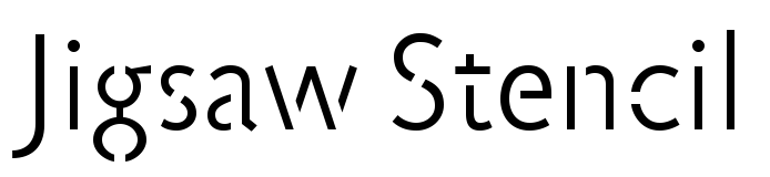
Cera Stencil for Begemann Schule
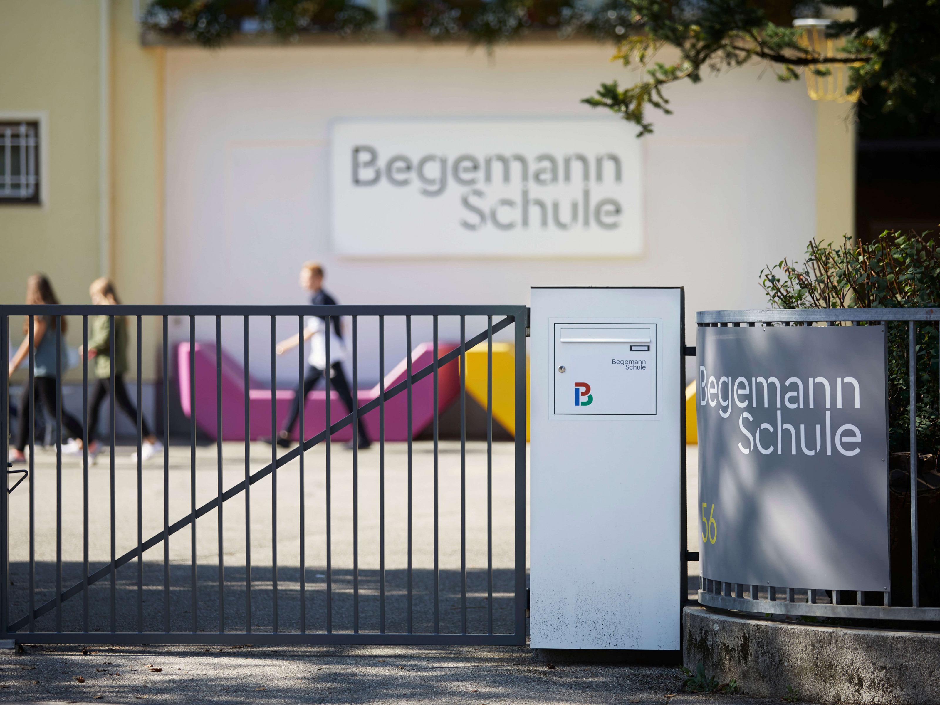
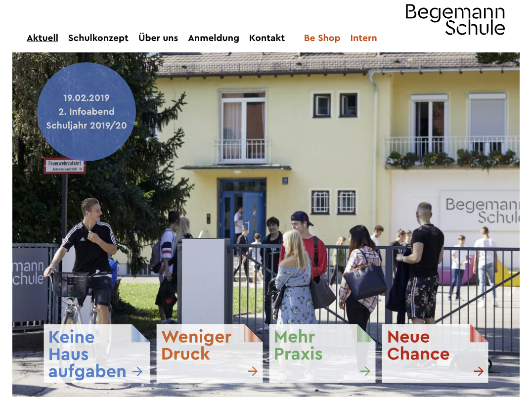
In fall 2018, Begemann Schule launched a new visual identity. The new look of the private school in Munich-Pasing was designed by Studio Umlaut. All communication, from stationery to door signs and brochures, is distinguished by the use of members of the Cera / Cera Stencil series by local designer Jakob Runge. His Cera Stencil is the cornerstone of the identity, which is refreshingly neat and consistent, certainly for a school.
In communication, the combination of young people and stencil letters is too often one where the typography is tasked with evoking street art and graffiti, based on the belief that “streetwise” is the key to communicating with young people.
Avinguda Pilar Esteves 72 skeiðarársandur artenschützerin Margarethe Danzi
143 Lisa Hughes Hollow 32 skeiðarársandur repetitivamente Gustav Geierhaas
John Philip Sousa Avenida Cruz B/13 ennegrecimiento Bad Reichenhall
Richard Leveridge Siegeszeile 32 surconsommation Sankt Goarshausen
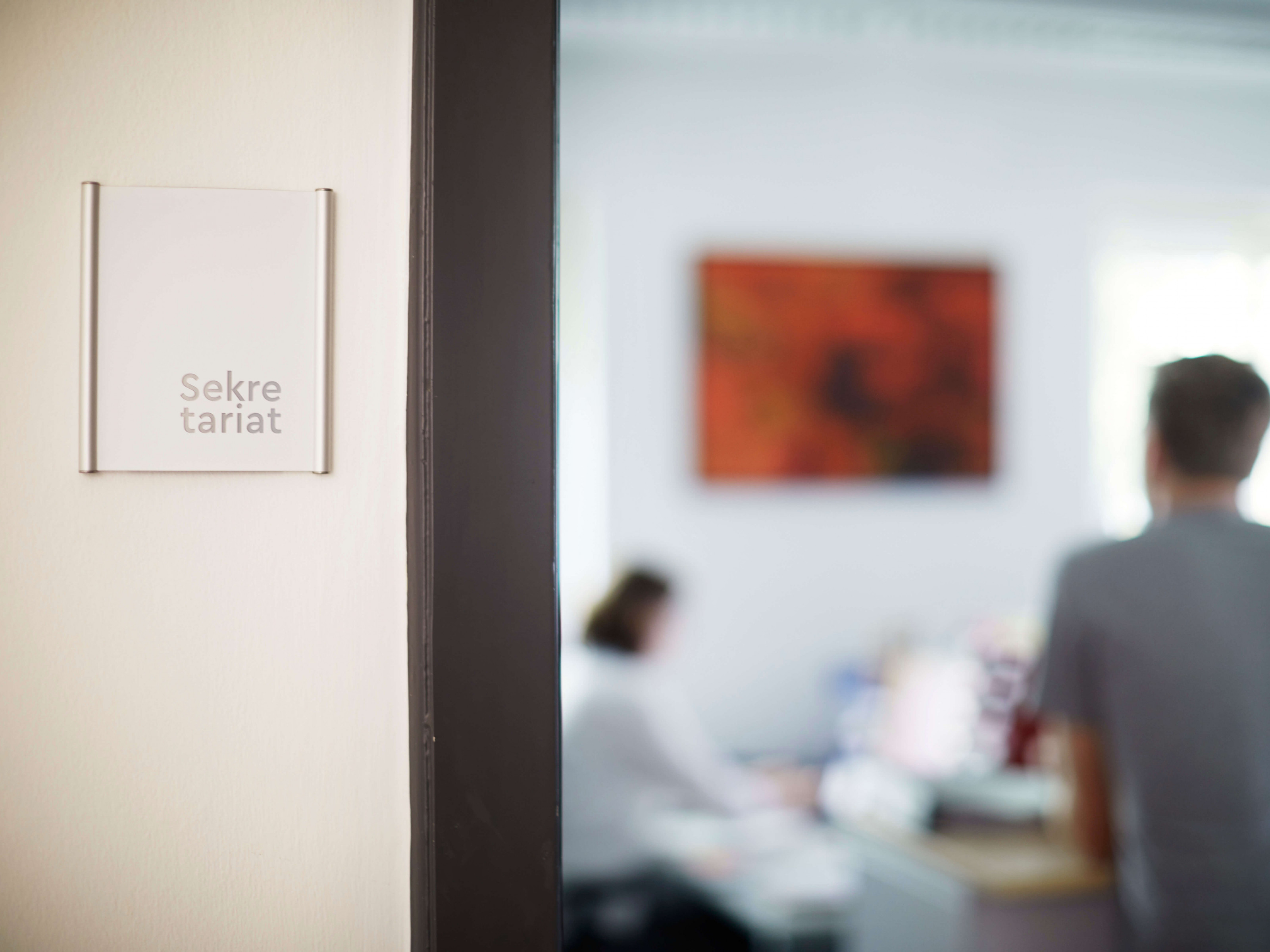
In this project the stencil letter is doing something quite different: it adds a playful rhythm and lightness to an otherwise sleek, almost austere design. Cera Stencil is aided in doing this by a clever trick: the designers placed the two words of the logo in a whimsical flush-left composition, and the logo itself is always placed on the far right of a plane. This playful style variation is repeated in the signage, where even short words are broken into two parts so they can be placed in two right-aligned lines.
You can check out the original version of this entry on Fonts In Use, where it was contributed by Florian Hardwig.
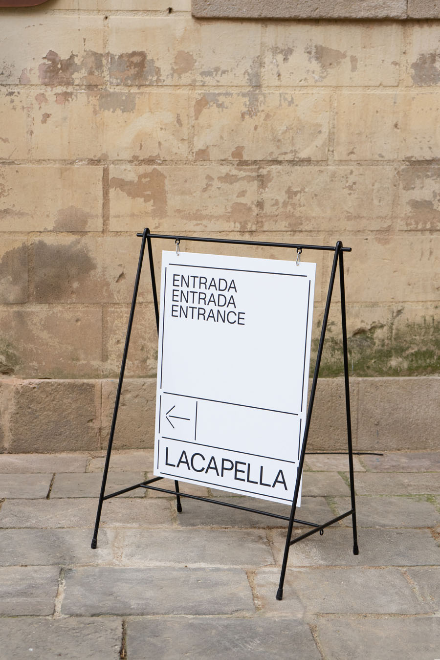
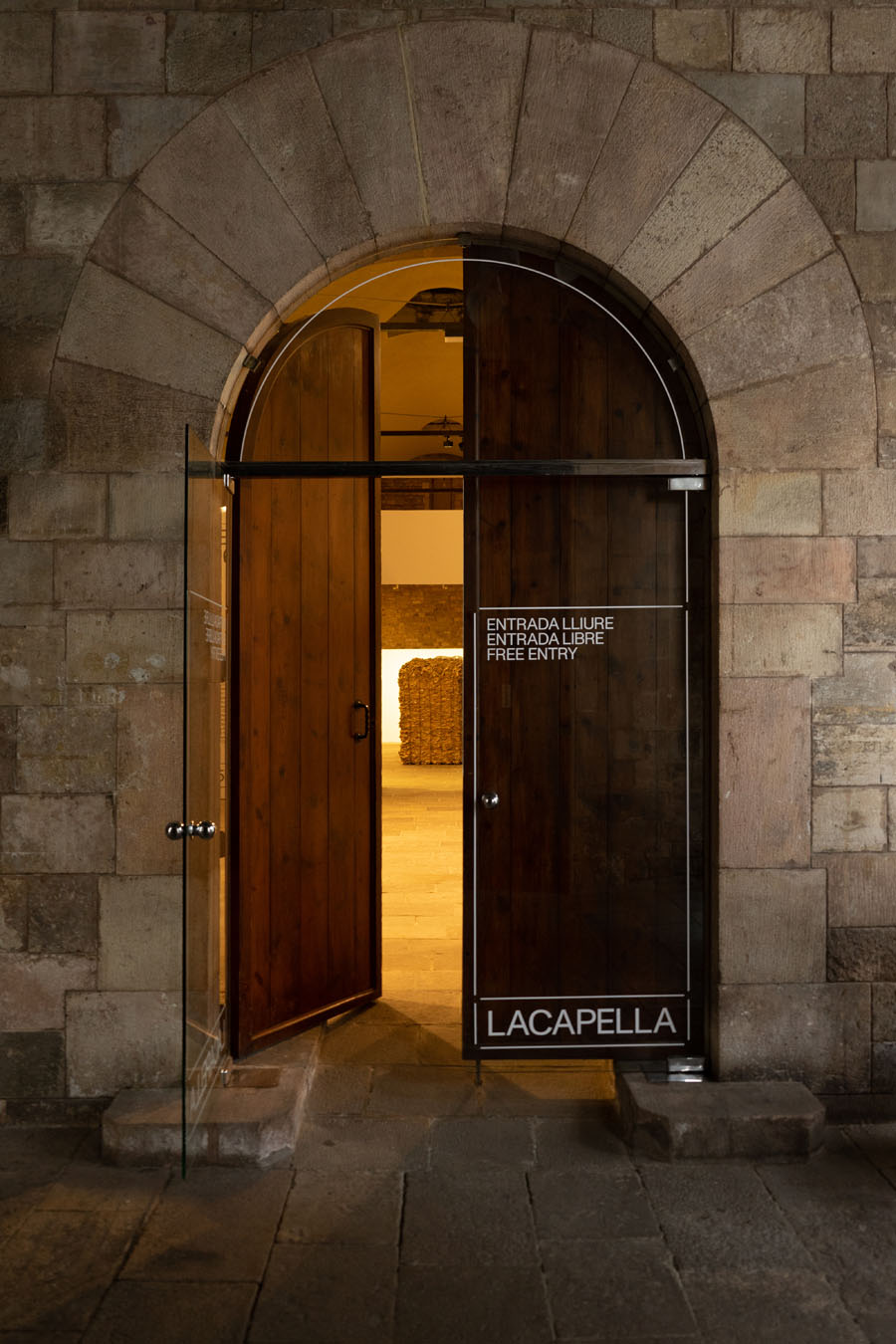
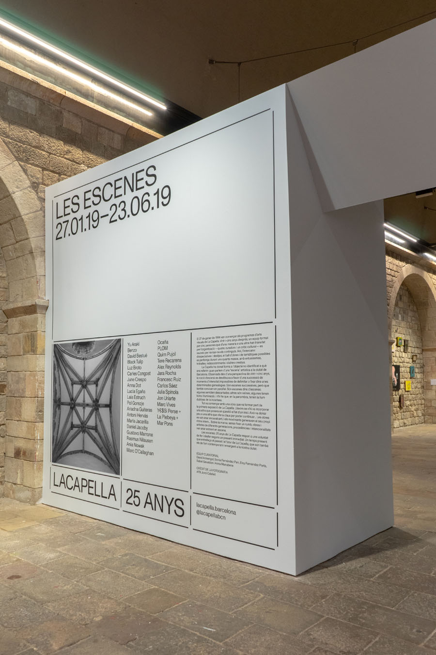
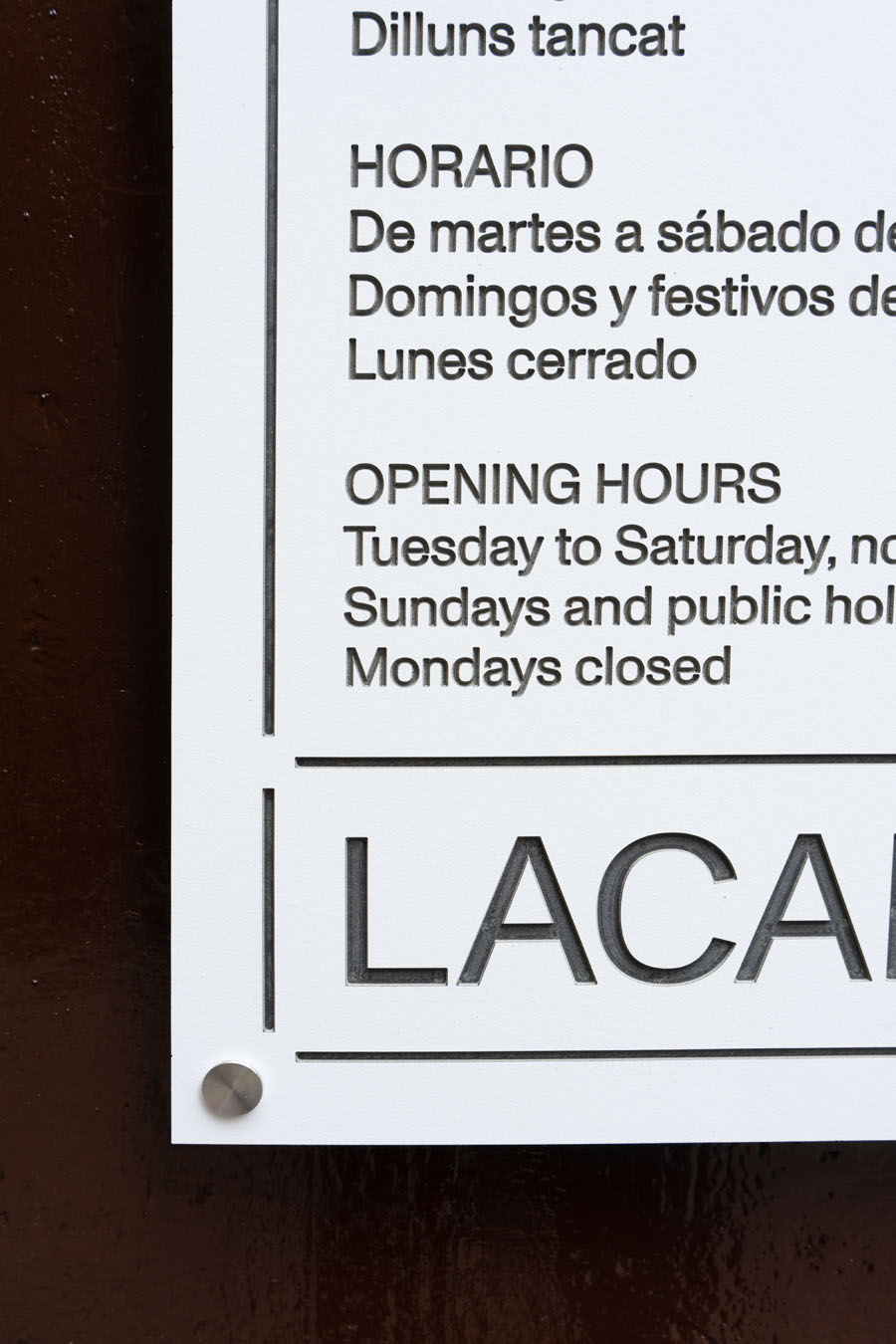
Monument Grotesk for La Capella
On the occasion of their 25th anniversary, cultural center La Cappella in Barcelona invited Folch Studio for a new (visual) identity that would mark a fresh start into the future. La Capella aimed to change from an institution to a more accessible center. Another important factor for the new design was their house, a monumental former hospital with a great deal of of historical value.
The new identity omits the word space from the organisation’s name in the all caps logo. La Cappella’s publications, website and building are connected by a modular system of unconnected lines that are combined to form frames, arrows and windows, evoking a stencil-like impression. The typography itself is not stencil, but solid. From logo to copy, all type is set in a single style of Monument Grotesk from type foundry Dinamo.
The term “grotesk” as a typeface description seems to be used for more and more sans serif releases, perhaps just as “pop music” takes on new meanings each year. If the genre is mainstream, its backbone is “hardcore”: grotesques-inspired-by-Helvetica-and-its-contemporaries – with a very narrowly defined design space. The room for variations here is very small, but nevertheless (or precisely because of that) this genre letter proved attractive in recent years for type designers looking for new variations on the theme. You need a connoisseur to recognize at a glance which grotesque from this genre has been applied in a design. And precisely this combination of familiarity and subtlety seems to explain much of the grotesque’s appeal.
Giuseppe de Majo Passatge Candelario 90 magnetoestrella Nowra–Bomaderry
Kalgoorlie-Boulder připomínajících Nicolas Lebègue Christopher-Krause-Gasse 10
elfenbeinarbeit Rillieux-la-Pape saltvandsområde Jean-Noël Hamal
veröffentlichung Johann Anton André Invalidenzeile 17 raffermissement
For Folch Studio, this sans was the right one for the job “due to its versatility”. Dinamo describe their Monument Grotesque as “a distinctly confident typeface with a raw and pleasantly unpolished feel” – the same associations are often aimed for when stencils are used in designs.
Typedesigners Larissa Kasper and Rosario Florio found inspiration on the pages of a Palmer & Rey specimen book from 1884. The crude forms of their Gothics were polished into a single weight that was used in Kasper-Florio projects for some years until it was released as a three-weight retail typeface in 2018, in Regular, Semi-Mono and Mono cuts.
You can check out the original version of this entry on Fonts In Use, where it was contributed by Bis Turno.
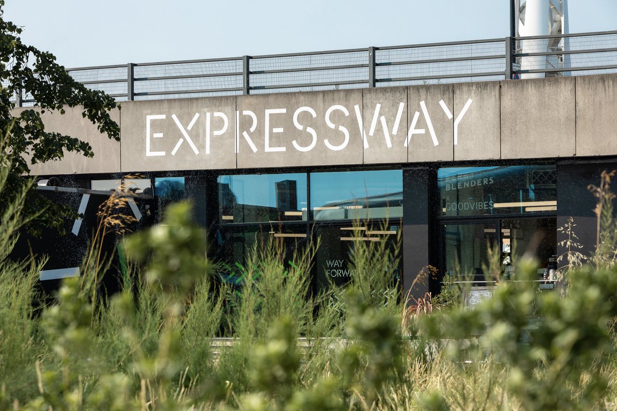
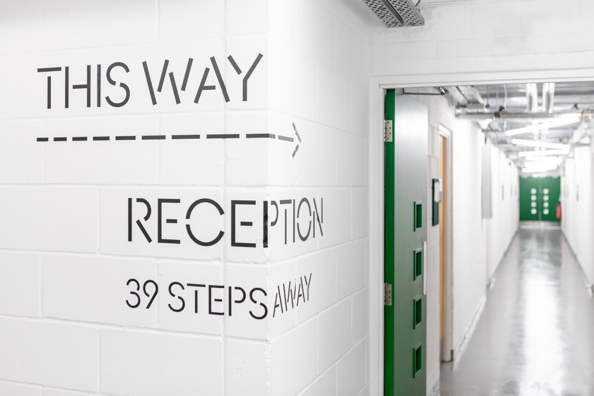
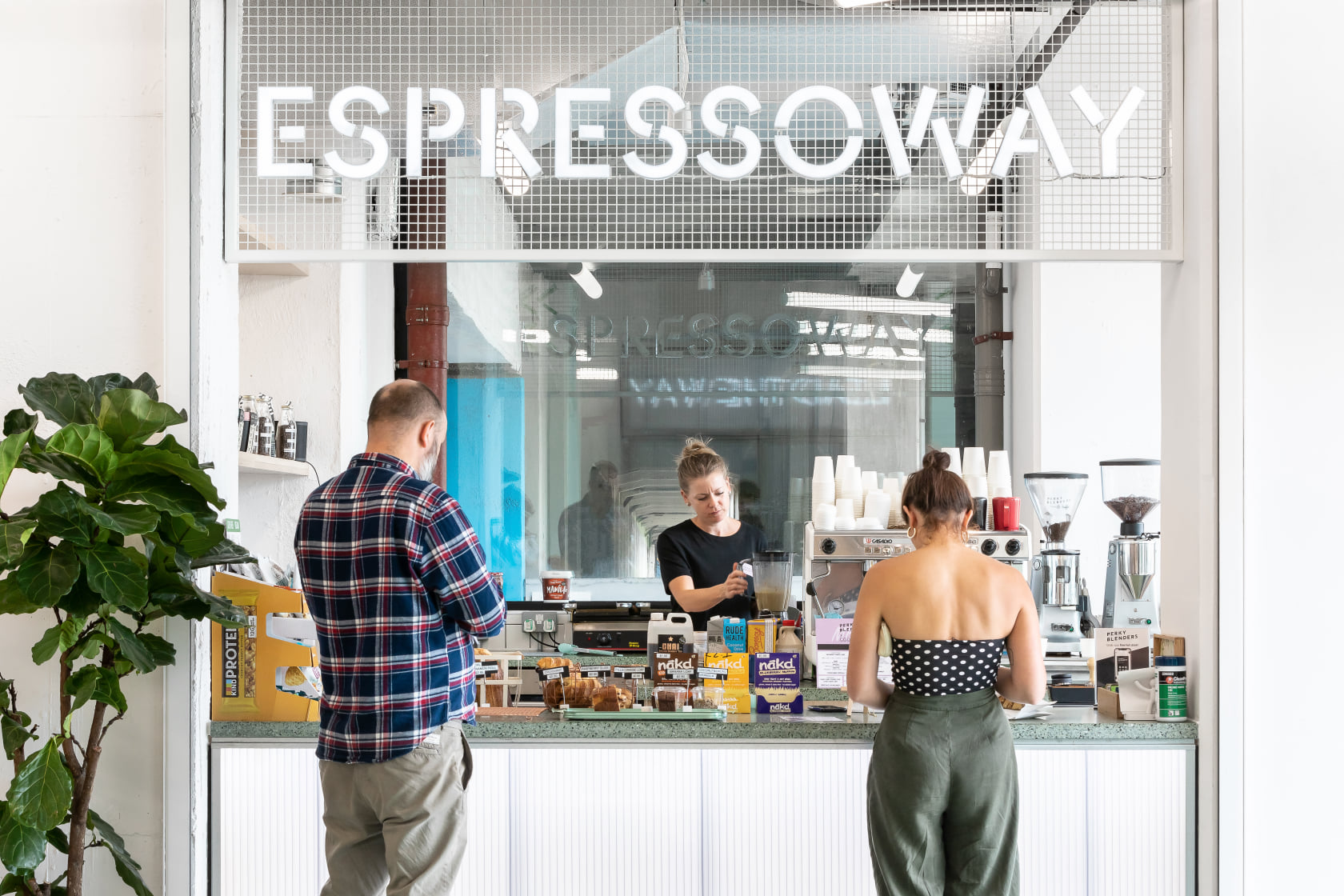
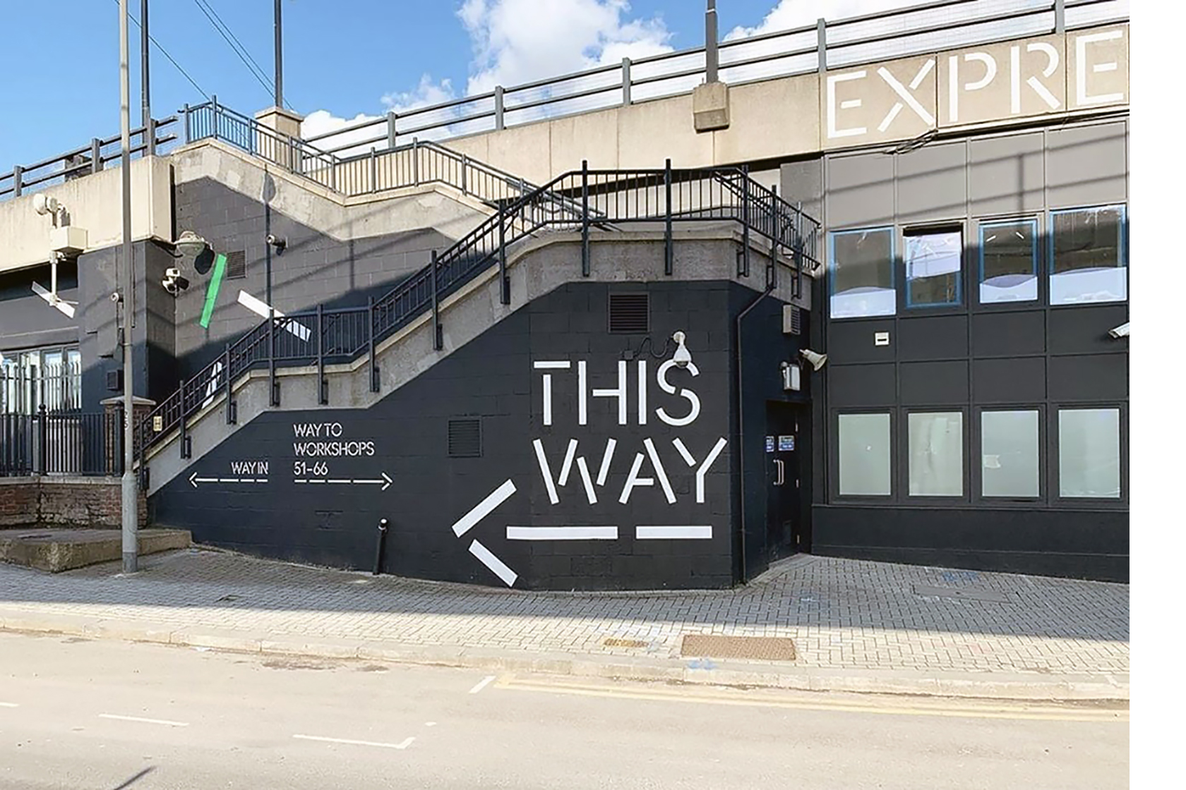
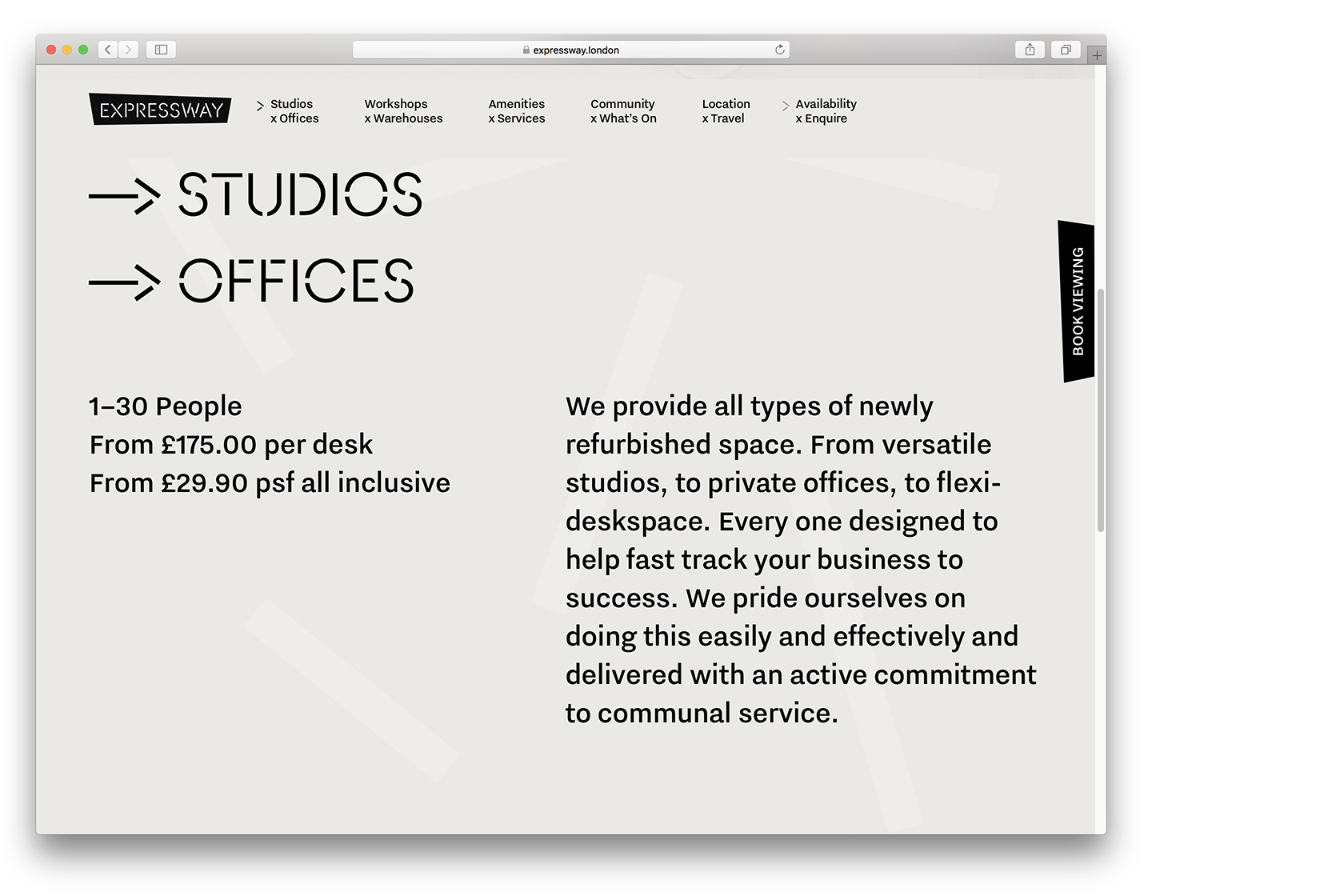
AnoStencil for Expressway Studios
Seventeen years after the launch of the London-based workspace hub, General Projects worked with Architecture 00 on the transformation of Waterfront Studios into Expressway Studios.
To underscore their desired image – “best-in-class, flexible, desirable and affordable”, the public areas are kept light and clean, with wood panels and plants as accents. The collaboration between architects and designers ensured that the signage is an integral part of the architecture. Typography plays a key role both in guiding visitors to their appointments and in conveying the atmosphere.
AnoStencil is a design by fellow Londoner Gareth Hague, and a variation on his geometric Ano typeface family. His design seizes one of the problems of drawing stencil letters as an opportunity for distinct solutions: if you cut the connection between two letter parts, to which of the two does the gap belong? In his design, the gaps are wide, and this clearly has more effect on some letters than others, resulting in a lively effect.
In the logo, the first three letters (EXP) are monumental and almost stately but when we get to the last three letters (WAY), the letter parts dance in all directions, making it almost confusing which part belongs to which letter.
This combination of “clean and lively” was carried through in the application of typography. Mostly applied directly on the wall but sometimes as a light box; wrapped around a corner or rotated foil lettering on a window.
technologickému Michael Corrette Dorotheermarkt 19 overexaggerates
Puerta Lurdes Rea D-23 miraculeusement Alhaurin el Grande skeiðarársandur
64 SQM. INNOVATIVE @ENERGIZED REVAMPED
Saint-Genis-Laval technologickému Ernesto Halffter 49 Passage Molière
On the website, Ano Stencil is paired with more down-to-earth type; Nitti Grotesk from Bold Monday.
You can check out the original version of this entry on Fonts In Use, where it was contributed by Gareth Hague.
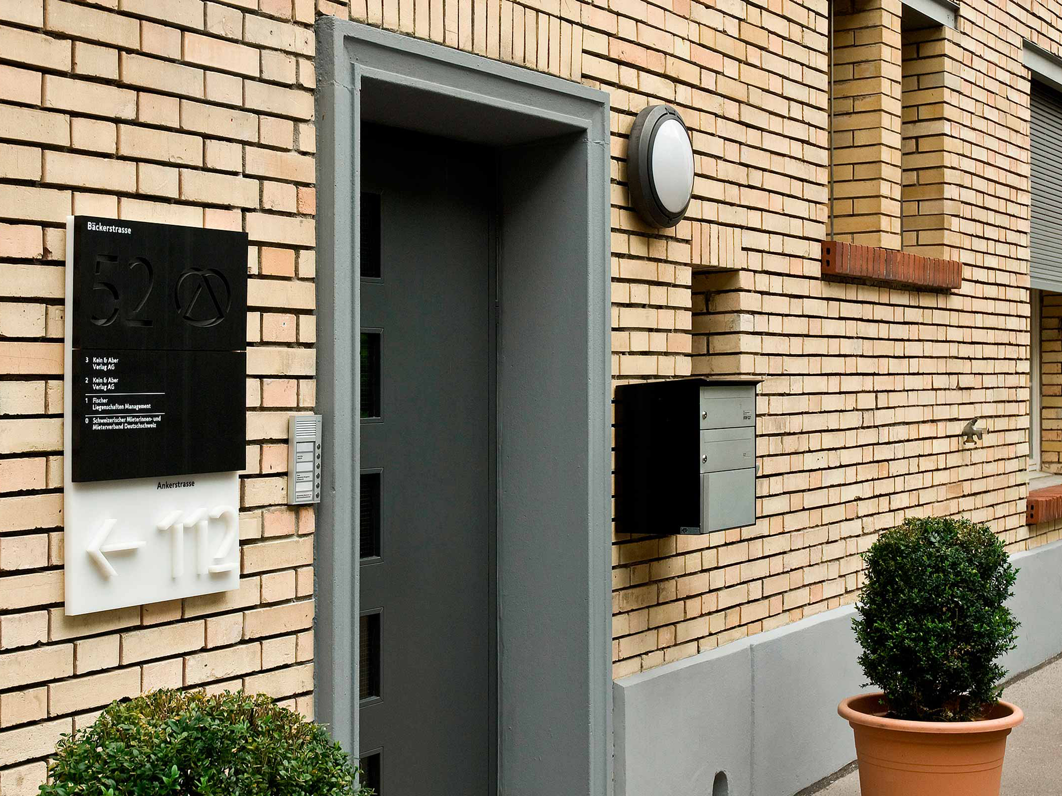
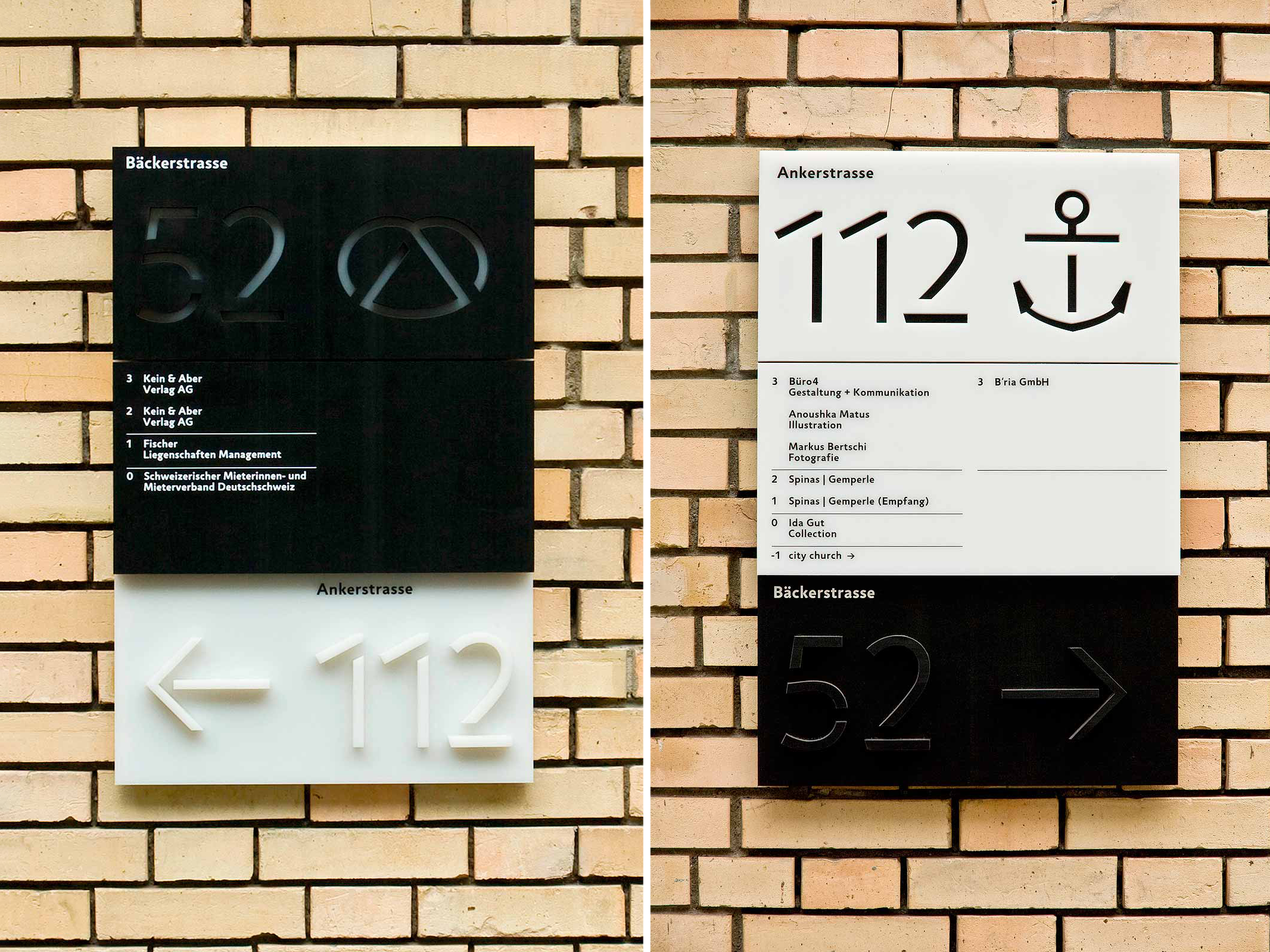
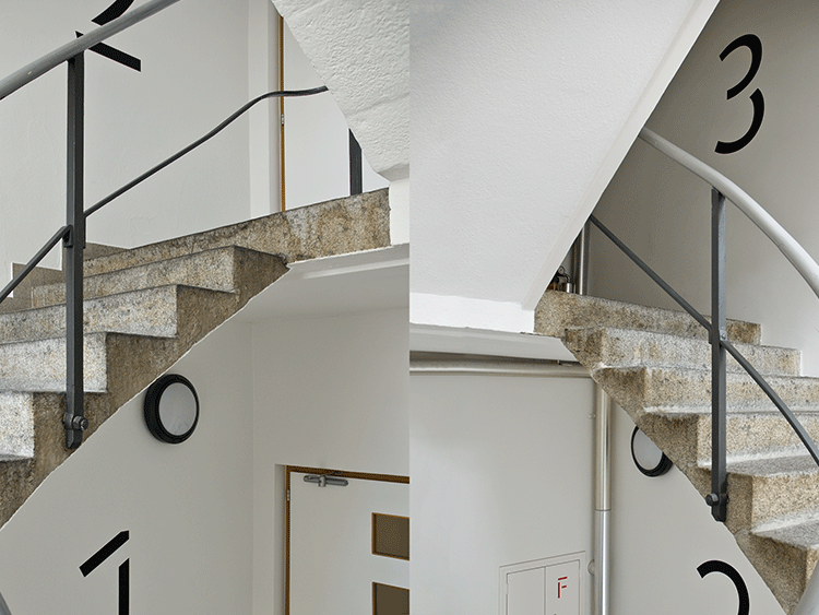
Jigsaw Stencil for Anker-Bäckerstrasse
Design office Re B (Reto Bürkli) and Büro 4 designed the signs and wayfinding for an office building with two entrances: Ankerstrasse 112 and Bäckerstrasse 52 in Zürich, Switzerland.
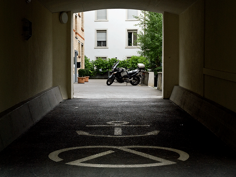
The stylish door panels use Typotheque’s Jigsaw and Jigsaw Stencil and two custom icons: a pretzel and an anchor, referencing the addresses (Anchor Street and Baker Street). Inside the building, Jigsaw Stencil’s Light weight helps visitors find their way, assisted by another small set of matching symbols.
The signage panels outside look plain and simple on first sight, but on a inspection the door panels turn out to be the most complex part of the project when it comes to execution, combining positive and negative stencil cut, and debossing, panel-on-panel variations, and vinyl lettering.
At first glance, the exterior door panels look simple. At a second look, they turn out to be the most complex part of the project in terms of execution, pairing various techniques and materials, in a different variant for each of the entries. The stem width of the cut-out stencil letters is almost equal to the thickness of the panels. Combined with viewing angles, sun and shade, this makes the design a good readability test for Jigsaw’s numbers!
constructivisms Dammarie-les-Lys skeiðarársandur Jan Václav Voříšek
Richard Leveridge 91 Chaussée Caroline Landry multiprocessors Villenave-d’Ornon
North Las Vegas 50 Brian Davis Expw F-46 dvanáctihodinovou alternativement
Mary Ann Pownall Carrer Coleman 69 enantiomorphism Hofheim am Taunus
Designed by Johanna Biľak in the days before OpenType and Variable fonts, the original plan for Jigsaw was to have an adaptable stencil gap size. This project uses the typeface as it was released, in multiple weights with fixed stencil gaps.
You can check out the original version of this entry on Fonts In Use, where it was contributed by Matthijs Sluiter.