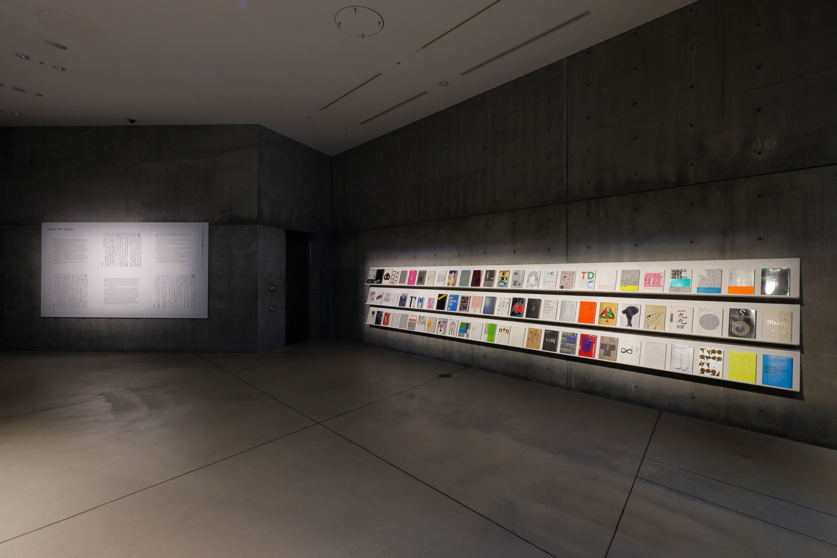
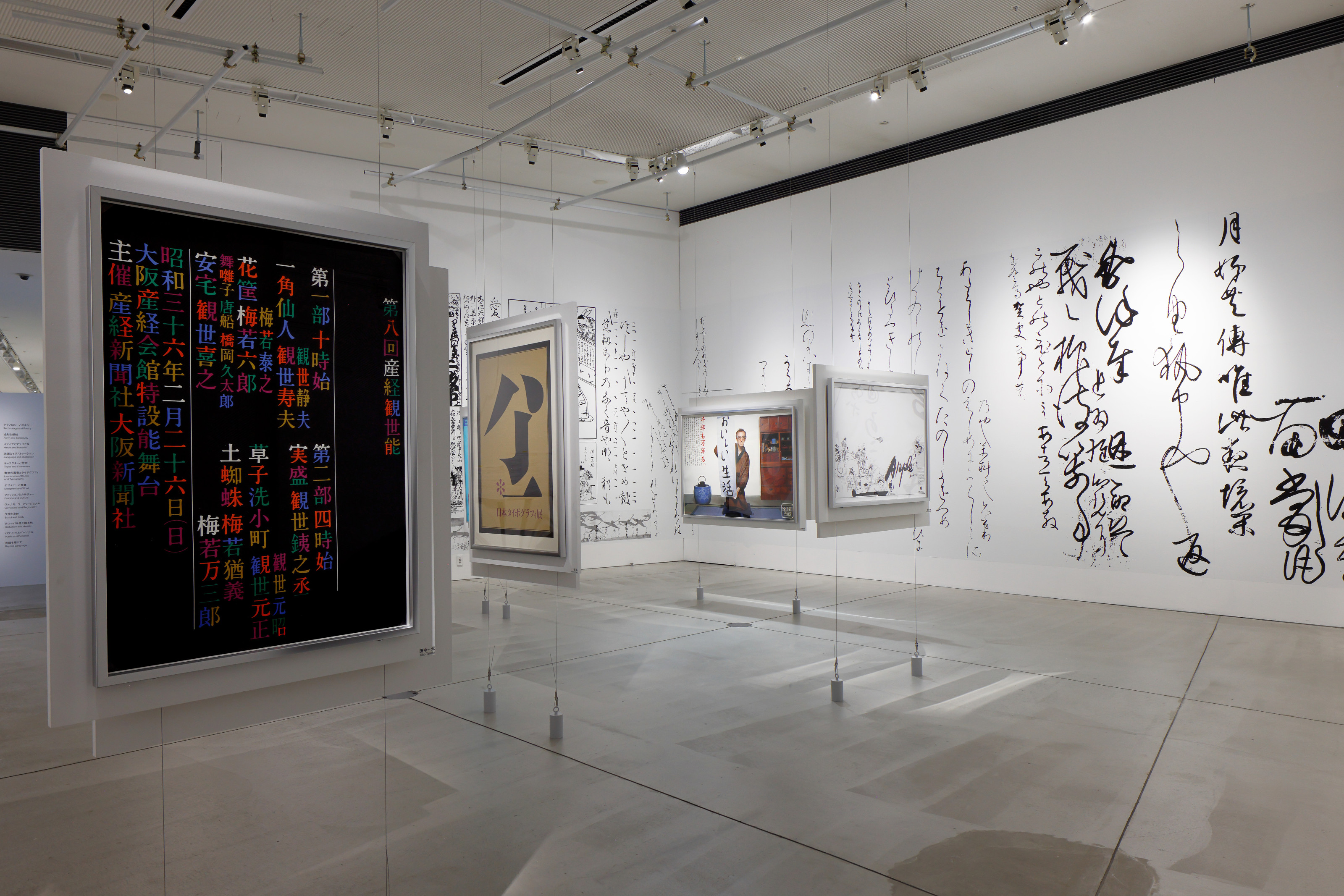
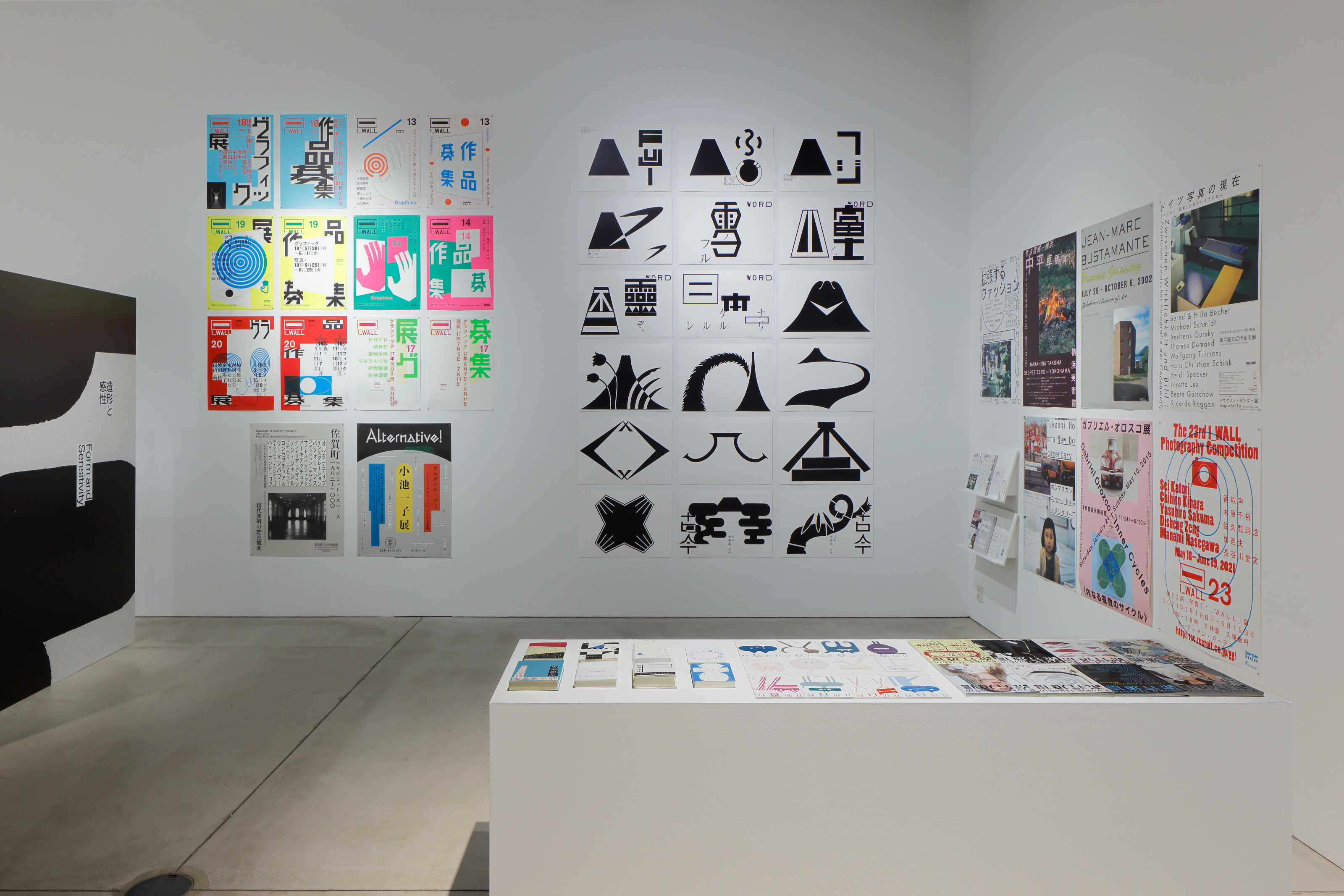
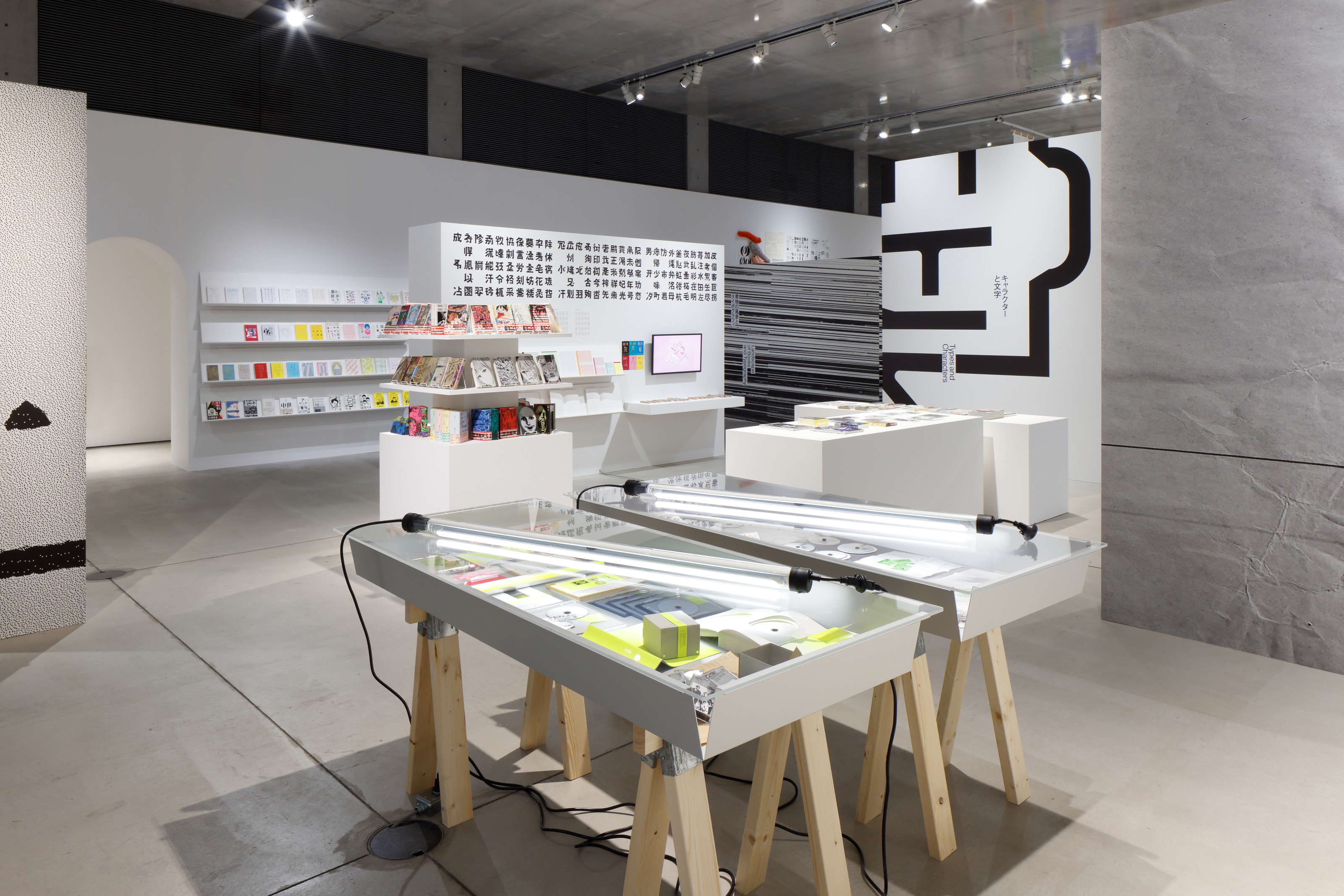
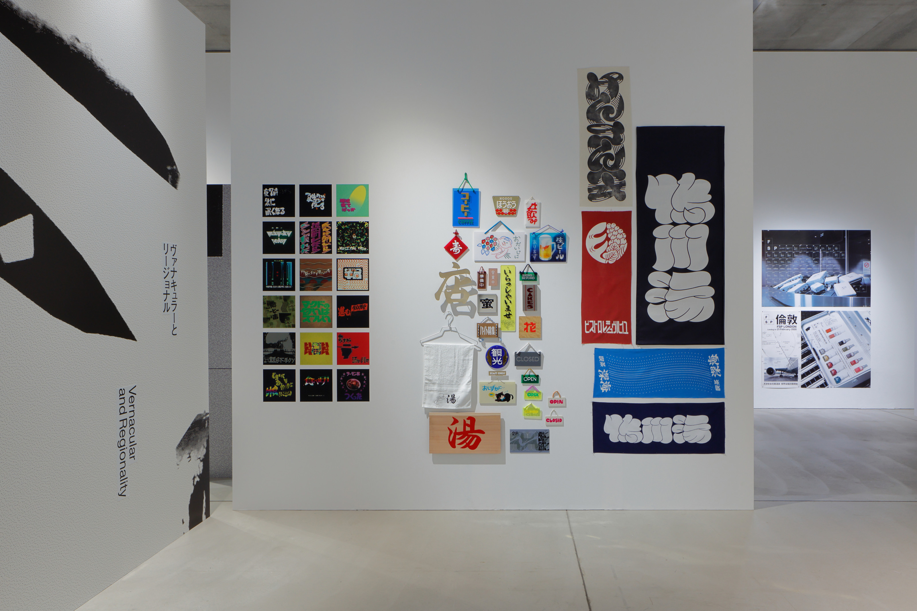
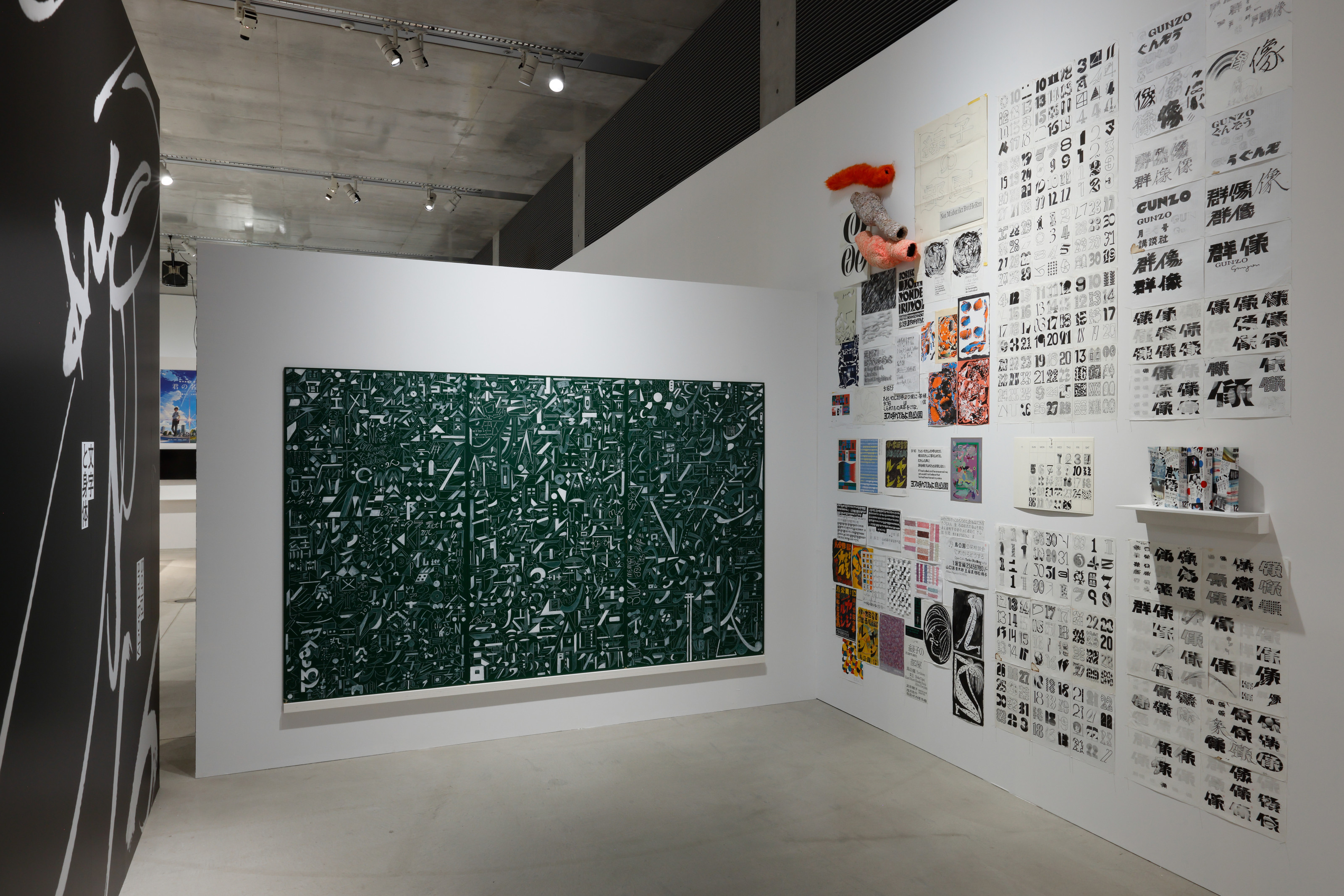
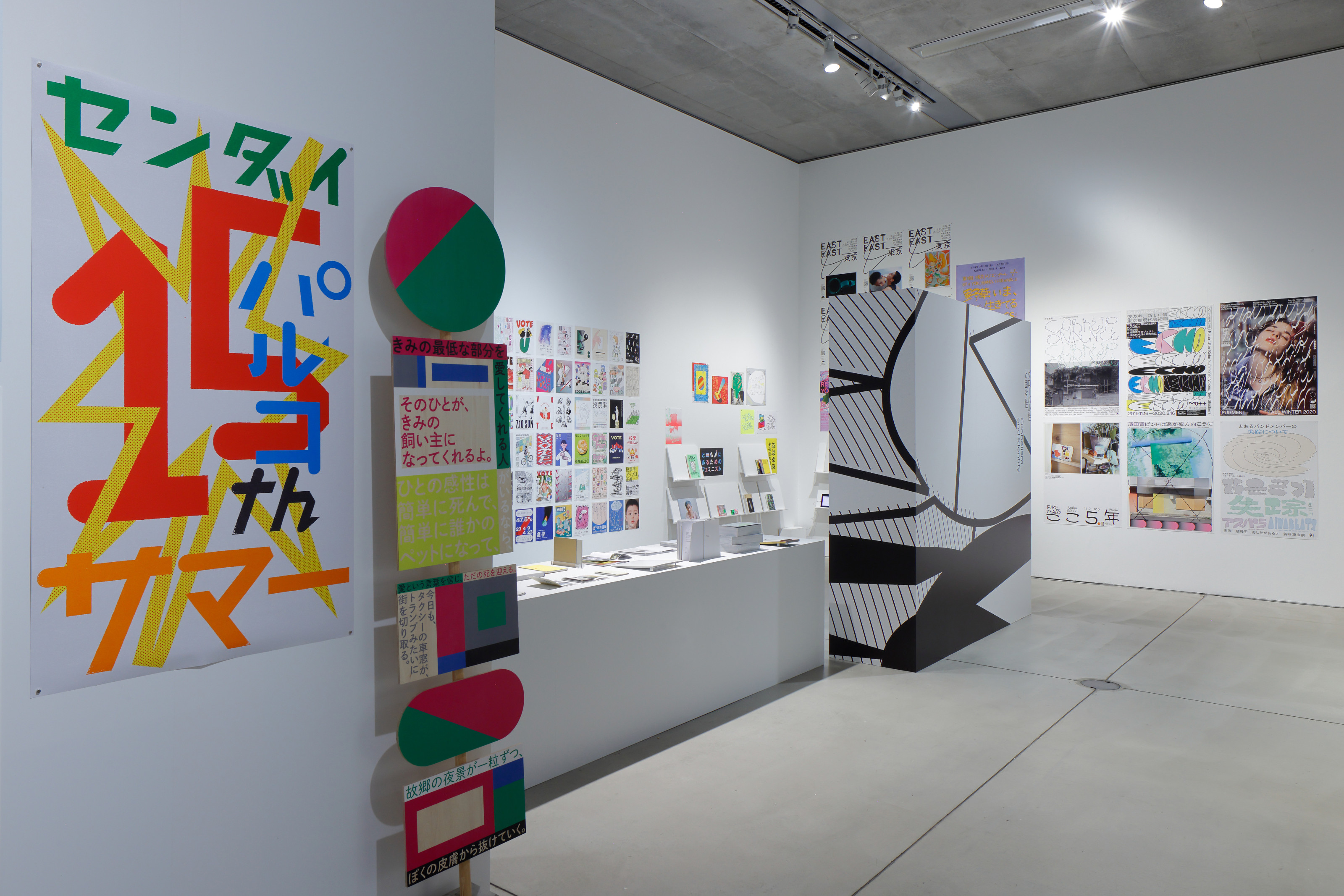
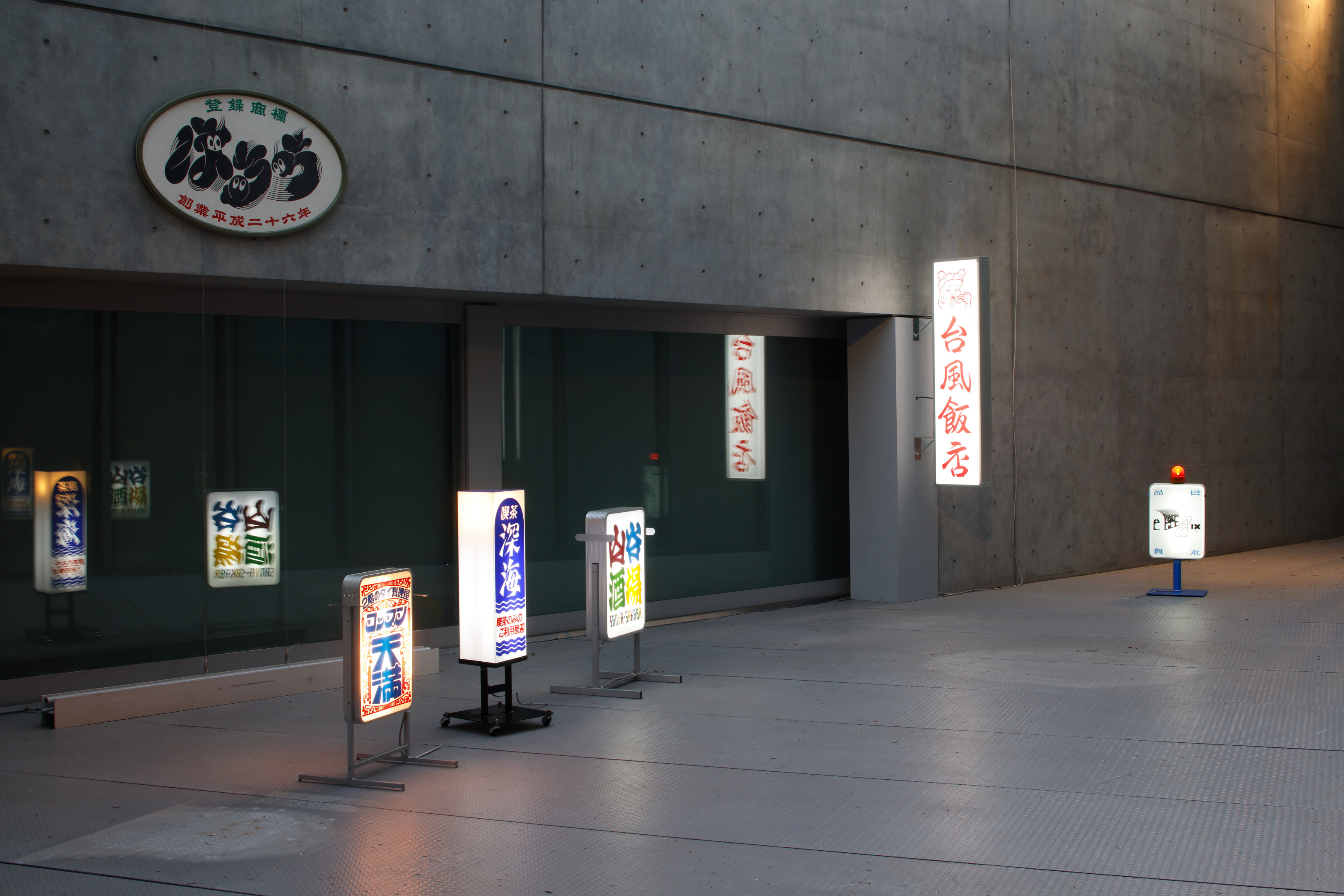
The exhibition delves into how Japanese graphic culture, with its unique use of multiple scripts (Chinese characters, Hiragana, Katakana, and Latin Alphabets) as well as the interplay of vertical and horizontal writing directions, has evolved in the face of global digital information technology. It is a fantastic opportunity to witness the broad spectrum of Japanese typographic designs, which in many aspects differ significantly from Western typographic designs—though the influence from Western typographic designs has always been present. The exhibition title in Japanese reflects the eclectic nature of Japanese typographic expression, too. It is intentionally written in four different scripts: “もじ” (Characters) in Hiragana script, “イメージ” (Image) in Katakana script, Graphic in the Latin Alphabet, and “展” (Exhibition) in Chinese character.
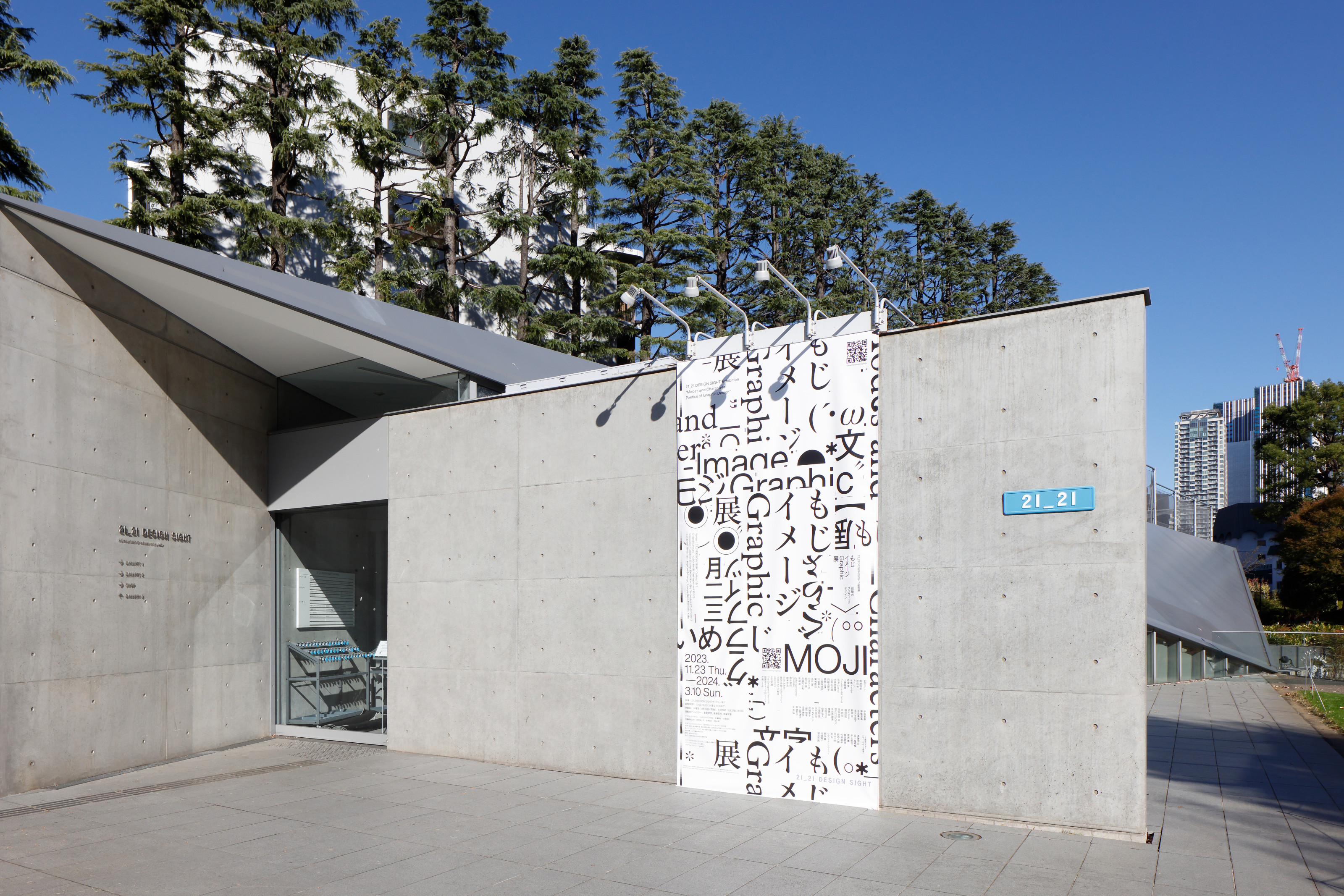
The exhibition is directed by Kiyonori Muroga, a committed editor of books on graphic design and typography, who held the position of editor-in-chief at IDEA magazine from 2002 to 2018. Tetsuya Goto, a graphic design researcher, and Kensaku Kato, a graphic designer, also contributed their expertise to the direction. The exhibition continues until March 10, 2024. If you plan to travel to Tokyo in the upcoming months, I highly recommend visiting the exhibition.