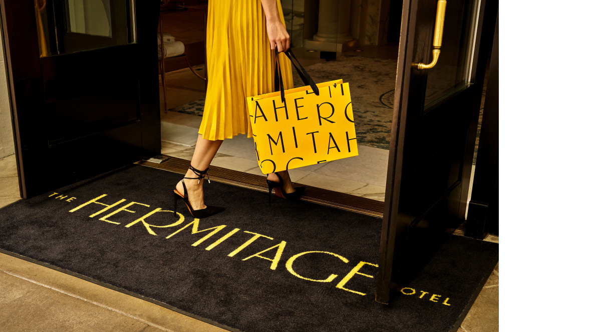
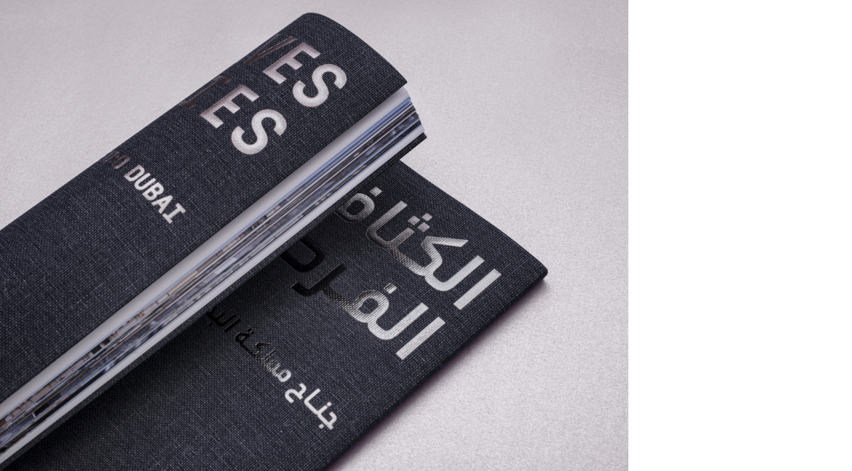
Not long ago, choosing a typeface for a design with “non-Latin” text (or even Latin-script characters outside those used in English) was an easy job: There was simply too little choice.
In setting body text, deviating from the black-text norm is an easily forgotten option. Here is a plea – in four examples – to offer readers the surprise of color as an extra dimension.
The three most frequently cited advantages of variable fonts are compact file size (especially an advantage for non-Latin scripts), the return of optical sizes, and the ability for font users to tweak the appearance of text. The design projects on Fonts In Use with “variable fonts” as the tag fall mainly into the latter category. Here are four examples where designers have used their project as a typographic playground, exploring the possibilities of variable fonts within a set of self-imposed constraints.
During the COVID pandemic, some countries recognized the value of art by keeping museums accessible during the lockdowns. In most countries however, visiting cultural activities quickly became a sweet memory from a near past that now seems distant. As a reminder that museums have not ceased to exist, here are four exhibitions from the past two years, indoors and out, from four continents.
This month’s selection features three tech-related corporate identities that each rely on unique typeface selection to come across as reliable and relatable.