For years, David Shields’s presentations on aspects of wood-type-manufacturing history have been a fixture at typographic network events, including ATypI 2016 Warsaw, Type@Cooper West’s lecture series at the San Francisco Public Library, and Type@Cooper at The Cooper Union in New York. In April, the University of Texas Press published his new book on the history of nineteen-century American wood type. Stephen Heller has already reviewed David’s book. I hope that the following post offers a sufficient meta-discussion instead.
In multiple cinematic franchises, the task of writing subsequent screenplays or directing later installments is given to persons aside from those who created the original work. Occasionally, the sequel to a film offers a more engaging story or is at least a visually richer tapestry. The Rob Roy Kelly American Wood Type Collection: A History and Catalog is an obvious sequel to Rob Roy Kelly’s 1969 book, American Wood Type, 1828–1900. David’s book examines the methods Kelly used to develop a narrative history of wood-type development in the United States during the 19th century. It is rooted in a discourse Kelly created, and without it, we would be no The Rob Roy Kelly American Wood Type Collection: A History and Catalog to discuss. However, that does not diminish the book’s achievements. Today’s audiences might even find this sequel more captivating than the “franchise’s” initial text.
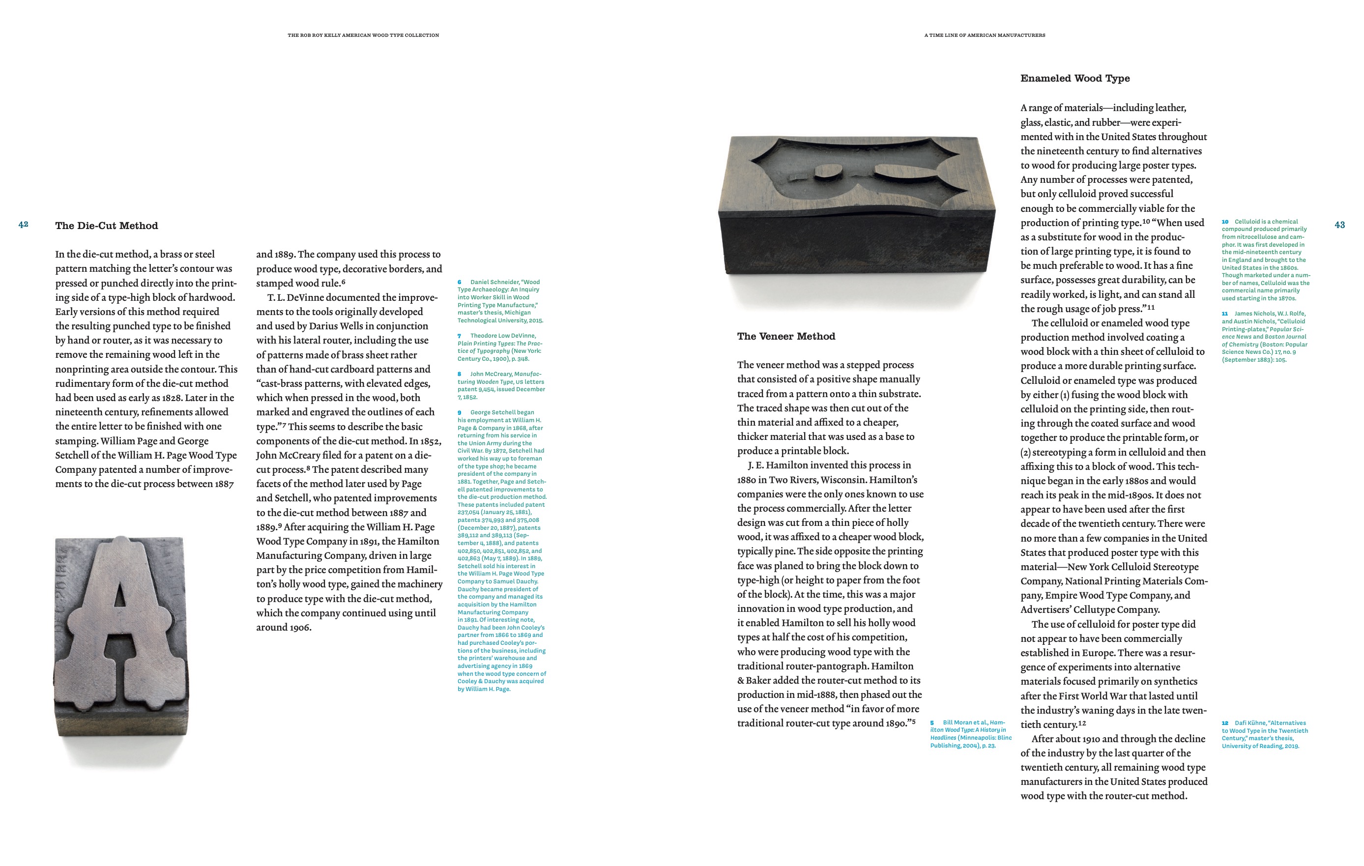
David began interacting with Kelly’s Wood Type Collection after he was appointed Associate Professor at UT Austin, which acquired the fonts in 1966. Born in 1925, Rob Roy Kelly passed away in 2004 – the same year Shields came to Austin. Although David transferred to Virginia Commonwealth University in 2012, he continued his research into American wood-type manufacturing in general and Kelly’s investigations of the same subject matter in the 1950s and ’60s. David has previously shared the new research methods he pioneered at conferences and other gatherings, like the three lectures linked to above, as well as on his blog, Wood Type Research.
The Rob Roy Kelly American Wood Type Collection: A History and Catalog is not just a book about the wood type Kelly collected but the first book about Kelly himself. David’s biographical insights not only help contextualize Kelly’s research but also help readers today understand the spread of graphic design education within the 20th-century university system in the United States. Kelly taught in several art programs and even founded graphic-design majors at the Minneapolis School of the Arts [Minneapolis College of Art and Design], Kansas City Art Institute, and Arizona State University.
As David’s book makes clear, Kelly’s wood-type research was practice-based. David also practices hands-on research, and – like Kelly – he consults type specimens and printing-trade publications for information about specific typefaces and the wood-type manufacturing industry at large. On his blog, David provides a list of digitized wood-type specimen catalogs. Kelly donated several specimens to the New York Public Library and the Special Collections at Columbia University’s Rare Book and Manuscript Library. He also helped those libraries acquire additional materials. An appendix in The Rob Roy Kelly American Wood Type Collection: A History and Catalog lists them, providing readers with the information necessary for seeing them in person.
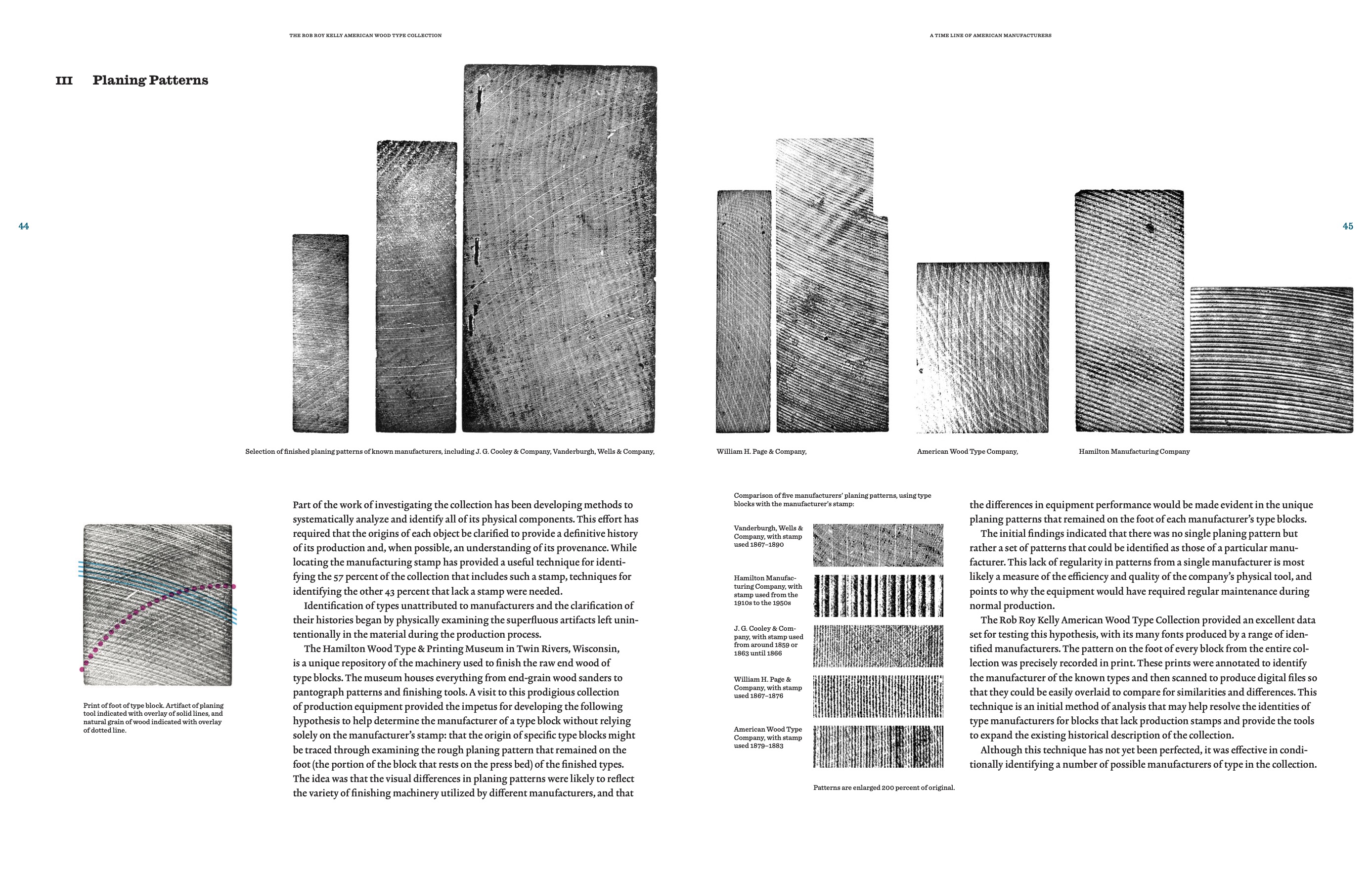
Something that may be less evident to some readers are the additional methods David has brought to the study of American wood type. For instance, he has printed the backs of wood-type blocks to analyze patterns from their manufacturers’ planing processes. By comparing planing patterns from types whose manufacturers had not been identified with those that had, it should be possible to pinpoint an attributed font’s origin. David blogged about this hypothesis in 2011. He also uses census data to gather information about the employees at various wood-type manufacturers. It does not receive a chapter in his book or a post on his blog, but it comes up online, like in this post on Charles Henry Tubbs.
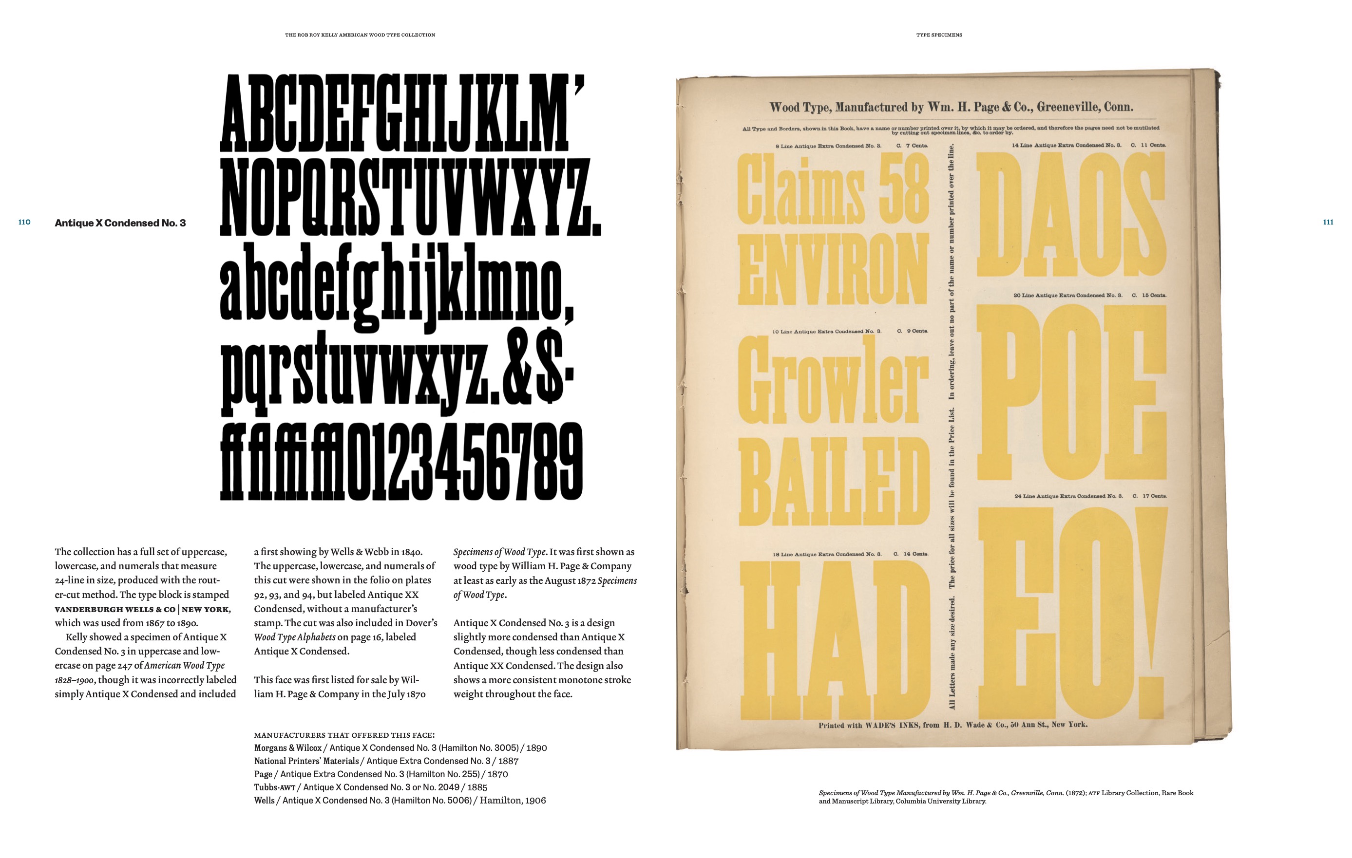
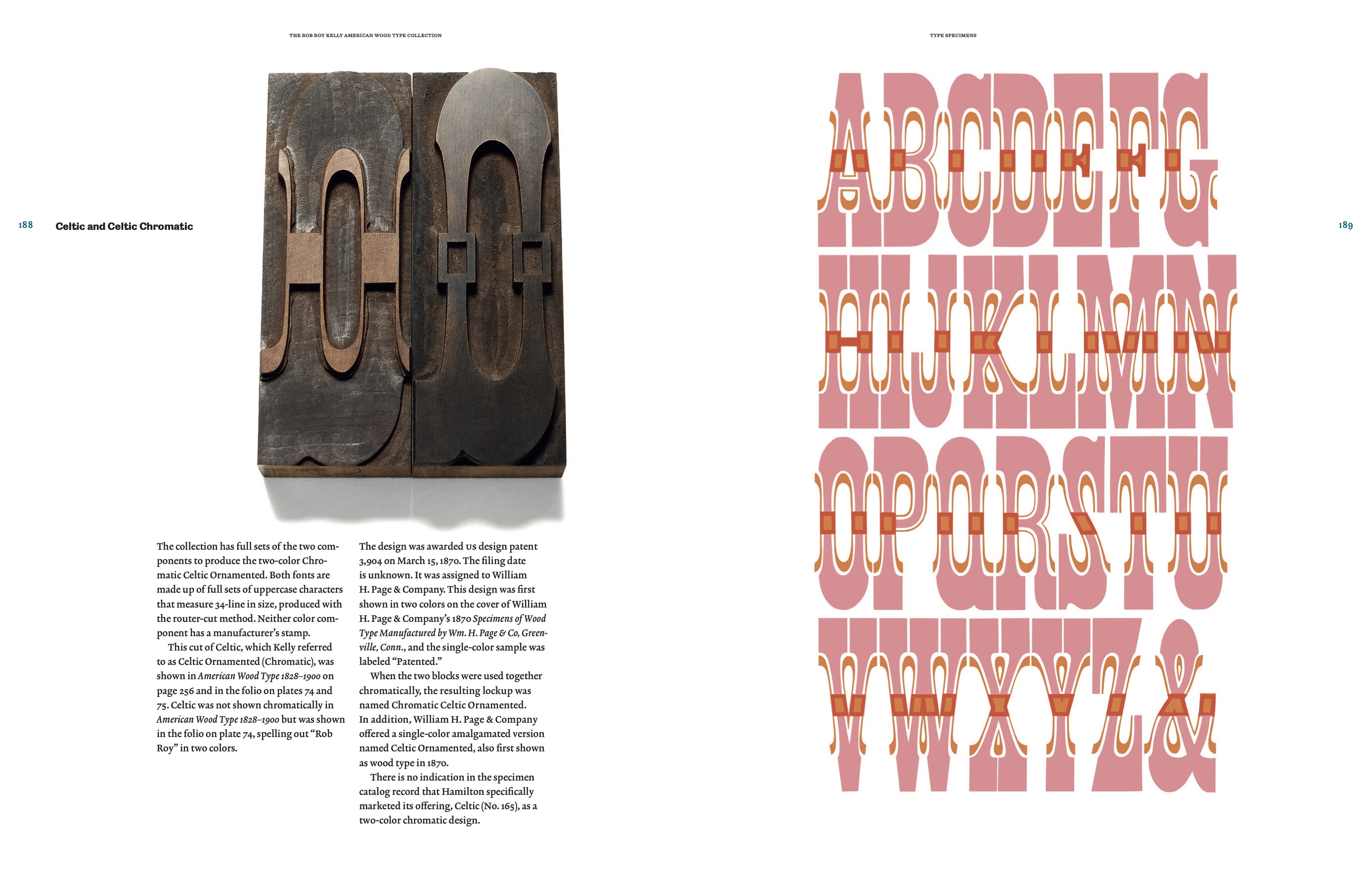
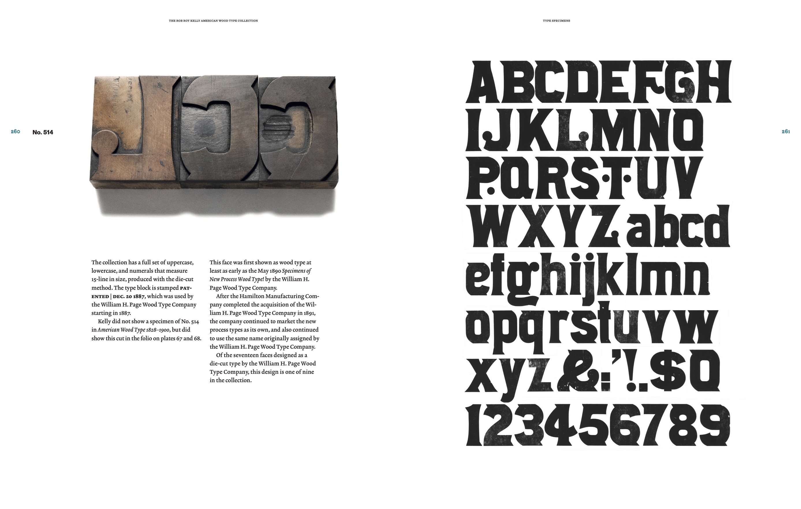
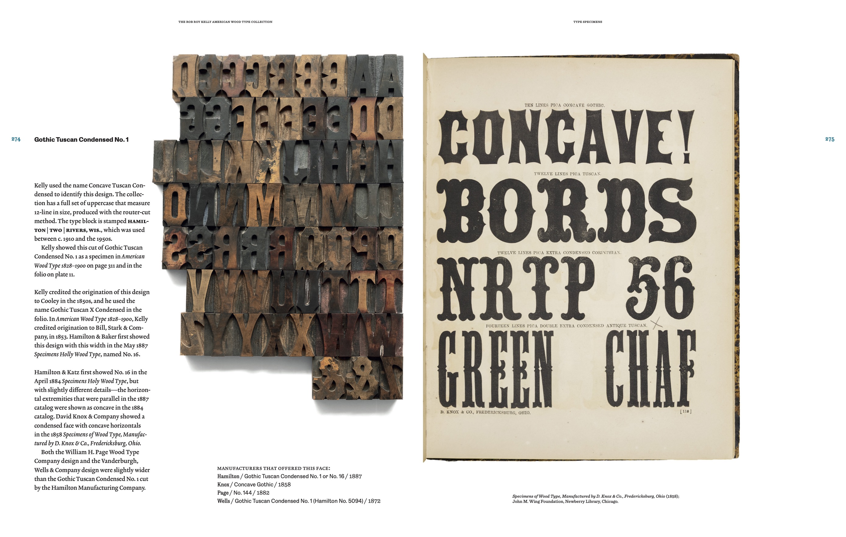
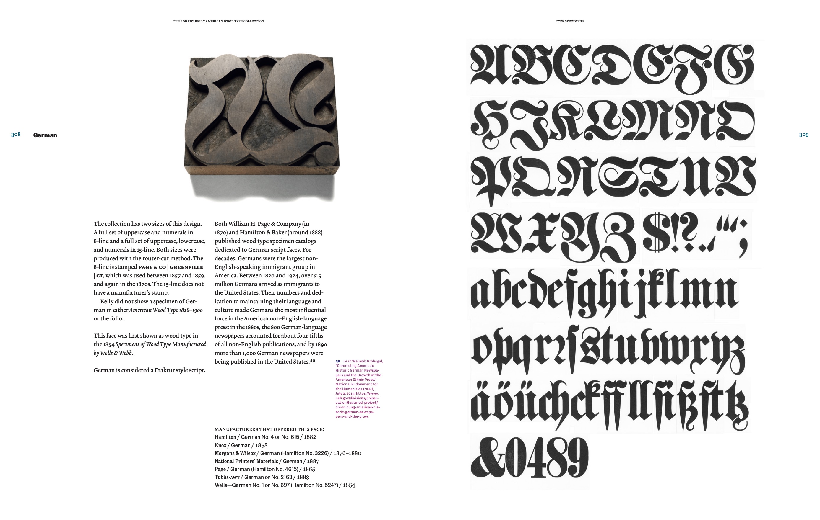
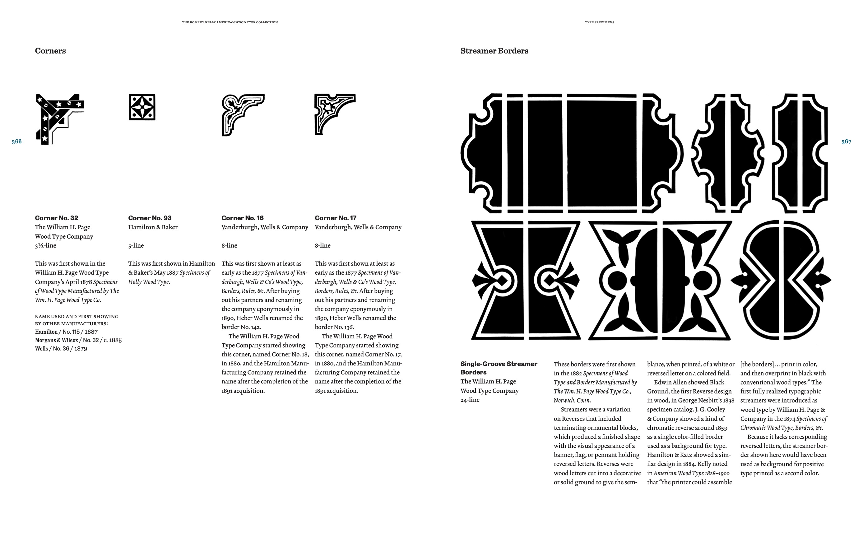
The core of David’s book is a description of each typeface in the Rob Roy Kelly Collection in the Design Division of the University of Texas at Austin’s Art and Art History Department. Those descriptions take up about 300 of the book’s 408 pages. A key element of David’s descriptions is their focus on each design’s distribution across the American wood-type-making network. David pinpoints which typefoundry or wood-type maker was the first to publish the design and how many American wood-type makers carried the design in their product ranges. Much of the information likely comes from David and his nearly two-decade-long study of primary sources, including wood-type and foundry-type specimens, various printing journals, and Kelly’s papers. Tracking the distribution of typeface designs across multiple manufacturers and typesetting media is still a relatively under-utilized typographic-research method. I do not think any publication has yet presented how type designs have moved across manufacturing networks more thoroughly than American Wood Type Collection: A History and Catalog.
David used many tools readers would expect in his book’s making, including digital photography, scanners, and desktop-publishing software. While that comes as no surprise, it is helpful to remember how much digital development took place since Kelly’s book was published in 1969, when finger and hand movements played a larger role in page design and illustrations had to be manually collaged together for analog photography in order to be reproduced. Shields utilized a lot of digital fonts in his layout; he mentions 16 typefaces in his colophon. It is difficult to imagine that kind of exuberance in a 1969 publication. Instead, David’s book echoes Kelly’s in other ways. The Rob Roy Kelly American Wood Type Collection: A History and Catalog is essentially the same size as American Wood Type, 1828–1900. The total width is a bit greater than Kelly’s.
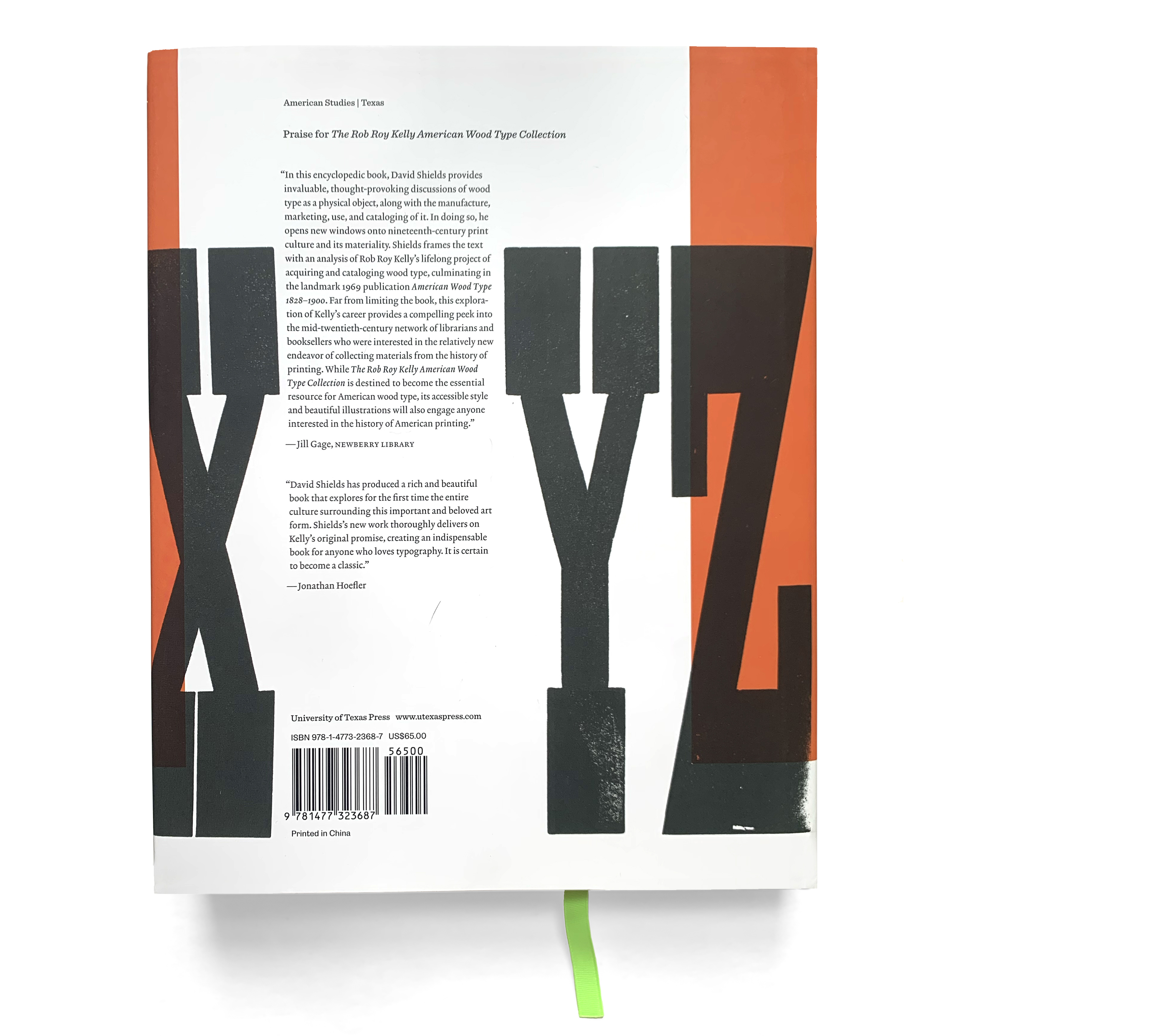
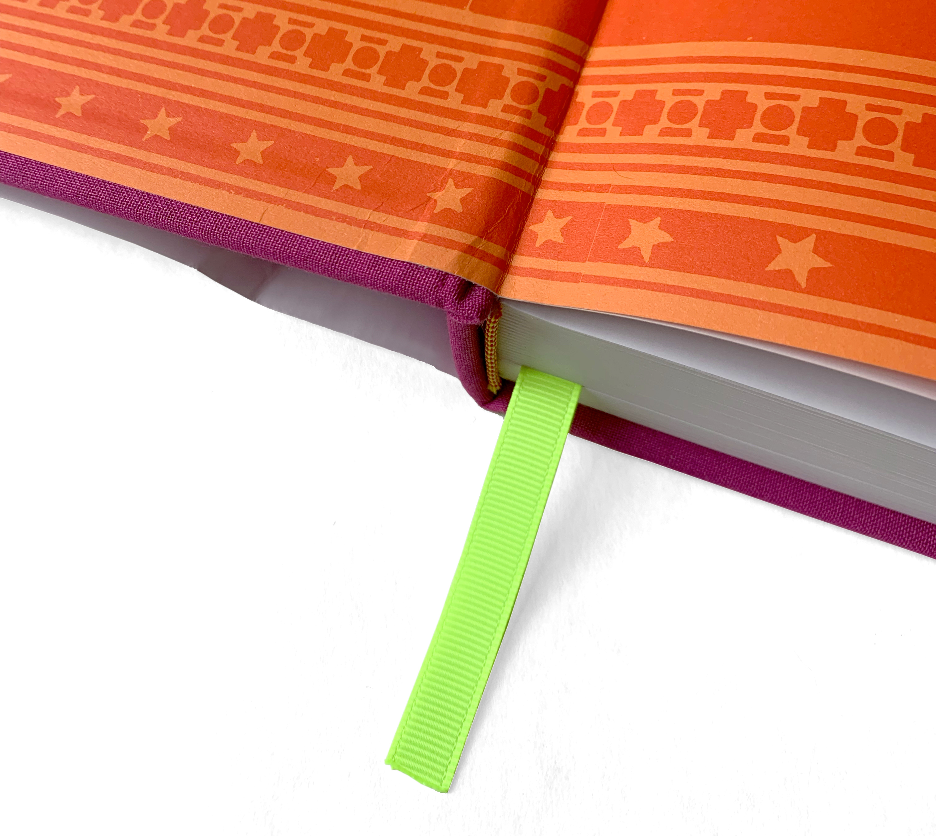
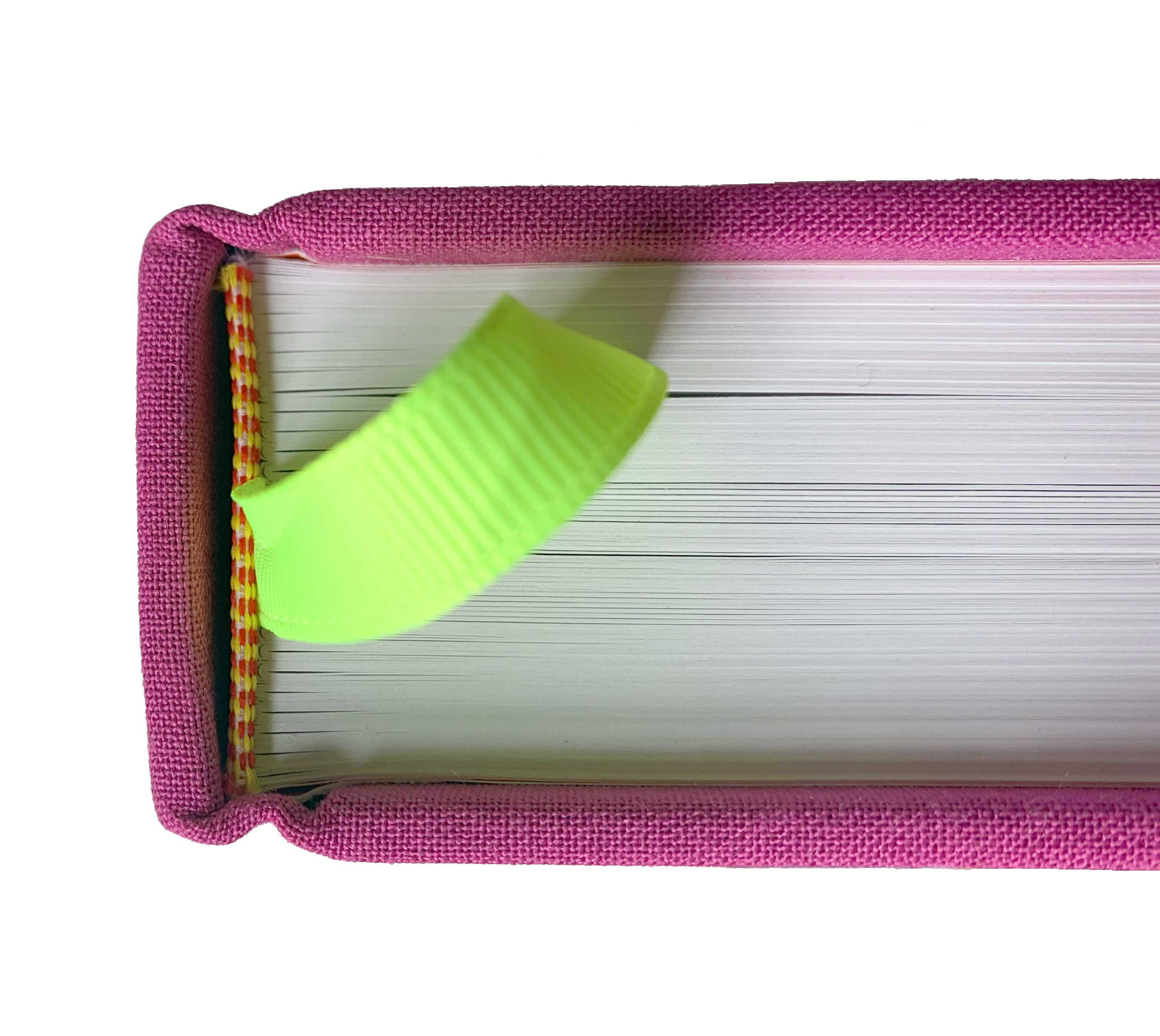
In American Wood Type, 1828–1900, Kelly laid his pages out densely. They were printed in just one color. David’s pages employ white space more generously, probably to not distract from the excellent-quality color photography he coordinated. Those photographs require coated paper, making The Rob Roy Kelly American Wood Type Collection: A History and Catalog a different haptic experience than American Wood Type, 1828–1900. David’s book is colorful: its jacket features bright orange ink, and the endpapers are printed with a two-tone orange pattern. The book is bound in purple cloth, and its font cover and spine are embossed with two purple colors, respectively. The combination of purple and orange is probably not an homage to Gerard Unger’s colorful personality. But, as Gerard (1942–2018) was wont to do, David’s book reminds typographers that they need not limit themselves to the traditional colors of black, white, and red.
Summary
The Rob Roy Kelly American Wood Type Collection: A History and Catalog, by David Shields.
Published by the University of Texas Press in 2022. 406 pages. English language, 30.5 cm (12 inches) tall.
Composed with Antica, Antique No 6, Bureau Grotesque, Caslon Ionic, Clarendon [Bitstream], Covik Sans, Egiziano Classic, Egyptian 710, Lexicon No 2, Obviously, Omnes, QFWFQ, Salmanazar, Sentinel, Service Gothic, and Triptych.