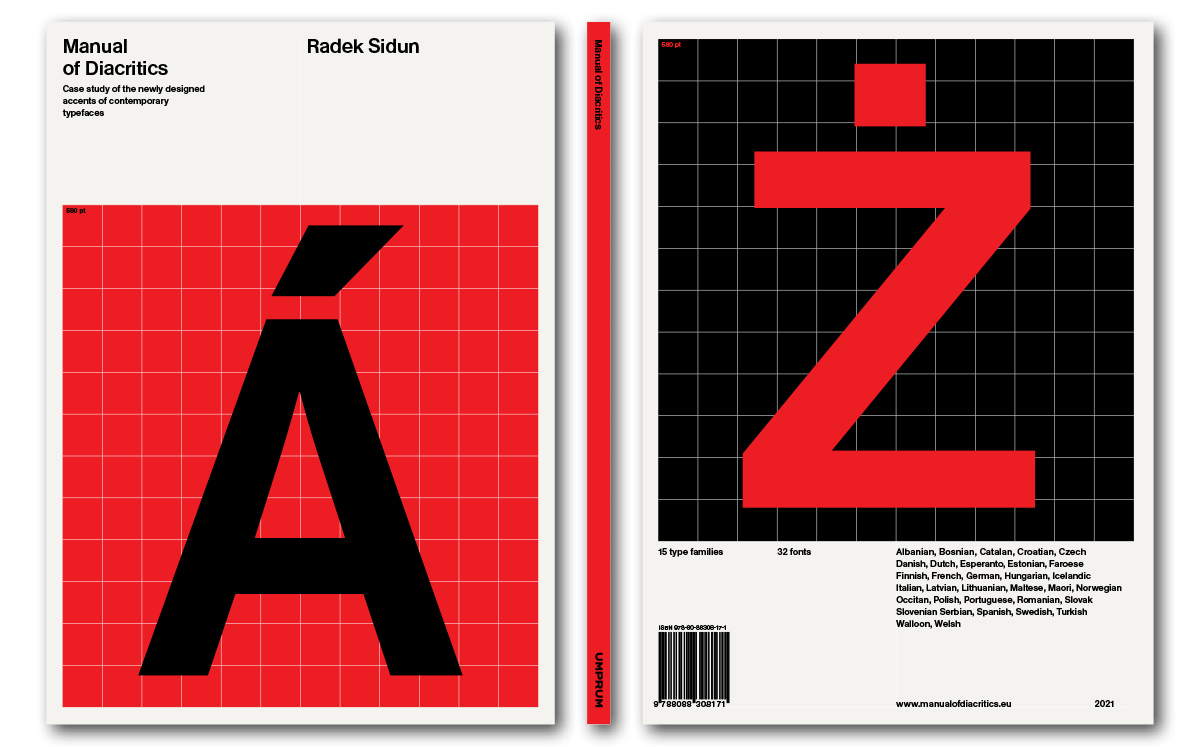
Rendering displaying the front and back covers of Radek Sidun’s upcoming Manual of Diacritics.
Manual of Diacritics is an upcoming book now available for pre-order. Written by Radek Sidun – a Prague-based designer who co-founded the Briefcase Type Foundry – the book is subtitled “Case studies of newly designed accents for contemporary typefaces.” That’s a pretty good summary of the contents. The book is a visual presentation of a series of diacritics Sidun drew from scratch for a total of 32 fonts from 15 widely-used typefaces. Manual of Diacritics grew out of Sidun’s 2009 master’s thesis at UMPRUM.
Sidun’s diacritics for those fonts aren’t “redesigns,” per se. While many of the typefaces he included already included the necessary diacritics for setting central and eastern European languages in 2009, Sidun did not consult them. As he explains, “all accents [shown in the book’s examples] have been created by myself alone.” This project was authorized by the foundries responsible for the original typefaces, as Sidun also mentions. He designed them all from scratch for future designers to use as a stylistic reference.
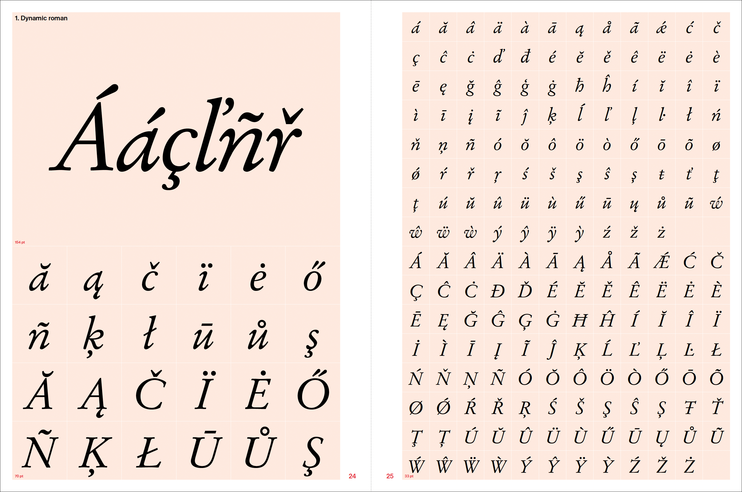
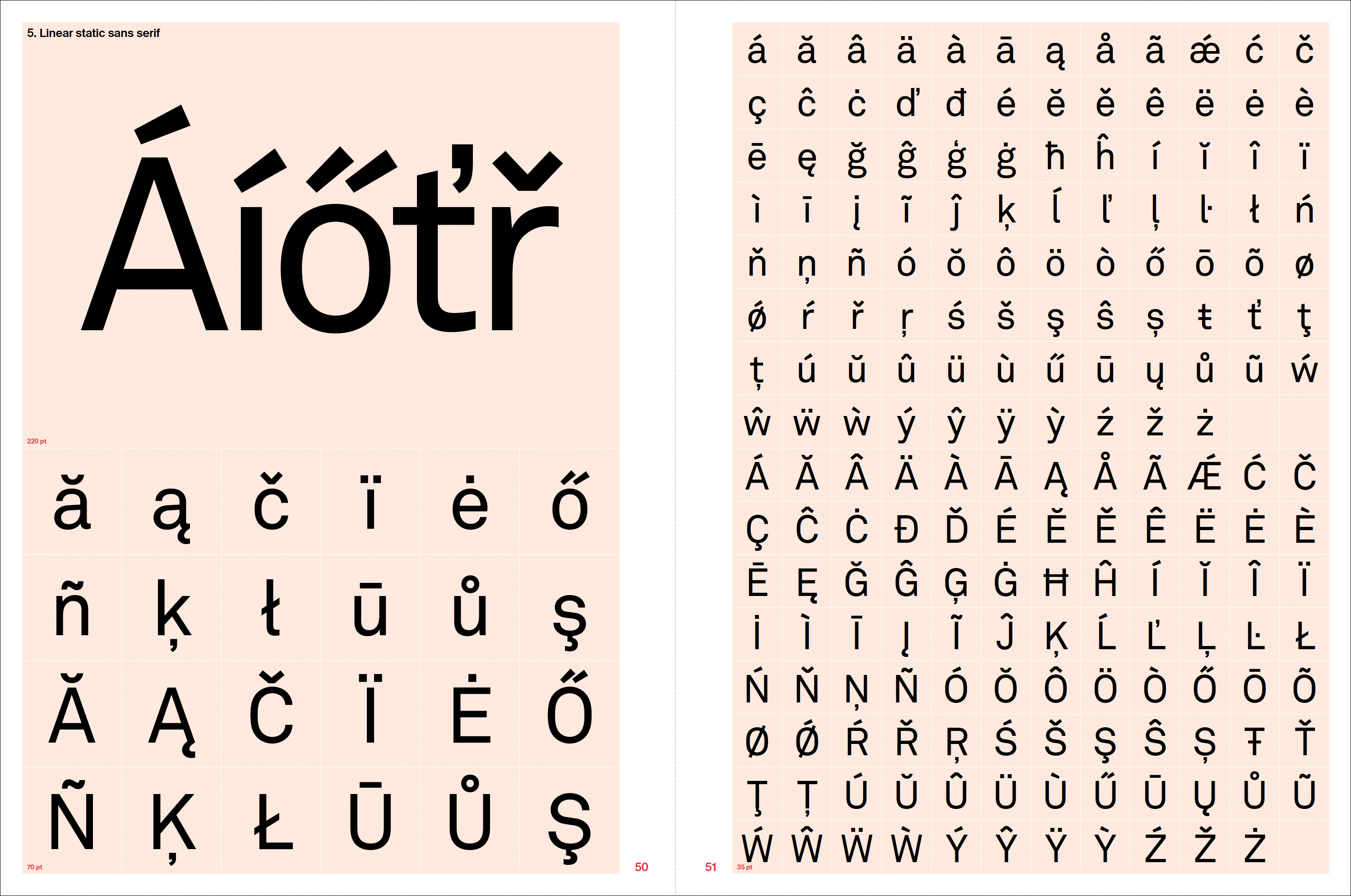
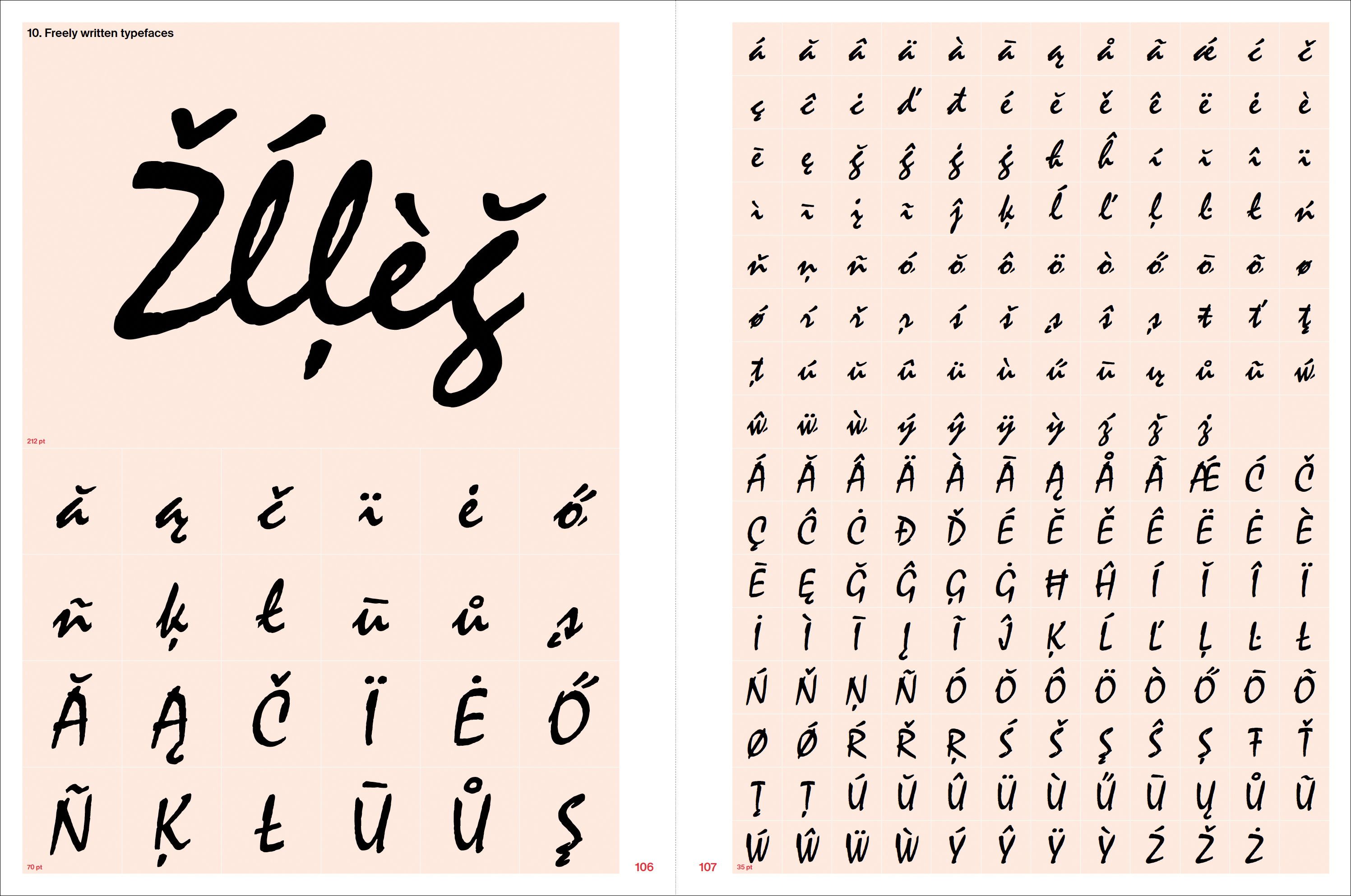
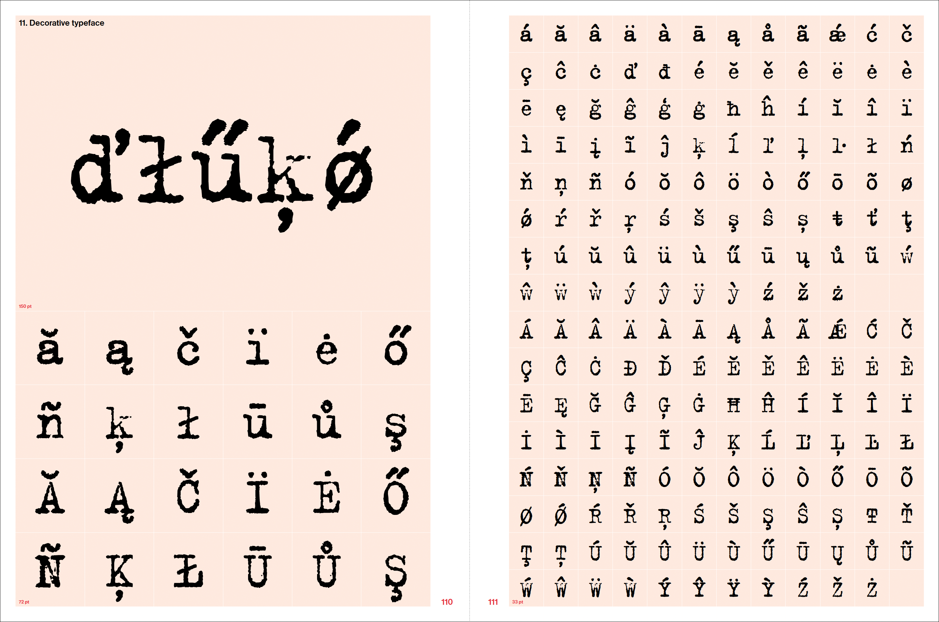
Although the 15 typefaces used as examples include classics created for letterpress printing like Stempel Garamond, Gill Sans and Peignot, the book also uses more contemporary designs, including Akkurat, Interstate and FF Trixie. Sidun’s selection includes at least one typeface from 11 categories defined in Jan Solpera’s type classification system, developed for Czechoslovakia in 1977. Although Solpera’s system is probably less well-known outside of the Czech Republic and Slovakia, it offers categories that will be familiar to almost anyone who designs with the Latin script (transitional roman, linear static sans serif, freely-written typefaces, etc.).
As Sidun mentions several times in his text, a single design solution for a particular diacritic will not necessarily be equally appropriate for every language using it. Nevertheless, each of the “diacritic sets” he presents is a single-design solution intended as the best possible form for all languages using the mark.
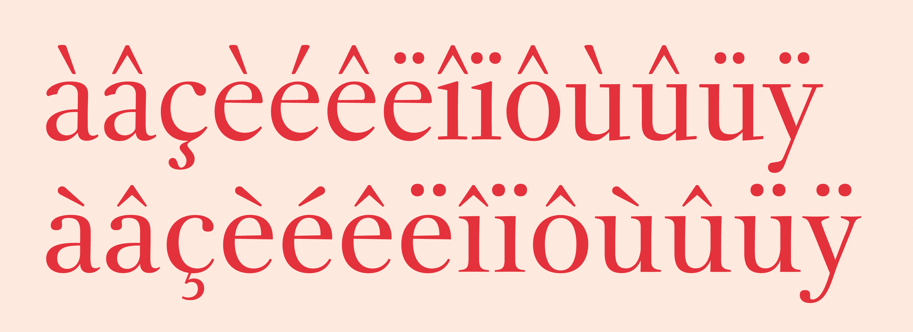
As an example of how the same diacritics may be interpreted differently, Sidun shows two typefaces designed by François Rappo. The diacritics in the top row are from Rappo’s Fournier revival. Their forms follow the manner traditionally used in French printing. On the bottom, this diagram reproduces diacritics from Rappo’s more contemporary Orso design, whose forms have a more “international” approach less rooted in the traditions of any particular country or language.
When Sidun first defined his master’s thesis, the problem of poorly-designed diacritics for central and eastern European languages was much more acute than it is today. Indeed, even in the late ’00s, it was still difficult for designers working in that part of Europe to access a comparable number of fonts that could set their languages than it was to find fonts supporting e.g., English, French and German. Even though the OpenType fonts – which allowed for character sets of far larger sizes than the 256 glyphs that a PostScrip Type 1 font could include – was introduced in the 1990s, it was not until the second half of the ’00s that many preexisting fonts were upgraded to the new format. And even before that, Robert Bringhurst had written in his The Elements of Typographic Style that “the allotment of 256 or even 224 characters is adequate for basic communication in the so-called major (i.e., familiar) languages of Western Europe, but this limit ignores the needs of mathematicians, linguists and other specialists, and of millions of normal human beings who use the Latin alphabet for Czech, Hausa, Hungarian, Latvian, Navajo, Polish, Romanian, Turkish, Vietnamese, Welsh, Yoruba, and so on. The extended ASCII character set is the alphabet not of the real world nor of the UN General Assembly but of NATO: a technological memento of the them-and-us mentality that thrived in the Cold War.”
Poorly-designed diacritics, or the complete lack of didactics for Central and Eastern European languages, pre-dates digital typesetting. Even in the distant days of metal type, most European (not to mention United States foundries) did not see readers of those languages as their primary customer base. Much of that is rooted in the political and economic history of the 19th and 20th centuries. This situation makes Sidun’s inclusion of four typefaces that debuted as metal type all the more relevant. Sidun not only shows fellow type designers what is and what might, but what always should have been in place.
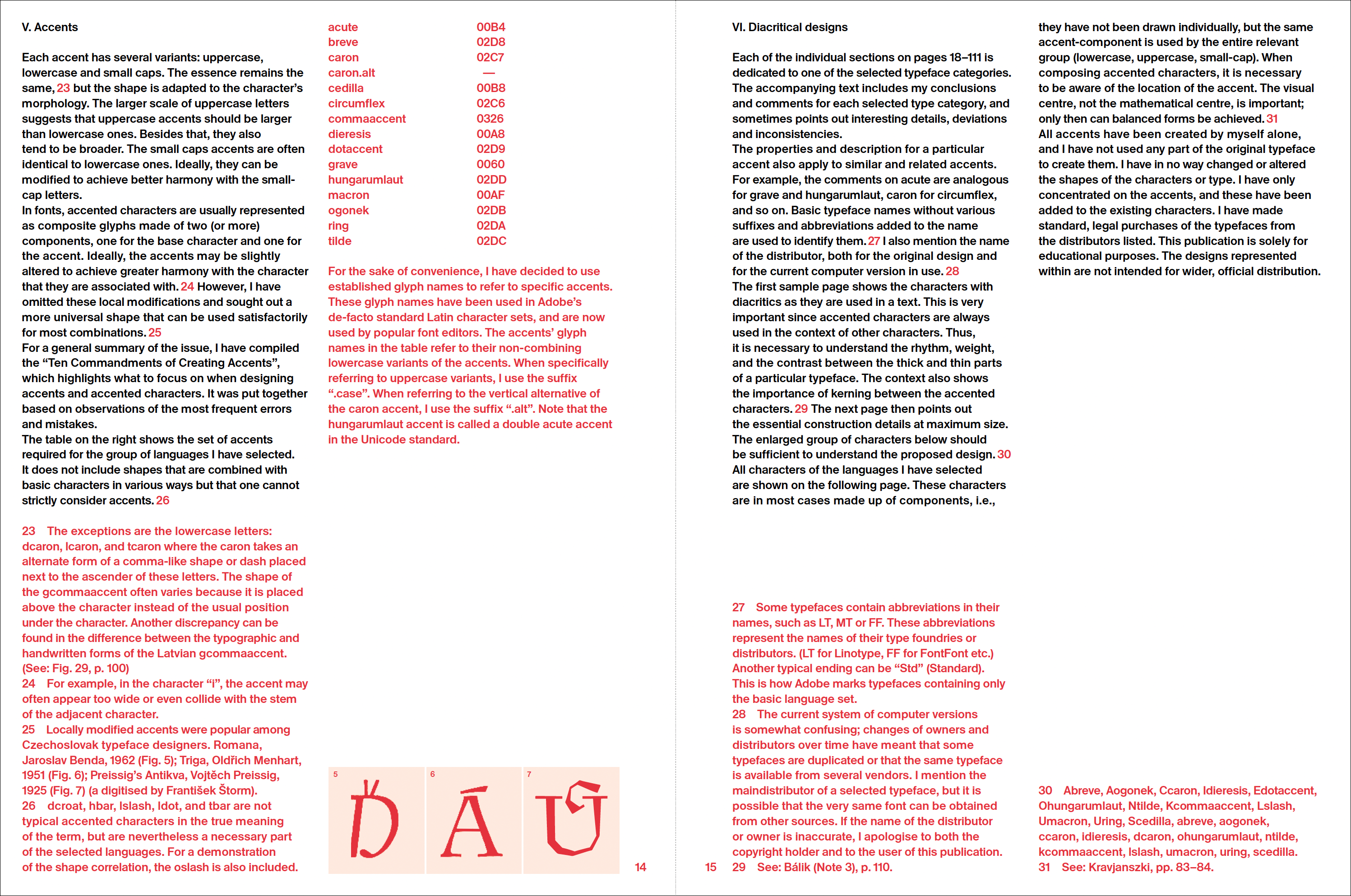
Preview of pages 14 and 15 from the forthcoming book. This illustration shows how the text-heavy pages have been designed.
I’m not surprised that this book was created in Prague. As Sidun writes on the Manual of Typography website, “diacritics are an integral part of the written Czech language, which is why we have so much experience making accents. Our Prague type studio is in the center of Europe, and accents are an integral part of every typeface we create.”
Czech designers have likely been as concerned for their language’s diacritics’ forms for as long as there have been Czech designers. But in the 21st century alone, there have been several resources that Czech typographers and type designers have helped create, including Filip Blažek’s 2005 (?) website diacritics.typo.cz, David Březina’s 2009 article On Diacritics and The Insects Project. That latter effort was a 2016 book prepared by Palo Bálik (Slovakia), Robert Kravjanszki (Hungary), Agnieszka Małecka (Poland), Zofia Oslislo (Poland) and the already-mentioned Filip Blažek. Distributed at the 2016 ATypI conference in Warsaw, The Insects Project book is now available for free download as a PDF. Sidun mentions all these resources – and many more – in Manual of Diacritics, but his book is much less explanation-driven than things that came before it. He wanted to make a visual book for visually-oriented designers.
Summary
Manual of Diacritics: Case studies of newly designed accents for contemporary typefaces, by Radek Sidun
English language book, approximately 28.5 cm (11.2 inches) tall
Text pages composed in Antique, specially modified for this publication with permission from Optimo
Available for pre-order at manualofdiacritics.eu