Last December, a comprehensive book on the works of Japanese designer Kazuo Hashimoto was published. Hashimoto is one of the most important figures in Japanese type design yet he has kept a low-profile – partly due to his selfless, craftsmanlike attitude towards type-making but also because of the gigantic scale of Japanese font production; it has always been a product of a teamwork even at the first stage of drawing glyphs. This meant that the fonts can often not be credited to an individual designer.
The author Akari Yuki is an experienced design journalist and has written a variety of books related to the subject. Through her dialogues with various designers in her career, she saw the significant value in writing about Hashimoto’s work – not only because he is an influential and prolific type designer but also because his work and life represents literally the complete history of Japanese type design after the World War II.
Akari Yuki, author of the book 『時代をひらく書体をつくる。
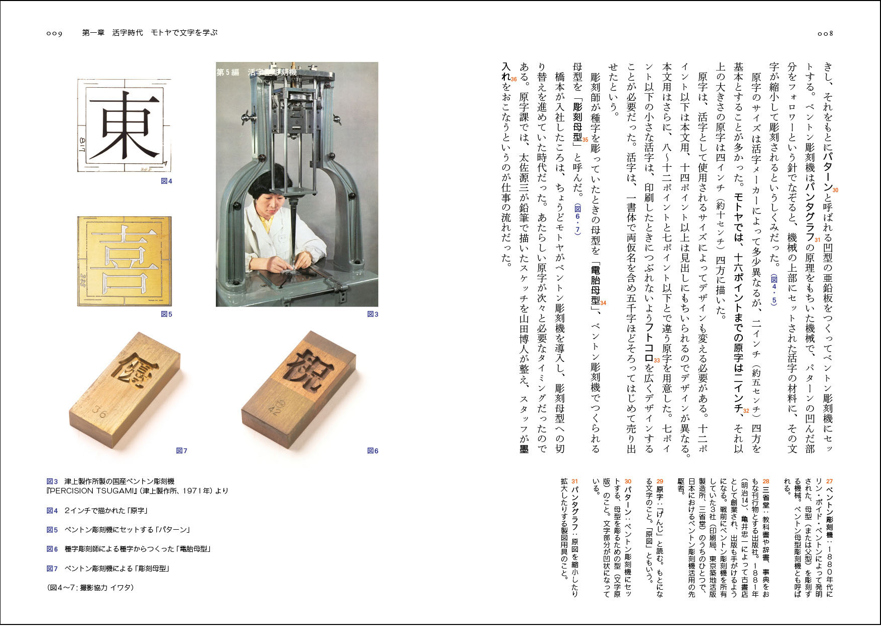
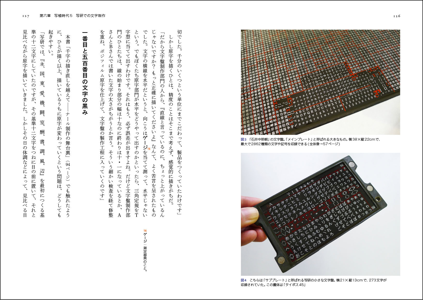
Hashimoto started his career accidentally; in 1954 as a young man, he applied for a job at the Motoya type foundry as an administration officer. He was however asked to work at the character drawing department, because his handwriting on the application letter was too good to be wasted in office work. Without any previous knowledge on type, he started to draw characters for a Benton Pantograph. The enormous glyph set has always been considered the main challenge of Chinese and Japanese type design. At that time each character was drawn by hand – and the trickiest part was to draw thousands of characters distinctively yet consistently.
After experiencing these difficulties, he decided to learn calligraphy in order to improve his drawing skill; First, he learned the Kaisho style from the Tang dynasty in China and then the Kana style from the Heian period in Japan – the two foundational styles of Japanese writings. As for some designers of other world script, calligraphy became an important source of inspiration throughout his career and he passionately practices up to today.
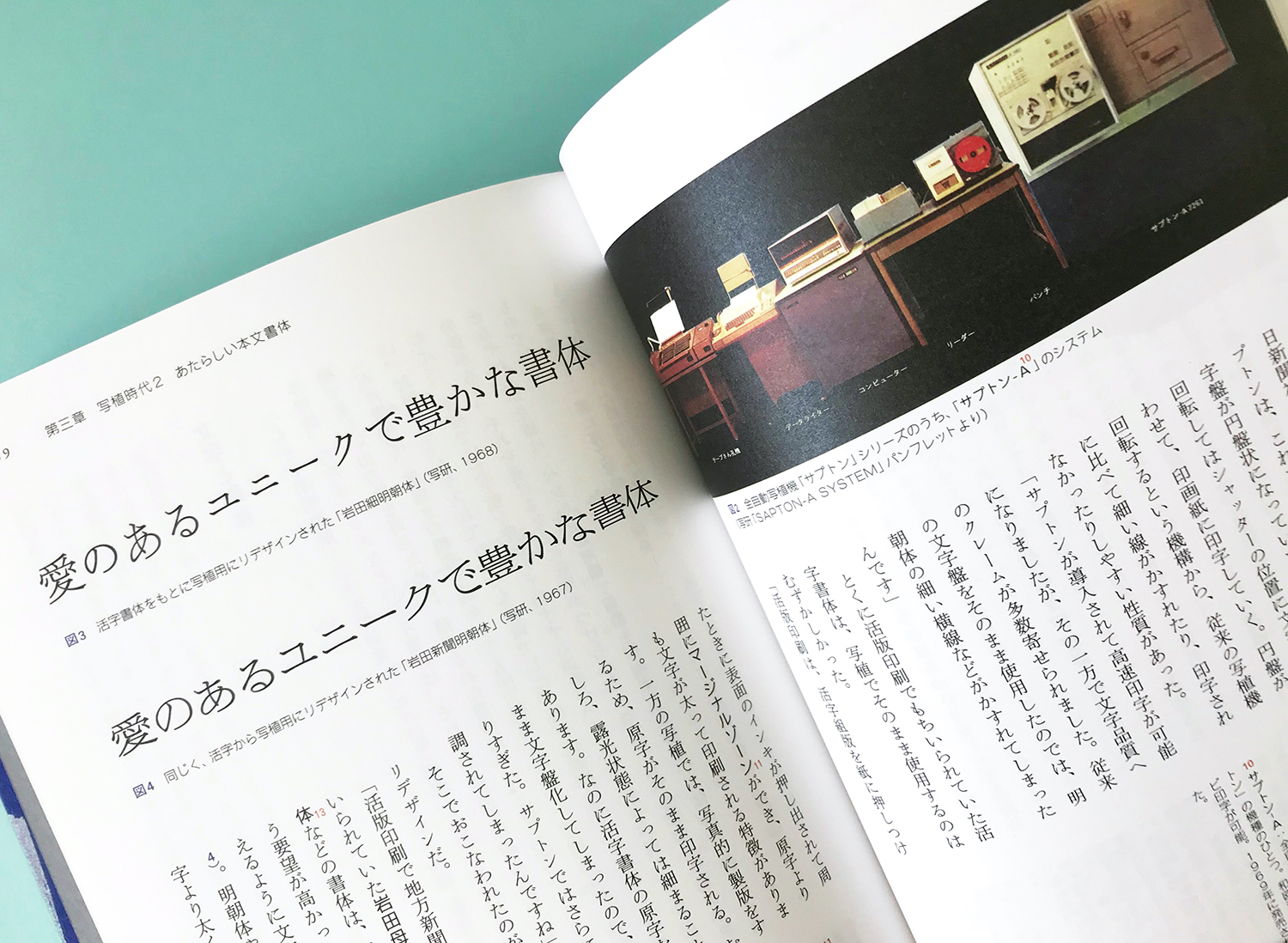
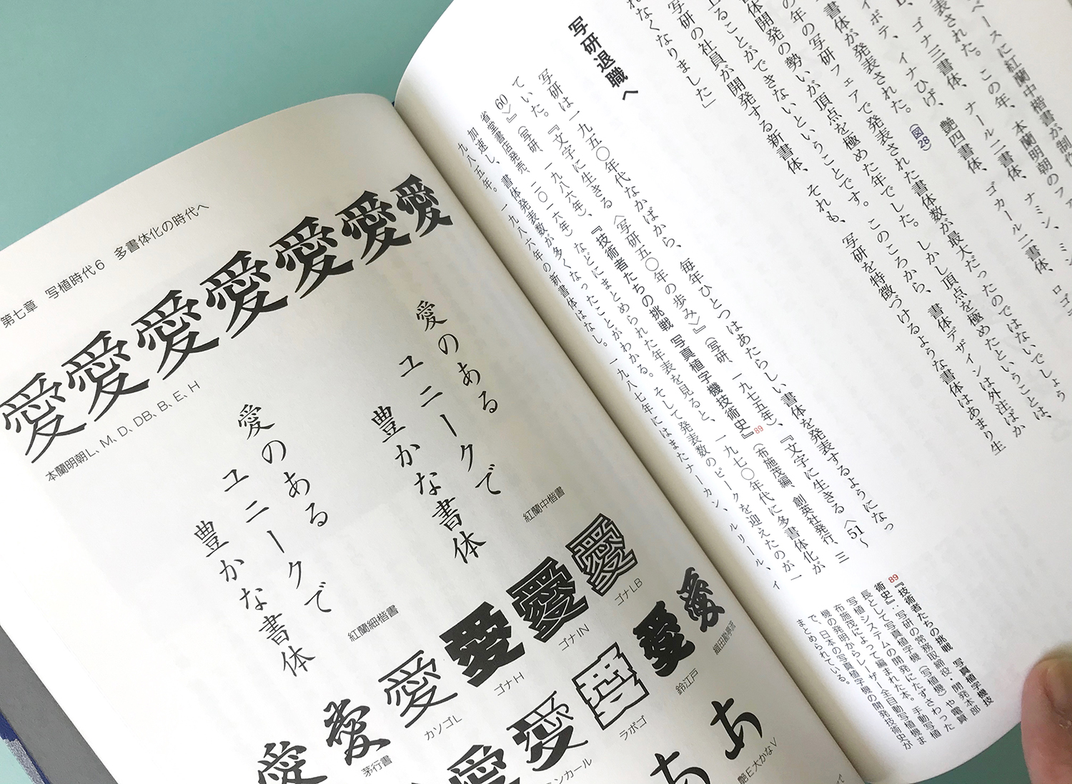
Motivated by his passion for photography, Hashimoto moved from metal type to phototypesetting in 1959 and started to work at Shaken, the legendary Japanese phototype company. Under his leadership as a type director, the firm brought out not only the most beloved typefaces such as the Honran family, NAR and Typos, but also the designers who were later going to lead the type design scene in the digital age: Osamu Torinoumi, Shigenobu Fujita and Akira Kobayashi, to name a few. Hashimoto even taught calligraphy to the employees at Shaken: the employees have effectively learned type design from him by day and calligraphy by night.
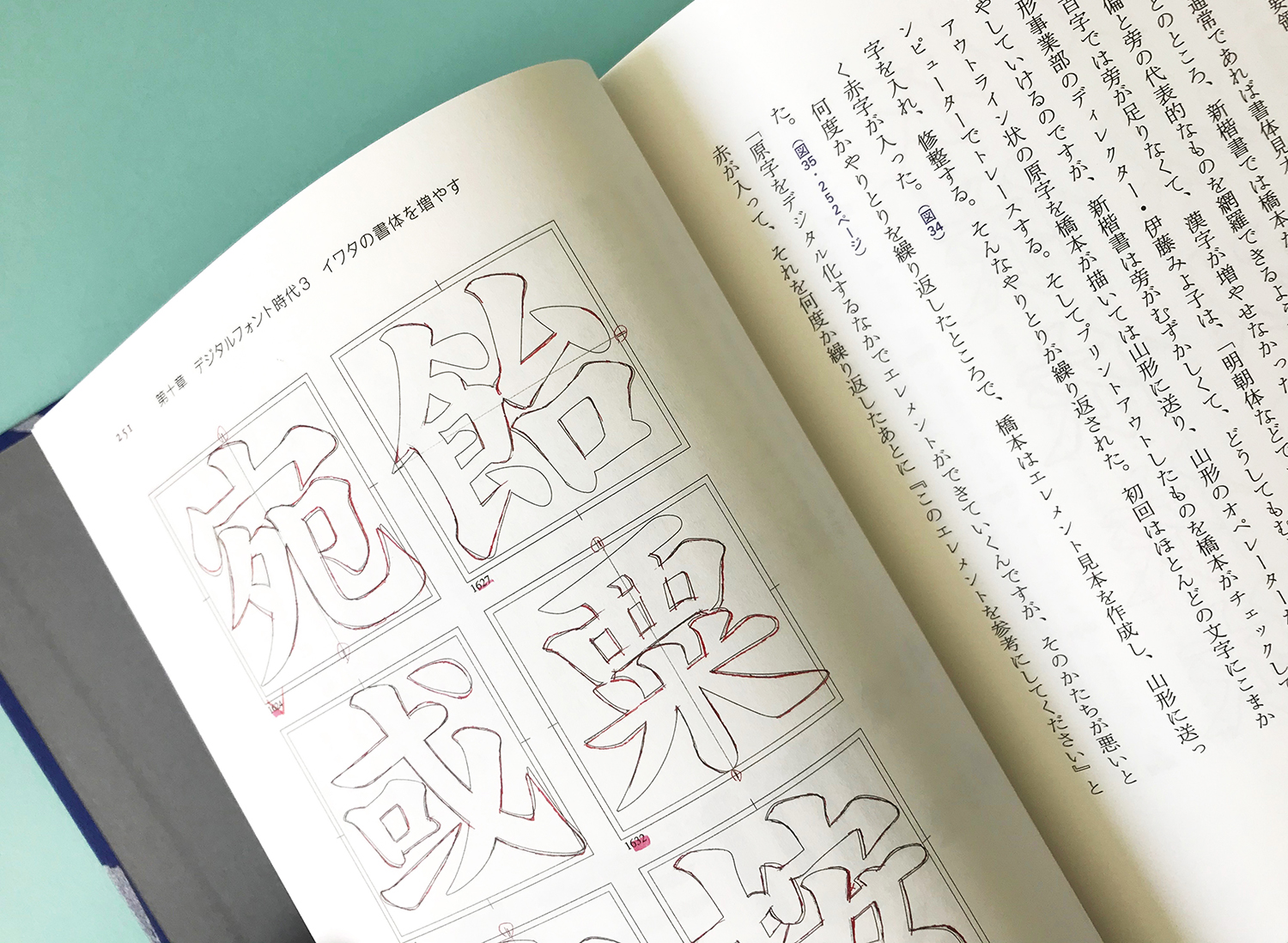
In 1995, Hashimoto became a freelancer and drawn display typefaces in which his calligraphic skill is to be seen; since 1999 he has been working at Iwata Corporation as a type advisor and worked on revivals of company’s metal type, produced diverse fonts optimised for screen, and design a typeface for school text books.
One of Hashimoto’s strengths is the curiosity to understand the production. He knows a good drawing is not enough to make a good typeface – the craft to perfectly adapt the design into the production technology is the key to make a solid typeface.
Thanks to this pragmatic and flexible attitude, he saw the two dramatic technological changes in type design not as a burden but as an inspiration. His contribution to the industry continues after 65 years. That long? Yes, he turns 86 this year and this cheerful and energetic man’s mind is still filled with ideas for new typefaces!
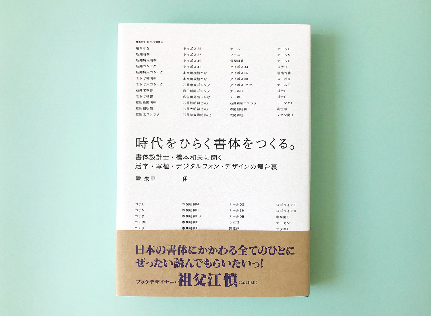
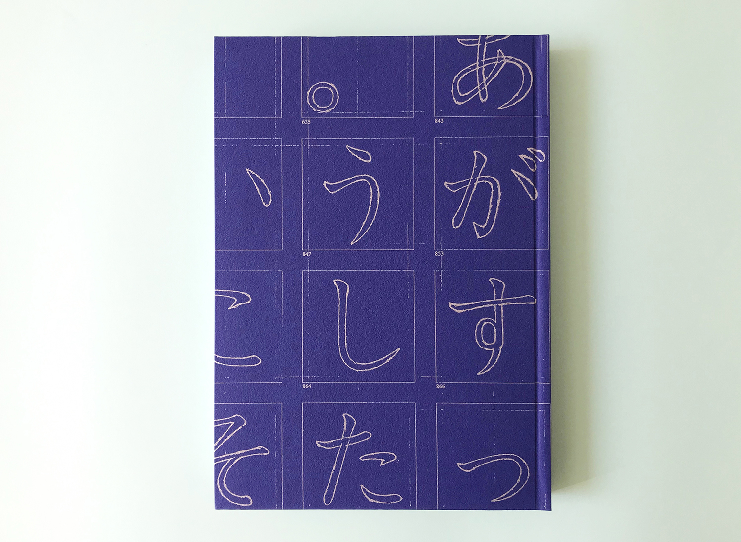
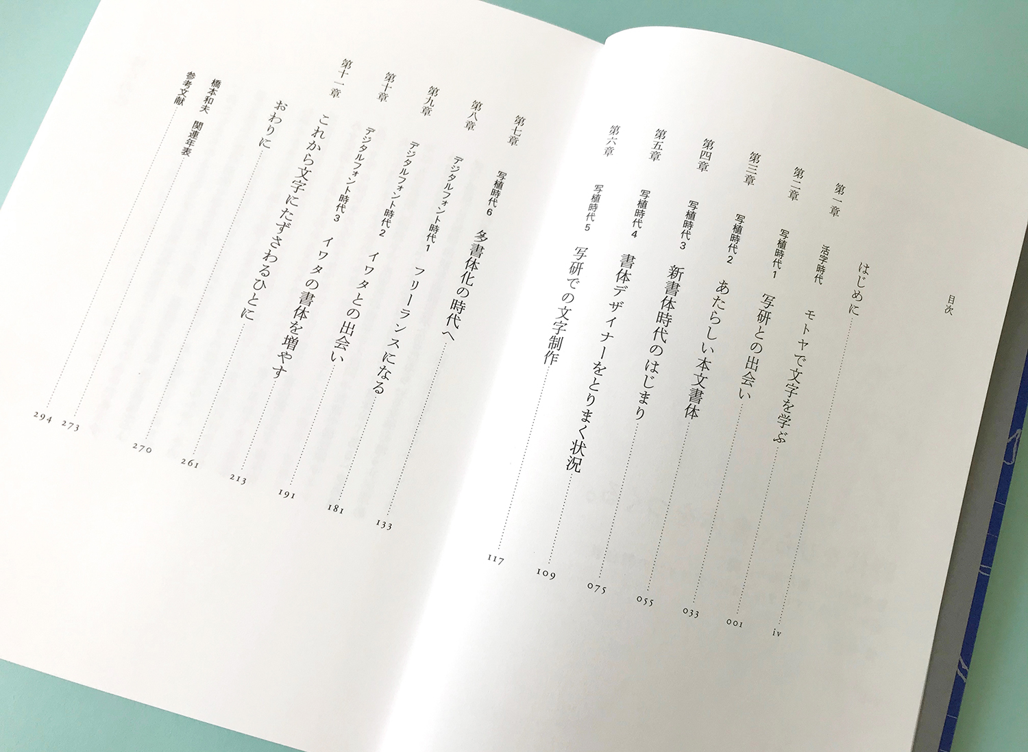
Based on the interviews with Hashimoto the author researched the technological backgrounds as well as the documentation of each era meticulously and enriched the book with illustrations and annotations for all the technical terms, important events and figures. As a result, the book became not only a well-written biography of a type designer with a life-long devotion to type making, but also it serves as an extremely good material to understand the know-how of Japanese type making and history after the War.
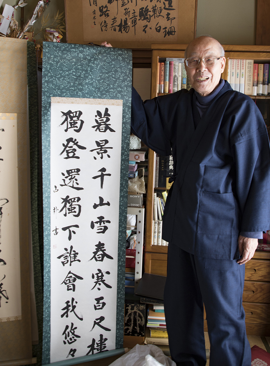
Portrait of Kazuo Hashimoto with his calligraphy in kaisho style
The book is in Japanese, but I really hope such an insightful book on Asian scripts becomes available in English in the future for the world’s readers.