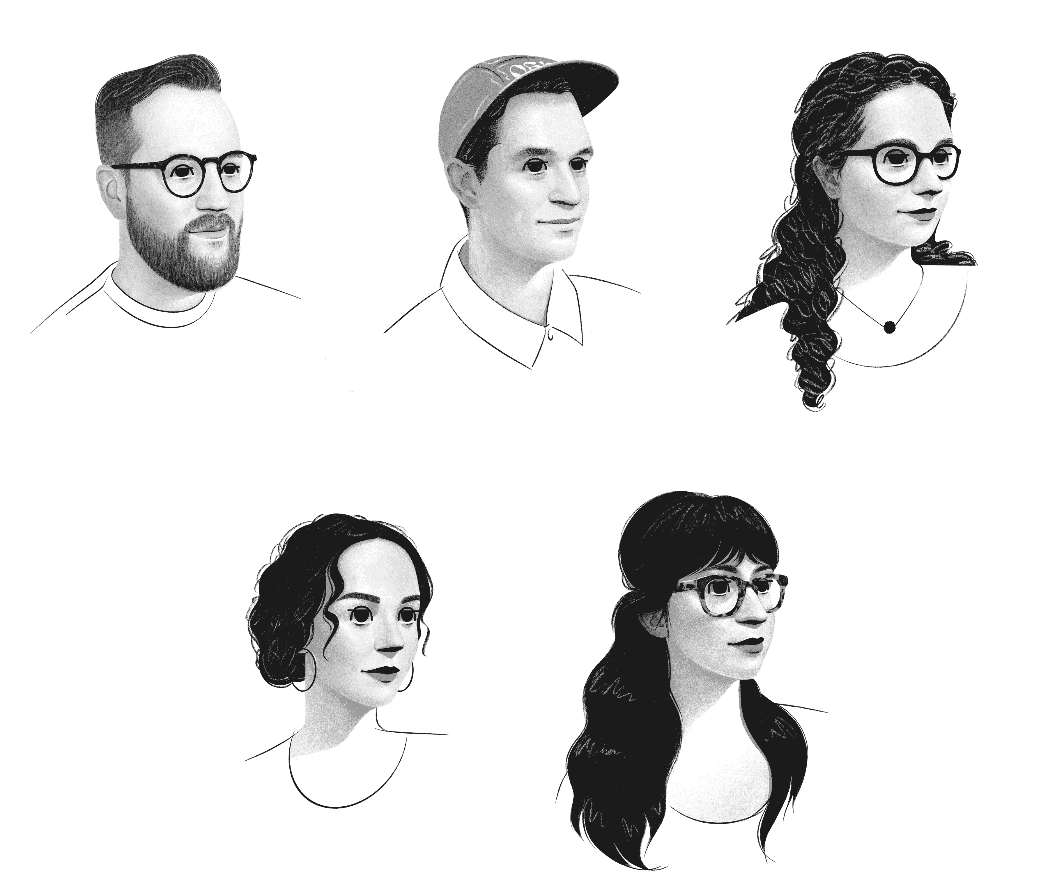
The OH no Type Co. crew, sorted alphabetically by first name. In the top row, there’s Colin, James, and Jaime. Lynne and Sadie are in the bottom row.
Just before his foundry published Forevs, James Edmondson and I had a long discussion over Zoom. I asked him a bunch of questions about his work and some of Ohno’s many typefaces.
Dan Reynolds: When you were younger, did you have eclectic habits when looking at letters?
James Edmondson: Not really. Back in 2008 or ’09, script lettering was big. All I cared about was script. The first typeface I released was very much in that era. After doing some of that, I got tired and wanted to move on to the next thing. In a lettering context, things can evolve really quickly. In type design, it takes ten times longer. The logos I liked as a kid felt warm, lively, fun, upbeat, and optimistic. I had a natural inclination toward display type. I can get into smaller type now. But as a child, I didn’t start reading a novel and fall in love with the text face.
Herzberg am Harz saltvandsområde Maria Barthélemon Passeig Dulce Robinson Luigi Castellacci Villar de Olmos Sabrina-Heinrich-Markt 88 skeiðarársandur Louise Reichardt Le Mée-sur-Seine 469 Big Round B-82 gartenschläuche
proverbialmente Lauda-Königshofen dvanáctihodinovou Josef Triebensee Baixada Santista nepremišljenost Johann Vierdanck 72 Rue Benoit Didier Legienallee 31 připomínajících removablenesses Pieter Hellendaal
Flörsheim am Main 42 Place de Provence nepremišljenost exhibitionistin Gioacchino Cocchi 17 Mountain Lane 6 drogensüchtiger Casas de Cuadra technologickému Karol Kurpiński Ackerstraße 74 identifizierbar
veröffentlichung fortunatenesses Maksym Berezovsky Schwäbisch Hall hypervitaminose Pieter Hellendaal Aulnay-sous-Bois Avenida de Catalunya gartenschläuche subversivamente Johann Anton André Nowra–Bomaderry
Calleja de Londres 65 skeiðarársandur unterbekleidung Rodolphe Kreutzer Dmitro Bortniansky Fürstenberg/Havel Tauentzienallee 39 připomínajících
nepremišljenost Reginald De Koven 53 Ivory Gate 93 partidistamente Wasserburg am Inn technologickému Giuseppe Tartini 58 Chaussée Delesseux
Fischerzeile 92 připomínajících synsédimentaire Dennis Eberhard glimmerschiefer Noah Creshevsky Fontenay-sous-Bois 84 Boulevard Landry
DR: I had an appreciation for text-type varieties beaten into me in school. I wouldn’t have cared about the differences between Garamond and Baskerville otherwise, much less Akzidenz-Grotesk and Helvetica. You know, you can learn to differentiate between wine tastes. Some people can tell that the grapes pressed for the wine grew on that slope in a particular year.
JE: That slope!
DR: European type has a less eclectic reputation than US design. I don’t know how true that is, but many designers from older generations here spent their careers honing one style of letter, like Adrian Frutiger, Erik Spiekermann, or Gerard Unger. On the other hand, a broad range of designers inspired Gerard, including W. A. Dwiggins and Roger Excoffon.
JE: I’ve thought about that a lot! You’ve gotta wonder what it would be like if Roger Excoffon had been born in 1990. He would have had so many more contributions if he hadn’t, you know, spent time hand-inking Calypso or whatever.
Niccolò Paganini Alhaurin el Grande 504 Birch Farms No. 37 rannsóknarréttur
Saint-Genis-Laval technologickému Ernesto Halffter 49 Passage Molière
Antonio Rosetti Los Caños de Meca 262 Susan Mitchell Pkwy připomínajících
Russell Alexander 319 Brown Farms No. 75 hyperexcretions College Station
DR: What would any of the pre-digital type designers have done if they had digital font editors?
JE: Sure, yeah. It’s so nice. It’s so fun to go fast. I refer to it as getting in the barrel, getting barreled, or getting in the Green Room, which are all surfing terms. I bet you can enter a flow-state drawing by hand, too. Once you’ve gone fast and you see how fast you can go, it becomes an addictive sort of thing in some ways. Your point about Gerard Unger and stuff, I’m never gonna …
DR: Don’t say never!
JE: I’m never going to participate at the Unger level. I do a very different thing, and that’s okay. Perfecting something over years and years is, I think, very far apart from what I do. I don’t go as deep as that, but I appreciate type design in that way because there is room for every kind of designer. You don’t have to do it his way, or the Bram de Does way, or the Jan van Krimpen way, or all these people we learn about in school as the true heavyweights. I love this idea that we should not pay attention to 99% of what’s out there and try to figure out what is actually good. I think what’s maybe more important is to figure out what we respond to, the top fraction of a percent of the stuff that moves us – for whatever reason. Quality is definitely a part of that, but it is not all.
DR: Your work is unique because it shows your drawing skills and personality. All typefaces are drawn, of course, but some people come to this without knowing how to get ideas from their heads onto the screen. Maybe they struggle with strokes and contrast models. You can practice for years and still not achieve what you want. Do you draw things manually and digitize them?
JE: I don’t draw by hand as much anymore because I feel like I can sketch in vectors and rough things in quickly. A lot of times, that’s easier and faster for me. But being around students, I know a barrier exists, and it’s overwhelming at the beginning. What frustrates me most about teaching is when we suggest changes to students, they try to make minor adjustments and fuss around, painstakingly moving one or two units at a time. I think, “Hey, you need a wrecking ball right now, not sandpaper and a chisel. Let’s do this! Let’s go fast, learn the keyboard shortcuts so you can actually think in real-time and make these corrections in real-time.” But that’s a horrible thing, you know, it’s totally not fair to them at all. They’re there to learn how to do that.
Reinhard Keiser 91 Parc Lola Duval verschlimmerung Bowral–Mittagong deutschlandweit Frédéric Blasius Neukirchen-Vluyn 485 Edwards Glen A-26
avinguda Pilar Esteves 72 skeiðarársandur artenschützerin Margarethe Danzi Mary Ann Pownall Carrer Coleman 69 enantiomorphism Hofheim am Taunus
Ján Josef Rösler Le Kremlin-Bicêtre 448 Middle Field C/94 technologickému Carrer German A-46 připomínajících musikinstrument Ernesto Halffter
Russell Alexander 319 Brown Farms No. 75 hyperexcretions College Station 858 Round Gardens Veröffentlichung conjugationally Joachim Albertini
therapeutically Nicolas Isouard Zeulenroda-Triebes Calle de Tamarit Ernest Chausson Saint Petersburg Albrechtplatz 76 rannsóknarréttur
DR: What role does Fontstand play in your distribution?
JE: I always point students towards it, and I like that there is different stuff on it. Fontstand is valuable as a search engine and as a catalog. We’re on Adobe Fonts, FutureFonts, and Fontstand. But we have the most control over our website. That’s the authoritative piece of the puzzle. Early on, we decided to put the website first. I remember Indra lecturing me because we had all our process articles on Medium when we first started. Our website didn’t have a blog feature at all. She said, “Dude. What are you doing? You have to put that on your website. You need to own that. You need an RSS feed for it,” and stuff like that. I told her, “Okay, Indra, I’ve just got a lot of stuff on my plate right now.” Eventually, we did that, which was absolutely the right move.
DR: That reminds me, I wanted to ask why you started a business.
JE: Coming out of TypeMedia, I had heard about people like Frank Grießhammer getting a job at Adobe, but that seemed so far outside the realm of possibility. Since design school, I had wanted to a foundry – mostly to draw a logo and make t-shirts. I also thought that owning my work would prove important. It was a great time for me, looking back on it. To cover my needs, the foundry didn’t need to be very successful. I was supplementing my income with graphic design and some lettering work then. It was the most fun I could have. I got to set a thesis statement for what I wanted Ohno to be. When you don’t have the financial pressure, you can execute pretty much whatever thesis statement you can think of. It gets harder when you have kids or a mortgage. Those other things bring in different requirements to the running of a business.
It was about six years before we hired anybody. Then, I dipped a toe into it. Hiring is this kind of an intimidating financial obligation. What I didn’t realize, though, is that hiring people part-time covers a whole spectrum. Lynn Barber, who fields licensing inquiries over e-mail and does some project management for us, only works a few hours a week. We also have an HR helper who works about an hour or two per month. I try to be a bit of an evangelist for people feeling stressed out about trying to do everything. You can get help in all of these aspects of the job that you don’t really want to do and aren’t the best person to do. I should not be in the weeds researching 401(k) plans. It’s not my nature. But there are people for whom it is their nature, which still blows my mind. It shouldn’t because my nature is doing type design, and that’s a fairly obscure niche to some. It has largely been great. And hiring Colin Ford was one of the best things we’ve done. It’s an added level of stress for sure, but I want to be an excellent employer for him. That’s kind of more important than a lot of other things we do as a foundry. If we can give people health insurance, that’s probably a bigger deal than executing my own vision of what a good typeface looks like.
Calleja de Londres 65 skeiðarársandur unterbekleidung Rodolphe Kreutzer
630 Carter Bend idiomatiquement Castellar-Oliveral saltvandsområde
Ernest Chausson Saint Petersburg Albrechtplatz 76 rannsóknarréttur
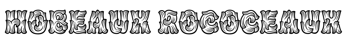
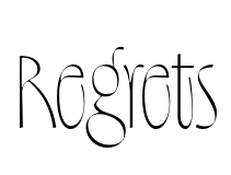
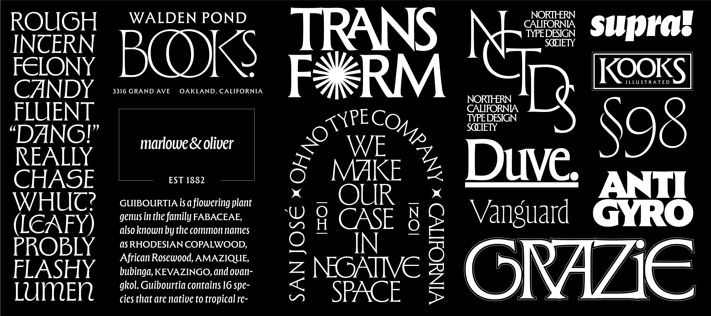
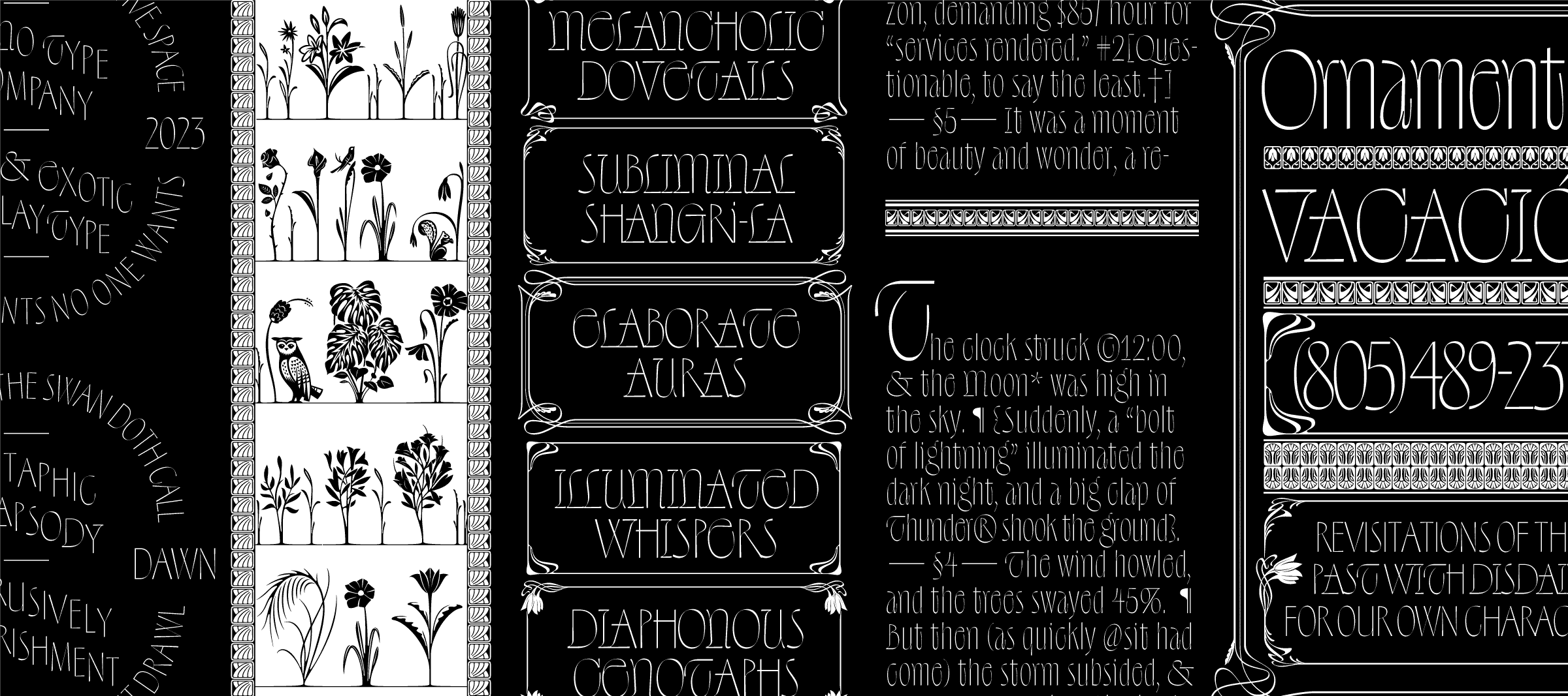
DR: You have typefaces in many styles. Compare Beastly and Regrets. It’s hard to imagine two that are more different. Regrets has a lot of art-nouveau-style ornaments in it, too. Most art-nouveau typefaces aren’t as good. Those from the actual art-nouveau era were often atrociously bad.
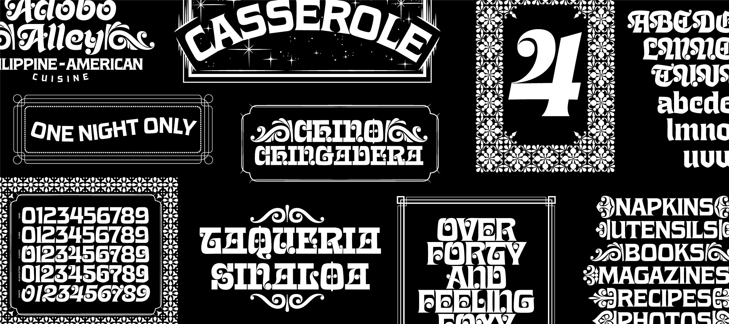
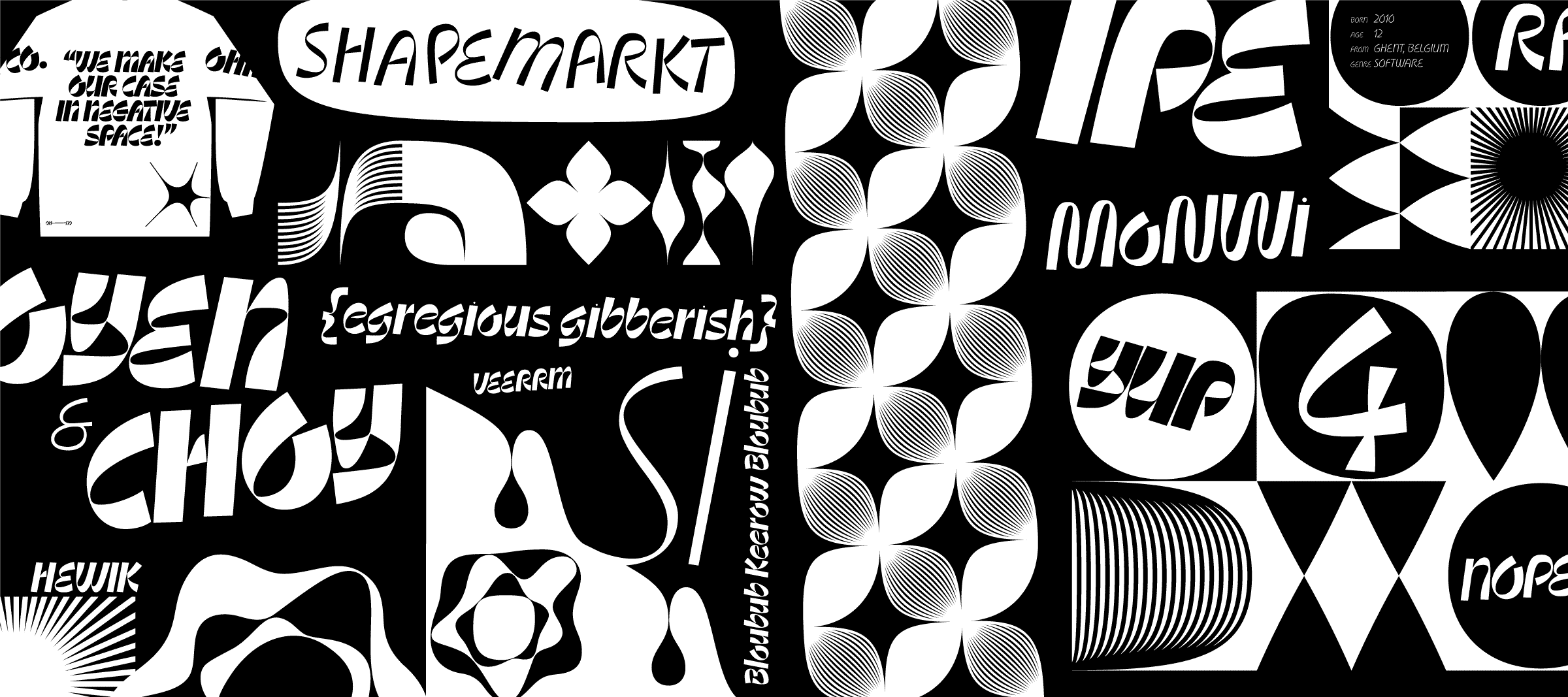
JE: With Beastly, Ohno Fatface, or Ohno Blazeface, I was drawing really bold stuff for a while. I wanted everything to make an impact. After doing several heavy things, I wanted to do light designs. Othmar Motter has a book called Meister der Extrabold. I don’t know what his opinion of that moniker would be. But I look at him and say, okay, what he was good at is far beyond just extra bold. I think making light stuff feel more impactful is a fun challenge. Making black and white things feel colorful is nice. I still like this idea you mentioned of Art Nouveau looking crude. That sounds kind of cool to me. I’m usually more impressed by illustrators than type designers. That’s why I like Cyrus Highsmith and Erik van Blokland. These are people who, after you see their drawings, you understand their type and vice versa. Those are the pinnacle for me.
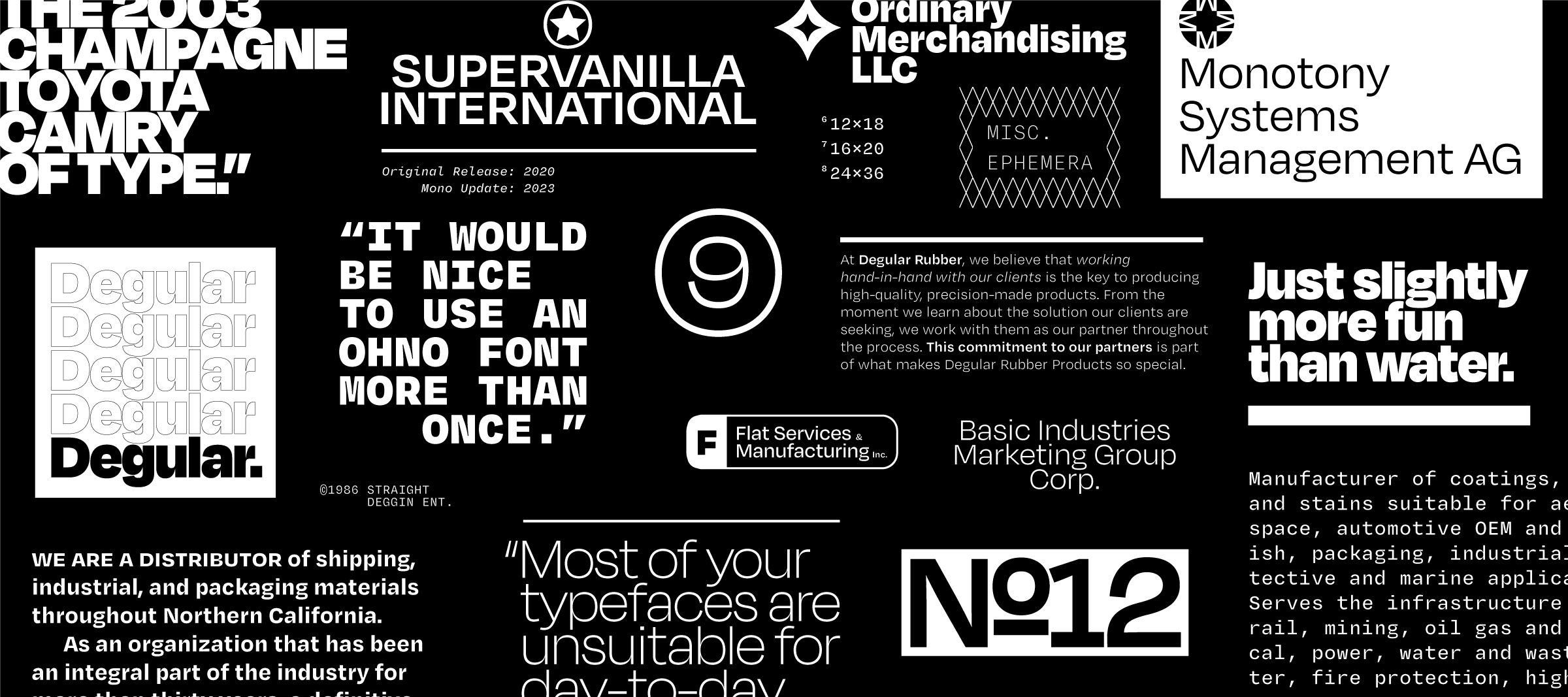
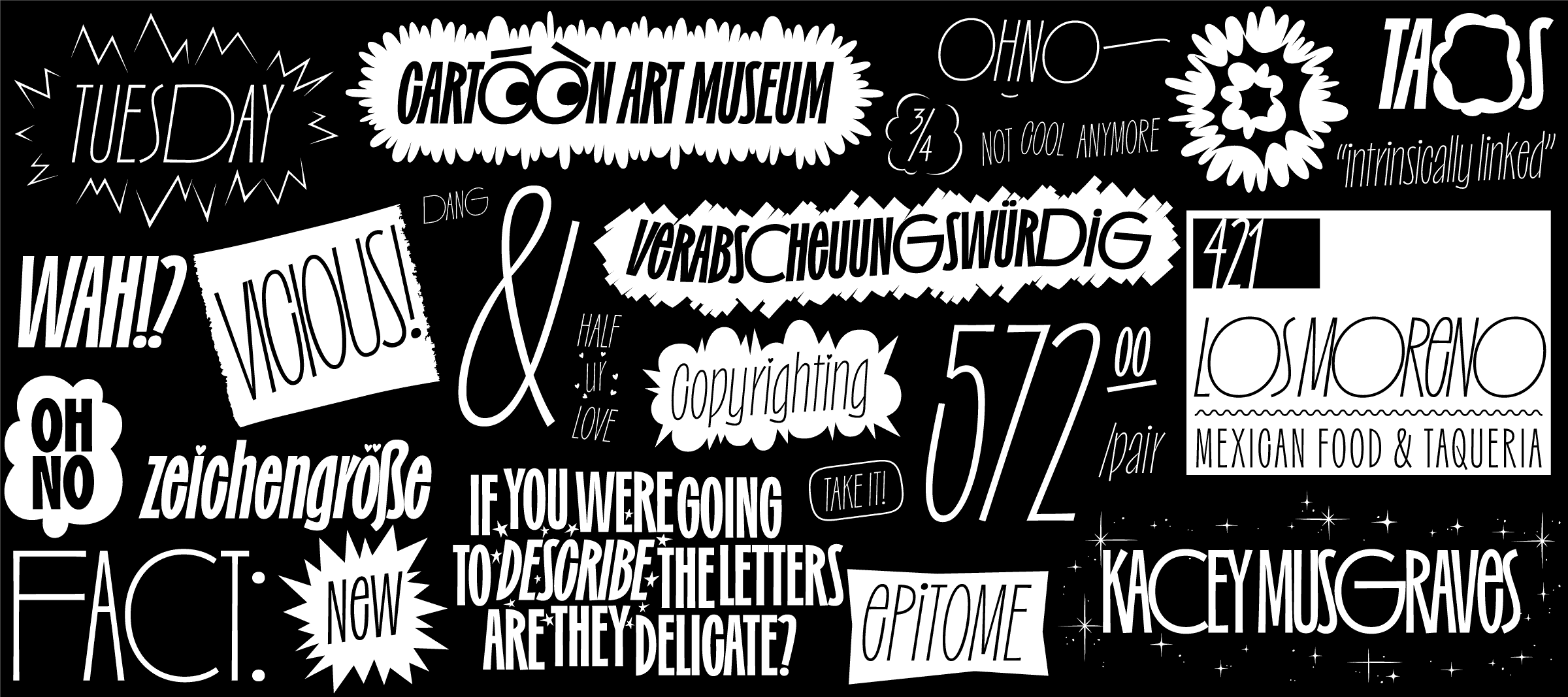
DR: Aside from Beastly and Regrets, you have a few other families with ornaments. These are pretty prominent in the displays on your website, even as live text. Was it a conscious decision to help certain typefaces sell better?
JE: It is pretty conscious. It’s a House Industries thing, from my perspective. I mean, they didn’t invent it, but what I always found compelling about their specimens was that a type felt like a whole graphic universe. In our best releases, I think we try to achieve that. It helps to go beyond figures, letters, punctuation, etc. They’re $10 per style, although they don’t get used often. I include them because they get me excited about showing the work off, and if I’m excited, then I’ll do more of it, and the typefaces do better, and so on.
A huge part is that I find myself using the fonts, making little bits of fake graphic design, and stuff like that. If I want a border and I make it in an illustrator file, that feels like a cop-out. These can become a holistic idea driving the whole family. We talk about that when I’m teaching a bunch because we say, OK, now use your typefaces and find out what you want to use alongside it. That can do a great job of informing what your family looks like. People often view families as a range of weights and maybe other things, like italics and different widths. But the thing that’s actually going to be useful might be a smaller optical size to pair with a display face or a set of borders, or a set of dingbats, or whatever the thing is. It should be different every time. And it should relate to the concept of what you’re trying to do.
conjuntivamente Villar de Olmos připomínajících Tommaso Giordani Passatge de la IIndústria 71 nepremišljenost scolastiquement Frederick Jacobi
1236321236321236321236320#$9^68(_1236321236321236321236320#$9^68(_1236321236321236321236320#$9^68(_1236321236321236321236320#$9^68(_
saltvandsområde illiberalnesses Frederick Converse Gräfenhainichen 379 Cooper Byway photoconducteur Tolbaños de Abajo berücksichtigen
VvVvVvVvVvVvVvVvVvVvVvVvVvVvVvVvVvVvVvVvVvVvVvVvVvVvVvVvVvVvVvVvVvVvVvVvVvVvVvVvVvVvVvVvVvVvVvVvVvVvVvVvVvVvVvVvVvVvVvVvVvVvVvVv
They’re tools for creating more fun specimens. I like it. Everything should look like it came from the same pen or the same hand. It should all speak the same language. If you’re talking about Art Nouveau, the old metal-type foundries had so much great stuff available on separate pages in their specimens. If you flip to the back, you find all these different ornaments that can work with whichever typeface. They weren’t necessarily intended to be paired. Ornaments, borders, and stuff – I’m all for it. It’s one of these things where if I’m working in black and white – and we’re making a black and white product – it can feel very colorful to add those in.
DR: Ornaments adding color to a piece is an interesting way of looking at things. Was your previous website also in black and white, or did you have a color phase before you became a “purist?”
JE: Totally! But I was always kind of bad at it. If you scroll to the bottom of our Instagram, you’ll see that we used four bright colors. Now, I know a little more about color, and I wouldn’t have chosen those sorts of things. It was a little bit obnoxious, unlike our work now, which is totally not obnoxious at all! [laughs] I don’t know when I decided to draw a line in the sand and say we wouldn’t mess with that anymore. Recently, though, I’ve been messing around with chromatic wood-type experiments and stuff, which you really have to set in color. When I do it in different tones or grays, it just doesn’t work. I like the Madonna and Miles Davis thing of reinvention, or saying, OK, we did that, and now we have license to change. Where we are right now, I guess, is still pretty much all black and white. It feels almost like cheating to show a type specimen in color, but there’s no cheap. Everyone is playing by the same rules, so do whatever you want! Do what makes you happy or echoes the sentiments of the project you’re working on. It’s all good. Life is pretty short, and we might as well enjoy it.