Traditional Devanagari type designs are characterised by structures drawn with a right-canted broad nib: sharpened shiroh rekhas (headline), sharp kanas (vertical strokes), triangular knots and rotund curves with distinct contrast.
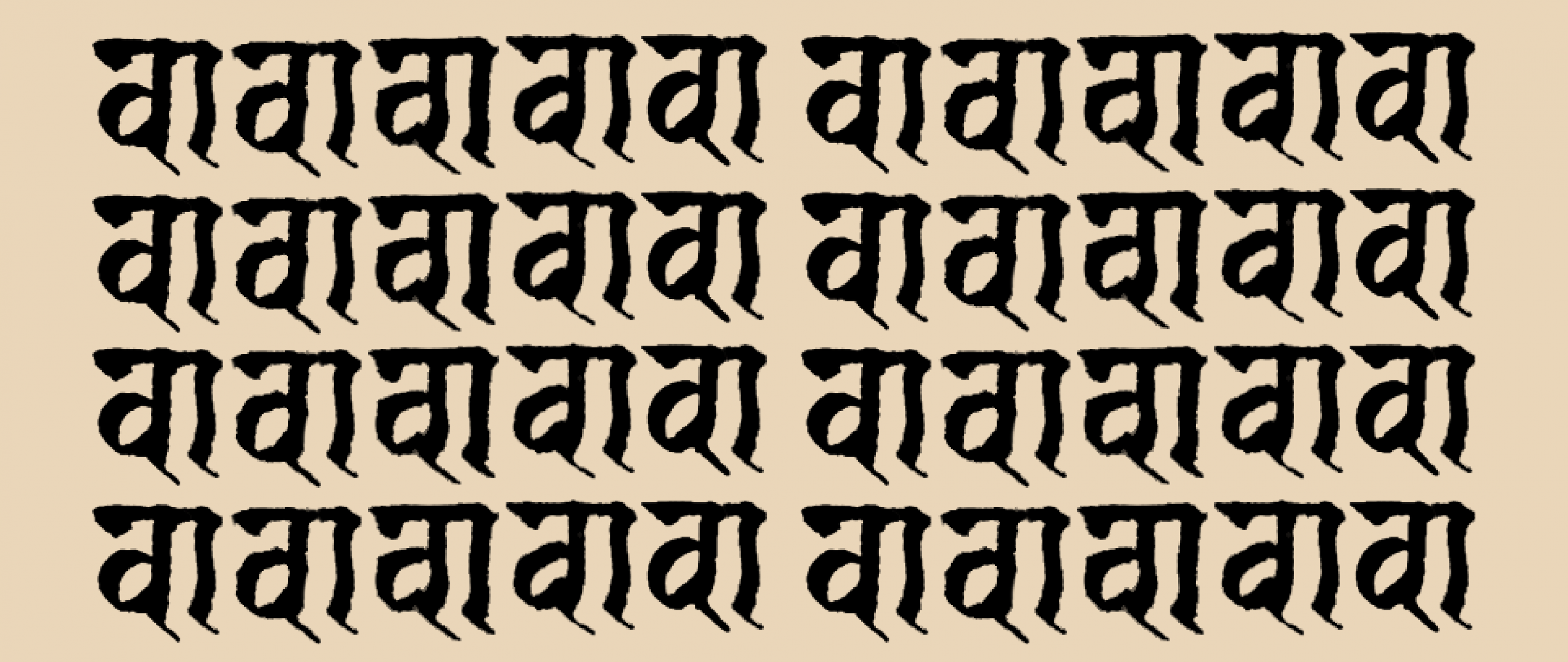
The Jaini typeface in text.
The image conjured by the above description will, for most readers, be similar. But the word “traditional” needlessly does a lot of heavy lifting. Specifically, it refers to the Balbodh style of Devanagari calligraphy, popularised by the Nirnaysagar Press and now proliferated across text typefaces on the market today. Monolinear typefaces too, when not a clear nod to street lettering or handwriting, have begun to refer to the same model, further elevating this style to the status of tradition. And it is in this context that the release of Ek Type’s Jaini seems timely.
Jaini references the calligraphy found in the Kalpasutra, an illustrated Jain text of the Svetambara sect. The manuscript, penned in Devanagari with ink and boru on paper, is a sanctuary of forms distinct from the garden-variety Balbodh seen today. Disconnected shiroh rekhas, kinked kanas, blotted knots, loops and wedges, and largely squarish structures allow each letter to coalesce, clotting them into a dense texture. It also helps that the matras are extremely short—barely a nib width—and vertical letters and matra conjuncts remain stacked within the kana height.
Reviving letters from a manuscript is tricky business. The identity and temperament of the hand vary across each page and line, making this as much of an exercise in curation as it is in omission. But designers Maithili Shingre and Girish Dalvi have combed through the manuscript, considering each variation as a possibility. So much so that their process reveals not just a route to the final design but a gamut of alternate futures.
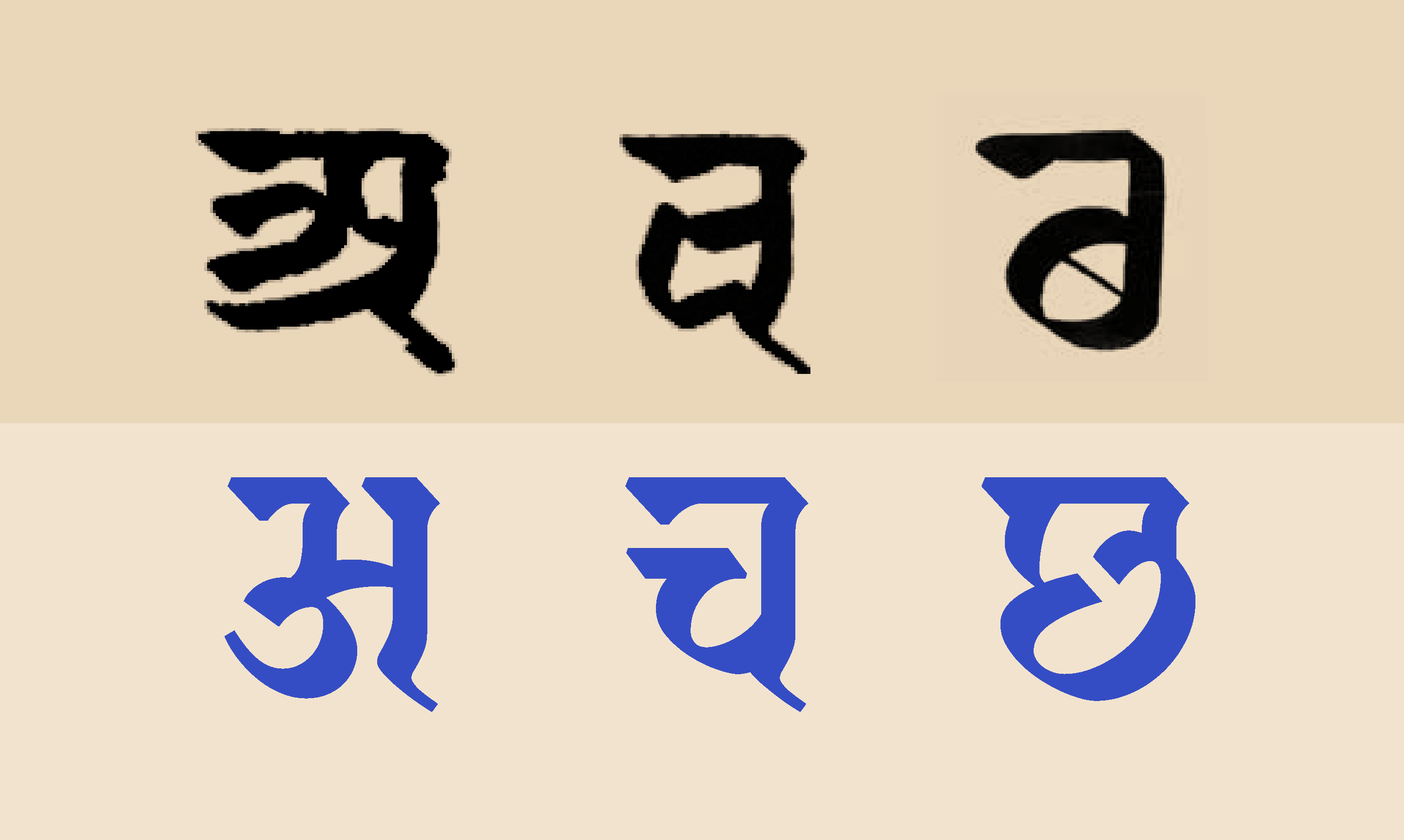
The result seems less a revival and more a translation, specifically a digital one. That is best illustrated in the wedge terminal along the shiroh where curves have been traded in for a sharper chamfered triangular structure. But there is a warmth to this as well: notice the vertical-horizontal joinery on the Va (व) and you’ll find that the squarish structures have been tempered with gentle curves; knots on the Na (न) and Ma (म) remain bulbous and droop to fill in the white space; the kanas retain the swerve, reminiscent of the calligraphic hand.
A feature exemplifying this amalgam between the digital and the calligraphic is the knot on the vowel I (इ). While the construction is uninterrupted in the Balbodh style, in Jain calligraphy, the pen is lifted once to draw the knot as a separate downstroke. Nevertheless, the spread of ink on paper often disguises it as a continuous stroke. However Jaini fully commits to the intention of the manuscript gesture, and the resulting form is equal parts referential and style. Perhaps one might prefer a less sharp—more grunge—aesthetic, one that evokes the patina of an aged manuscript. But, as Walter Benjamin puts it, “a real translation is transparent; it does not cover the original, does not block its light, but allows the pure language, as though reinforced by its own medium, to shine upon the original all the more fully.”


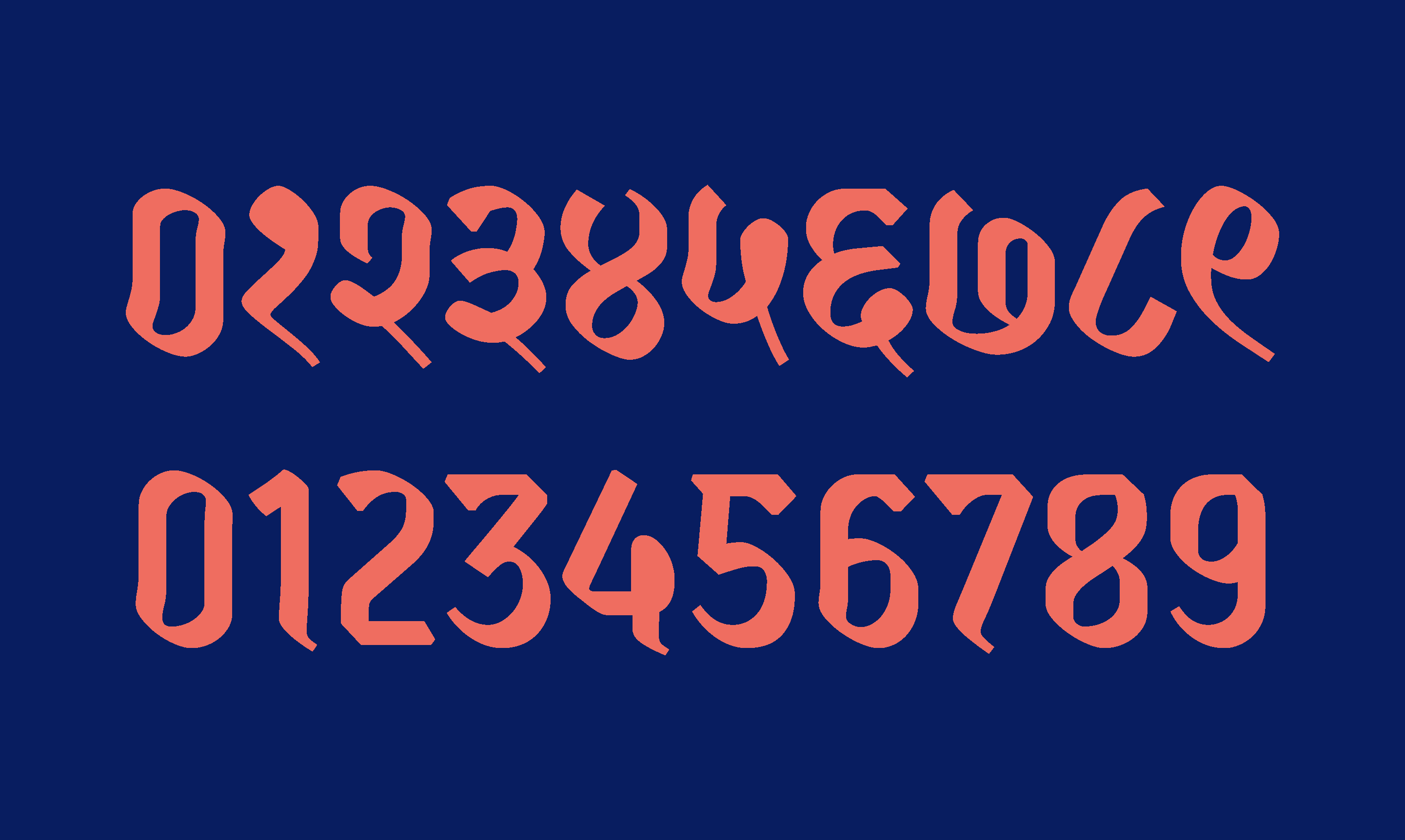
Jaini is not just an inert revival but is a design for the present. Archaic forms such as the A (अ), Cha (च) and Chha (छ), among others, are swapped out for the more urbane forms of today. The Lla (ळ), absent from the source but common to Marathi texts, is reimagined in the same hand, as are the Latin numbers now popular among Devanagari typesetters. Rather than dilute the revival, Jaini comes in two variants: Jaini and Jaini Purva. While the former has simpler and more recognisable horizontal conjuncts, the latter retains the stacked vertical conjuncts found in manuscripts.
Jaini is not the first typeface to reference Jain manuscripts. Modular Infotech’s Shree Devanagari 3605 and 4548 both take off from a similar source but only dabble in motifs while retaining familiar readable structures. However, Jaini is a more sincere examination of history, and its structures—case and point the gregarious Ha—are not for the faint-hearted. But Jaini accomplishes something more: it broadens the scope of what we consider tradition.
What is “tradition”
“Tradition” is a fungible concept. Though at times a guiding spirit, the slightest atavistic impulse renders “tradition” into a monolithic phenomenon. Implicit (complicit) in every utterance of tradition is a survivor bias: we often forget alternate histories only to find ourselves submerged in a sea of bland uniformity.
There’s been a spate of Devanagari typefaces released in the recent past. Much of this owes to the number of multinational brands looking to make their presence felt in the Indian market, with brands learning to speak the languages of the country. Fortunately, multiscript type-design assignments have shifted from an exercise in “matching to the Latin” to an exercise in “harmonising with the Latin”. Sure, that is more than a shift in semantics: designs draw from their script histories rather than simply plastering the shapes of their Latin counterparts. But the fact remains: Latin first, then the others. It doesn’t help that the Latin precedents happen to be bland bread-and-butter serifs and sans serifs which necessitate equally sedate Devanagari companions. Sure, these are limitations of the “font business”.
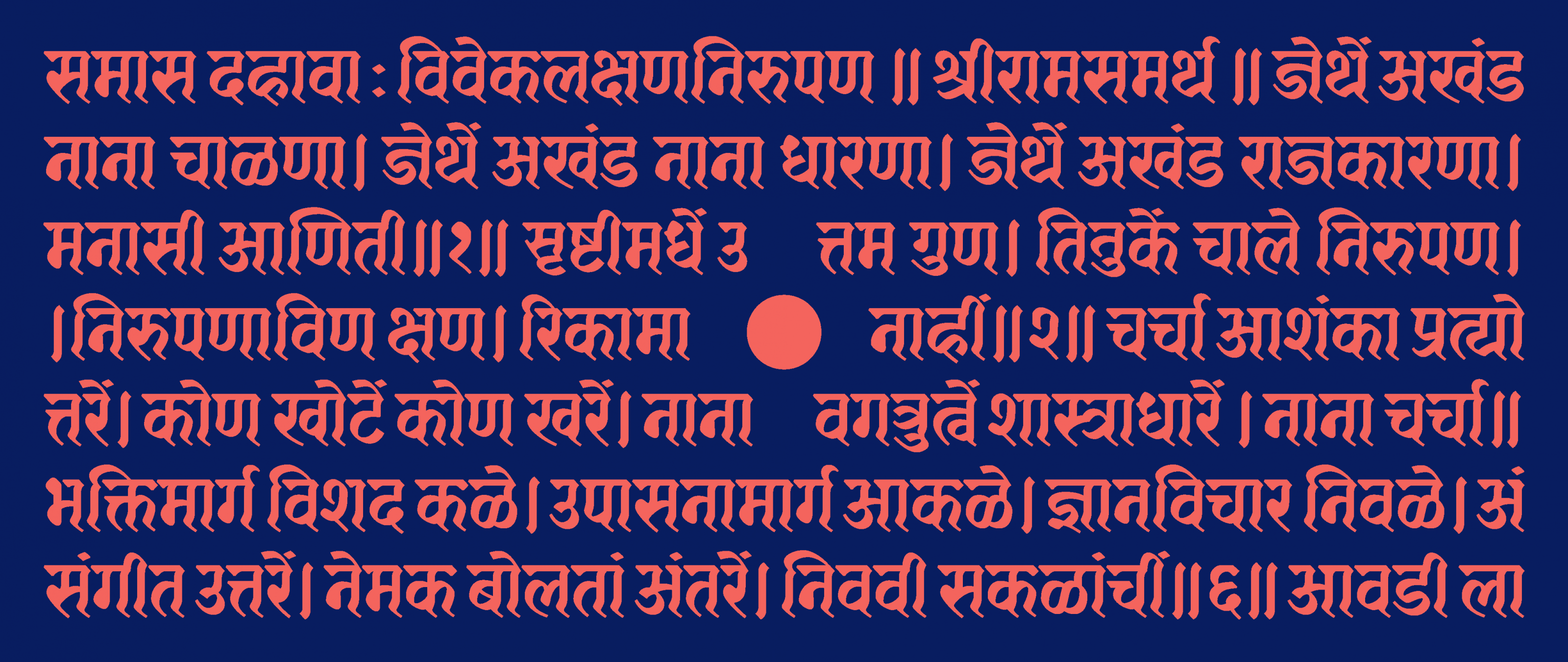
Another text sample set in Jaini.
But display typefaces provide a refreshing escape from the strictures of commerce. They offer a glimpse of what a script can look like outside of the normative. And when designs flirt with “tradition”, albeit alternate ones, they can provide genuine typographic insights. An example of this is Pradnya Naik’s KABK project Lehiya, which distills Jain calligraphy into a genteel text-amenable typeface.
सभी मनुष्यों को गौरव और अधिकारों के मामले
में जन्मजात स्वतन्त्रता और समानता प्राप्त है
A display typeface like Jaini is only possible with a Devanagari-first approach. It is uninterested in and thus unencumbered by the Latin script. And this fact, among others, makes it important.
To learn more about Jain manuscript culture visit here, here and here.