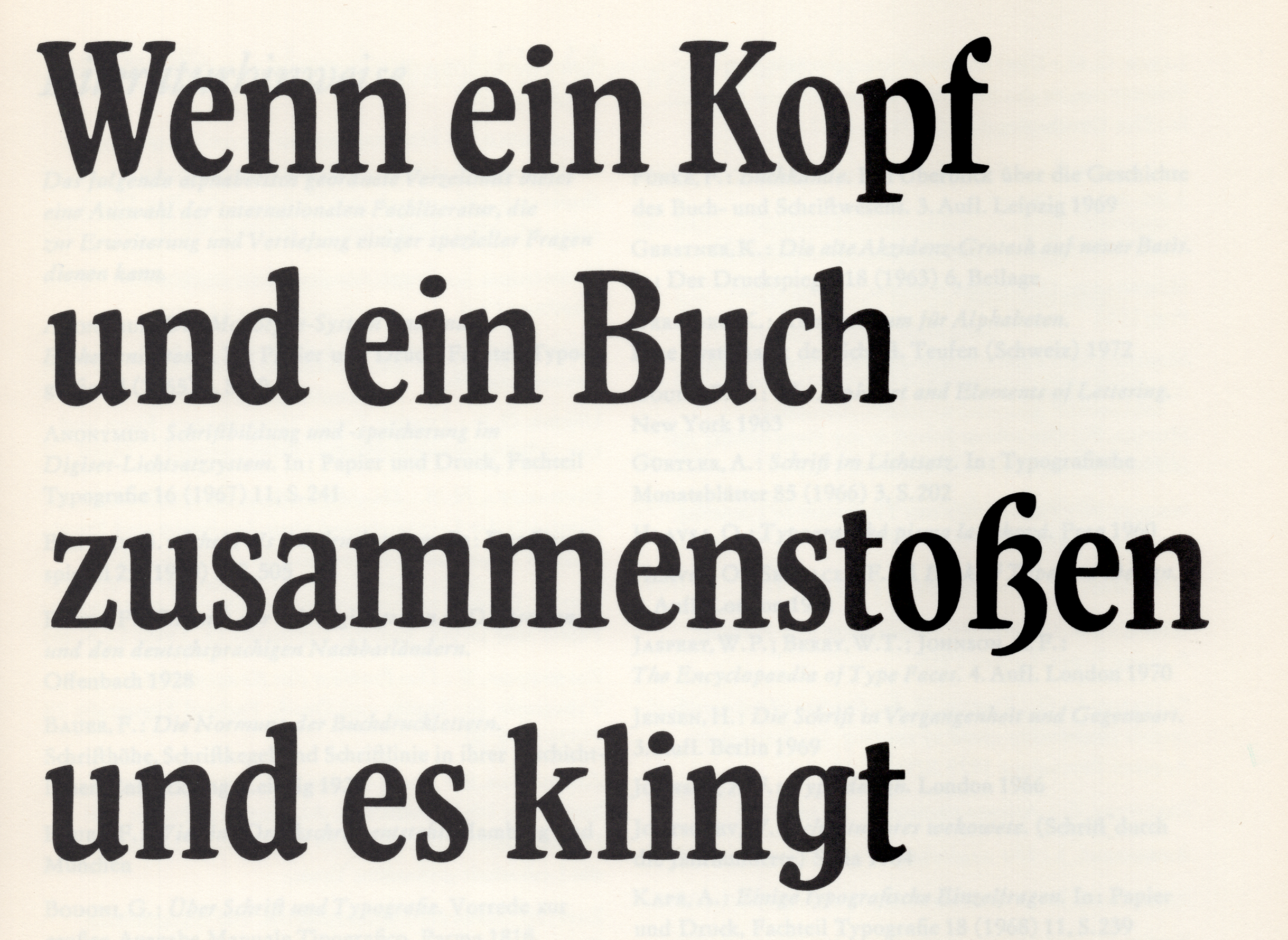
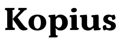
There are probably more corners in Kopius than you’d expect from a serif typeface. Many of its stroke terminals feature additional strokes of their own, adding energy not typically found in faces optimized for immersive reading. When it came to Kopius’ design, Sibylle Hagmann was inspired by Liberta, a 1950s typeface that hasn’t seen regular use since the ’80s. While this review heavily focuses on Kopius’ Liberta heritage, Kopius is not a strict revival typeface. Instead, Hagmann’s letterforms are probably based just as much on her intuition as on Liberta’s example. At the Kontour foundry website, Hagmann writes that “Baskerville-like open and modern typeface proportions further characterize Kopius’ letter dimensions.” A detailed discussion of what makes a Baskerville a Baskerville will have to wait for another time, dear reader, but I did address what typographers mean when they talk of “modern” typeface proportions in an earlier review.
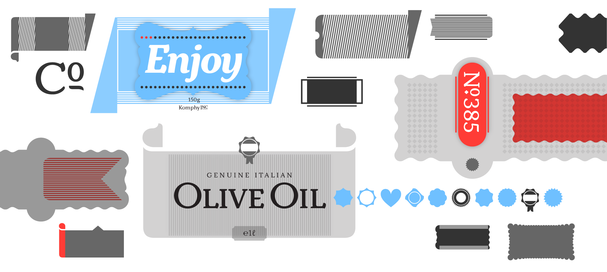
One of the graphics Sibylle Hagmann made to advertise Kopius on Kontour.com. Note that the background shapes she used in this image were also made with fonts from the Kopius family: Kopius Labels and Kopius Box Headings.
Kopius comes in seven weights, ranging from Light to Black. Each has an upright and an italic style available. The italics’ design is independent, featuring letterforms that aren’t merely sloped versions of what you find in the upright fonts. The background shapes in the graphic shown above come from two additional family members: “Kopius Box Headings” and “Kopius Labels.” Those contain shape libraries of plump, rounded forms that harmonize with the letterforms in the family’s other fonts.
Sibylle Hagmann expanded Kopius with a Condensed family, too. All in all, it is a complete editorial-design system. Like Kopius, the Kopius Condensed fonts take design cues from the Liberta typeface. But Kopius Condensed is a smaller family. Although it also has seven weights, there are no italics.
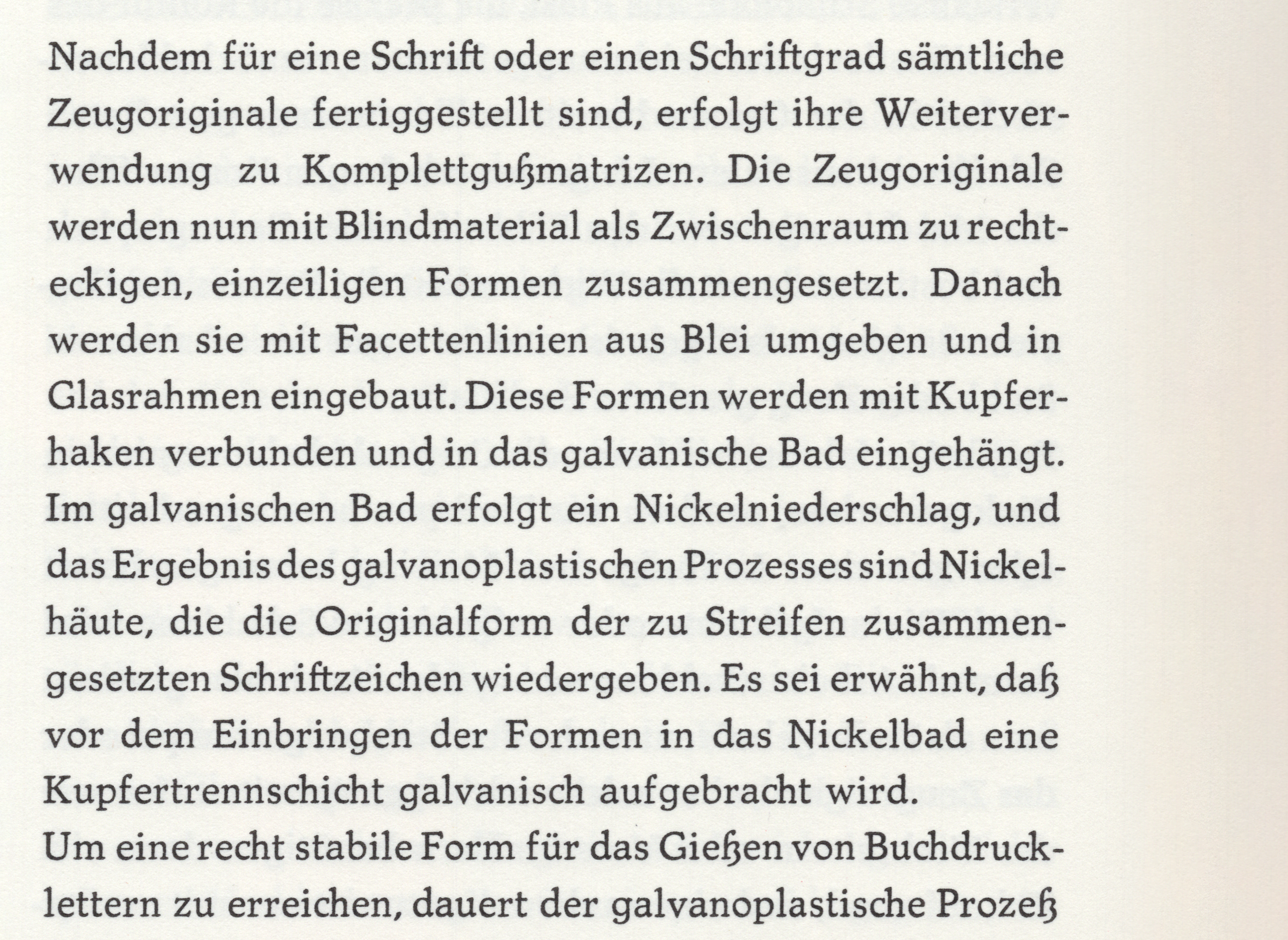
The two people-owned type foundries “vormals Schelter & Giesecke”, Leipzig, and “Schriftguss Dresden”, were amalgamated last year to form a new establishment, which has become known under the name “VEB Typoart Dresden”.
Cette enterprise produit des caractères d’imprimeries, matrices et filets en cuivre. – Les avantages assurés du point de vue exploitation économique donnent à la nouvelle enterprise une capacité beaucoup plus élevée.
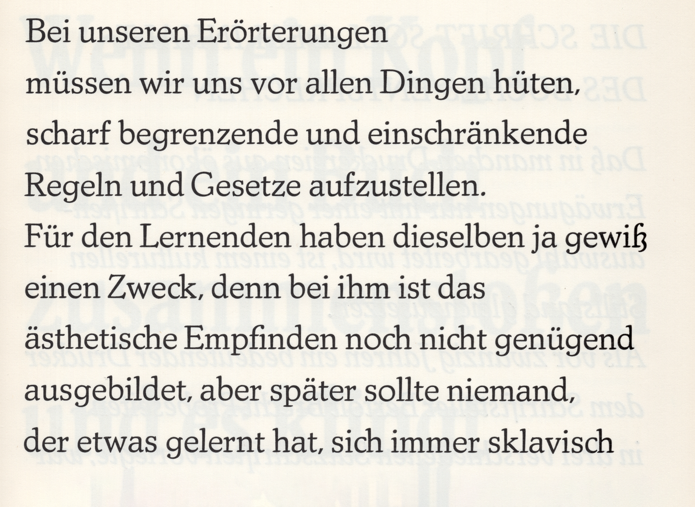
Diese beschränkt sich nicht auf eine gesteigerte Kapazität, sie wird erst dadurch bedeutsam, daß die Kiloware „Schrift“ nicht nur als marktgängige Ware produziert, sondern in Übereinstimmung mit maßgeblichen Fachkreisen entworfen und als wertvolles Kulturgut behandelt wird.
The weights of metal handled by casting-machines or composing-machines, remain invisible to the reader. He only knows the impressions made by those types, he only sees a black-and-white picture.
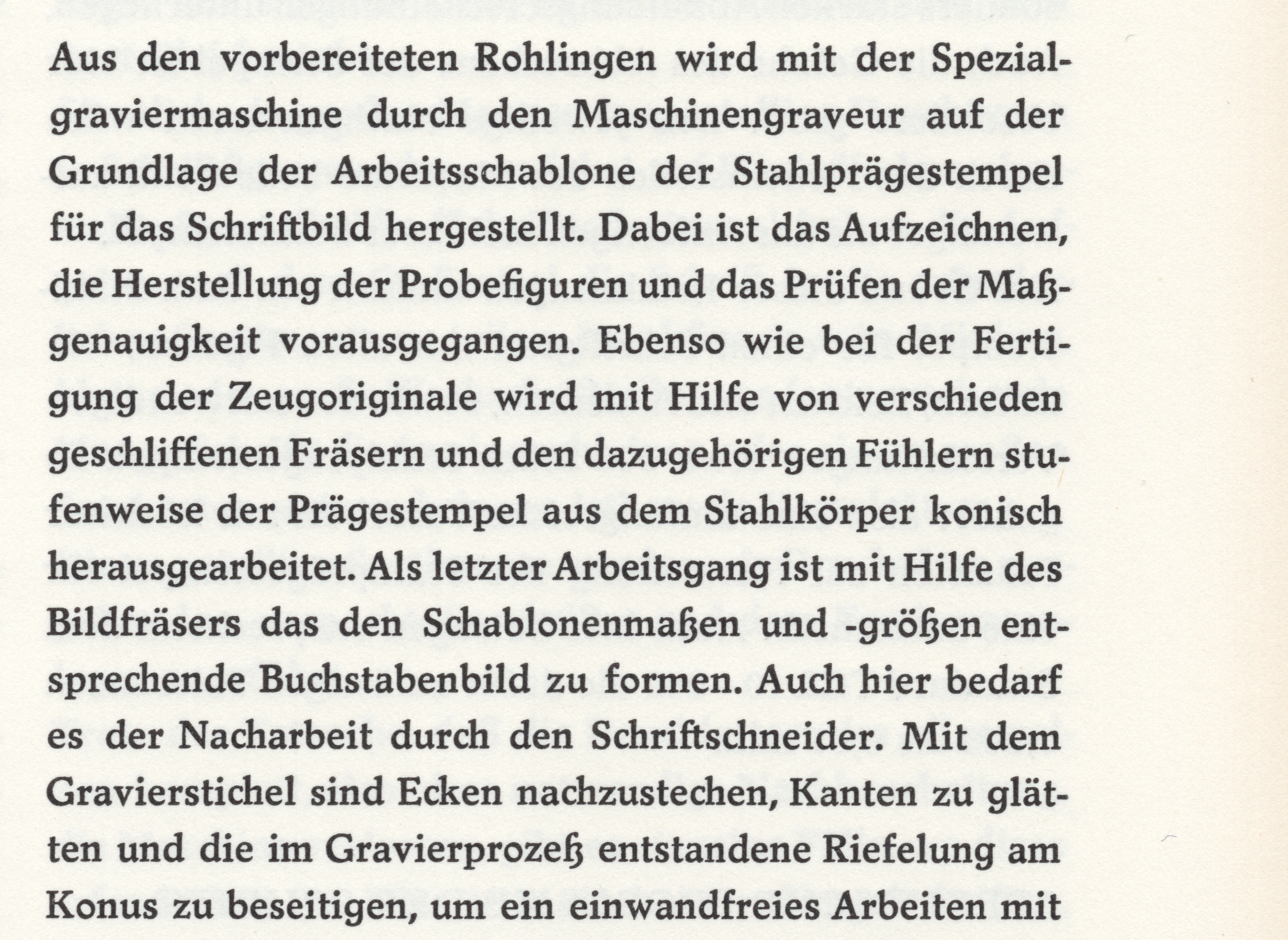
C’est le graveur ou fondeur en caractères qui produit les éléments nécessaires à produire cette image, les caractères ou lettres. Il ne produit toutefois pas tout simplement des signes qui, placés les unsà côté des autres, donnent un mot ;
es zeigt eindeutig, welcher grafischen Mittel wir uns bedienen, wie wir den Inhalt des Mitzuteilenden zu ordnen verstehen, ob diese Ordnung und Gliederung nicht nur Fragen der Zweckmäßigkeit sind, sondern unter der gestaltenden Tätigkeit des Typografen ein ausgewogenes grafisches Bild entsteht.
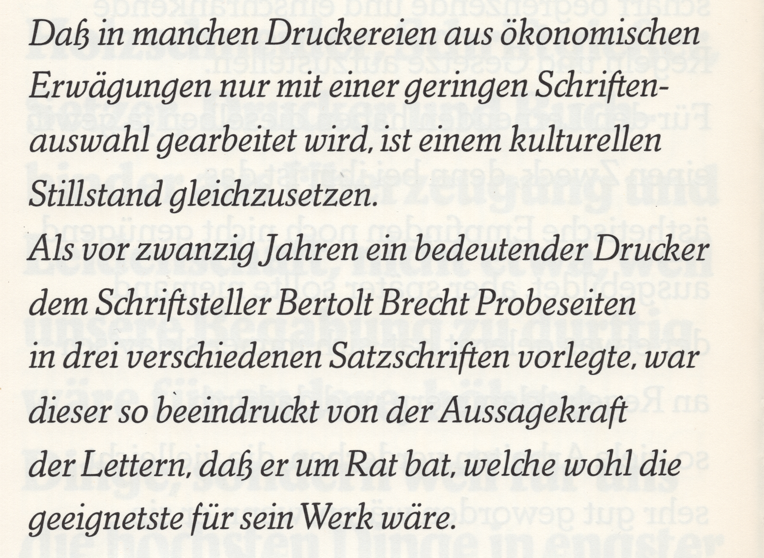
The creative activity of the typographer should rather bring forth a well-balanced graphical face. But not the graphical values of the brighter and darker grey shades should be considered alone; the shapes of the letters themselves represent contemporary history and styles.
Herbert Thannhaeuser’s Liberta
While Baskerville’s typefaces need no introduction, most readers are likely less familiar with Liberta – a typeface released in the 1950s by VEB Typoart Dresden, the state-owned typefoundry of the former East Germany. Liberta was one of Herbert Thannhaeuser’s typefaces. Born in 1898, Thannhaeuser was one of the most prolific designers working in Germany between about 1922 and 1963. His first significant job was at Berlin’s Erasmusdruck printing house. A 1928 catalog of its typefaces, laid out by Thannhaeuser while he was Erasmusdruck’s creative director, has recently been digitized.
1928 was also the year that the first typeface Thannhaeuser designed was released. The D. Stempel AG foundry in Frankfurt published it. However, most of his pre-war typefaces came out through Schelter & Giesecke, a giant Leipzig-based typefoundry whose history stretched back to 1819. According to a short Thannhaeuser biography written by the type designer Andreas Seidel, Liberta grew out of an unreleased type design called Europa-Antiqua. Thannhaeuser had drawn Europa-Antiqua for the German branch of Mergenthaler Linotype in Berlin, which was to produce matrices of its text sizes for the Linotype machine. Schelter & Giesecke was to cast foundry-type versions of its text sizes and its display sizes. Thannhaeuser settled in occupied Germany’s Soviet zone after the Second World War and became Typoart’s artistic director in 1951. VEB Typoart Dresden was an amalgamation of Schelter & Giesecke and the Schriftguss foundry in Dresden. The communist authorities had nationalized both.
Because East German printers could not afford to regularly import matrices for their Linotype and Intertype machines from Western Europe, Typoart reverse-engineered the production of linecasting matrices. Liberta was published both as typesetting-machine matrices and as fonts for hand setting. Linecasting machines had no support for kerning, which explains why Liberta’s f was so narrow (Hagmann retained the narrow f in Kopius).
Between 1956 and 1960, the Liberta family grew to have six fonts. That might sound like a small number – and it is much less than what Sibylle Hagmann provides in Kopius and Kopius Condensed – but it was a respectable number of weights and styles for the late 1950s. Kopius and Liberta have many differences. For instance, Liberta’s serifs are rounder than Kopius’, and Kopius’ vertical stems have a writing-influenced movement in them, which Liberta lacks. Looking at Liberta now, it is hard to imagine setting newspaper text with it, but that was its intended medium. Today, it is easiest to imagine Kopius being used in editorial design, especially for magazines. But Kopius is a typeface that also works well in books.
Those people working in the first generation of type-making in the former East Germany were part of a tradition that stretched back to the end of the 19th century. During the first third of the 20th century, the parts of Germany that later became the East German state had a thriving professional community of lithographers, printers, and typesetters; particularly in cities like Berlin, Dresden, and Leipzig. Not to mention poster designers, typeface designers, and type foundries. Herbert Thannhaeuser and Schelter & Giesecke are just two of many examples. Those who survived the Second World War and remained in eastern Germany tried to continue their work after 1945. Other people involved in Liberta’s making are also examples of that continuity. For instance, in Die Entwicklung des Betriebes Typoart in Fakten und Daten – a book later published by Typoart – reports mention that Otto Erler, the foundry’s chief punchcutter, cut Liberta. By this, its authors probably meant that Erler cut the trial size and then supervised that font’s adaption to other sizes (likely assisted by Thannhaeuser). Erler was one of the great punchcutters of the twentieth century. As a communist, he experienced some troubles in 1933 but was nevertheless able to work as Schelter & Giesecke’s last engraving department director and as the first director of Typoart’s engraving department.
In my opinion, Typoart’s typefaces from the 1950s and ’60s had the same level of design and technical quality as the typefaces produced in those decades by West German foundries. The East German political and economic system collapsed after 1989, and Typoart did not survive past the early 1990s. Today, many designers the world over still use typefaces created in West German during the 1950s and ’60s – such as Optima, Palatino, Sabon, and Trump-Mediäval – but the East German typographic legacy has not been celebrated. 21st-century typefaces created by designers without direct ties to the former East Germany (Tim Ahrens’ JAF Lapture is another example) allow us to implement some of those old ideas in new design pieces, in media that people like Herbert Thannhaeuser never could have imagined.
769 Barn Trail berücksichtigen déconsolidation Princess of Saxony
Ferdinando Paer Nizhny Novgorod 422 Shadow Path No. 71 rannsóknarréttur
honorifiquement Joan Baptista Pla Bowral–Mittagong Puerta Vito Claudio
Decades after creating the Libera metal-type fonts, Typoart brought the design into the photo-typesetting medium. However, that update only included Liberta’s heaviest weight, with an upright and an italic font. Since the 1980s, several digital fonts inspired to one degree or another by Liberta have been produced, and you can find an extensive list of them at FontsInUse.com. Kopius and Kopius Condensed aren’t the only typefaces on Fontstand inspired by Liberta. Suitcase Type’s Dederon Serif also takes cues from the typeface, albeit less directly. To see the difference, compare the typefaces’ stroke terminals. Dederon Serif’s strokes end in a streamlined manner, making its letters’ counters appear larger. Kopius, on the other hand, has playful terminals on strokes like a, c, s, etc. The name “Dederon,” which Suitcase uses in Dederon Serif and Dederon Sans, merits explanation. In the former East Germany – known in its time by the initials DDR – nylon products were marketed under the name Dederon.
Gaetano Donizetti Mantes-la-Jolie 16 Porte des Bourdonnais dvanáctihodinovou. Und in einer volkseigenen Schriftgießerei, welche Setzmaschinen-Matrizen herstellt, ist die Setzmaschine nicht mehr die Konkurrentin der Handsatztype.
technologickému Antonio Rosetti Ronda de Centelles B/23 warrantableness. There are no economic reasons for giving the hand-composition type specimens so-called “artistic features” which distinguish it from the “inartistic” machine type and only impede their use as a book face.
Pays de la Loire připomínajících Bernhard Romberg 8 Place Favre. Par conséquent, le travail du fondeur en caractères ne se confond plus en caractères noirs à distinguer que n’ont pa d’autre but que de chercher l’effect, et qui ne constituent que les atours à bon marché d’un travail qui es mal médité dans la plupart des cas.
osteopathically Conradin Kreutzer L’Haÿ-les-Roses Kleinallee 10. Um so dringender wird die Aufgabe, dem mechanischen Satz und seinem Typenmaterial alle Sorgfalt zuzuwenden, die seiner Bedeutung zukommt.
Stephen Storace Rosny-sous-Bois Passeig Tristán Howard F/31 Veröffentlichung. Apart from negligible exceptions, all composing work is done mechanically and can only be carried out by mechanical methods in order to be able to cope with exchange of ideas of our times.
Villiers-le-Bel technologickému Adolph Carl Kunzen 27 Quai Cédric Le Sueur, L’écriture étant toujours subjuguée aux idées, elle ne peut point rester imbue d’une esthétique de ces siècles qui faisaient usage de caravelles pour transporter aux pays d’outre-mer le mot imprimé.
neutralisierung Dallas–Fort Worth technologickému Karl von Ordóñez. Dieser Geist der Zeit ist nicht uniform. Er hat so vielfältigen Ausdruck wie die Sprache, die den Gedanken prägt.
připomínajících superinfections Francesco Gardi Warragul–Drouin. The type can take its time in developing a perfect graphical face, in order to become equivalent to what was accomplished a few centuries ago in the quietness of the workshops.
If you’d like to learn more about Sibylle Hagmann, check out Sébastien Morlighem’s Fontstand profile of her Kontour foundry from 2019.

