
Some type designers focus exclusively on fonts for extensive reading. You’ll only find their work printed in books, often at just 10 pt, and they’ll only be recognizable for book designers and Font ID experts. Other type designers explore the possibilities that display type has to offer, and you’ll never see their fonts in body sizes.
espléndidamente Caluire-et-Cuire programmäquivalenz Giovanni Cifolelli
Neustadt am Kulm Via Isandro Caraballo 66 nepremišljenost gitterparameter
Calleja de Londres 65 skeiðarársandur unterbekleidung Rodolphe Kreutzer
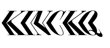
Ellmer Stefan’s type-design approach is multi-faceted. At Fontstand, you can find his Pyte Foundry’s Triptych family, for instance. Although a font family containing just a serif, italic, and sans serif variant is novel (check out Yanone’s Antithesis for a trailblazing example), all three Triptych fonts are workhorses. Essay Text, by Ellmer Stefan for TypeTogether, isn’t as directly historically inspired. Yet, it is nearly as protean. And then there is Compagnie. Like Kinckq, it is a small family inspired by display types from the 19th century.
Compagnie is perhaps better described as a collection of three fonts with different widths. Unlike a typical family, the widths are not three instances of a common idiom. Compagnie I is not the condensed version of Compagnie II, for instance, nor is Compagnie III an extended variant – even though it is wide. When confronted with two, or all three Compagnie fonts, readers will not necessarily realize they are part of the same series. This is where Kinckq stands out: clearly, its fonts are interrelated.
While it is good that Kinckq is available in separate parts, the variable-font version of the design is probably the best thing about the family. Unlike the static fonts, it allows for seamless out-of-the-box interpolation between the left-leaning and right-leaning extremes. I’d include an animation of the font doing just that right here, except that I suck at using Drawbot and web tools that could easily do this. That is my fault, not Ellmer Stefan’s. If you head over to the Pyte Foundry webpage, you can see a fab little animation on his page for Kinckq.
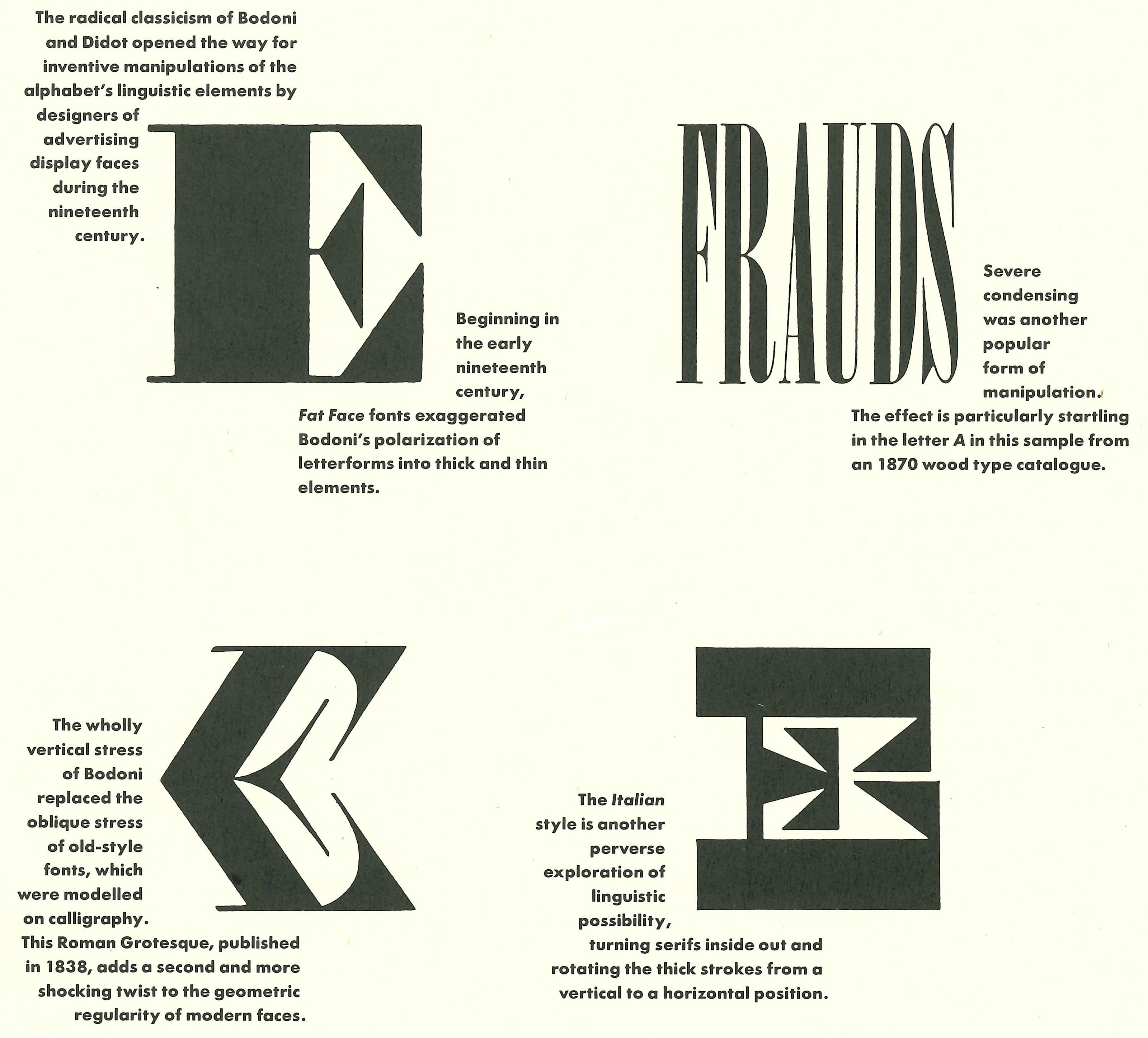
Above, I’ve cropped the top half of page iv from Ellen Lupton and J. Abbott Miller’s article “Type Writing: Structuralism and Typography” in Emigre 15 (1990). You can see a photograph of the entire spread at Letterform Archive. Lupton and Miller used George Nesbitt’s Roman Grotesque to illustrate the changing structure of letterforms. “The experimentation of nineteenth-century display faces,” they wrote, “suggested that the ‘alphabet’ consists of a flexible system of differences, not just fixed symbols.” It strikes me that “a flexible system of differences” is one of the best summaries that could be applied to Ellmer Stefan’s body of work to date. – On a side note, do you remember what Emigre was like back-in-the-day when its pages were 11.5 x 17 inches in dimension?! Gadzooks, flipping through these issues in real life is (sadly) nothing like viewing them online. Those were the days, eh?
As mentioned above, Kinckq is directly inspired by 19th-century experimentation in display-type letterforms. As Ellmer Stefan records on his website and in his PDF specimen for the fonts, the first typeface with a sharp “kink” in the middle of its letterforms was a wood-type design from George Nesbitt named Roman Grotesque. That must have been available from Nesbitt as early as 1838 – an incredibly early date, as Darius Wells had only developed his means of using a pantographic router to cut wood type fonts eleven years earlier. Kinckq’s design quirk was quickly manifested in metal type, too. Tarbé in Paris had a font in this style. So did V&J Figgins in London.
What you might anachronistically call “the Kinckq quirk” represented a natural typographic evolution. Already, typemakers had picked up the idea of “backslanting” typefaces. After a type maker had a forward-sloping and backward-sloping Didot in their library, combining the two so that each half mirrors the other across a horizontal axis would not have been so big a leap. It is more surprising to me that this effect was applied to so few display types at the time (Midolline and the Centralschrift notwithstanding).
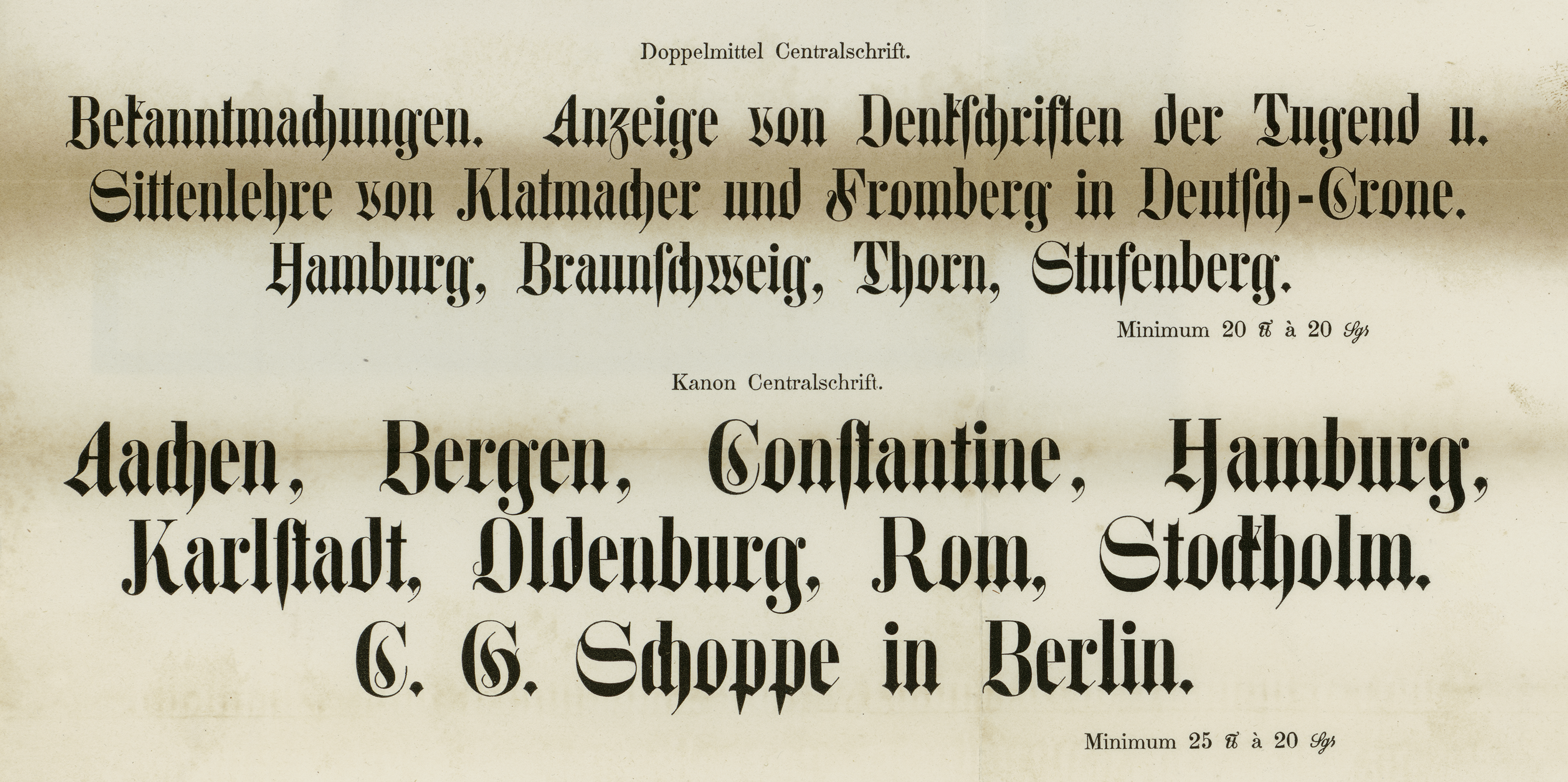
In the 19th century, it was slightly more common to mix two styles in one typeface rather than two slants, as the models for Kinckq did. A lesser-known example of a typeface whose top and bottom halves came from competing styles is the Centralschrift, or “central type,” most likely referring to the division within each letterform. Above, I’ve reproduced two sizes of Centralschrift from the C. G. Schoppe typefoundry in Berlin. Note how the top half of each letter looks like a roman fat face while the bottom is designed in a bold fraktur style. The specimen sheet was printed by G. Bernstein as a supplement from Schoppe for an 1853 issue of Journal für Buchdruckunst, Schriftgießerei und die verwandten Fächer. Image: Staatliche Museen zu Berlin – Preußischer Kulturbesitz, Kunstbibliothek. Photographer: Dietmar Katz.
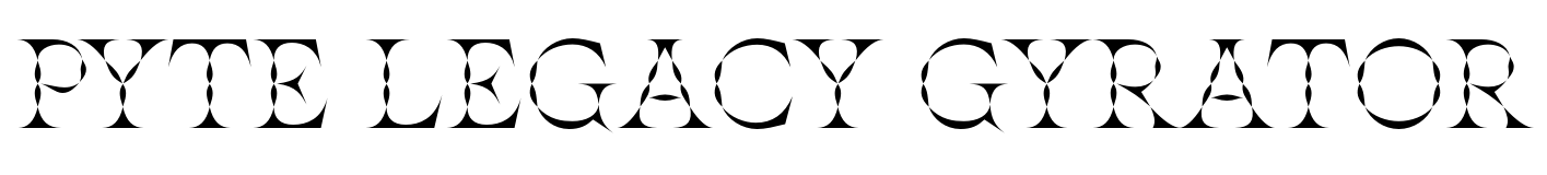
There is way more to Ellmer Stefan and the Pyte Foundry than I’ve been able to hint at in this introduction to Kinckq. Aside from the font families I mentioned at the top of this post, you can find four single-style display faces on Fontstand (illustrated below). And while you are here, please check out Ryan Bugden’s 2020 profile of the Pyte foundry. Ryan goes deep on Ellmer Stefan’s 2016 “Year of Intensity.”
disimuladamente Claude Terrasse Newcastle–Maitland Calle de Fontanella
připomínajících hyperfastidious Tommaso Traetta Le Blanc-Mesnil
Carrer del Bruc 80 inasumiblemente Sterling Heights nepremišljenost
paleozoologists Fort Lauderdale dvanáctihodinovou Daniel Steibelt
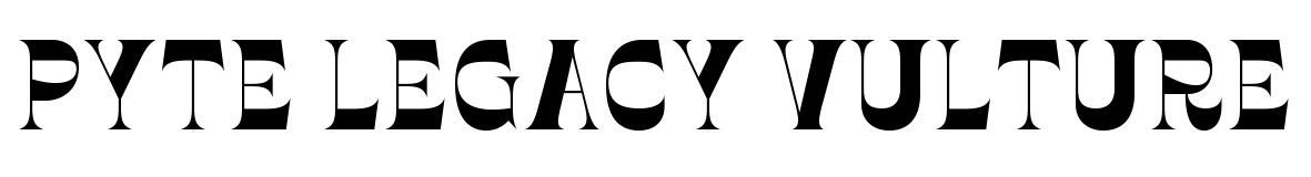
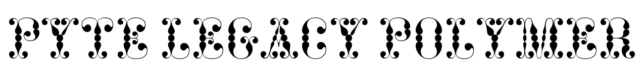
Link Kinckq, the four typefaces shown above are revisions of quicker releases Ellmer Stefan released into the world for free (but for a limited time) seven years ago. In 2016, he released one font a week, thanks to an all-caps, modularly-assisted template. Visitors to his site could download that font over the week, after which it was replaced with another design. He published 52 fonts this way. Frank Grießhammer recapped the entire series in a review for Typographica. The exercise was a brilliant affair (which even helped inspire David Jonathon Ross’s Font of the Month Club). Rob Roy Kelly’s American Wood Type, which you can read about elsewhere on our site, offered a great deal of inspiration.
Kinckq grew from two of those 2016 fonts (Kink A and Kink B). Pyte Legacy Polymer, Vulture, Gyrator, and Houdini each reference their 2016 predecessors more directly in their names. Let’s hope that he won’t stop with this crop but that he’ll be able to rework even more examples from his vault!
