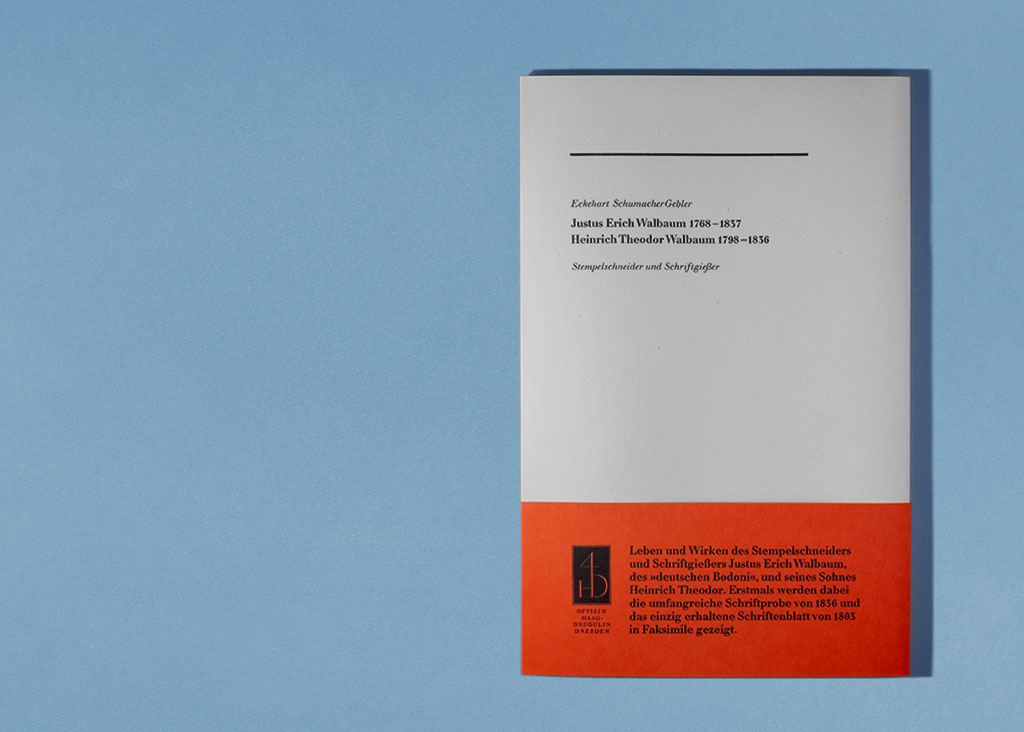
After the Offizin Haag-Drugulin in Dresden, Germany launched its new website at the end of 2020, it was finally possible to order Eckehart SchumacherGebler’s 2019 book Justus Erich Walbaum 1768–1837, Heinrich Theodor Walbaum 1798–1836: Stempelschneider und Schriftgießer online. That is an excellent German-language overview of the Walbaum family and their typefaces.
Born in 1934, Eckehart SchumacherGebler is one of Germany’s leading printers. By the time desktop publishing tools were introduced in the 1980s, his typesetting studio in Munich had already been running for decades. In 1992, he purchased the tradition-rich Offizin Haag-Drugulin in Leipzig, which eventually moved to Dresden. In terms of letterpress printing-houses, the OHD must have the largest collection of foundry typefaces and Monotype matrices in Germany. SchumacherGebler is well-known in Germany and abroad for his writing on typefaces and type designers. Many designers cherish their copies of his trilingual 26 Letters Lettern Lettres typeface calendars published in 1989 and 1992. In 2001, he published a large monograph on F. H. Ernst Schneidler, which is surely one of the most comprehensive examinations of a single type designer’s work yet produced.
Most Fontstand customers will probably not be immediately familiar with the “Walbaum” name, although František Štorm’s Walbaum 2010—available through our service—is one of the most excellent digital revivals of Justus Erich Walbaum’s roman and italic types yet produced. It has often been written that, before the wide adoption of digital fonts in the 1990s, the typefaces used in graphic design and publishing differed greatly from country to country. In the early 20th century, many type-makers in Europe and the United States produced revivals of late-18th/early-19th century faces cut by Giambattista Bodoni in Parma and by/for the Didot family in Paris. While German foundries also had “Bodonis” of their own, the use of Walbaum’s similarly-formed roman types became very common in Germany after 1920. Today, one rarely speaks in German of “Didones” (types based on work by the Didots and Bodoni), but rather of “neoclassical types like those of Bodoni, Didot and Walbaum.” As the OHD says on its website, Justus Erich Walbaum is “the German Bodoni.”
Of the typefoundries operating in German-speaking Europe between 1790 and 1890, the Walbaums’ was written about the most during the twentieth century.
This is likely due to twentieth-century revivals of the Walbaum’s typefaces.
It was at home in Weimar between 1803 and 1836.
Theodor Walbaum managed the family’s business for a few years himself.
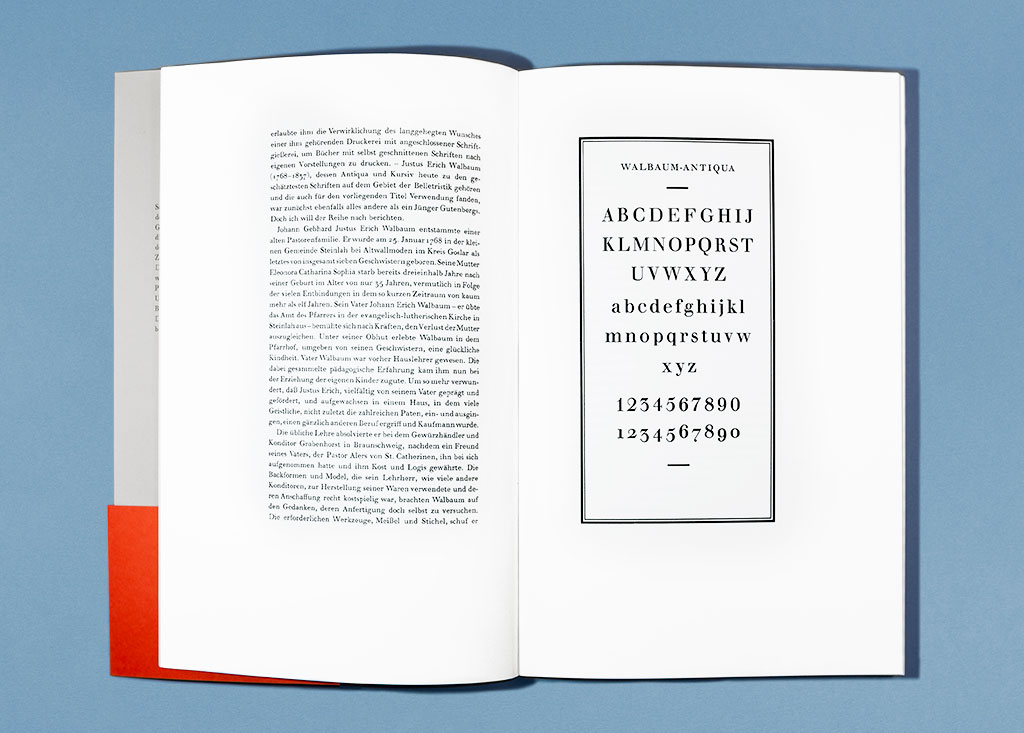
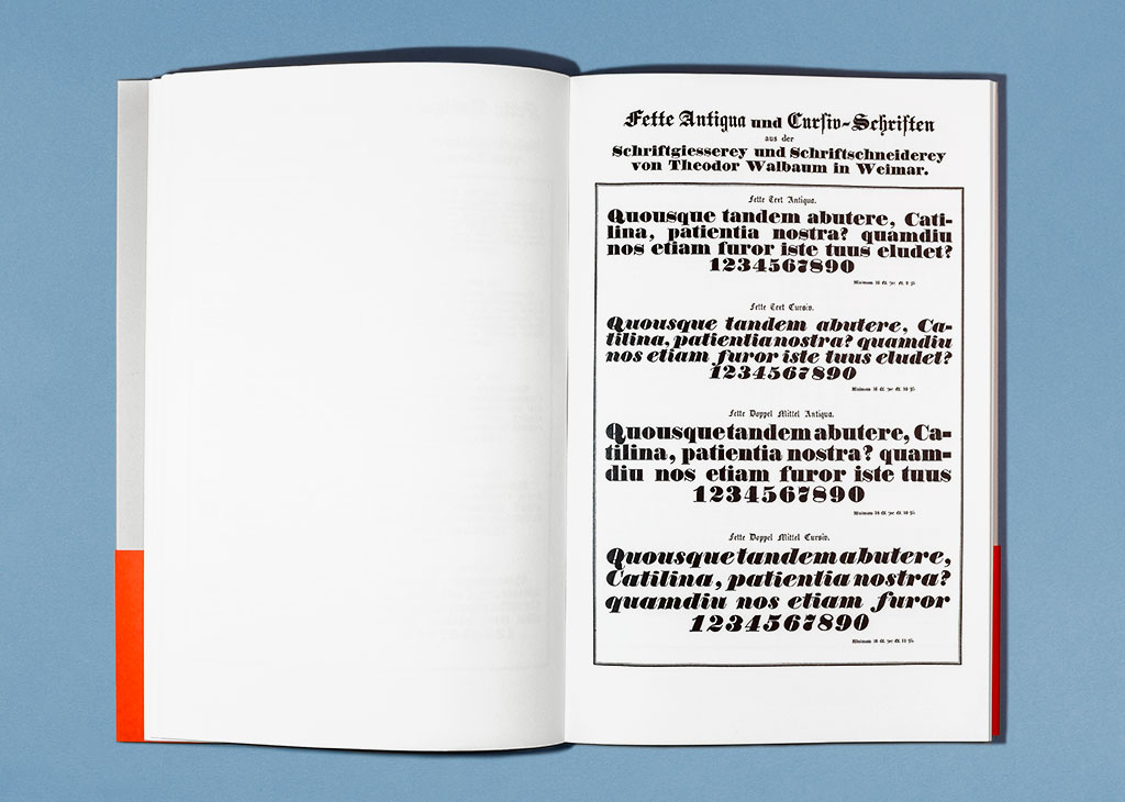
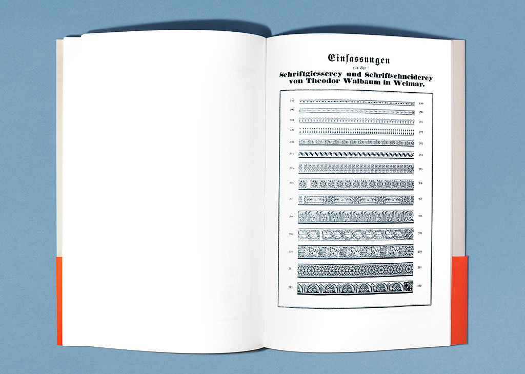
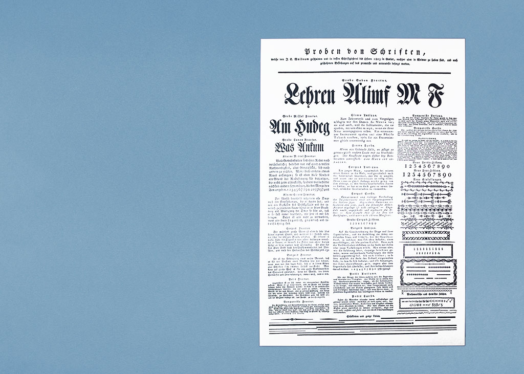
It should be no surprise that a figure like Justus Erich Walbaum has been the subject of many typographic publications in Germany over the last century. However, the last Walbaum biography in book form was published in 1964. SchumacherGebler’s book combines a sixteen-page overview of Walbaum’s life and work. This is combined with a facsimile’s of two Walbaum specimens. The first, from 1836 when Walbaum’s son Heinrich Theodor was running the business, is fifty pages long. It shows what was probably the entirety of the Walbaum foundry inventory at that point, which was far more than roman, italic and fat-face types. The Walbaums also sold a great number of Fraktur, Schwabacher and Textura fonts, as well as fonts of symbols, printing ornaments, numbers and decorative types. The facsimile also includes specimens of Greek types, Egyptiennes, and sorts for printing decorative backgrounds, borders and rules.
With some effort, you could find most or all the pages from the 1836 specimen on Google Books, as they were digitized together with issues of a German printing periodical called the Journal für Buchdruckerkunst, Schriftgießerei und die verwandten Fächer. Nevertheless, that is a time-consuming process, and not all the specimen pages were scanned by that service very well. SchumacherGebler’s book includes the first printed facsimile of all the 1836 specimen pages, and his sources were clean copies. Even more interesting, albeit much shorter, is the reproduced facsimile of Justus Erich Walbaum’s 1803 single-sheet specimen. It features nine sizes of what one might retrospectively call the “Walbaum Fraktur” as well as six sizes of Walbaum’s roman and four sizes of his italic.
After 1837, Walbaum’s roman, italic and Fraktur types never disappeared from German printing altogether. His foundry was acquired by the publisher F. A. Brockhaus. In 1918, that publisher sold its typefounding business to H. Berthold AG. Although based in Berlin, Berthold purchased several Leipzig typefoundries and combined them into a single location that continued to cast type from that city for some time. The Berthold company must have been well aware of the sales potential Brockhaus’s Walbaum types offered, as it soon began to advertise them prominently. Cast until 1978, it is likely that the designs for many of the letterforms in the Walbaum fonts Berthold sold remained unchanged since the days of the Walbaums themselves. It is therefore not correct to speak of their Walbaum as a “revival.”
In the 1930s, British Monotype created their own version of Walbaum, which its employees drew from scratch for their machines. Monotype’s Walbaum can easily be placed in the revival category—although Robin Mientjes’s term “translation” is more apt since Monotype’s employees translated the formal language of Walbaum’s types into forms that fit into its technology’s matrix system. I bring this up because the text portion of SchumacherGebler’s book was composed with hot-metal Monotype machines using Monotype’s Walbaum. Although Monotype’s Walbaum might be considered less authentic than Berthold’s foundry-type product, Monotype Composition is a more economically sensible method for producing fine books than setting each letter by hand would be. As SchumacherGebler has done for so many decades now, this book shows how warm well-set hot-metal Monotype text can look when letterpress-printed onto quality paper. His book is a joy to hold and read. The facsimile may not have enough detail for it to be used by type designers for tracing, but it certainly presents a thorough overview of the Walbaums’ oeuvre. Both as an object and for its facsimiles, the book is worthwhile—also for those who do not read German.
Summary
Justus Erich Walbaum 1768–1837, Heinrich Theodor Walbaum 1798–1836: Stempelschneider und Schriftgießer, by Eckehart SchumacherGebler
German language, 31 cm (12.2 inches) tall
Text pages composed in Monotype Walbaum and letterpress printed
Facsimile pages digitally printed
The 1803 facsimile sheet is not bound into the book; its unfolded dimensions are 38 × 24.4 cm (15 × 10 inches)