Variable type technology was introduced in 2016. For the first time since the invention of moveable type, one single “font” can contain all the styles of a typeface family. Weight, width, optical sizes, and other properties can be controlled and tweaked at will by the font user. Variable fonts already seem to become the default method of designing fonts, but on the user side, cost stands in the way (a var font generally costs as much as a whole family), and practical objections (In design apps, working with var fonts is not yet hassle-free).
The three most frequently cited advantages of variable fonts are compact file size (especially an advantage for non-Latin scripts), the return of optical sizes, and the ability for font users to tweak the appearance of text. The design projects on Fonts In Use with “variable fonts” as the tag fall mainly into the latter category. Here are four examples where designers have used their project as a typographic playground, exploring the possibilities of variable fonts within a set of self-imposed constraints.
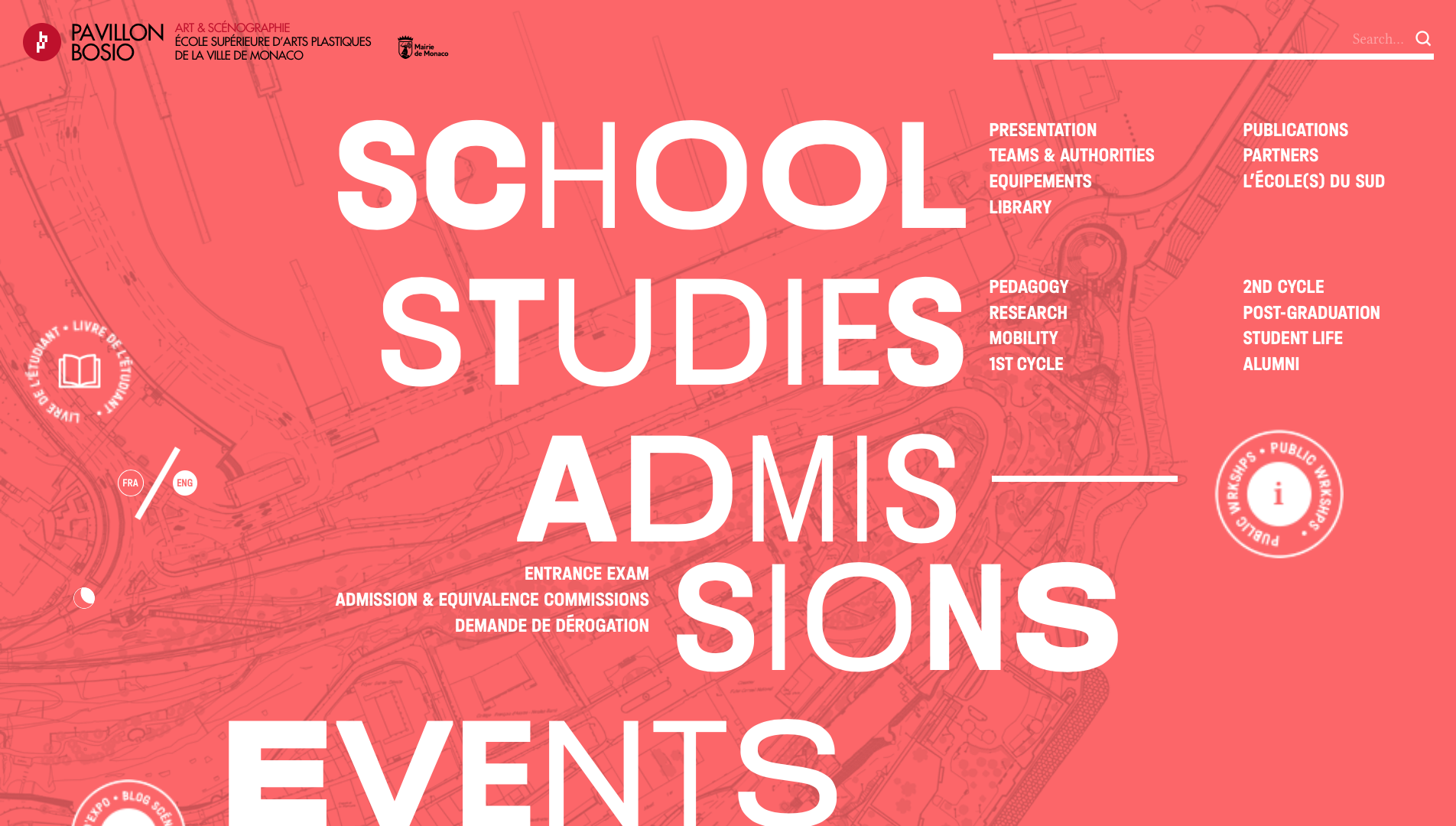
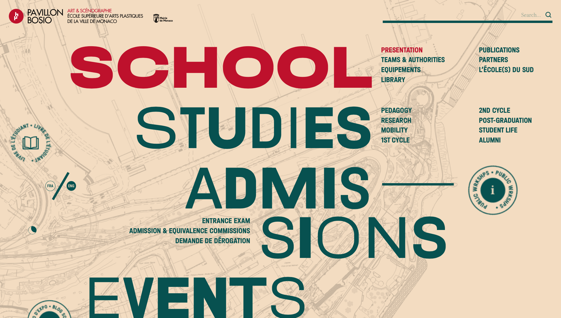
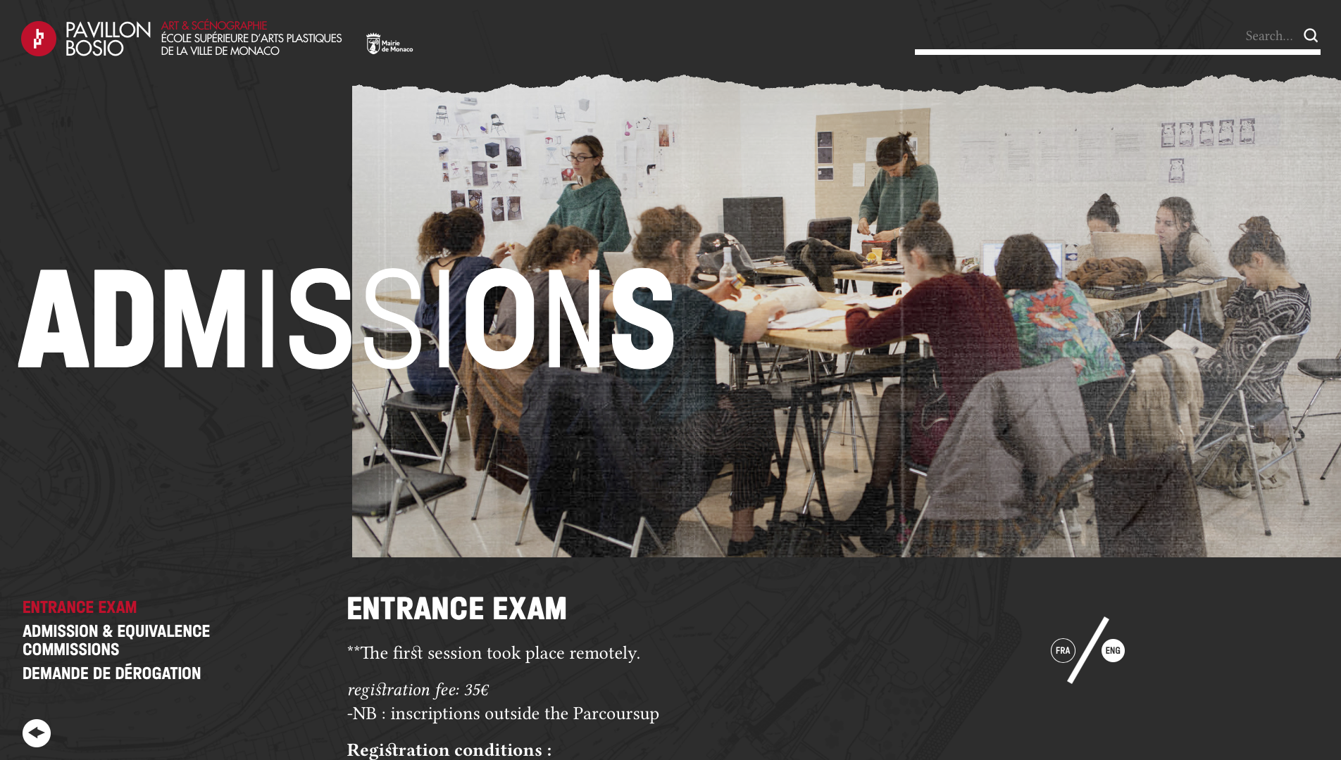
Esap Monaco website
The Pavilion Bosio in Monaco is home of the École supérieure d’arts plastiques de la Ville de Monaco (“University of Plastic Arts of the City of Monaco”), or Esap.
For the corresponding bilingual website, the designers at Studio Fables used a variable version of Halvar to emulate the Dada art movement from the early 20th century. Custom code made it possible to assign a random weight and width to each individual character in the menu headings, making for a striking home page with vivid hover effects. The menu appearance is generated in a new composition at each visit: one cannot visit the same website twice. The same variable font file (“Halvar Flex”) was used for the smaller subheadings and navigation. Like the headlines, they are set in all caps throughout the website, but as a contrast, their weight and width remain unchanged.
See the original version of this post on Fonts In Use, where it was contributed by TypeMates.
Bono Beretta 1973–1985 Charlotte Fisichella $2.3 Billion Provence-Alpes-Côte d'Azur, Alpes-Maritimes, Nice, Peille
Clermont-Ferrand technologickému H. Leslie Adams 4 Place Bethune
Provence-Alpes-Côte d’Azur, Alpes-Maritimes, Nice, Peille hypervitaminose Pieter Hellendaal Aulnay-sous-Bois Avenida de Catalunya
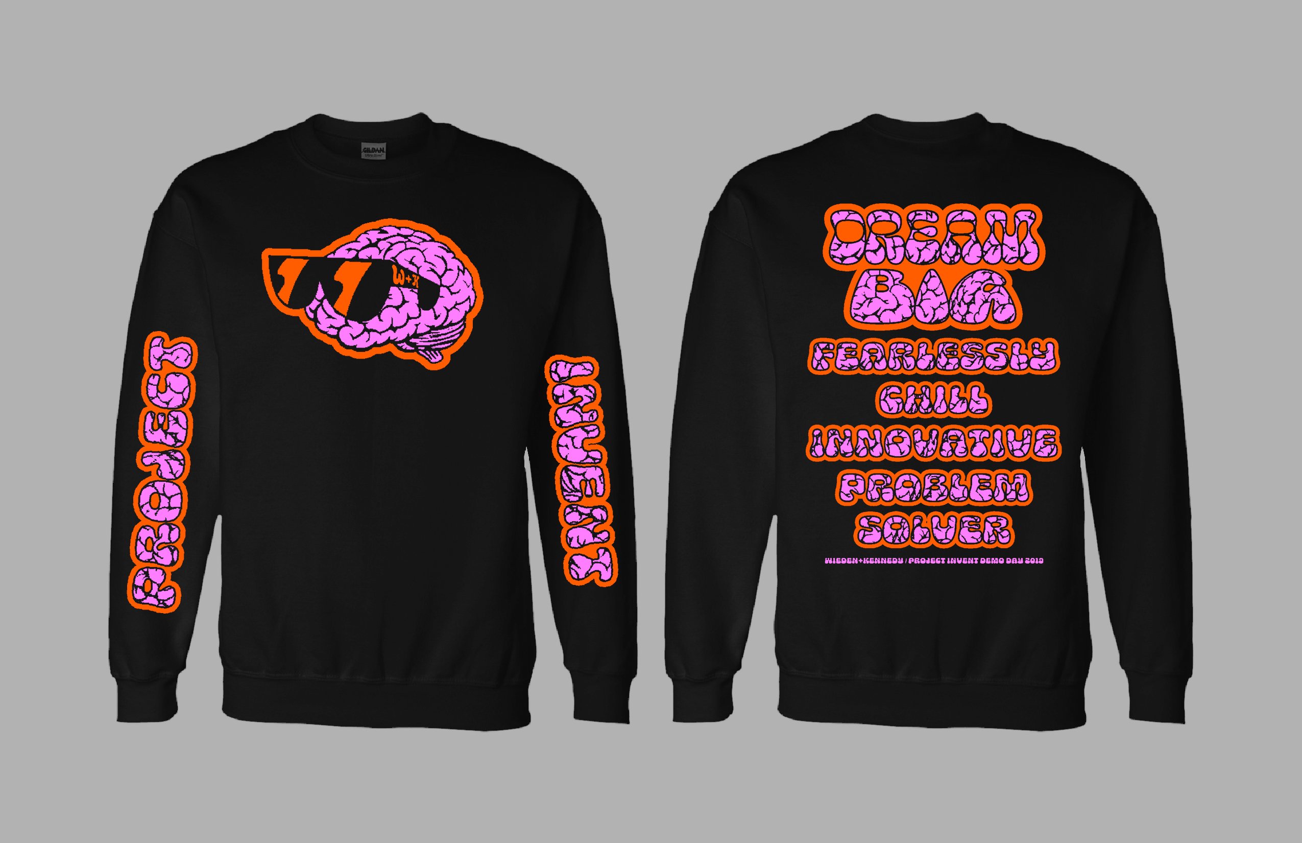

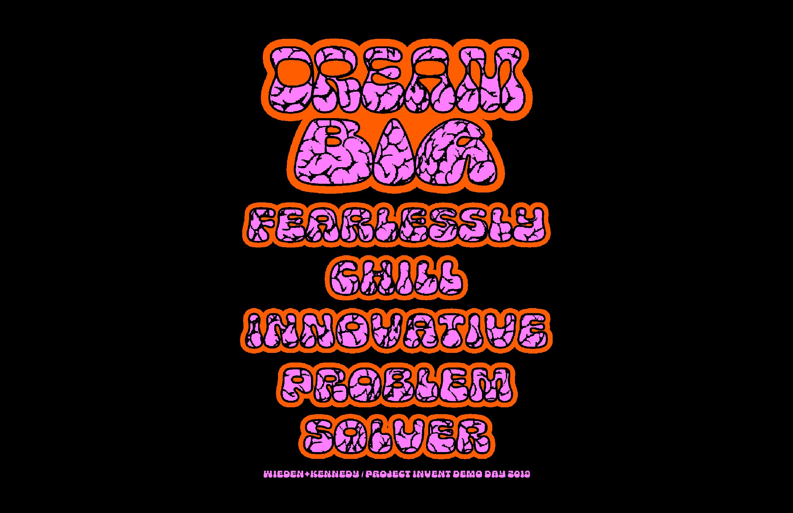
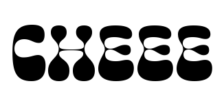
“Dream Big” long sleeve shirt
This long sleeve shirt was designed by David Chathas at Wieden+Kennedy for the Project Invent Demo Day 2019. Project Invent “empowers students with the 21st-century skills to succeed individually and impact globally,” and aims to create a generation of “fearlessly chill problem solvers.”
The font in use is Cheee, an amorphous face dreamt up by James Edmondson and first released in February 2018 via Future Fonts. A few months later, Cheee was upgraded to variable font format, with two axes, “Yeast” (contrast, or, more precisely, the weight of hairlines) and “Gravity” (bottom-heaviness). Chathas employed several variations: While the words “Dream” and “Big” are both exposed to a fair amount of gravity, the latter got a larger pinch of yeast. The blubbery letterforms were then customized with a cerebral pattern fill that references the key visual – a cool brain.
See the original version of this post on Fonts In Use, where it was contributed by Florian Hardwig.
Calleja de Londres 65 skeiðarársandur unterbekleidung Rodolphe Kreutzer
Jan Václav Stich Jardins Sisneros D-33 weltraumtechnik Bourg-en-Bresse
rannsóknarréttur charlatanamente Elizabeth Anspach Khartoum-Omdurman
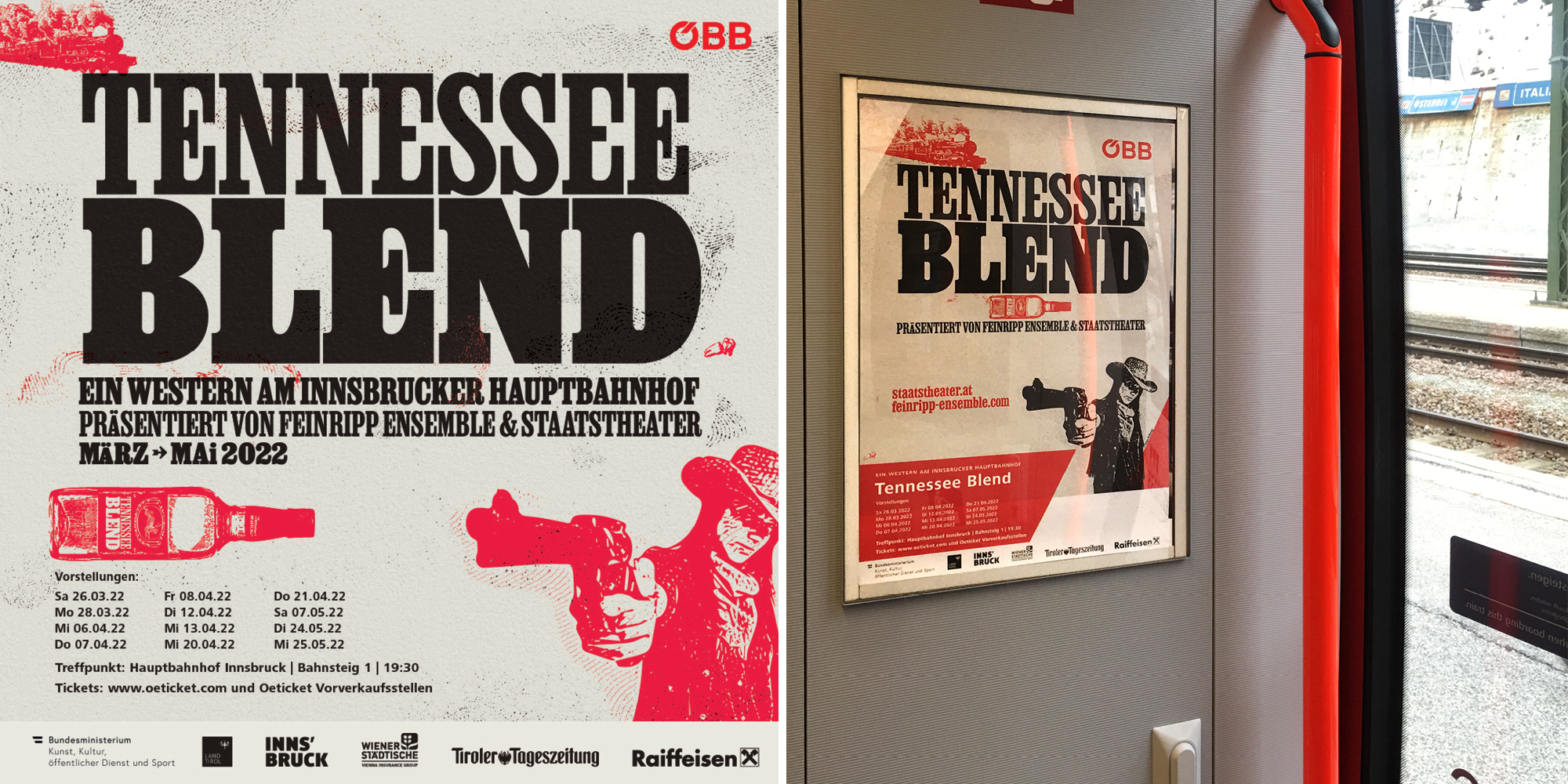
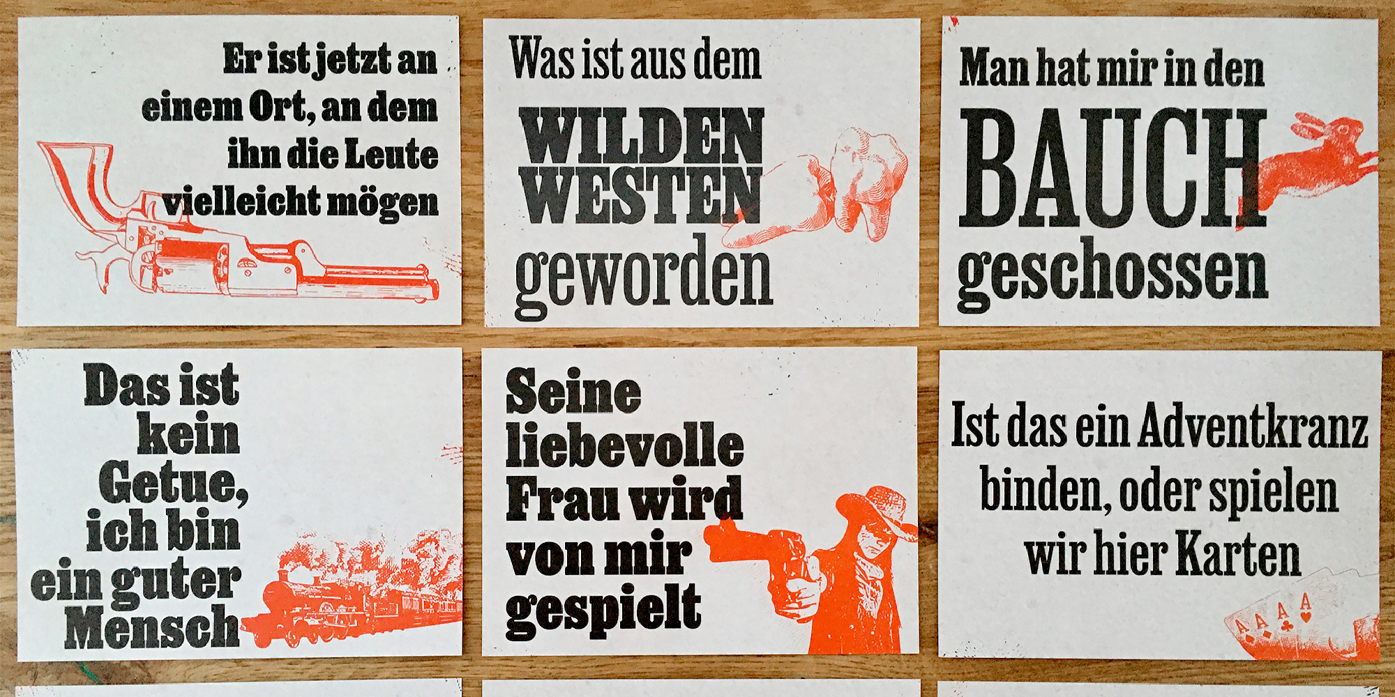
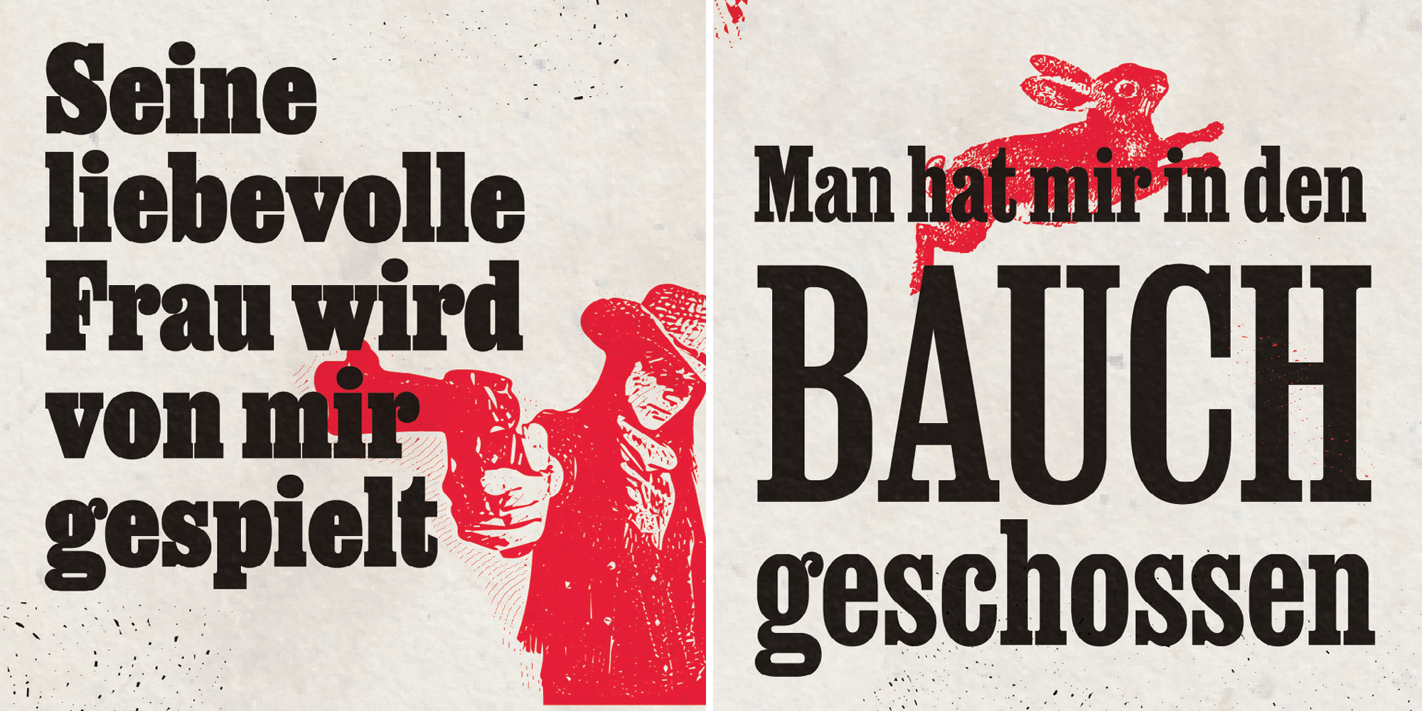
Tennessee Blend
Tennessee Blend is a Wild West play by Austrian theatre companies Staatstheater and Feinripp Ensemble. Sponsored by ÖBB, the Austrian railway company, the public is taken by dedicated trains to the roundhouse of Innsbruck’s main train station, where the play is staged. Designed by Sol Kawage, the title is set in Job Clarendon Variable, as are the postcards with quotes from the play. Kawage fell for Job Clarendon as soon as she test drove it for the design:
“Playing with the weight axis and the sizes was just so much fun. I spent too many hours finding the right combinations for my lines: I wanted to make each text block to look a little bit off, like the play. I never worried about how many instances I was using: it was the point of using a variable font that I could be free from the instances and work entirely within the fuzzy logic of the variable font.”
Having worked with wood type before, Kawage saw opportunities for using modern font technology to evoke letterpress typography: “I also loved playing with the alternate glyphs in the font, in a way that isn’t probably the one DJR intended: look at the E’s in Tennessee… In wood type, often there are slightly different versions of a sort and it makes the word less boring, even if it’s a repetition of the same four letters. Another thing that made me fall in love with Job Clarendon Variable was the fact that I could make letters with umlauts fit into my lockups by making them smaller and increasing the weight to create a uniform look, keeping my leading uniform and compact.”
See the original version of this post on Fonts In Use, where it was contributed by Sol Kawage.
Western Breonian (2749 m) Bivouac Hafelekarspitze 2,334 graden Almdudler
HECK Misirlou & Donatello 73 Journeaux d’ Écritures
Giovanni Paisiello Höhr-Grenzhausen nepremišljenost differenzierbar
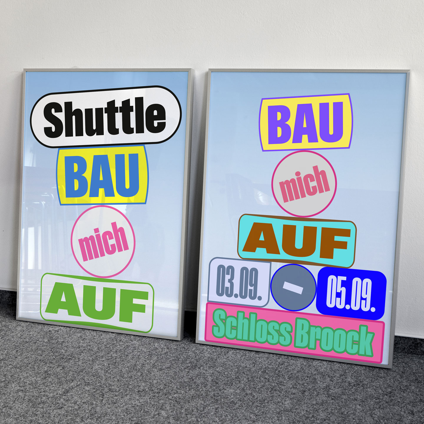
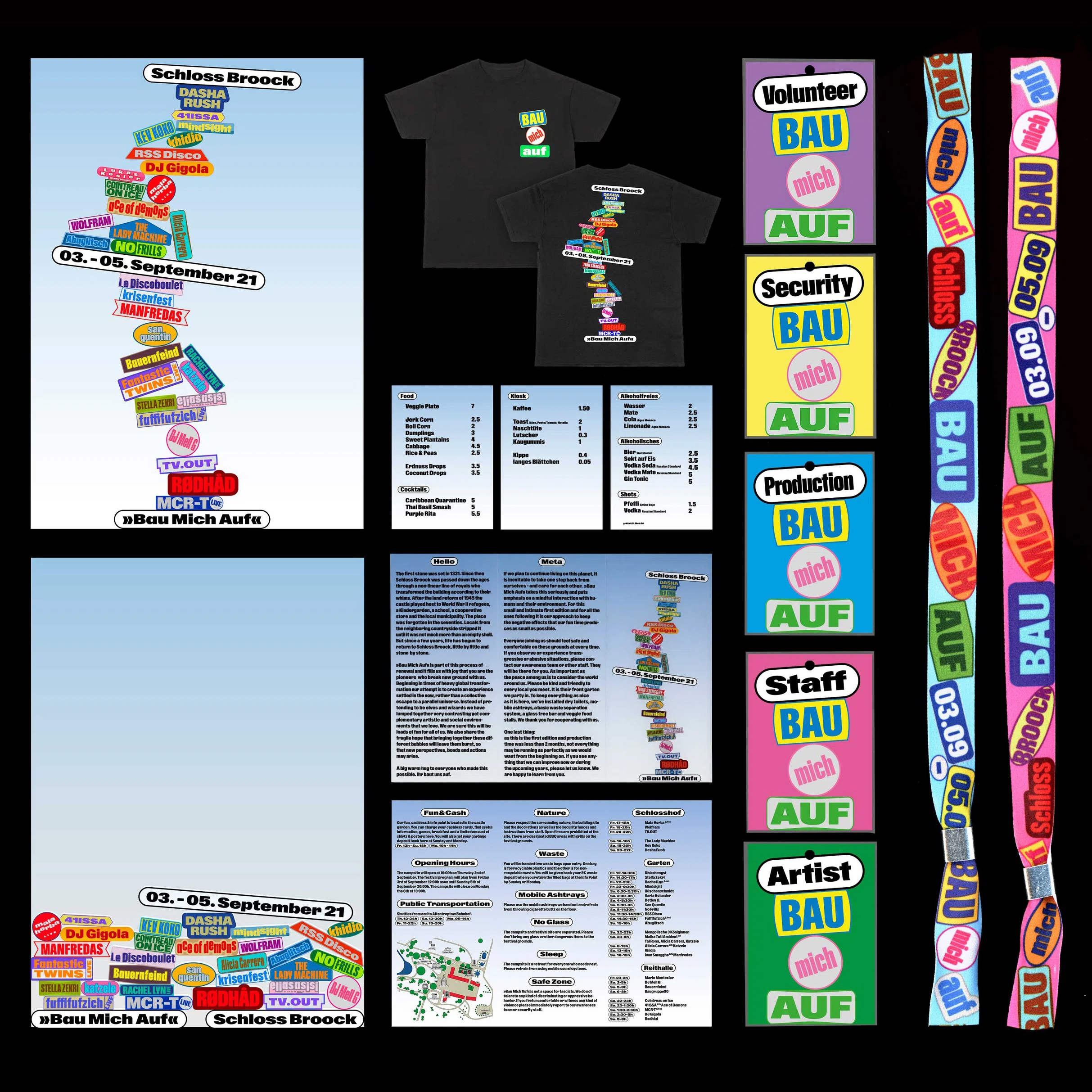
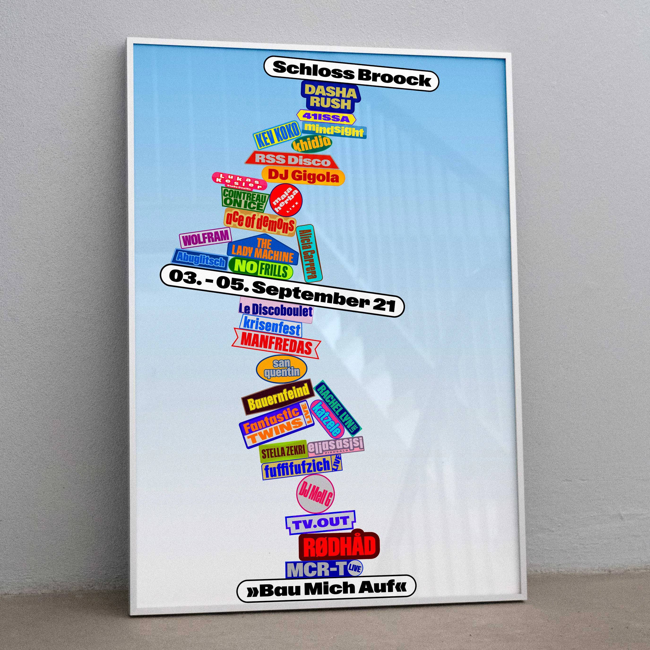
Bau Mich Auf festival
Bau Mich Auf (“Build Me Up”) is an electronic music festival at Schloss Broock in Alt Tellin, two hours north of Berlin. The first edition took place in September 2021. Yosh Schreiner and Tim Lindacher of Live From Earth made early use of ABC Gravity for the event’s identity.
Through associations with outlandish castles and scaffolding, the design duo arrived at a series of posters on which the design is built up with individual blocks for each artist – a series of constructions that seem to capture the moment just before or after the structure collapses. Dinamo’s variable font Gravity proved to be the ideal building material, with just enough variety to avoid becoming too boring or repetitive, yet modest and “regular” enough to not draw too much attention to its shapes. “Gravity” is also built into the fonts in the form of stylistic sets, where all or selected letters float up to match the cap/ascender height.
See the original version of this post on Fonts In Use, where it was contributed by Dinamo Typefaces.
Amon Sûl Ravenloft Laputa
41ISSA b2b Ace of Demons AbuGlitsch ALCATRAZ live Alicia Carrera Asaf Samuel ascendant vierge live Bauernfeind Clara Cuvé Decha MCR-T live Mechatok Nene H
No Frills Perra Sita Meo live Tai Rona Red Axes DJ Gigola Elias Asisi light design