In the archives of the Klingspor Museum in Offenbach, Germany, many a typographic treasure lies dormant alongside one or another type-design curiosity, some of which are over 120 years old. Most of the historical material originates from the former type foundry of the same name, which made type history in the early 20th century with artists such as Otto Eckmann, Peter Behrens, and Rudolf Koch. In addition to artistic specimens that advertised the finished products, sketches, and other process materials provide insights into the creation of printing typefaces. With their approximately 60 boxes, they make up only a fraction of the museum’s library – albeit an essential one – and yet they are the largest-surviving and most-coherent collection of materials from the Gebr. Klingspor typefoundry. Each box looks different from the inside: Some can hardly be closed because so many loose sheets are piled up inside them, and others are very light, containing just two little booklets. The approximately 2,500 objects have not yet been fully inventoried, let alone digitized. So what is it like when such a collection goes digital? What is our view of the historical material today? Are the objects still of interest at all?
Eckmann-Schrift, which was realized with the young painter and illustrator Otto Eckmann, was the first »Künstlerschrift« [artist’s typeface] at Klingspor. At that time, the foundry had not yet been renamed and was still called the Rudhard’sche Gießerei, as it had been before the Klingspor brothers took over. This art nouveau typeface appeared in 1900 and became one of the key moments for the company. It helped Gebr. Klingspor attract a great deal of attention. The typefaces was later extended with bold and inline style. Eckmann also began work on an Italic, which, however, was not completed due to his early death. Sketches for it can also be found in the museum’s archive. Photo: Klingspor Museum Offenbach.
Work on the Eckmann-Schrift began in 1899, and the process reportedly wore out two punchcutters before a third finalized the typeface. That was the punchcutter Louis Hoell, who was sent to Eckmann in Berlin, facilitating more direct collaboration. This typeface clearly shows how beautiful letters in themselves do not make a good typeface yet. When compared with specimens of the finished typeface, significant changes are noticeable: The forms are less eccentric and fit together with less white space. Eckmann himself writes in the introduction to the foundry’s specimen brochure about the cooperation between the artist and the expert with a practiced eye and the necessary tools. Making a parallel between his typeface and contemporary furniture design, he wrote that: “we see the great wooden arches and flourishes tearing apart quickly and then falling apart – without it being the practitioner’s fault, for he had not been given a chance to speak up.” Photo: Klingspor Museum Offenbach.
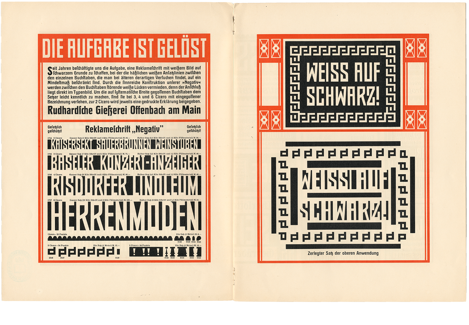
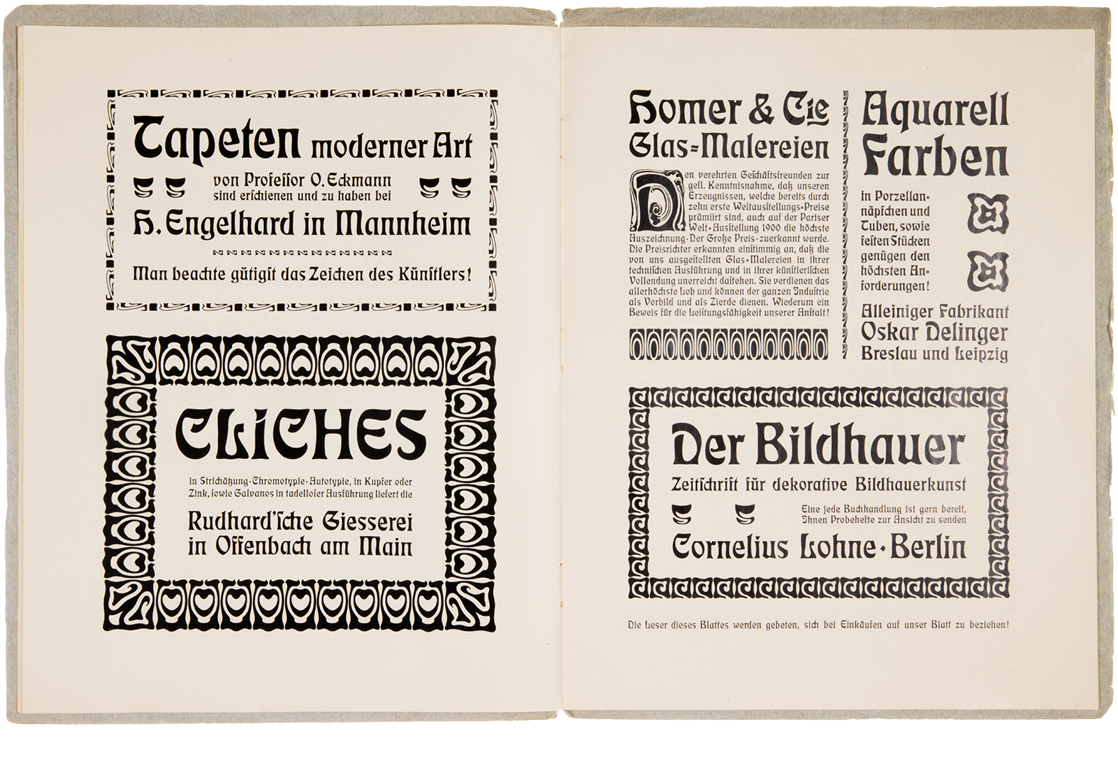
Negativ tackles the challenge of printing “white on black.” What is easy to do on the computer today was much more complicated back then: everything else had to be printed, except the characters. The trims and print areas around the letters must therefore be seamlessly connected to achieve the desired result. The technical setup is nicely illustrated in the type specimen, and the printed, multicolored examples show the whole thing very nicely in use. Photo: Klingspor Museum Offenbach.
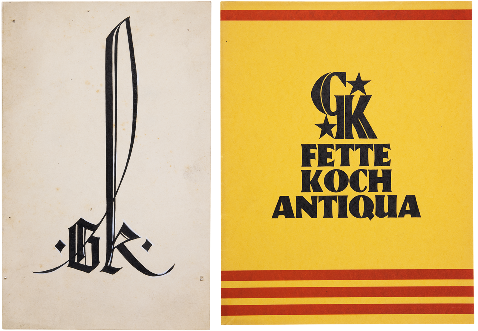
Digital collage. The type foundry Gebr. Klingspor was known for its innovative and formally diverse typefaces, as well as for the artfully produced type specimens with which they advertised their products. Following a holistic design principle, their attention to detail is also evident in many very different company signets: a separate logo – like the one you can see above to the left – was designed for almost every type specimen, matching the style of the respective typeface. The signet adorning the specimen for the Schmale Deutsche Schrift is shown here. On the right, you can see a Gebr. Klingspor company logo on the cover of the Fette Koch-Antiqua specimen from 1926, which also matches the typeface. Photos: Klingspor Museum Offenbach.
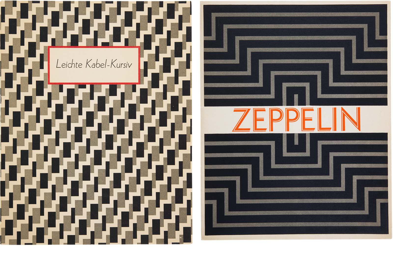
Digital collage. Rudolf Koch designed Kabel, a geometric sans serif typeface, at Karl Klingspor’s suggestion. The market for sans-serif typefaces was already highly competitive at that time. The release of the first weight in 1927 made Kabel a contemporary of Erbar Grotesk (from Ludwig & Mayer) and Futura (from the Bauersche Gießerei), which appeared in the same year. Leichte Kabel Kursiv appeared two years later, in 1929. You can see its specimen’s cover above, on the left. On the above right, you can see the cover for Zeppelin. Originally intended as a display extension (i.e., for posters and headlines) to the Kabel family, this extension appeared in 1929. Another, named Prisma, followed in 1931. While the former is simply an ornamental inline variant of Kabel, the latter is more complex. With its strict construction, it lives up to the attribute “geometric sans serif” even more than its more prominent sister, Kabel. Photos: Klingspor Museum Offenbach.
Although Rudolf Koch’s Kabel typeface followed the prevailing fashion of geometric sans-serifs and was purely constructed instead of being based on Koch’s handwriting, it clearly shows calligraphic influences and historical allusions. The Rundbuchstaben (round capitals) supplement, with its Art Deco touches, and the optional Geschriebene Initialen (written initials) each especially set the typeface family apart from the dogma of pure objectivity and practicality inherent in the zeitgeist of the 1920s. Photo: Klingspor Museum Offenbach.
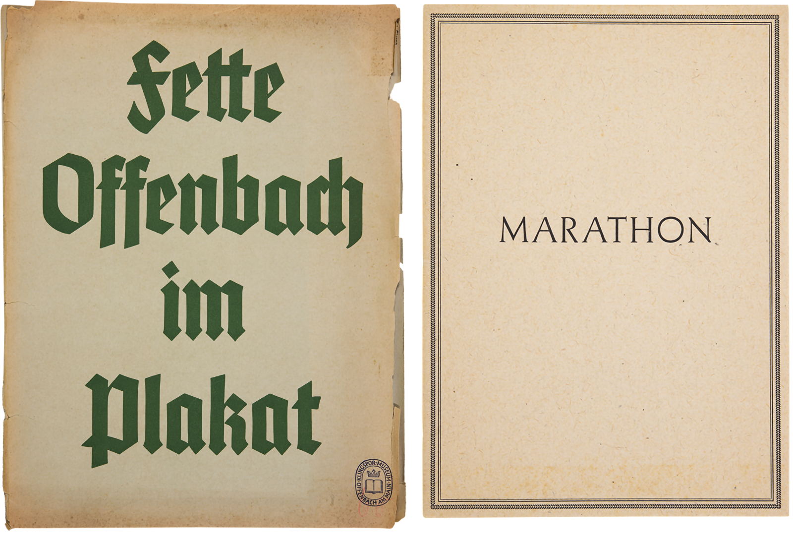
Digital collage. Like the Kabel typeface, Offenbach was not based on handwritten models. Its design was constructed instead. Offenbach appeared in 1934 and was thus one of the last typefaces from Rudolf Koch before he died. The cover for a Marathon specimen is shown above on the right. Marathon was a serif typeface designed by Rudolf Koch in the 1930s. He even cut the steel punches for one size of the typeface himself. Photos: Klingspor Museum Offenbach.
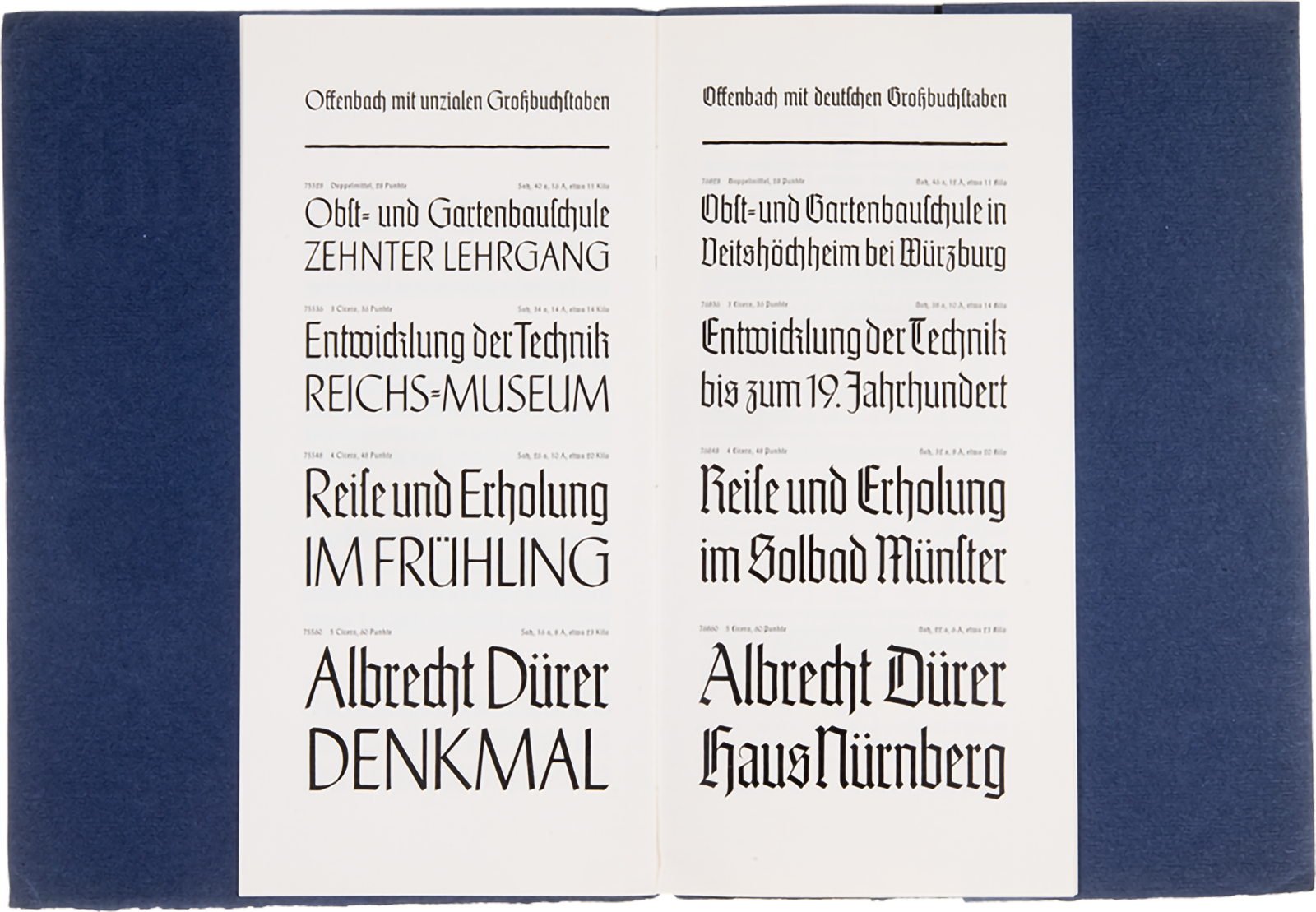
Offenbach is a hybrid typeface containing two sets of uppercase letters: One has blackletter forms, while the other has roman ones. Because of their stroke weights, they can each be combined well with the lowercase alphabet. These options give the typeface a very different character in one direction or the other. Photo: Klingspor Museum Offenbach.
We have been familiar with the archive for several years now, thanks to our studies at the nearby University of Art and Design [in German: HfG] and our involvement with the Klingspor Institute for Type Design, which promotes teaching and research on-site as a cooperation between the museum and the university. Over time, our view of the historical legacy has changed: While Klingspor was initially not a household name to us, and the old printed matter was primarily formally interesting, curious, or irritating, we gradually became aware of the stories attached to the objects, their partial contradictions and the interest they enjoy internationally. The museum’s archive is incredibly hands-on, and the originals can be viewed independently on-site, yet we couldn’t shake the feeling that (not only) we were missing the “big picture” of what was inside it. With every visit, something new emerged – classic archive FOMO. Through our own type projects, as well as our teaching at the HfG, our collaboration with the museum on publications, and an exhibition on the history of the typefoundry, we developed a concept to give the analog archive a digital extension: A platform that supports visibility and location-independent accessibility to the collection, which contributes to the conservation and inventorying of the objects, and which offers entirely new possibilities to contextualize them. Finally, and most importantly: All of this is part of a public institution and, therefore, should be freely accessible.
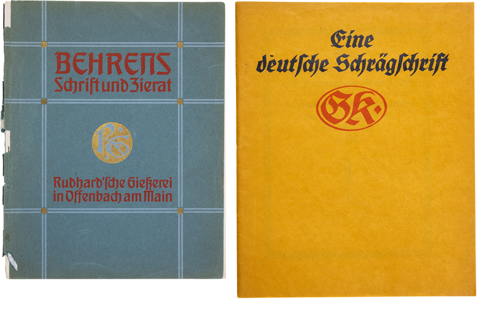
Digital collage. Behrens-Schrift was the second »Künstlerschrift« to appear at Klingspor, in 1902. Like its predecessor, the Eckmann-Schrift, it was also a hybrid typeface in the spirit of Art Nouveau. Yet, instead of sweeping organic brush shapes, it had a more constructed and architectural character. The Werkbund artist Peter Behrens was active in various design fields in addition to architecture and designed, among other things, the visual appearance of the AEG and various objects of everyday life. Klingspor’s Deutsche Schrift (later also often called the Koch-Schrift) was created from 1906 onwards. It was Rudolf Koch’s first printing typeface. Its clear calligraphic influence soon makes it a real bestseller. Due to the high demand, it gradually expanded into an entire typeface family that included more than 15 styles, including an italic (Deutsche Schrägschrif) in 1912. Hardly any other typefaces by Rudolf Koch grew into comparably large families. Allegedly, the economic success of this typeface was so significant for the foundry that the construction of an entire extension to the company factory was built with its earnings. Photos: Klingspor Museum Offenbach.
The collaboration with Klingspor was initiated by Behrens. Behrens-Schrift was his first typeface. In the years to come, it was to be followed by other typefaces also published by Gebr. Klingspor (or the Rudhard’sche Gießerei). During the process, similar difficulties arose in the cooperation, as had been the case with Eckmann. Behrens himself wrote in the introduction to the specimen brochure for the Behrens-Schrift, “If I now compare my first drafts, created three years ago, with the finished typeface, I must admit that there is a considerable amount of work in between, and the finished typeface often deviates quite a bit from the letters that were drawn rather large at the beginning. [...] Then it became clear to me that it is good if a single letter has a beautiful form, but the essential thing is how the individual letters relate to each other, how they join together without leaving holes, and that the individual letters are subordinate to the word and sentence composition. It turned out to be necessary to simplify some forms, which are good in themselves, in favor of the sentence-picture, and to change them, even if often with a heavy heart.” In his next typefaces, we can observe how he takes these particular requirements more into account from the outset. Photo: Klingspor Museum Offenbach.
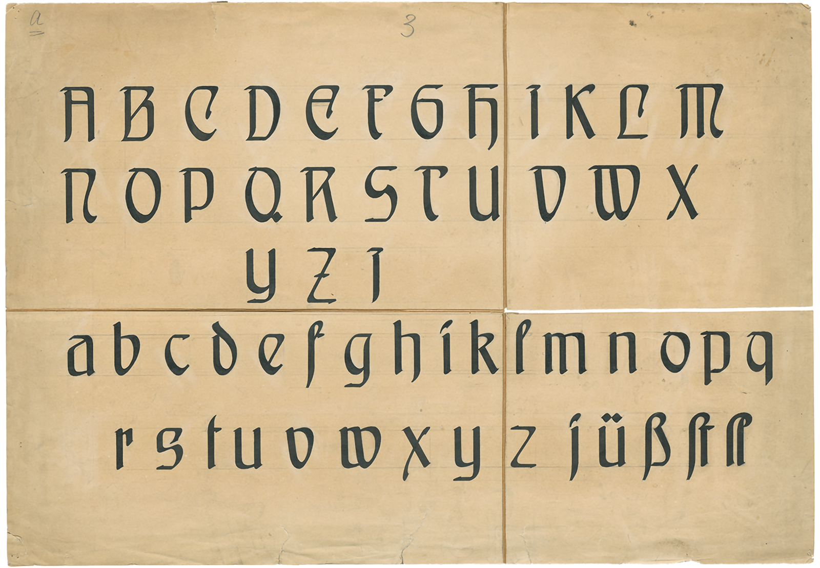
In many of Koch’s projects, work started with calligraphy, which then became the template for a later printing typeface. In the case of the Deutsche Schrift, the design began with a handwritten copy of the Gospel of John from around 1908. Above, you can see a handwritten preliminary drawing for his Deutsche Schrägschrift, the family’s italic. Photo: Klingspor Museum Offenbach.
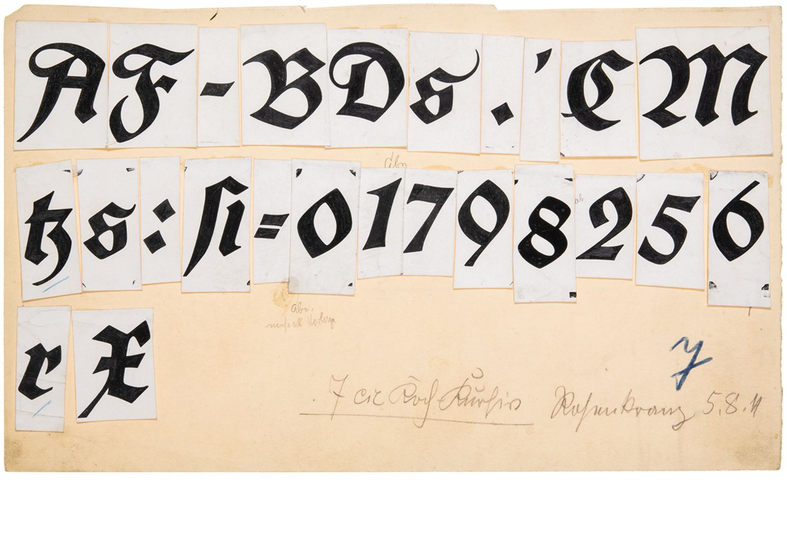
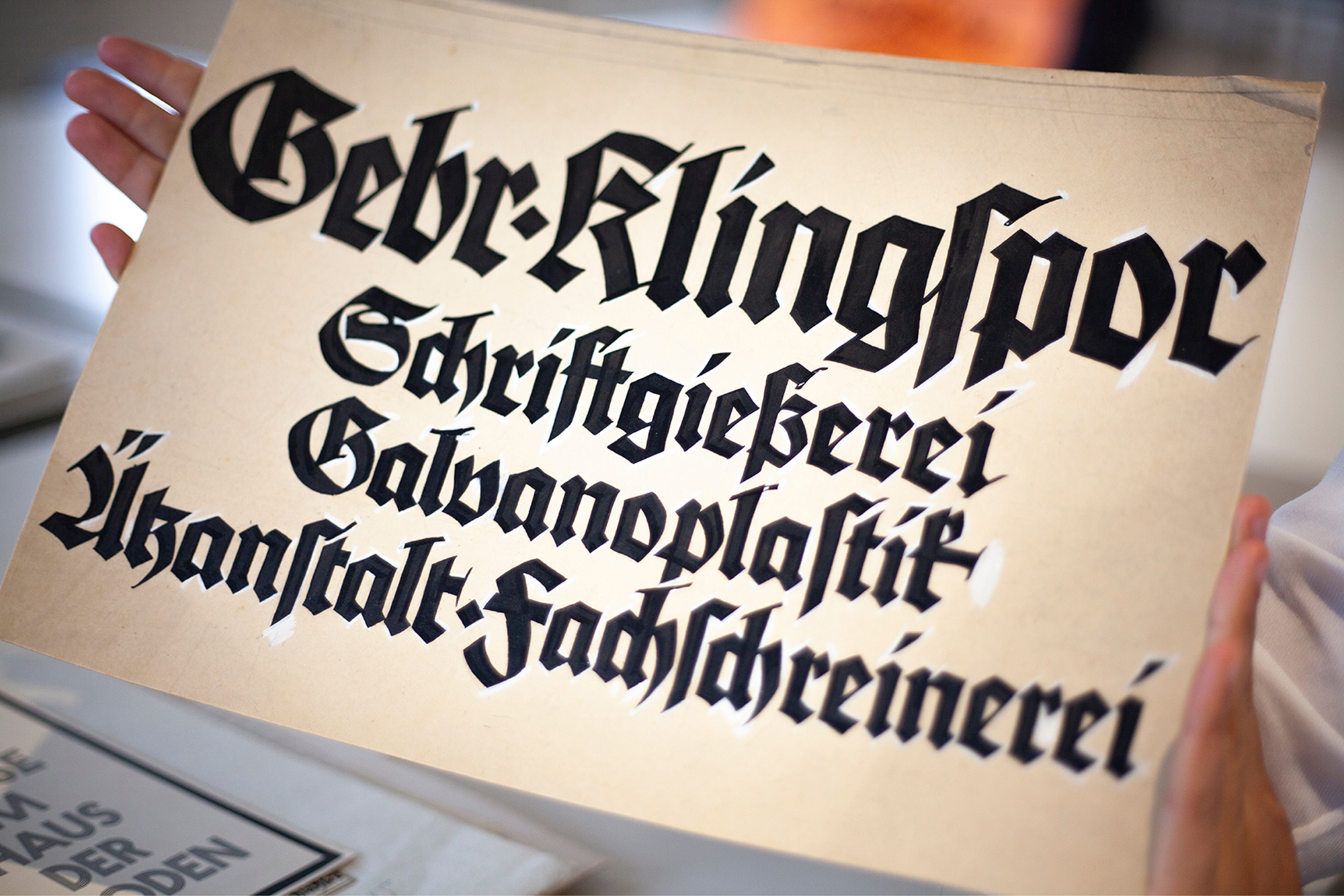
Especially in the case of the so-called »Künstlerschriften« (artists’ typefaces), such as those sold by Klingspor, the artist’s personality – with its individual creative spirit – was in the foreground. Often, these typefaces were even named after their creator, and it was not uncommon to find a concept text by the author in the corresponding type specimen. Even though little can be found in the archive about most of the company’s employees, it is clear from the material that it took many hands to create a typeface. A foundry employed various experts and skilled workers (not exclusively men) in its numerous departments. Their work was indispensable. Despite all the artistry, typefaces at Klingspor’s time were above all industrial products. Photo: Klingspor Museum Offenbach.
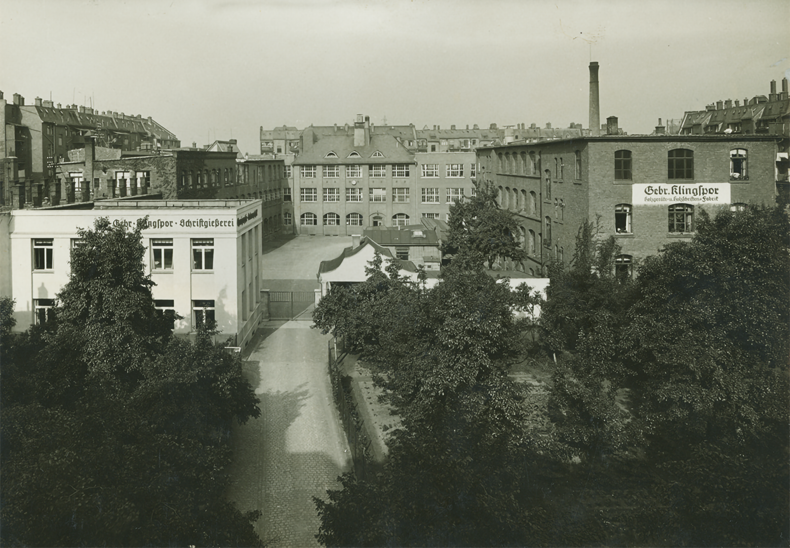
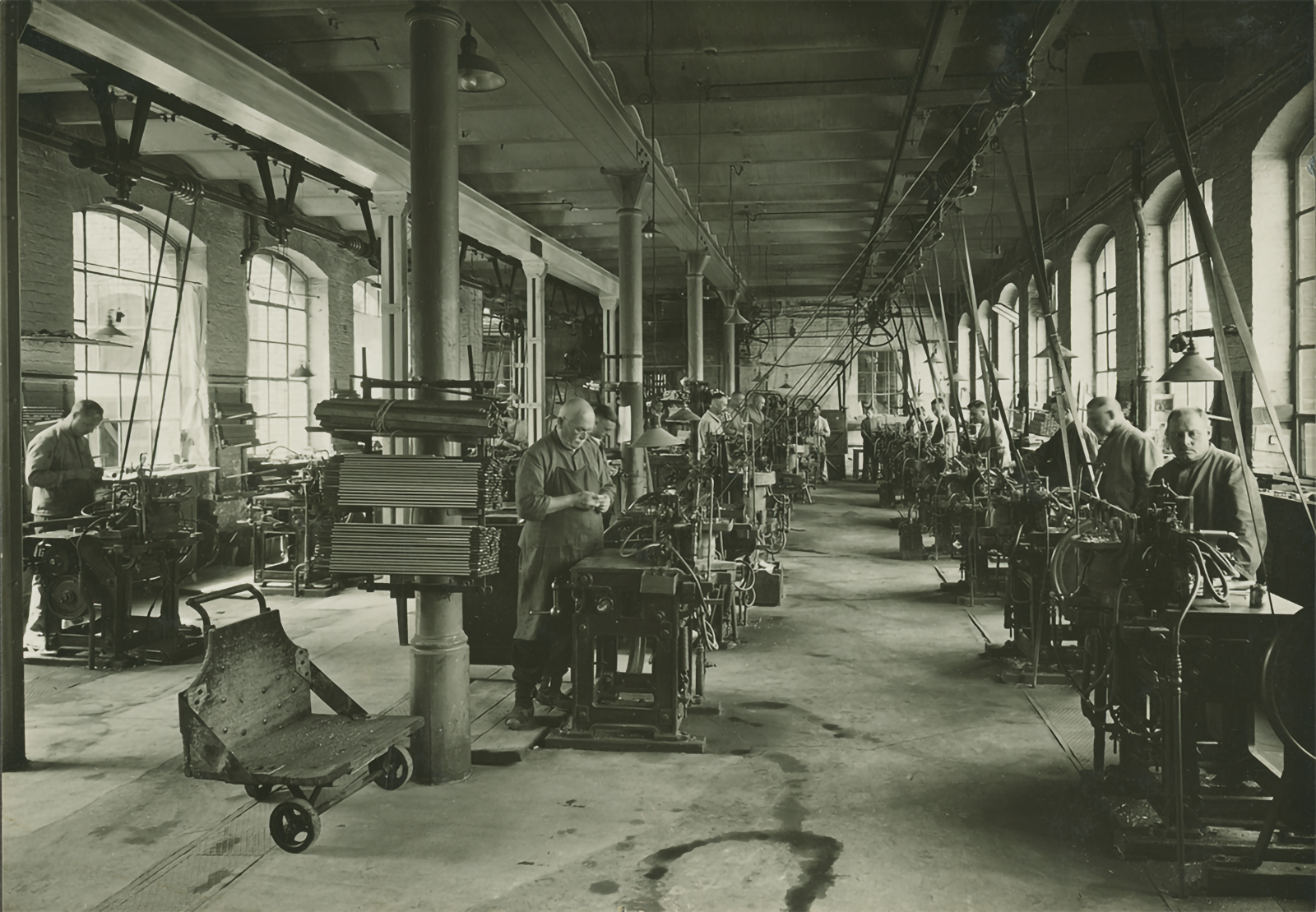
Gebr. Klingspor was one of several typefoundries in Offenbach and, with almost 400 employees at times, an important employer in that industrial city. The company was part of a long tradition of type and books in Germany’s Rhine-Main region – with the Gutenberg city of Mainz and the (book) trade-fair city of Frankfurt in the immediate vicinity. Photo: Klingspor Museum Offenbach.
The above image is a cropped photo of a design from the Neuland box in the Klingspor Museum’s archive. It is one of a handful of process sheets and it shows lowercase letters for the typeface. However, Neuland was only available as a pure uppercase alphabet: as Neuland and Lichte Neuland (Neuland Inline). Photo: Klingspor Museum Offenbach.
Between 1913 and 1914, Rudolf Koch designed his Frühling typeface. It was registered in 1914, but because of the war, the first specimen only appeared in 1917. This delicate Fraktur shows strong similarities to his handwritten book »Vom Judentum« [On Judaism]. Koch often developed typefaces from handwriting. Type design and independent projects can cross-fertilize each other, as Frühling illustrates. Photo: Klingspor Museum Offenbach.
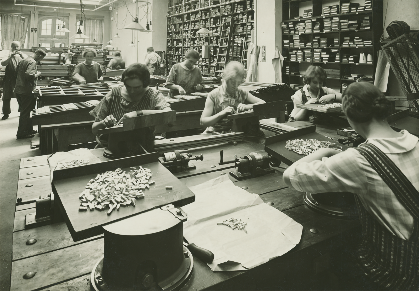
Photos in the archive show that the company was by no means exclusively male. What the roles and the contribution of the (non-male) workers were, however, remains mostly unclear. At Gebr. Klingspor, only typefaces were published whose authors were men. Photo: Klingspor Museum Offenbach.
What initially began as our diploma project grew into an official collaboration with the museum. If we had known at the time what kind of work would be in store for future Leonie and future Laura, we probably would have kept our hands off it, but fortunately, archive fever and collecting mania prevailed. At first, however, we had a lot of questions: Where to start? What differences and added value could a digital archive offer compared to its analog starting point? And how could we adequately map the physical objects in an online space? Even though the museum’s library is open to the public, not everyone is aware of its existence or knows what to ask for when visiting it. A digital archive should be equally usable for specialist audiences and interested laypeople without prior knowledge of the museum’s collection. We have therefore designed various access options: In addition to targeted searching and sorting, the site also lets you rummage around unintentionally at any time, offering a range from as little info as necessary and as much as possible, depending on need. The question of how to digitally reconcile such a heterogeneous collection was not an easy one to answer. How could we create a structure that was not too unspecific and, at the same time, not too small in scale? So it was all the nicer to see that, in practice, completely new synergies really do emerge via various sorting criteria (including purely formal aspects such as color or font size). And via digital linking paths and supplementary texts, we have various options for ensuring that both particularly exciting or sometimes problematic objects receive the necessary descriptions and comments.
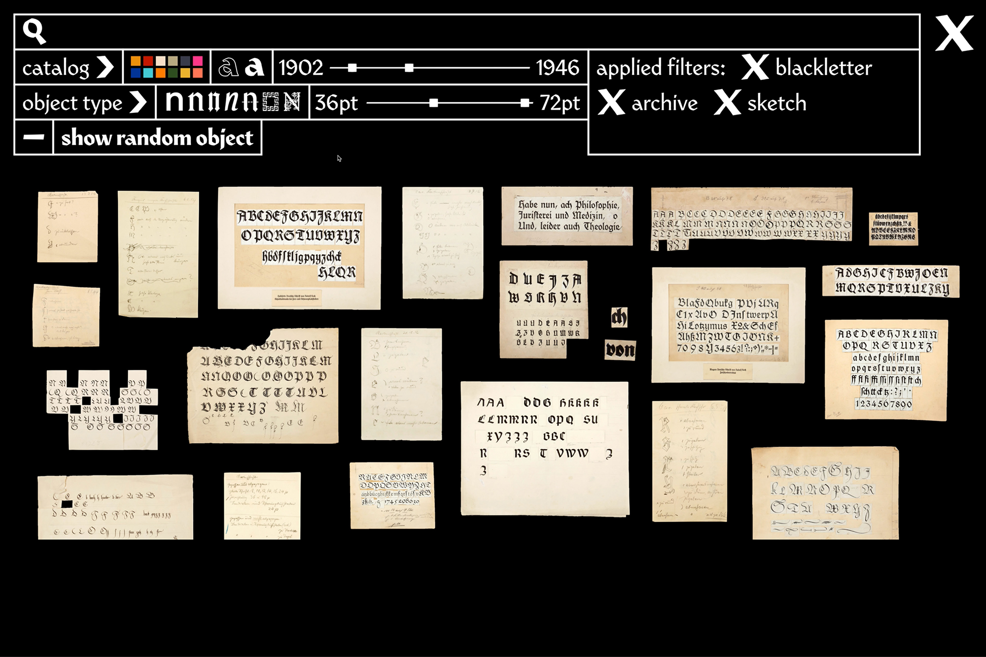
The visit to the digital archive begins with the historical objects in the catalog archive. Similar to their physical home, we grouped them by the box they are stored in and displayed them as a loose stack on the screen. The result is a screen full of large images that speak for themselves and can be moved around and searched for – as if they were spread out on a digital light table. If this seems too confusing, one can choose from two other modes that offer more of an overview and give viewers an idea of their size relations. And in contrast to the offline collection, there is no reason for fear of contact here – everything is tidied up in one click.
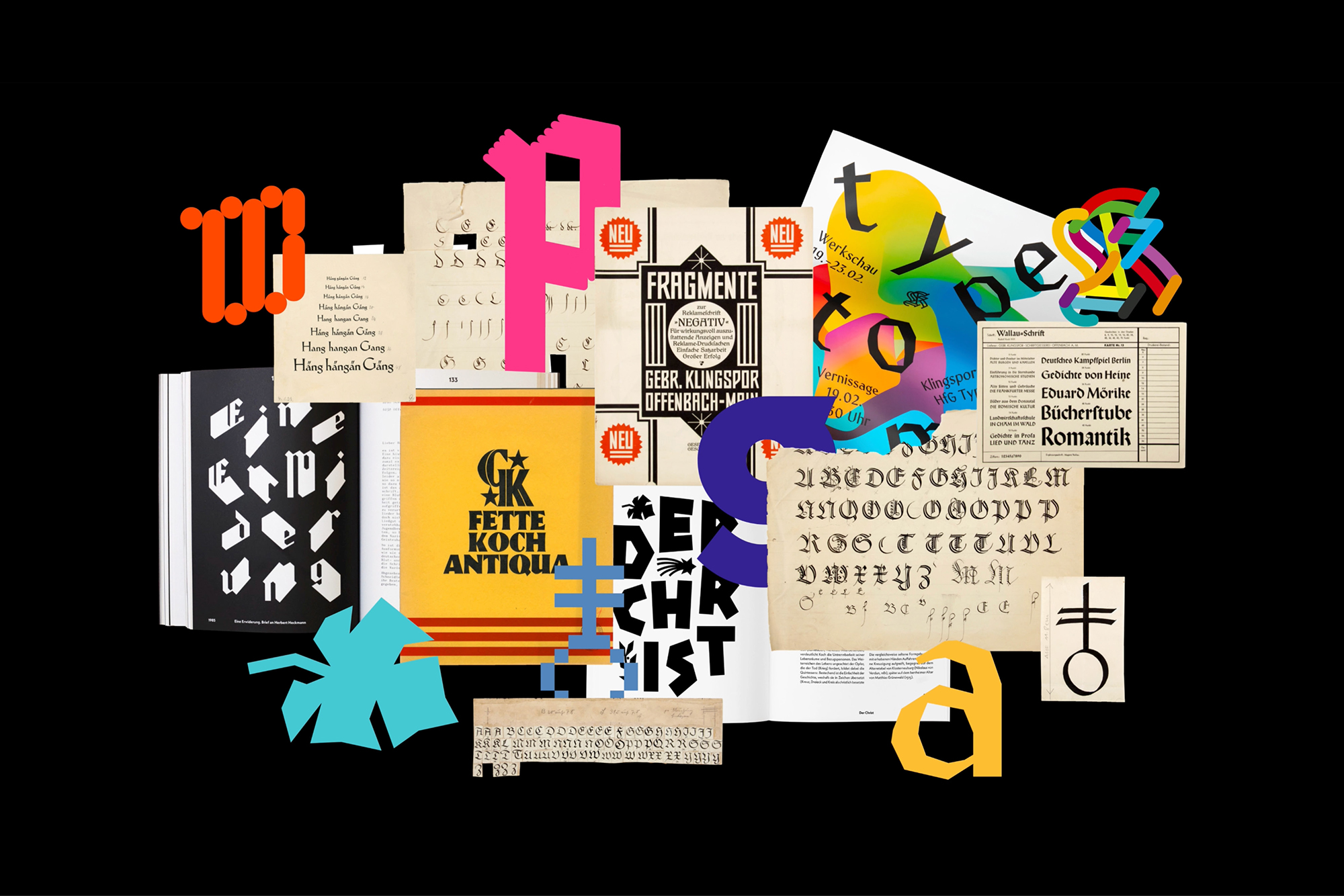
One goal of the website is to bring historical and contemporary material together. In a sense, it is a dialogue across the centuries. In any case, it revitalizes the archive and the discussion about it. That’s why we’ve mixed up the projects and decades a bit in the starting animation for the website… Image: turbo type.
The contents of the boxes vary greatly. Here you can see a view into the box »Rudolf Koch: Verschiedenes« [Rudolf Koch: Miscellaneous]. Partly they are arranged by person, partly by typeface, and partly they have a little bit of the appearance of a general store, with names like »Ältere Kleinproben« [older small specimens] or »Alte Materialien 2« [old materials 2]. Photo: turbo type.
The stack view, in which the archive material is displayed default on the website, is definitely modeled on the content of the analog boxes. Here, too, you have to dig through the stock bit by bit and don’t discover some treasures at first glance. However, the buttons in the top right corner can be used to clean up or rearrange the archive digitally. If only it were that easy offline! Image: turbo type.
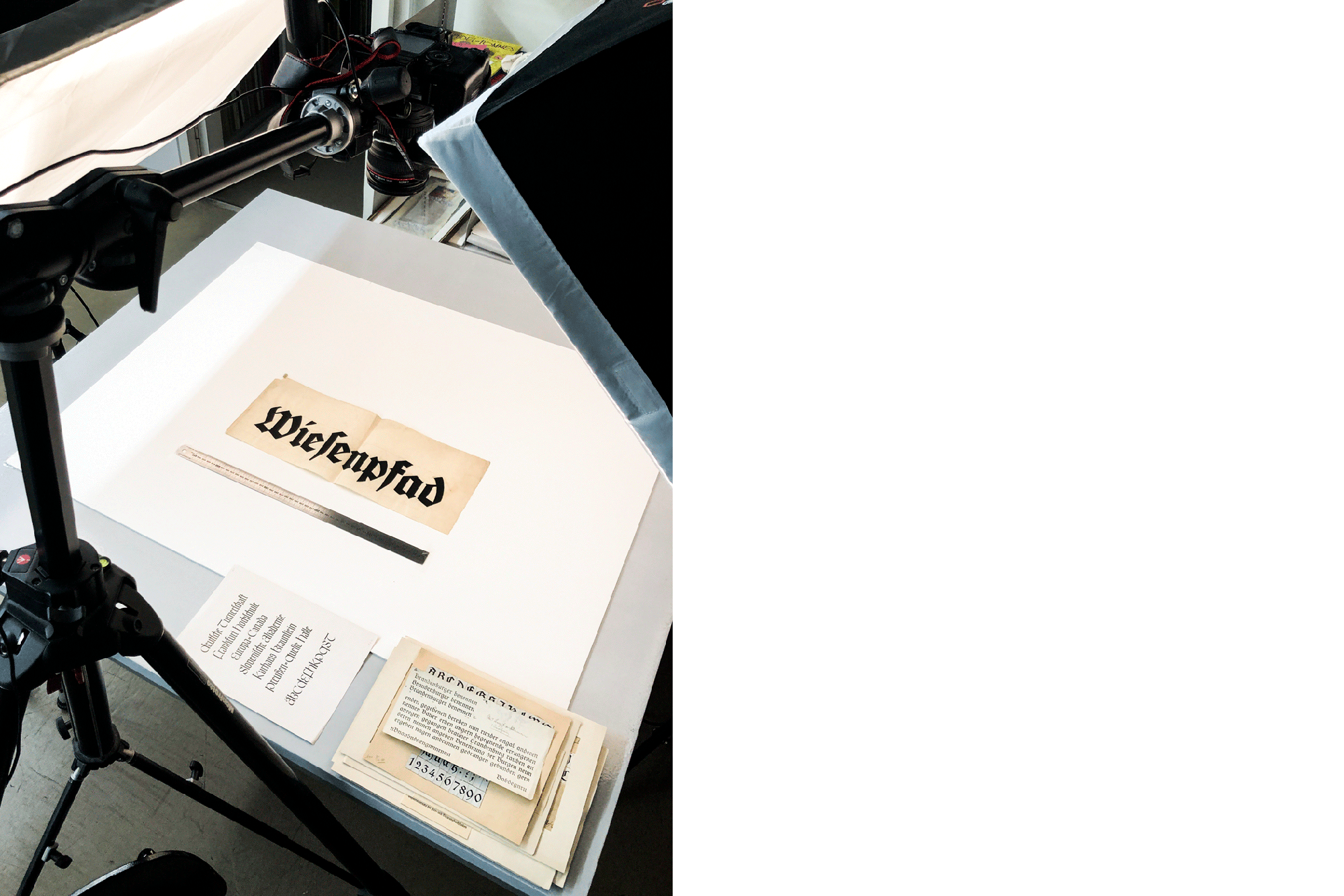
To record all the archive objects, we set up a temporary photo studio among all the shelves and historical items and locked ourselves in it for a few days. The entire contents of the shelf with Klingspor material have been photographed in the meantime, and the image processing is progressing more and more. Photo: Klingspor Institute / Marc Schütz.
The website makes browsing and discovering the collection a lot easier. And for those who really feel like searching: The icons representing the individual typeface categories in the search feature on the website are all taken from real Klingspor typefaces – their historical models are hidden in the archive… Image: turbo type.
Digitizing the archive is a good opportunity to check the sorting of the boxes and update them if necessary. Where not done, the objects are also inventoried, and the data known about them is recorded. This work also gradually makes the analog archive more searchable. However, it will be some time before all the material has found its way into the database… Photo: turbo type.
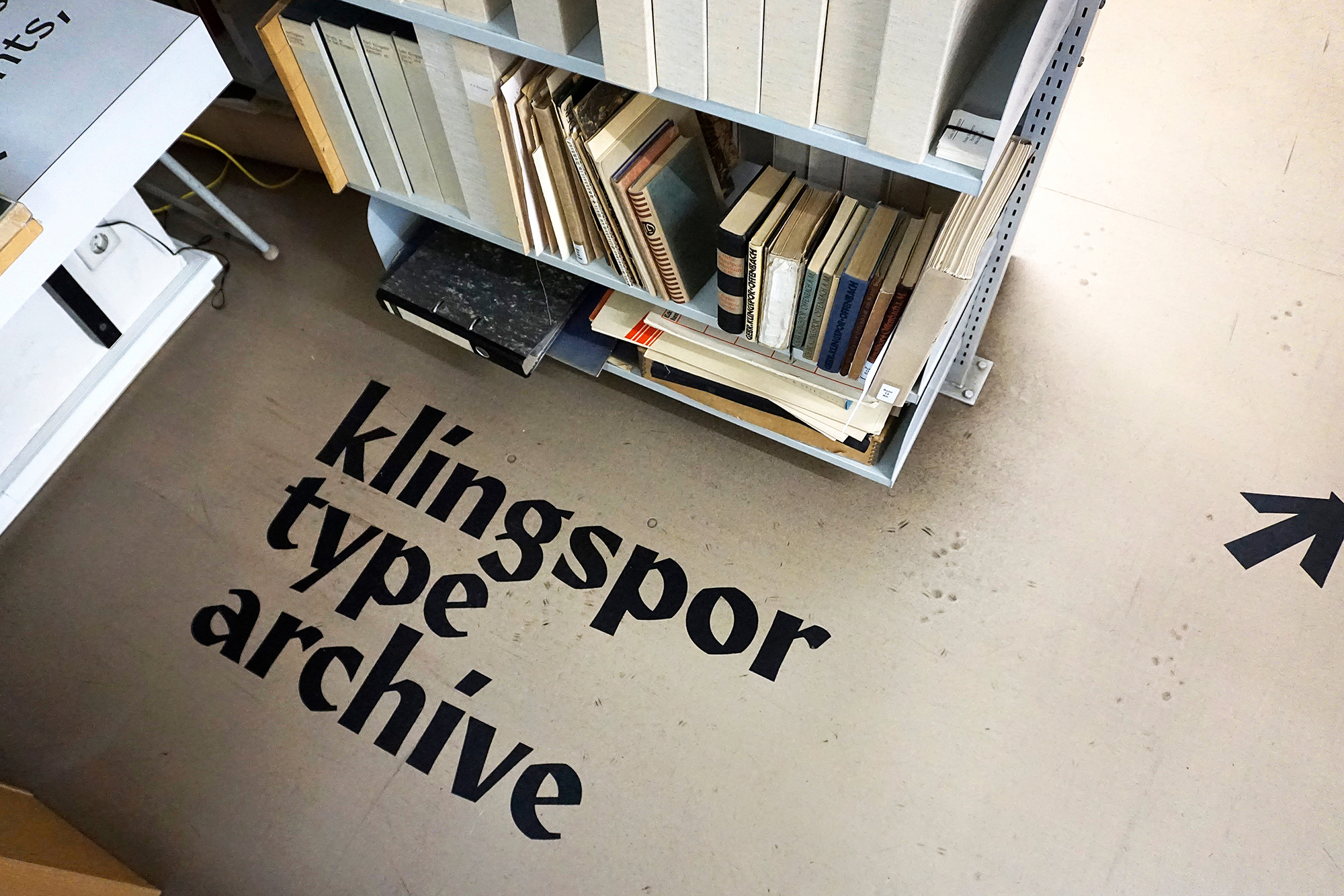
The offline Klingspor Type Archive is just a shelf full of boxes and loose samples. But a little bit of the website has made it back into the analog world, marking its own starting point. Photo: turbo type.
Sifting through the entire contents of the archive was and is a lengthy and, at the same time, exciting process that we started with the Klingspor Institute for Type Design. But even today, a few years later, we still come across new objects that we had not known about or had overlooked before. Photo: Klingspor Institute / Marc Schütz.
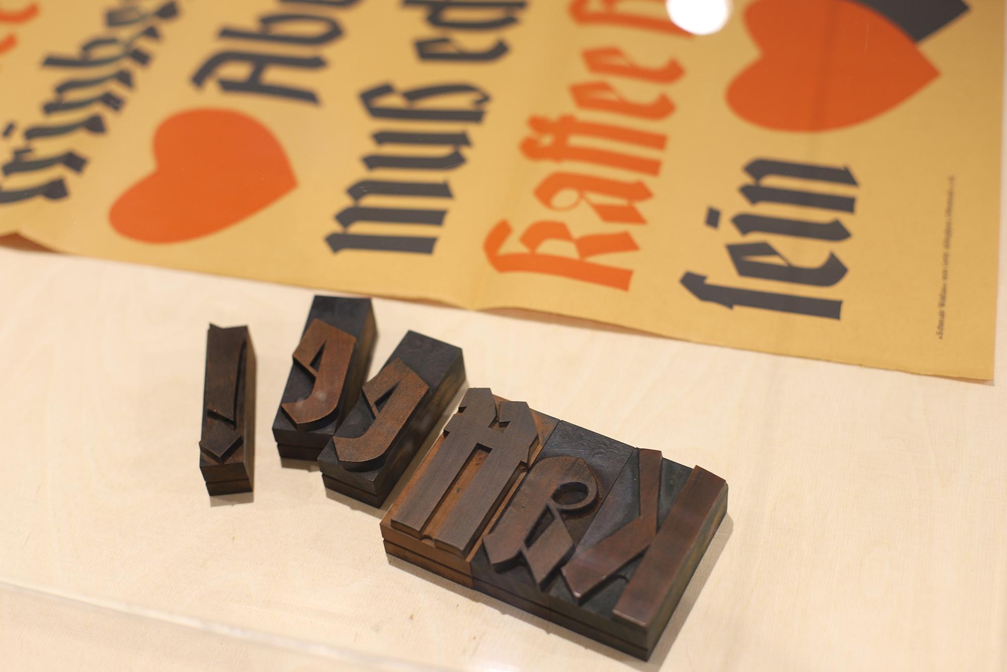
A good opportunity for research and preliminary work on Klingspor Type Archive was the exhibition Beyond the Archive in 2022, in the course of which we shipped stories about the company Gebr. Klingspor and many of its typefaces into the museum’s exhibition space. Shown above is a poster printed in Wallau with matching wooden characters from the nearby printing workshop. Photo: turbo type.
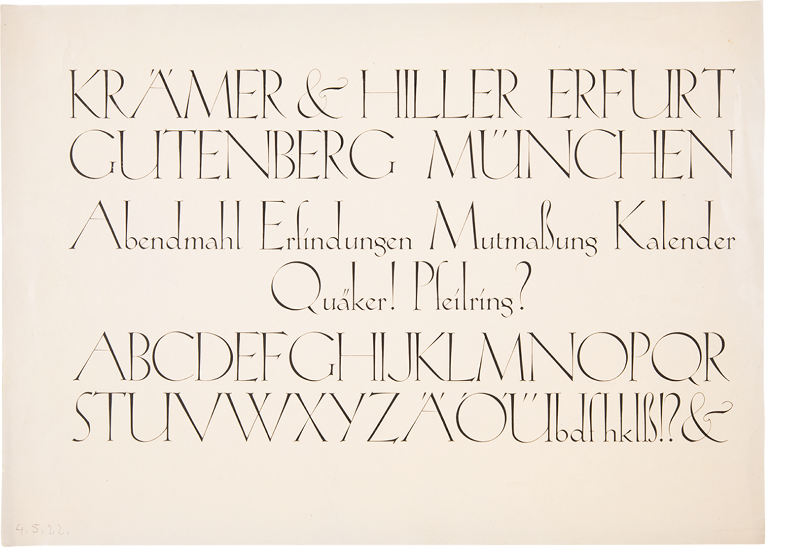
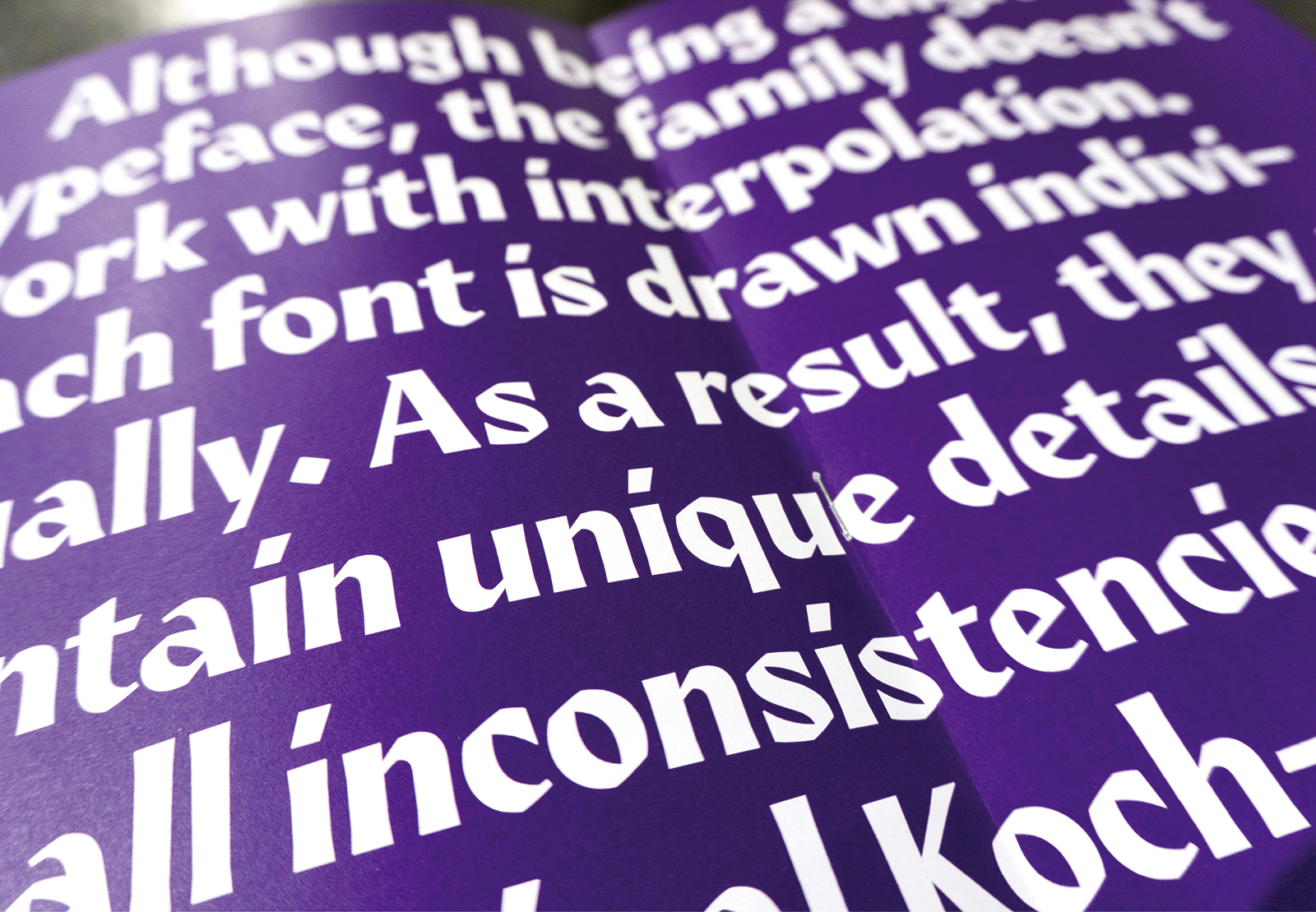
The focus of the Klingspor Type Archive is clearly on the imagery. That imagery is only supplemented by a typographical interface. The forms of all elements in the interface have the touch of a broad nib. After all, how could the online archive of a former type foundry be shaped in any other way than using type as a fundamental element? Our website’s design provides a platform and framework for its imagery, but it also takes a creative stance toward the collection. Our bespoke typeface family is also a new interpretation. It picks up from the Koch-Antiqua published by Gebr. Klingspor from 1922. Each of the four alphabets in the custom typeface – and the set of icons – were individually drawn. The font styles are not interpolated. They feature inconsistencies and handmade details reminiscent of their vivid historical model. And even the search feature, while suitable for scientific work, is a big visual toy inviting exploration with its sliders and buttons. After all, the archive – similar to Klingspor’s specimens, which were designed with a love of detail – should also be fun for the eye!
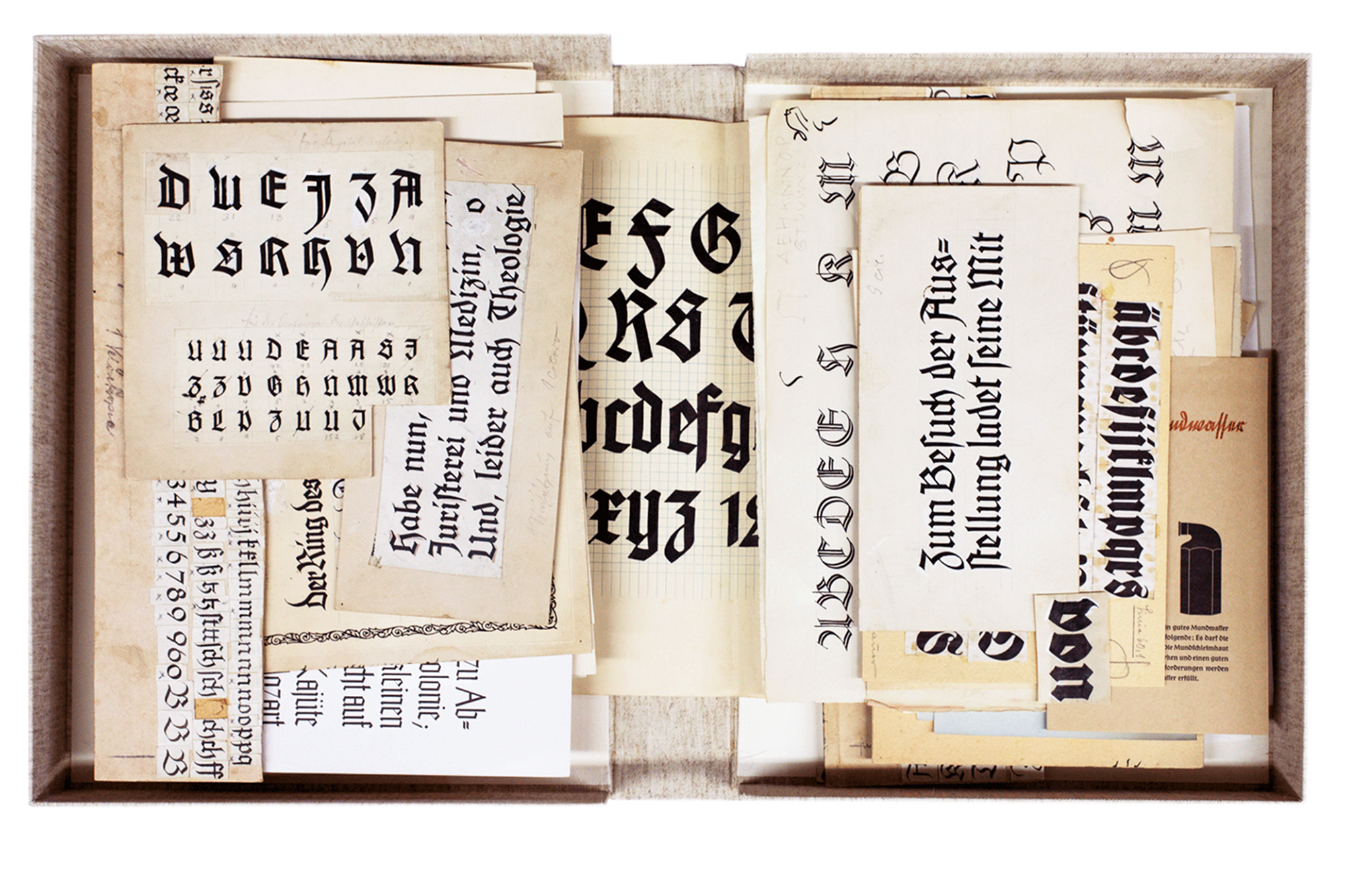
Koch-Antiqua, whose box from the archives we are looking at here, was designed by Rudolf Koch for Gebr. Klingspor. The first cut, simply called Koch-Antiqua or Magere Koch-Antiqua [Light], appeared in 1922, followed by its Kursiv [Italic] a year later, the Grobe [Heavy] in 1924, the Fette [Black] in 1926, and the Grobe Kursiv [Heavy Italic] in 1929. Also available for the typeface were ornamental initials and an additional uppercase alphabet to match the alternate minuscules with accented ascenders. Photo: turbo type.
Even though the means of production have changed significantly over the last 100 years, there are still many parallels to the design process today. Recognizing individual work steps from our own workflow and being able to trace the progression of a print typeface has taught us an immense amount about type design. This proof shows Grobe Koch-Antiqua. Photo: Klingspor Museum Offenbach.
The bars increasing upwards and the different angles, especially for the dots and dieresis, were two of the details of the historical original that also made it into our reinterpretation. Photo: turbo type.
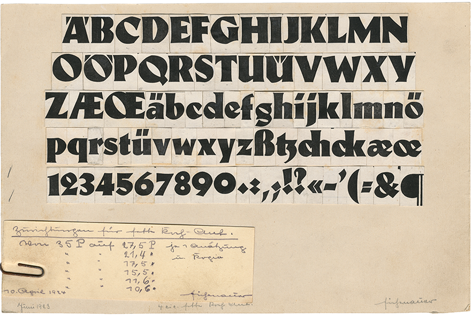
We were particularly taken with the sketches for Koch-Antiqua: in many tests, the forms are still much more expressive than the market-ready final product. For instance, the final version of Fette Koch-Antiqua [the black weight] completely lost the axis of the round forms that are still present in this sketch. The initial drafts for the typeface looked much rawer, almost woodcut-like. Photo: Klingspor Museum Offenbach.
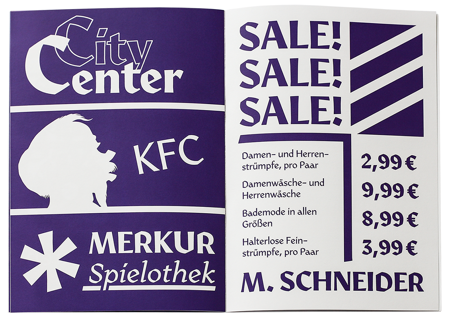
The bespoke font family for the digital archive includes a Regular Sans, Regular Serif, Bold, Italic and a set of Icons as controls for the website interface. And just as fictional ads were set in the Klingspor type specimens as examples of use in the respective typeface, we created fake ads for a few Offenbach-typical locations to demonstrate the custom fonts in print. Photo: turbo type.
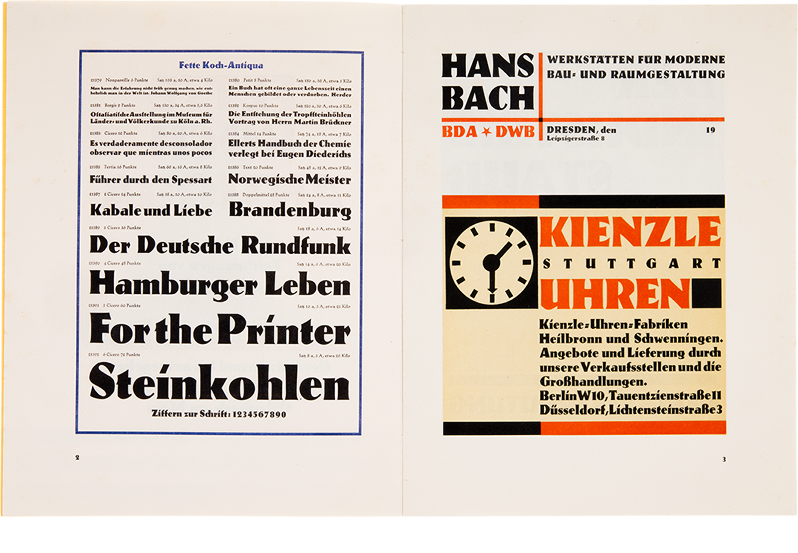
Compared to the lighter weights of Koch Antiqua, the Fette weight – with its angular forms – has almost more in common with Neuland, another of Koch’s typefaces, which comes into its own even more in the preliminary sketches. Compared to the rest of the typeface family, the broad-nib style here gives way to a much more static construction. And like so many typefaces at Klingspor, the font also has a lovingly designed type specimen with multicolored in-use examples. Photo: Klingspor Museum Offenbach.
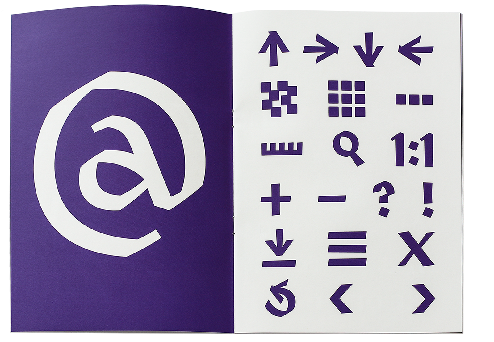
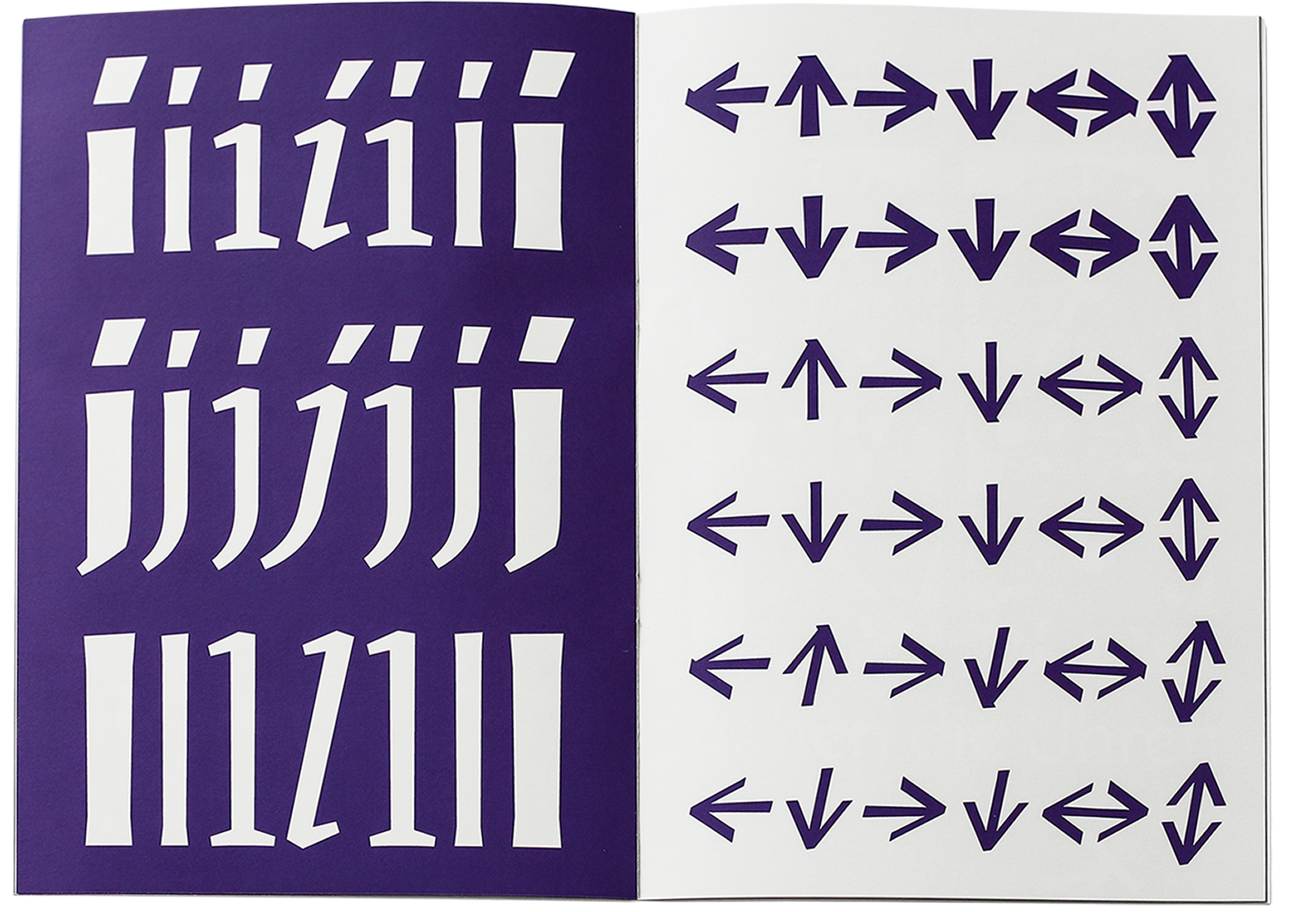
The icons bring a touch of broad-nib to the digital environment of the website. They include common interface buttons – as well as archive-specific icons, such as those for the three different view modes (stack, masonry, and row), along with a tape measure symbol. Photo: turbo type.
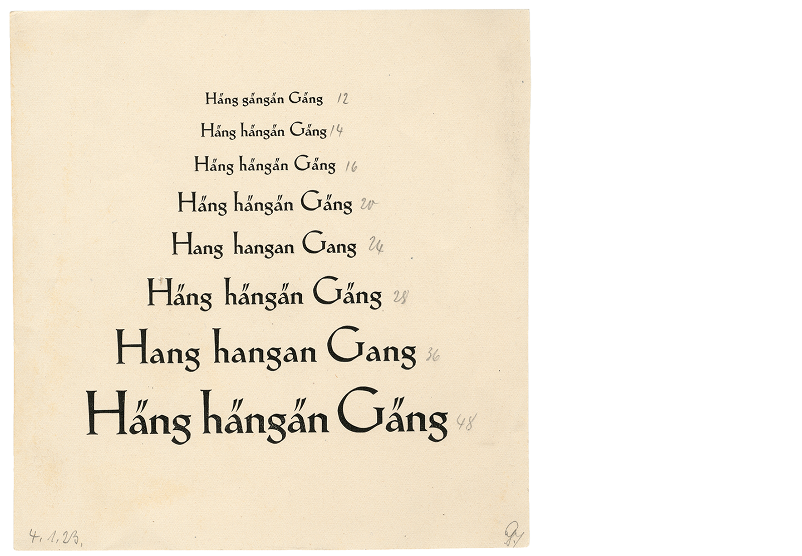
This proof of Magere Koch-Antiqua shows the alternate minuscules with extreme ascenders and the corresponding capitals in the appropriate size. They emphasize the spiky elegance of the light weights of this type family. Even without the more extreme alternates, it has a rather low x-height. Besides their elongation, the vertical bars (in both lowercase alphabets) are also emphasized by their swelling shape. Also eye-catching are the serifs, which take very different shapes and positions. Photo: Klingspor Museum Offenbach.
As a further reminiscence, a few of the Koch-typical letterforms have made it into our font family for the archive: the lowercase “e,” the lowercase “g,” or the lowercase “a” are examples of this. The latter often stands out, especially in the designs for Koch-Antiqua, because it leans extremely to the left. In the italic cut of the historical model, it almost looks like it was taken from the roman. Photo: turbo type.
Over the last few years, several type-specimen digitization projects have been underway. Letterform Archive’s Online Archive gives people from around the world access to items from its collection without having to go to San Francisco in person. The Universitätsbibliothek J. C. Senckenberg in Frankfurt digitized Gustav Mori’s collection of broadsheet specimens from the 16th through 18th centuries. Several Berlin institutions collaborated to digitize hundreds of specimens printed in that city before 1951. Last year, the St Bride Library published its pre-1831 collection of type specimens on archive.org. Websites like the Typographica Library and the Letter Library now help interested parties find digitized type specimens, whatever website might host them. Paul Shaw has posted lists to his blog as well. It is delightful to see so many people and institutions consider how to make their collections accessible via the Internet.
Pardon the interruption.
Would you like to subscribe to Fontstand Weekly Newsletter?
We never viewed the Klingspor Museum’s archive as a dead, purely historical place either. Examining the materials there caused us to think a lot about our workflow. From the variety of forms you can find at the museum, we have been able to draw inspiration for our own design practice. Developing a historical awareness of what came before us has helped us react to it better. That has even consciously caused us to design differently. The museum’s collection is also a recurring reference point for other designers and researchers. Exciting projects often emerge from their interaction with it, which they take back to their own institutions and publish through their own channels. To link these contemporary works with their historical starting point, we equipped the Klingspor Type Archive with two additional catalogs: showcase and research. We are always delighted by the diverse results and hope that the website can thus continue to contribute to a lively discourse in and around the Klingspor Museum’s archive.
Now, two years after the first concept and prototype were presented, the Klingspor Type Archive has come online. The title pages of all objects have been photographed and are gradually moving onto the online catalog. A purpose-built database has been set up, and we are steadily feeding it with content. Prominent type specimens and other highlights from the collection will continue to have their own sections, and short articles will be added over the year. So it will be worth visiting www.klingspor-type-archive.de every now and then – and the analog archive in Offenbach too!
The fonts mentioned in this article are available to rent by the month for a fraction of their retail price on
Fontstand.