For the first two-thirds of the 19th century, Leipzig was the undisputed center of the German book trades. That changed after the unified German state was founded in 1871. Then, the position held by Berlin-based companies grew ever more predominant. By 1900, the capital city had 3,384 businesses operating in the book trades. Together, they employed more than 11,000 employees. That included 541 printing offices – two of which even had in-house typefoundries – and eight independent typefoundries. Leipzig at that time only had 1,482 book-trades businesses, with a little less than half as many workers as were employed in Berlin. For our purposes, Berlin’s H. Berthold AG is particularly important. Started by Hermann Berthold in 1858, it cast metal type from 1893 until 1978. It disappeared from the market in 1993. By taking over numerous competing companies, it rose to become one of the largest typefoundries in the world during the 1920s. Over the next few decades, it helped shape the International Typographic Style’s direction – not least because it cooperated with Herbert Bayer, of Bauhaus fame, and another modern design, Georg Trump.
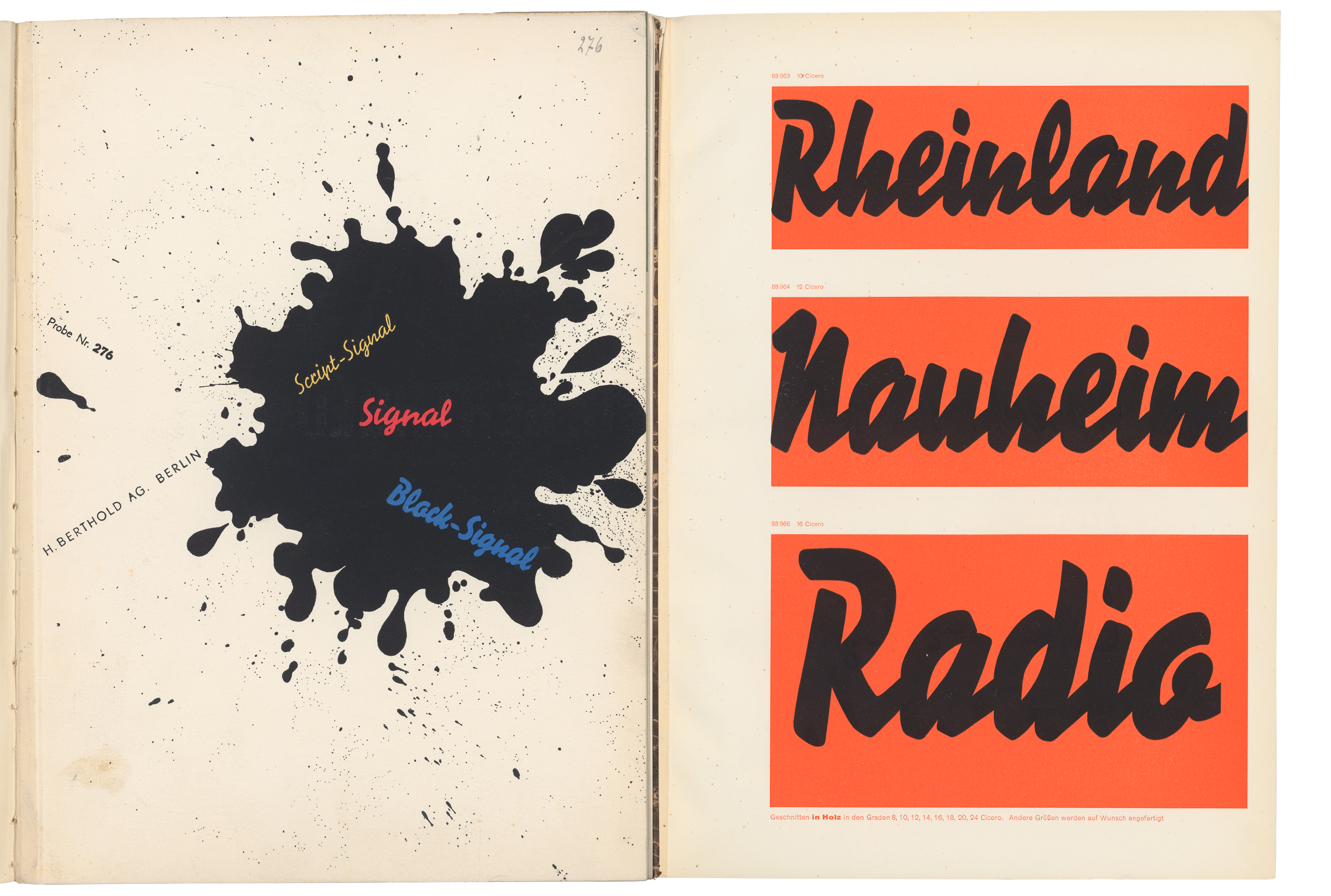
During the early 1930s, Herbert Bayer designed a specimen brochure for Berthold’s Signal typeface. Above is a collage of the digitized version from the Staatsbibliothek zu Berlin. Its cover is shown on the left. The right-hand page displays three of Block-Signal’s wood type sizes.
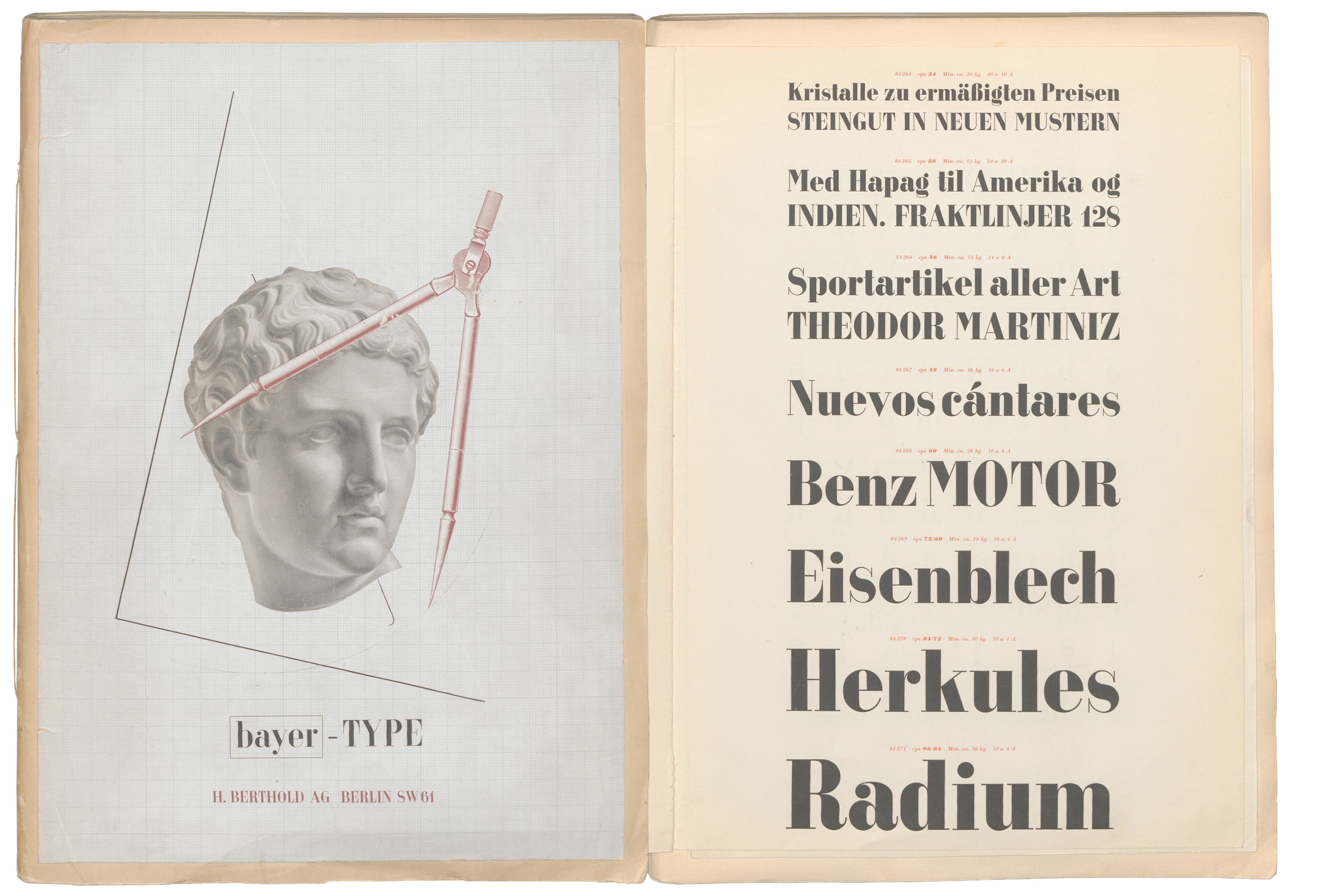
Herbert Bayer also designed a typeface for the H. Berthold AG. The foundry advertised it in a specimen brochure Bayer designed, too. This digital collage also shows its cover and one inside page. The copy of the specimen digitized by the Deutsches Technikmuseum comes from the private library of Berthold’s long-term creative director, the type design Günther Gerhard Lange (1921–2008), which the museum acquired in 2013. Lange’s copy is not in its original binding. SDTB / Hist. Archive III.2-36218.
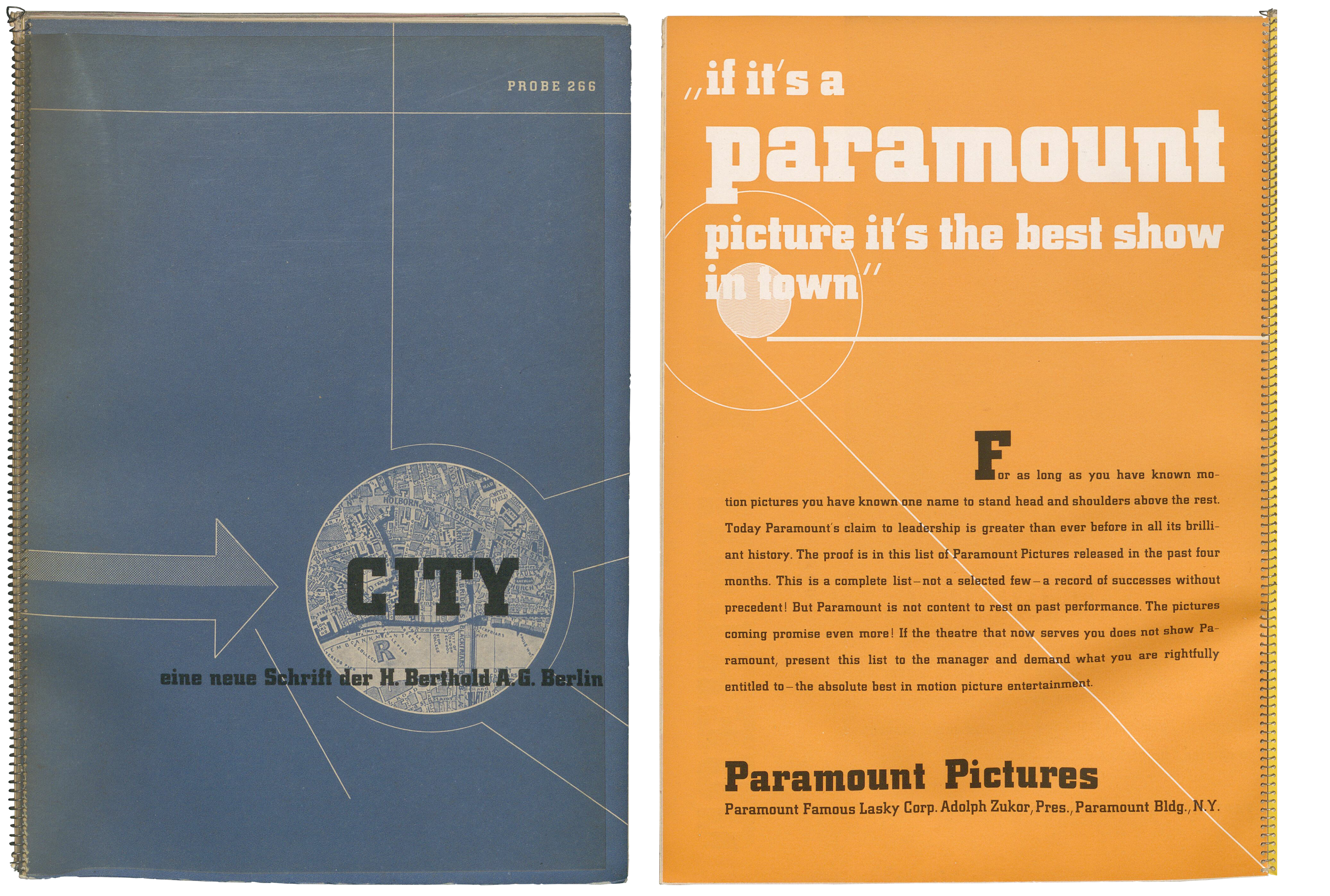
One of Berthold’s most avant-garde typefaces was City, designed by Georg Trump. The Deutsches Technikmuseum has a copy of the City specimen from 1930. Indeed, the Deutsche Buchkunst-Stiftung selected this specimen as one of the fifty-best designed books of that year. This digital collage shows the specimen’s cover and one inside page. SDTB / Hist. Archive III.2-24168.
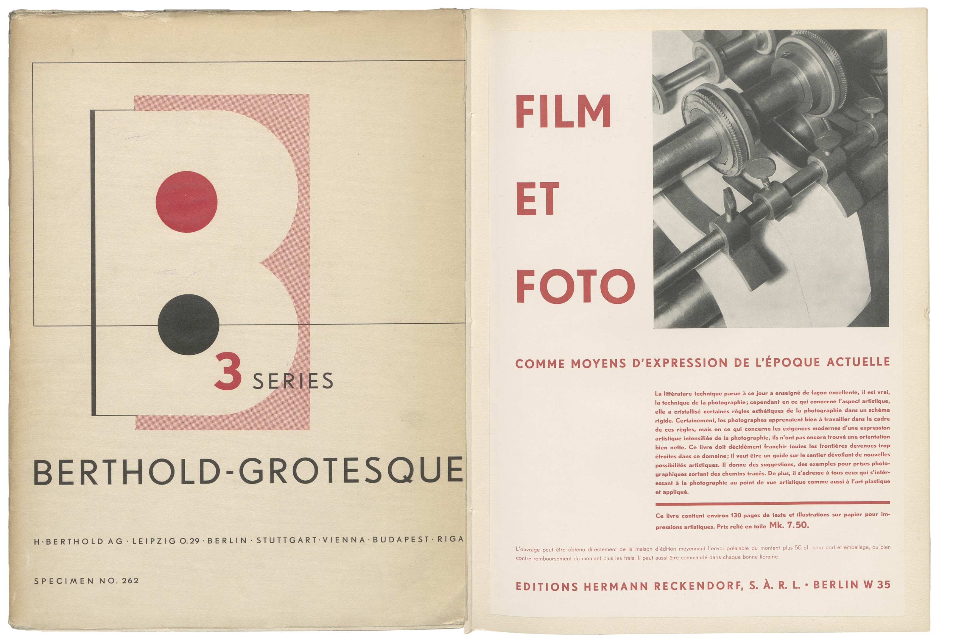
Like Bayer, Georg Trump also made graphic designs for Berthold, and he designed this specimen for the Berthold-Grotesque typeface in c. 1929. This digital collage shows the specimen’s cover and one inside page. The Lettergieterij ‘Amsterdam’ reworked Berthold-Grotesque to create the Nobel typeface. SDTB / Hist. Archive III.2-23733.
The richness and material variety of the typographic culture in Berlin during the 19th and 20th centuries is not only reflected in the wood, synthetic, and metal type its firms manufactured or the printed matter produced with them. No, the type specimens from those companies are equally as relevant for studies of the city’s economic, art, and cultural history as they are for the history of books and typography. Those type specimens ranged from just a few sheets of paper to hardbound catalogs with more than 1,000 pages. In-house and independent typefoundries alike used them to market their offerings of typefaces, initial letters, ornaments, vignettes, and border-printing elements to an international audience.
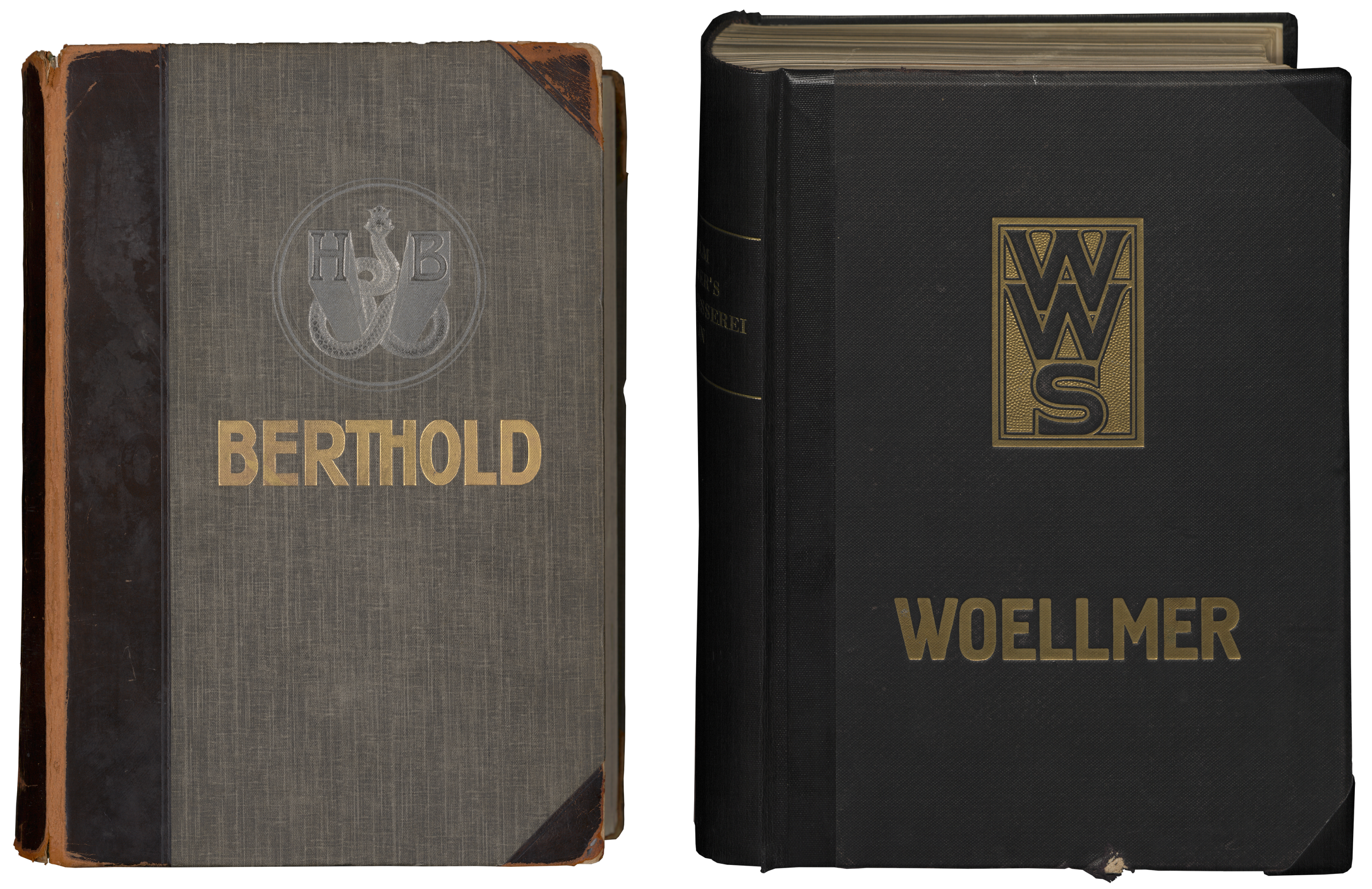
The largest type specimens were typically complete catalogs showing all products a foundry had. In German, the term for that kind of specimen is often Hauptprobe. This project digitized six different Hauptproben alone, to say nothing of the dozens of other large, hardbound catalogs produced by typefoundries that didn’t happen to name one catalog or another a Hauptprobe. The most common Hauptprobe in Berlin collections is Berthold’s, from c. 1911 (shown above on the left). Indeed, among the digital specimens, you will find several copies of this particular item. Another Berlin-based foundry from the late 19th and early 20th century was Wilhelm Woellmer’s foundry. A Woellmer Hauptprobe is shown on the right.
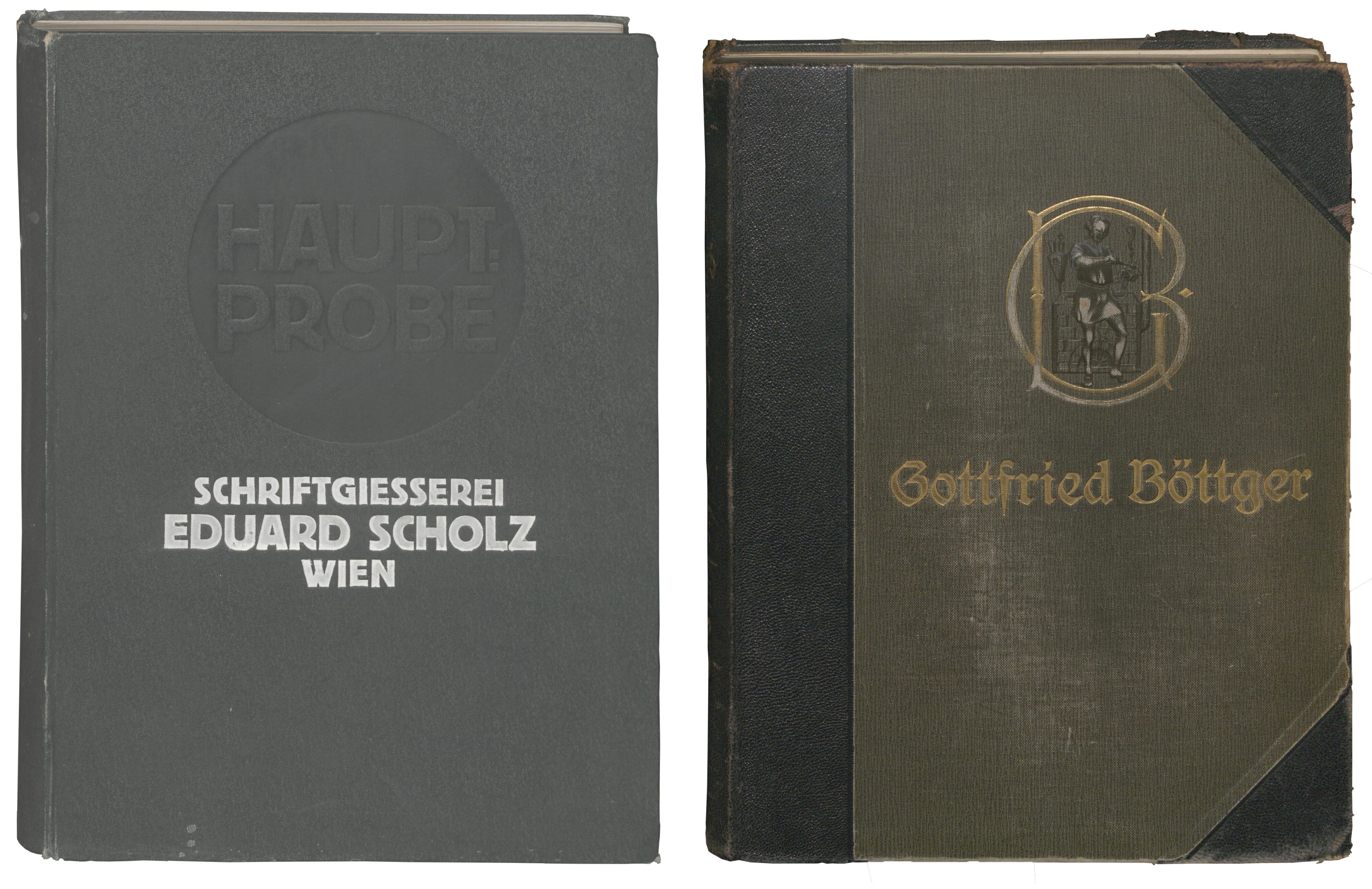
Berthold purchased several other typefoundries during its history, including Gottfried Böttger’s foundry in Leipzig. Together with D. Stempel AG in Frankfurt, it acquired Eduard Scholz’s foundry in Vienna. You can see covers from the Scholz and Böttger Hauptproben in the collage above. Unlike the Berthold and Woellmer Hauptproben shown in the previous collage, these are only represented in the Deutsches Technikmuseum’s collection.
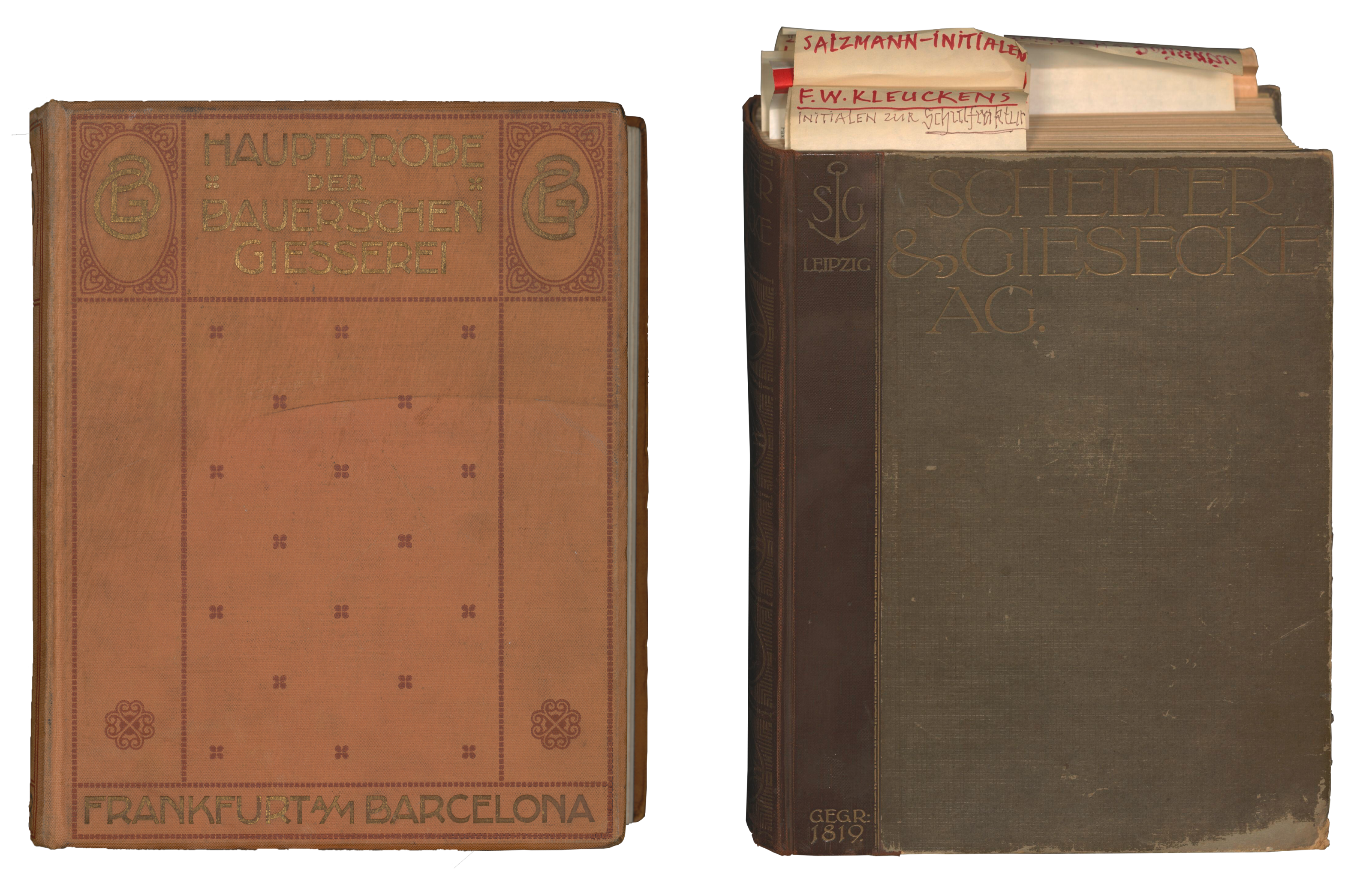
Given that the scope of specimens digitized by this project was only supposed to cover companies based in Berlin and firms bought by Berlin-based foundries, there are some items now online that may surprise you. Above are photographs of Hauptproben from the Bauersche Gießerei (left) and Schelter & Giesecke (right). At the Staatsbibliothek zu Berlin, some specimens from the Bauersche Gießerei in Frankfurt am Main were grouped together with type specimens from Bauer & Co., which was based in Stuttgart and Düsseldorf before Berthold acquired it in 1897/98. Although Bauer & Co. was cofounded by a son of the punchcutter who founded the Bauersche Gießerei in Frankfurt, there were no direct business ties between the foundries. The digitization of a Bauersche Gießerei Hauptprobe is therefore a happy accident. The Schelter & Giesecke Hauptprobe (vol. 1), from 1912 was digitized because it was Günter Gerhard Lange’s personal copy. As you can see above, Lange had placed many bookmarks in it. Those were also digitized.
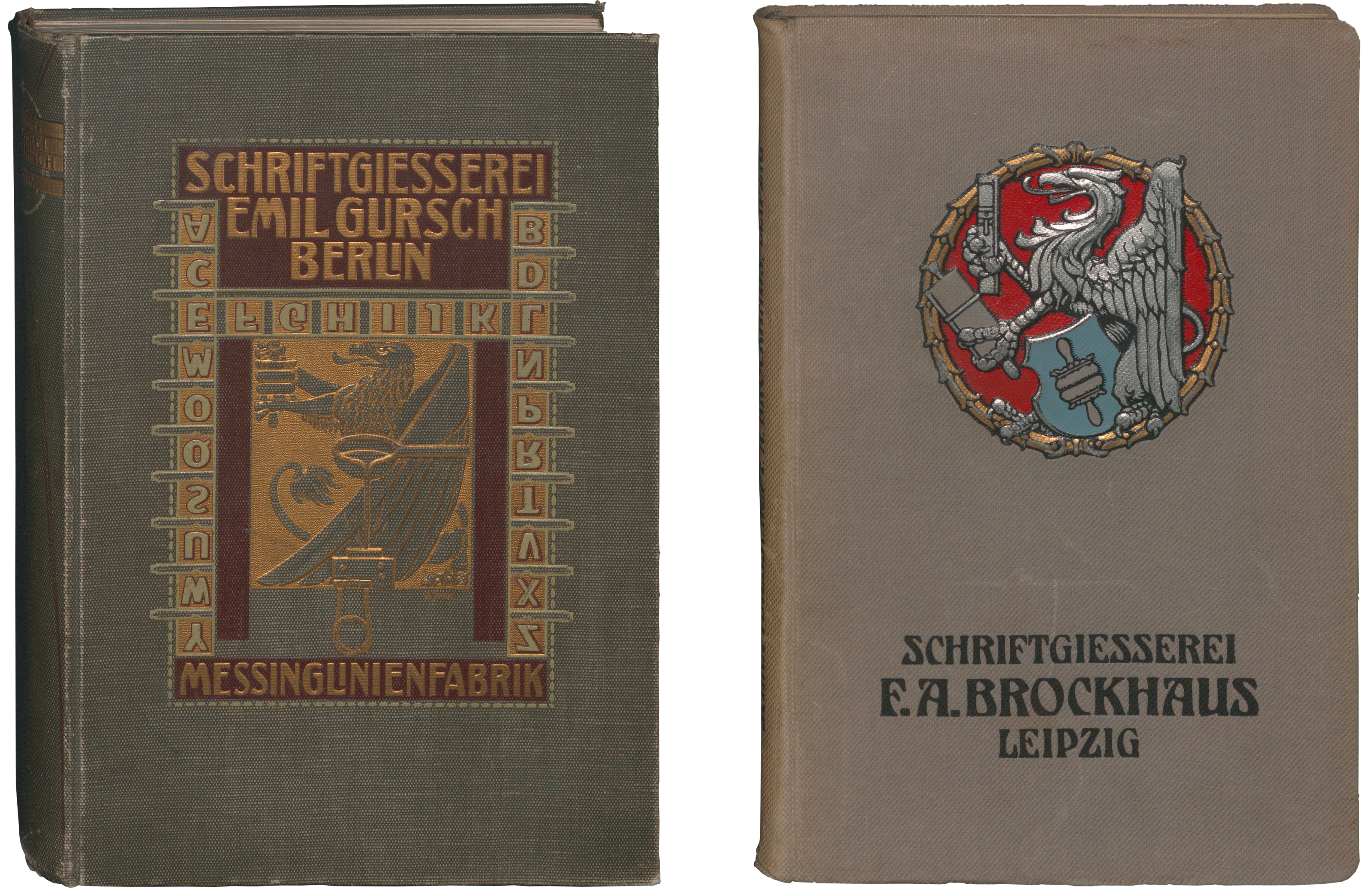
There must be complete, hardbound catalogs from at least a dozen foundries digitized in this digiS project. To find the others, users will have to search for different terms, including Musterbuch or Gesamt-Probe, etc. Above, you can see a collage of covers from two of the Gesamtproben from the Deutsches Technikmuseum’s collection. A catalog Emil Gursch’s foundry produced is on the left, while one from F. A. Brockhaus in Leipzig is on the right. Interestingly, the cover designs for each type specimen catalog used griffins, the heraldic beast associated with the printing industry and used in its coat of arms.
Although type specimen books are preserved in large numbers by various archives, libraries and museums around the world, they still attract hardly any attention from the public, despite their importance to the visual culture of everyday life. Nevertheless, type specimens’ social significance should not be not be underestimated. Countless digital typefaces inspired by historical models have been designed during the last 40 years. Type specimens are a primary source for the history of typography, but until recently, it has been difficult to access them digitally. Some institutions have begun digitizing their archives, and other individuals have made valiant efforts to collect together lists of what is available at disparate online sources. But the most important thing to do is to begin digitizing large collections. Making more type specimens available will not only help practicing design and researchers at art and design schools. It will help researchers at numerous universities and scientific institutions, too. Irrespective of the relevance type specimens may have, a comprehensive scientific study on the history of the type specimen as a genre still waits to be made.
Pardon the interruption.
Would you like to subscribe to Fontstand Weekly Newsletter?
In order to correct at least some of the necessities mentioned above, the Stiftung Deutsches Technikmuseum Berlin, Erik Spiekermann Foundation gGmbH, Kunstbibliothek der Staatlichen Museen zu Berlin, and the Staatsbibliothek zu Berlin applied for funds for a joint project. To our great delight, we received that funding from the Funding Program for the Digitization of Cultural Assets of the State of Berlin (digiS). Throughout 2021 and the beginning of 2022, our team of institutions worked together on the typeface front. The Deutsches Technikmuseum primarily focuses on the technical-historical dimension of the polygraphic trades, which have been extremely important for Berlin’s economic development since the second half of the 19th century, at the latest. Erik Spiekermann’s non-profit Foundation is devoted to preserving the cultural technology of letterpress printing and developing its potential with the possibilities offered by digital tools. In contrast, the Art Library and State Library have dedicated themselves to the systematic documentation of the typographic cultural heritage of Europe since Gutenberg’s time, in its dual function as information and an artistic medium. The digitization project was supported by a scientific advisory committee comprised by Jürgen Franssen, Dan Reynolds, and Katharina Walter.
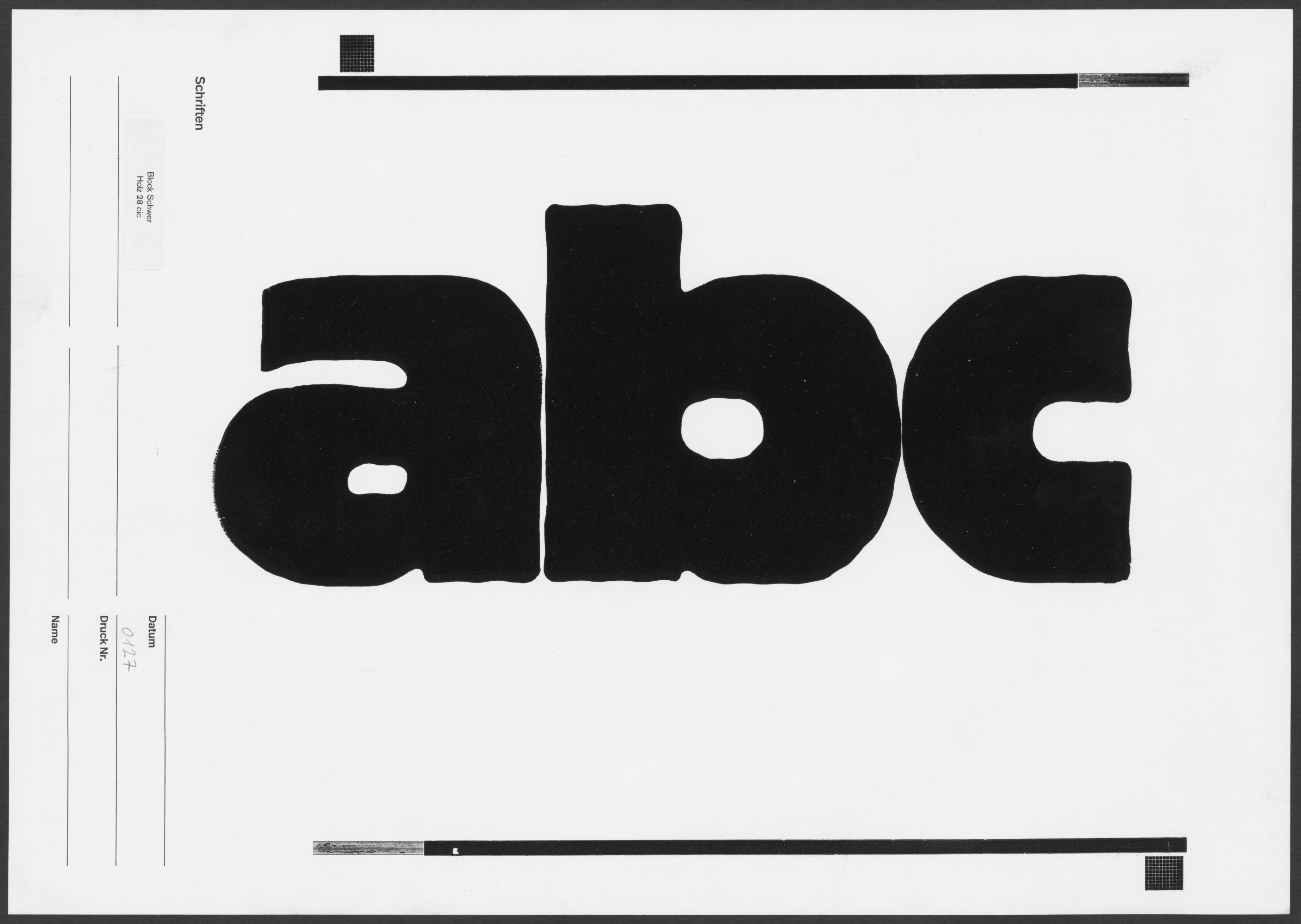
Proof print showing the 28-cicero size of Berthold’s Block Schwer wood type font. Made at Erik Spiekermann’s p98a studio in Berlin and uploaded by the Deutsches Technikmuseum to museum-digital.
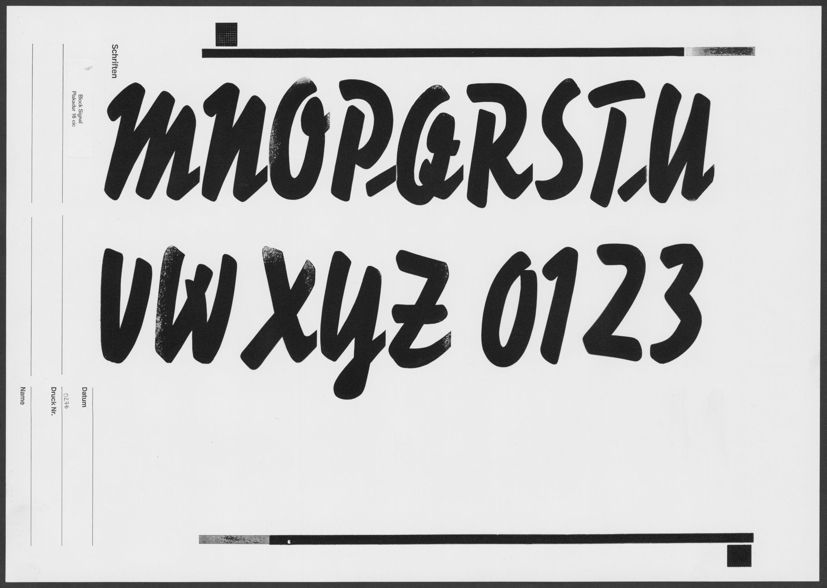
Proof print showing the 16-cicero size of Berthold’s Block Signal Plakadur font. Made at Erik Spiekermann’s p98a studio in Berlin and uploaded by the Deutsches Technikmuseum to museum-digital.
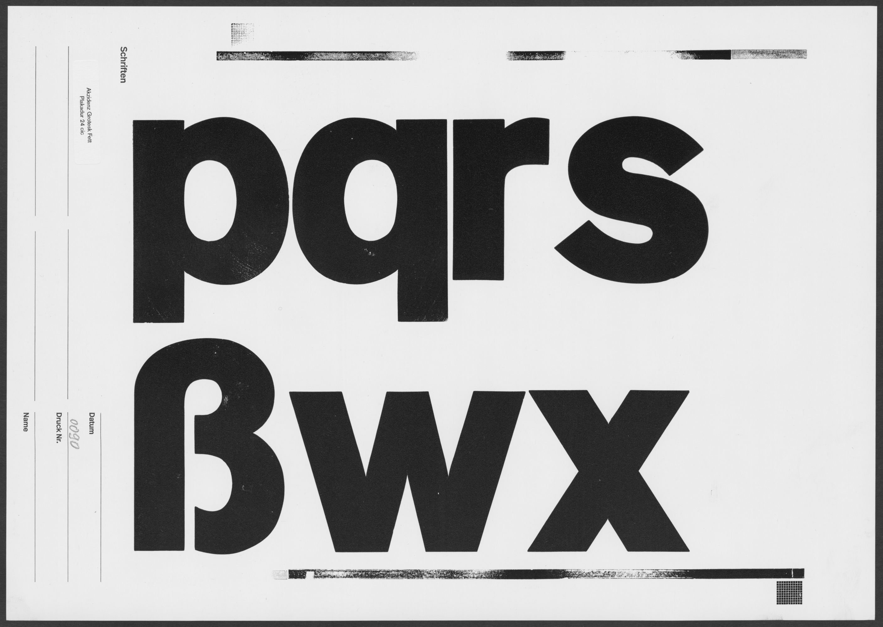
Proof print showing the 24-cicero size of Berthold’s Akzidenz-Grotesk Fett Plakadur font. Made at Erik Spiekermann’s p98a studio in Berlin and uploaded by the Deutsches Technikmuseum to museum-digital.
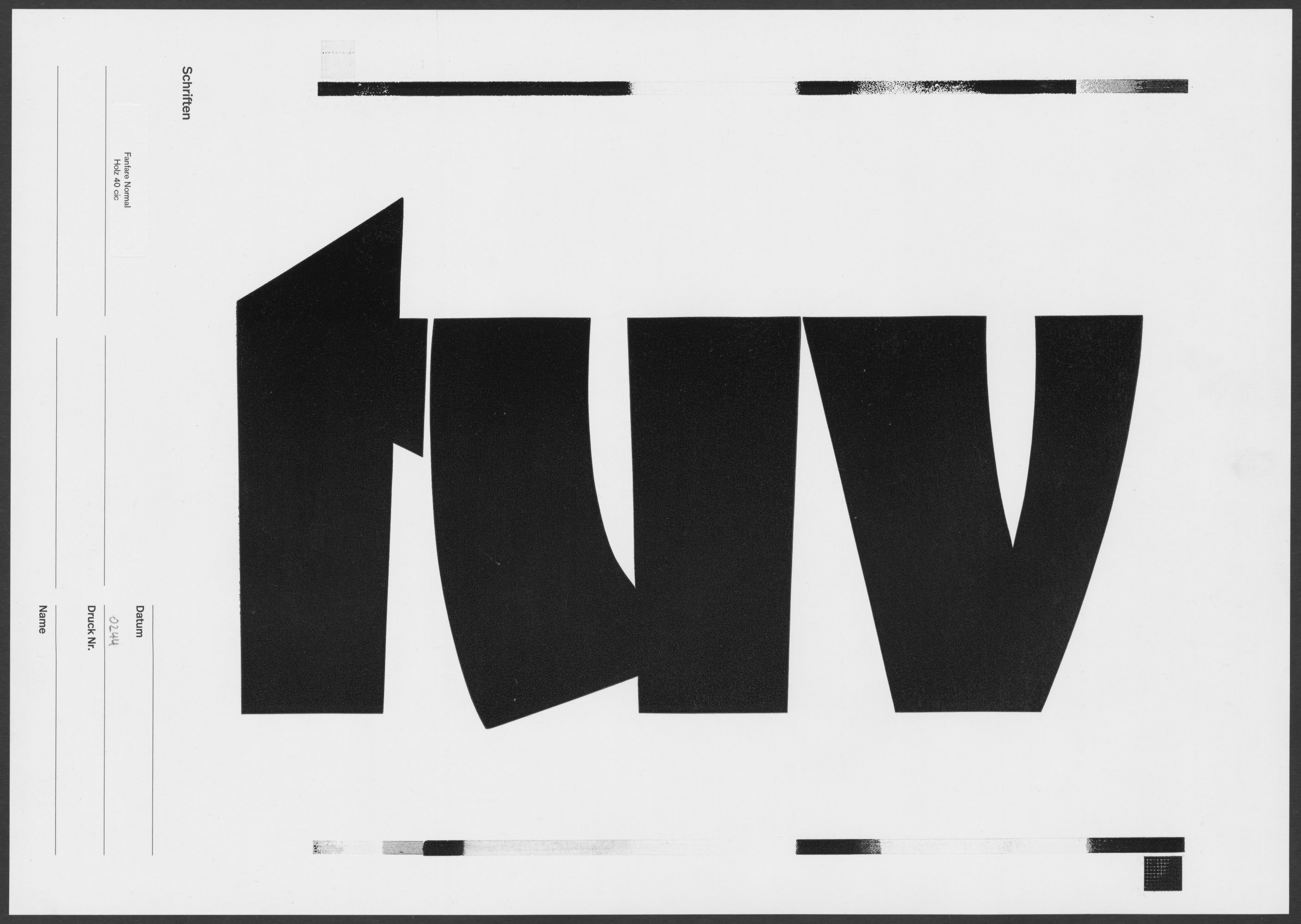
Proof print showing the 40-cicero size of Berthold’s Fanfare wood type font. Made at Erik Spiekermann’s p98a studio in Berlin and uploaded by the Deutsches Technikmuseum to museum-digital.
Staatsbibliothek zu Berlin’s digitization center only uses precision scanners, ensuring the most exact image geometry possible. Specimens from the collections of the Kunstbibliothek der Staatlichen Museen zu Berlin and the Staatsbibliothek zu Berlin have been placed online as 600 ppi color images. However, for this project, we deviated from our standard digitization process – essentially based on the specifications of the German Research Foundation (DFG) – in terms of the images’ quality. Because we also saved copies of all the scans from those two institutions’ specimens as grayscale files with a resolution of 600 ppi. While you can easily view our color digital copies and download and reuse them freely, access to the grayscale scans is a bit more complex (for us at the library, too)! So if you are interested in using images from the Kunstbibliothek or Staatsbibliothek specimens as models for designing new digital typefaces, get in touch to access the higher-quality images offline. But please don’t be in a hurry!
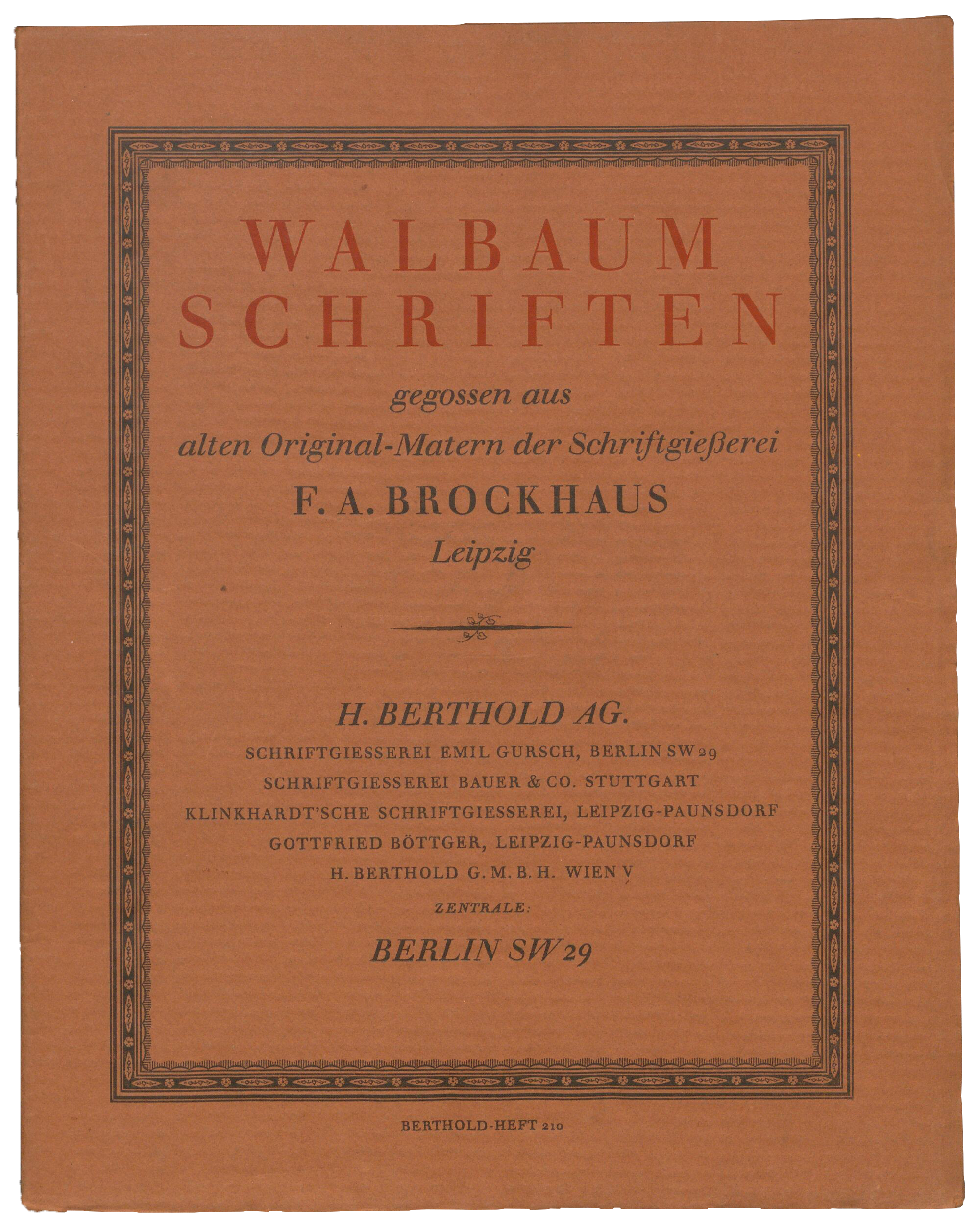
Many digitized specimens will surely delight type designers, typographers, and design historians. Walbaum was one of the most popular typefaces Berthold sold during the 20th century. At the end of Justus Erich Walbaum’s life (1768–1837), he sold his Weimar-based typefoundry to the F. A. Brockhaus publishing company, who later moved it to Leipzig. H. Berthold AG acquired Brockhaus’s typefoundry after the First World War. With it, Walbaum’s original types came into Berthold’s possession. The cover above is from one of many Walbaum specimen brochures kept at the Deutsches Technikmuseum in Berlin.
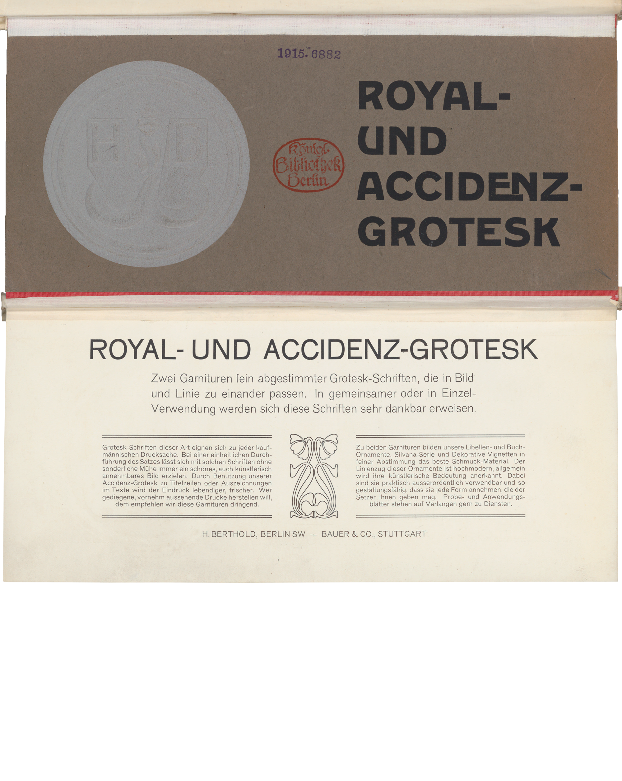
Above is a digital collage showing the cover and title page of H. Berthold AG and Bauer & Co.’s first specimen brochure for Royal-Grotesk and Akzidenz-Grotesk, from c. 1904. It is one specimen from a large collection Flodoard von Biedermann assembled between 1900 and 1914. The Staatsbibliothek zu Berlin acquired his collection in 1915, the reason for the “1915” stamp on the brochure’s cover. Although this specimen itself is undated, it was described in a 1904 issue of Archiv für Buchgewerbe, plus a bibliography of typefounding documents Biedermann helped Berthold assemble in 1923.
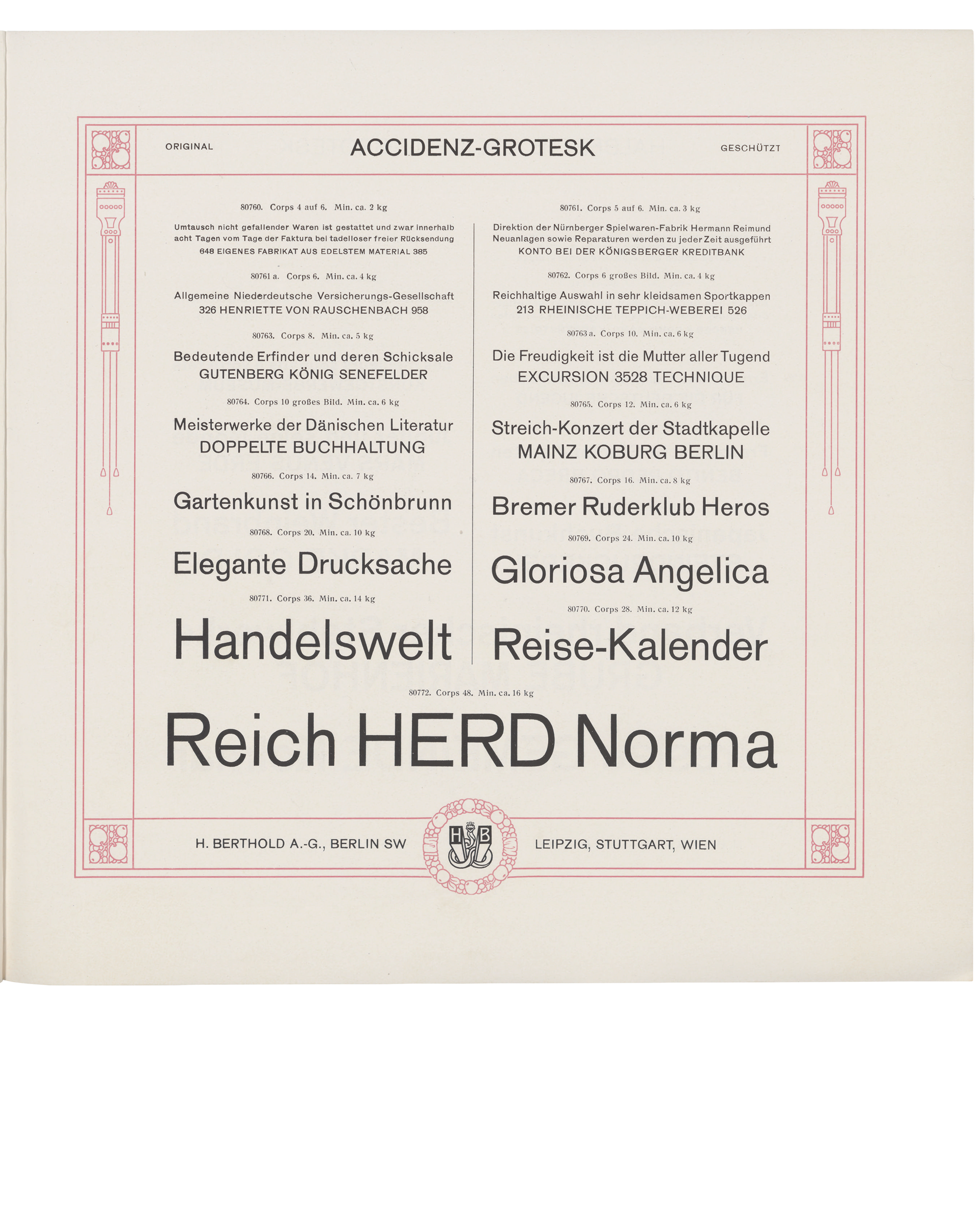
Another specimen of Accidenz-Grotesk, as the typeface’s name was originally spelled. This image is from a 1921 type specimen brochure in the Kunstbibliothek’s collection. The brochure was probably a re-edition of an earlier specimen that Berthold and Bauer & Co. originally printed in 1912.
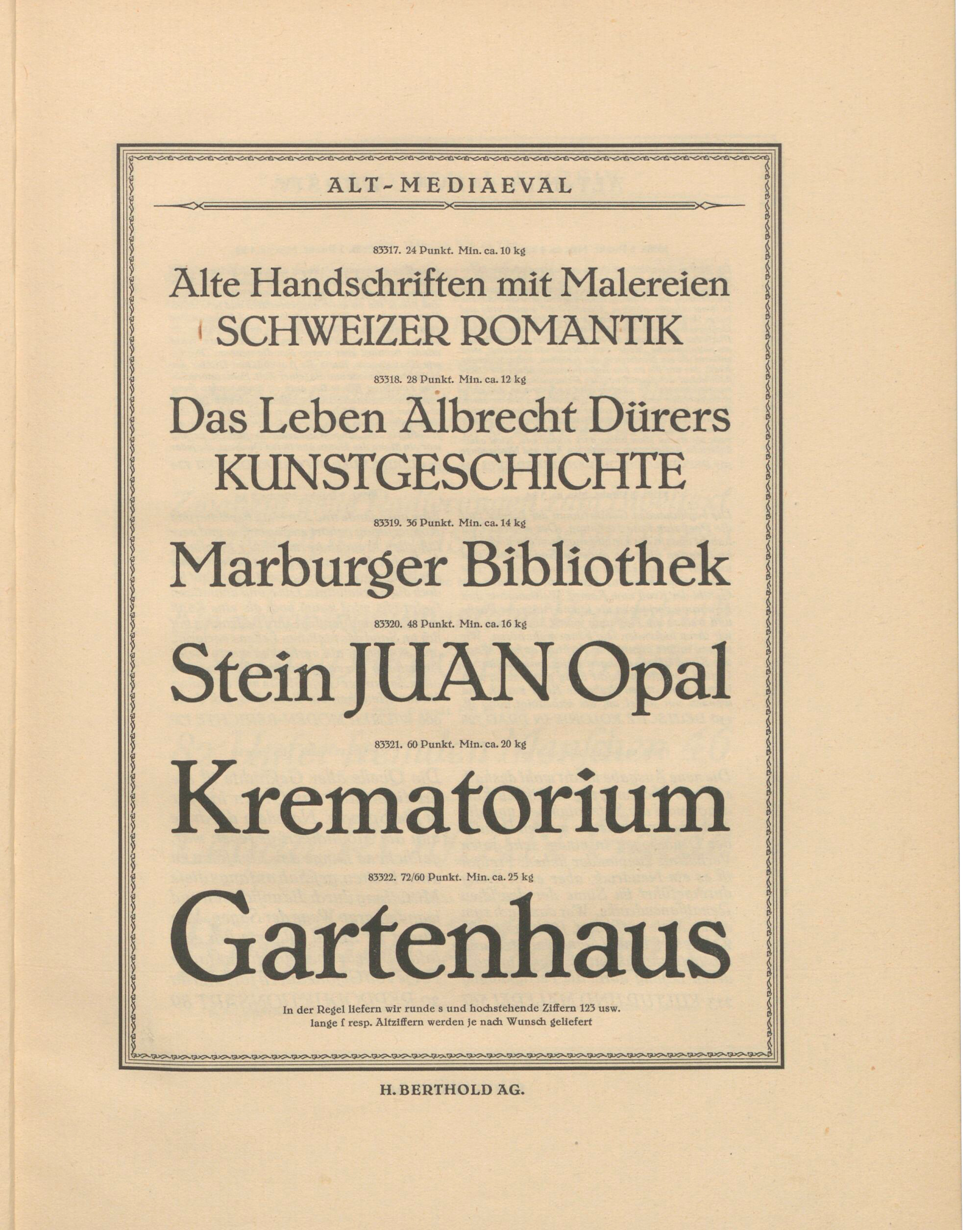
The graphic designer Max Hertwig designed Berthold’s Alt-Mediaeval typeface. Work on the project was probably finished in time for the BUGRA, an international book trades exhibition held in Leipzig during the summer of 1914. The First World War probably prevented Alt-Mediavel’s timely release, but Berthold finally published the fonts during the early 1920s and produced a specimen brochure for the typeface then, too.
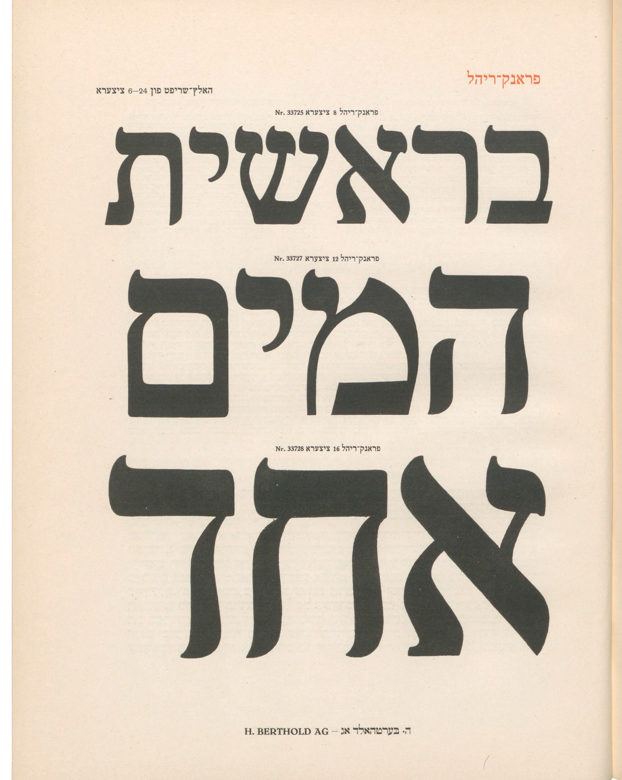
Joseph Tscherkassky (1879–1950) was born in Ukraine and eventually became the owner of a Kyiv typefoundry. At some point between 1914 and the Russian Revolution and Civil War, Tscherkassky moved to Berlin, where he was likely part of the city’s Jewish émigré community. Berthold’s managing director Oscar Jolles (1861–1929) hired him to run the “oriental types” department. Tscherkassky’s Katalog hebräischer und jüdischer Schriften was printed by Berthold in 1924 and this is one of its pages. Tscherkassky later moved to Brazil in 1930, where he remained for the rest of his life.
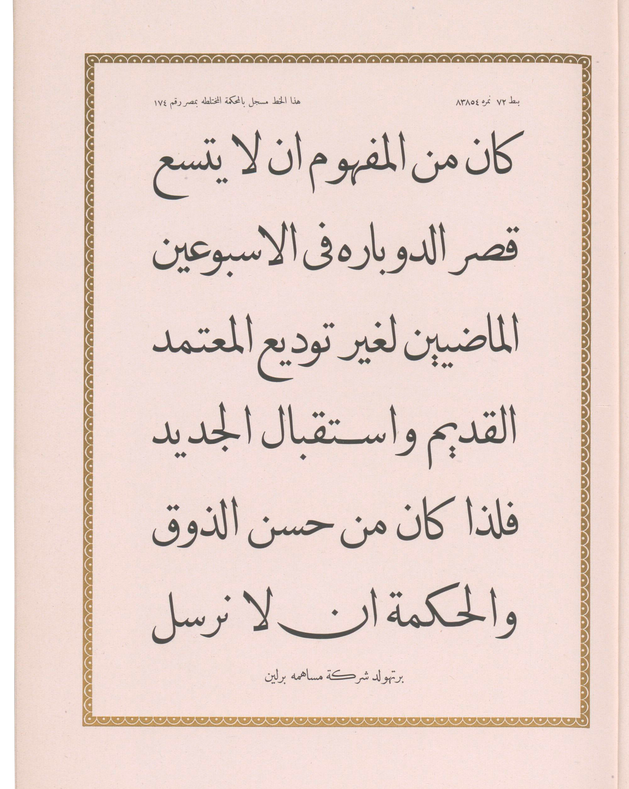
Tscherkassky also produced a type specimen catalog for Berthold’s Arabic-script typefaces.
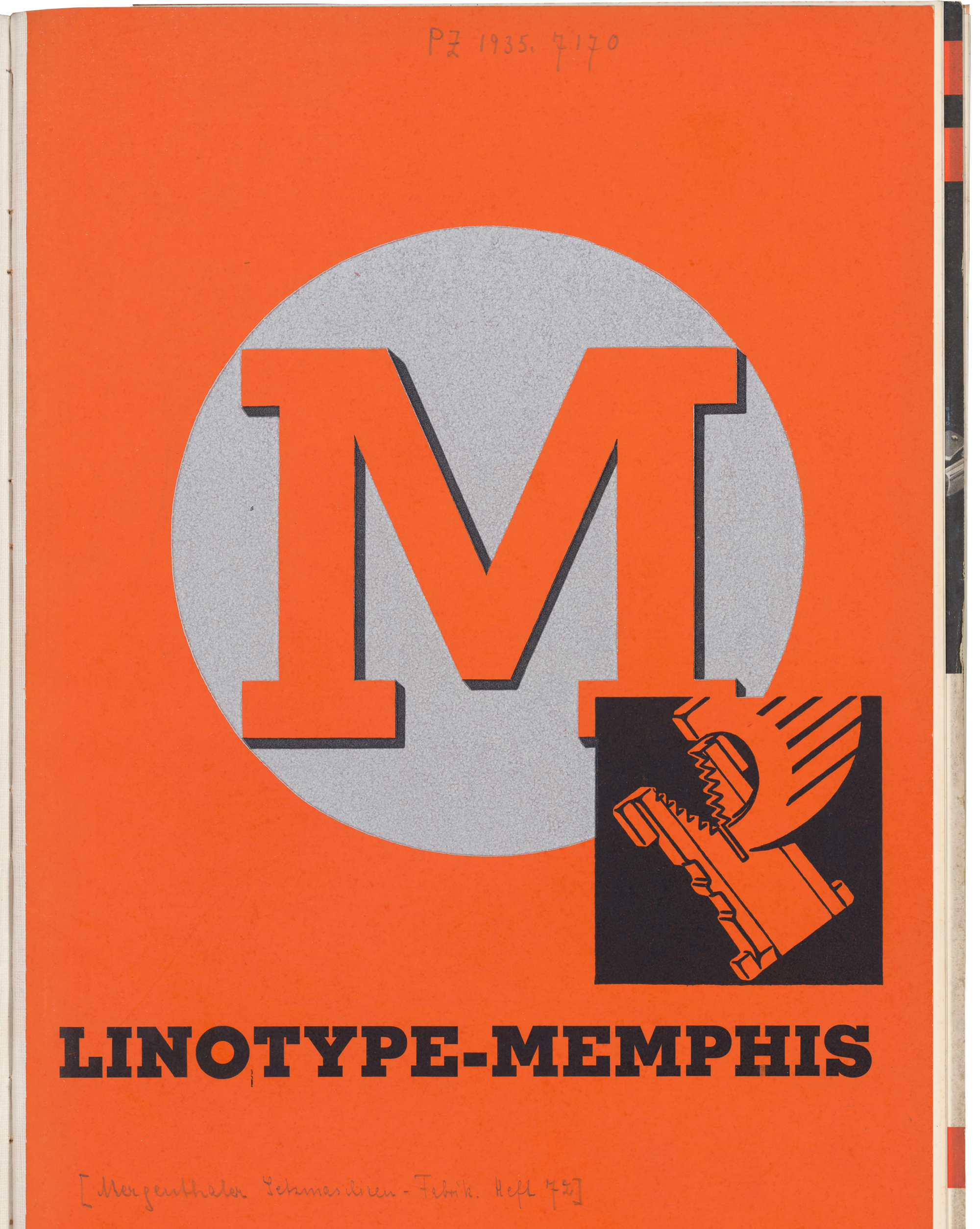
The Memphis typeface was created by Rudolf Wolf at D. Stempel AG in Frankfurt. Stempel sold foundry-type versions of the typeface, and Linotype distributed Memphis for its typesetting machines as well. When the Memphis typeface was released, the German Linotype headquarters was not in Frankfurt but in Berlin. Therefore, a specimen brochure for Memphis is just one of many Linotype specimens that were digitized as part of this Berlin-based project. You can see a copped view of the cover from the Mergenthaler Setzmaschinen-Fabrik’s specimen brochure for Linotype Memphis.
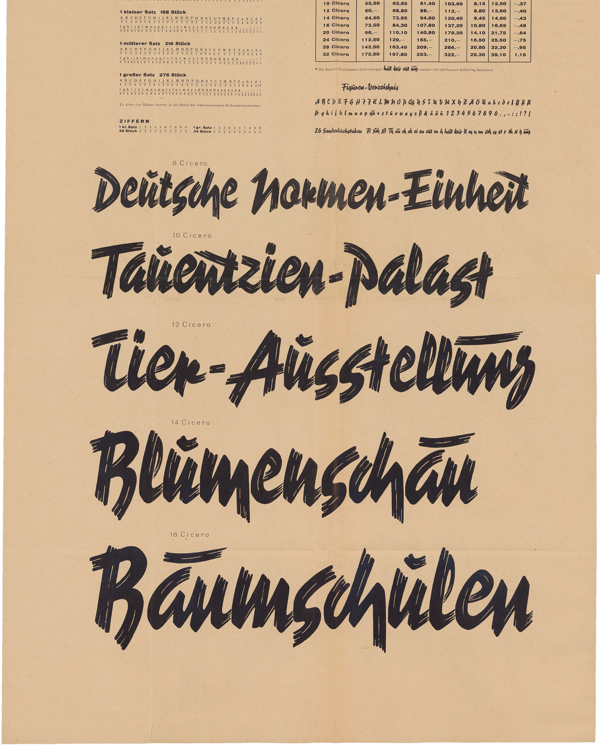
I’ve mentioned above that Berlin had many more type-making companies than just the H. Berthold AG. One of the city’s other 20th-century typefoundries was the Norddeutsche Schriftgießerei. That business was owned by the Wagners, a family of punchcutters and typefounders from Leipzig who eventually moved to Ingolstadt in Bavaria. The last Wagner typefoundry stayed in business until 2002 when the Ingolstadt business closed down. One of the most-famous Wagner-company typefaces was Reporter, created by Carlos Winkow at the Norddeutsche Schriftgießerei in Berlin during the 1930s. This page shows several wood type sizes that were available for the typeface.
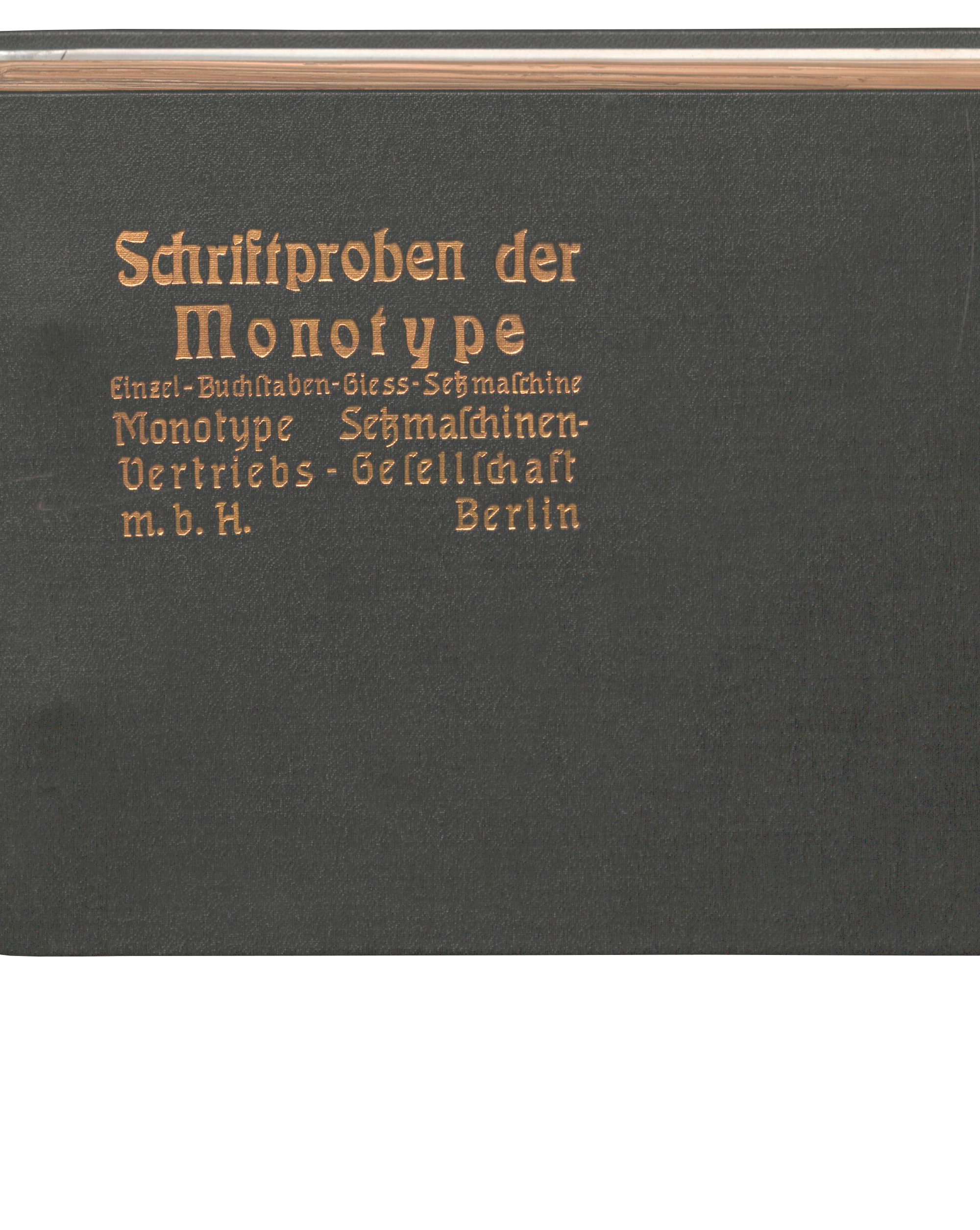
Monotype’s German headquarters was also in Berlin for a long time. The Deutsches Technikmuseum has a very old German Monotype catalog, and you can see a cropped view of its cover above. I find it interesting that the lettering on this specimen’s cover shows the Eckmann typeface, from the Rudhard/Klingspor typefoundry in Offenbach, and Georg Schiller’s Neudeutsch typeface. Neither typeface was available for Monotype composition.
Since the Ferd. Theinhardt typefoundry was acquired by Berthold in 1908, the type specimen collection at the Deutsches Technikmuseum – which primarily comes from Berthold’s company library – includes several large volumes of Theinhardt specimens. The cropped spread reproduced above shows a typeface that the Theinhardt foundry sold as Sempiterna. Theinhardt was one of at least three German foundries to sell this design, each under a different name. The typeface itself originated with a foundry in the United States.
After the H. Berthold AG’s bankruptcy, the Deutsches Technikmuseum in Berlin received the company’s material legacy, including its business archives, its remaining matrices, photo-typesetting machines, etc. Because of Berthold’s importance to Berlin’s typographic history – which can hardly be overestimated – it goes without saying that the Deutsches Technikmuseum acted as the joint specimen digitization project’s coordinator. The Deutsches Technikmuseum’s Historical Archive holds Berthold’s type specimen library. As I mentioned above, the part that could be digitized in this project is accessible online at museum-digital. But in this project, for copyright and funding reasons, we could only digitize specimens made by Berlin-based companies before 1951. Naturally, H. Berthold AG’s specimen library contains hundreds of items that fall outside those parameters. The company was never averse to acquiring creative or technical know-how, and it wanted to stay informed about the typeface designs of competing companies in Germany and abroad.
The fonts mentioned in this article are available to rent by the month for a fraction of their retail price on
Fontstand.