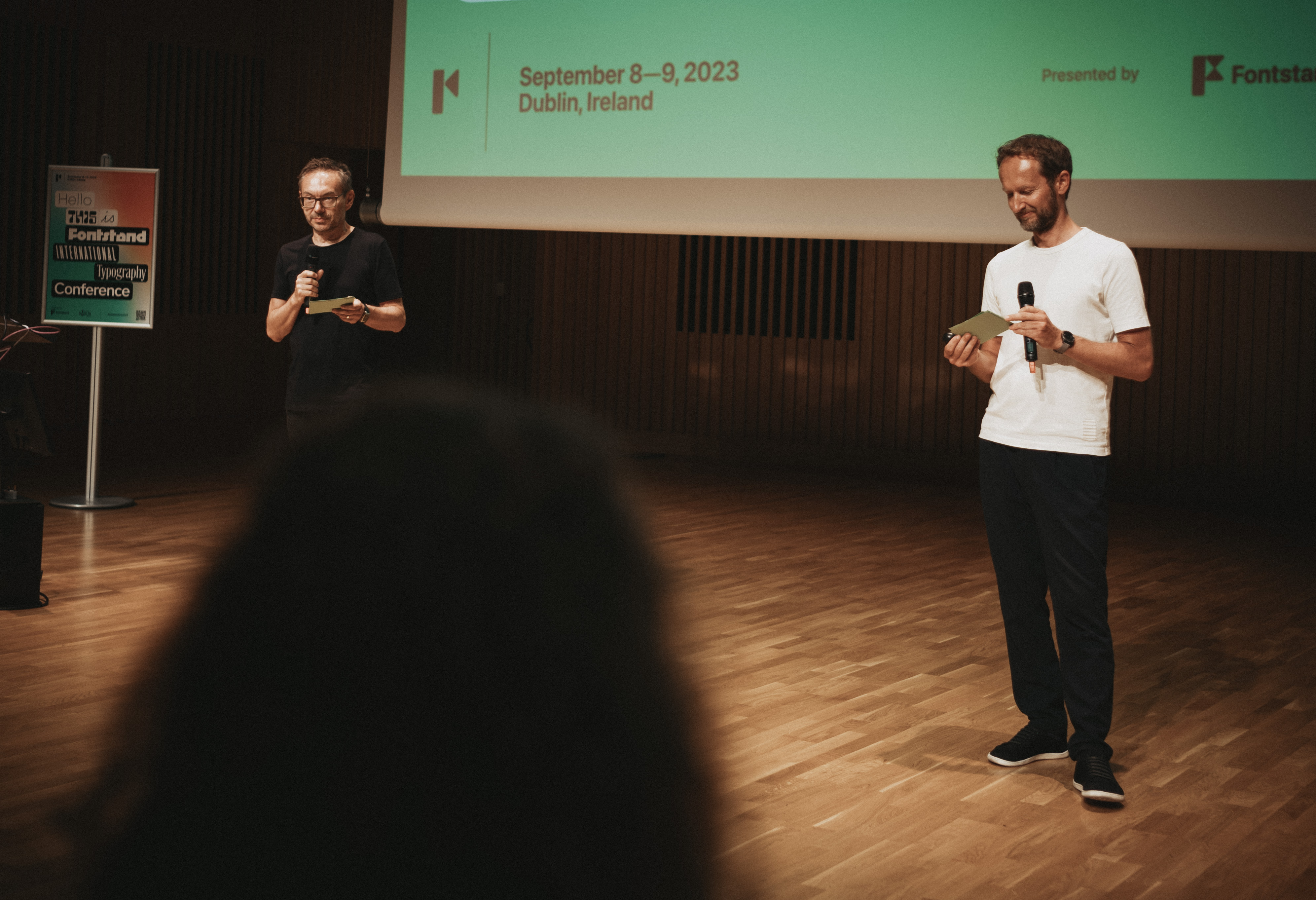
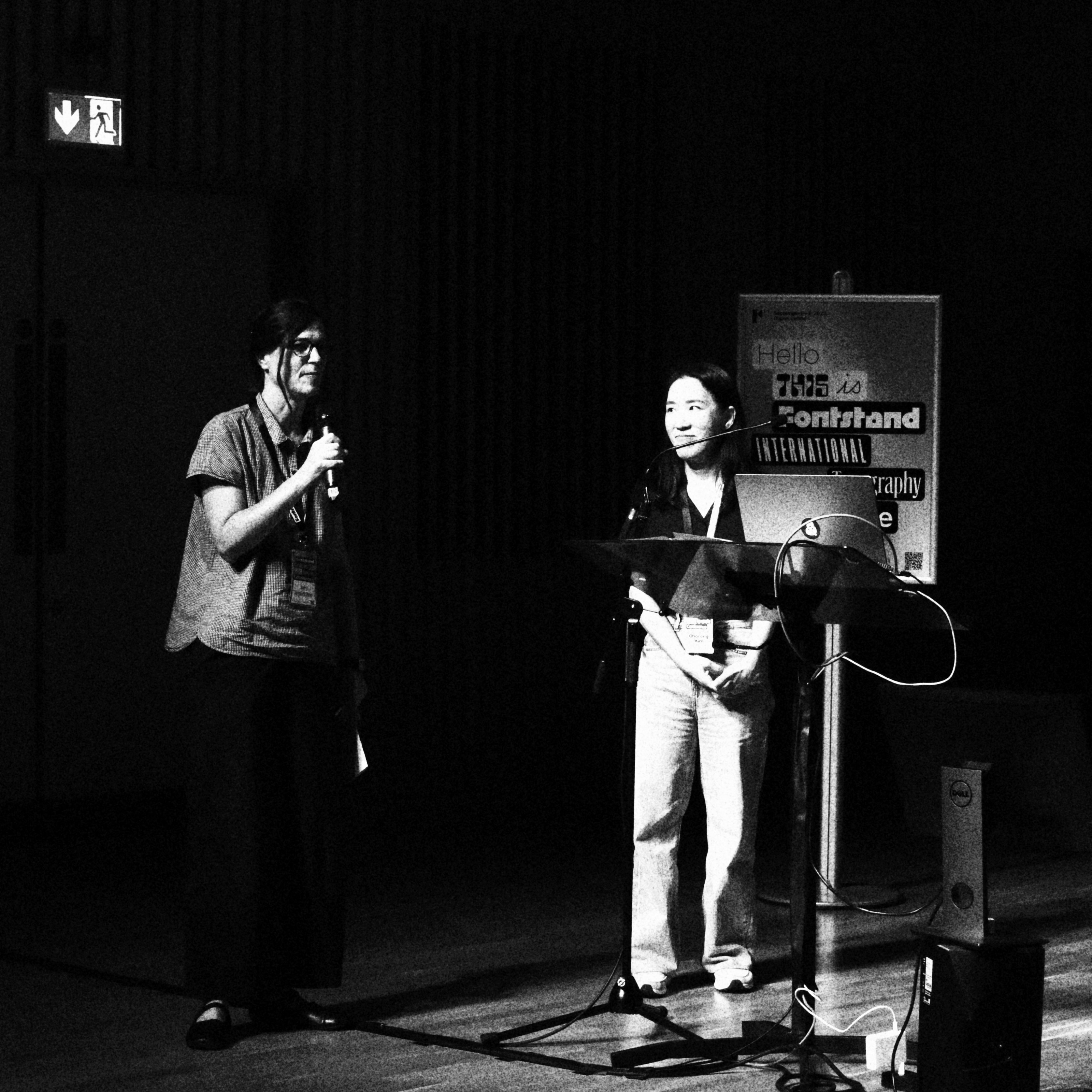
Andrej Krátky and Peter Biľak on stage welcoming attendees to Fontstand’s 2023 conference in Dublin. Photo courtesy of Michael Hochleitner.
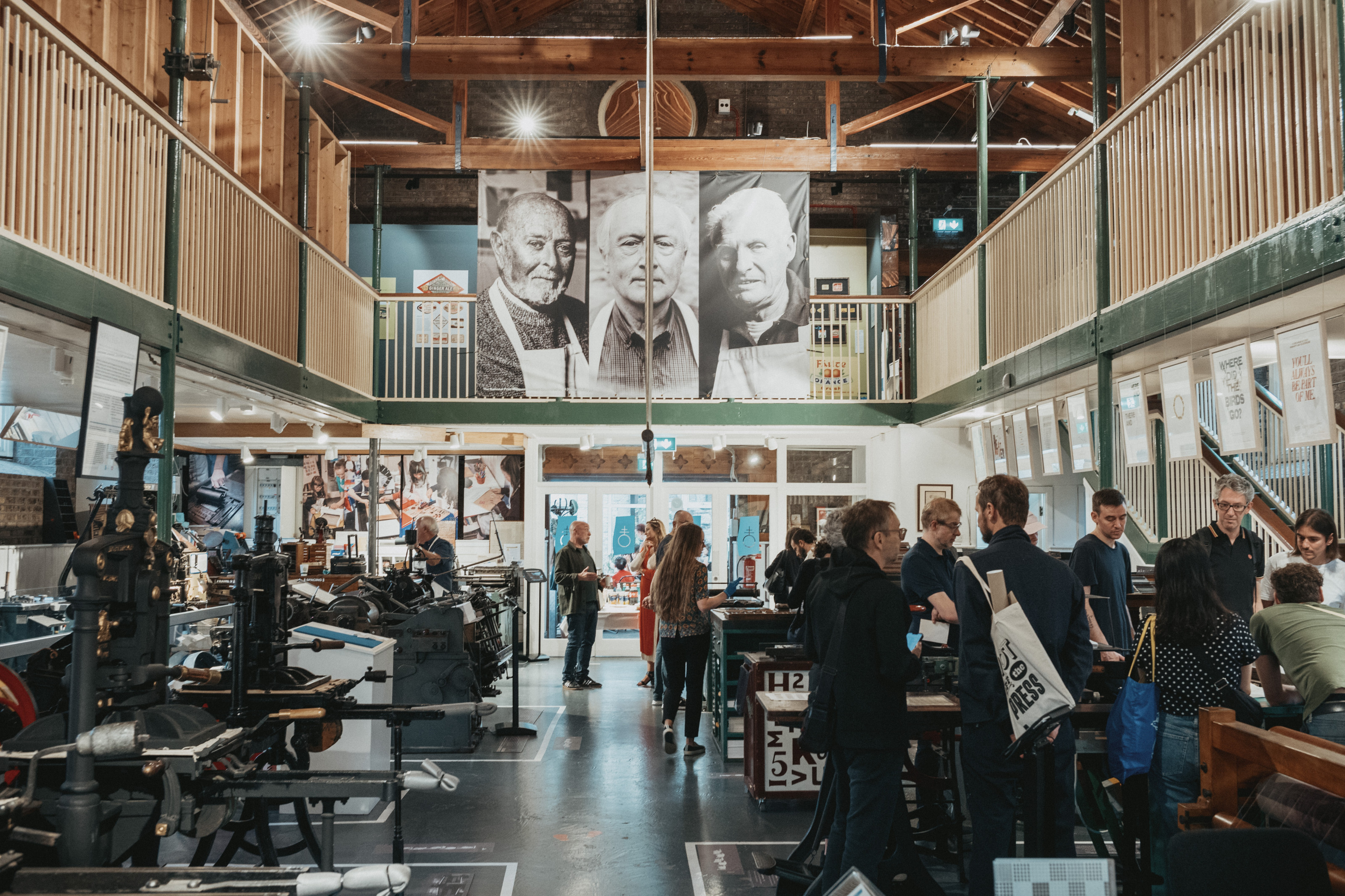
As participants arrived and hugged each other, it quickly became obvious to Dublin, that the typography conference in town was not the professional networking event some had expected. And so it was that the fourth annual Fontstand International Typography Conference opened in an atmosphere best described as that of a family gathering, with the warmth of welcome extended especially to those at the event for the first time. For community is at the heart of Fontstand, with makers, users and type enthusiasts coming together to meet new font friends and to bring type to life through the many opportunities for learning and exchange.
The weekend began on a Friday with practical workshops focused on type design, scripting, and type usage and an opening talk in the evening. A second day followed with a program of a further ten presentations which addressed not only various uses of typography such as print, motion design, and branding, but also a series of shared thematic interests in audience, process, form and the character type brings to different contexts.
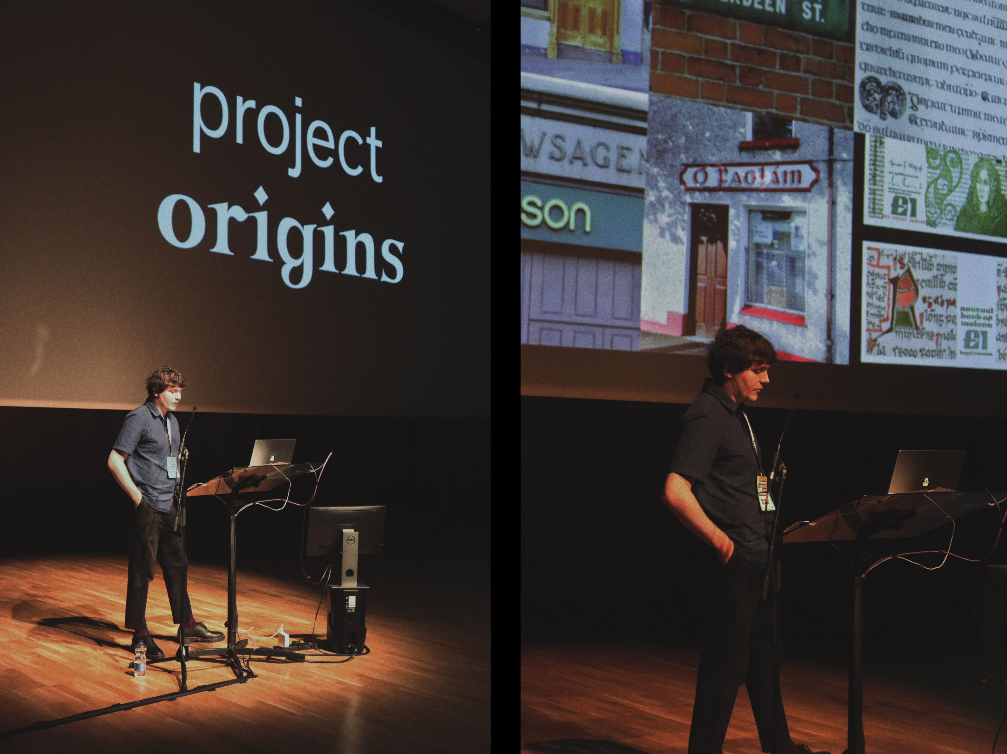
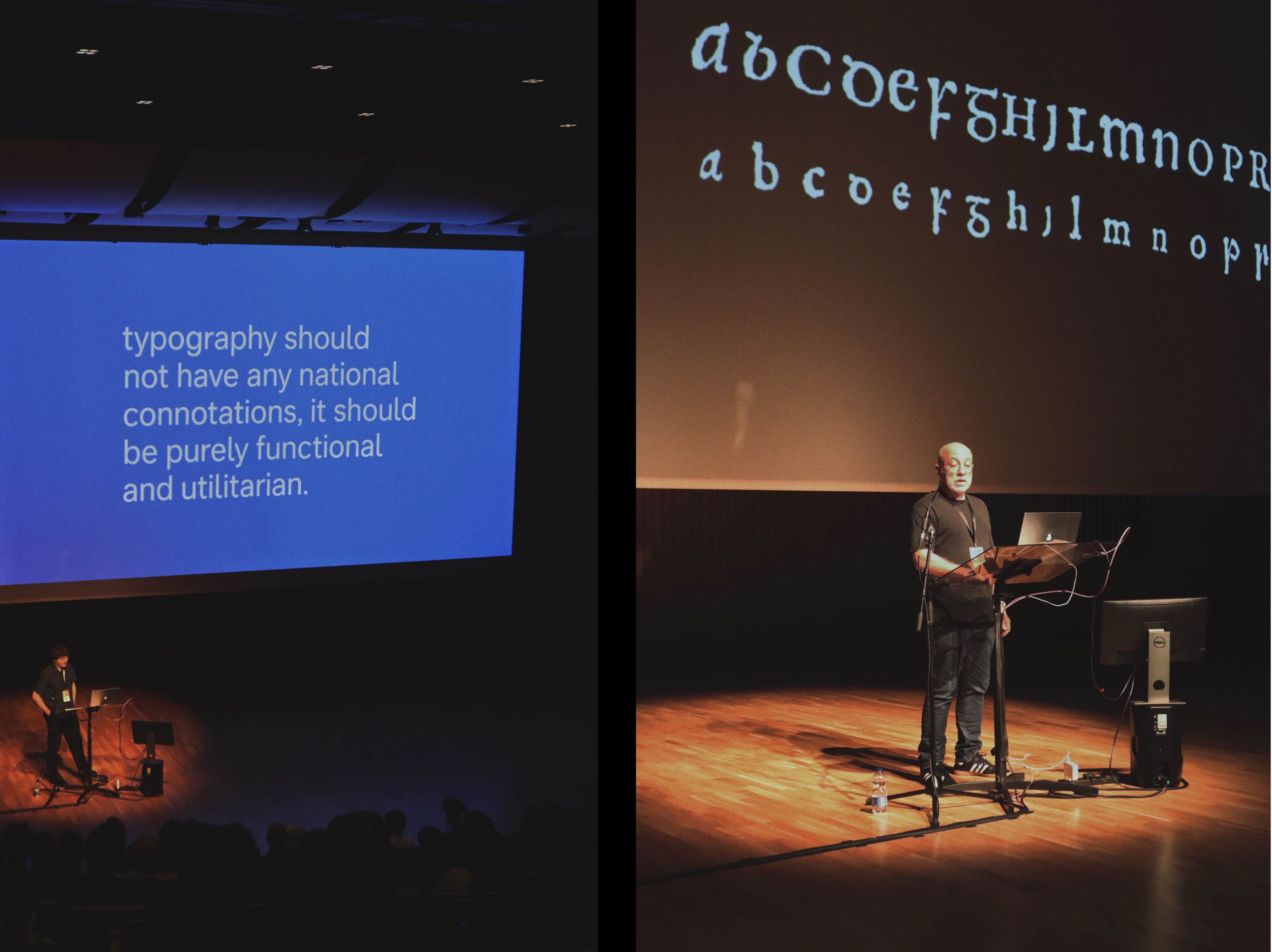
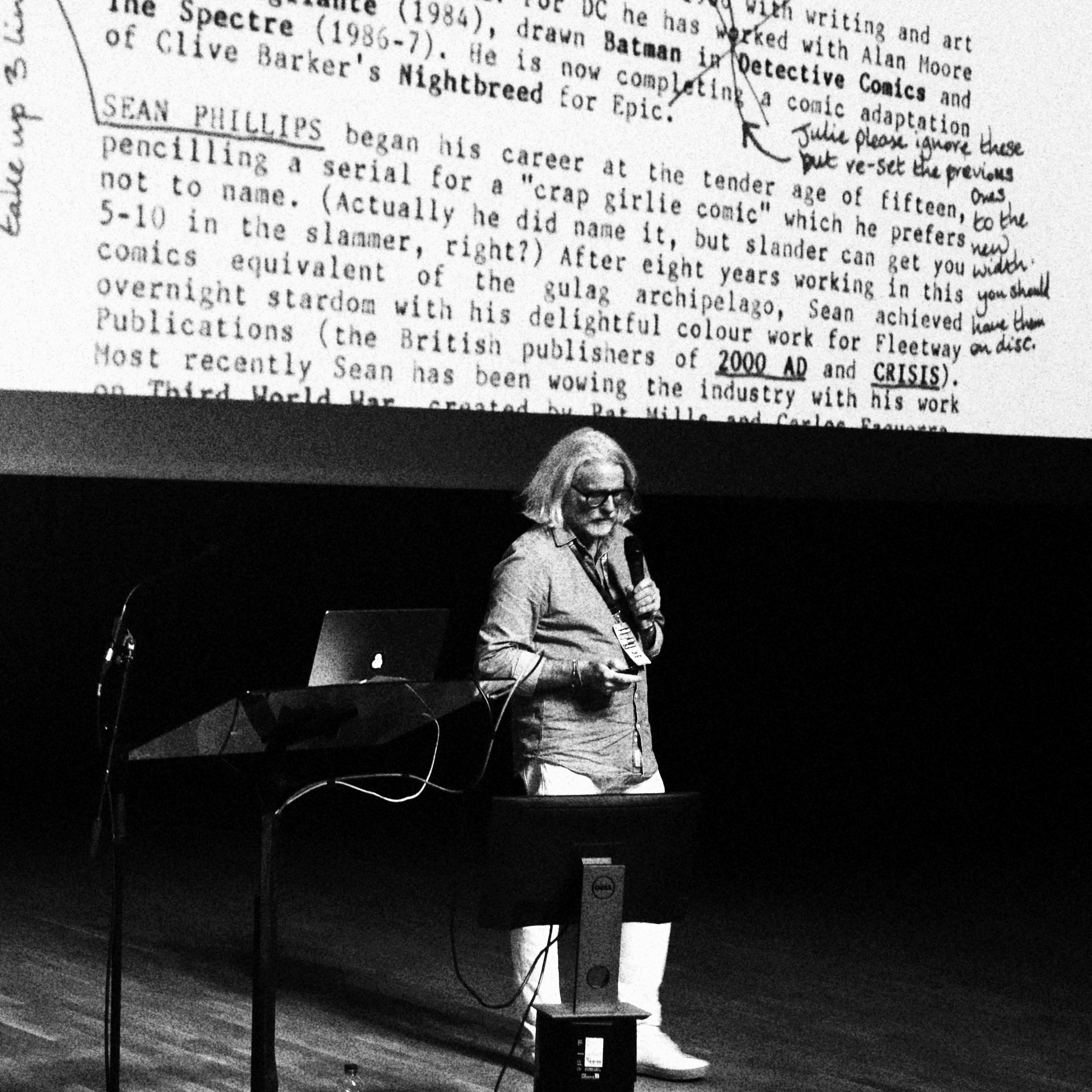
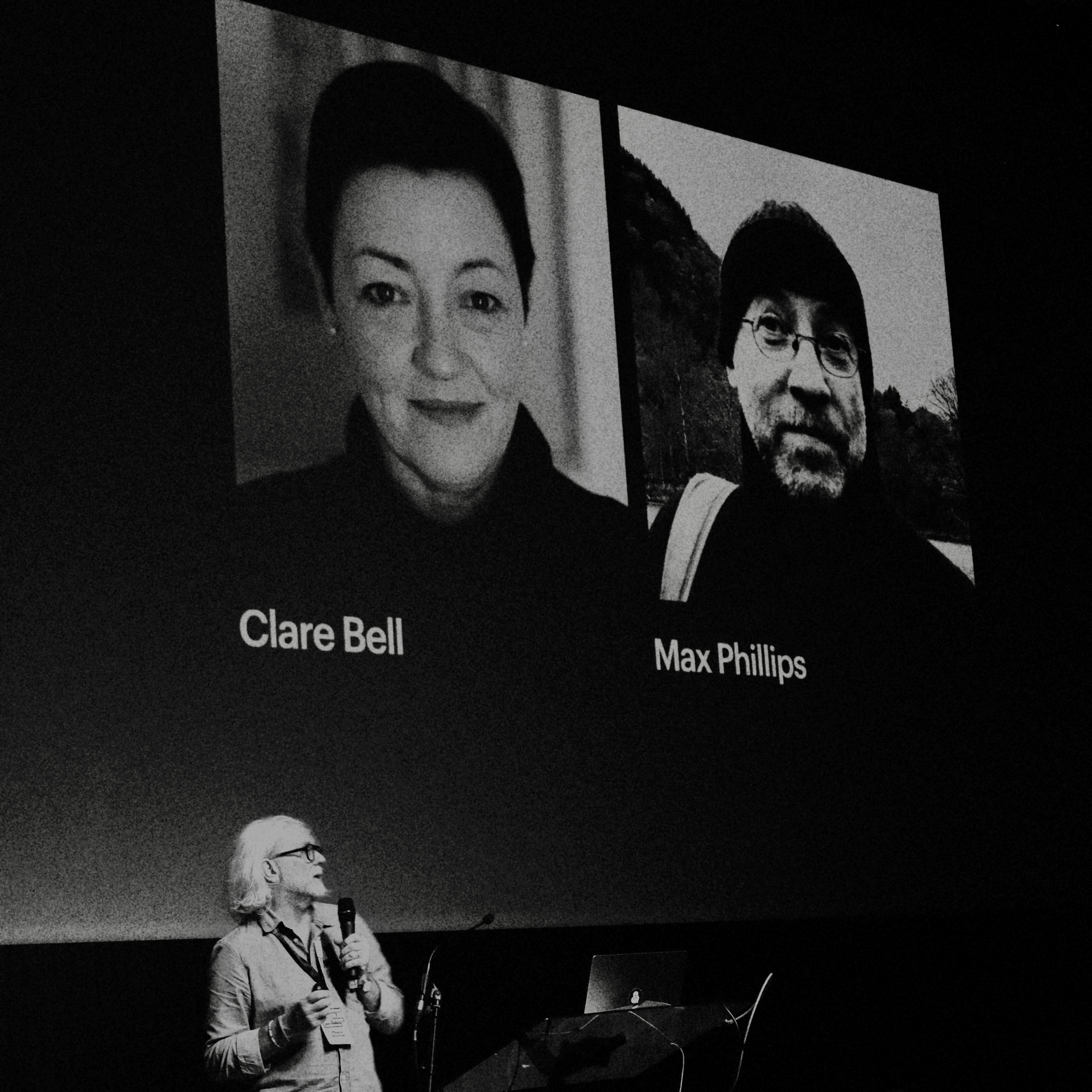
Audience was at the heart of Saturday’s first presentation, which took the form of a lesson in, ‘How to (un)make an Irish typeface’. Mary Ann Bolger, Clare Bell and Declan Behan (TU Dublin) together with Max Phillips (Signal Type Foundry) presented their various research projects exploring colonial legacy in Ireland and the idea of what Irishness might look like on a page from a historical, cultural, and most interestingly, a social perspective. Using variable type technology Bell and Behan have generated a font to use in an examination of the complex relationships between language, letterform, and identity. Through the act of calibrating the variables of the typeface individuals are required to reflect on the strength of their personal associations with sets of shared and disputed forms intrinsic to factional identities. It is an experience which many have found to be difficult and confronting, but which has subsequently allowed for the start of conversations which feed into ongoing processes of reconciliation and sustainable peace. It was an extraordinary presentation in which a typeface could be reimagined as a catalyst for hope, and not only across Ireland but beyond, as a model for communities in conflict elsewhere.
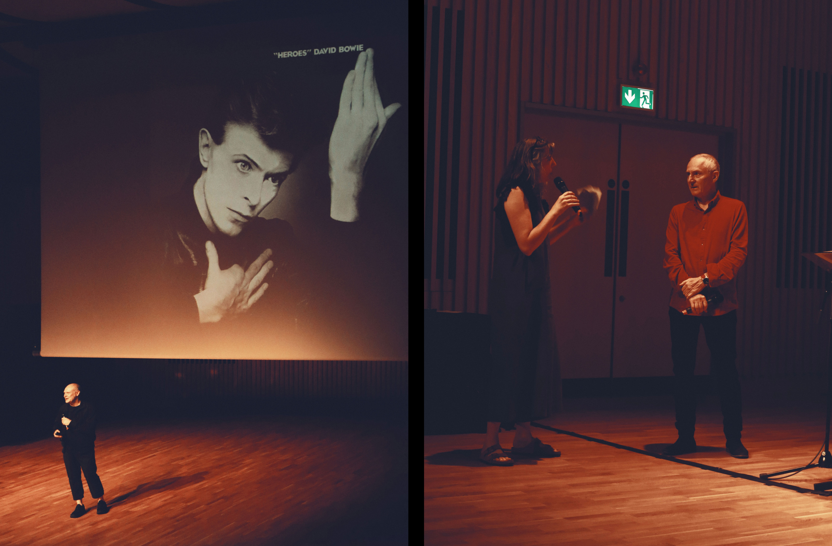
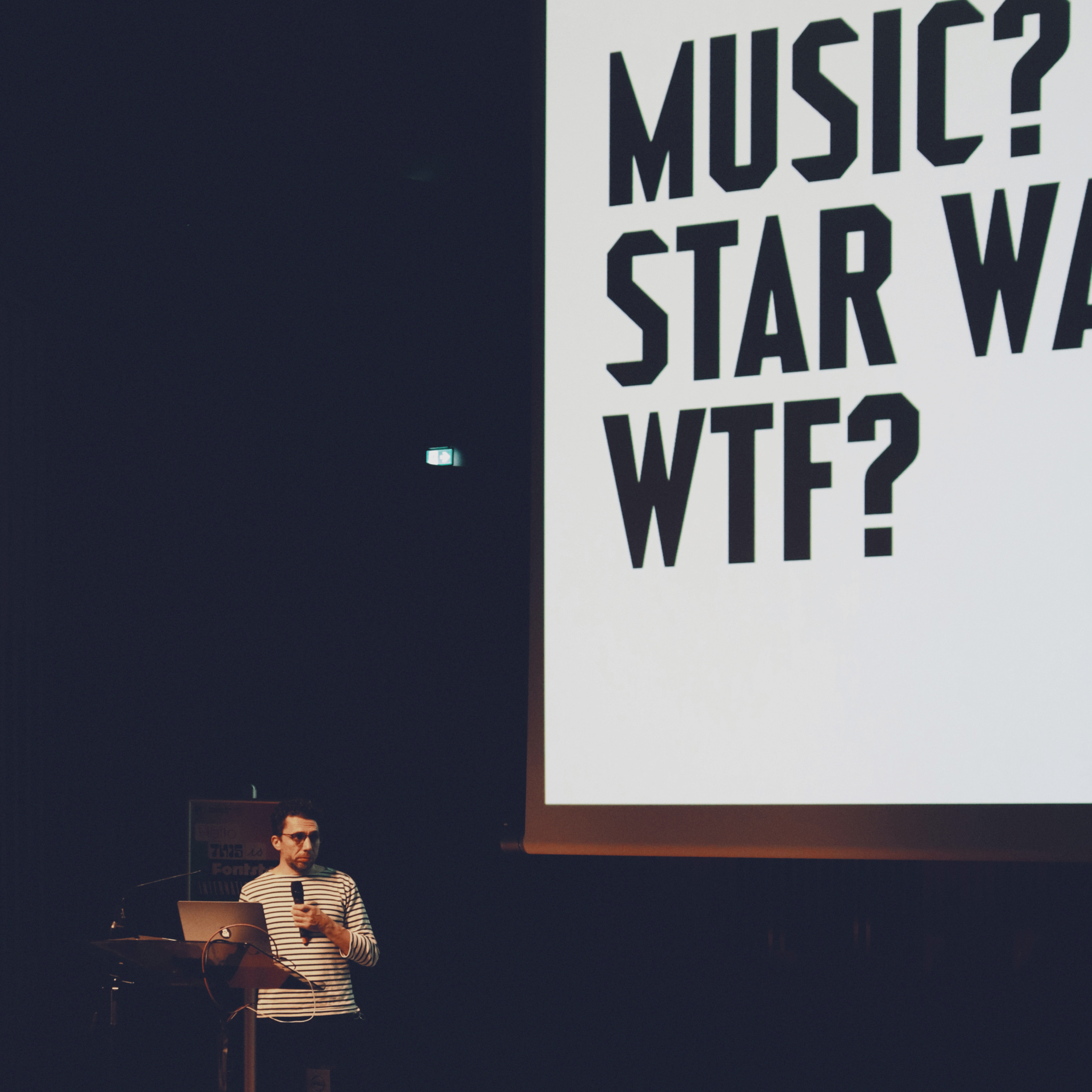
The agency of an audience was also a key theme of Jon Barnbrook (Barnbrook fonts) in his reflections on music, typefaces and collaborating with David Bowie. In sharing with us the process informing cover designs for Bowie’s later albums, Barnbrook was, in part, ignoring Bowie’s advice to him not to explain work. This was more generous guidance than it might at first seem, reflecting Bowie’s recognition of the need to let go as a creative and allow people to situate a cover within their own world. Still, from the perspective of a teacher, it was rewarding to hear a designer unpacking the process that precedes such iconic outcomes to reassure students especially that design rarely arrives in the world perfectly formed.
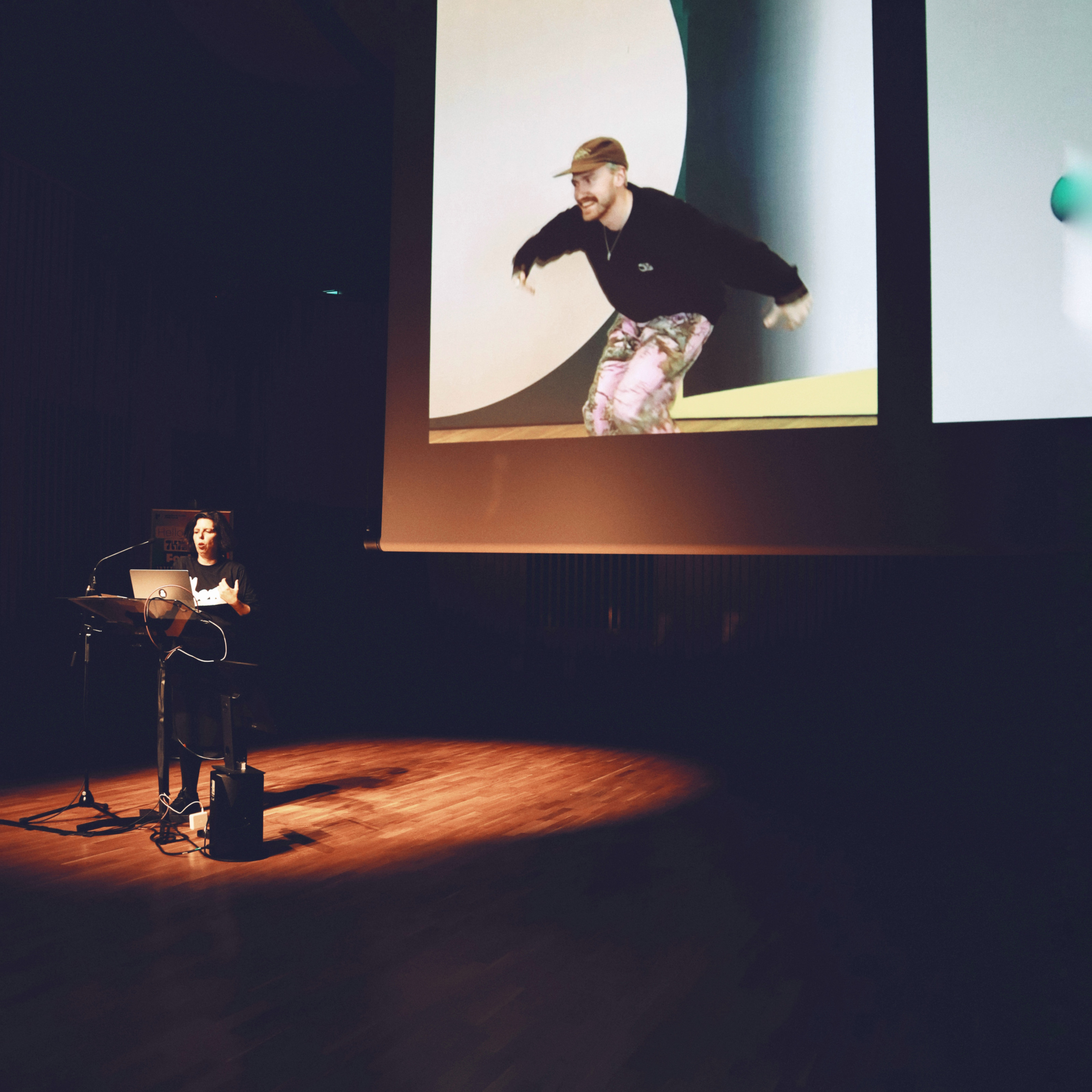
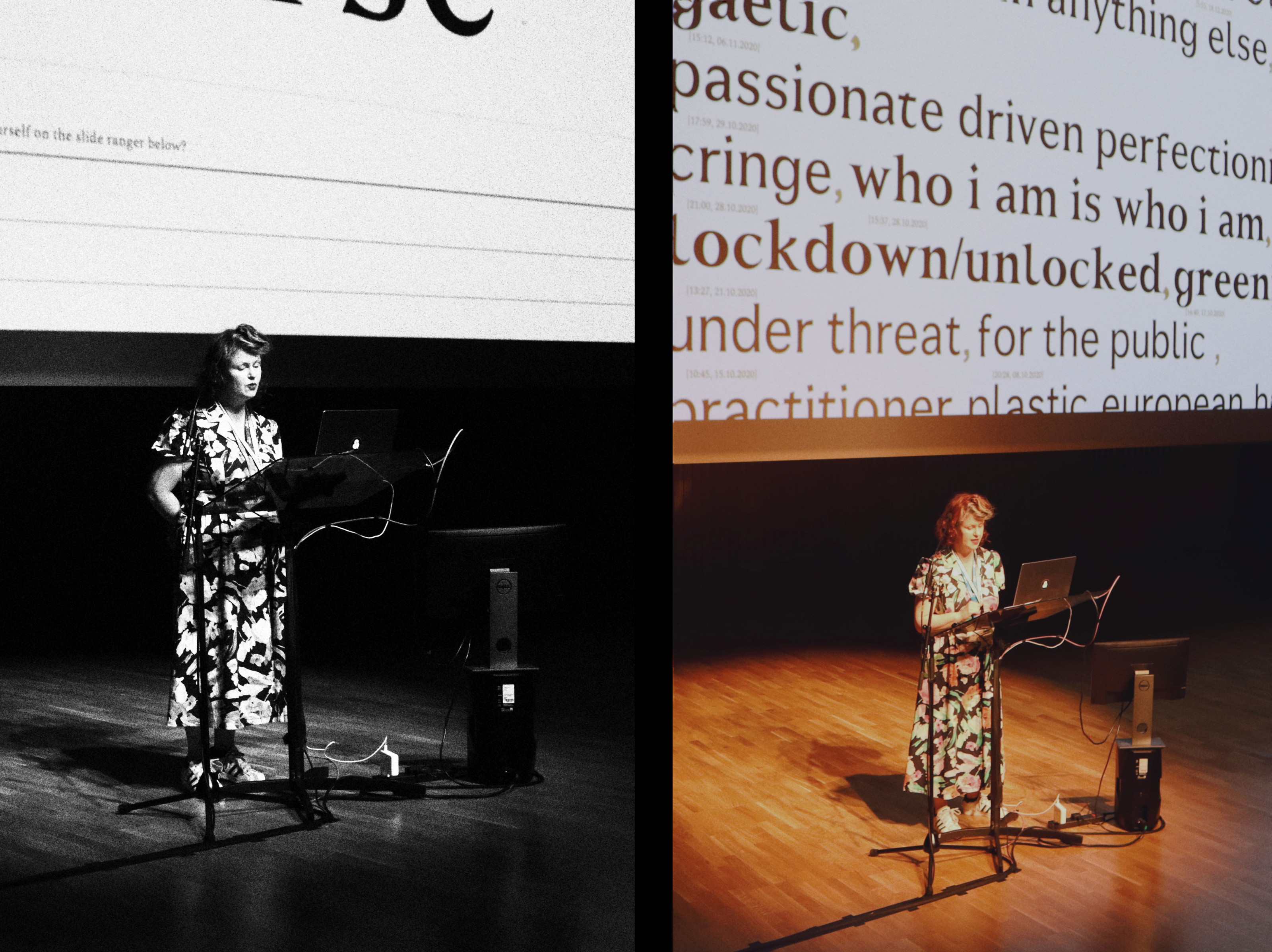
Liza Enebeis (Studio Dumbar) similarly unpacked process in her ‘more is more’ talk ‘Character in motion’ during which letters spun and flexed in celebration of the possibilities for working with motion design. As founders of the Demo festival the studio transformed Amsterdam’s Central Station into an art gallery for 24 hours, repurposing the 80 advertising screens as digital canvases. For a jazz festival they evolved a set of rules for visual improvisation in response to the spontaneity of the music. It was hugely encouraging to see creative thinking so heavily underpinned by the studio’s playful approach to digital making, with outcomes emerging from an iterative cycle of experimentation. Such openness to risk-taking in practice was later amplified by Astrid Stavro (Atlas) in a talk which shared a position more than a practice. Do what you’re most scared of!
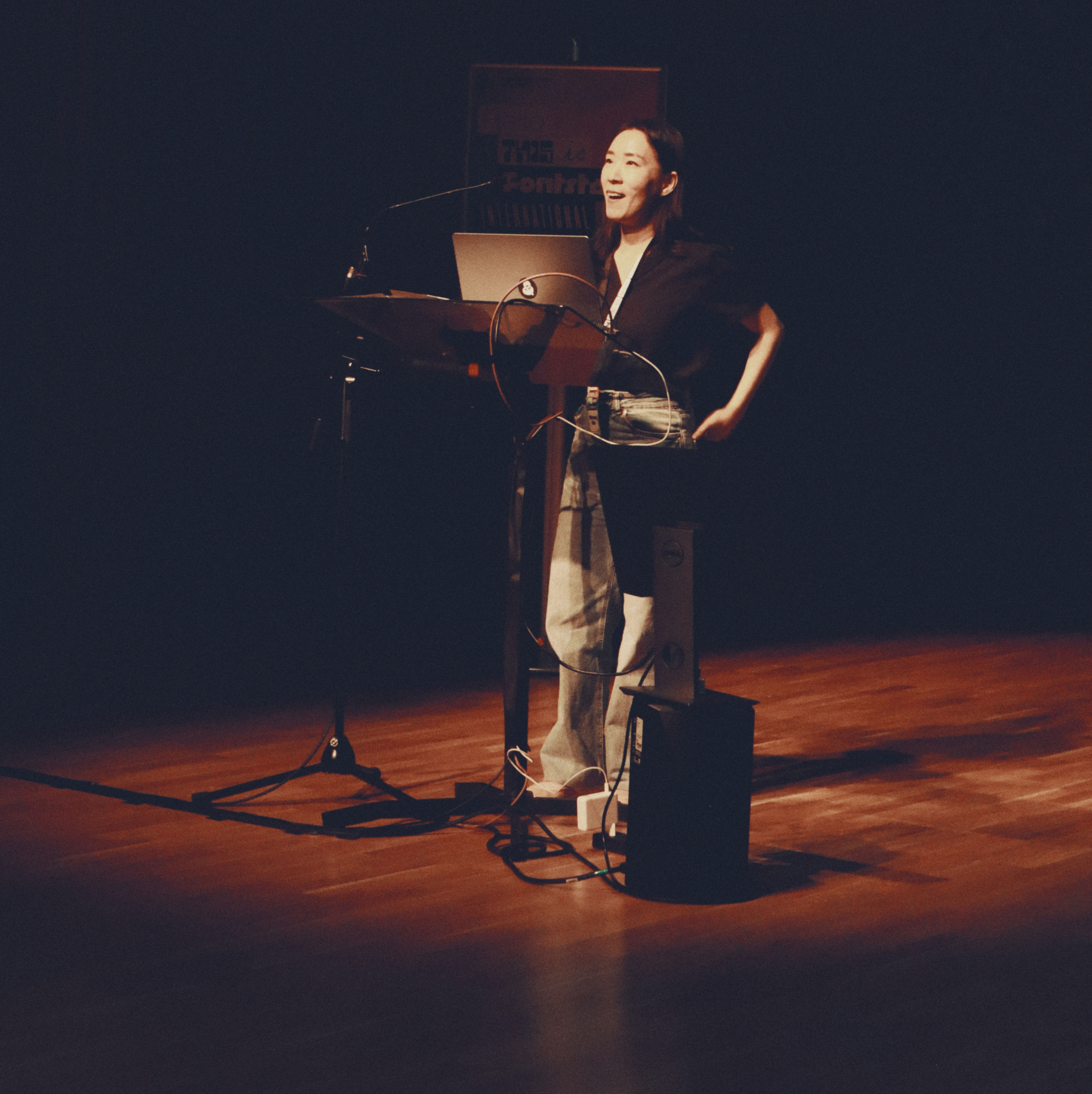
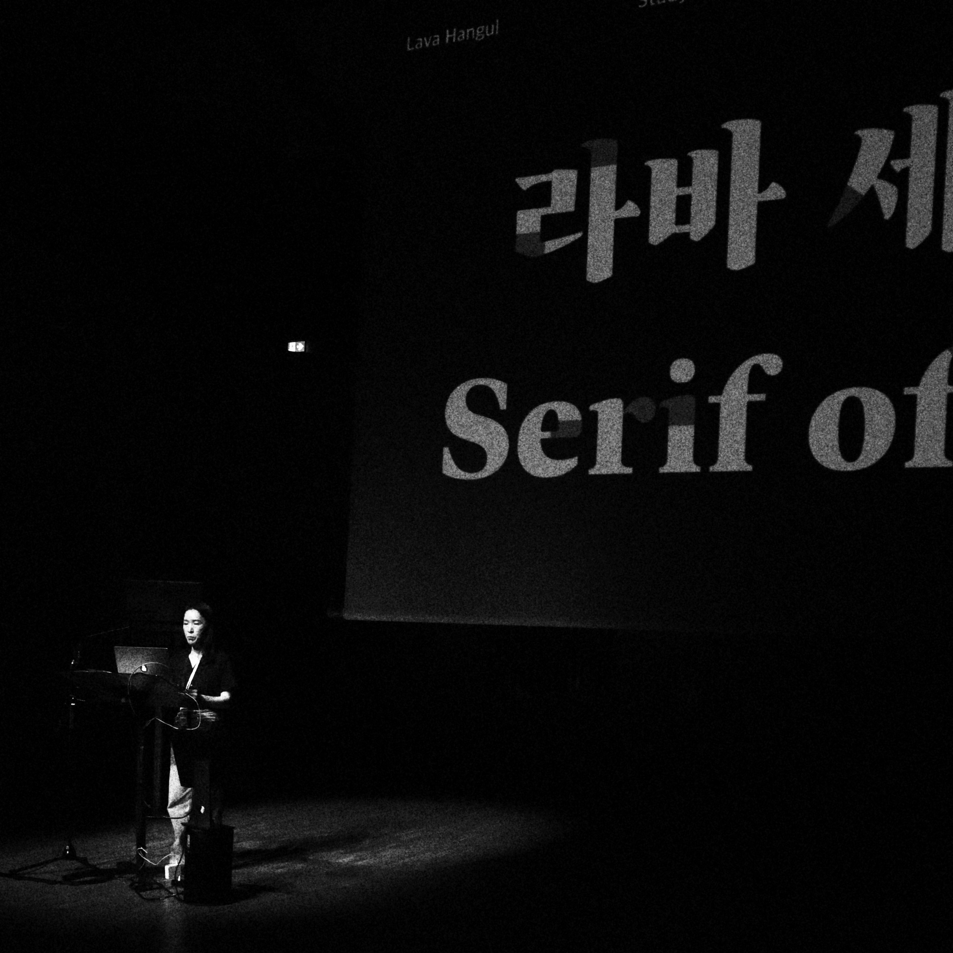
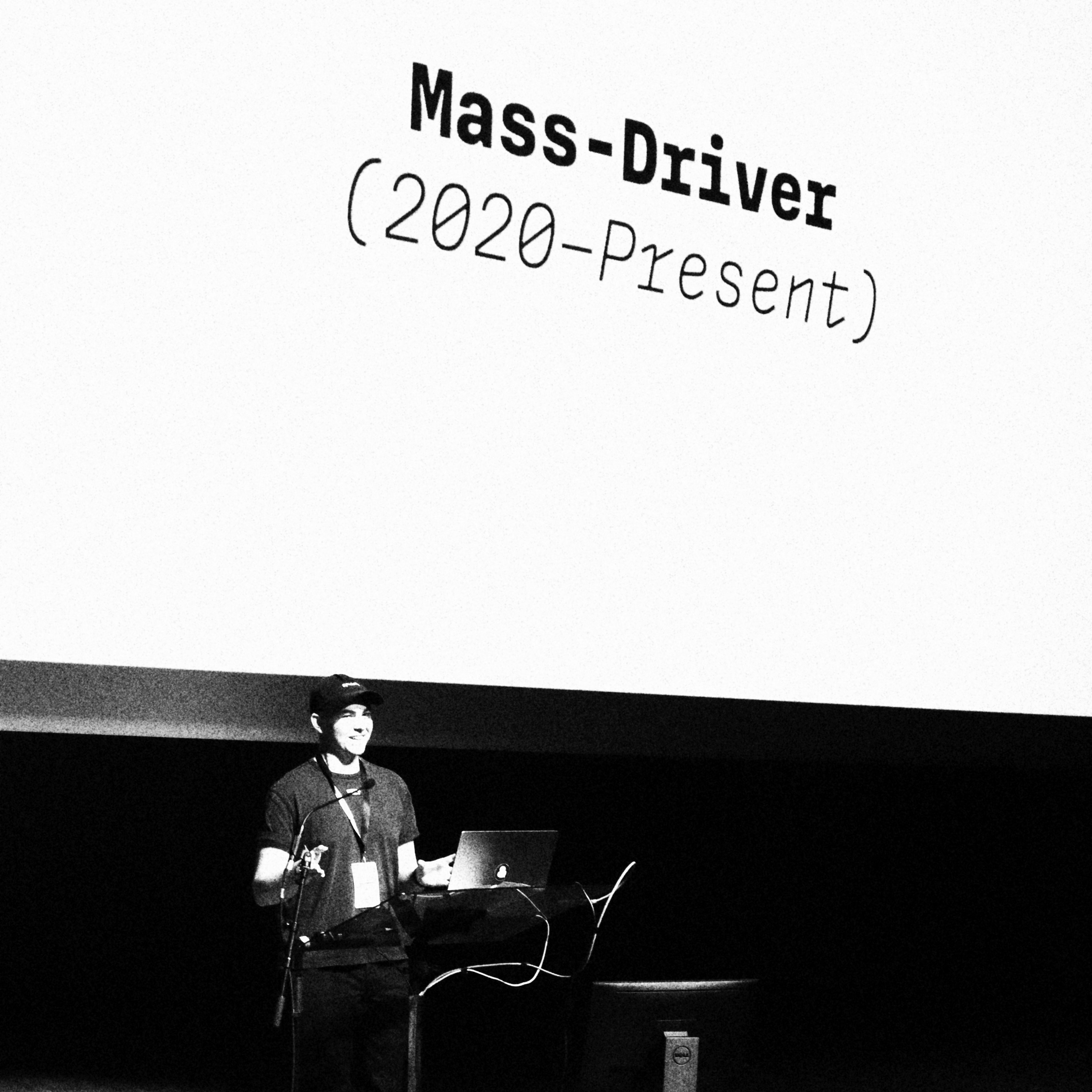
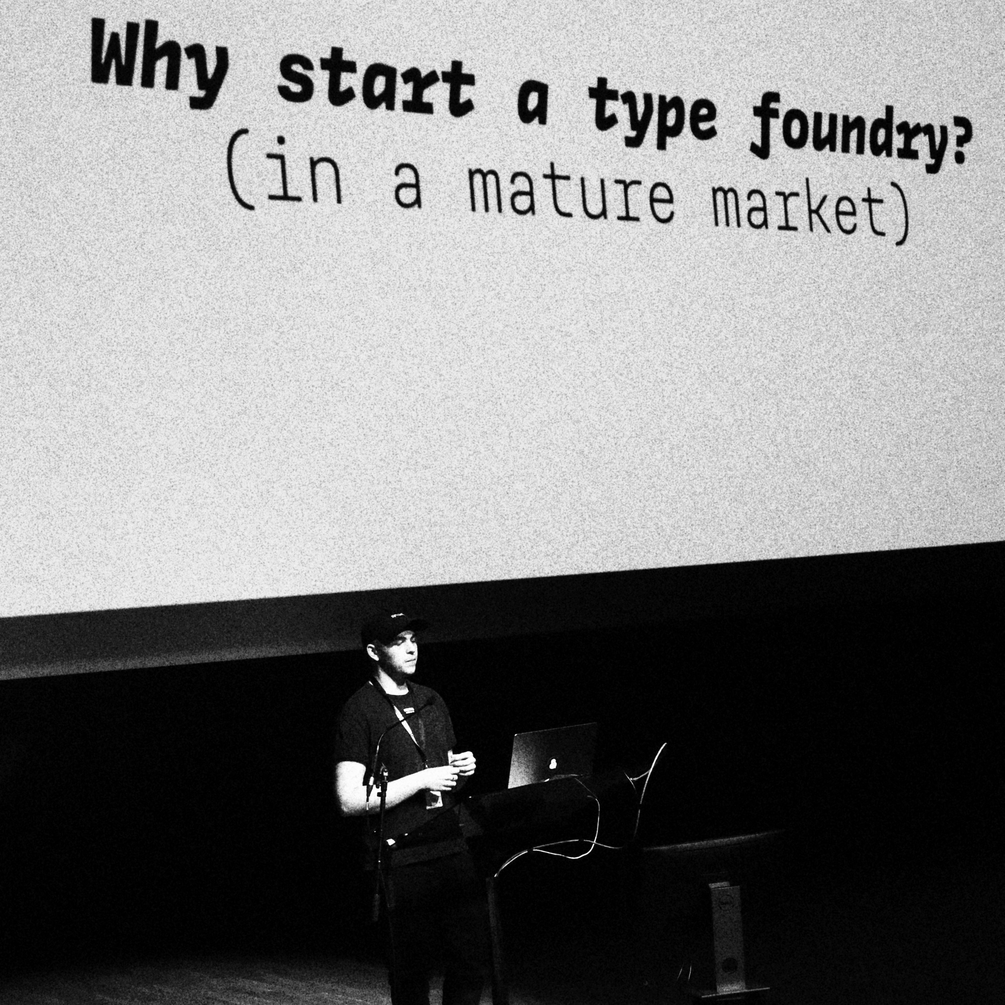
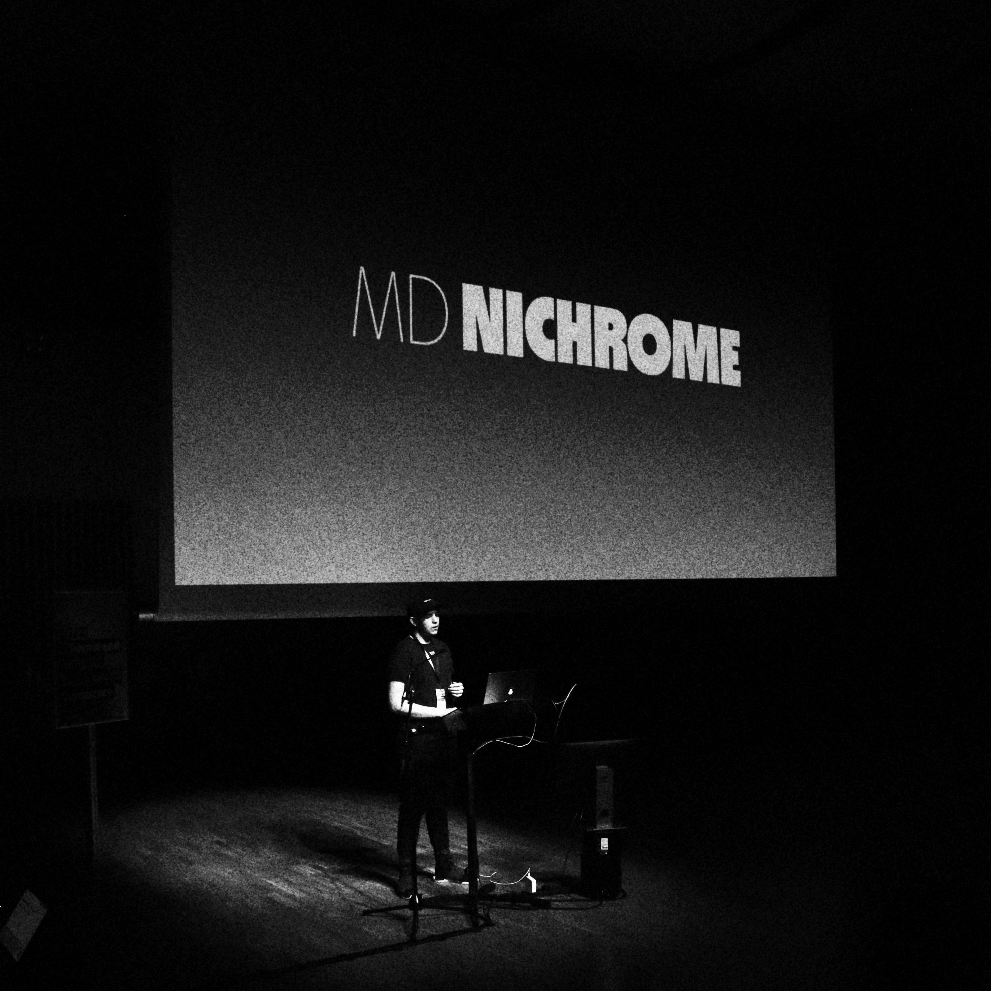
Several speakers chose to focus on more formal concerns, with Jonas Hecksher (Playtype) zooming in on the form of a single character, the Danish ‘g’. Though as his talk revealed the quirk of an incomplete-tailed ‘g’ is an import from Germany that somehow stuck and became a part of Danish typographic and linguistic identity. Chorong Kim (Sandoll) shared a case-study in the contextual reinterpretation of Typotheque’s Greta Sans typeface as a Korean type and the outcome of a new ‘humanist’ form of Hangul. Rutherford Craze (Mass-Driver) showed how his digital-native approach to type sought opportunities for practical invention given the constraints of designing to a pixel-grid. His well-justified points also spoke of the wearying challenge of carving out new creative spaces as a young designer when so many typefaces already exist. As he wryly reflected, no-one ever asks young musicians if we need more music.
Annie Atkins held the opening keynote of our 2023 conference. She spoke about the design of props for film and how these can make a fictional story feel real.
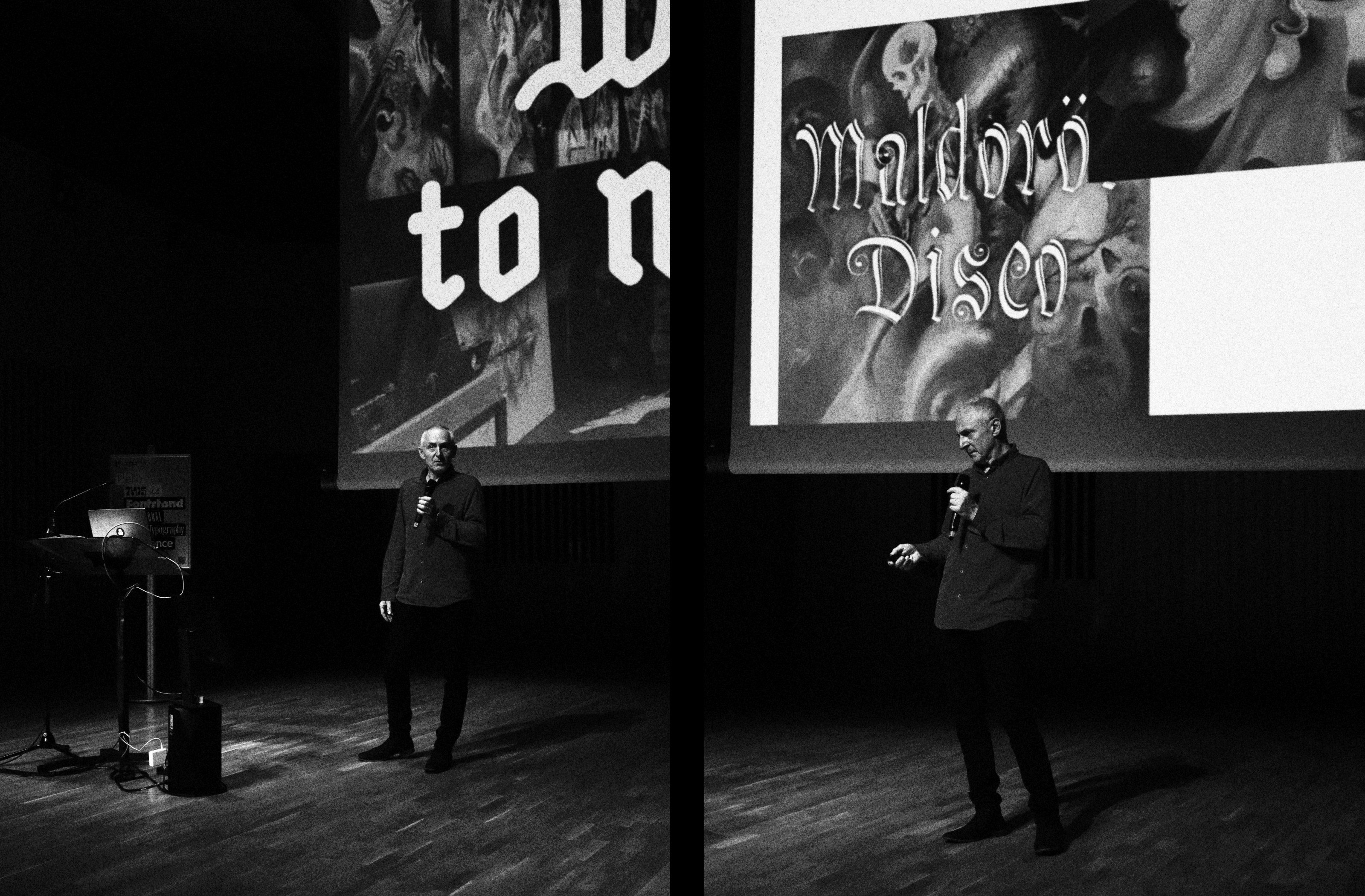
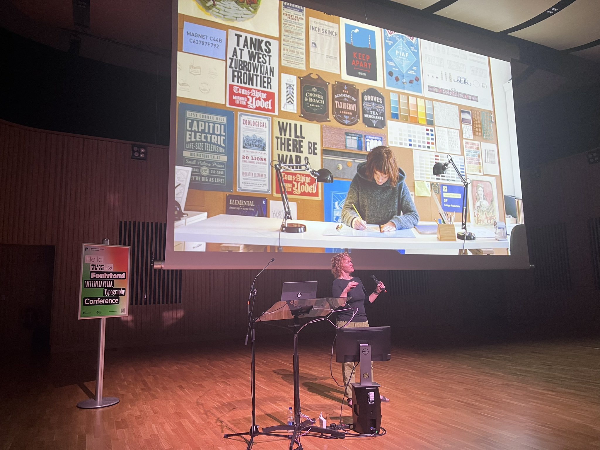
Other speakers shared in various ways a series of interesting reflections on the character of type. Annie Atkins modestly described her work as a graphic designer for movies as working on, ‘all the things that everybody sees and nobody cares about’. Yet, through her collaborations with directors such as Wes Anderson her graphic design often assumes the role of an actual character in the films. Czech musician, photographer and general polymath František Štorm (Storm Type) presented designs for several book series in which he combines the character of his typefaces with the expressive potential of drawing in illustrative evocations of the words of Bram Stoker and H P Lovecraft. It was a showcase of a prolific creative and clearly evidenced why he has had no time for talks for many years, making his appearance at the conference a rare treat.
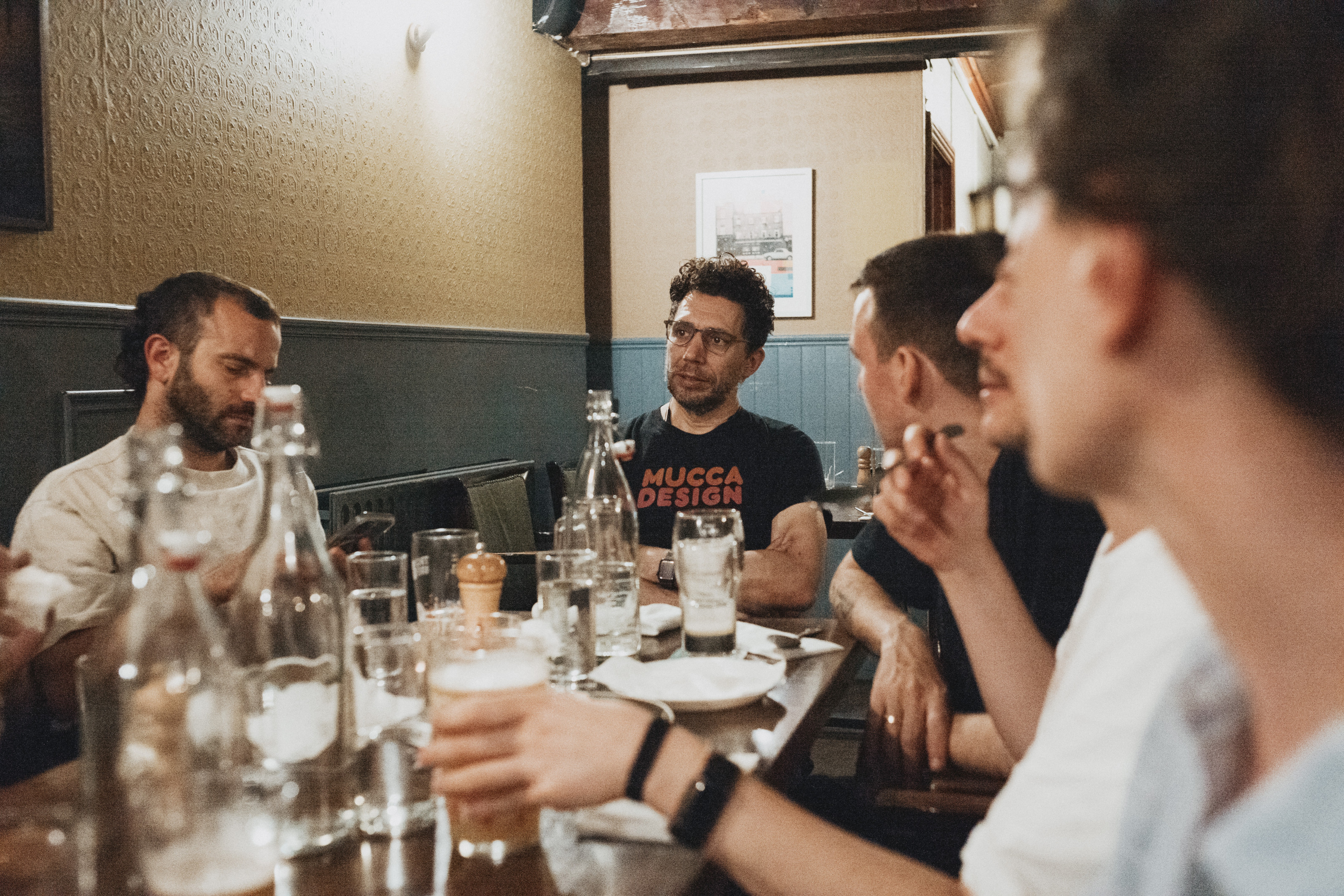
Matteo Bologna (Mucca Typo) talked us through his exhaustive (and exhausting) branding project for the Tin Building, a culinary market hall located in lower Manhattan’s seaport. The scale of the project was a challenge, needing to capture the heritage of the building itself while extending to a huge number of sub-brands including 12 dining venues and even the market produce. By anchoring the identity in type Bologna shared how he was able to use fonts as the thread which held the historic character of everything together. Mark Porter (Mark Porter Associates) drew the day to a close with another complex branding project aimed at uniting into one master brand a cluster of Irish Independent newspapers without resorting to any of the cliches of how to reflect what Irish culture might look like in design.
And so, thematically, at least, we ended where we began. Though not quite. New connections had been made and friendships both started and strengthened over the many coffees and beers shared. In other ways, too, we had all moved forwards, aware of new possibilities for how we might each think and work with type. Thank you Fontstand.