“It is to a ‘non-technician,’ the Italian poet F. T. Marinetti, the founder of Futurism, that the credit must be given for providing the curtain-raiser for the change-over from ornamental to functional typography.”
– Jan Tschichold, Die neue Typographie, 1928, p. 54 (translated by Ruari McLean)
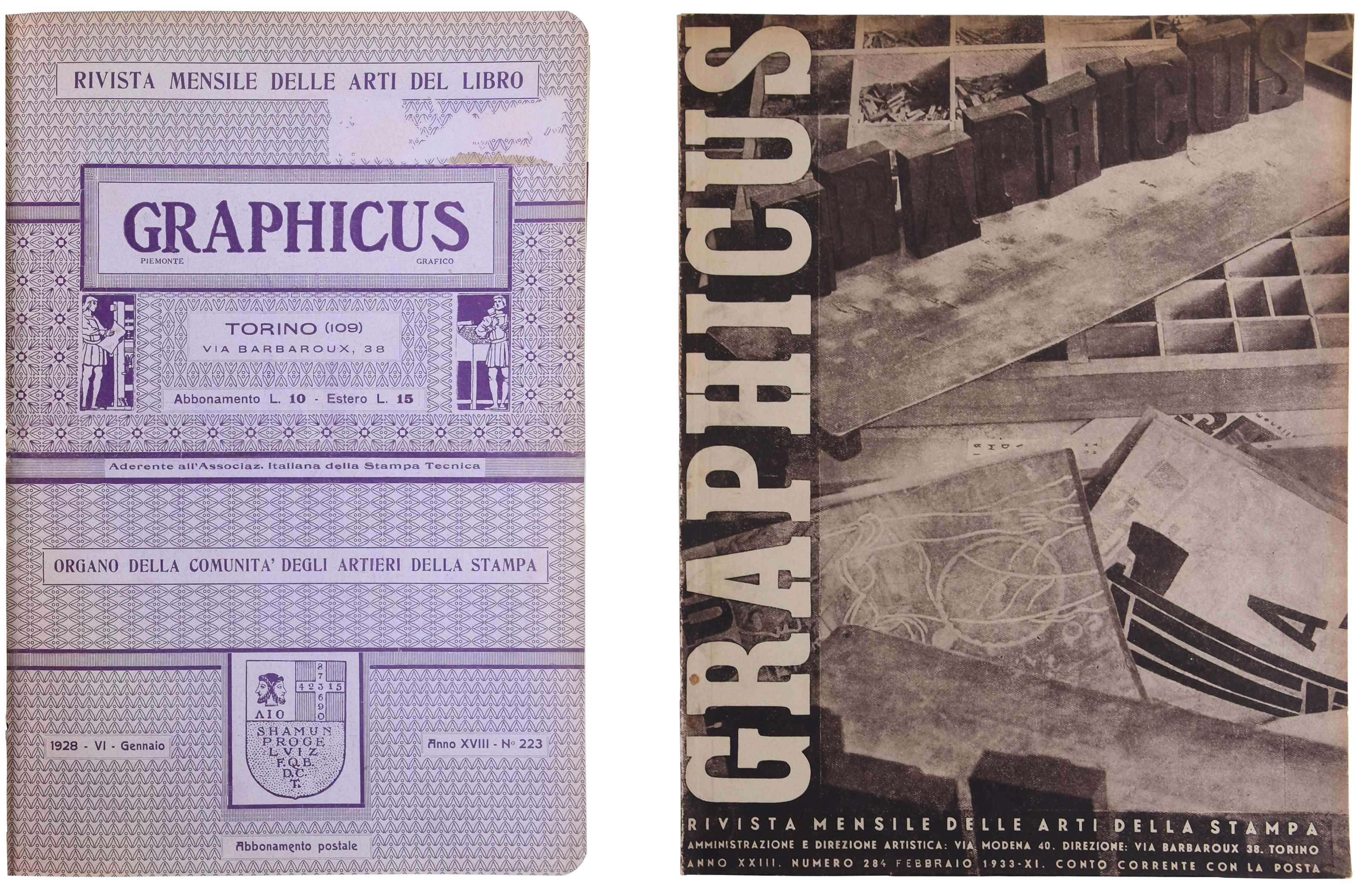
With the paragraph above, Jan Tschichold contributed to placing Futurism on the map as one of the primary roots of what he called “the new typography.” However, when leafing through Italy’s trade publications of the time, it would be hard to find a similar acknowledgment of the relevance of the avant-garde movement. That is hardly a surprise because, in the late 1920s, the primary Italian typographic magazines Il Risorgimento Grafico and Graphicus were still firmly in the hands of supporters of that very “typographic harmony of the page” that Marinetti had set out to destroy with his poetic manifestos. As this article will try to show, the version of modernism that developed in fascist Italy had its own roots and motivations.
The period of the Fascist dictatorship – known in Italy as the “Ventennio” – began at the end of October 1922 with the March on Rome and Mussolini’s seizure of power. It lasted until his ousting in 1943 and was followed by the Repubblica Sociale Italiana (Italian Social Republic), which administered the territories occupied by the Nazis in northern Italy until the end of the Second World War. In the more than twenty years of its rule, the fascist regime managed to pervade Italian politics and society, leaving visible signs even in architecture and visual communication. The history of Italian graphic design of that time is recently receiving renewed attention, with studies that finally take fully into account the complexity of the context, such as Archigraphiae, edited by Matthieu Cortat and Davide Fornari, with essays by Chiara Barbieri and Carlo Vinti.
In the 1920s and 1930s, typography was mostly considered from the perspective of the art of printing. In 1928, Il Risorgimento Grafico defined itself as a “Monthly magazine of graphic art and technique,” while Graphicus was a “Monthly magazine for the arts of the book.” On their pages, many advocated for the improvement of typography, often looking at the country’s glorious past, with Giambattista Bodoni as the guiding light. What hope for renewal one had was placed in the hands of artists, whose collaboration with typographers would lead to the continually called for aesthetic improvement. Current trends in the European and North American printing fields received some attention; however, the most evident innovations – such as the use of lowercase type or constructivist layout – were usually dismissed as bizarre curiosities.
Nevertheless, Italy developed its own form of graphic and typographic modernism, which, as Carlo Vinti recently noted, took place not in spite of living under a Fascist regime but also because of it. Fascism had a strong interest in the arts and heavily influenced the art system through state-led exhibitions, institutions, and corporations – but it did not endorse one unique official style. For instance, modernist architecture lived alongside a monumental one, which strived to compete with the traces left by the Roman empire.
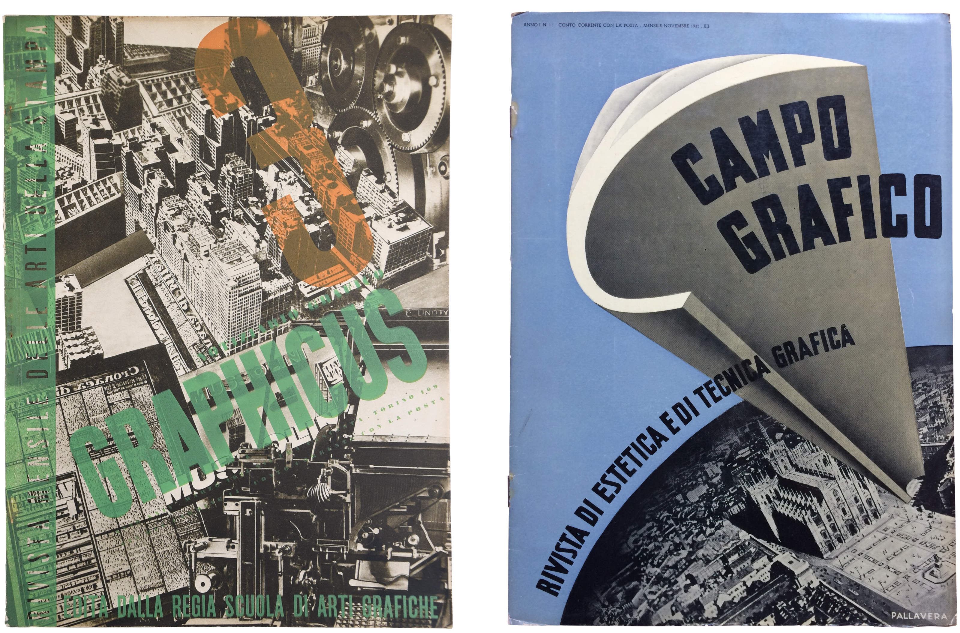
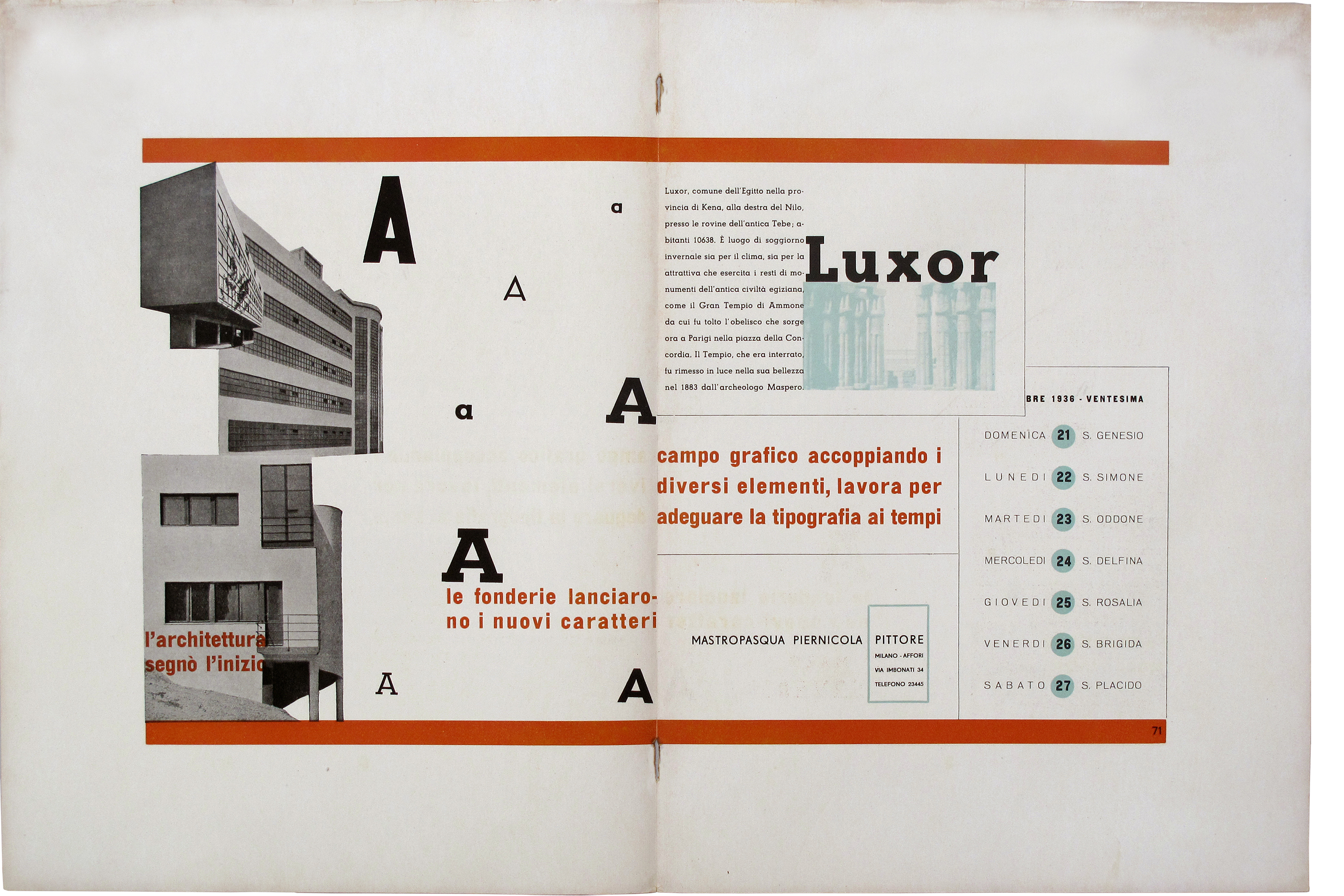
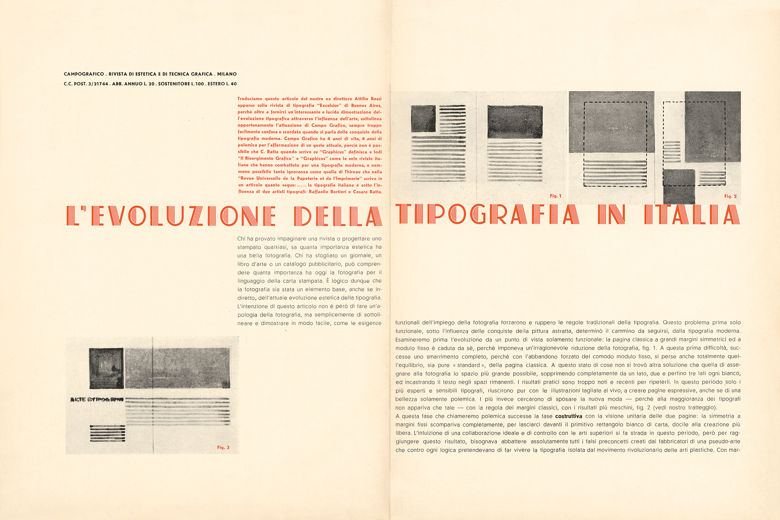
These influences were clearly visible in the pages of the most well-known typography magazine of that time, Campo Grafico – founded by a group of typographers-printers. In 1933 the “campisti” set out to inspire their colleagues with a mix of technical and artistic content and with a continuously changing layout that could provide them with examples of “the current possibilities of graphic art, disclosing the continuous mutations of trends and means in this era of fertile progression.” Throughout the short life of the magazine, whose last issue was published in 1939, the editors tried to avoid explicit connection with fascist ideology, which was instead very evident in Graphicus.

Rationalist architecture (the term used in Italy), together with abstract painting, was one of the primary references for typographers who wanted to innovate the field. Antonio Boggeri, the founder of the Milanese studio bearing the same name, went so far as to state that architects were better suited to creating modern layouts than painters due to their greater compositional ability.
But what did “being modern” mean at that time in Italy? Looking at the debate in trade magazines, one cannot find an unambiguous definition; it could mean including the latest technologies and accepting photography – and sometimes photomontage – as effective communication tools, but it was rarely about radical innovation. A shared intent was to educate the audience and develop a sense of what critics often called “gusto moderno” (modern taste).
In 1935, art critic and journalist Pietro Maria Bardi complained about the lack of a typographic style that could reflect its own time and praised the efforts of people like Guido Modiano and the Campo Grafico group for bringing new ideas to the field. “We love Italian-style typography, clear, designed with a constructive feeling, renewed without extravagance, and considered with intelligence. We accept any revolution as long as it is based on logic. We think of typographic rationalism: a return to elementarity, serenity, and simplicity.”
This balanced approach to modern layout can be seen, for instance, in Quadrante, the magazine co-founded by Bardi and printed by Modiano, which aimed to create a bridge between modernism in architecture and the arts and the ideas supported by the regime.
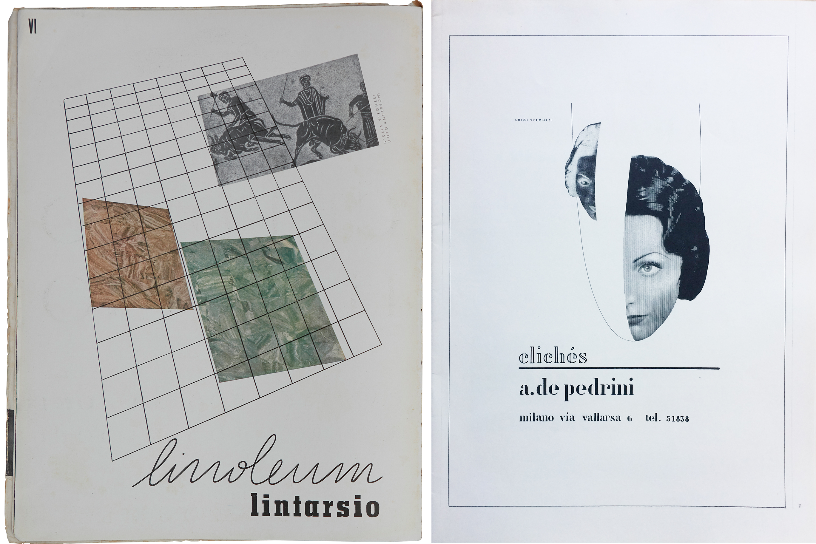
Graphic designers and typographers were often trying to propose something “new” – without rejecting the tradition for which Italy was recognized – something that could be seen as a form of betrayal under a nationalist regime. Guido Modiano, one of the main supporters of an Italian “new typography,” was accused of being “too German” in his work. Having inherited his family’s printing company, Modiano was a key figure in those years, working alongside people like Edoardo Persico, Bruno Munari, and Riccardo “Ricas” Castagnedi in creating some of the clearest modernist designs of that era.
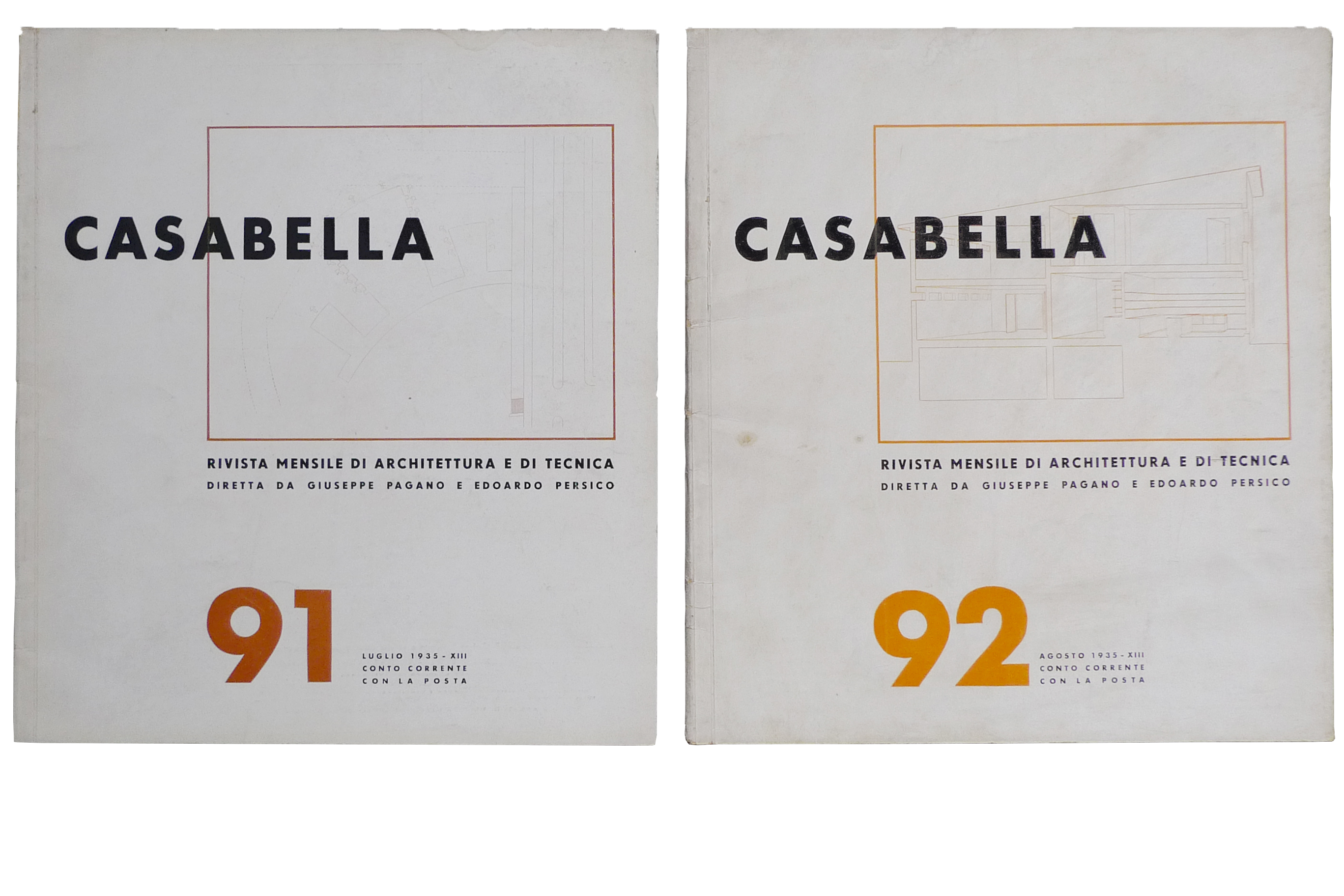
The architectural magazine Casabella, under the editorship of Giuseppe Pagano Pogatschnig and Persico, was another space where modernist design was promoted. Its layout, developed by Persico with the essential contribution of Modiano, followed the idea that two pages should form a visual unit and was based on a four-column grid where photography had a central role. In 1933 the magazine adopted a squarish format, and in 1934 chose a new standardized cover layout; this was not entirely new in trade magazines of the time, which often showed little variations in the covers of each issue. However, its asymmetric arrangement and its use of Futura for the title and issue number aligned Casabella with the Central European typography of the time.
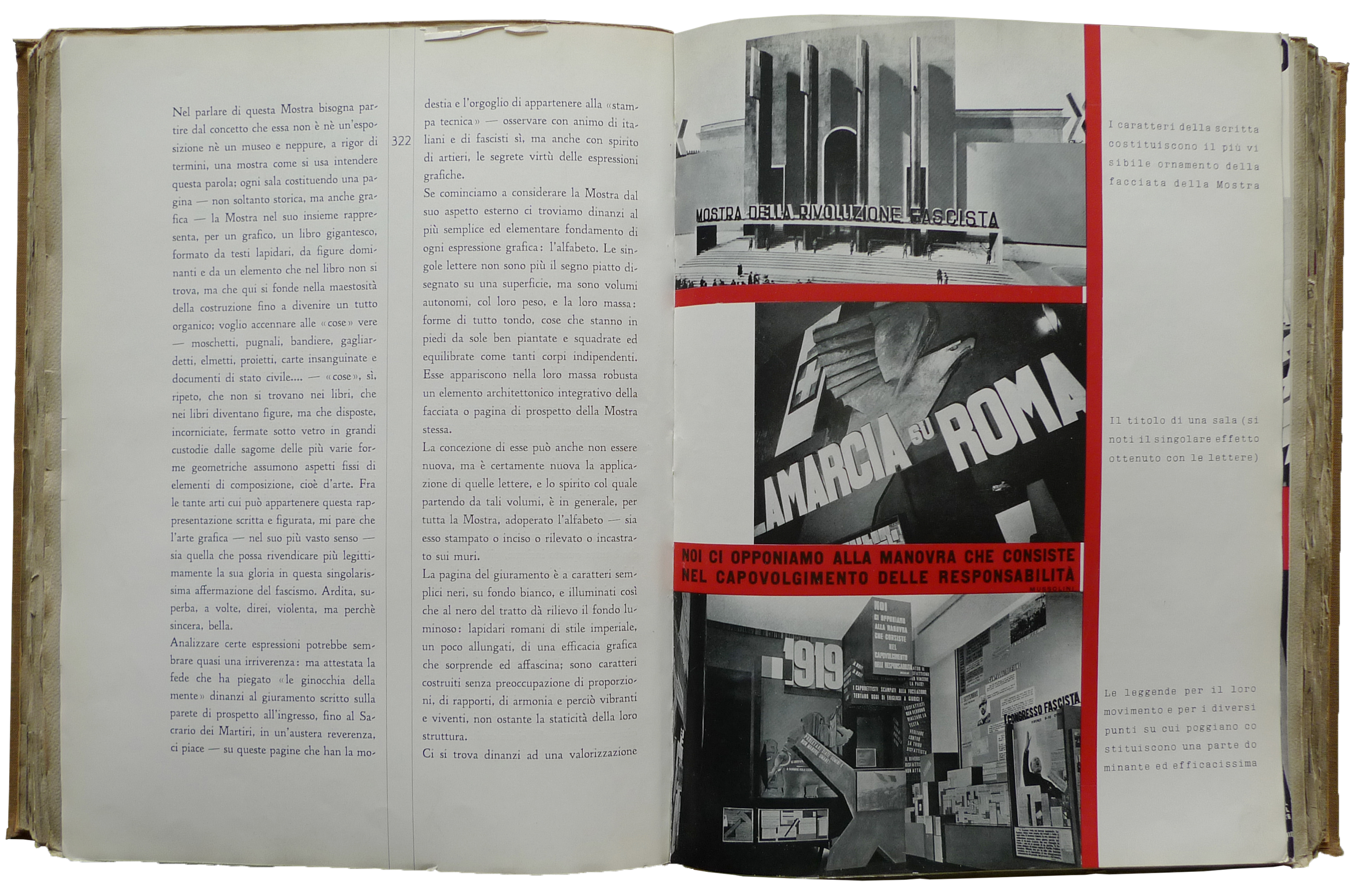
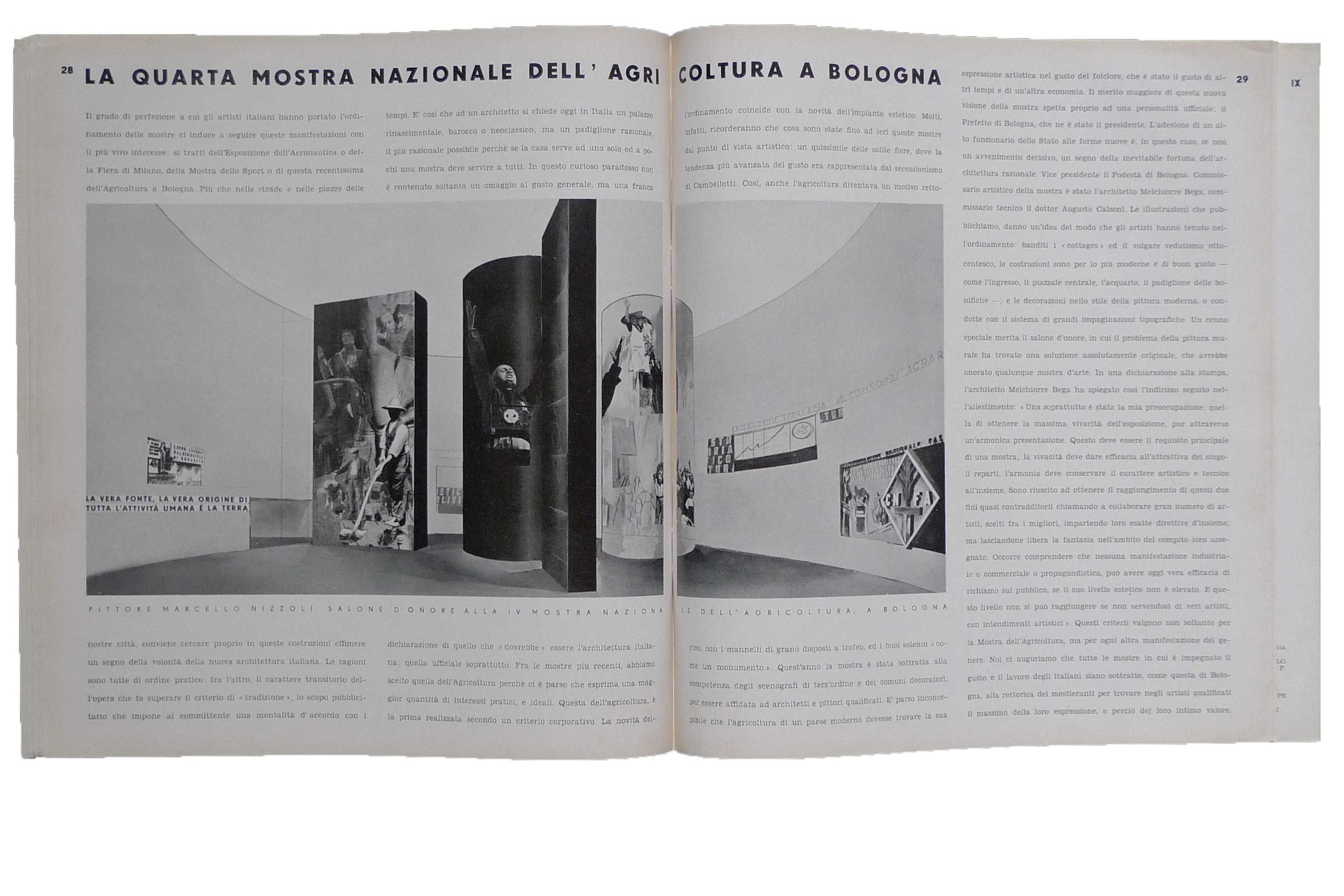
Although architects and their magazines were among the most enthusiastic advocates of modern layout, one of the greatest impulses for the modernization of design and visual communication came from the relentless exhibition activity promoted by the PNF [National Fascist Party] to spread and secure its cultural dominance in all fields. The Mostra della rivoluzione fascista [Exhibition of the fascist revolution] – a show celebrating the first ten years of Fascist rule in Italy in 1932 – was acclaimed on the pages of Risorgimento Grafico, Graphicus, and Campo Grafico as “the most important ‘layout’ we have ever seen,” a model to follow for designers and typographers alike for its effective use of text and image on a monumental scale.
Renowned Italian designers and artists, such as Erberto Carboni, Bruno Munari, Marcello Nizzoli, Edoardo Persico, Giovanni Pintori – many of whom went on to play an important role in post-war graphic design – were involved in these events, celebrating the achievements of the regime in economic, social and technological fields. The exhibitions, besides their role as a tool of fascist propaganda, contributed to expanding the field of activity of Italian graphic designers, who were called to design three-dimensional displays and temporary façades.
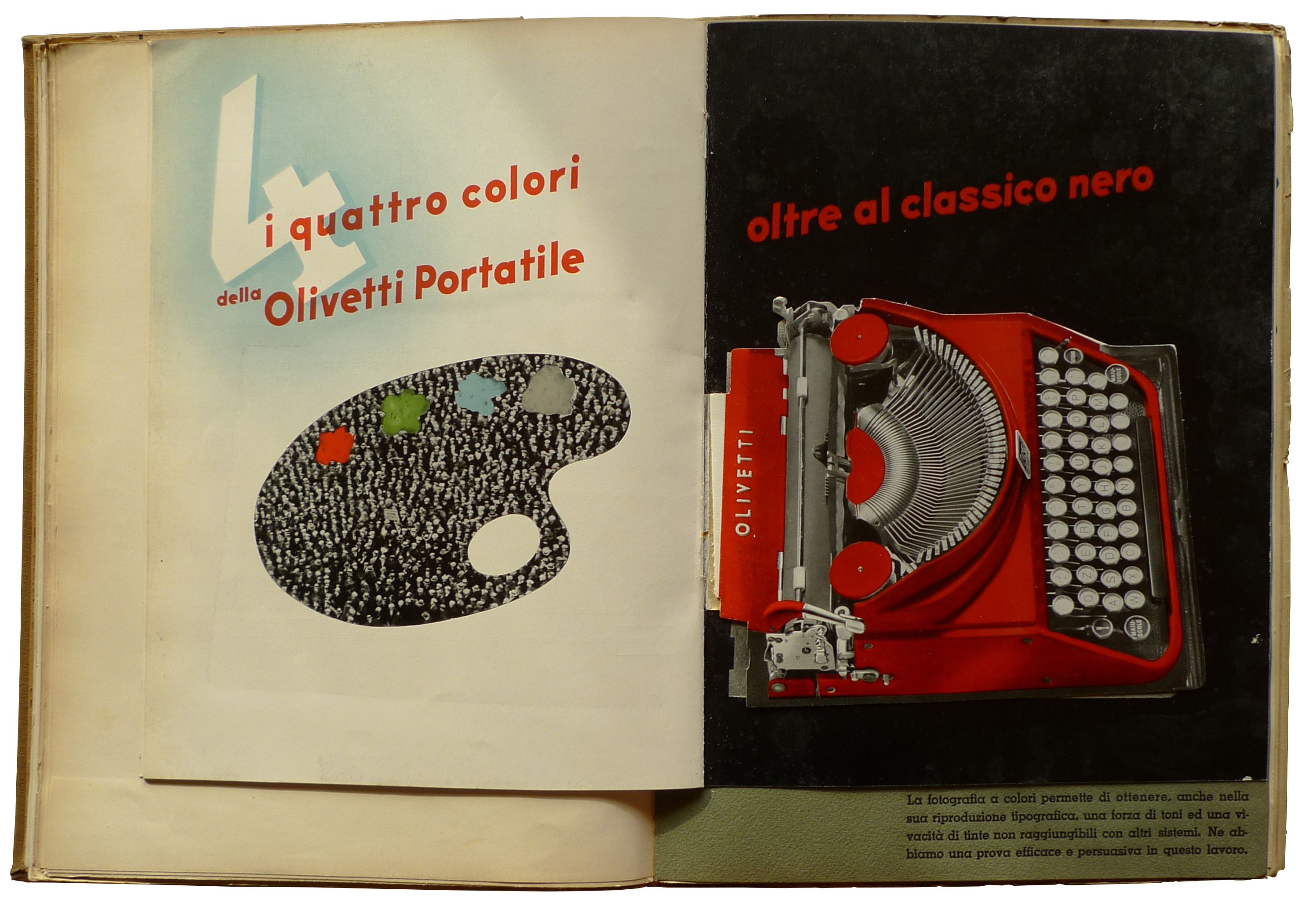
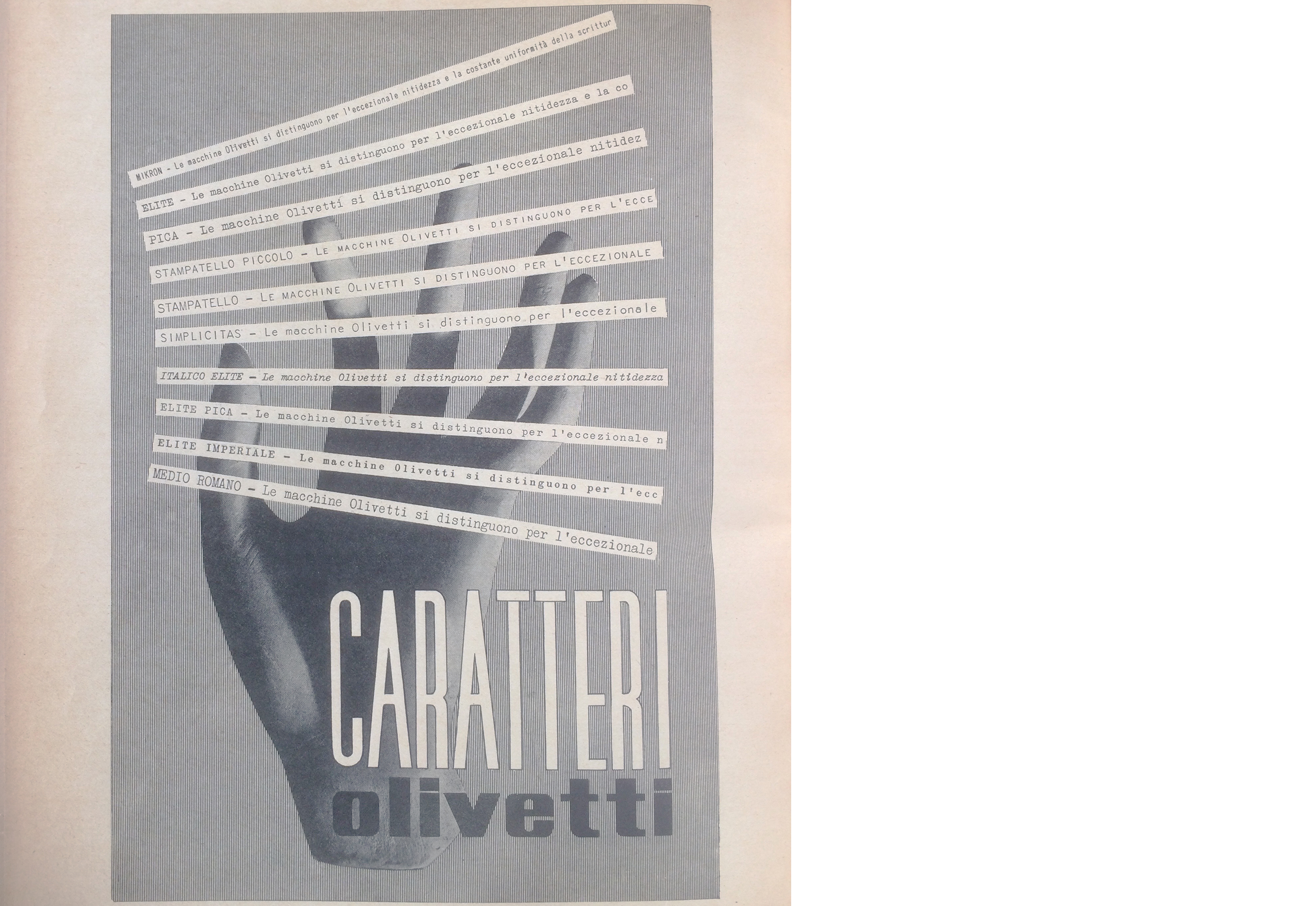
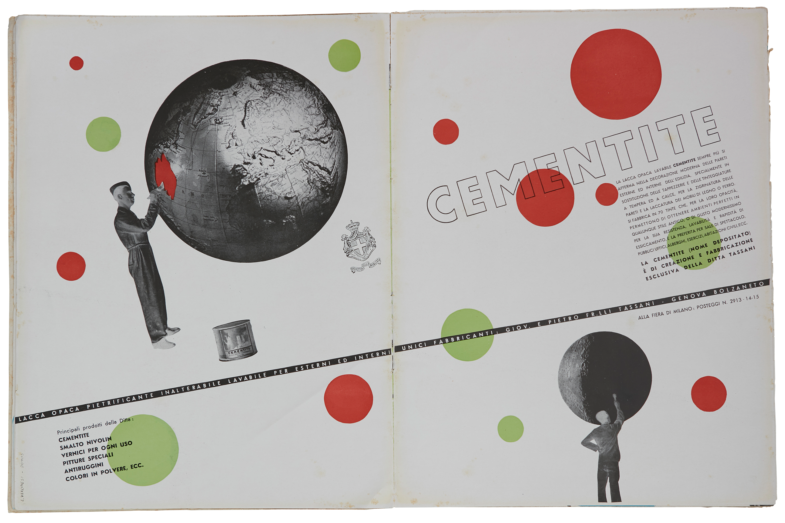
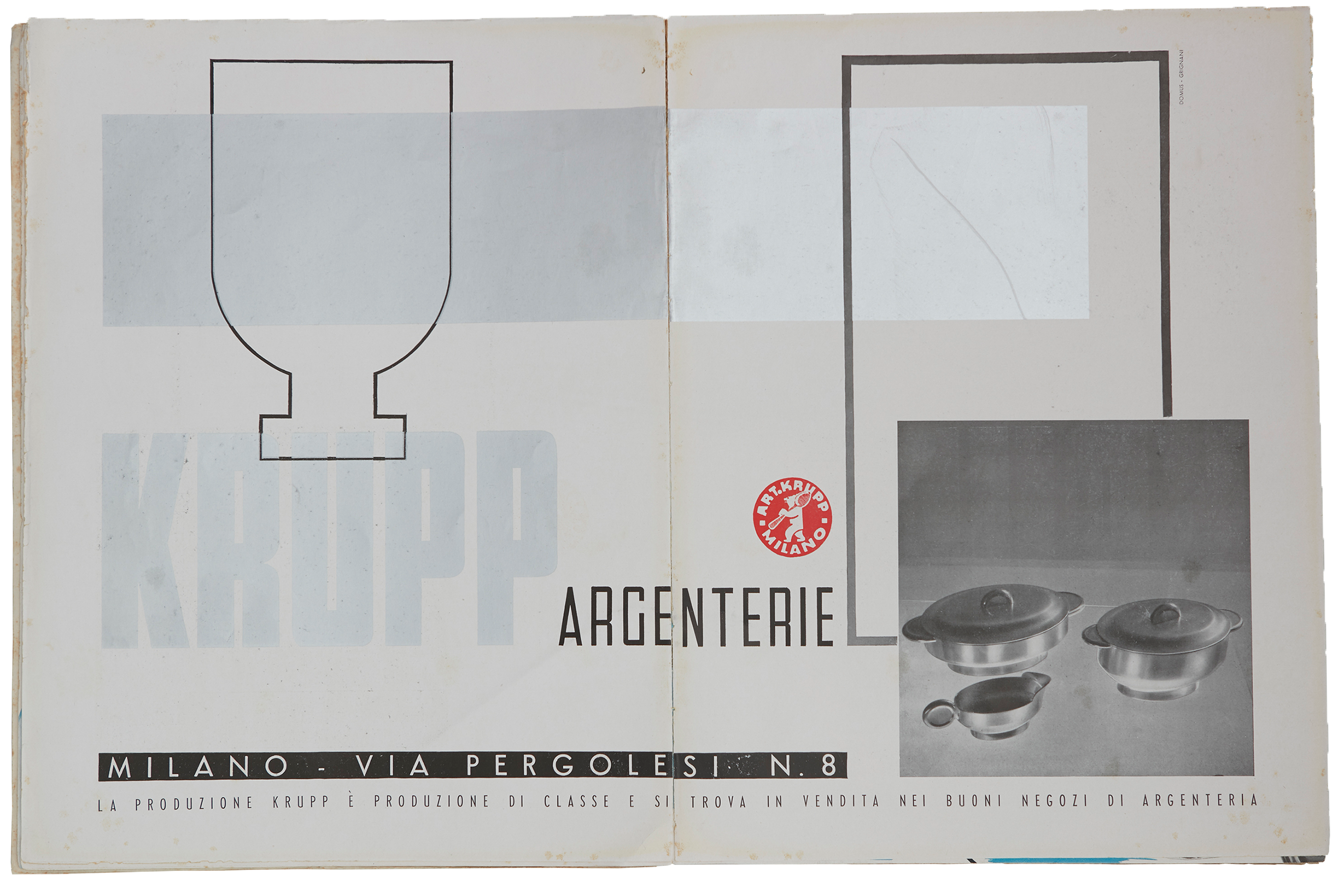
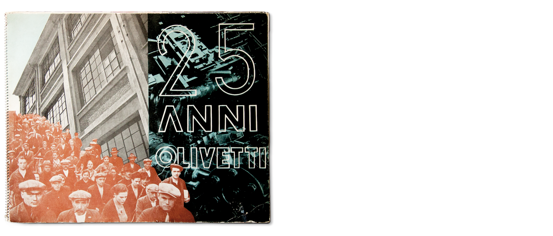
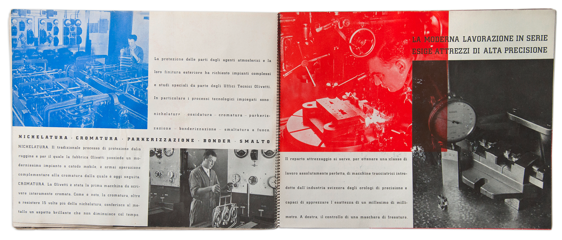
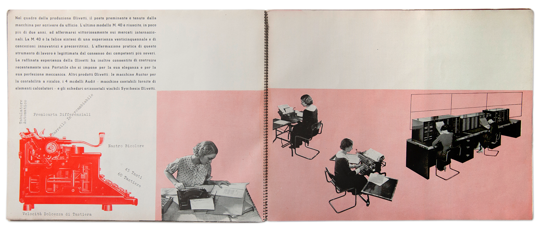
Another expansion of the field came from the general acceptance of advertising as a new and rewarding business; trade magazines gradually abandoned their traditionalist approach and acknowledged the need for new typefaces and layouts that could attract the audience with their novelty. Photography became widely accepted in the 1930s as an effective tool for advertising, and photomontage became popular – both in propaganda publications by the PNF and its organizations and in promotional brochures by industrial companies such as Olivetti, Montecatini, Snia Viscosa, and others.
Although it took place under a dictatorship, the adoption of modernist graphic design and the increasing interest from a group of innovative companies for advertising and visual communication in the 1930s can be seen as the root of the post-war “Stile industriale” that made the Italian approach to corporate communication an internationally recognized example.
References
Matthieu Cortat & Davide Fornari (eds.), Archigraphiae. Rationalist lettering and architecture in fascist Rome, ECAL Lausanne, 2020
Carlo Vinti, 01. Tif – Campo grafico, Tipoteca Italiana Fondazione, 2019
Marla Stone, “Exhibitions and the cult of display in fascist Italy,” in Germano Celant (ed.), Post Zang Tumb Tuuum. Art Life Politics. Italia 1918-1943, Fondazione Prada, 2018
Jeffrey Schnapp, “The spectacle factory,” in Germano Celant (ed.), Post Zang Tumb Tuuum. Art Life Politics. Italia 1918-1943, Fondazione Prada, 2018
Jeffrey Schnapp, Bruno Munari, “Maquette for the advertisement Forces of the Empire, 1937,” in Jodi Hauptman & Adrian Sudhalter (eds.), Engineer Agitator Constructor. The artist reinvented, 1918-1939, MoMA, 2020
Alessandro Colizzi, “Renato Zveteremich,” in Progetto grafico 24, 2013
Alessandro Colizzi, “Milan’s anarchic Modernist,” in Eye 85, Spring 2013