Google returns a few links when you search for his name, but nothing that does justice to the veteran lettering artist whose career spanned more than six decades. His work has appeared in countless periodicals and record labels, as well as for plays and film titles. If you grew up in India in the ’80s and ’90s, there is a good chance you will have seen his work in one of those spaces.
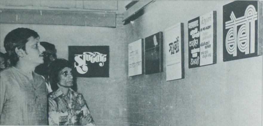
Amol Palekar inaugurating Kamal Shedge’s first exhibition.
Early Career
Kamal Shedge’s introduction to the world of making letters was through his father who worked as a calligrapher at the Times of India newsgroup’s art department. Shedge was more inclined towards writing stories but having fared poorly in his high school exams, pursuing that line of study was difficult. It was then that his father asked him to join him at work. His lack of formal education as a designer proved to be an administrative hurdle initially until the famed art director Walter Langhammer intervened with the concerned personnel and brought him on board. When he started in 1955, he was working on smaller jobs of completing or finishing the rough sketches of senior designers in the department. Back then design and layout was all an analog job and Kamal worked hard to master the laborious process that involved measuring, tracing, inking, cut-pasting sheets and meticulous attention to details due
Steadily his growth and confidence as a letterer increased and he was assigned designs for mastheads of the festive magazines such as “Dipawali”and “Chandrakant“ released annually. as well headlines for article in Marathi and English monthly magazines such as Dharmayug, Filmfare, Illustrated Weekly and Femina. He was closely mentored by subsequent Art Directors of the Times Group, JD Gonghaleka and Ramesh Sanzgiri under whose guidance he would develop his layout and typesetting sensibilities.
Top: Maharashtra Times nameplate drawn in 1962. Bottom: A self-edited version included by Shedge in his 1995 showing the changes he would have made decades later.
Theatre Titles
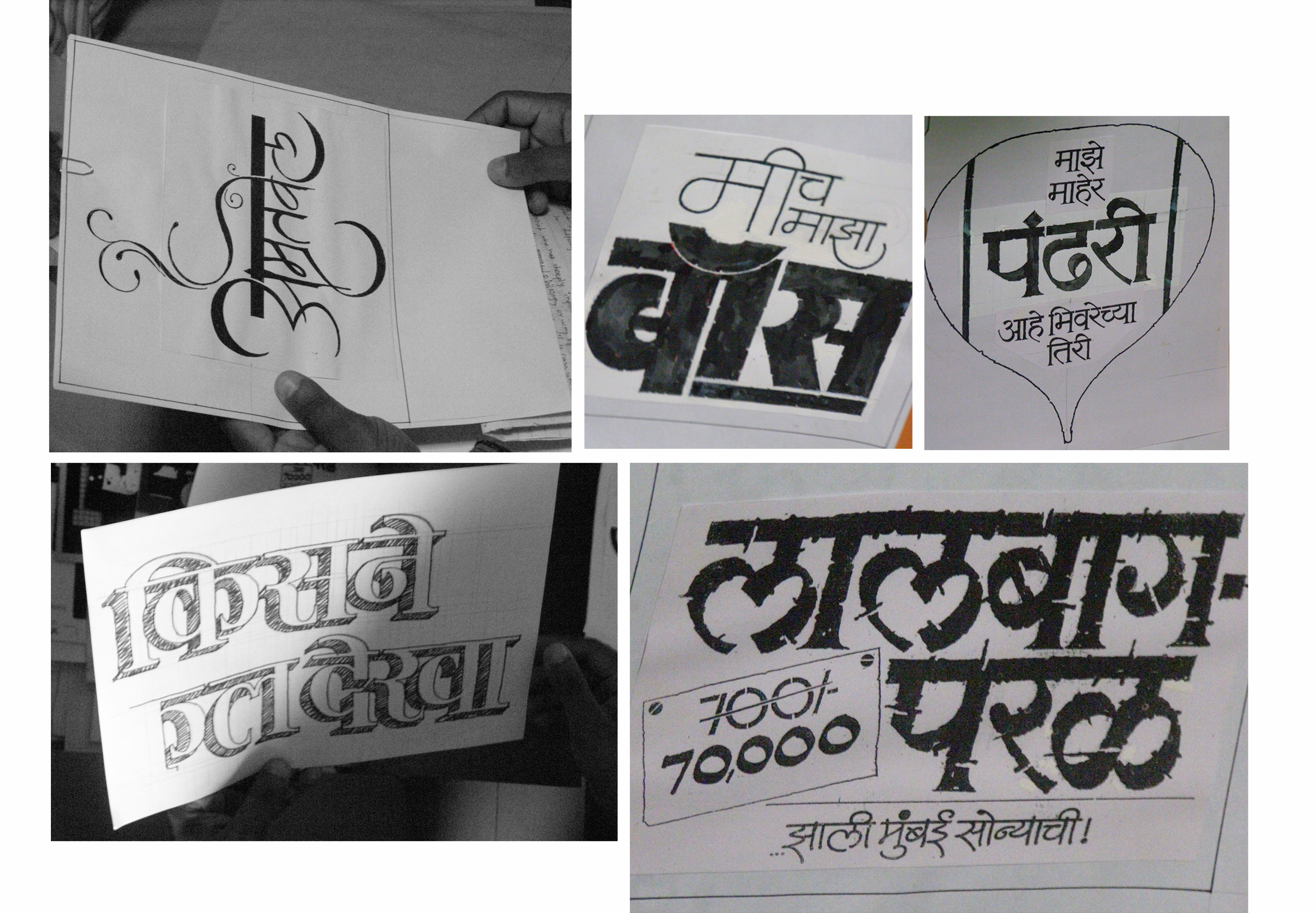
At the recommendation of a colleague, Kamal Shedge got to design his first title for a play in 1962. It would take almost two years to get the next opportunity but after the design for “Matsyagandha” his demand only kept growing. His ability to transform the letters into evocative typographic forms and embed in them expressive elements brought his many admirers. He not only designed countless such titles but also their advertisement layouts . The training he had as an in-house newspaper designer equipped him perfectly to design single column layouts that stood out in the classifieds. “Extremely versatile and experimental” is how Lokesh Karekar, an illustrator and founder of Studio Locopopo describes Shedge’s work. Karekar sees the fidelity of the forms paired with strong concepts in Shedge work as an indication that the man had a great command not only on his hand but also on his mind.
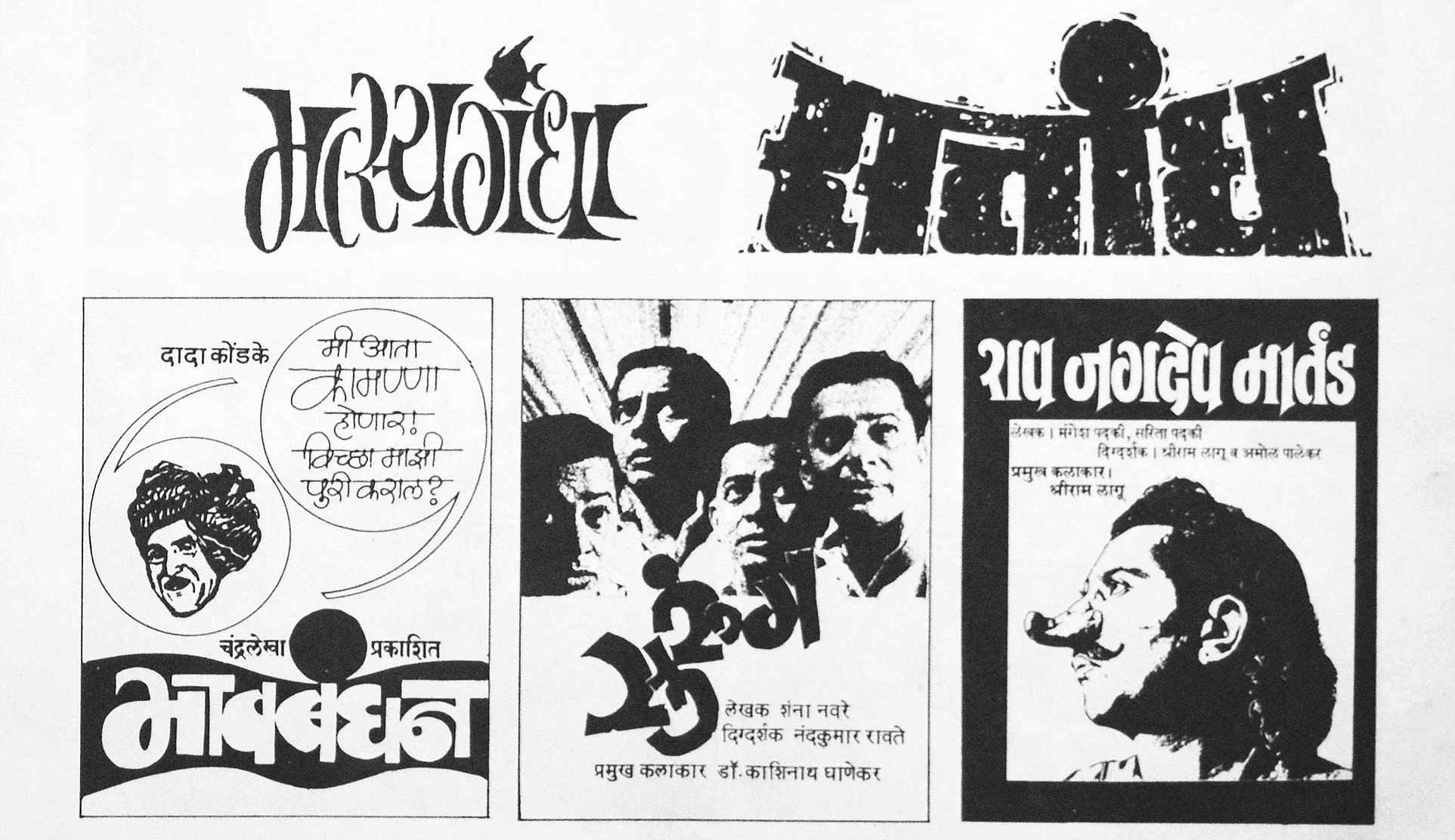
Various Theatre Titles and advertisements designed by Kamal Shedge. On the top-left is the design for “Matsyagandha” which launched his title design career.
Kalnirnay
In 1974 he was approached by Jayant Salgaonkar to design the logo for the then fresh venture “Kalnirnay”. This was a marathi calendar-almanac combination that has since branched out to other languages. Shedge agreed and since the first day of 1975 the Marathi calendar has carried the logo and numerals designed by Kamal Shedge. Noopur Datye, type designer and co-founder of EkType remembers growing up with the calendar being a permanent fixture at home, as is common in all Maharashtrian households even today. Datye considers the numerals designed by him for the dates to have ideal Devanagari proportions.
Adaptive Style
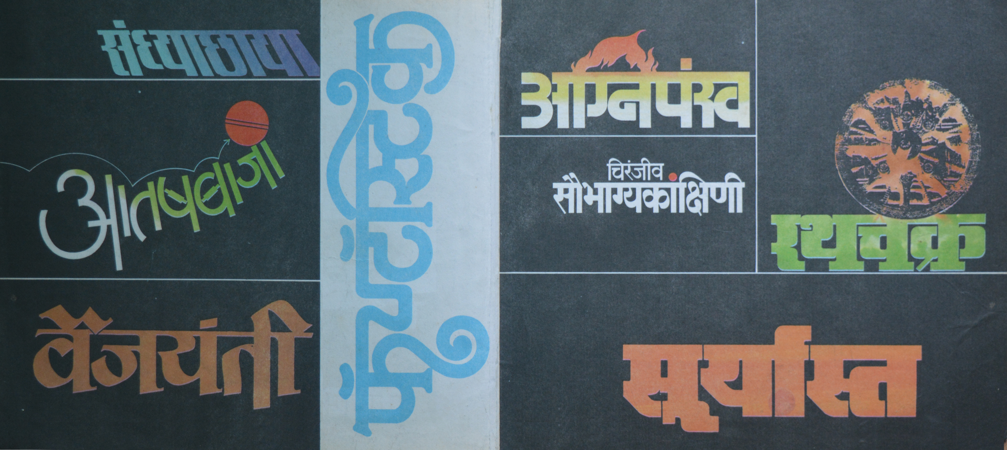
While designing for Theatre titles he met Mohun Wagh who was setting up his own theatre company “Chandralekha”. and went on to design many titles for the production company. Over the next two decades they also worked on several cover designs for records and cassettes. Wagh was credited with the photography and Kamal incorporated that to design not just the title but the entire sleeve jackets and cassette cover. His versatility ensured he was a popular choice and he ended up working on record covers for Indian classical music icons like Bhimsen Joshi as well as playback singers such as Lata Mangeshkar while also creating artwork for Bollywood film music with some Gujarati records on the side.
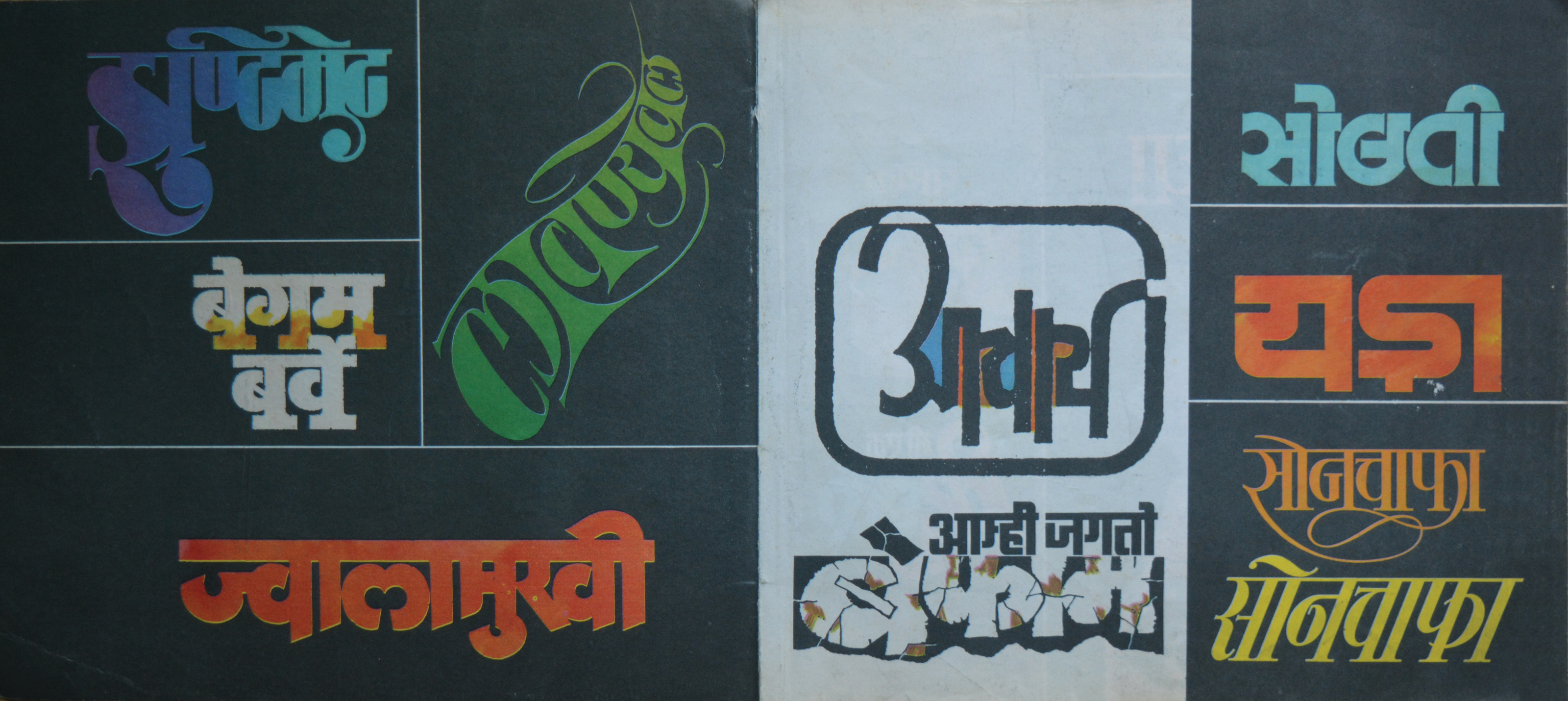
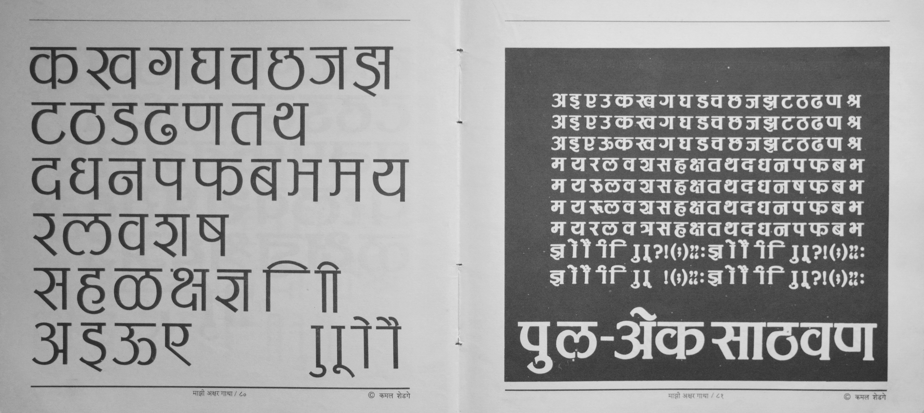
Not only was he adept at expressive lettering for Devanagari, he had developed an acute sense of how to adapt a style to that script. There is strong evidence of borrowing sensibilities from Latin lettering examples. The generous use of serifs in his Marathi letterings is witness to the fact but gets away with it because of a strong grasp of the typographic form of the Devanagari script. In his book “Maaji Akshar Gaatha” Shedge talks about how it was Sanzgiri who exposed him to English publications such Elle, Seventeen, McCall’s and Look very early on and he was aware of what his contemporaries in the west were creating. His grasp of how the tool made a mark informed the outline he drew for the letter. Even when creating calligraphic forms he preferred to use the two pencil technique to create outlines and then fill in the spaces.
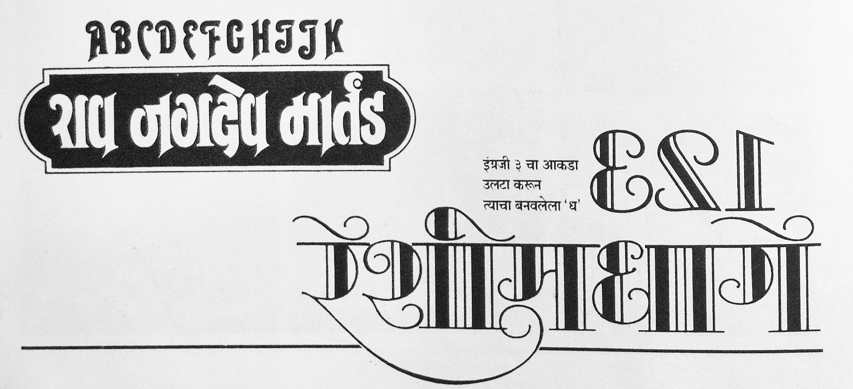
Comparisons of Shedge’s Marathi lettering and the original Latin-script letterforms he based them on. In the bottom-right design, he flipped the numeral 3 to draw the Devanagari ध visible directly below it.
Bollywood Calling
This ability to draw across scripts came handy when film producers needed someone to adapt designs for their upcoming releases. He worked on countless Marathi and Hindi films such as Dilwale Dulhaniya le Jaayenge, Devdas, mostly adapting the English design to Hindi but occasionally he designed for both scripts as done for the 2010 film Kites. But appreciation from Bollywood was not something new to Kamal Shedge. Prof. Vinay Saynekar, recollects the fan fare around Shedge’s first exhibition which was inaugurated by Amol Palekar, a leading Actor from the ’70s. Held in 1979 at Sir JJ Institute of Applied art, where Saynekar was a student at the time, he describes Shedge’s designs as “Pioneering” especially memorable for him were Devanagari adaptations of the fonts Stilla and Serif Gothic from the Letraset catalogue. Shedge was not able to design a functional font but the basic character set and maatras for various styles were used across his own designs.
His typographic mastery was grounded in immense practice and skill that he continued to apply to projects right till the very end. He passed away on 4th July 2020 taking with him the magical ability to capture the essence of a story and releasing it into a design that entertained its audience and set the tone for what they could expect. It is no wonder he was crowned “Akshar Samrat”(Emperor of Letters) by his contemporaries.
This article would not have been possible without detailed oral histories from the many people quoted in the article. I am particularly grateful to Prof. Vinay Saynekar for helping contextualize Kamal Shedge’s work in the environment and time period it was created. I am also thankful for Pooja Saxena, as well as to Kalpesh Gosavi, who shared anecdotes from his interview of Kamal Shedge and images of Kamal Shedge’s drawings and rough sketches.
References
Kamal Shedge. “Maaji Akshar Gaatha.” Courtesy of Lokesh Karekar: 2–88.
Kamal Shedge. “Chitrakshar.” Courtesy of Pooja Saxena: 4–10.