Germany’s capital city has a rich tradition of making typefaces. Type design is still a very active design activity within Berlin today. In 2018, the Berliner Morgenpost published a special issue of the Berliner Illustrirte Zeitung on the occasion of what proved to be the last TYPO Berlin design conference. Although its text is only available in German, the issue – available as an 8-page PDF – offers an excellent summary of the city’s type-making activities. This article, written as part of the efforts to highlight a large Berlin type specimen digitization project funded by digiS, centers around H. Berthold AG. That company was founded by Hermann Berthold in Berlin in 1858. In 1893, the firm added a typefoundry. Over the subsequent decades, H. Berthold AG became one of Germany’s largest typefoundries. For a time in the 1920s, it even claimed to be the largest typefoundry in the world. As Alexander Nagel recounts in the video embedded below, H. Berthold AG branched out into photo-typesetting in the late 1950s. By the 1970s, fonts and machinery for photo-typesetting were its prominent business. The company filed for bankruptcy in 1993.
Typefounding and Phototype: A Berlin interview series remembering H. Berthold AG
The Deutsches Technikmuseum is a technology museum located near the center of Berlin. Its Printing and Paper department just published the second of a five-part video-interview series. The series title “Constant Change” comes from a statement made by Manfred Weber, the first person interviewed for it. Weber worked as a type caster at H. Berthold AG from 1960 until 1967, and he noted that “there had always been changes at the company: structural, personnel, there was always change. One always has to relearn, even today. The job you once had won’t stay the same. You will have to relearn how to do it. Yet, what happened back then in the graphics industry was just extreme, in terms of what was revolutionized there.” The graphics industry was not just in a passive state of flux. It also made many changes, innovations, and – above all – knowledge transfers possible.
In West Germany at the end of the 1950s, including West Berlin, the materials used in the typesetting and printing processes began to change fundamentally. This situation was new for many people involved, even though the transition was carried out somewhat later than in the United States, which can be explained above all by the Second World War and its aftermath. Through the end of the 1970s, it was still common in Germany to print from type and clichés cast in lead or brass. For larger-sized texts, wood types and types made with H. Berthold AG’s Plakadur process were often used. In phototype, compositors used different tools: font-matrix discs, hand drawings and cut friskets, letterforms saved onto glass or in computer memory, etc. Alexander Nagel talks about this transition in the second online video interview from the series. As a young man, Alexander Nagel trained as a typesetter. In addition to working at other companies, his career brought him to H. Berthold AG. Later, he founded the Nagel Fototype company, which eventually brought him to MetaDesign in Berlin.
Over the next few months, a sequel will be published for the museum’s previous interview with the type caster Manfred Weber. That will feature a tour of the former H. Berthold AG company headquarters. A transcript of the first film (the interview with Manfred Weber) and his tour of the H. Berthold AG headquarters is already available as a PDF-download (in German).
The H. Berthold AG Photo-typesetting Studio
In 1963, Alexander Nagel began an apprenticeship as a typesetter at a job-printing house in West Berlin’s Tempelhof district. Initially, the work he composed was printed via letterpress. In 1967, he undertook a 40-hour part-time Diatype training course at H. Berthold AG in the evenings. To actually be able to work in phototypesetting, he had to switch jobs. At that time, the Lichtenfelde printing house was the “only company interested in getting new employees in that area.” In that new job, he set the text for the speech bubbles for comics – titles like Akim, Superman, or Tarzan (Nagel, 2021). Phototype composition for comic books’ text offers an interesting parallel to the importance video game design had in the early days of digitization.
Alexander Nagel soon switched jobs again. From the late 1960s until the mid-1970s, he worked inside H. Berthold AG’s phototypesetting studio as a compositor and instructor. Towards the end of his tenure there, he produced 16mm instructional films and audio cassettes in a company recording studio for Berthold’s customer service. Looking back, he describes his former colleagues in the phototypesetting studio, most of whom were also former typesetters, as a “creative community of young people who were open to new ideas.” Work was done at 6 to 8 workstations on the Diatype phototypesetter, a daylight device containing a drum on which film sheets measuring 22 × 29.7 cm were stretched. The glyphs to be set were selected individually, using a lever.
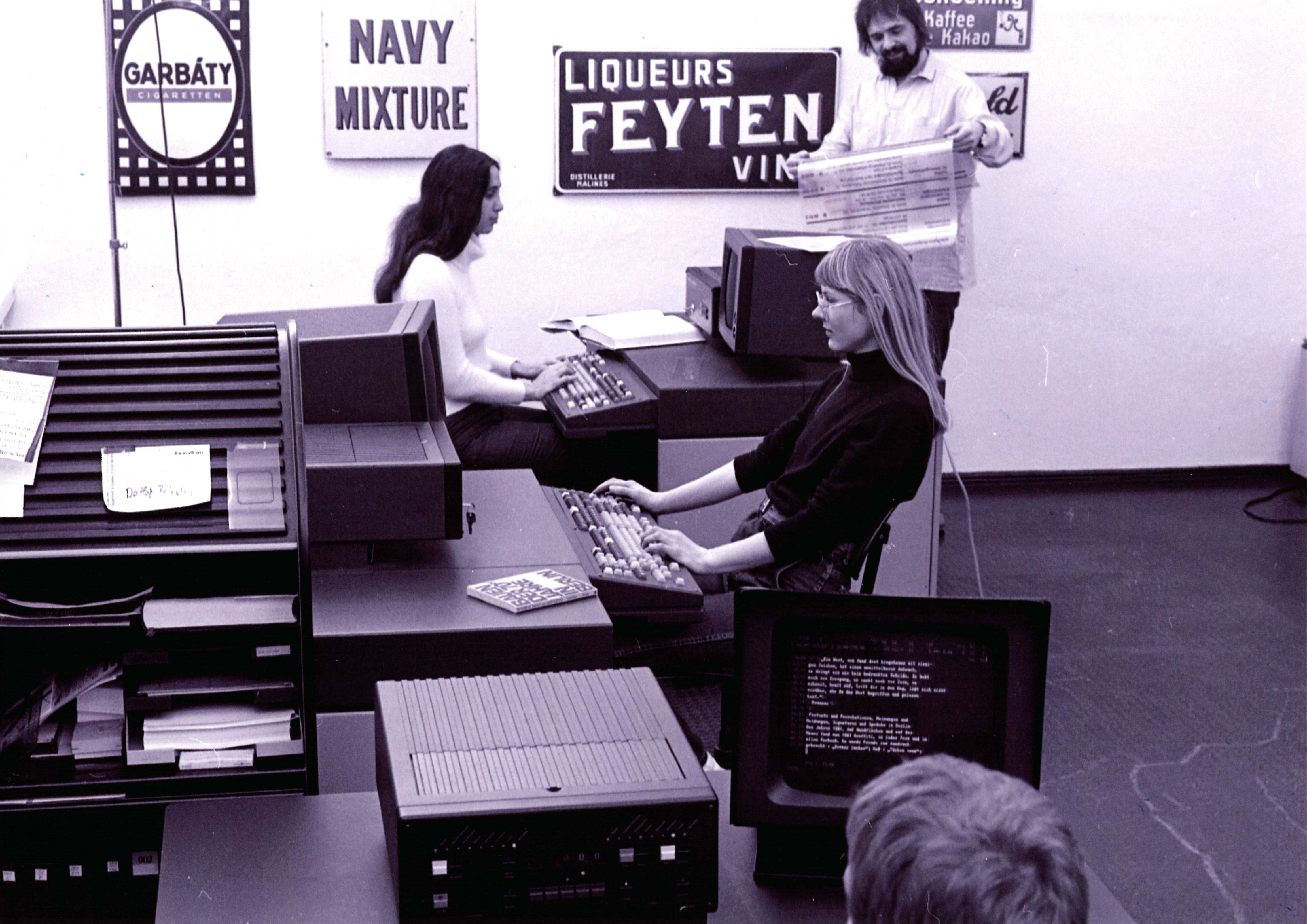
Photograph taken at Nagel Fototype, with Alexander Nagel standing in the back. Photo courtesy of Alexander Nagel.
Printed samples, advertising material, company brochures and type specimen books were all produced on with the “new typesetting possibilities” the machine offered (Nagel, 2021). However, “imaginary orders” were also produced for use as creative typesetting: advertisements, jobbing printing, transit plans or timetables as “samples to show what could be done with the respective typefaces” (Nagel, 2021). Aside from the machines and their accessories, the most important tools in photocomposition were the measurement-conversion tables and rulers for measuring line-height and type sizes.
Photo-typesetting machines from H. Berthold AG
Berthold AG manufactured numerous phototypesetting devices, including the Diatype, Diatronic, Staromat, ADS3000, and diatext. With the first phototypesetting device from H. Berthold AG, the Diatype, there is an assumption that it was initially developed for cartography. The Diatype used an optical process to set type – later, an optoelectronic process – a tactic whose roots stretched back into the late 19th century. For users of the Diatype, it was not possible to see what had been input immediately. Orientation was based on coordinates. Alexander Nagel explains provided more information, saying that “you approached each respective letter with a lever. You had to input every letter after selecting it by pushing a button, and of course, that was a relatively tedious job. The Diatype improved on that. The machine had a real keyboard. While you could not see the entire form that you set onto film, you at least had an eight-letter display, so you could see and correct the last eight letters. But otherwise, if you got past the eight letters and noticed that you had typed a word in incorrectly, then there was nothing you could do, the mistake was there, and you had to correct it later laboriously. An instruction book from Berthold suggested that you should sit in a very quiet room, where you would not be distracted. Later, on the ADS3000 typesetting machine, there was a screen where you could check what you had set. That was initially displayed in block letters, but Berthold added WYSIWYG to it later.” (Nagel, 2021)
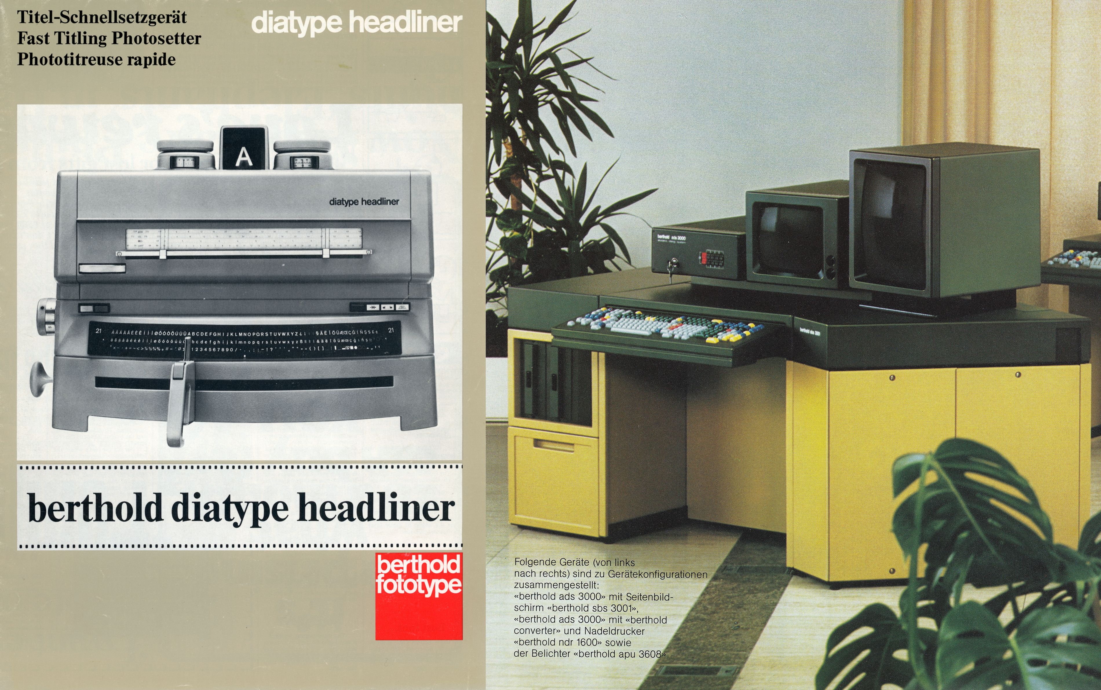
Two H. Berthold AG typesetting devices. The cover on the left is a scan from the SDTB/Historical Archive, shelf number: III.2 30968-01. The workstation on the right is an ADS3000 with an additional SBS 3001 monitor. The image comes from a scanned ADS3000 brochure uploaded to Archive.org by Marcin Wichary.
Some phototypesetting devices from H. Berthold AG are preserved in the Deutsches Technikmuseum collections. During a functionality test with Alexander Nagel in 2019, we composed a single sheet with one of those Diatypes. Shows below, this had the simple text “set in the Deutsches Technikmuseum on the Diatype.” Unfortunately, it is difficult to find the necessary photographic materials to develop photo-typeset text composed on a Diatype today.
Making typefaces more legible through optimization
Around 1980, after having worked at the Gottschalk printing house and the Rotaprint and Compugraphic companies, Alexander Nagel founded his own typesetting business together with Götz Gorissen and Regina Lindenlauf. As he describes it, one of his most important tasks there was to “make fonts legible by optimizing their specified tracking, character-width values and the letterspacing of the fonts.”
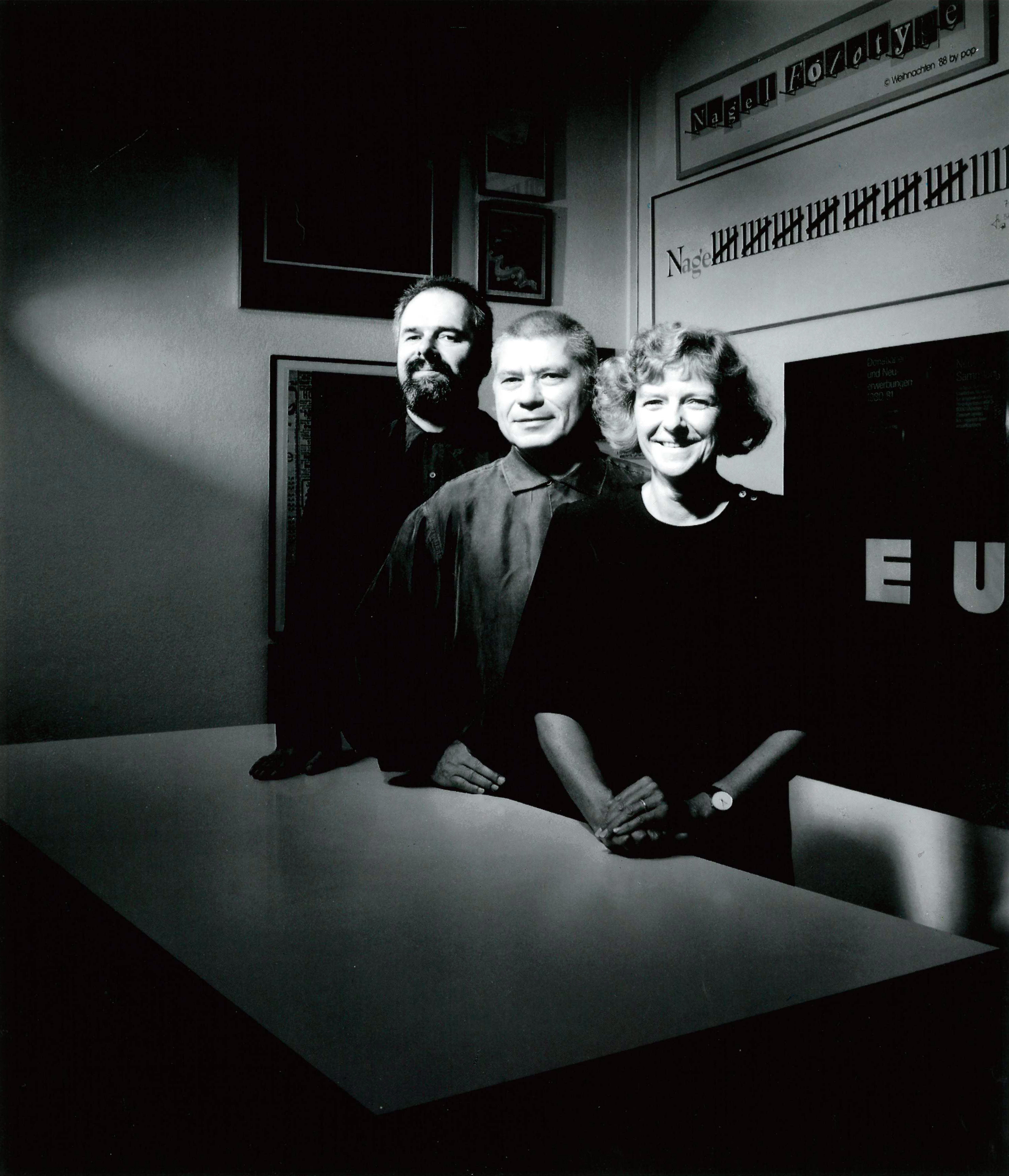
The Nagel Fototype founders, from left to right: Alexander Nagel, Götz Gorissen, Regina Lindenlauf. Photo courtesy of Alexander Nagel.
Beginning at the end of the 1950s, photo-typesetting had enabled “new possibilities in the area of graphic design, which were used more and more often. Intermediate weights could be created for existing typefaces, and it became possible to experiment with typesetting more. For instance, kerning letters was now a more realistic possibility, and they now they could even be nested inside each other. Line spacing could be made so narrow that there was no longer any space between the lines” (Nagel, 2021). These things would have been impossible with traditional typesetting methods.
Phototypesetting and – a short time later – digital typesetting techniques also increased the need and demand for “new typefaces” in general. At the same time, the switching font on the Diatype still required manual replacement of the installed lettering disk. Each disk contained one font with a character set of about 196 glyphs. The Diatronic machine had a magazine that could hold eight fonts, and the typesetter using it could switch between them with the push of a button.
The original hand-made drawings for Berthold’s photo-typesetting library
The original hand-made drawing for the creation of the glyphs on the font disks are kept on foil, which was projected onto the font disk. The use of the film medium meant that the letters and other characters on the font disks had clear, sharp edges. That allowed them to be depicted with absolutely sharp edges in print: they offered a “very, very good Diatype quality” (Nagel, 2021).
In 1995, the Deutsches received the “original hand-made drawings from the Berthold Library, created after World War II for phototypesetting” as a contractually defined donation. The hand-made drawings produced at H. Berthold AG in Berlin are in red boxes; blue boxes contain the hand-made drawings from Berthold Fototypes GmbH in Munich. The master disks for the photo-typesetting fonts for the Diatype, Staromat, Diatronic, and Diatext photo-typesetting devices are also preserved in the collection.
Many of the typefaces Berthold created for photo-typesetting were based on pre-existing foundry typefaces. For photo-typesetting, it revised its designs. Other typefaces were completely redrawn. Instead of continuing to deliver fonts on physical media, the next technical change saw Berthold begin to store fonts in its photo-typesetting machines digitally. Like many companies in the photo-typesetting business, Berthold used the IKARUS font digitization system from URW in Hamburg to convert drawings into a digital format. You can see Berthold’s workflow in a 12-minute promotional video made by the company in the 1980s. When it came to digitizing its fonts, Berthold did so for customers to use them on their Berthold typesetting machines. But another way to install fonts on digital devices loomed on the horizon.
The Desktop Publishing (DTP) Revolution
The next major shift in the graphic arts industry was ushered in by the Desktop Publishing revolution. The PostScript programming language, developed by Adobe Systems, could be used to store both the text and image elements of a page. With Macintosh computers (1984), Apple’s LaserWriter printer, and software programs like Aldus PageMaker (both 1985), it had become possible to layout entire pages digitally, right at your desk. Digitally-created files could be sent to an imagesetter, creating high-resolution output for use when preparing a document for offset printing. Linotype manufactured the first PostScript-enabled imagesetters, which came onto the market in 1985.
After 1991, the H. Berthold AG typefaces were also available for Macintosh and PCs. These important fonts were available in a Berthold Exklusiv (BE) edition, which Adobe sold for almost a decade. H. Berthold AG also distributed many DTP fonts in a product line it created called Berthold Quality (BQ). Not only did H. Berthold AG make BQ fonts from its own designs, but also for typefaces it had licensed from other font makers. In 1989, FontShop was founded in Berlin, which was another channel through which Berthold’s digital fonts could be obtained, once they were available.
The new technical possibilities meant that “clients and customers were suddenly doing their stuff themselves – by no means in the quality we provided. They stopped coming to us. And the things that they would have gotten upset about, or that they would have just expected us to deliver, like very precise typesetting of excellent quality, well … they were much less critical of themselves and what they put together on their own. And that has had a great deal of influence on the quality of typesetting in the times since then.” (Nagel, 2021). During the years the DTP shift was underway, a merger took place between Nagel Fototype and MetaDesign. In the 1990s, MetaDesign became one of the most exciting design agencies in Berlin – perhaps even in Germany and the whole of Europe.
Backward into the Future: The Book is here to stay
In 2015, Alexander Nagel began teaching as a lecturer at a private design school, among other things. In our interview, he says that it can sometimes be good “when things go the other direction again.” He describes how nice it is to see what changes result from practical experience in letterpress workshops, “how sensitively the students can then deal with type, or learn to deal with it. They look at the typesetting that we make with metal type in our workshops differently than the typesetting they do on the computer. Therefore, it is more important to ensure that they balance, and then students will look at the letters and the type in a much more sensitive way. Seeing that happen gives me great pleasure when working with students.”
We’re sure that the book is here to stay. Print is not dead!
This article was originally written in German by K. Wallbach. Dan Reynolds contributed to that article and then translated it into English, editing it and extending it for publication here. Read K. Wallbach and Dan Reynolds’s German-language article on the blog of the Staatsbibliothek zu Berlin, whose Berlin type specimens were also digitized as part of the 2021 project funded by digiS.
