I meet Mathias Clottu in January, it’s Thursday evening and we’re looking for a quiet spot to talk about its fresh-from-the-press Artery somewhere in East London, close to his studio located in Islington area.
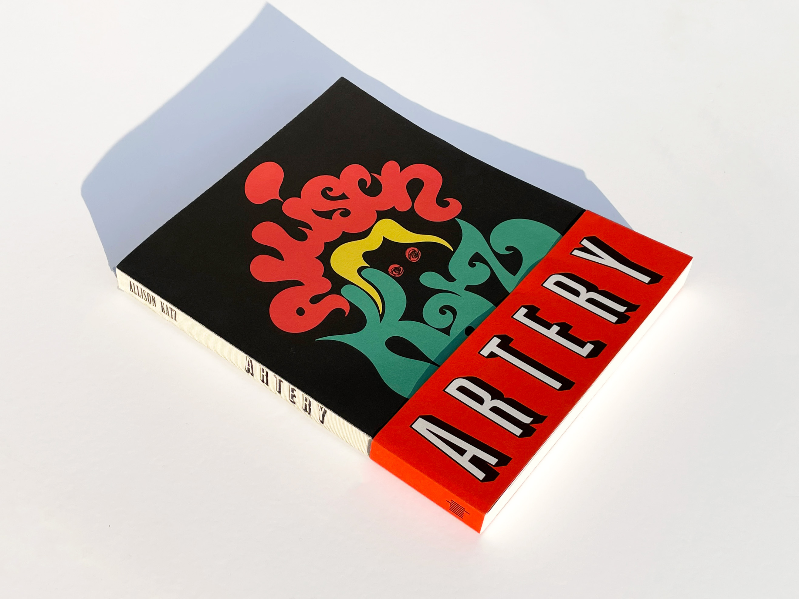
Artery is the new book by Allison Katz, a Canadian artist based in London, and represented by Hauser & Wirth. Artery is published by MIT Press and designed by the artist with London-based Studio Mathias Clottu. Mathias started the graphic design and art direction studio six years ago and specialises in book design and typography.
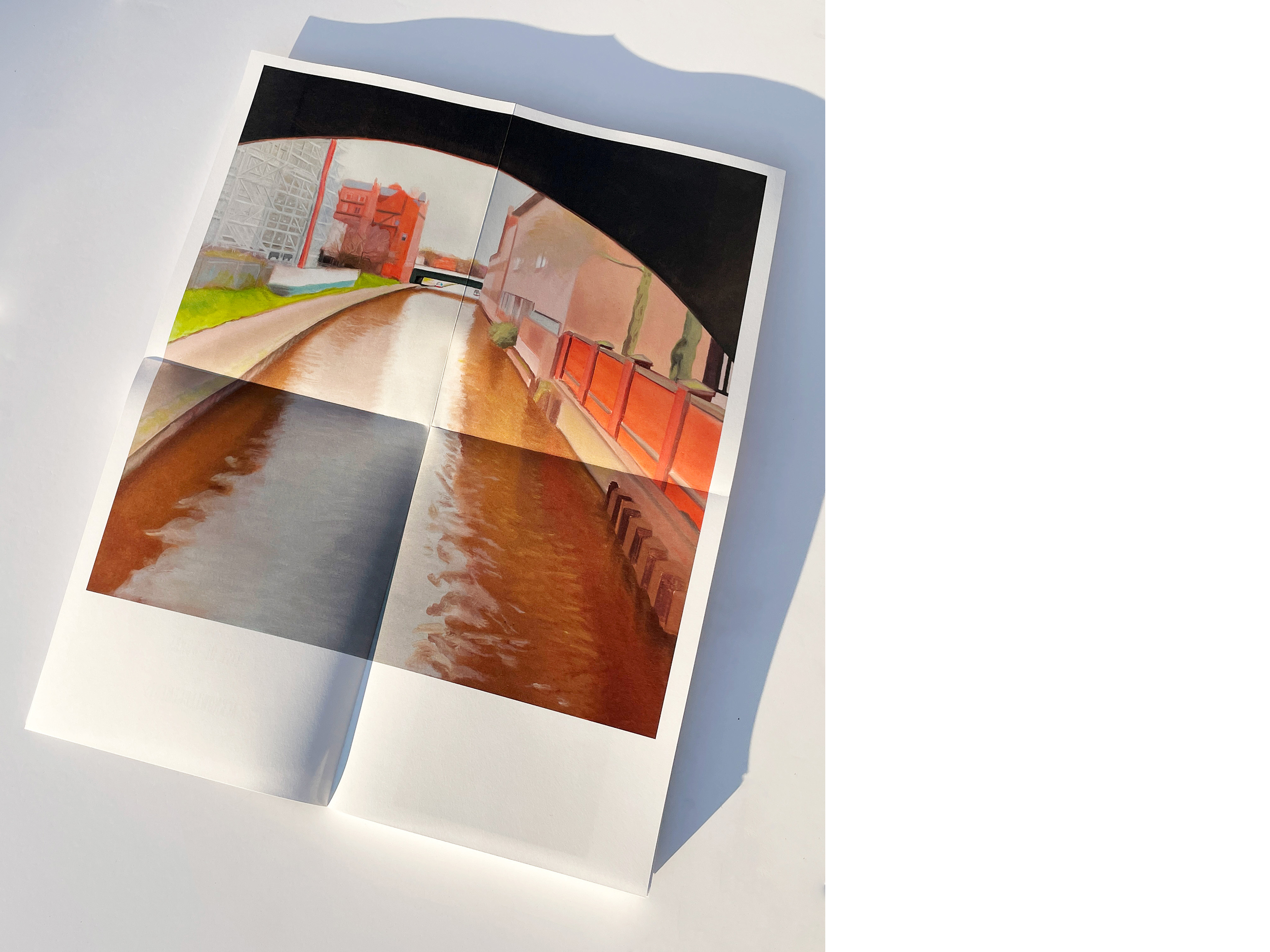
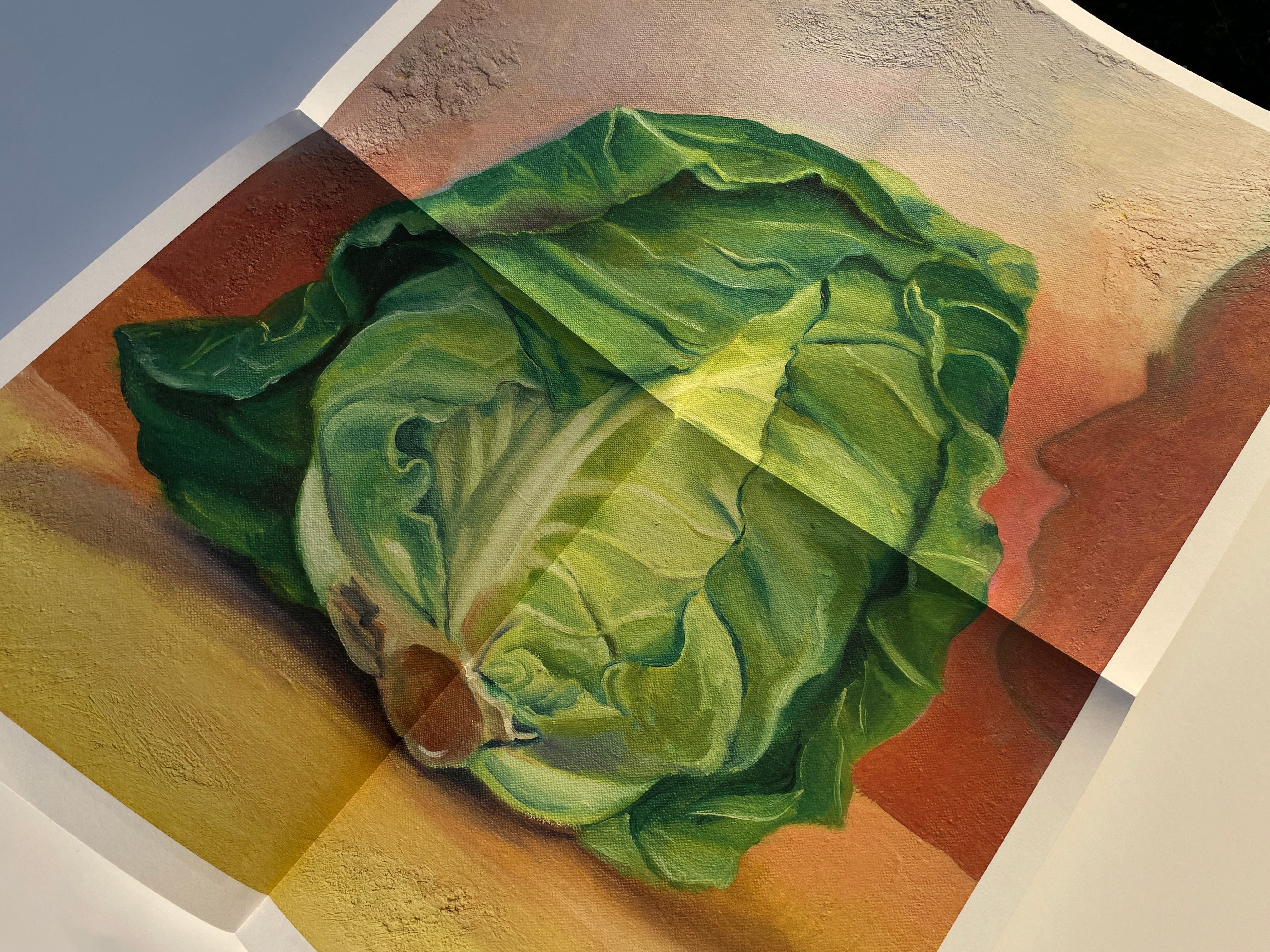
The book takes the shape of 224 folded – and full-colour pages that open to display 28 bound posters.
(Michela Zoppi) So, Mathias, I haven’t prepared any questions, as I know we always have our way to get to things and move around topics. But maybe you could tell me a bit more about how the book was born and how it developed from the first time you met Allison.
(Mathias Clottu) Let’s start by having a look at it, whilst I tell you of its conception. The work on the book started in early 2021. It was meant to be a catalogue for the show, Artery, the first institutional solo exhibition in the UK by Allison Katz, commissioned by Sam Thorne for Nottingham Contemporary, then toured to the Camden Art Centre in London. Because of the travelling nature of the show, we were trying to figure out how not to make an exhibition-specific catalogue, but more a book that would continue the conversation initiated with the exhibitions and allow Allison to explore the format of the book.
(MZ) So going a bit deeper on this, how did you and the artist choose to make a publication with more the prerogative of an artist’s book than an exhibition catalogue? And also, how was this decision digested by the galleries, who I suppose, briefed you on something quite different?
(MC) The story is that the first exhibition happened before the timeline for the publication was approved collectively, so from the start it was very much working with Allison to understand what the book is about. We both enjoyed that freedom of defining the scope of the publication as we were unfolding the content into the page, not restricted by the definition of it as a “catalogue”.
(MZ) Yes, so it must have felt such freedom to detach from the “exhibition catalogue” and to have open possibilities when it came to defining what object you wanted to make.
(MC) But then it also happened that my and Allison’s energies invested the institutions; Sam and Kiera (respectively the director and curator at the Nottingham) trusted our decision to make a poster book, supporting the project entirely. Afterwards was just about who would be interested in publishing it. Thomas Weaver, Senior Editor for Art and Architecture at MIT Press, who I’ve worked with in the past, was enthusiastic about taking this title on. Finally, Sarah Handelman – editor I also regularly work with on publications – joined us to work alongside Allison on the text.
(MZ) And so how did you decide to design a book which is also a series of posters: an object to read as much as to look at, but fundamentally to engage with on a deeper level of playfulness and discovery?
(MC) For me, it was very important to understand how to orchestrate the different content. I wanted to put my expertise in design by whispering, suggesting things, but I also respected the artist’s content and her decision-making; we worked through conversations, welcoming each other’s expertise. It would only work when there is so much trust, you have to let go in so many instances, but still, placing your role on the back doesn’t mean there isn’t always a sense of responsibility.
Studio Mathias Clottu, Artery by Allison Katz. Published by MIT Press, April 2023.
(MZ) I know what you mean, at that moment trusting the process and letting who’s involved to make independent decisions, well it’s a great act of faith that could potentially also set you up for failure.
(MC) Totally, and in Artery there was exactly that, my expectations, the artist’s and the institution’s– all energies that as a designer I had to consider and respect, whilst finding space to explore the design routes. It’s again a question of chemistry, and trust I think. I remember you and me talking about this before, what kind of designer do we define ourselves as. And for me is quite clear that what a designer can provide best is a service, which is something very pragmatic, and in a way, elementary. You could say this is a book and was made because someone needed a book. This exists out of necessity.
For an artist who’s entering a new chapter in their practice, a publication could be both an archive of past shows, and of their practice until the present time, but alongside that it’s a way to present their work to a broad audience in a new format. So as the designer, I have some level of responsibility when working on a media that is also an output for an artist’s practice; in this sense design for me is always a service.
(MZ) It’s a service that comes with responsibility, and therefore time spent becoming an expert by looking through the content. So the service relates also to that and to the industriousness of the project. Back to Artery, I feel this is an intimate book, where it is asked to the reader to get closer to the author’s story and perspective.
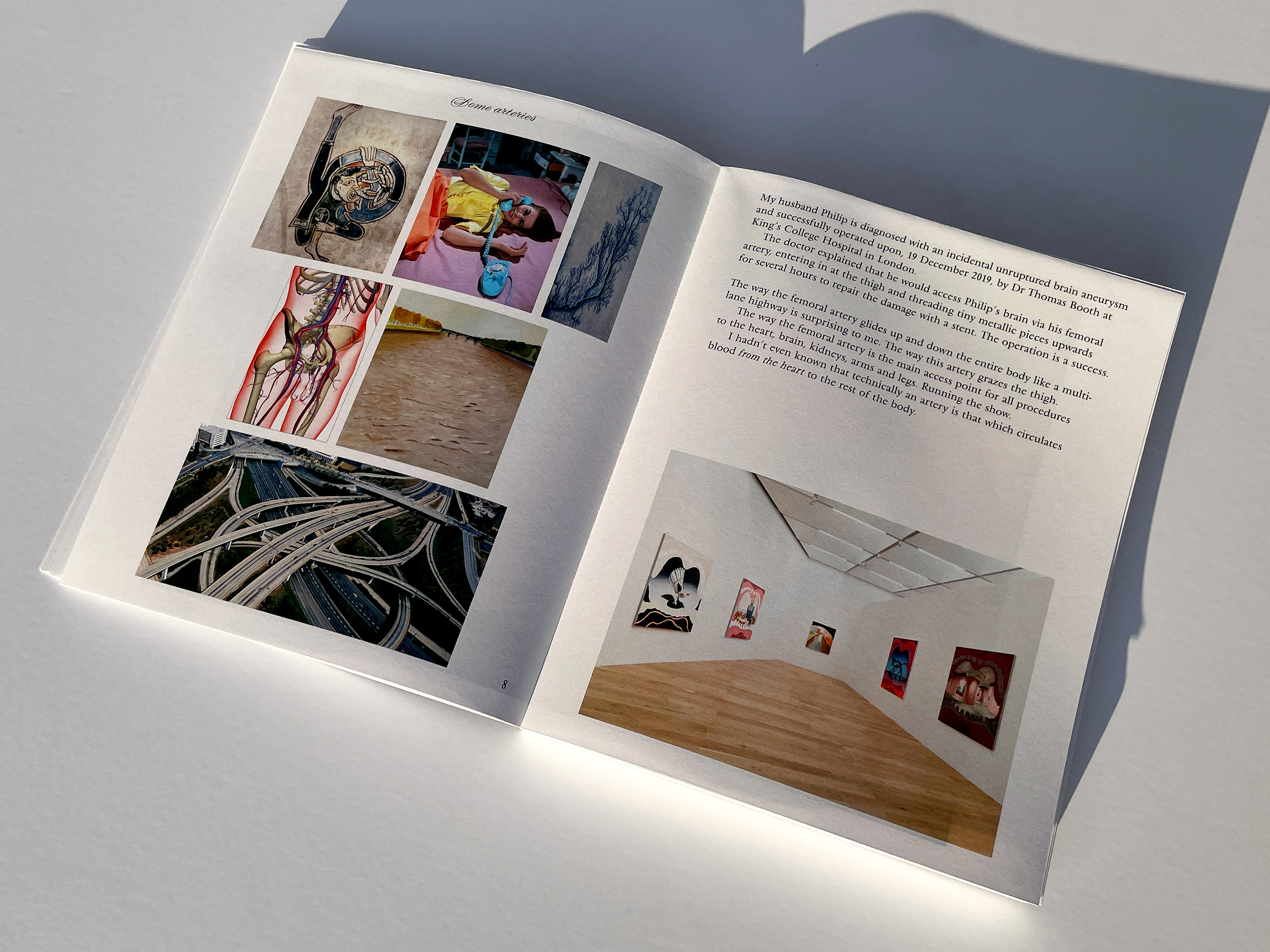
(MC) The text was written by Allison herself. It presents a wide array of themes and topics the reader can discover whilst “decoding” the pages – in this, it’s not certainly like a catalogue that places objects in plain sight. We wanted to have a continuous reading, so she wrote it as a unique essay, even though we knew from the start that we would give the text a performative expression, or better, partial flexibility. The editor Sarah Handelman was a little bit like an accompanying figure in Allison’s writing, helping her to direct the text in specific places, and the two processes – writing and editing – almost happened in tandem.
(MZ) So then within this singular strong voice, where all these different typefaces are coming from? Also, how many faces are there in the book?
(MC) There are seven typefaces in the book; this is where as a designer I responded to their work. I made the conscious choice of engaging with the text by bringing an idea: all the typefaces are coming from the pre-digital age advertising posters and large format signage. I’m a fan of these French typefaces designed just before the historic change into a more digital way of making types. Then, small – sometimes family-run – foundries were aiming to make high-spec industrial typefaces that retained hand-writing characteristics. It was an interesting moment for typography in post-war Europe, a moment of transition; and I set on the work of the Marseille-based foundry Olive, and the designer Roger Excoffon. Excoffon’s types were from the very start a success. Air France used a customised variant of Antique Olive until 2009. Olive became immediately a strong rival of the Deberny & Peignot Foundry, at the time the metal type market leader in France. Even if successful, Olive’s catalogue presented only a small selection of typefaces. This gave me the perfect “toolbox” to choose from, I could display their catalogue, partly also as a celebration, but more pragmatically I could keep the focus on a place and a time and a mood.
On the cover instead, we remained faithful to Allison’s work and simply redrew the lettering from one of her posters. Adrien Vasquez, co-founder with British designer John Morgan of the foundry Abyme, with whom I share studio space and often work with, redrew and improved the lettering.
(MZ) Looking at the material, is it the same paper for the cover and inside right?
(MC) Yes, it is. Cover to bellyband to posters. It’s an object that needed lots of work. I really believe in details, materiality, and finish, and I worked with Amsterdam printers and binders to make several machine-made dummies. Even if this final version might look like a simple perfect bound book, to be able to hold so many posters openable full size required quite a lot of tests and trials.
There is always a reason behind the shape of a book, and by working with artists I think you can make objects with a higher value of craft and interactivity. I feel artists understand why it’s important to think that way, it’s very much part of their practice too. As a designer, I like to think that the obsession for craft pushes you to acquire as much technical, mechanical and production knowledge as you can, aiming always to find that one challenge that turns a simple book into an object that is particular.
Artery is a simple book really, there is a little action, that demands energy from the reader, but overall it wants to be accessible, and enjoyable. I feel since the pandemic perhaps people also want more physicality, something that you can’t see or understand easily through pictures, whereas you need the object in front of your eyes. Then it becomes a great opportunity to do something special, I feel otherwise you’d waste money and time and material only to make a book like many others.
(MZ) I think you can really see that, Mathias, when you approach the book. For me it’s not a flick-through object, the complexity of the structure and layout requires the reader to spend time with it. It’s not an easy book, in a nice way.
Title: Artery
Author: Allison Katz
Published by: MIT Press
Essays by: Sam Thorn and Martin Clarke
Concept: Allison Katz and Mathias Clottu
Design and production: Studio Mathias Clottu
Managing editors: Kiera Blakey and Nicole Yip
Copyediting: Sarah Handelman
Dimensions: 600 × 470 mm, folded to 300 ×240 mm
Extent: 28 folded posters, folded to 224 pages
Typefaces: Banco, Choc, Calypso, Diane, Nord, Mistral, Olive, Vendôme
Printing and binding: Robstolk, The Netherlands
Date of publication: April 2023
ISBN: 978-0-262-54528-0
https://mitpress.mit.edu/9780262545280/allison-katz/