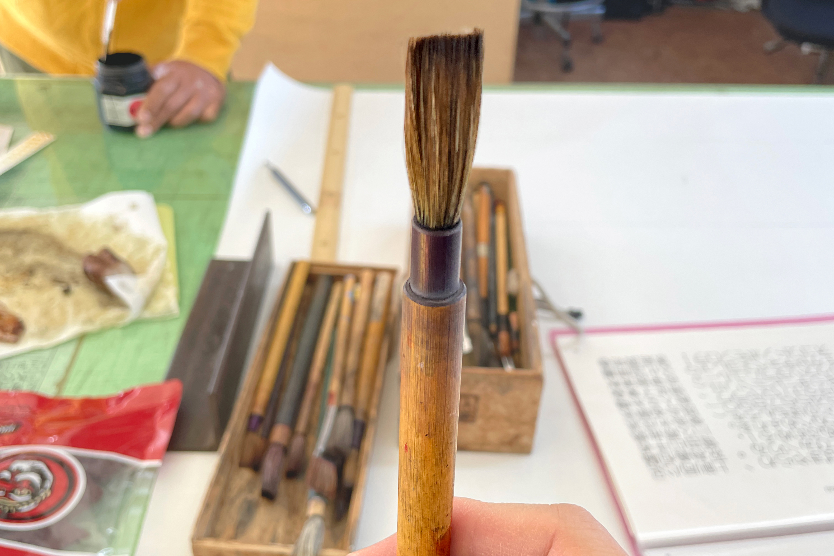
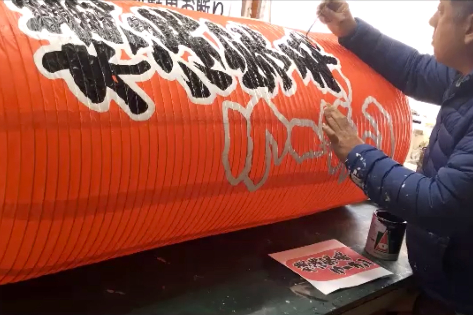
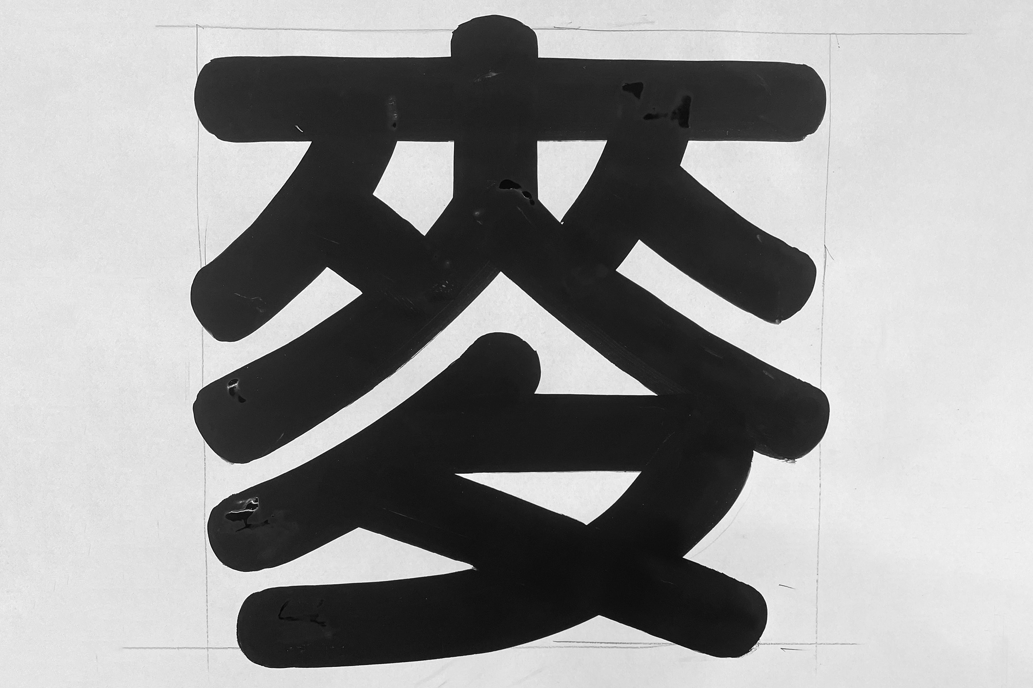
Authentic, because they possess the skill to draw nearly any character, regardless of style and size – without preliminary sketch or references. Specifically, they employ a technique that lies between writing and drawing; it involves writing with minor retouching when the text size is small and as the text size increases, the technique becomes more similar to drawing. The majority of sign makers in Japan nowadays does not and cannot work in such a way. Considering the intricacies of Japanese writing (using three distinct scripts), it is truly astonishing what Kenji and Shu can achieve solely with their eyes and hands.
The last generation of sign painters
Kenji began his apprenticeship in 1984 at the age of 18; Shu in 1986 at the age of 20 – both in Osaka, but in different workshops under different master craftsmen. They soon discovered each other, as the profession is very specialised and young people in the industry were becoming rare. To this day, they maintain a strong and special friendship. They mostly work independently, but they do collaborate on big commissions and frequently meet to discuss character forms, sign making and type design with great passion and humour (and beer!).
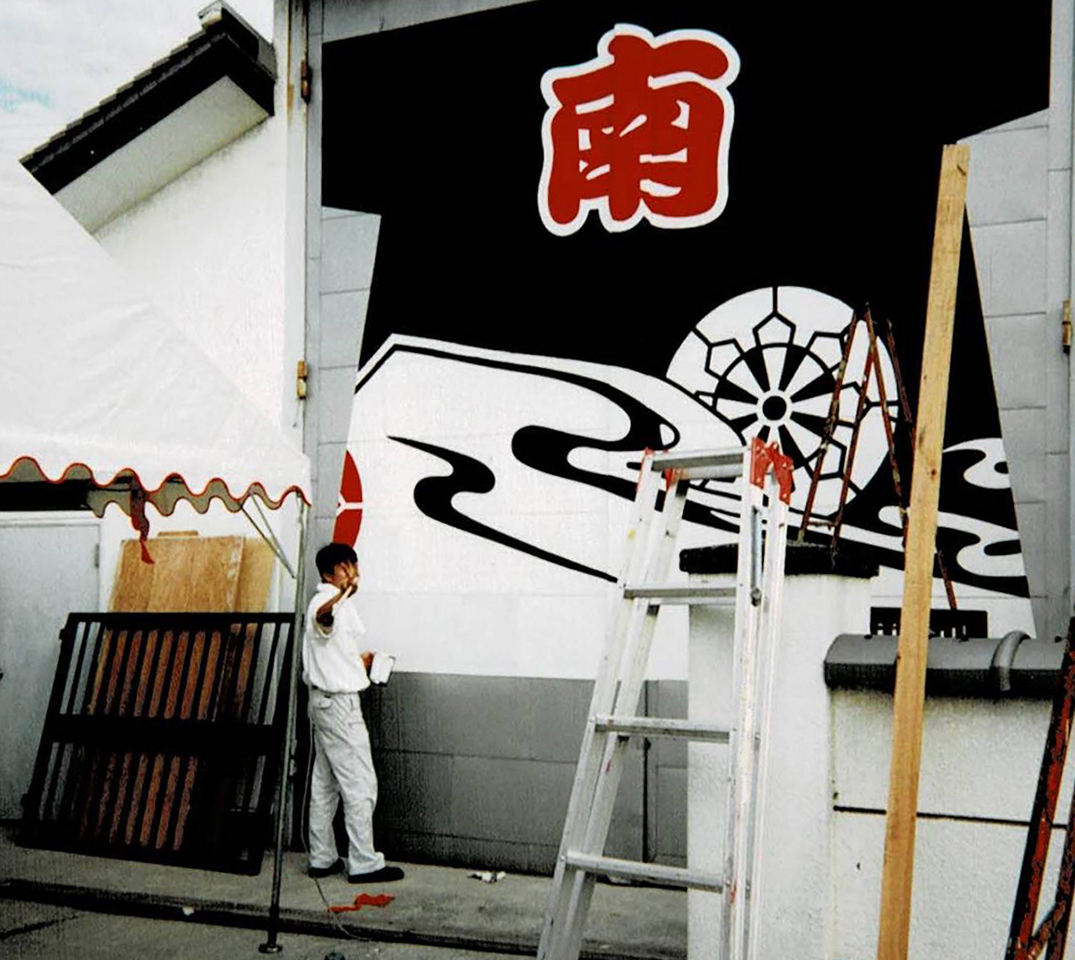
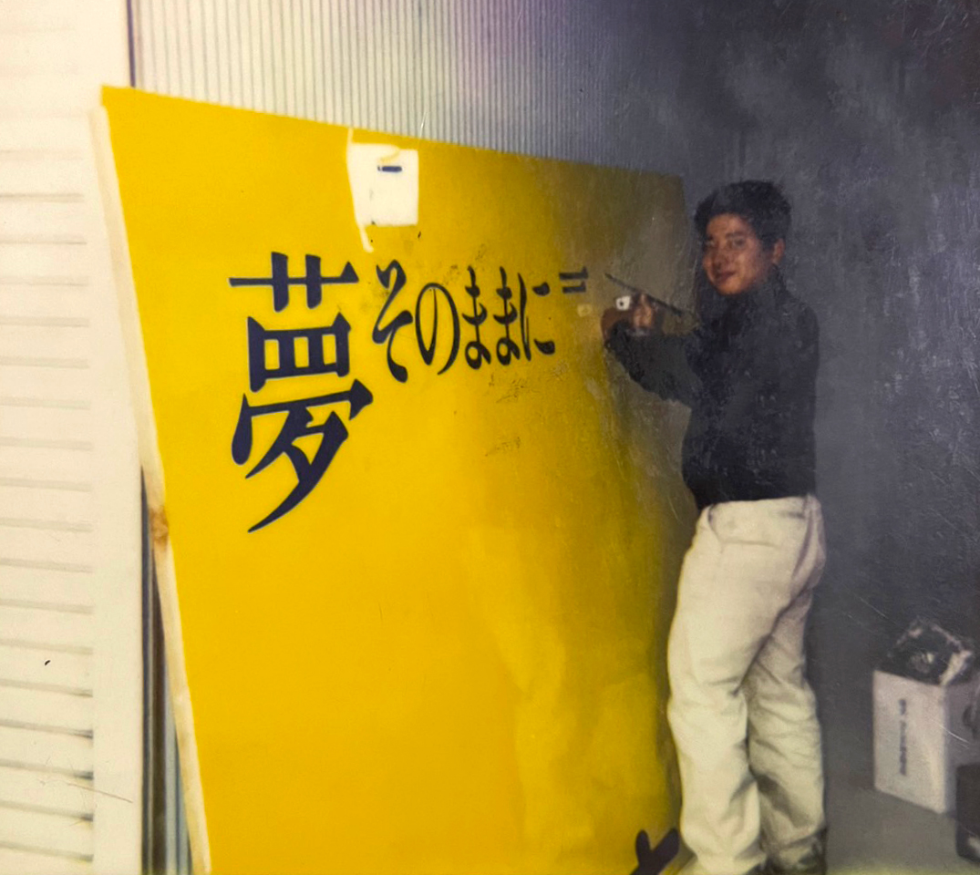
Throughout the 1980s, the predominant method of sign-making remained manual, with craftsmen hand-drawing signs using a brush. In the 1990s, however, the industry underwent a sudden and irreversible transformation worldwide, and Japan was no exception. Traditional practices were quickly replaced by more cost-effective and “efficient” techniques, such as cutting plotters and large-format inkjet printers.
This is why Kenji and Shu often refer to themselves as the final generation of sign painters. The abrupt change in the industry meant that generations younger than Kenji and Shu had no opportunity to fully attain craftsmanship. In fact, when Kenji and Shu completed their 10-year training period and started their independent work, the demand for handwritten signs was already decreasing.
Shu recalls that around half of the commissions he received in the late 1990s were for hand-drawn signs, while the other half were produced using machines. At the workshop where Kenji worked, they continued to create signs manually for a longer period. However, by the end of the 2000s, the demand for hand-drawn signs had significantly declined, with only 10 percent of signs being made manually.
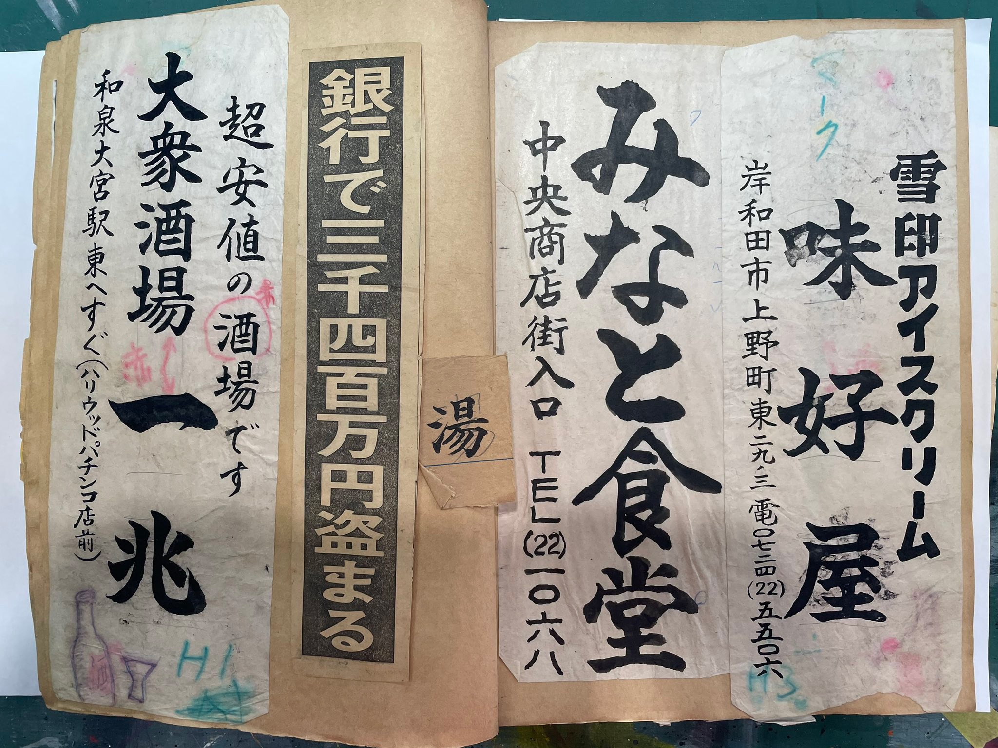
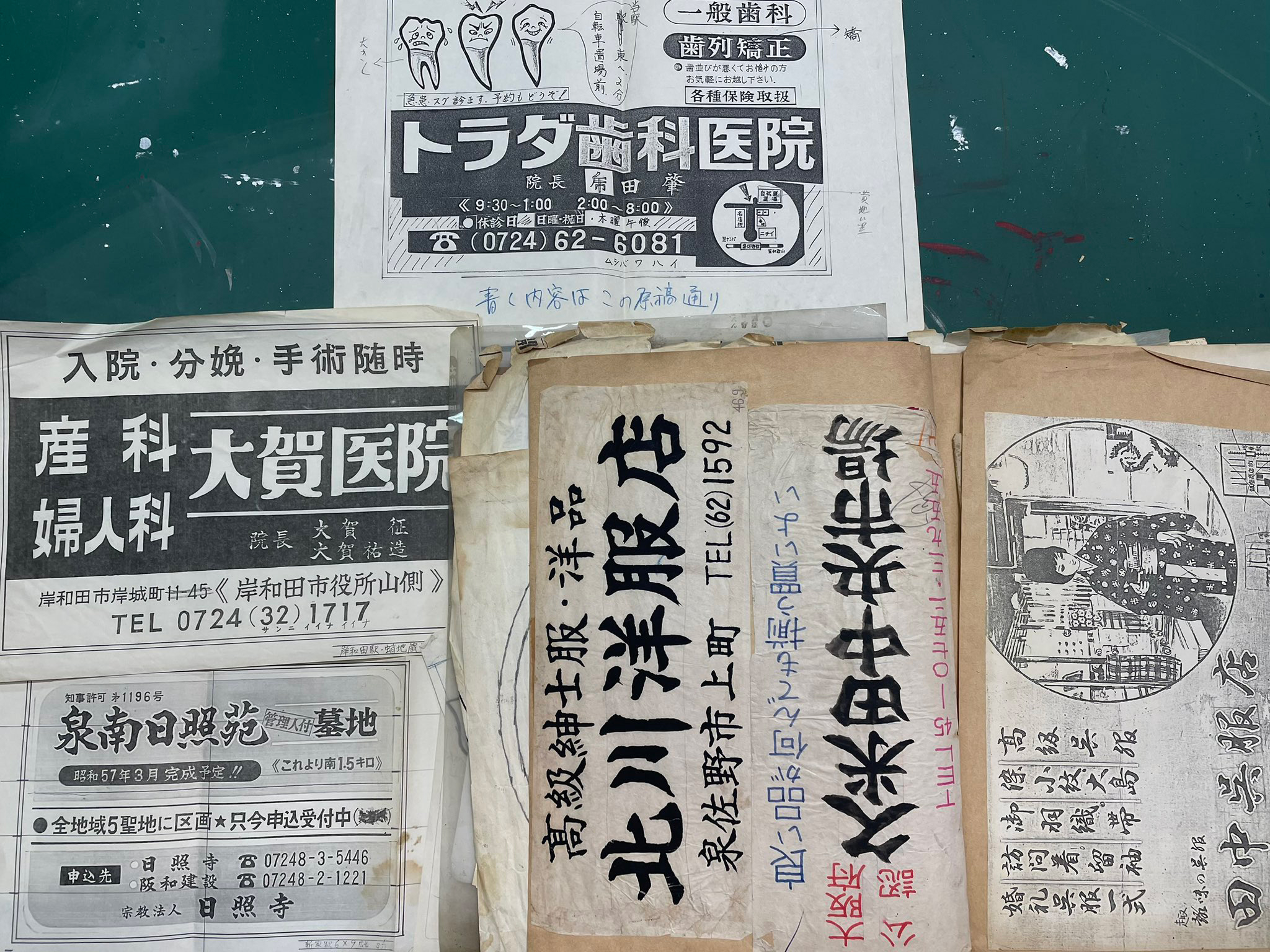
Hand-drawn signs age gracefully!
Nowadays, most commissions sadly involve methods other than hand-drawn signs. However, Kenji and Shu emphasise that there are still situations where hand-drawn signs offer advantages over other techniques.
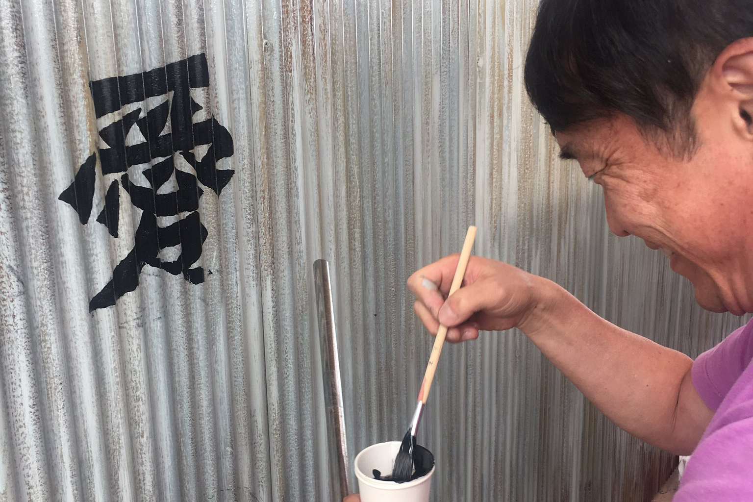
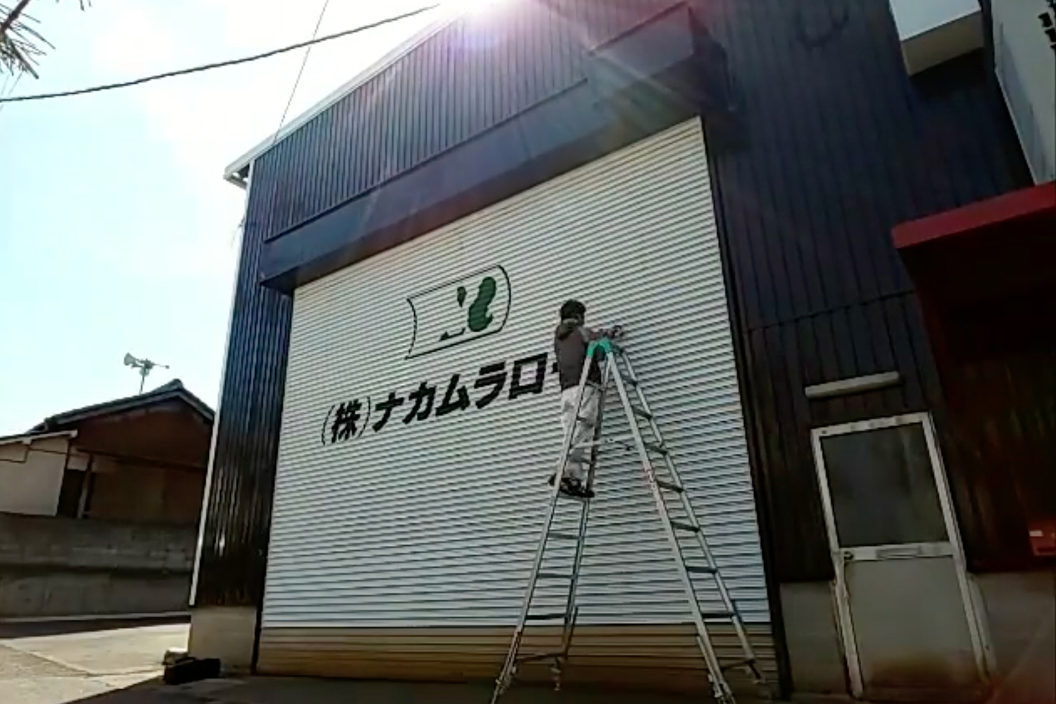
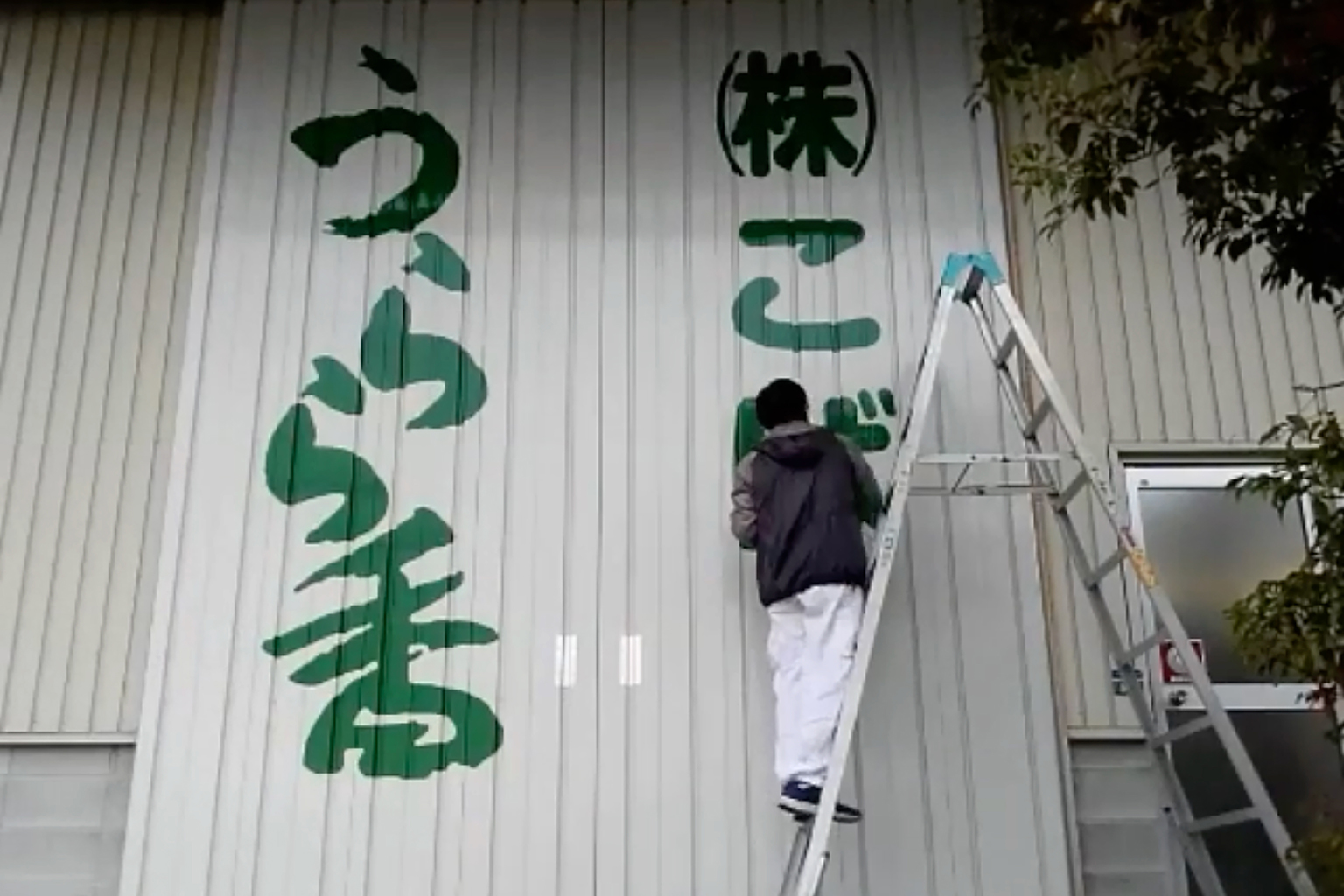
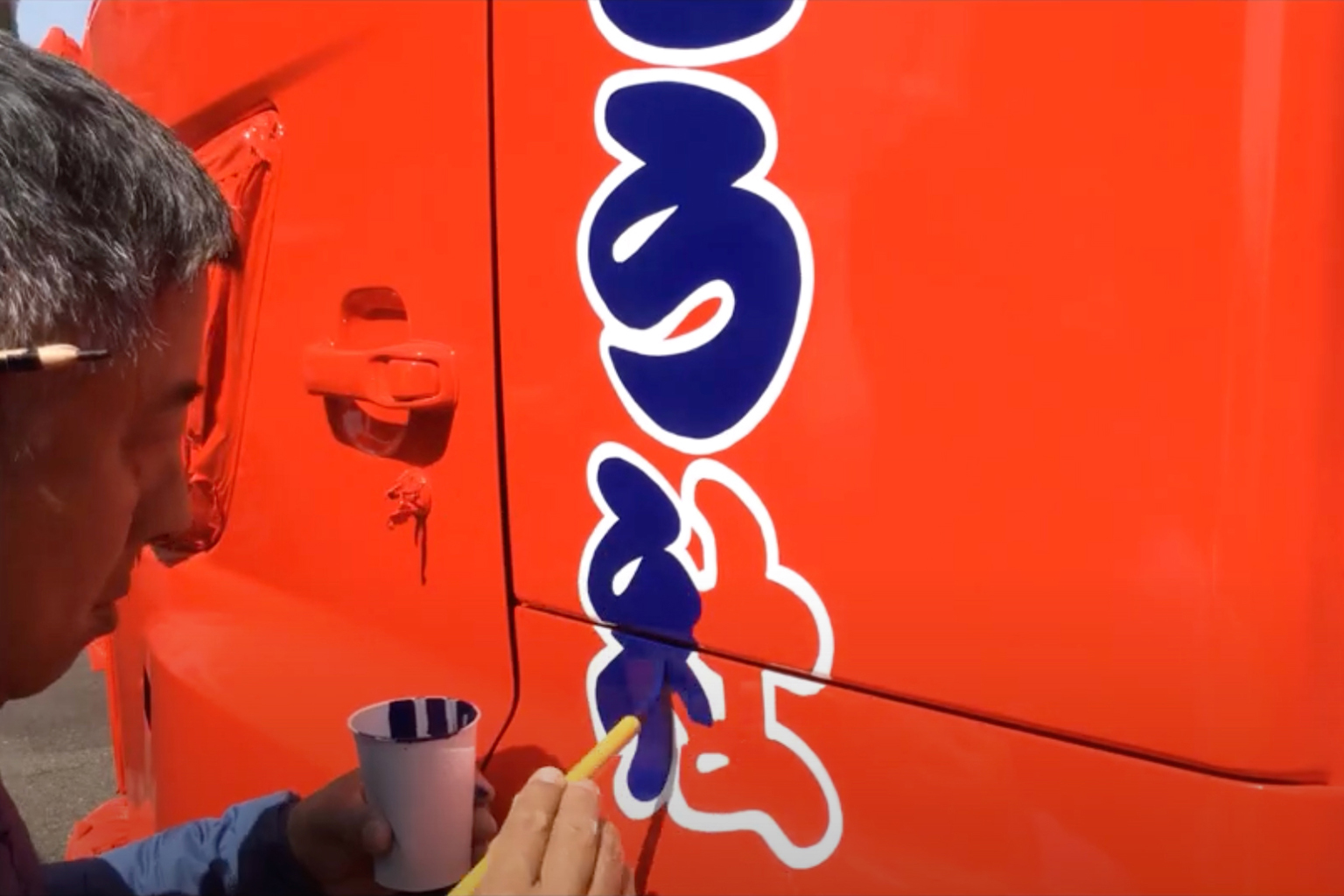
“When the surface is not flat, such as on storefront shutters, it must be done by hand. The same applies to iron gates and doors; they also need to be done manually,” explains Kenji. Shu adds, “Cutting sheets may initially seem more economical and straightforward, but they tend to wear out suddenly after 10 to 15 years of use. In contrast, handwritten signs develop a unique charm as they age slowly and gracefully. Ultimately, handwritten signs truly stand out!”
Efficiency in Motion
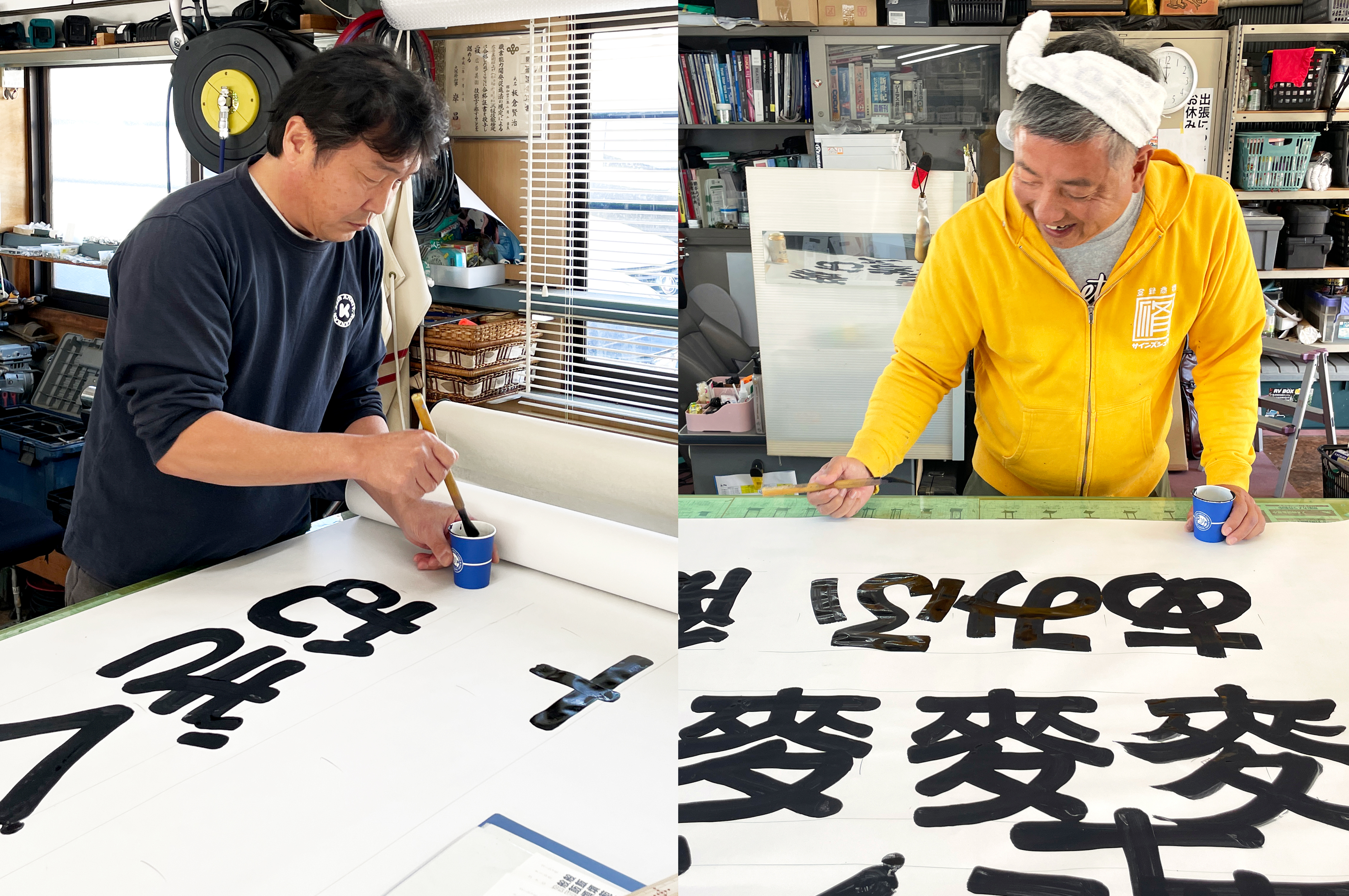
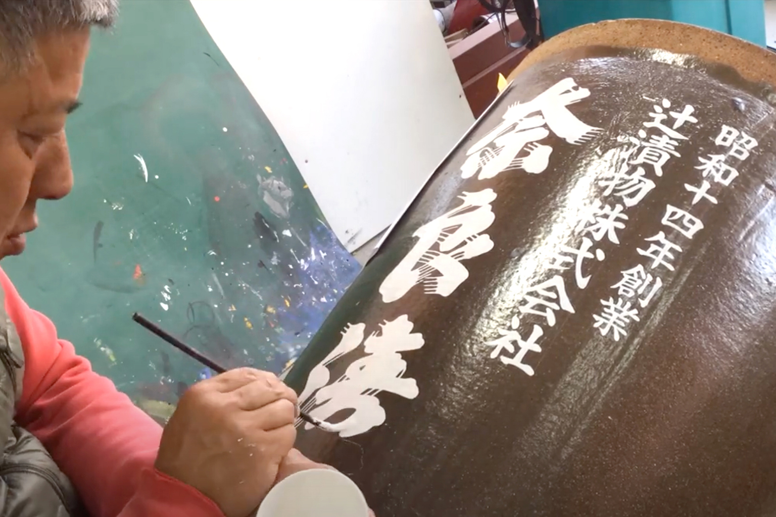
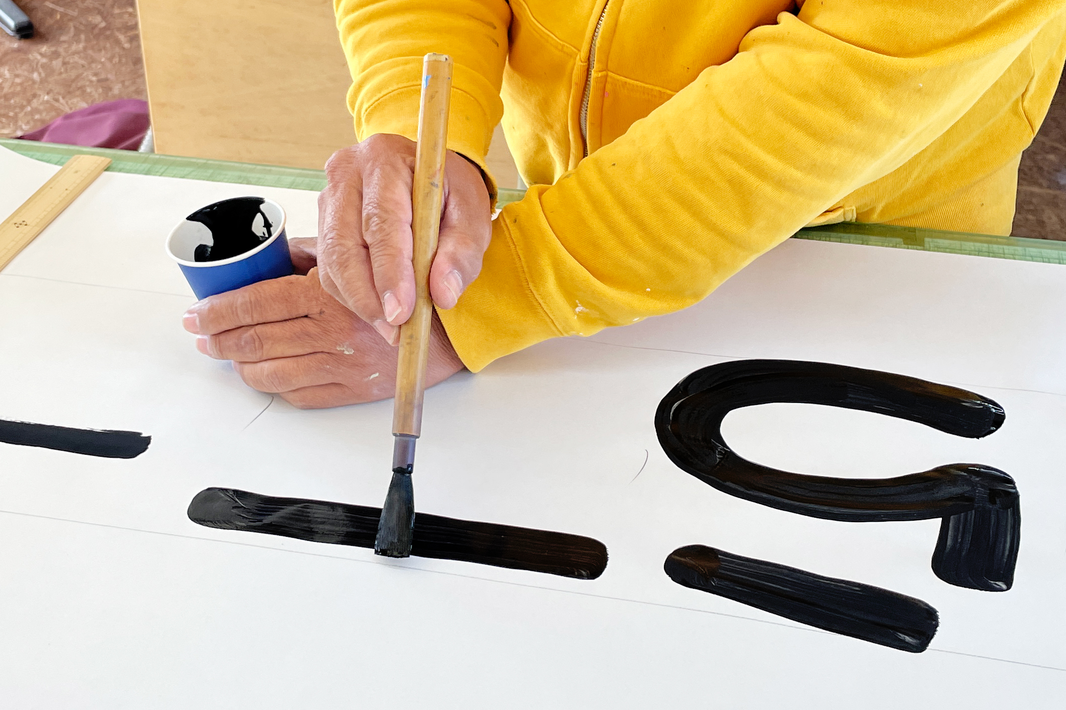
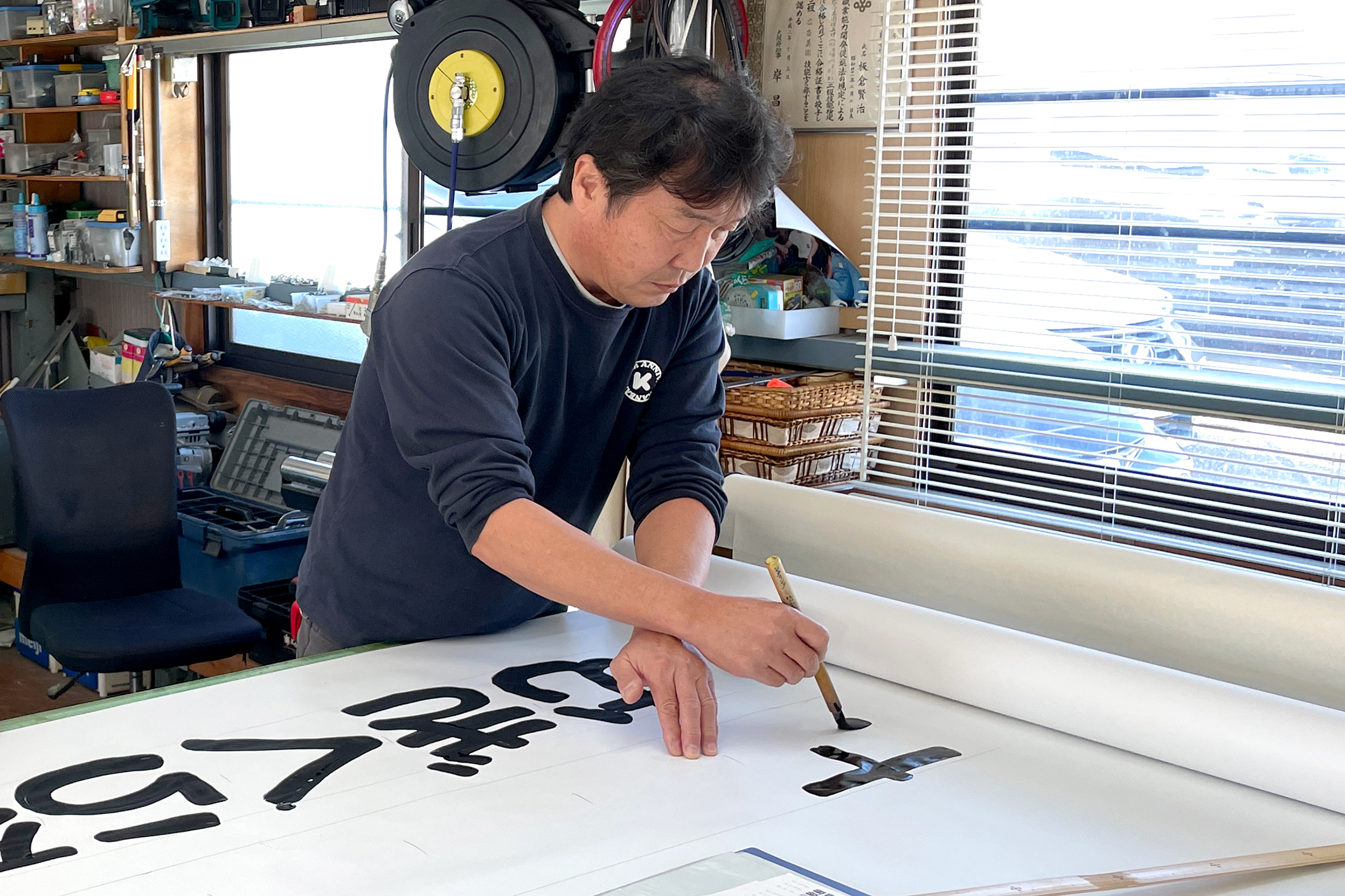
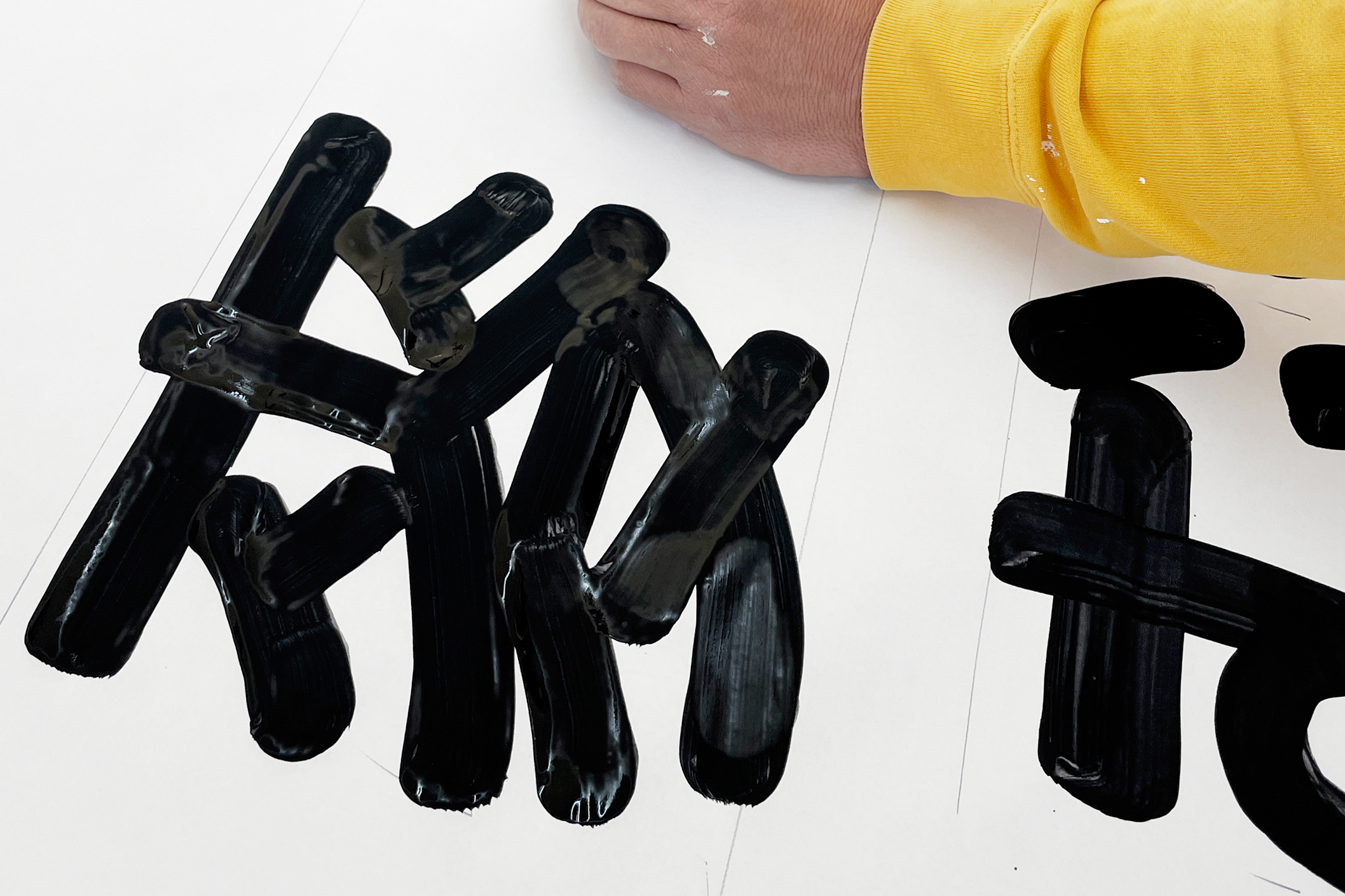
Throughout my visit, Kenji and Shu demonstrated their proficiency; even during our conversations, their hands were constantly in motion. They explain, “Nowadays, even those who work manually draw characters using a lettering method – they draw outlines first, and fill the inside, like a colouring book.”
Whilst the lettering method may produce precise results, its drawback lies in its time-consuming nature, making it economically impractical. When the majority of signs were crafted manually, one could easily imagine the paramount significance of efficiency. Indeed, I was truly impressed by the speed with which Kenji and Shu could draw characters.
To provide a specific illustration: Kenji and Shu draw my surname in both Hiragana and Kanji scripts. It took an average of 45 seconds to write a single Hiragana character at a size of 25 × 25 cm – and they accomplished this effortlessly while engaging in conversation and constantly making jokes.
Naturally, more intricate Kanji characters take longer. However, considering this pace, one can imagine the completion of an entire signboard in well under half an hour, which I find remarkable!
On contemporary type design
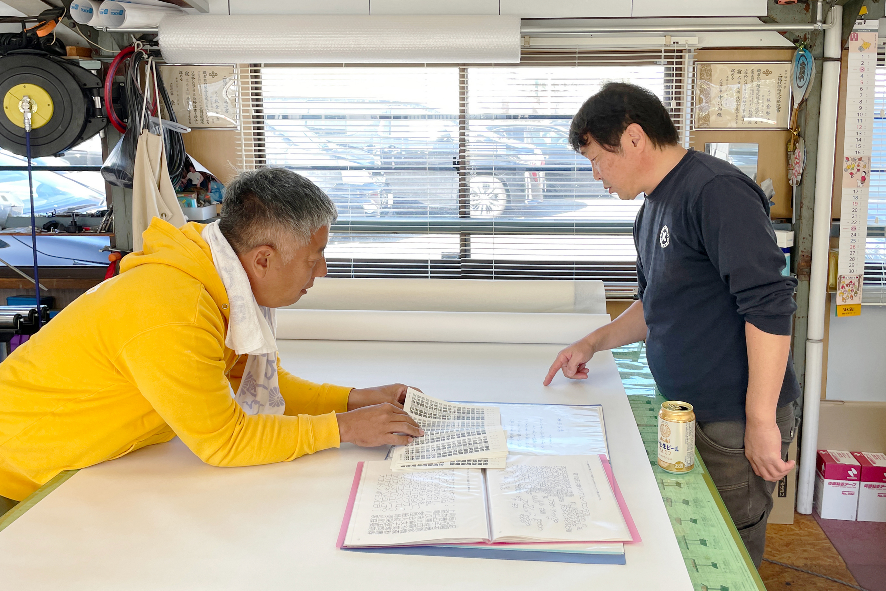
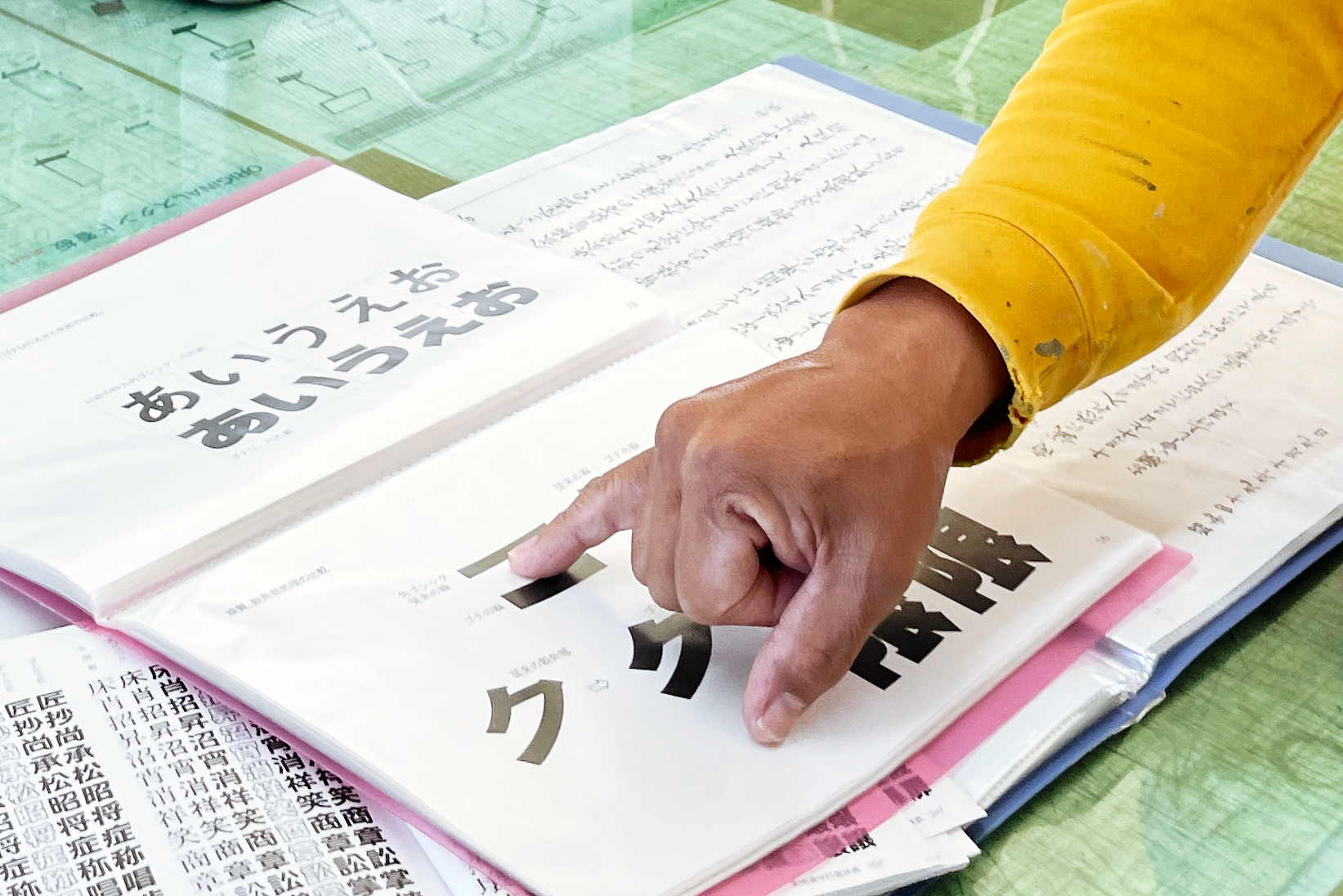
During my conversation with Kenji and Shu, what struck me most was their deep respect for previous generations of sign painters – as well as their constant effort to study character shapes.
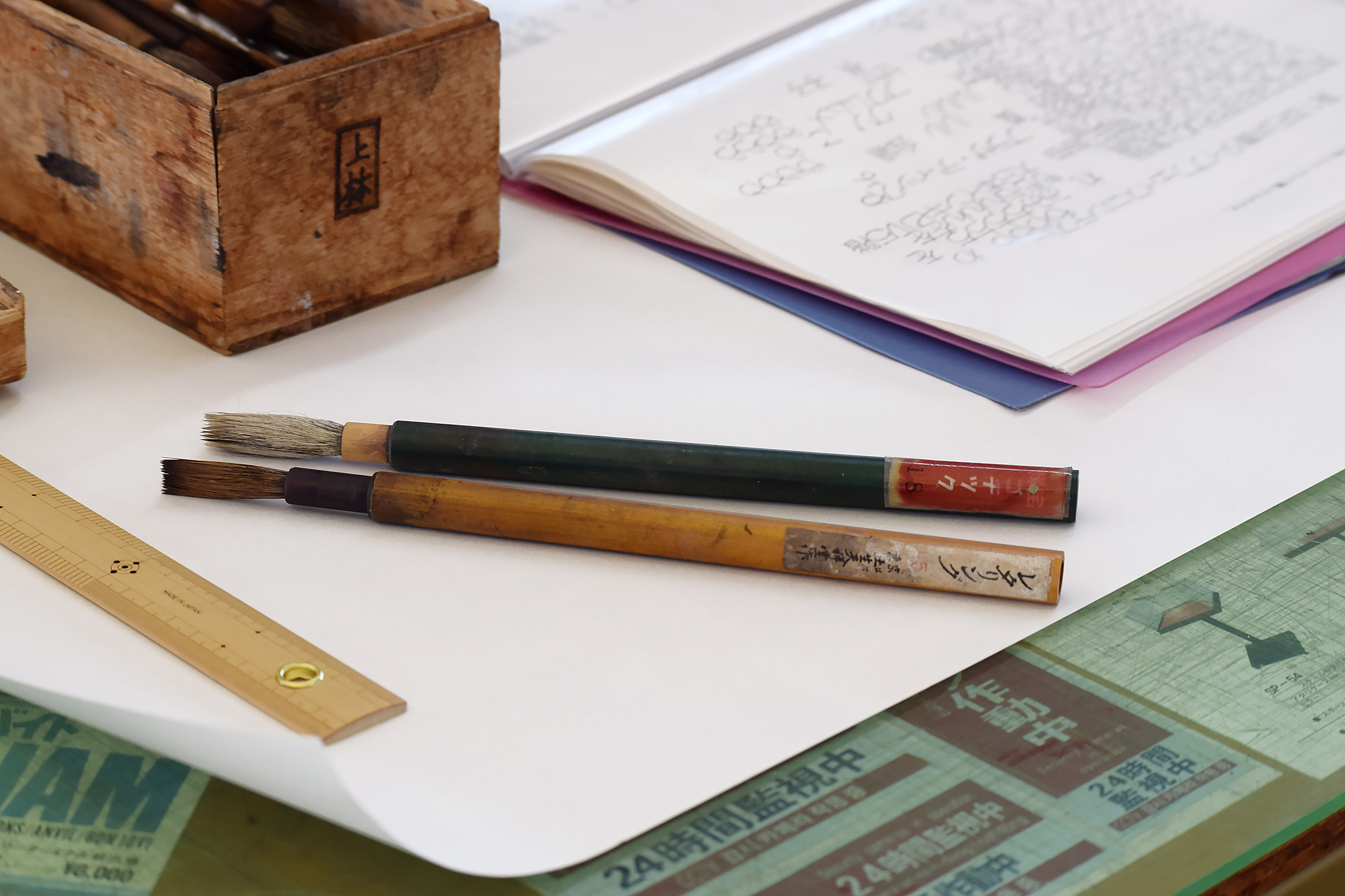
As they showed me scrapbooks of character forms that they collected during their apprenticeship, Shu said:
“The generations before our parents were all very skilled at writing. They were familiar with the brush from an early age and, above all, their role models were even better at writing.
“Once, Kaisho characters [the most common calligraphic style] were written with exceptional skill and originality, but that era has passed. Now, they have evolved into a more mediocre style that anyone can write.
“This is the same for signboards. The skills of craftsmen have declined over time. The fact that our ability to write Kaisho is not even close to that of our predecessors is a sad testament to this.”
Their humble attitude, combined with their constant effort to retain and improve their skills, has impressed me greatly.
As we discussed the current sans serif letter forms of Japan, Shu spoke with an unexpectedly sharp tone:
“Today, type designers and typographers are often overly focused on body text fonts, particularly the Mincho style.* They seem to believe that the Mincho style is the ultimate Japanese font style and apply the same logic used for creating body text fonts to sans serif fonts. As a result, many unnecessary fancy details are included in these designs that do not seem to make sense to us.”
“Typographers and type design professionals are obsessed with old metal type and photo typesetting. They might additionally learn calligraphy, but they do not seem to give much attention to hand painted signs.”


While Shu might be right to some extent, another reason for the popularity of “sans serif fonts with old-fashioned flair” could be the growing preference among graphic designers for typefaces that evoke a sense of neo-nostalgia. This trend is not necessarily solely a result of type designs influenced by the Mincho style.
What I strongly agree with is that there is insufficient research and writing about the profession of sign painters. Not only design journalists and historians, but also educational institutions, tend to focus heavily on metal type or photo typesetting. This focus may have led to an unfair neglect of the influence and contributions of sign painters, especially considering their significant role in shaping our perception of character forms over the centuries. It would be beneficial for everyone to learn about this profession and to appreciate the beautifully crafted character forms created by anonymous master sign painters.
Kenji’s social media
Instagram: www.instagram.com/k.kanban
Shu’s social media
YouTube: https://www.youtube.com/@signsshu
Instagram: https://www.instagram.com/signsshu
* Mincho styles (明朝体) are the most commonly used styles in books in Japan. This style features contrasting vertical and horizontal strokes, as well as triangular serifs that appear on the top or top-right edges of the strokes.