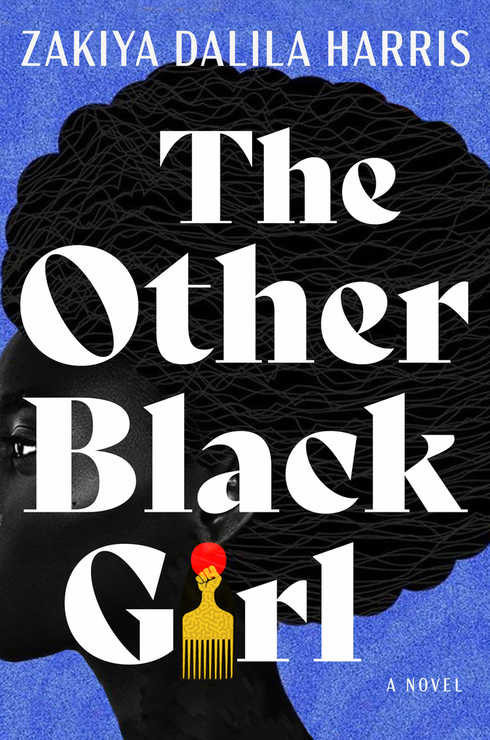
A book title with four short words of almost symmetrical length offers a dream opportunity for a cover with eye-catching typography, and designer James Iacobelli didn’t pass up the opportunity.
Source: https://www.goodreads.com © Atria Books. License: All Rights Reserved.
For his design, he set the book title and the name of author Zakiya Dalila Harris in the largest possible font sizes. They are on top of an illustration by Temi Coker that he blew up past the edges of the cover. All that remains visible of the woman’s face is her eye, looking past the book spine from behind the letter B. The yellow background color of the original artwork was changed to a vibrant blue, and so the design pairs two concise color palettes: black and white and the primary colors. The sole red element is the focal point of the composition: a symbol-rich earring with a clip that simultaneously a rising sun and the dot on the i.
Type and illustration make for a perfect match. Both Bely Display and the silhouette make use of lively curves and monumental shapes. The reclining diagonals in e and O reflect the angle of the woman’s neck; the undulating afro hairstyle rhymes with the loops and arcs of the letters. Stemmed letters (T, h, etc.) have thin but wide serifs that “tie the words together.” They make sure each word keeps its feet on the baseline, preventing Bely’s wilder characters from dancing away.
Bely, a design by Roxane Gataud, is available from TypeTogether. In addition to the Display style used here, Bely has four more font styles with a calmer tone for longer texts or smaller font sizes: Regular and Bold, both with italics. TypeTogether chose Roxane’s design as the first project for their Publishing Incentive Program in 2014 – a program designed to boost the careers of newly graduated type designers. In 2016, the program was renamed the “Gerard Unger Scholarship.” It has now entered its seventh year, with Florian Fecher’s Lektorat as its latest release.
The capital letters used for the author’s name share Bely’s confidence while also offering some gravitas as a counterbalance. They are set in a Condensed style Mark Simonson’s Acme Gothic typeface series, a design inspired by lettering from the first half of the twentieth century. Despite its roots in the past and the stately, classic effect almost always guaranteed by loosely spaced capitals, Acme Gothic refuses to come across any bit old-fashioned.
James Iacobelli’s typography for the book cover pairs type from a celebrated upcoming type designer with a face from an experienced colleague. When Mark Simonson released Kandal, his first retail typeface, in 1994, Roxane Gataud had not even yet entered primary school. Mark, as he describes himself on his website, was “kind of a late bloomer” and did not release type until he was well in his forties.
The Other Black Girl was published by Atria Books in June 2021. You can check out the original version of this post on Fonts In Use, where it was contributed by Quentin Schmerber.