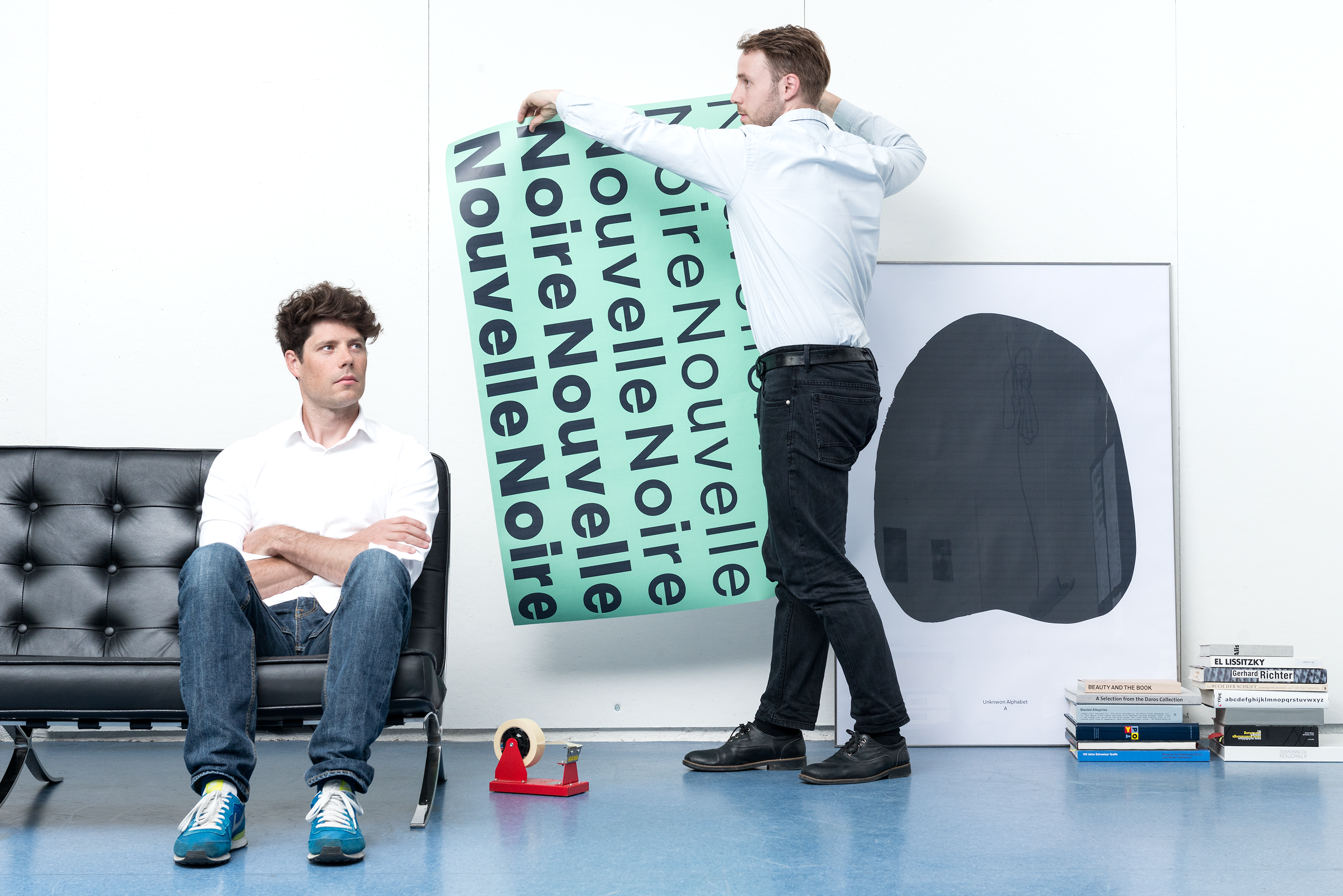
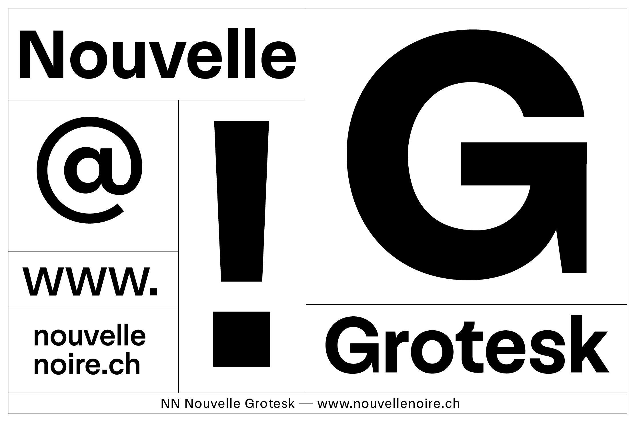
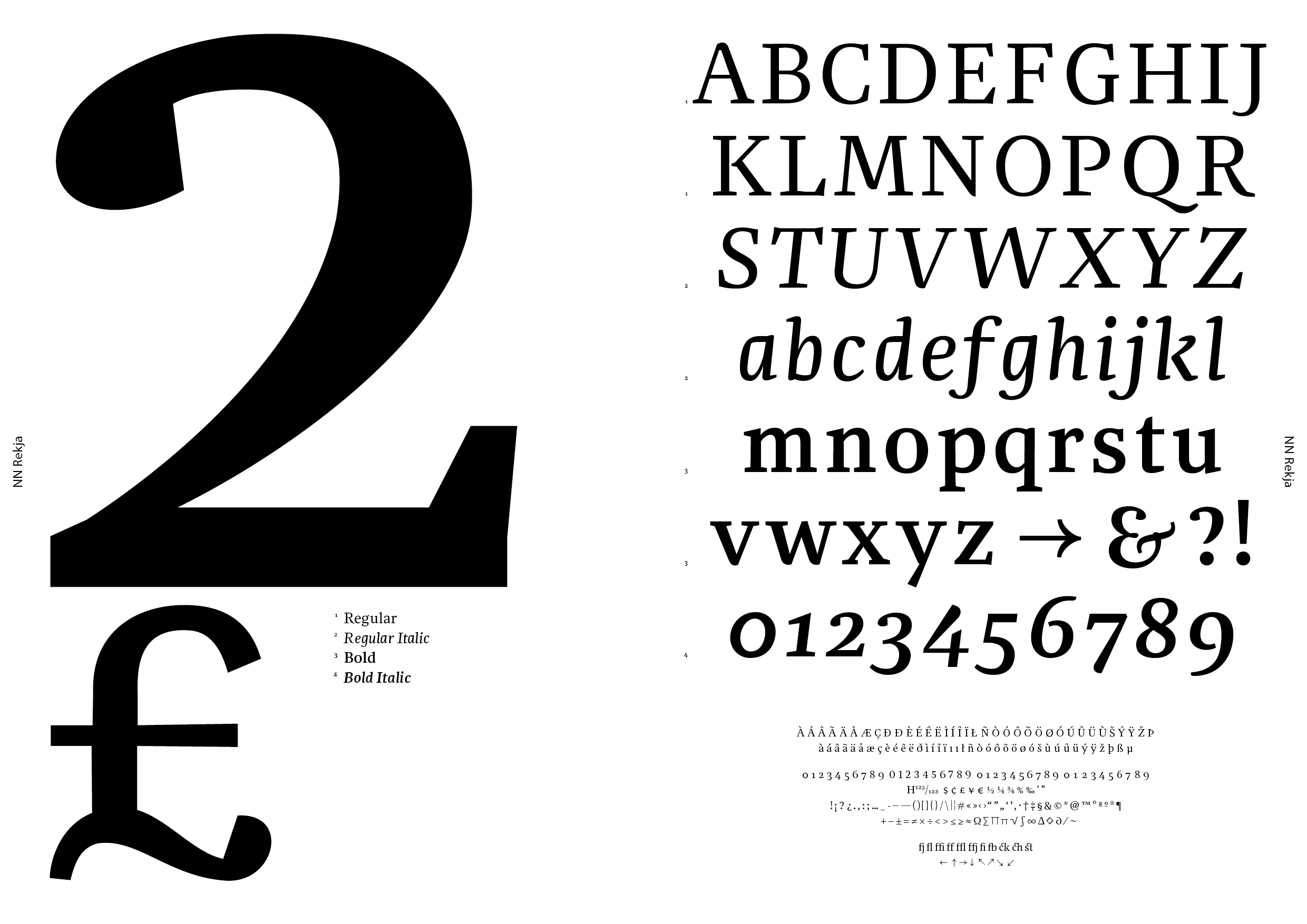
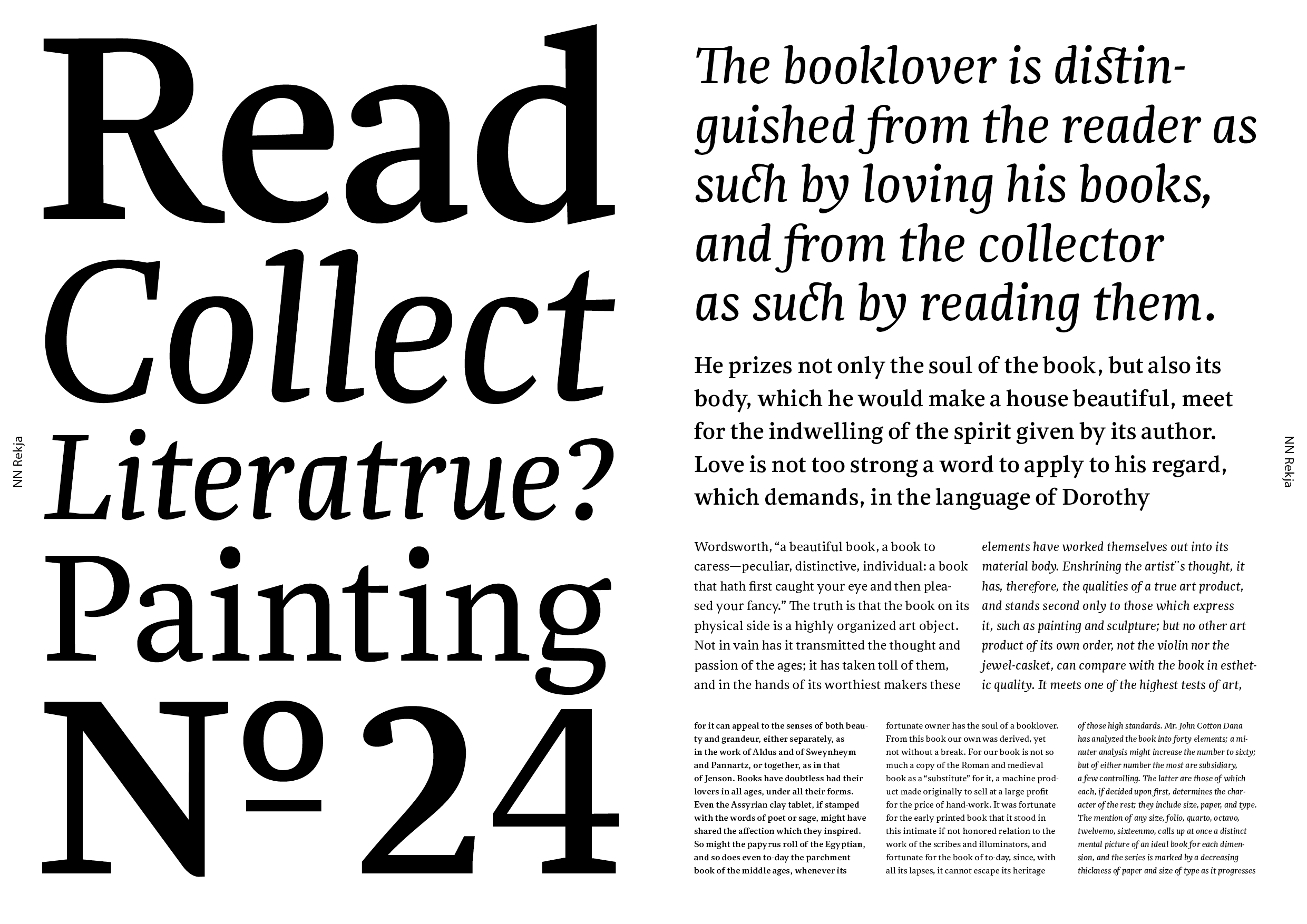
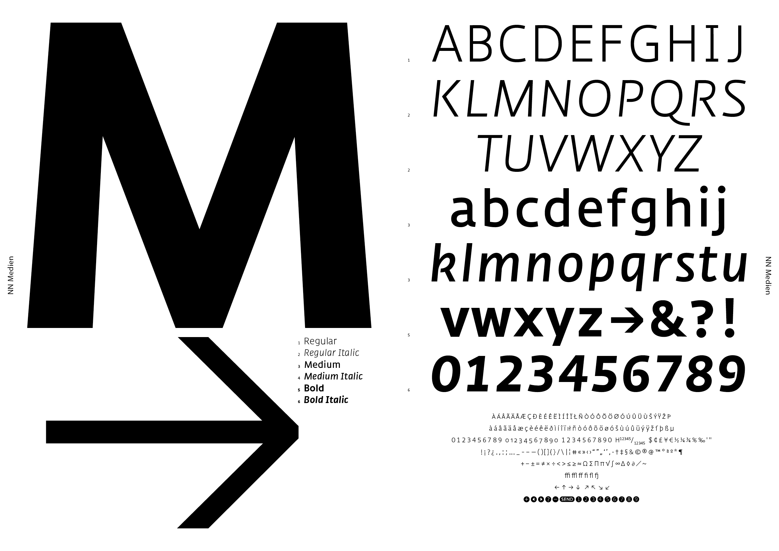
Two designers, French-German Clovis Vallois (b. 1978) and Swiss Anton Studer (b. 1983), met at the postgraduate course on type design at the Zurich University of the Arts (ZHdK). They each found an affinity in the other’s passion for type design, and their collaboration that started with a student project led to more professional collaborating after their graduation in 2008. At first, they maintained their separate practices as graphic designers, in addition to their joint type design studio that they named Nouvelle Noire (‘New Black,’ which references printing inks and digital type)—a memorable name with a nice ring to it. The font foundry’s further development was more organic. In 2012, they launched their website with their first three fonts: Medien (A. Studer, 2009–2011), Rekja (A. Studer, 2009–2011) and Ernesto (C. Vallois, 2010–2011).
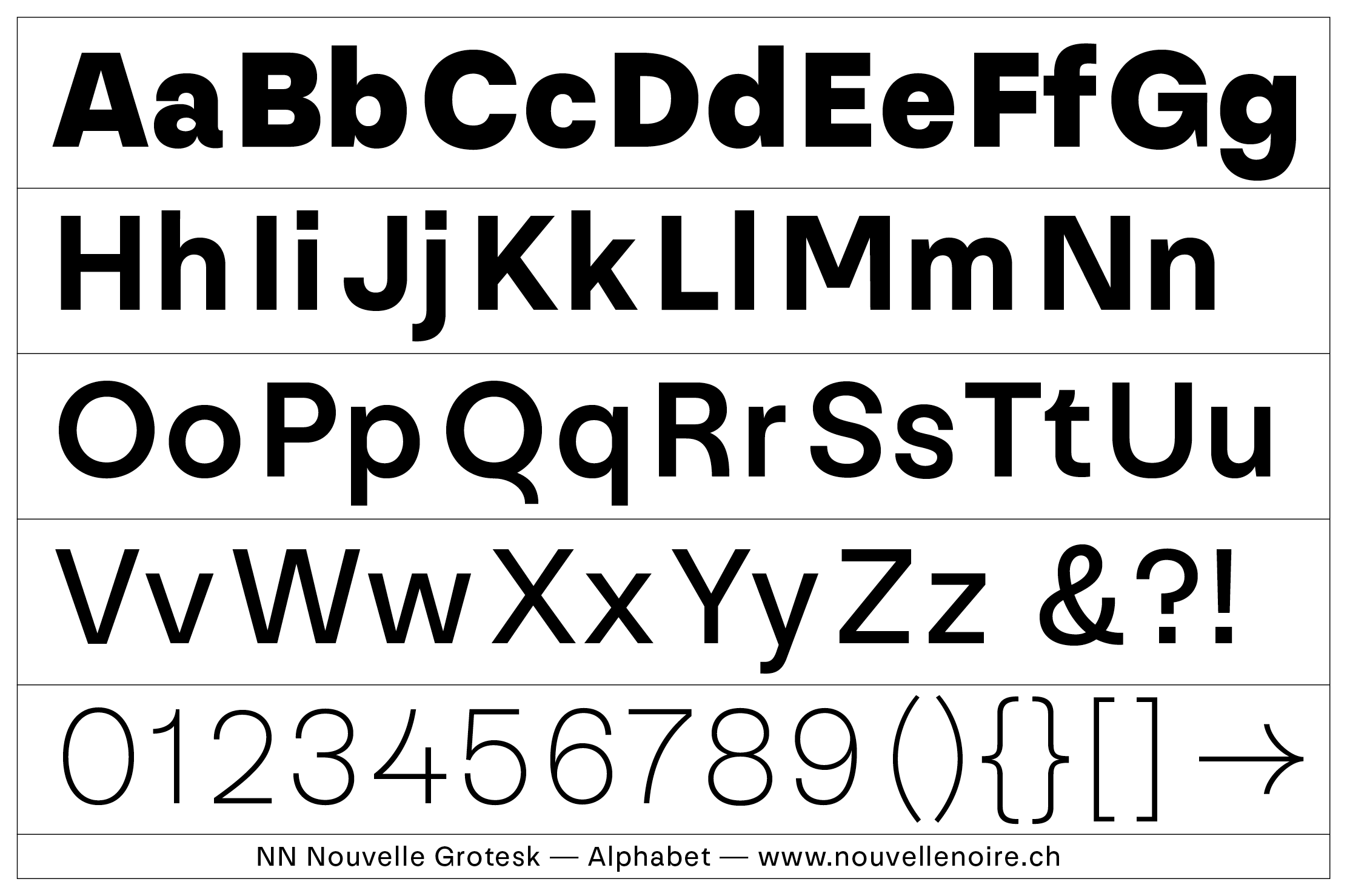
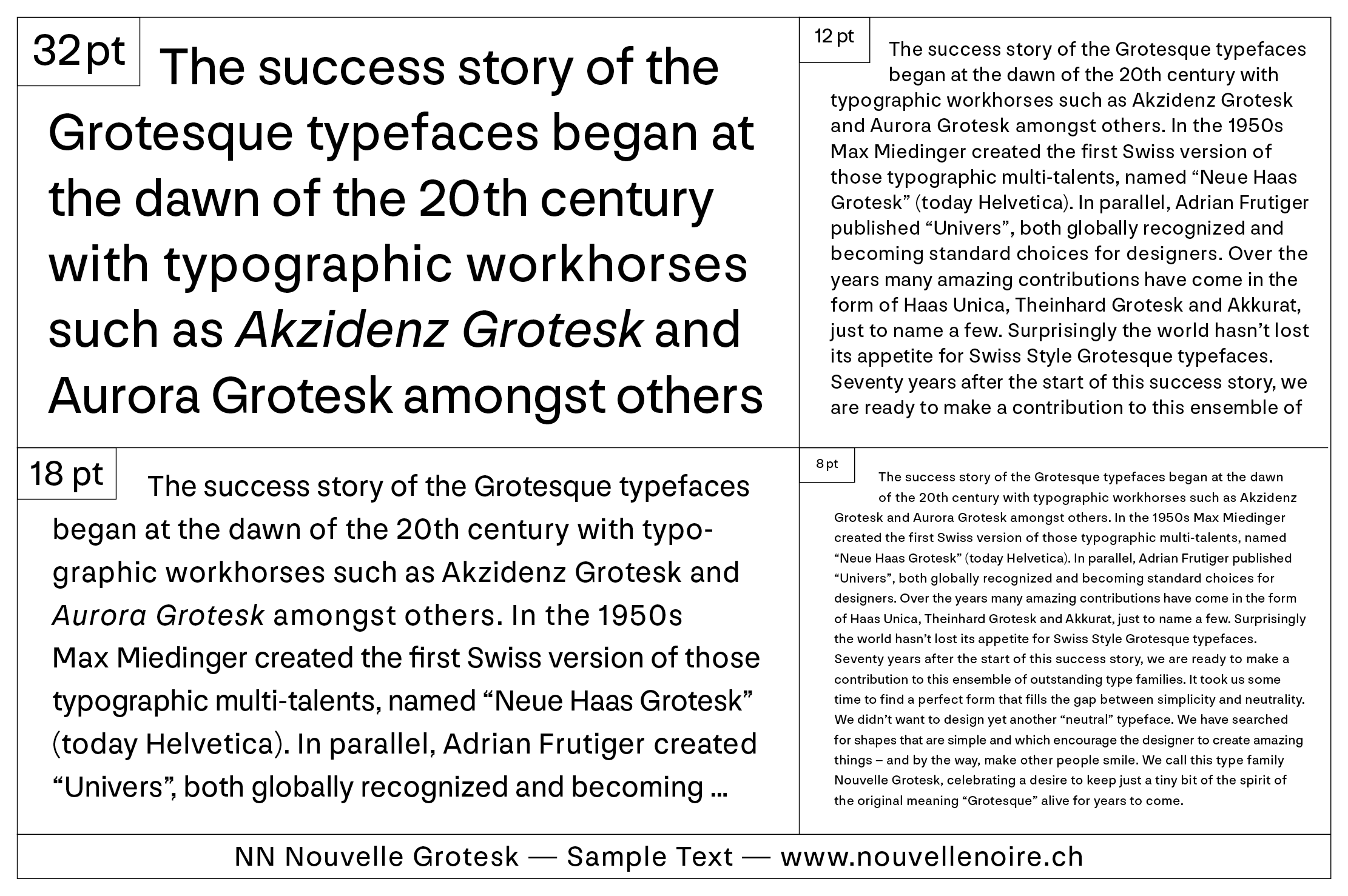
Nouvelle Noire’s approach to type design is as wide-ranged as their list of collaborators and type designers. Between the partners, the variety of fonts already extends from the playful and graphical exploration of letterforms (as in Vallois’s work) to the more crafted and classical type design (in Studer’s case). Their collaborations on typefaces also cover a broad spectrum: from fonts based on the lettering of French postmodern graphic designer Philippe Apeloig (b. 1962) to historical revivals of Swiss sans serifs to humanist book typefaces by the modernist book designer Jost Hochuli (b. 1933). Nouvelle Noire’s design approach is the sum of its contributors; there is no artifice in building ‘an image.’ Instead, they remain focused on their passion and explore what they find interesting. As graphic and type designers, they find inspiration in commissioned projects and custom type designs—especially those with cultural implications.
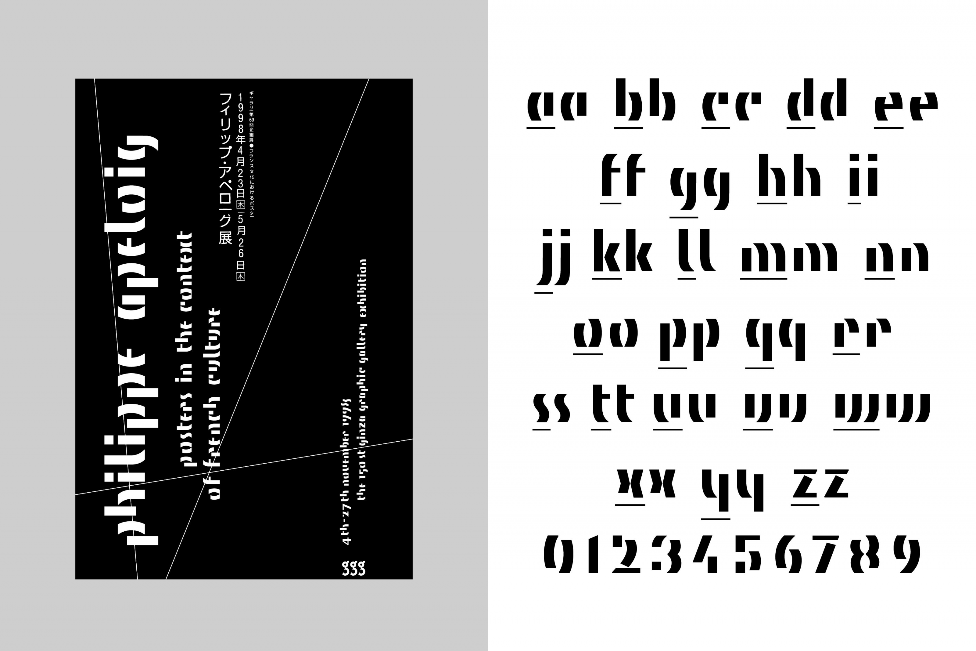
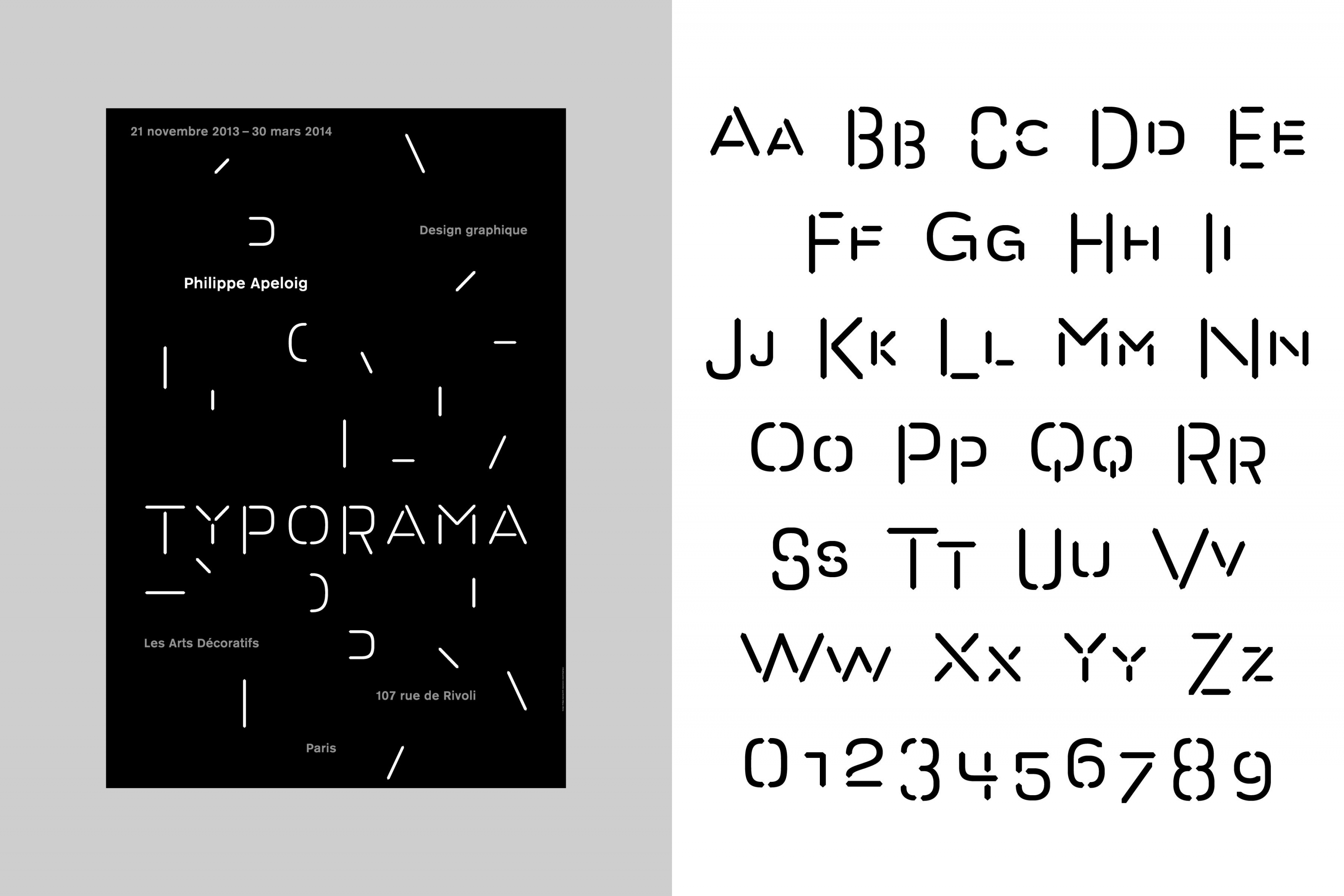
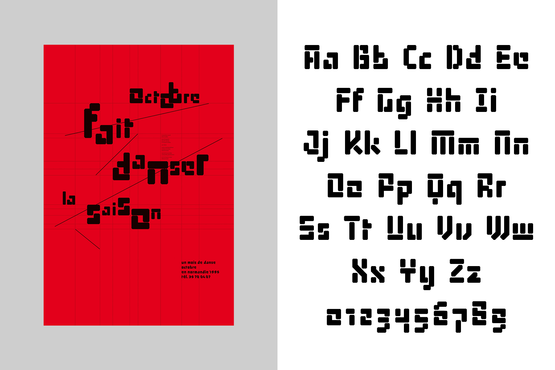
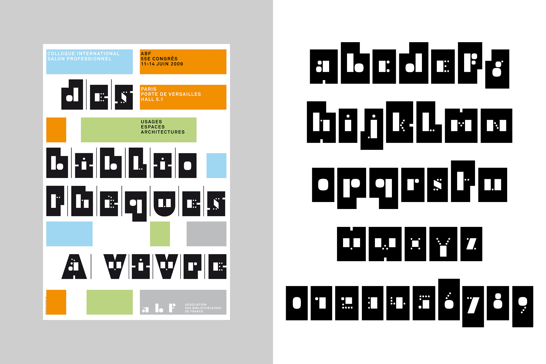
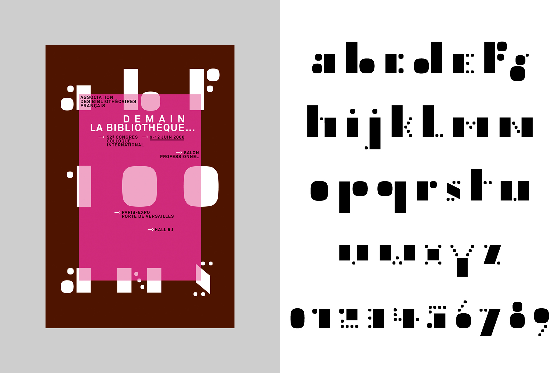
Their first collaboration was with Philippe Apeloig in 2012. Clovis Vallois knew Apeloig well; he had done a six-month internship in his studio in Paris during his undergraduate visual communication studies in Freiburg, Germany. In 2011, Apeloig was preparing for a retrospective exhibition of his work, and so Vallois made a proposal: they would create fully functional digital fonts based on Apeloig’s typographic lettering for his numerous poster designs. The work was an enriching learning process: Nouvelle Noire was faced with developing a whole character set based on a few letters. They had to imagine what ‘being Apeloig’ might mean and understand how he ‘conceives the process of type design as a research and play between legibility and forms’;1 as well as anticipating the shapes of the missing letters to complete each character set. They settled on ten designs they would develop as fonts, which were exhibited in Apeloig’s Typorama exhibit (held during 2013–2014 at the Musée des Arts Décoratifs in Paris). The fonts then became part of Nouvelle Noire’s retail font collection, displaying an experimental approach to letterform construction, challenging legibility and favoring ‘image-making.’ They each express a specific idea that illustrate the intent of the posters they were originally designed for. The Apeloig Type Library represents a spirit of exploration, especially prevalent during the early developments of digital typography in the early 1990s. The Apeloig Type library helped expand their font collection with ten new experimental typefaces: ABF Petit, ABF Silhouette, ABF Linéaire, Coupé, Poudre, Aleph, Izocel, Ndebele, Ali and Octobre.
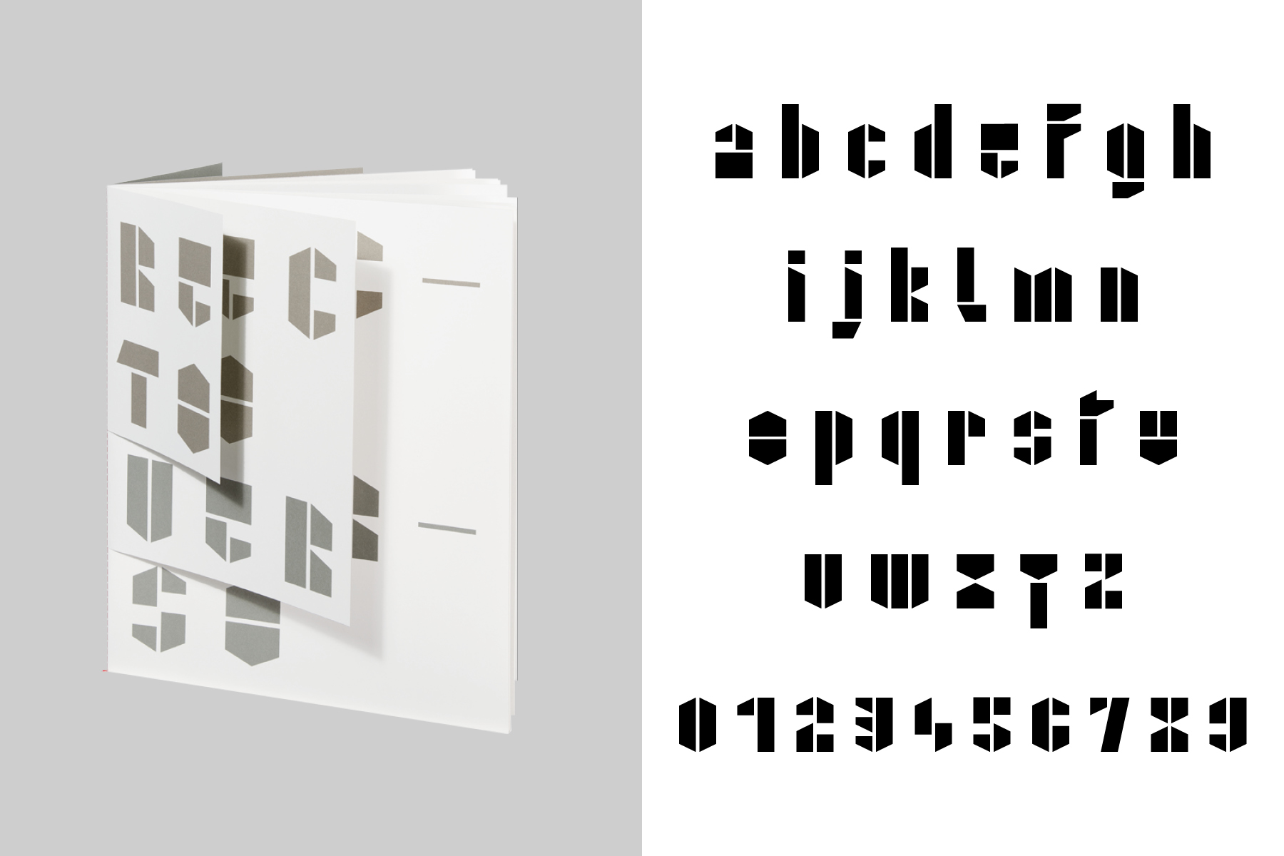
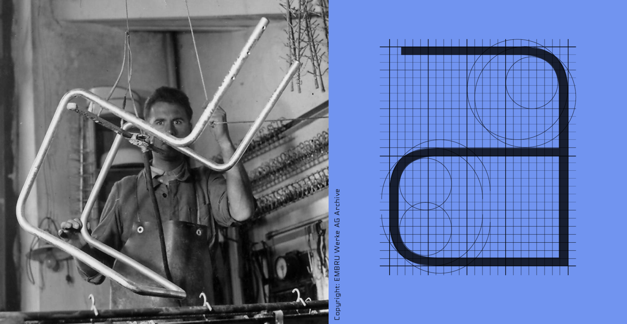
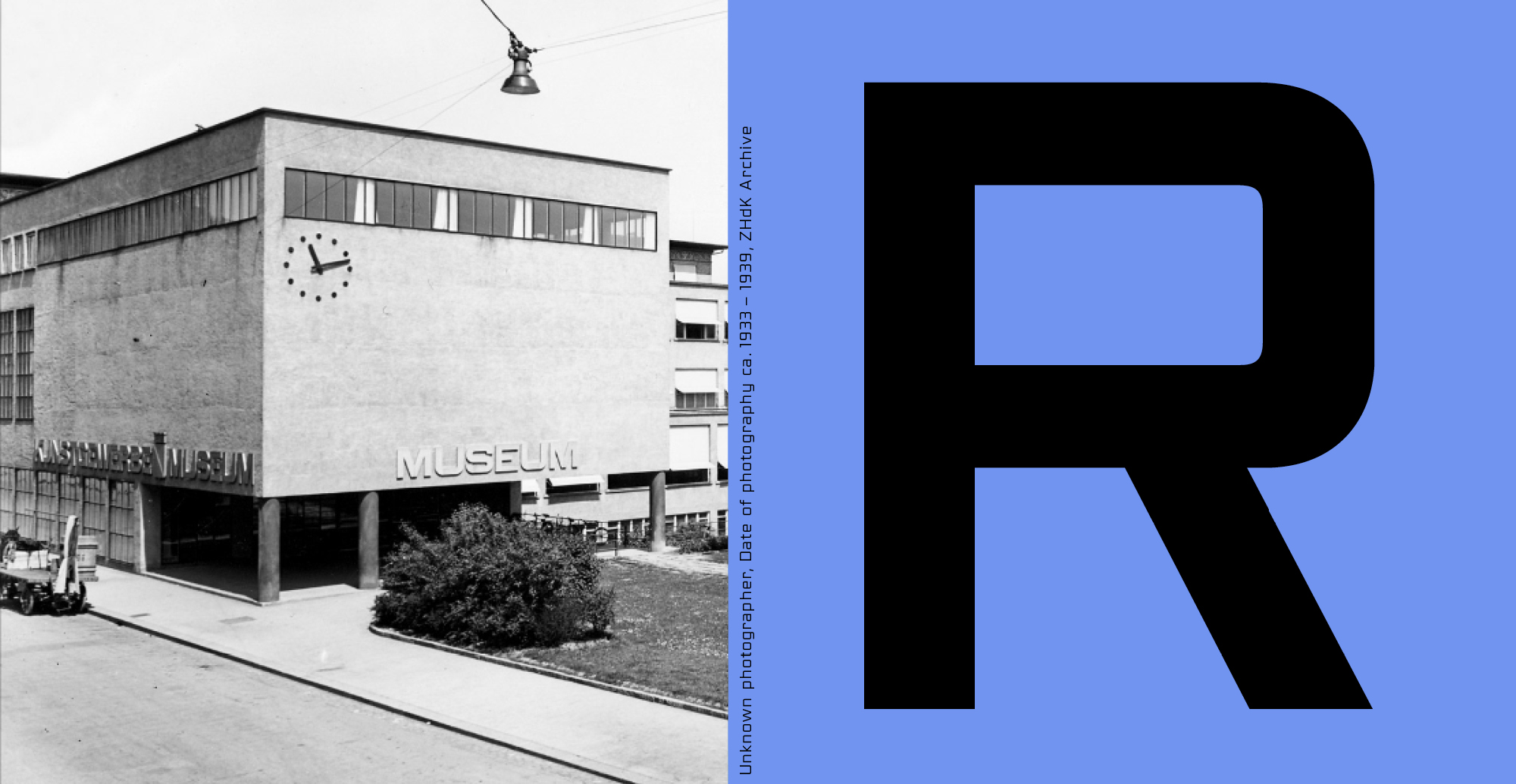
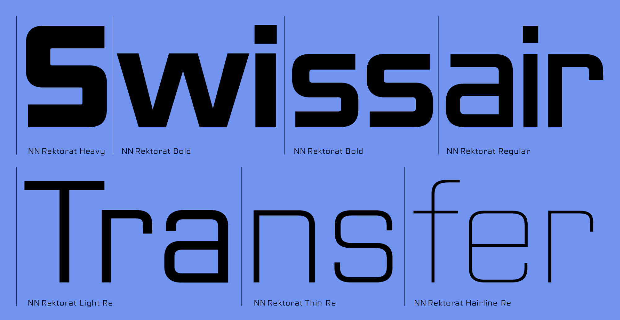
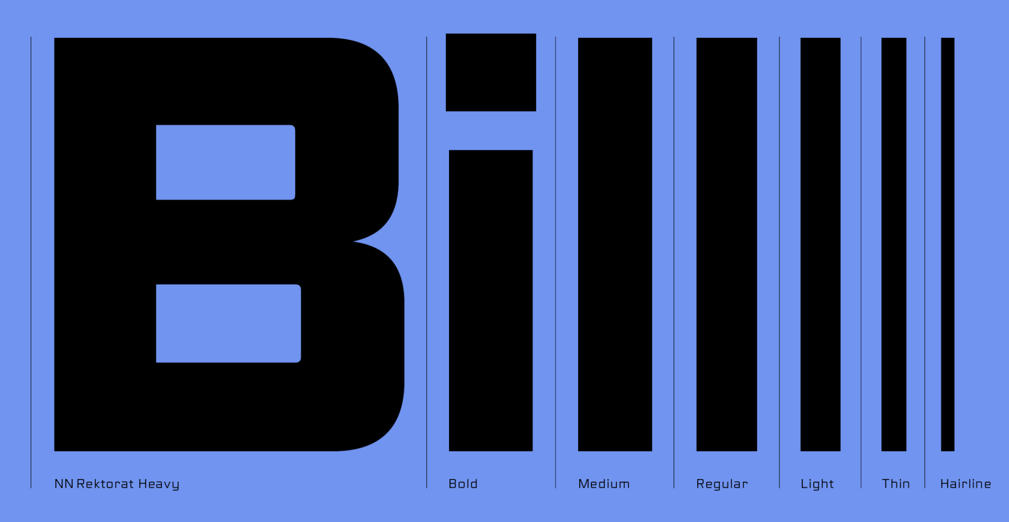
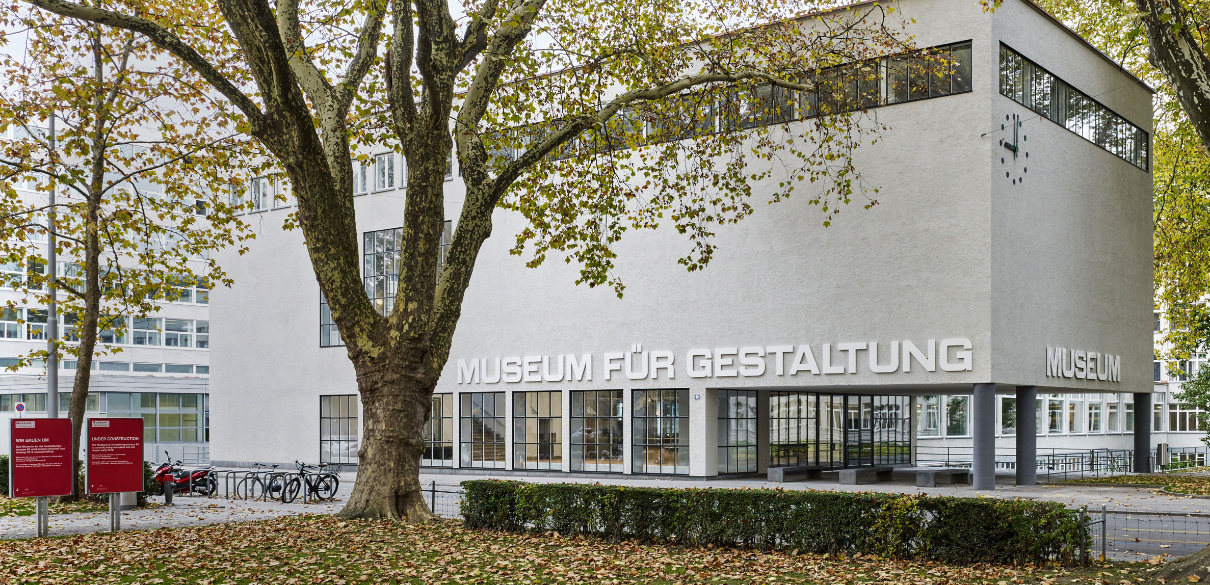
After the fruitful collaboration with Apeloig, Nouvelle Noire went on to enter into several more collaborations and archival projects. The Rektorat type family (2018, Rudolf Barmettler and Anton Studer) is the second such collaboration, undertaken with a colleague from ZHdK, Prof. Rudolf Barmettler (b. 1956). Rektorat is a 1930s squarish geometric sans serif lettering, based on the historical signage of the modernist building of the ‘Kunstgewerbeschule’ (School of Arts and Crafts, renamed ZHdK), and where the Museum für Gestaltung (or ‘MfG’, the design museum in Zurich) is now housed. The original lettering is attributed to Ernst Keller (1891–1968), the widely acclaimed contributor to the development of Swiss graphic design, who taught at the school for 40 years. As the building underwent a renovation in 2001, parts of the original signs were discovered, hidden behind some wallpaper. Barmettler, a teacher of typography and type design at the Zurich University of the Arts, was invited to create a typeface out of them. With the help of his students in the typography course, they traced the characters, refining and completely redrawing them in ink. In 2002 they continued their work, producing extra weights and digitizing the characters. However, the project was eventually shelved—until Barmettler began collaborating with Anton Studer in 2014. ‘They reworked the entire concept and every detail of the typeface to make it more than just another historical remake.’2 As type director, Barmettler was super-precise. He meticulously checked every detail, and the font underwent several revisions before it was fit for release. The final outcome remained faithful to the initial design and its synergy with the building’s architecture. In 2016–2017, when the building was refurbished, MfG’s management commissioned Barmettler to restore the original lettering for both the exterior and the interior signage system. Barmettler invited Nouvelle Noire to collaborate with him on creating a custom typeface based on the historical drawings for the signage of the museum. Since Barmettler and Studer were already working on a font family based on the same historical model, they decided to use the Rektorat type family as a starting point, making adjustments to the width and proportions of the letters to match more closely the original lettering. The font for the exterior signage is slightly different from the interior one; its letters are bolder and some have completely different shapes. They also added a set of matching pictograms to the character set that was not part of the original model. The current Rektorat family consists of two styles in seven weights, which are only the beginning of an ever-growing superfamily.3 Nouvelle Noire recently developed a custom Cyrillic version of the typeface for a computer gaming company in the US.
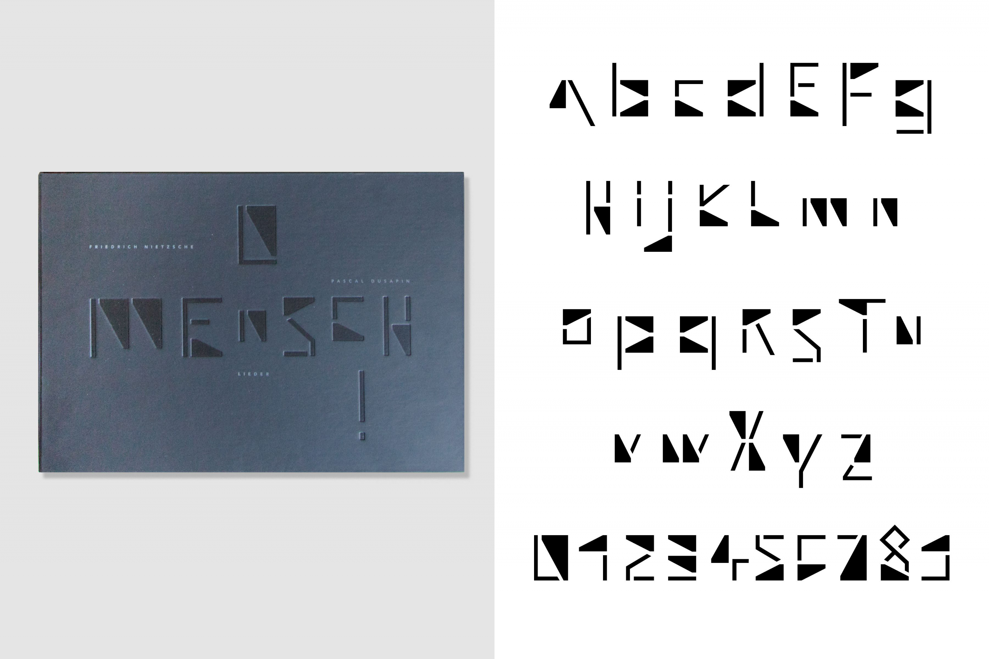
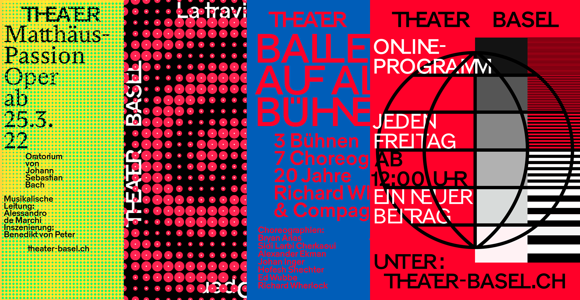
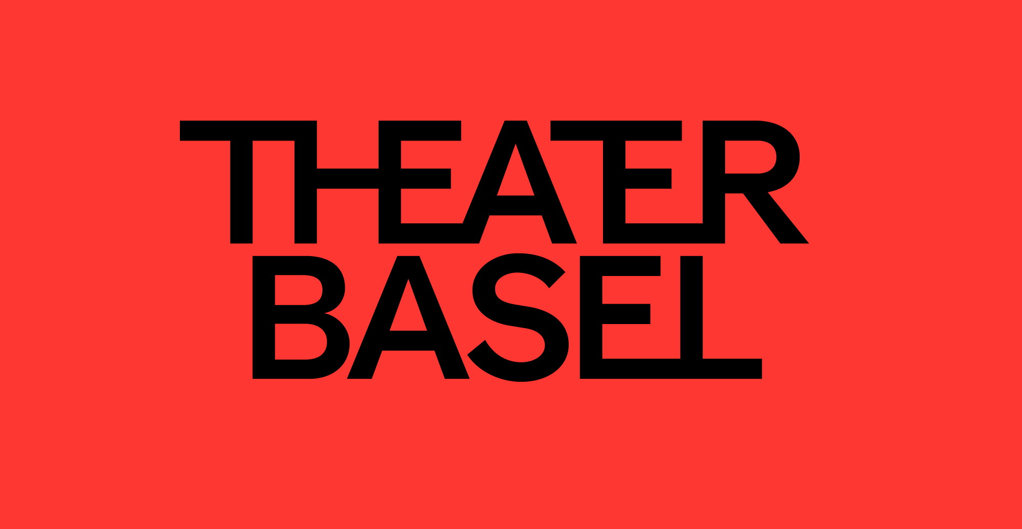
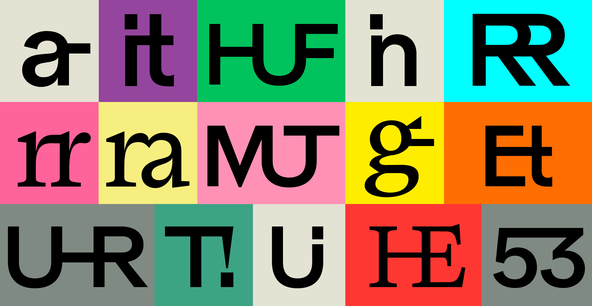
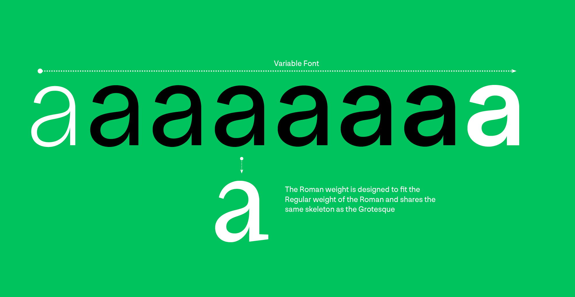
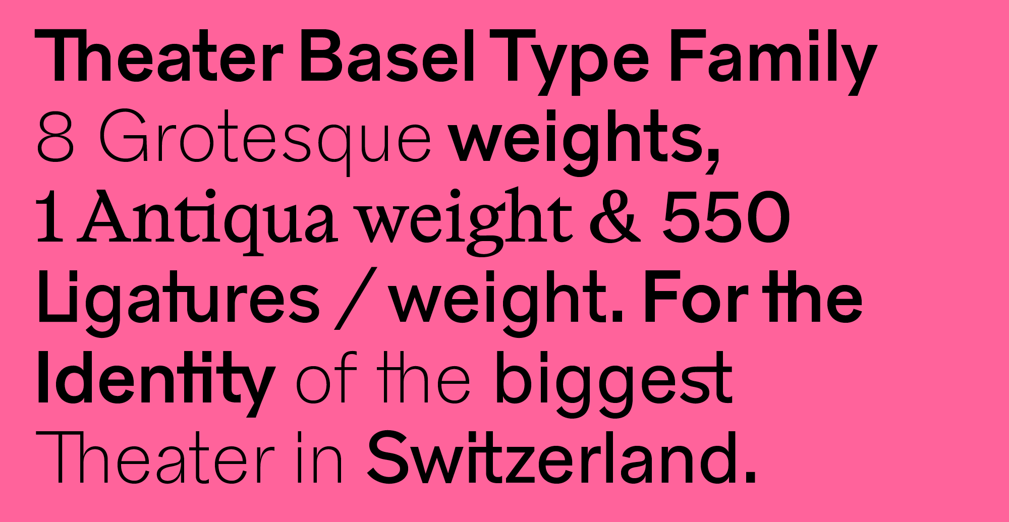
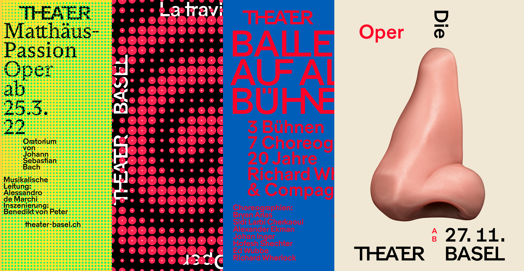
In 2020, Nouvelle Noire collaborated with Jiri Oplatek from the Basel-based design agency Claudiabasel on developing a typeface for the rebranding and signage system of the refurbished Theater Basel (Basel’s National Theater). The Theater Basel Grotesk follows the Swiss tradition of 20th-century grotesque typefaces, such as Akzidenz Grotesk. However, it is a contemporary interpretation of the genre extended with features that reference the architecture of the theatre building. One core feature of the typeface is the large set of ligatures that were inspired by Swiss graphic designer Armin Hofmann’s 1960s illustrative typographic compositions for the posters he designed for the theatre. Hofmann interconnected and merged letters to create ‘images’ that express specific messages, thus developing uncommon and unique ligatures. A similar use of ligatures was observed in the design of the historical signage of the building. The set of ligatures created for the custom type family extends the number of ligature combinations extensively. The type family was conceived as a variable font, while eight main weights were defined for use throughout the visual identity. The weights range from Thin to Bold and are designed to be paired with a matching Roman. This new revised design is yet another historical project of Nouvelle Noire that valorizes the Swiss design heritage by giving it new contemporary functionalities.
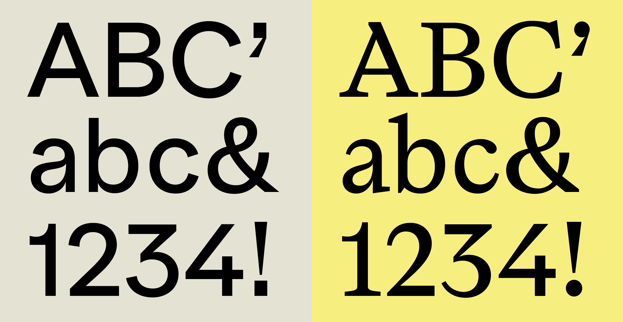
In 2019 Nouvelle Noire took on another collaborative project with Arnaud Chemin, which tackled the ‘French’ tradition of Didones. Didot Modern was released in the autumn of 2021. It is not a revival but yet another typeface design that revisits a historical model and gives it a new and contemporary twist. It is a high-contrast typeface with delicate features, simplicity of form, and ‘contains alternate characters based on the aesthetics of Grotesk typefaces.’4
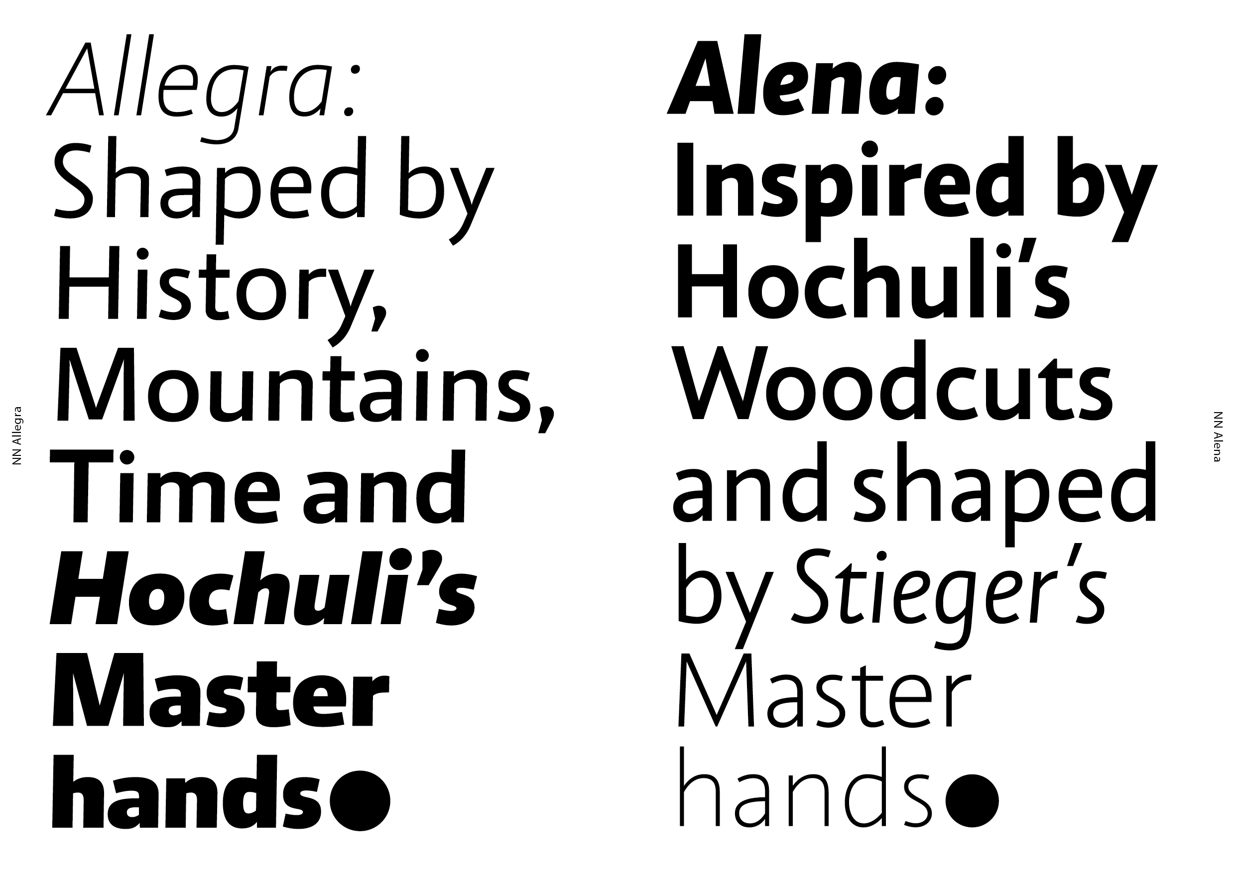
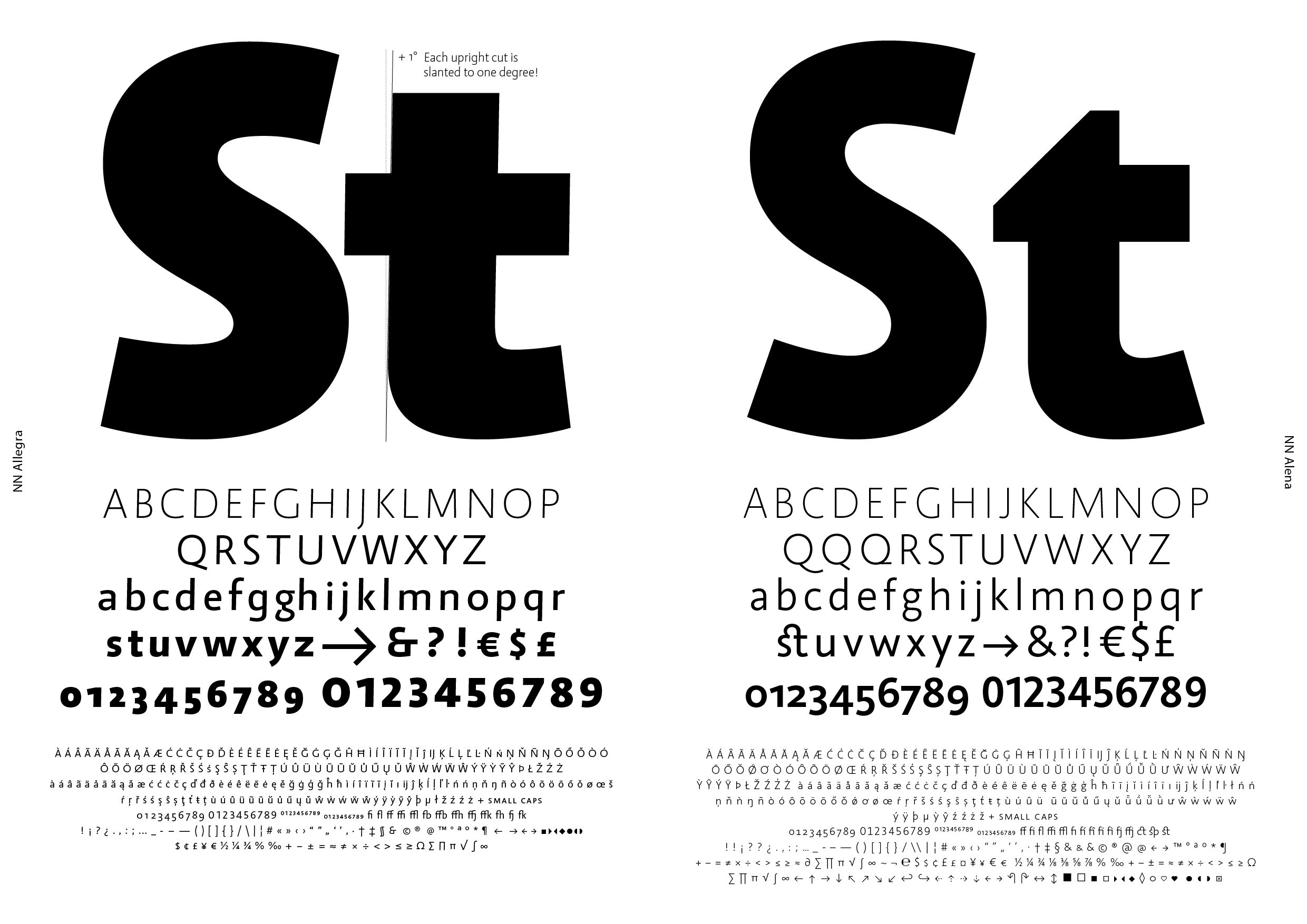
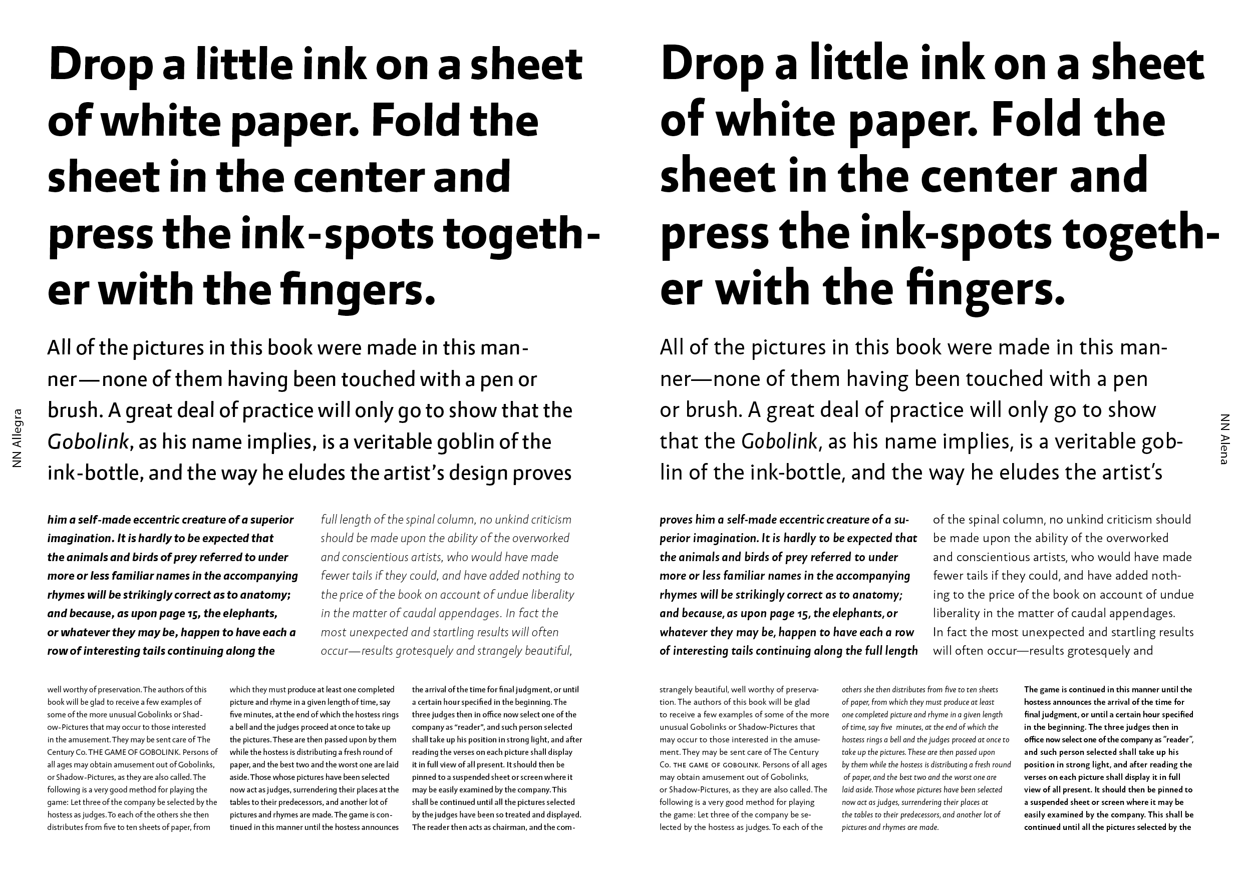
As a Swiss type foundry, Nouvelle Noire continues to explore the Swiss School’s design legacy. They produced a documentary on the type design work of Jost Hochuli (b. 1933), who is better known as a book designer and type historian. Hochuli and his student Roland Stieger (b. 1970) joined Nouvelle Noire’s type collection in 2019 with their lively humanist sans serif ‘type siblings’,5 Allegra (by Hochuli) and Alena (by Stieger). Allegra’s seven weights and matching italics make it suitable for complex book typography, whereas Alena, which took as its starting point a 1980 woodcut by Jost Hochuli, shares with Allegra an uppercase based on the Roman capitals and lowercase letters based on a late form of the humanistic minuscule. The matching italics of Alena’s eight weights have a space-saving narrow ductus, as was the case with the first italic typefaces, and a slight inclination of five degrees, which makes them fit harmoniously with the upright letters—so as not to visually disrupt immersive reading. Both Allegra and Alena are highly legible at small sizes, making them suitable for complex typesetting and web-based design applications. For Alena and Allegra, Nouvelle Noire created a microsite.
Nouvelle Noire’s work explores the potential of type design to revisit historical models and connect archival material to the present. Their custom type designs offer a contemporary response to a variety of communication needs, and their work exudes both a certain clarity of purpose and a penchant for research on iconic 20th-century designs.
1. MAGMA Brand Design (ed.), ‘Apeloig Type Library / Nouvelle Noire.’ Slanted #23, Swiss Issue (Karlsruhe: Slanted Publishers, 2014), p. 6
2. https://nouvellenoire.ch/product/rektorat/
4. https://nouvellenoire.ch/product/didot-modern/
5. https://nouvellenoire.ch/studio/