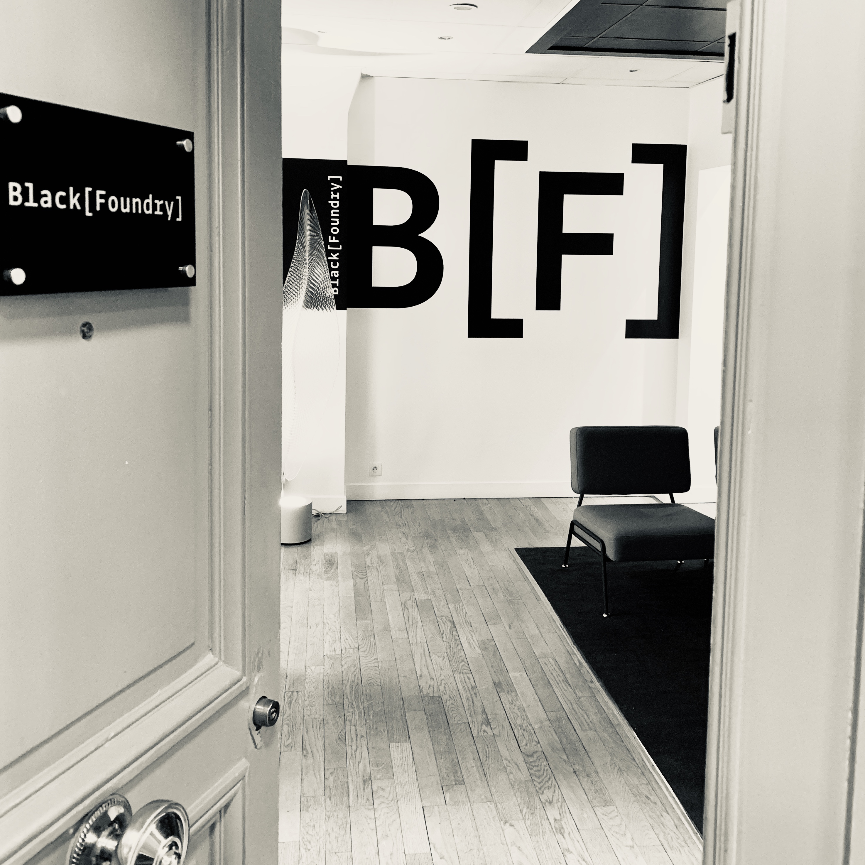
Photo: Jérémie Hornus
Jérémie Hornus and Grégori Vincens created Black[Foundry] seven years ago, and I recently spoke with Hornus about their work. He recounted how they set the company up, explaining that he’s ‘been into typeface design and font-making since 2006. I always wanted to run my own thing, so I jumped at the chance to share a company with Grégori, who I had already worked with at FontYou.’
Hornus and Vincens both hail from Toulouse originally. ‘Although the city has a design scene,’ Hornus told me, ‘Toulouse isn’t a typographic focal point, like Paris. Some places in France have a lot of stone carving resources or collections of manuscripts and other things that are paleographically relevant. Lyon, for instance, was a center of printing. Toulouse also had some activity in the past – even in the distant past, like the Middle Ages and the Renaissance.’ Fortunately, Toulouse had a school called the Scriptorium, which operated from 1968 until 2005. ‘This was a very attractive place for graphic designers and type designers to be back then,’ Hornus recalled. ‘You could learn Latin palaeography, typeface design and stone carving. It was a bit like KABK is now, just without the computer programming teaching aspect.’
After his time at the Scriptorium, Hornus headed for England in 2005, where he studied on the MATD course at the University of Reading before joining DaltonMaag. Meanwhile, Vincens went directly to Paris. Hornus eventually joined him there at an earlier company Vincens had established: the above-mentioned FontYou. According to Hornus, Black[Foundry] was initially a kind of FontYou spin-off, ‘but in its structure, we are more like a traditional foundry than FontYou was. Grégori has been an entrepreneur for a long time. For him, it is natural to run the company. Our association is a good mix because I had experience working inside of other foundries, in addition to my experience at Reading.’
Black[Foundry] has a team of designers, but it is rare for more than two or three people to work together on a project. Collaboration between different actors on a typeface is important, however. ‘For feedback, it is critical,’ Hornus explains. ‘We involve even more people on feedback. That’s the power of teams. You can show your work, talk about it, change things and evolve more quickly if you are open to showing your work to the rest of the team. For custom work, of course, we provide the client with beta versions. They are also part of the design because they guide the decisions and help make the brief.’
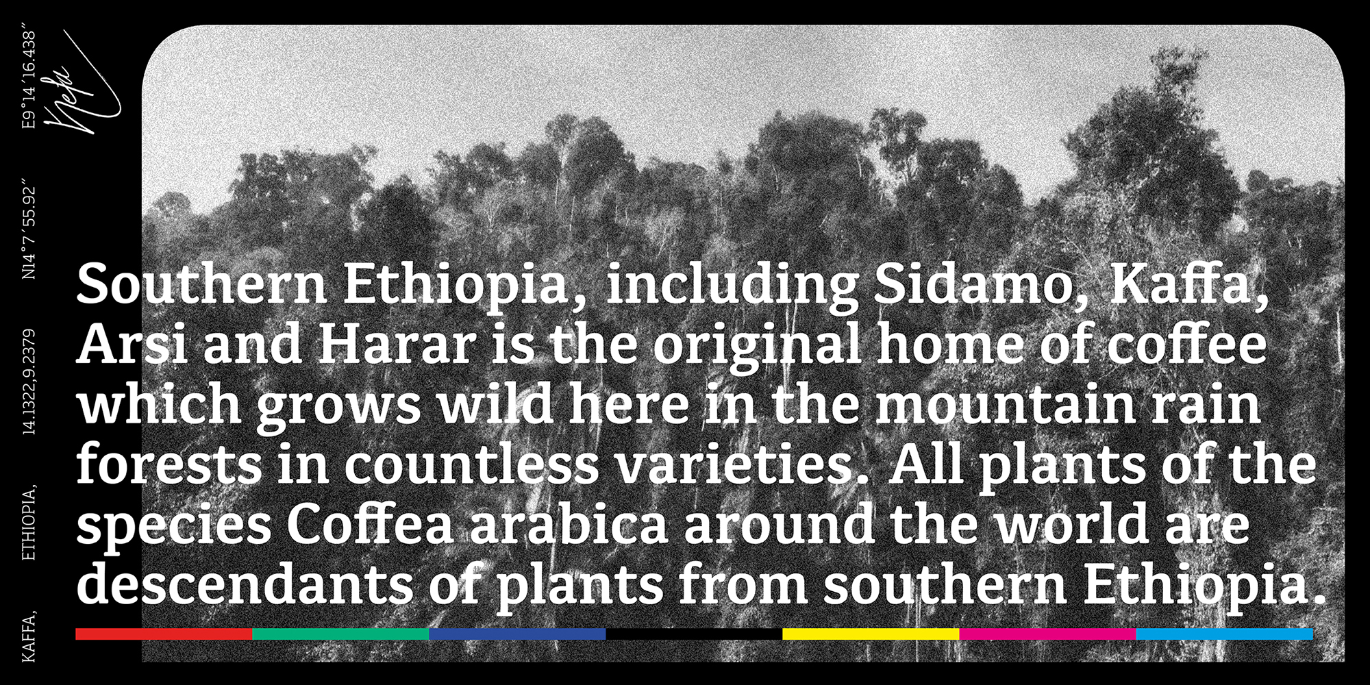
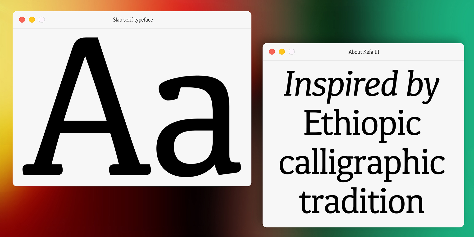
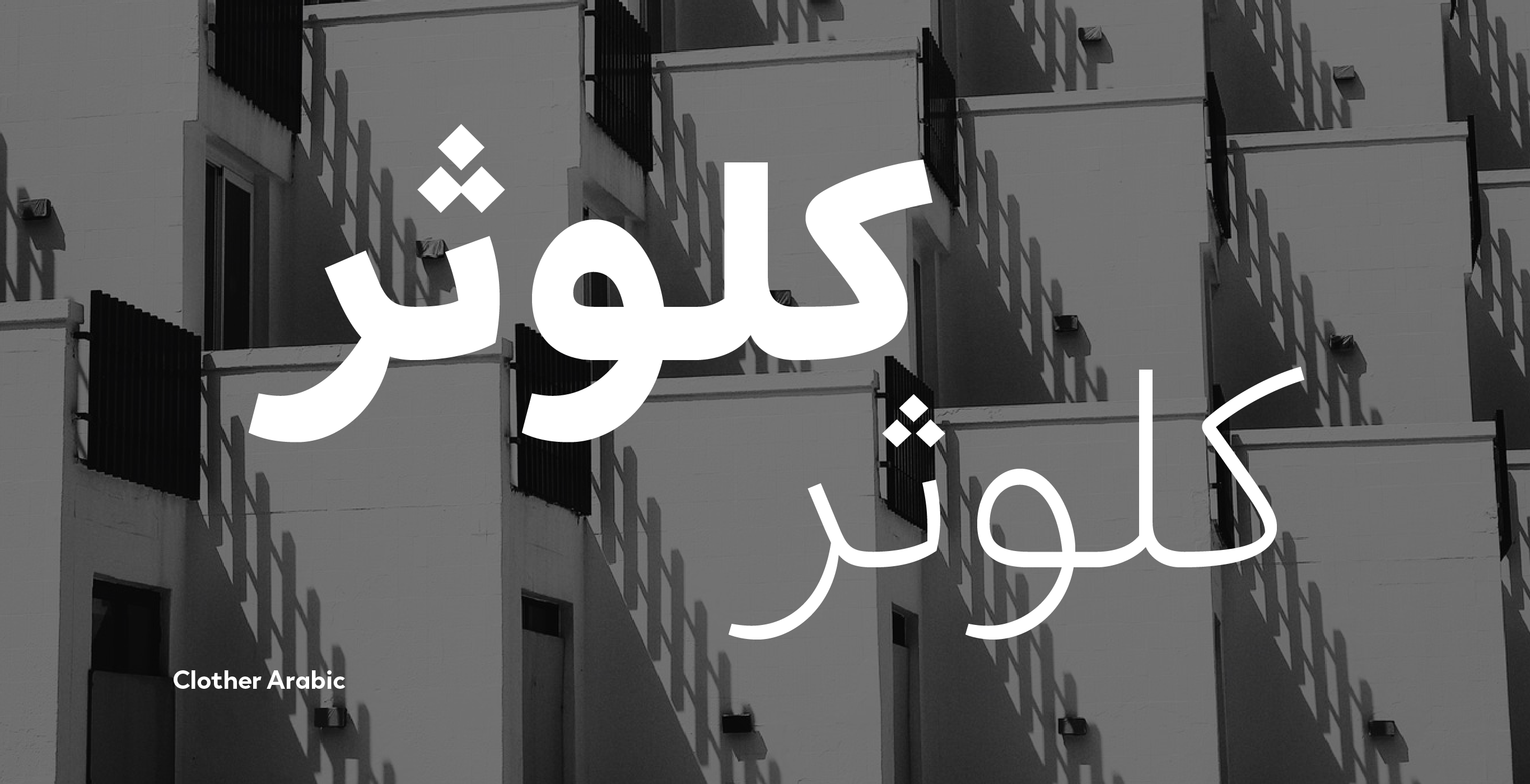
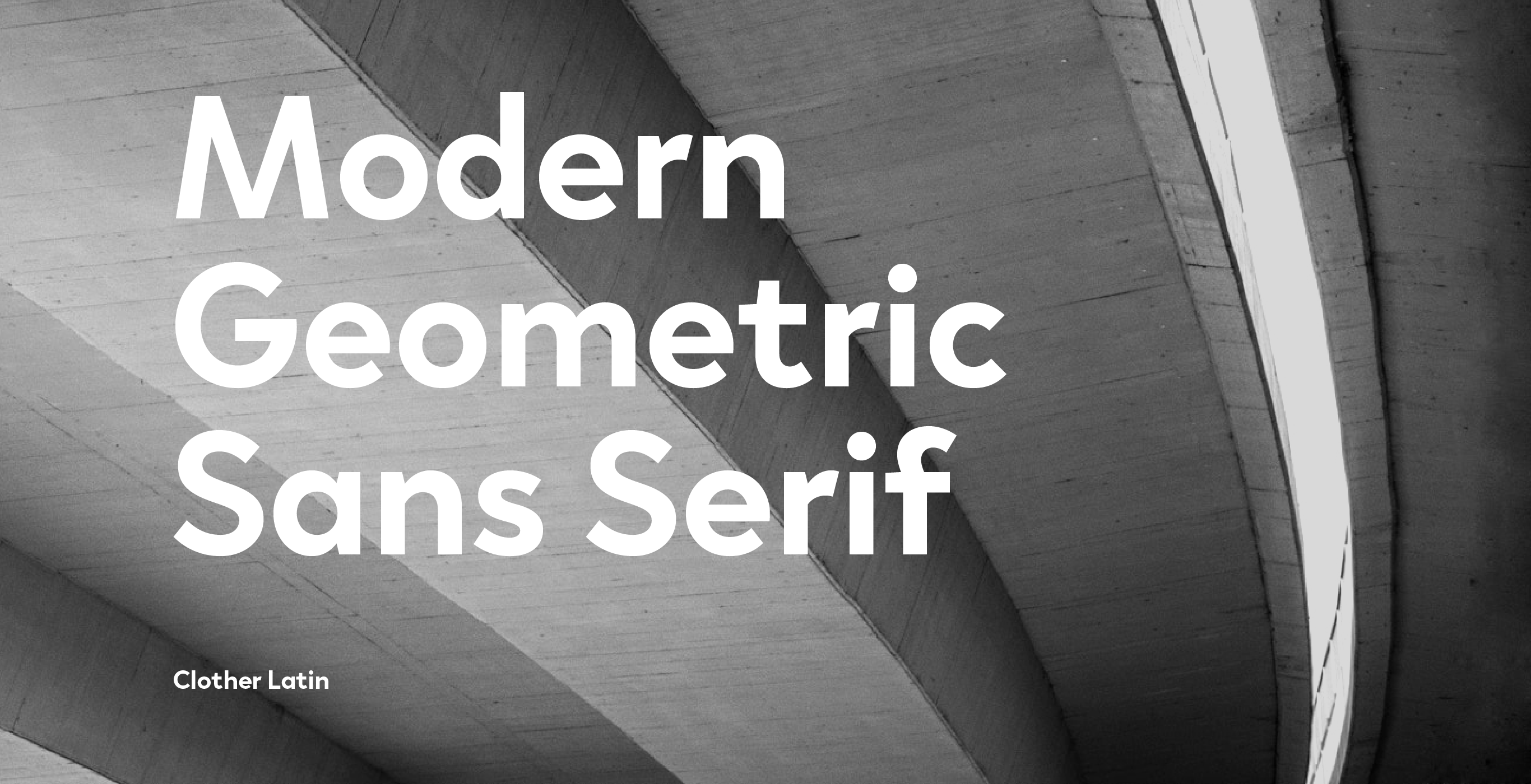
Multi-script products are a key part of Black[Foundry]’s work. Hornus learned how to deal with scripts other than his native Latin one at Reading, or as he calls them, ‘scripts that are not familiar to you, which you don’t read, or don’t write. At Reading, I designed a typeface named Kefa, which supports both the Latin and Ethiopic scripts. Kefa became part of macOS. Since then, I have made a few more Ethiopic typefaces for specific clients. I enjoy research a lot, especially for Ethiopic – looking at manuscripts and things like that. This methodology can be applied to many writing systems.’ Black[Foundry]’s Clother supports Arabic, Cyrillic, Hebrew and Latin. Vesterbro has Cyrillic and Greek, plus its Latin character set also includes Vietnamese.
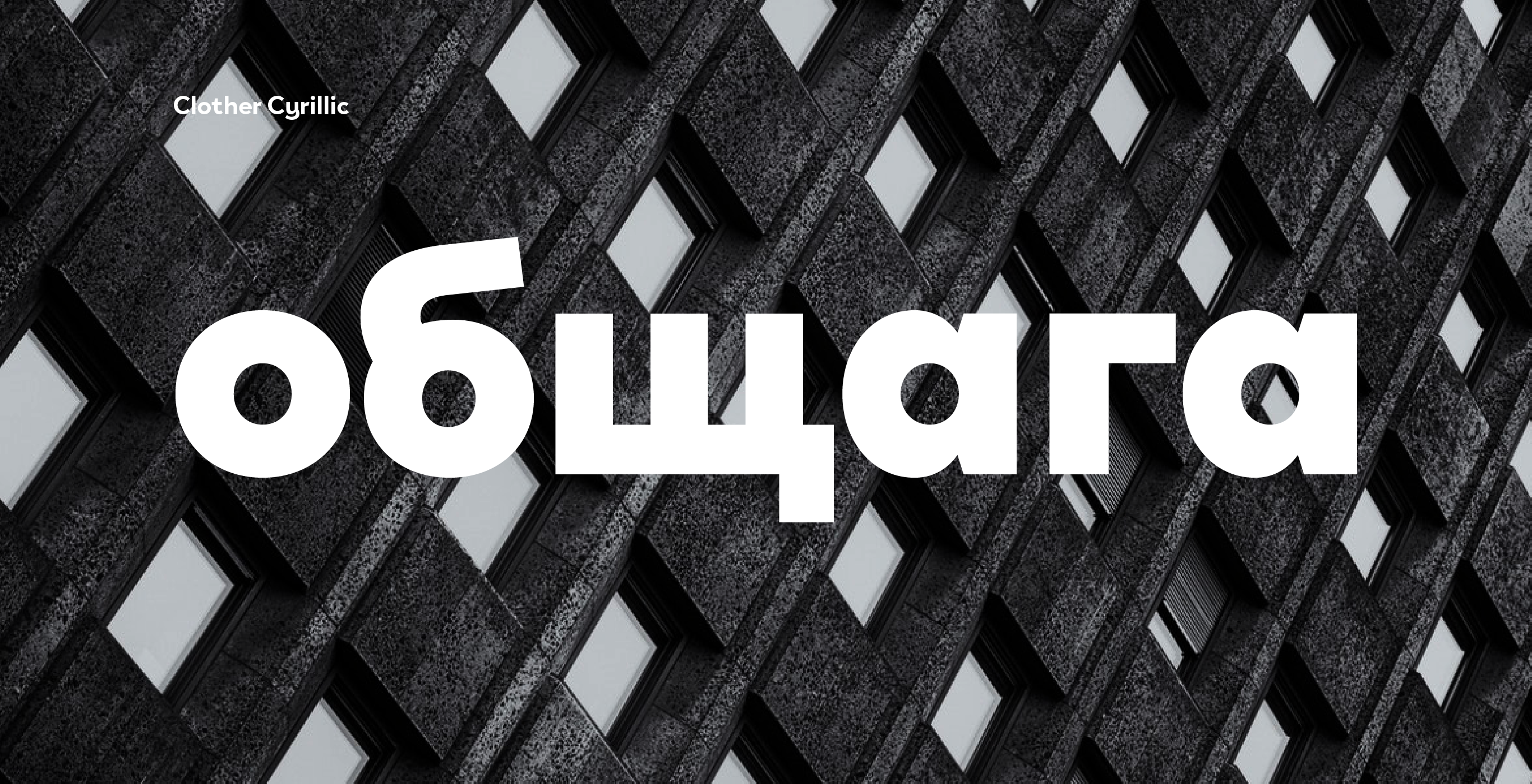
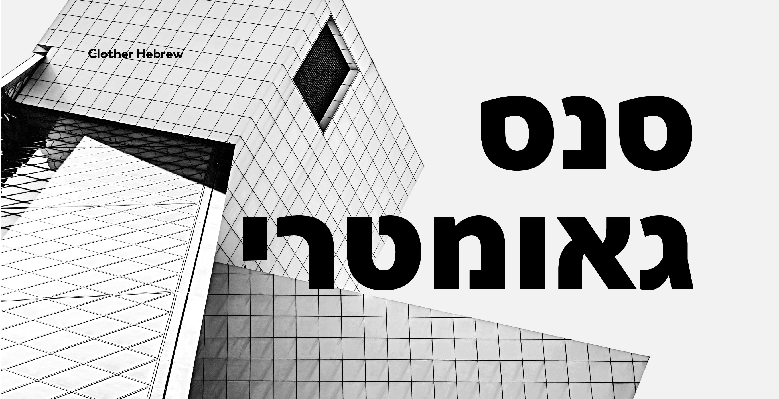
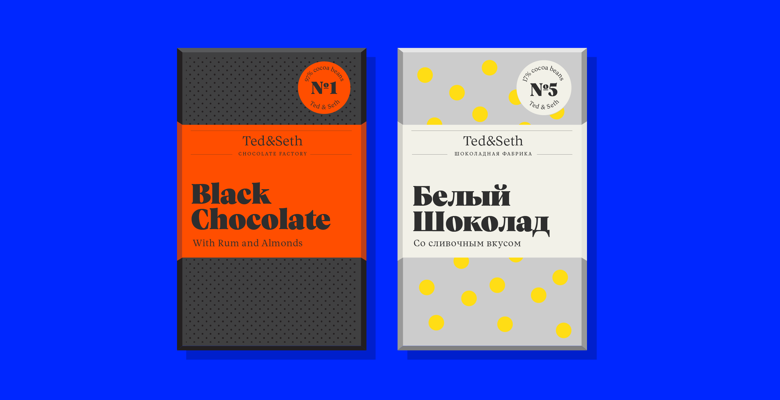
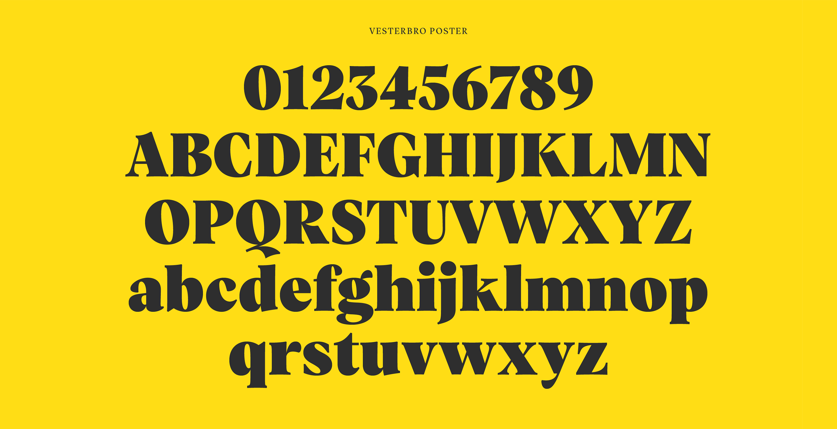
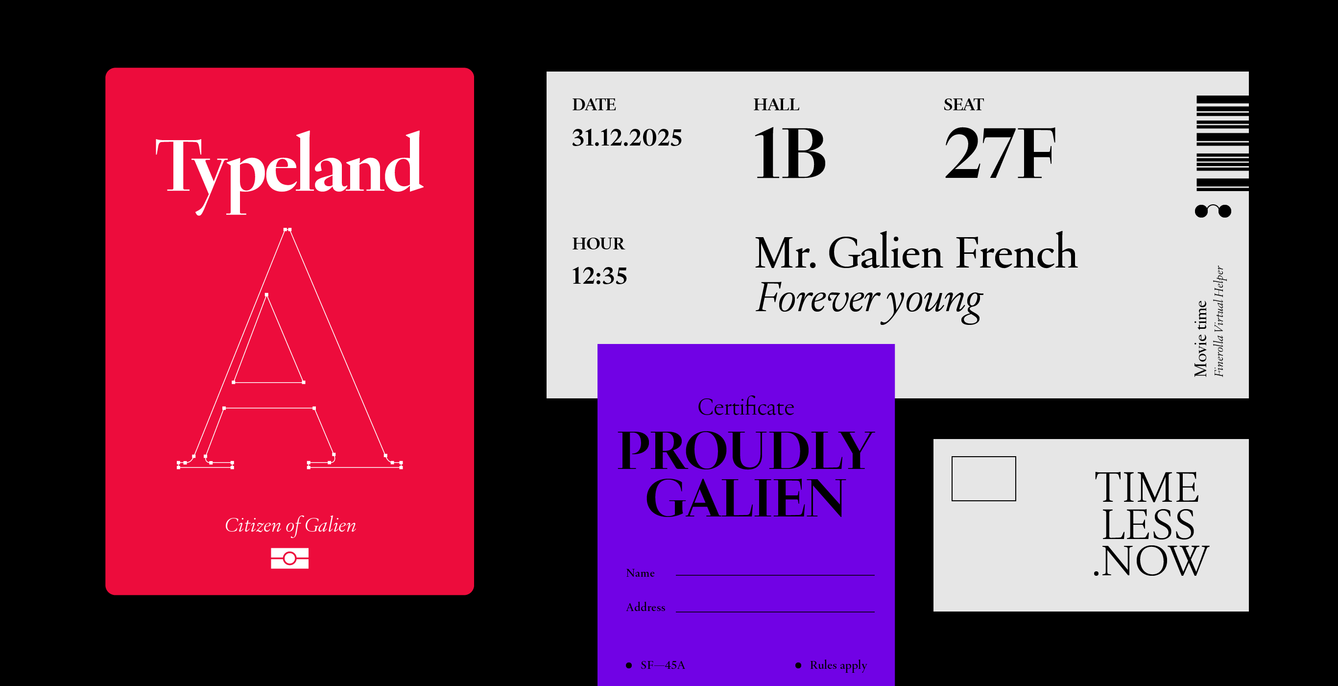
‘At first, our idea was for every new release to have one script in addition to Latin. This was one of our rules, but we broke it many times. However, we want to release updates to these fonts, as soon as we have the time and budget. Sometimes, when we define a brief for a new typeface, we think: “It should include these scripts.” Clother was defined all at once; it has Latin, Cyrillic, Hebrew and Arabic. Vesterbro was defined with Latin/Greek/Cyrillic initially, but then we finished the Greek later. But for example, with Galien, we had been working on an Arabic version. When we design a new typeface, sometimes the other script is not ready, but it is still in there somewhere, in the DNA of the typeface, even if its characters are not in the released product yet. I think that virtually any typeface can support any script, but it is good when they are conceived together. For instance, in Vesterbro, the Cyrillic influenced the Latin a lot. The Ethiopic influenced the shape of the Latin in Kefa, too. So you can have a kind of hybridization of writing systems and they can interact in the conception of the design, which is interesting.’
“When you think of corporate design, you think of sans serifs. But we don’t only make designs for corporations. And serif styles are used in corporate design, too.”
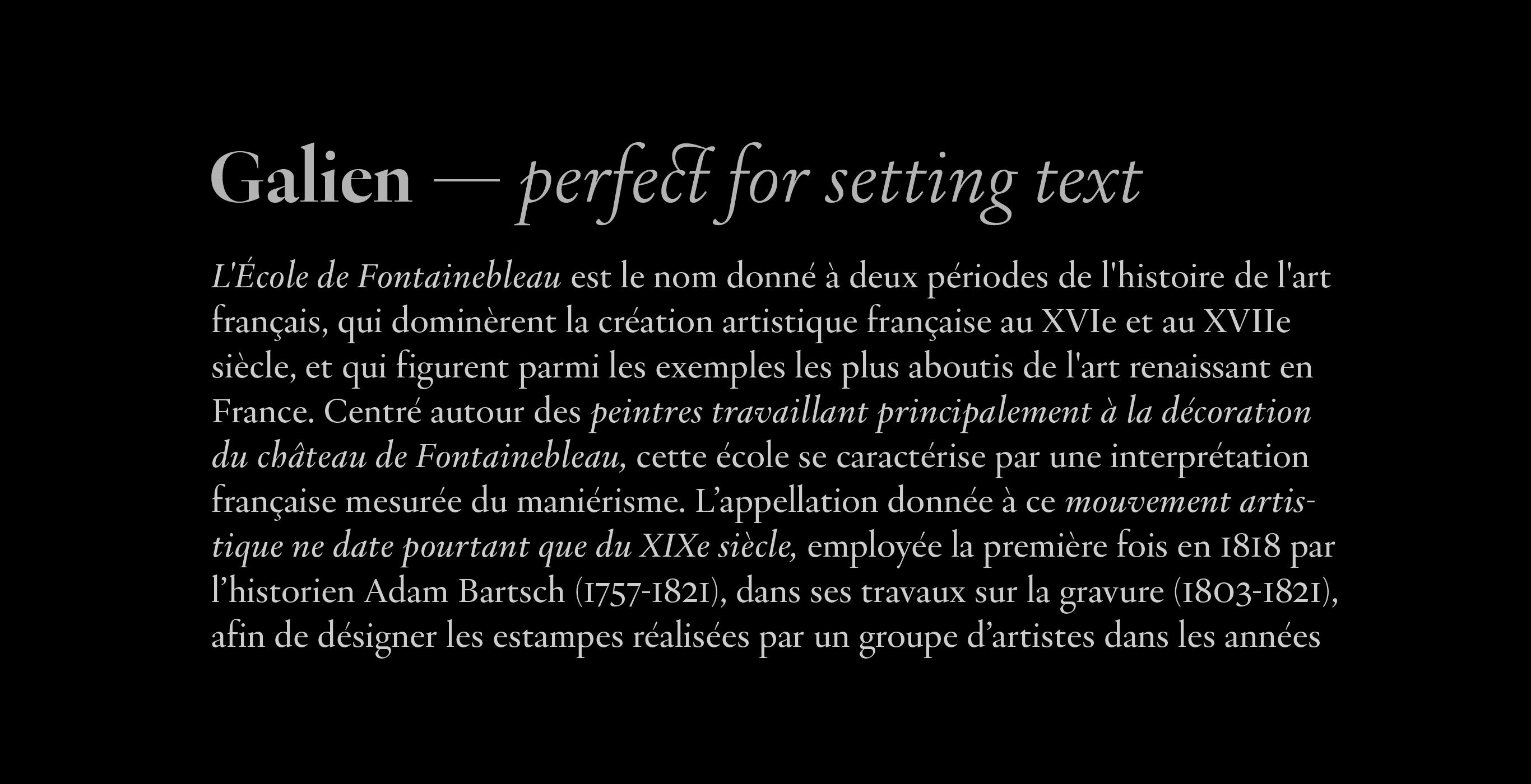
Almost half of the Black[Foundry] typefaces on Fontstand have serifs. Some foundries these days don’t make serif type at all – and indeed, as Hornus explained, ‘when you think of corporate design, you think of sans serifs. But we don’t only make designs for corporations. And serif styles are used in corporate design, too. We realized this after we published Vesterbro. The Poster weight, especially, gets used for corporate design, which we had not expected. It was a nice surprise, and it proves that serif typefaces can be used for corporate design again. Maybe this is what encouraged us subtly to release Galien, which goes even further because it is very oldstyle, very Renaissance.’
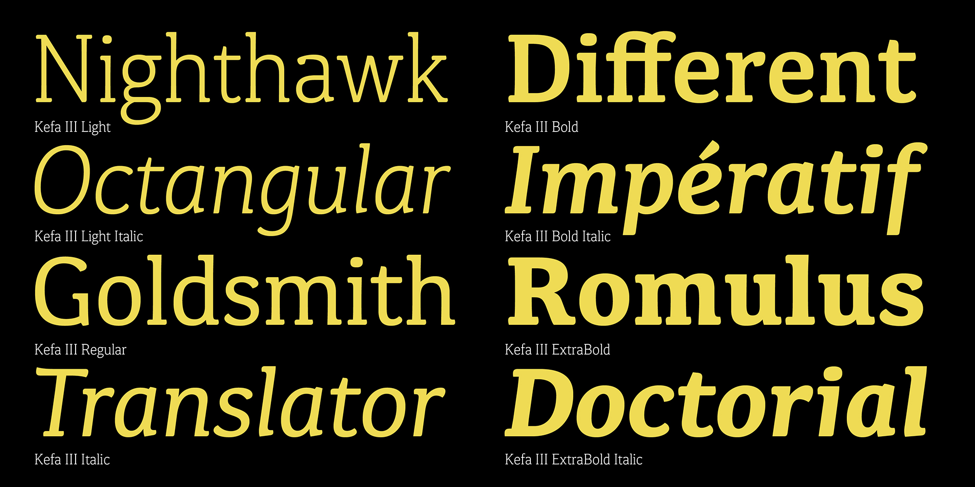
Perhaps a revival of serif type is coming that will diversify the typographic palette in corporate design. In the 1980s and ’90s, there were many corporate identities using serif type. Apple used a condensed version of ITC Garamond for a long time, and if you look at other companies’ identities from that time, you will find a lot of similarities. ‘I like that typeface a lot,’ Hornus told me, ‘and I think it works well. It could come back because we see a lot of these 1990s designs coming back, especially in graphic design. I also think that the slab serif could come back more easily into the field because those letters can be shaped a bit like the sans serif, with less contrast. When I was designing Kefa, I was thinking of this: a serif that can be used in display and be modern, not attacked as old-fashioned, should be a slab with interesting slabs.’
In 2020, there was a discussion on Twitter about whether variable fonts will be the standard format for all new typefaces by 2025. I asked Hornus about this, and he replied that ‘this would be nice! You see that the Type 1 fonts have disappeared, almost. They are not completely supported any more. Variable fonts were made to be compatible with existing technology, at least in their minimum or default form. They can coexist. I think the problem comes down to pricing. Clients don’t always need a full family. We need to make a new way of shipping fonts, where you can have a variable font, and it’s the exact variable font you want – which will not always be the full family. For instance, we have one family with 126 static fonts. But sometimes, you won’t need those capabilities, like the condensed. Maybe you don’t need all the weights, but you still want the variability, so that you can make animations or have a lighter webpage. We need to respond to this because there is real demand. We need to give customers the ability to subset variable fonts. We already do this when it comes to script coverage: if you don’t need Arabic with Latin, you choose just the Latin version. Or you could have just Cyrillic and Arabic, or whatever else you want. You make your selection and get the fonts that match your needs.’