Photo: Max Phillips
When Max Phillips set up the Signal Type Foundry in 2012, he still lived in New York City. Two years later, he and his family moved to Dublin, where Signal has been based ever since. Max became involved in the Dublin design community and was one of the coordinators for the Fontstand Conference, originally scheduled for May 2020, and now postponed to 2023. ‘The design community is my favourite part of Ireland,’ Max told me. ‘It’s a proper community, very close-knit, and I found it really welcoming. As small as Dublin is, there’s a lot of very strong studios to collaborate with, which I think has to do with the quality of Irish design education and the presence of deeply committed teachers like Clare Bell, David Smith and Conor Clarke.’ That community means there is a real family feeling to Ireland’s design scene – which sometimes includes, he said, ‘the gossip and the squabbles.’
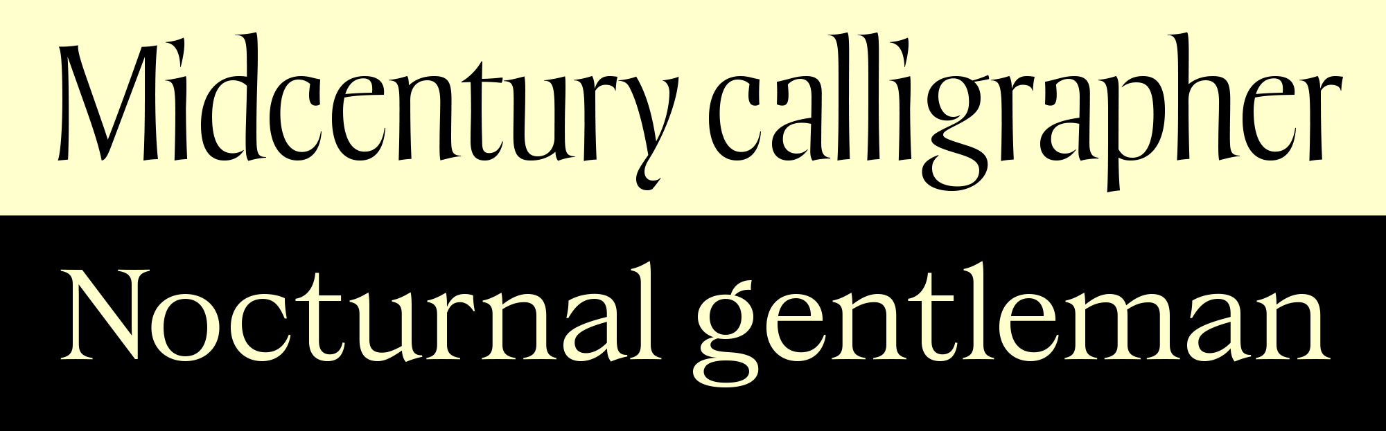
Several of Max’s typefaces show a degree of historical inspiration. Since letters are defined and governed by historical convention, he does not believe it is possible to design a typeface without drawing on older letterforms to some extent, ‘but some are more directly drawn from history than others,’ he explained. Before establishing his own foundry, Max published his first typeface through FontFont. FF Spinoza was partly inspired by Hermann Zapf’s Aldus and Georg Trump’s Trump Mediaeval. He had also looked to the baroque typefaces cut by Nicolas Kis for influence. However, Max started FF Spinoza with no notion of becoming a professional type designer. ‘I was running a creative services department for a hedge fund (yeah, I know) during the day and writing novels at night (another story), and I guess I must have felt like I still had too much time on my hands, so I started drawing a book typeface. It wasn’t meant as a side hustle. It was just something I did out of love for a particular genre of mid-century Garalde. God knows, I didn’t do it for money. I spent 11 years on FF Spinoza, on and off, and while it earns a bit every year, it’s certainly the least profitable work I’ve ever done, including summer jobs in high school washing dishes.’
I asked Max if he had used Trump and Zapf’s typefaces in his graphic design work. ‘Much as I love Zapf’s faces,’ he responded, ‘I’ve seldom been able to use them. They’re deeply unfashionable these days and haven’t ever been really suited to the corporate design I’ve spent most of my life doing. Aldus and Trump Mediaeval are on a long list of faces I’d love to use and probably never will, and Melior is probably the face that first got me trying to draw letters at the age of 14 or so. Melior and Milton Glaser’s Baby Teeth. I’ve been drawing letters ever since.’ Max recalled that he took a couple of font production classes at Type@Cooper. ‘They were wonderful. I’m self-taught as a designer – my undergraduate degree was in painting – so those are the only formal training I’ve had.’
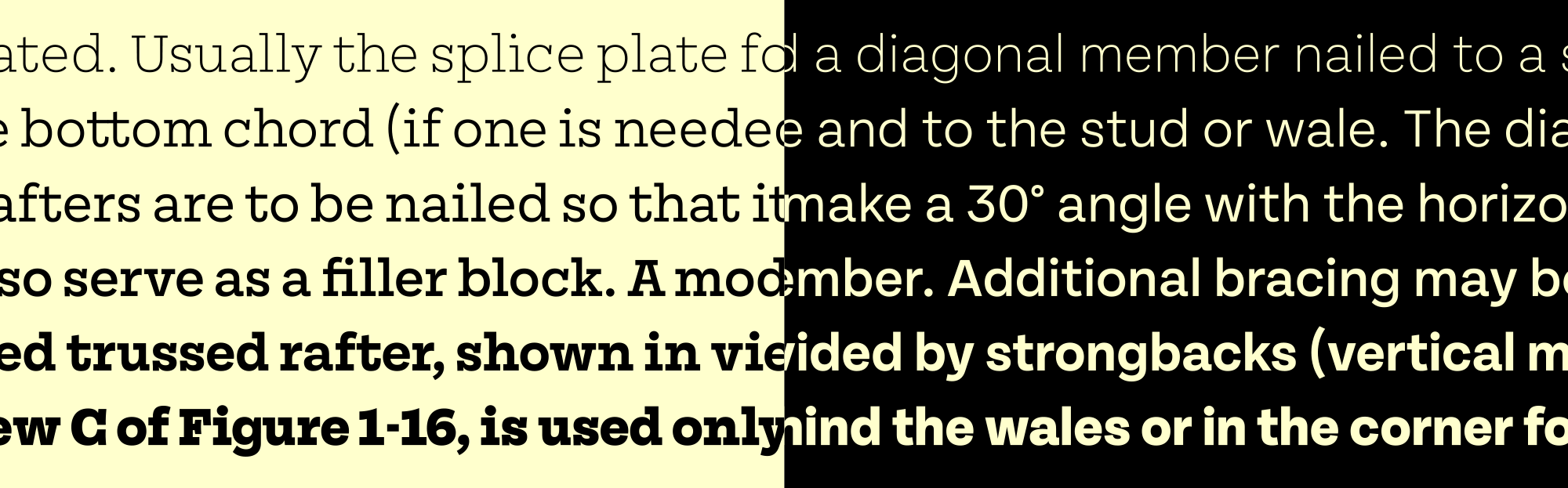
Turning to designs in the Signal library, Ballinger’s spiritual inspiration was Morris Fuller Benton’s News Gothic, from ATF. ‘News Gothic was probably the first proper superfamily,’ Max said, ‘and I wanted to do something as sturdy. Ballinger is monoline design, without frills. A workhorsey typeface.’ He doesn’t think his result resembles Benton’s work much, at least not visually. ‘The only forms in Ballinger that directly draw on a historical model are the deep junctures of h, n, m and u, which were swiped from Candia, an unreleased typewriter face Müller-Brockmann designed in the 1970s.’
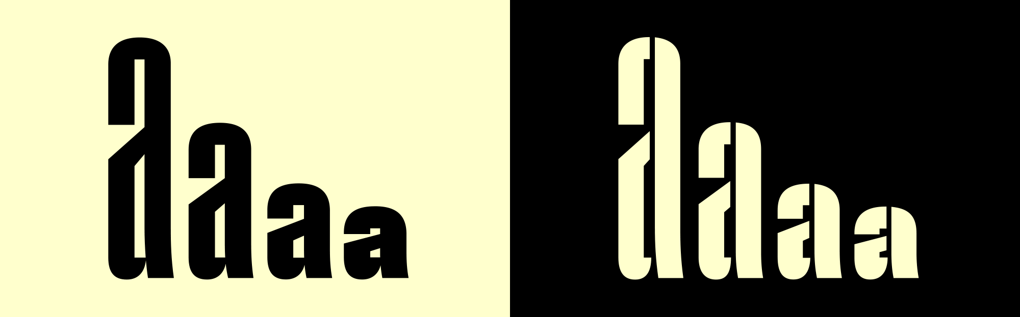
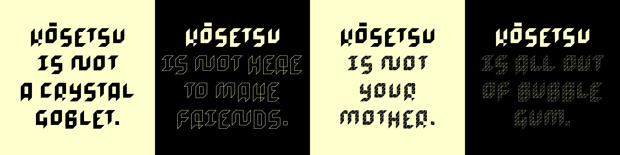
There’s more, of course. The square counters in Pressio are inspired by Eugene Grossman’s RCA logo from the 1960s. Max has also published a large new serif family called Dashiell, which is ‘a typeface meant as a synthesis of Garalde and Caslon forms. It’s available in three optical weights, with an extensive set of ornaments and borders.’ A work-in-progress typeface named Lorber, which he hopes to release next year, is based on the lettering of a forgotten mid-century calligrapher and book jacket designer named Rosalind Lorber. Another Signal WIP is Field Gothic, also slated for release next year. A superelliptical neo-grot family, Field Gothic will launch with 64 styles (eight weights and eight widths).
WIP: Field Gothic №62, №63, №64, and №73, with apologies to Sainsburys
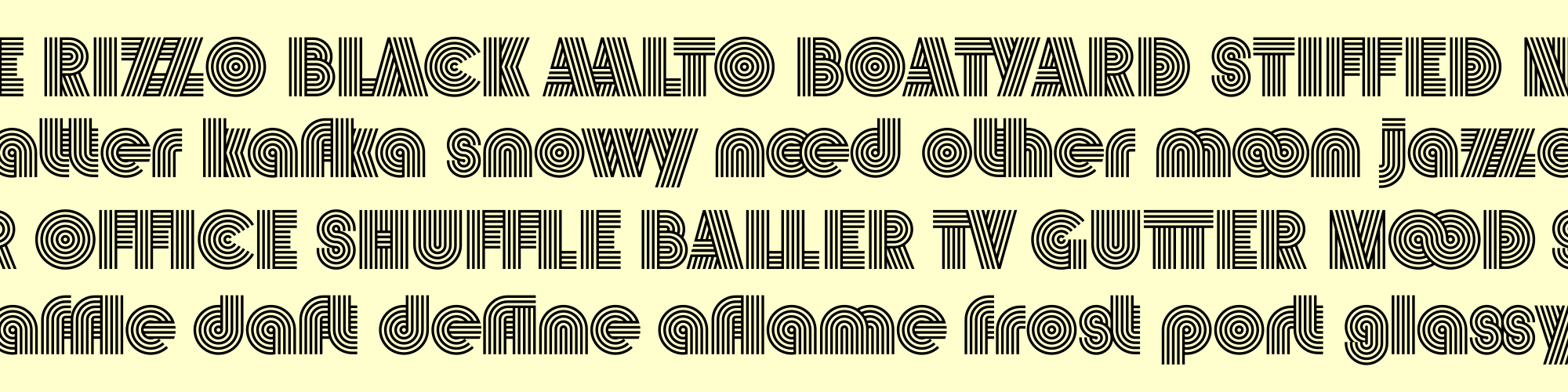
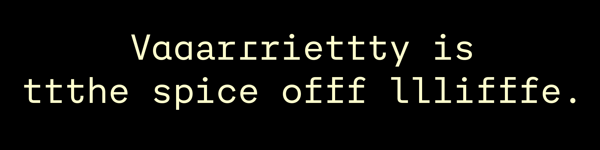
Vibro may be the most striking Signal typeface. It brings to mind Lance Wyman and the Mexico 68 design team’s prismatic identity for the 1968 Olympic games in Mexico City, or Rudolf Koch’s Prisma. When I asked him about the face, Max remembered that ‘as a kid in the 1970s, I wanted to draw rub-down typefaces for Letragraphica. I still love old Op Art headline faces like Stack and Aki Lines, and that’s one reason I wanted to draw Vibro. But I didn’t make Vibro by applying stripes to an existing set of letters, as Koch did with Kabel. I tried to build more or less legible letterforms out of a few simple geometric elements constructed of stripes, and to do it without counters or, if possible, any negative space at all. So the shape of the glyphs was determined by the rules I set out for myself, not by any external reference. As for what it pairs well with, God knows. My corporate design clients are pretty conservative, and I’ve never had a chance to use it.’
On the Signal Type Foundry website, Max wrote that Mortise was his first collaboration with an outside designer. This was with Seán Mongey, a principal at a Dublin graphic design studio called Post. ‘All our collaborations so far – and there are a few still in the pipeline – are based on branding faces he’s initiated for Post clients,’ Max said. ‘Seán basically makes stuff he wants to use himself, and I help him because I’ve had more practice drawing type. On my website, I describe him as “an aspiring furniture-maker”, which is a bit of an inside joke. Seán loves furniture and makes it in his spare time.’
Max is active on Twitter. Regarding his social media participation, Max explained that he ‘got onto Twitter solely to market the Signal foundry, but it turned out to be a terrific source of valuable information and camaraderie. (I pretty much only follow people in the design industry, and I’m pretty quick with the mute button if anyone gets ugly, so my timeline’s fairly stress-free.)’ As for networking, there are people out there he’d love to work with who only know he exists because of his social media presence. ‘I’m not sure it’s ever directly led to a commission or a sale,’ he said, ‘but one lives in hope.’
If you’ve enjoyed this introduction to Max and his work, check out all the Signal typefaces available on Fontstand, or follow him on Twitter. Hopefully, he’ll be able to help welcome our conference to Dublin in 2023, too.