(Michela Zoppi) Where does a project begin for Wolfe Hall?
(Jason Wolfe and Luke Hall) In these past five years of practice, we discovered that some of the best projects started with a similar process. We believe there is validation in history and the historical narratives, so from the beginning we pull out those stories and twist them to bring contemporary relevance. These parallel narratives have diverse origins: a big part of research comes from the collections we build as a studio, but we also look at the the client’s history and the project’s landscape. Alongside there is the more specific and practical knowledge: of typefaces, of techniques, communication media and printing methods.
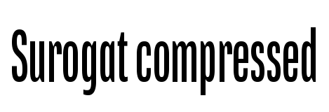
The work is constructed on parallel storylines, weaving together layers of time and narratives. A good example of this generative process is the identity for the Royal Academy of Dance. The project started almost five years ago and was recently completed. At the time the RAD was using the humanist Gill Sans by Eric Gill, and, as many British institutions, embraced the idea that the best language for an institution is a traditional sans serif.
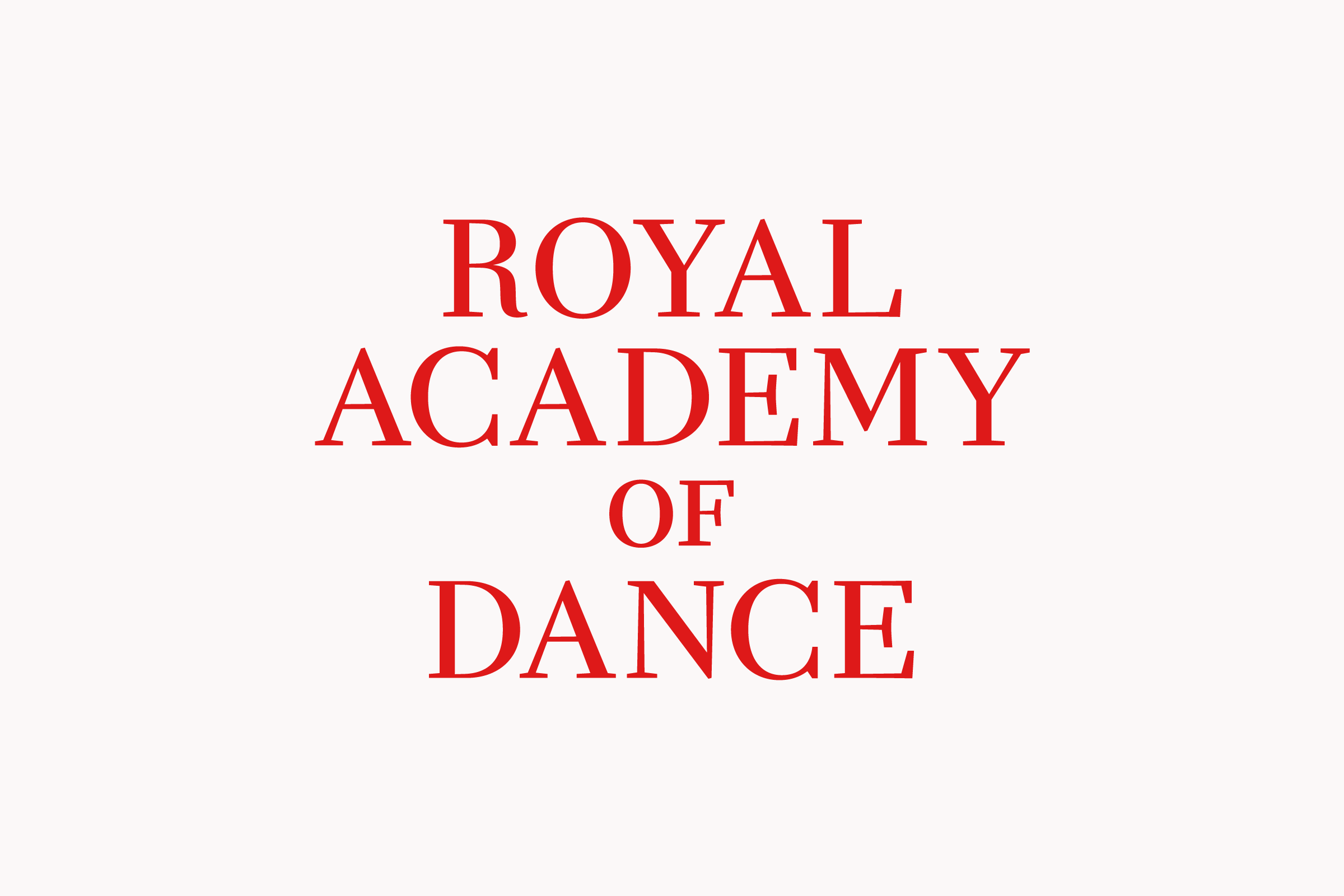
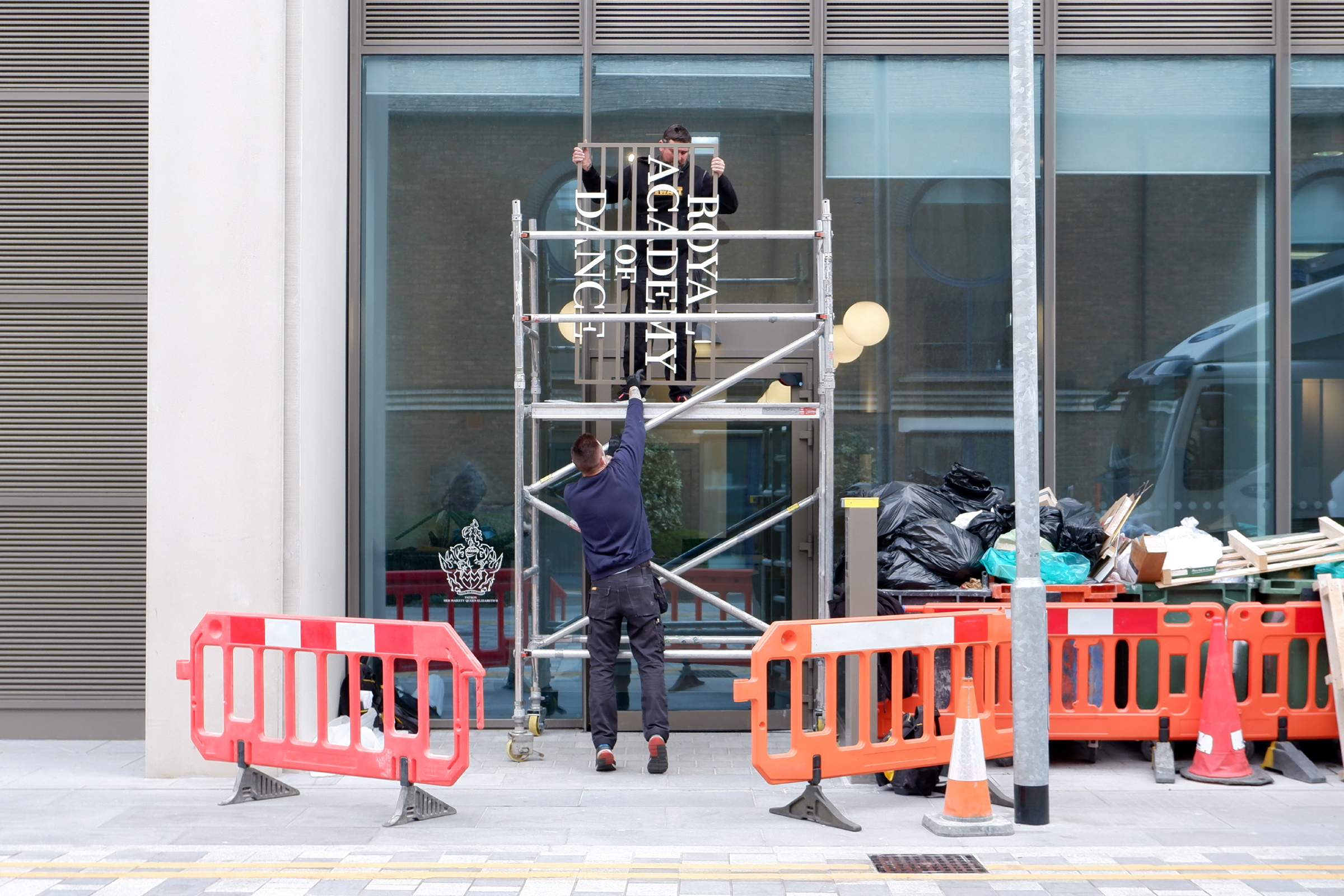
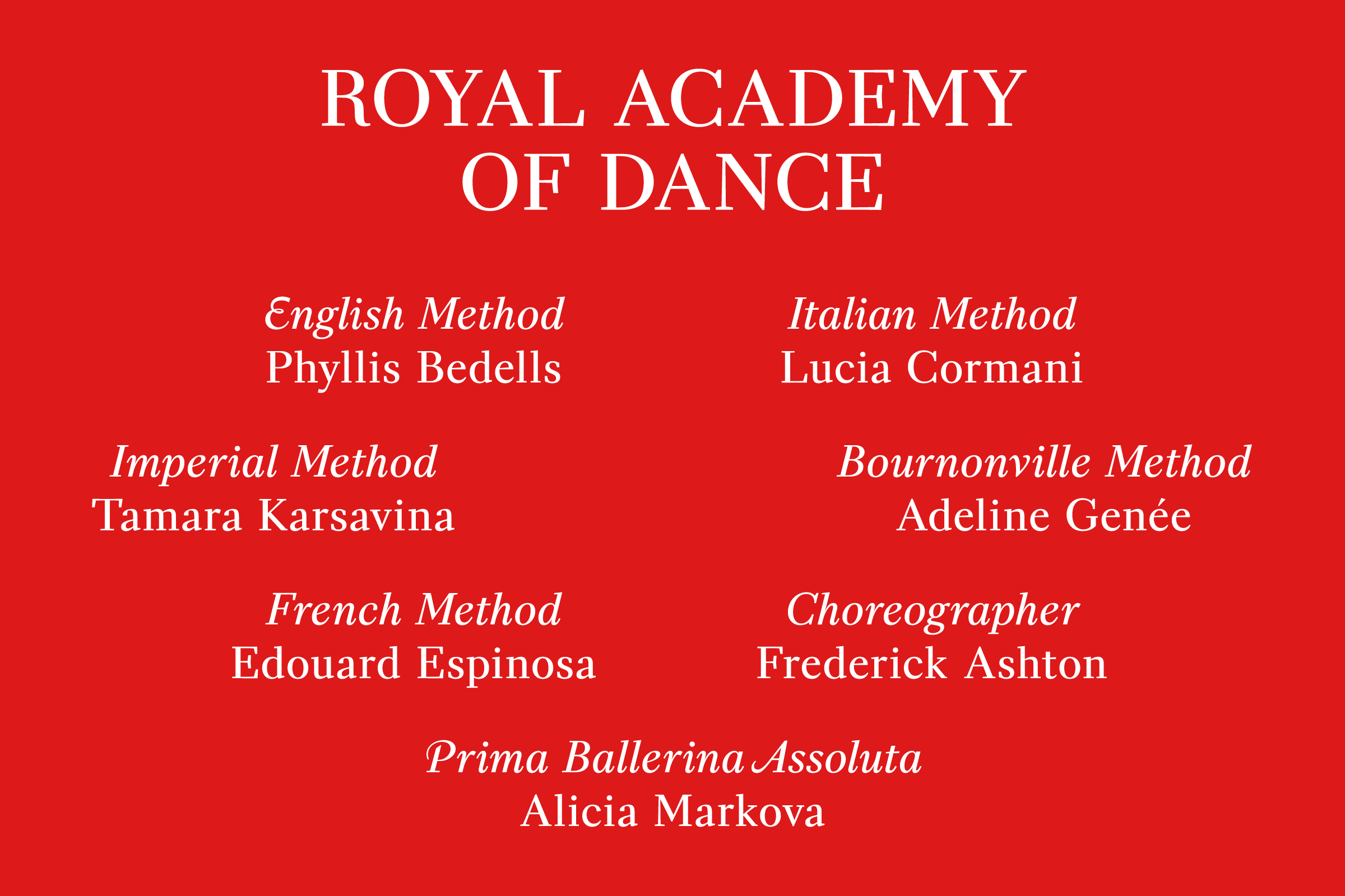
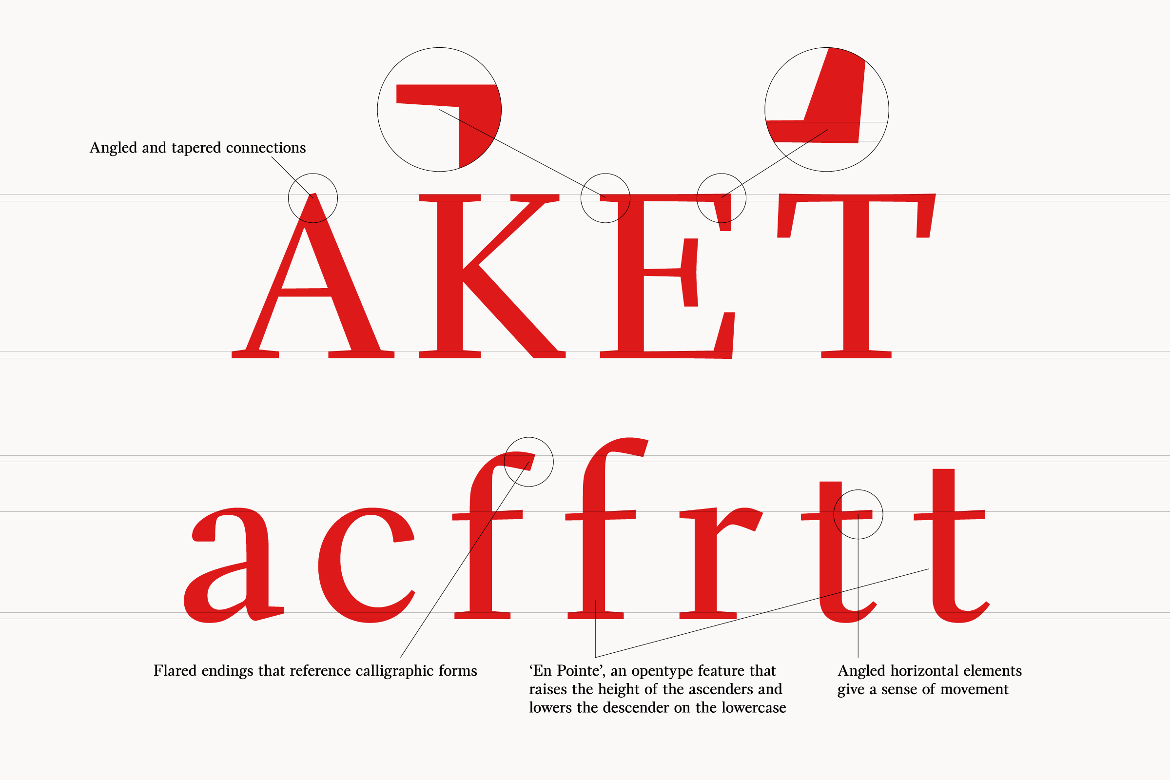
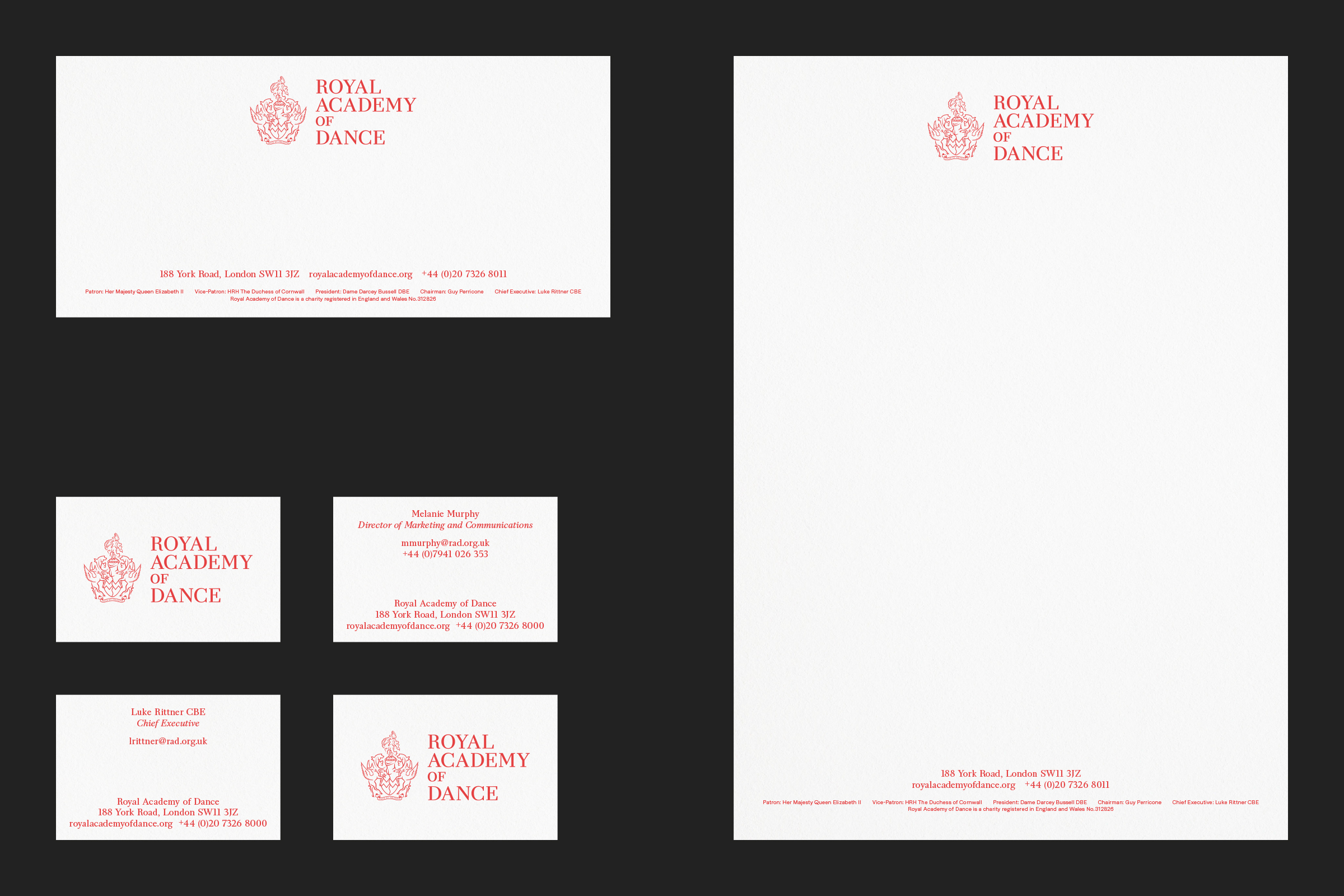
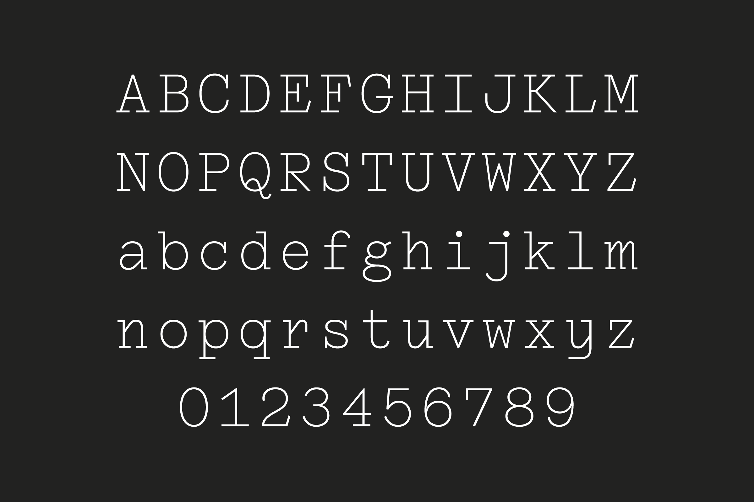
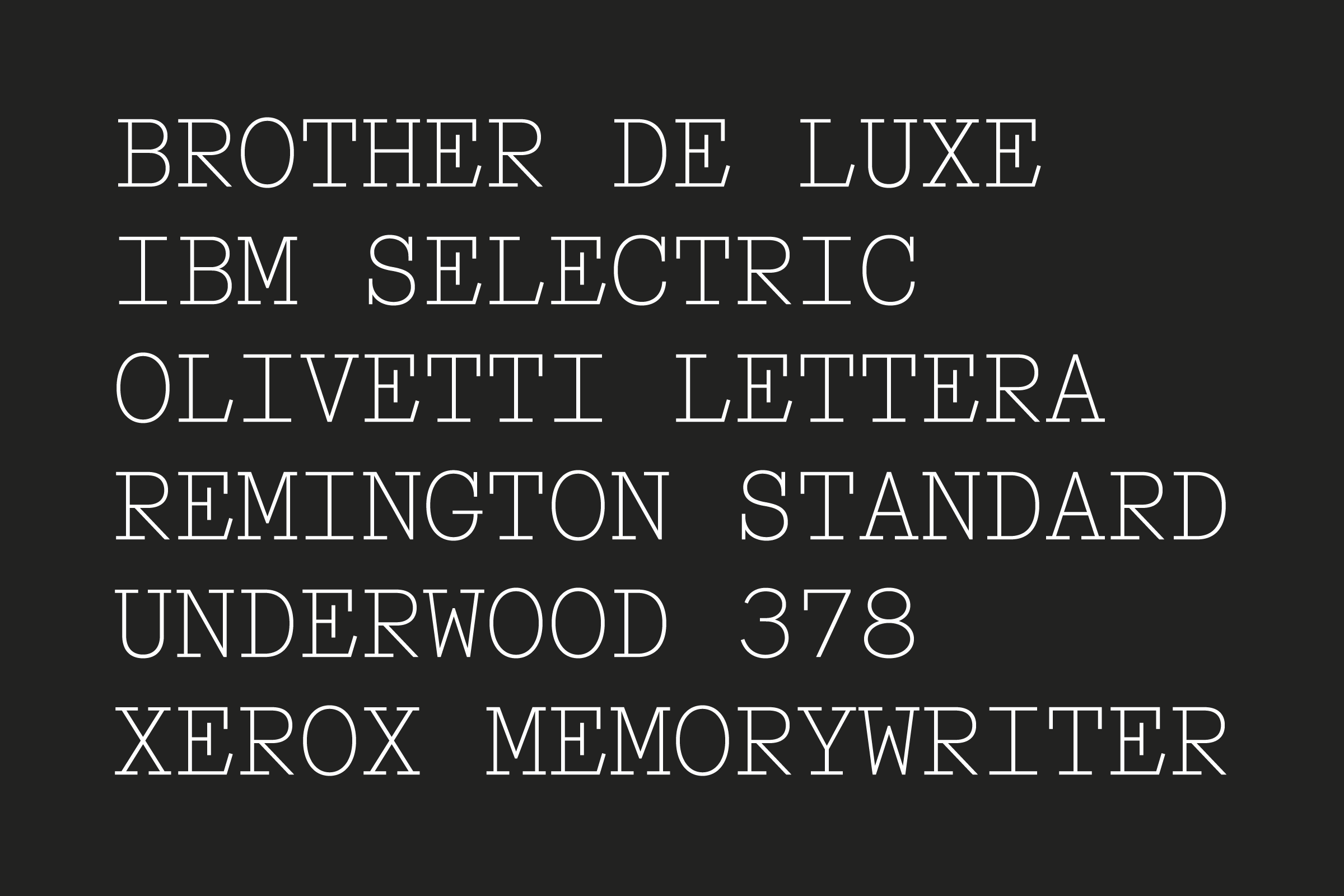
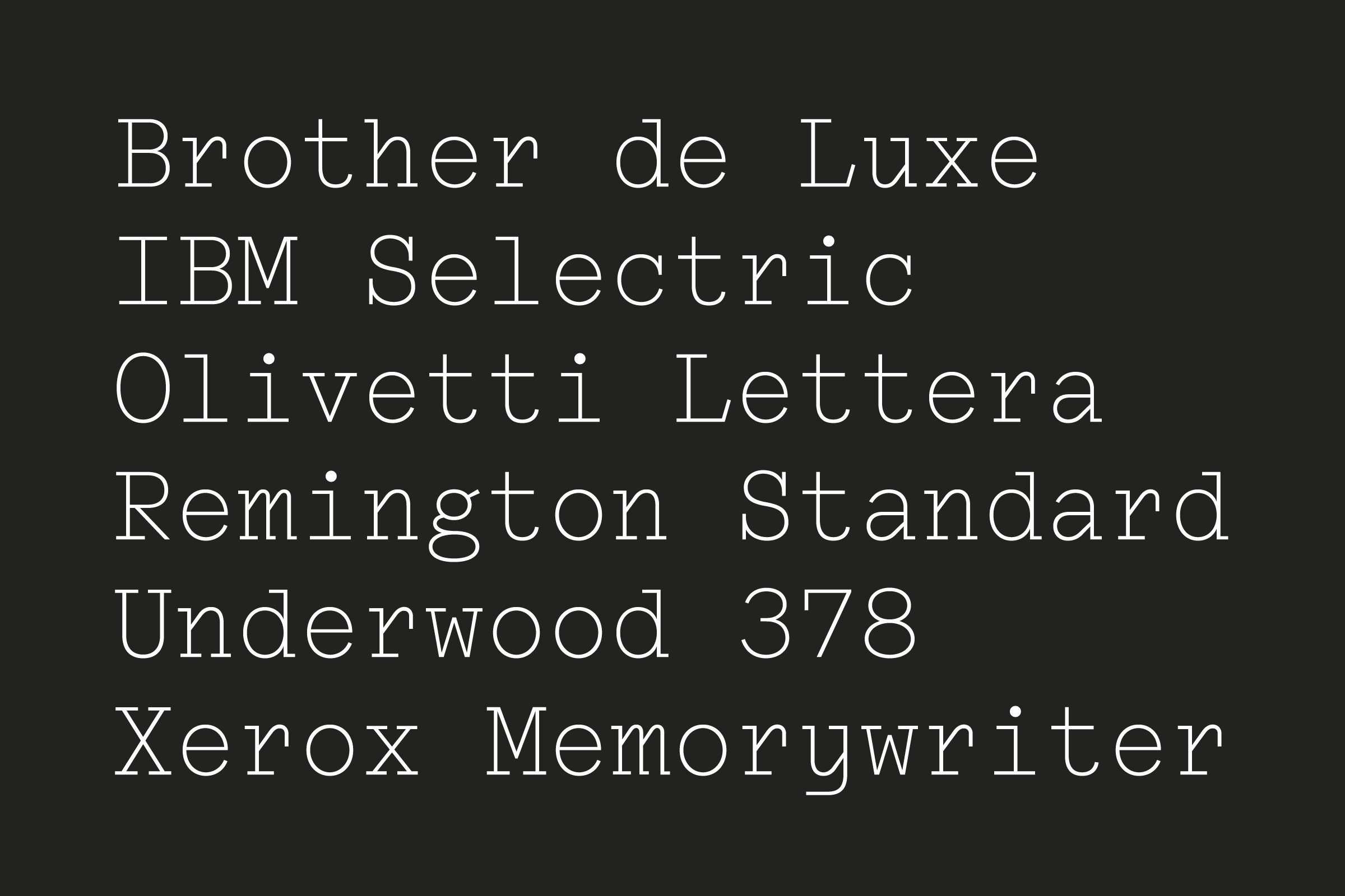
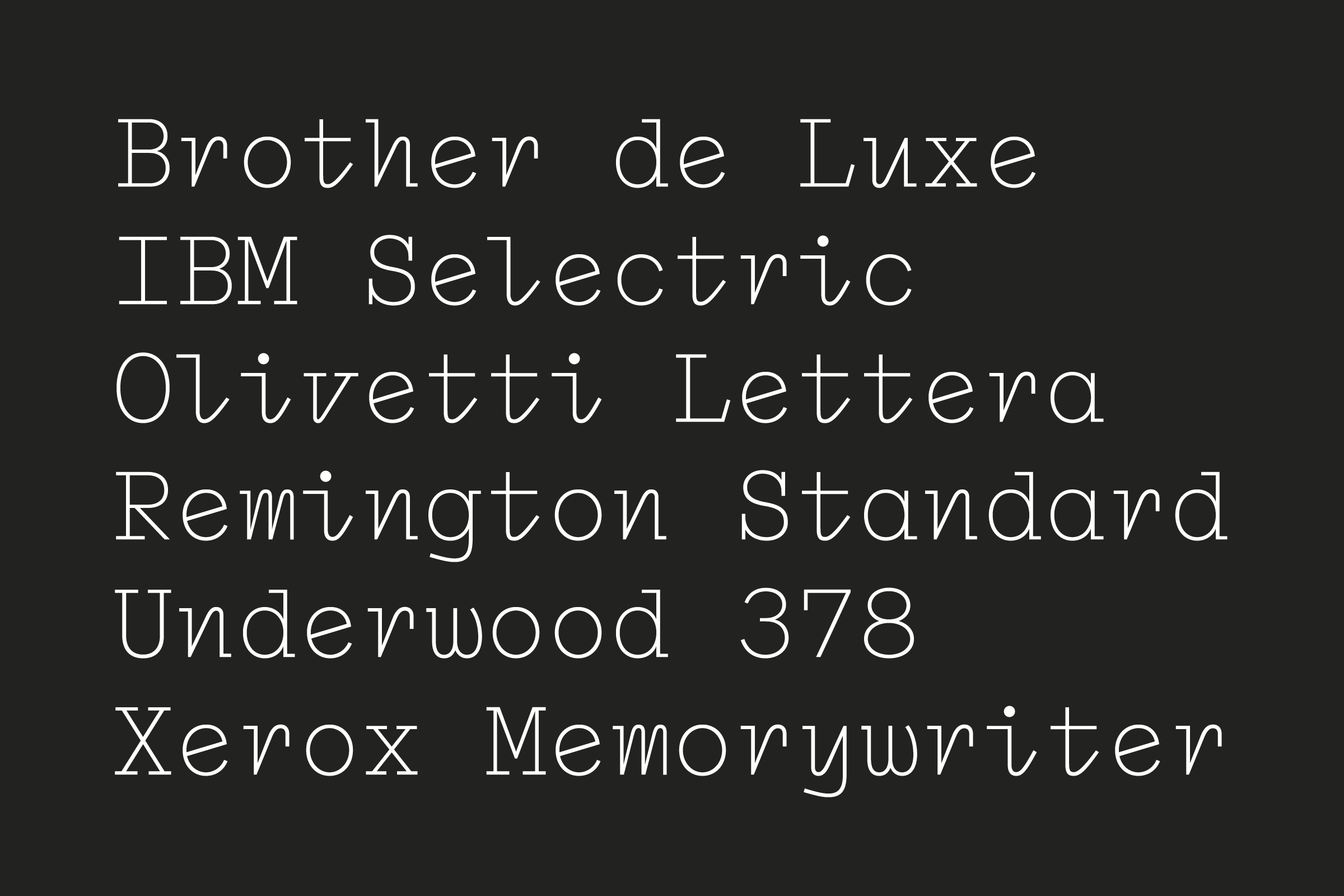
We were considering to return to a serif typeface, so we took time looking in their archive and discovered that they kept almost everything from a century before turning to digital means: letterheads, posters, handbooks, old internal and external communications. We wanted this vernacular to feed into the new identity, to reframe the heritage into a contemporary form: the past visual language as well as the institution’s aim to modernise dance teaching approaches and methods, bringing together the main international ballet styles. That’s when we decided to make a bespoke typeface, a serif that could work in print, on walls and digitally.
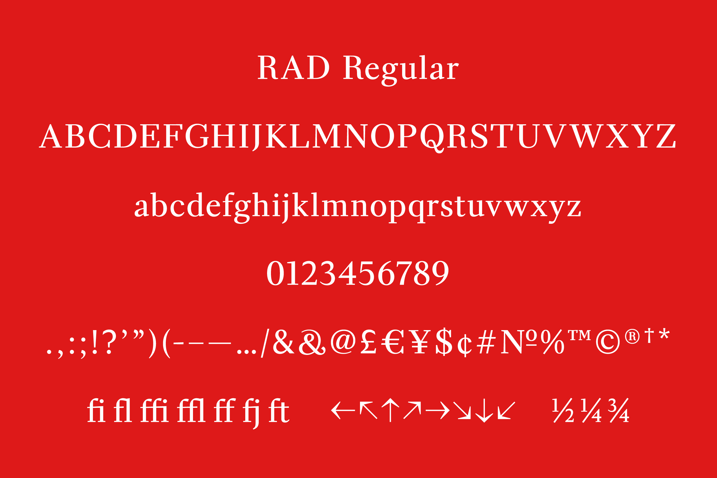
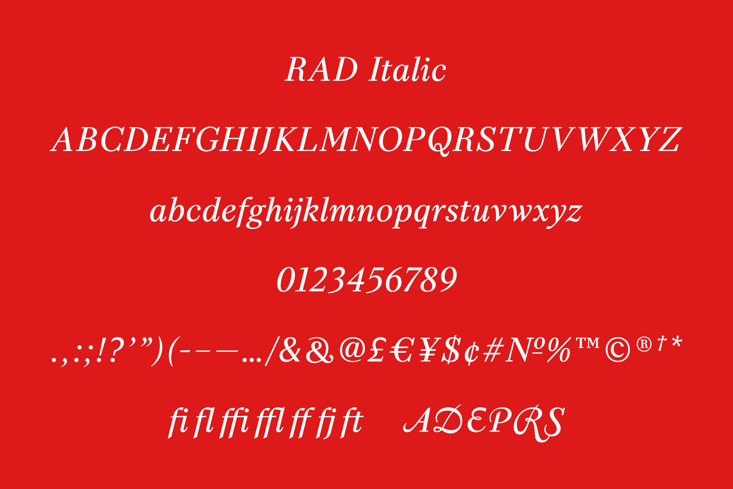
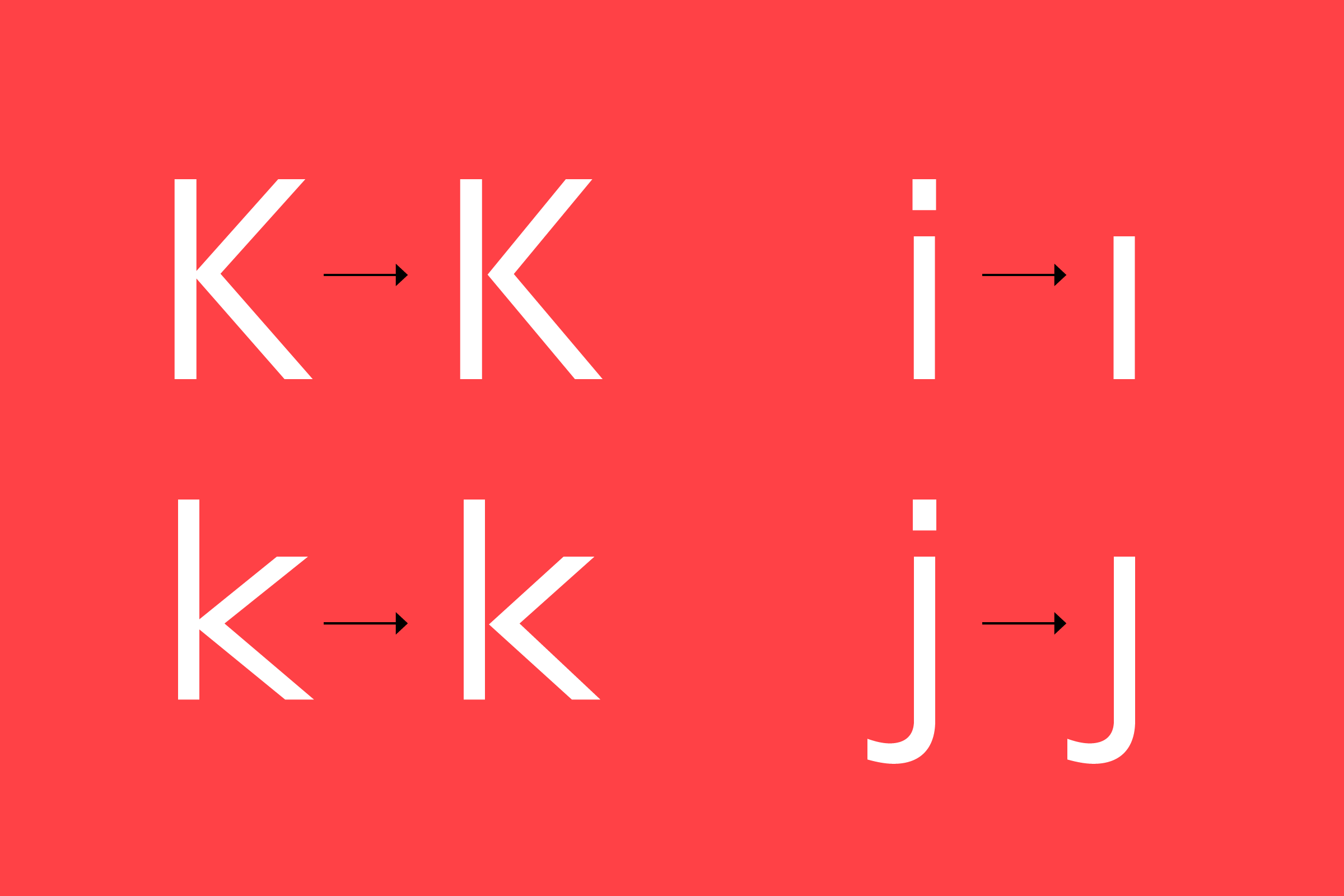
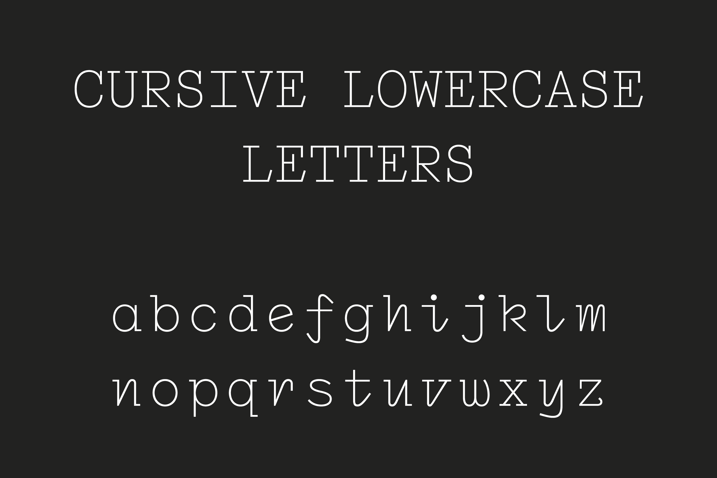
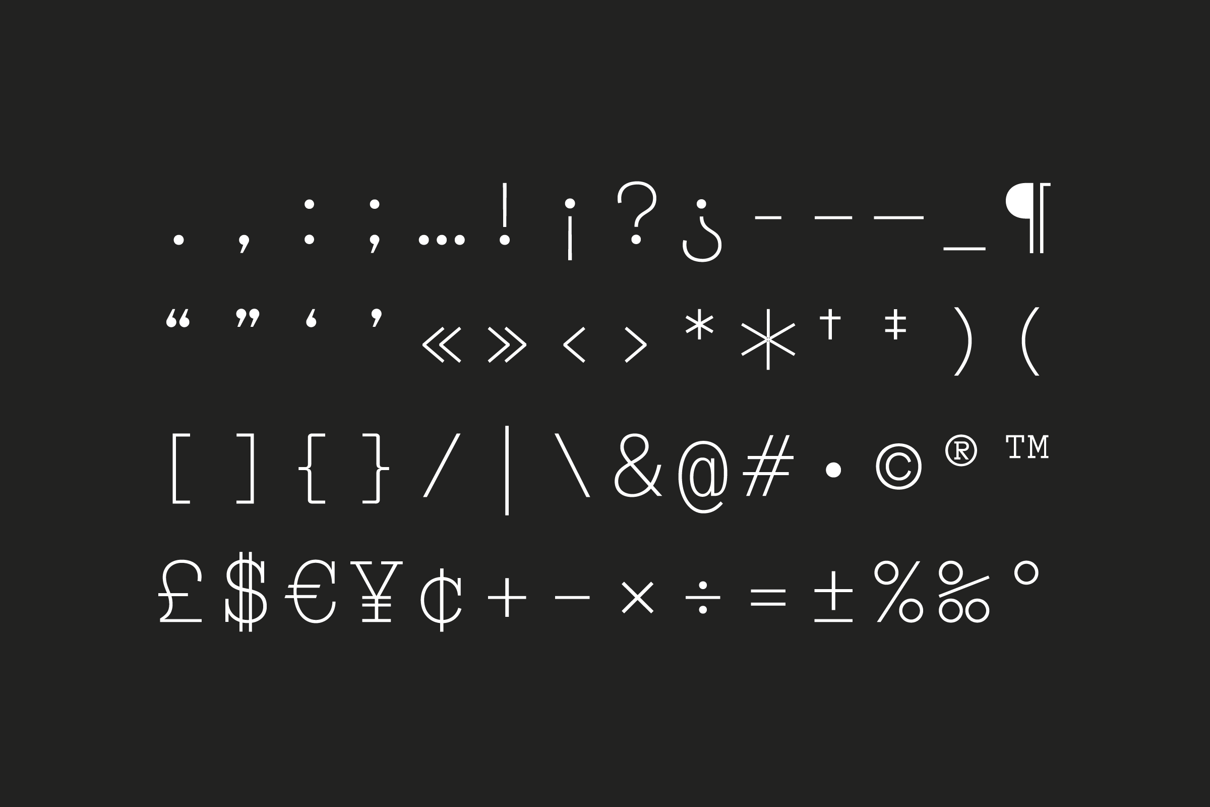
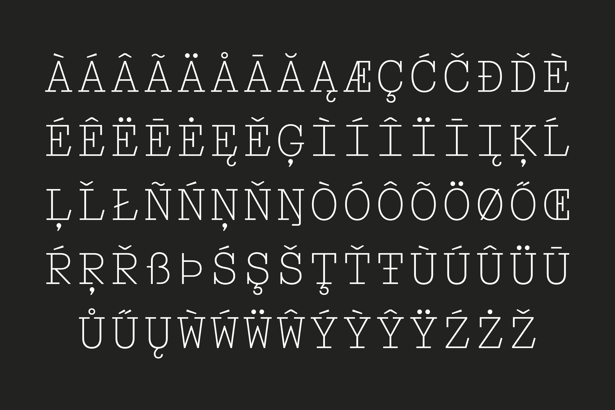
We drew the RAD Serif in regular weight from scratch, and worked with Quentin Schmerber to finalise the type and create an italic. That time we were interested in the modernisation of serif type design as a reaction to the international style minimalist approach to typography. We looked at designers such as Eric Gill, William Dwiggins and Berthold Wolpe who embraced the history that came before, but created completely new forms. The rediscovery of serif, calligraphy and the presence of the hand, was important for the design of RAD, we embraced the idea of giving fluid movement to the letterforms – you can see in particular for the letter “s”. Very early decisions were to integrate tapering lines and to maintain a wide x-height to help legibility across the many different media. To complete the design, we drew an ‘En Pointe’ OpenType mode, where descenders and ascenders are extended as if they are jumping on their toes.
(MZ) Do you feel that you learned from this project a method or approach that was applicable to other projects?
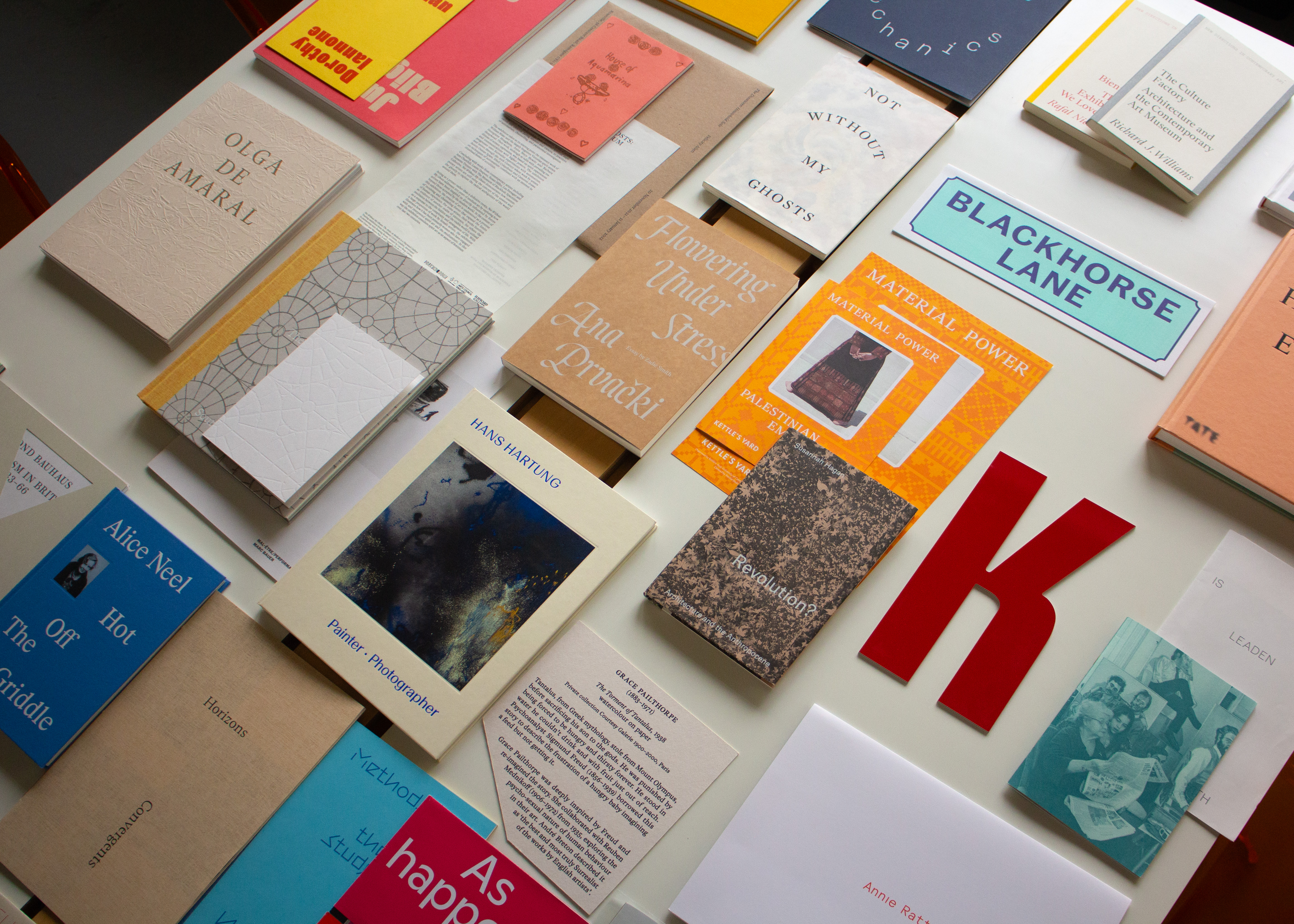
(JW and LH) When we started with RAD we were finding out how we wanted to work as a studio, and although it’s an ongoing quest, we did maintain some continuity in the approach. Our method of presenting and structuring the work is a extension of that mentality of looking at past and present to create a valid narrative. We build the project around three pillars: the extensive historical research, the typographic investigation, and the choice of materials and production processes. There is a balance between context, typography and materiality/production in our work. We experiment with all these elements, we play with custom typefaces and use materials that might more conventional in non-conventional ways, and our broad knowledge of production helps us to understand how to fit within the budget, how to re-purpose lesser seen, older methods in new ways.
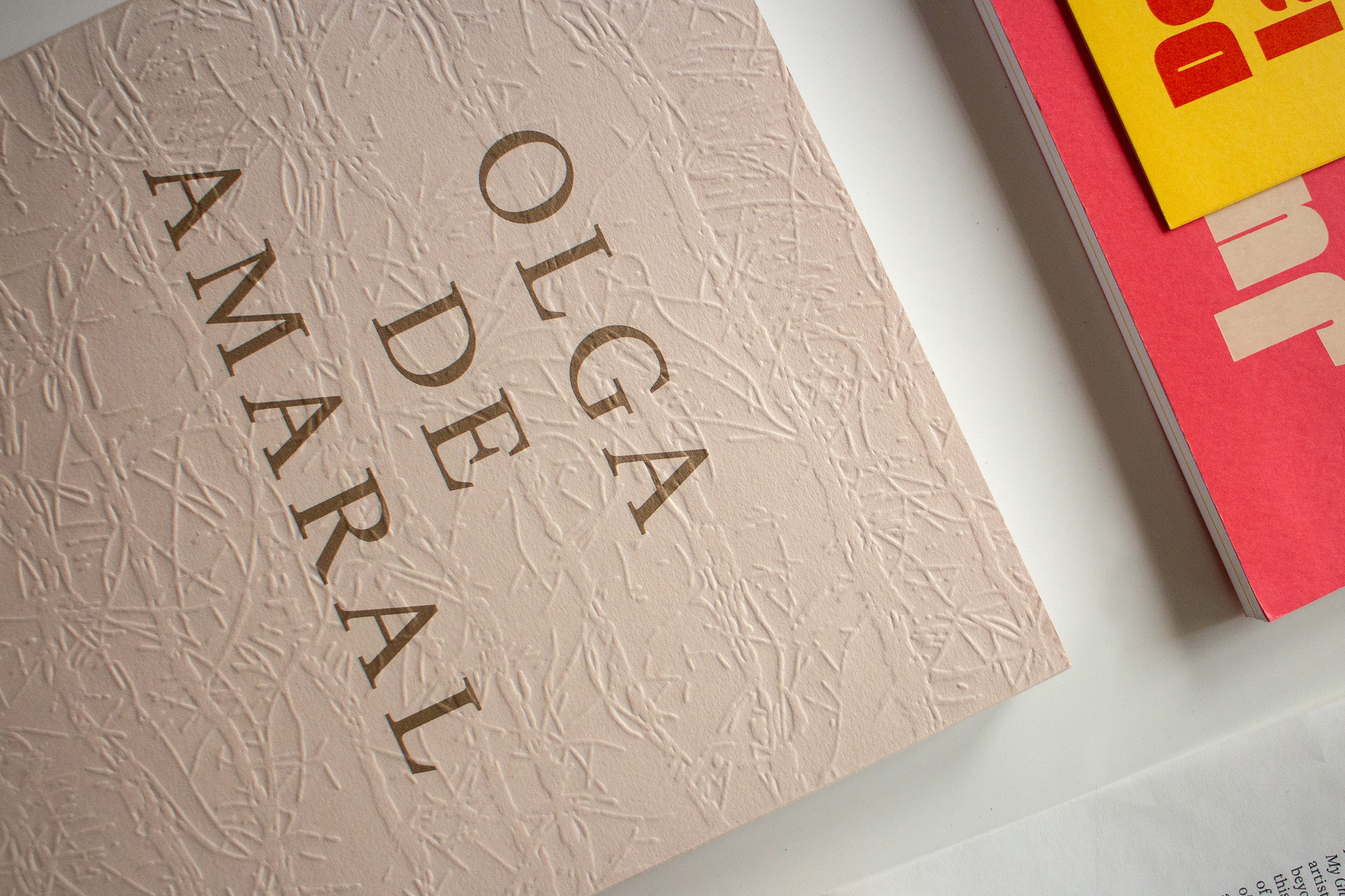
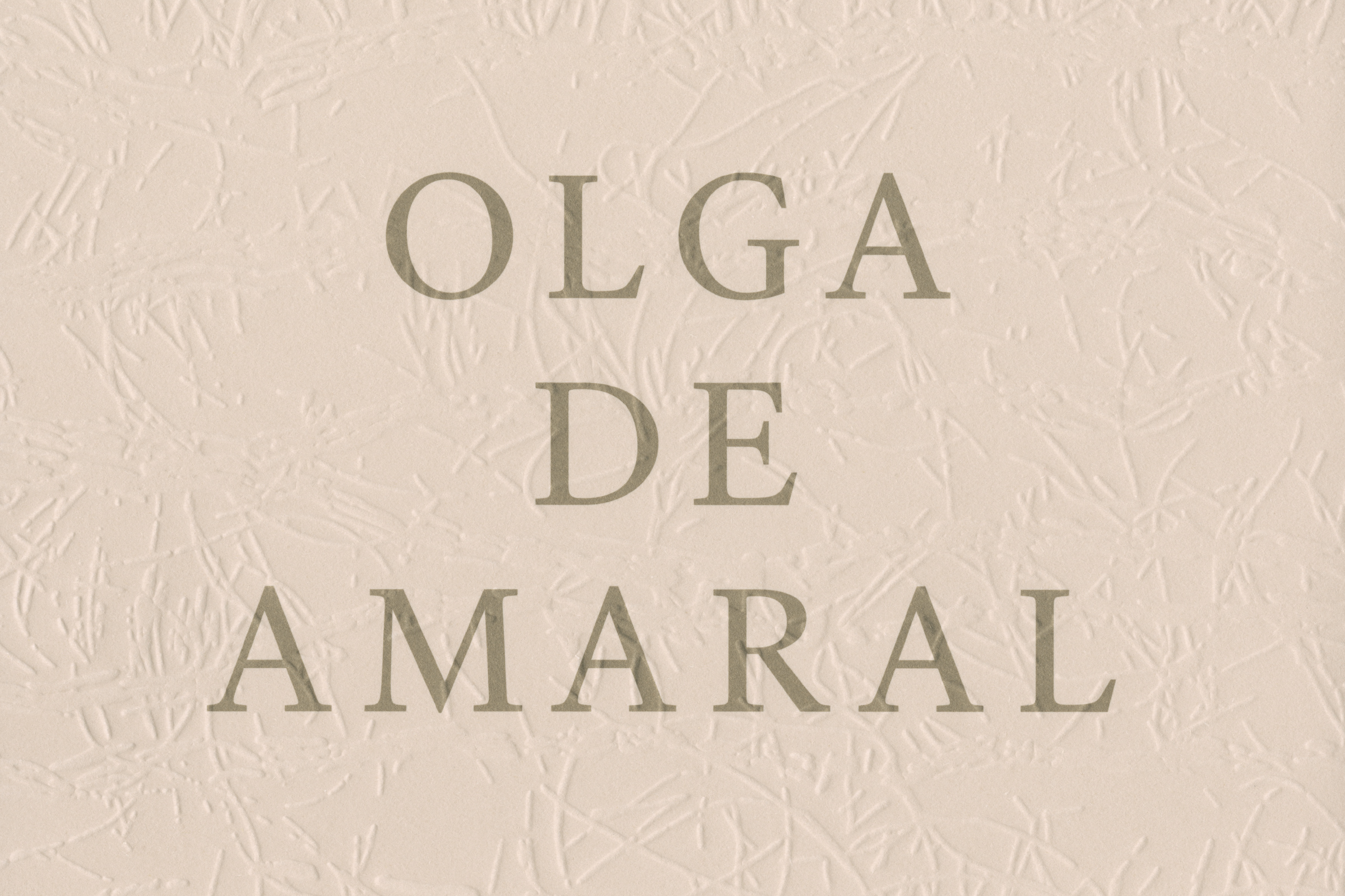
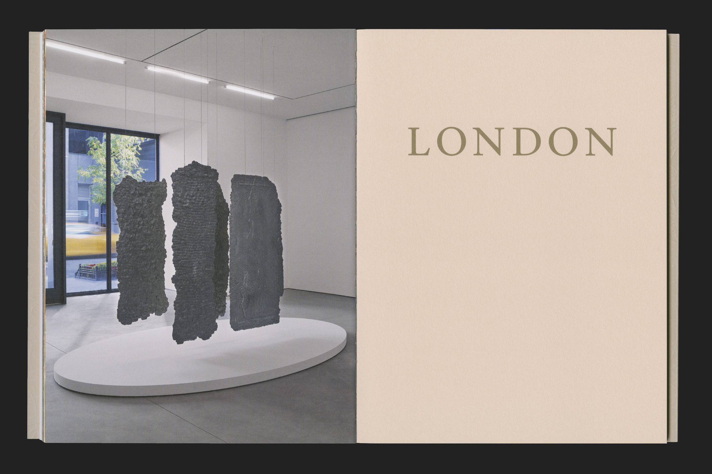
A good example is the catalogue for Lisson Gallery about the Colombian artist Olga de Amaral. Her work is an exquisite example of textile design and invention, so we brought some of her mastery of textures and material in the book: we created the bespoke debossing on the jacket by processing a photographic detail of her textile to extract a resembling texture.
(MZ) Can you tell me more about the design of the catalogue?
(JW and LH) Olga de Amaral has produced a vast large-scale textile-based body of work, exploring twisting, weaving, and manipulating. Supported by the curatorial team, we decided to de-construct the idea of the traditional, high spec exhibition catalogue. The publication comes as a soft-back with exposed spine with a heavyweight uncoated jacket material paired with a light internal paper. We introduced some playful ideas too, like the alternating white and bronze binding threads.
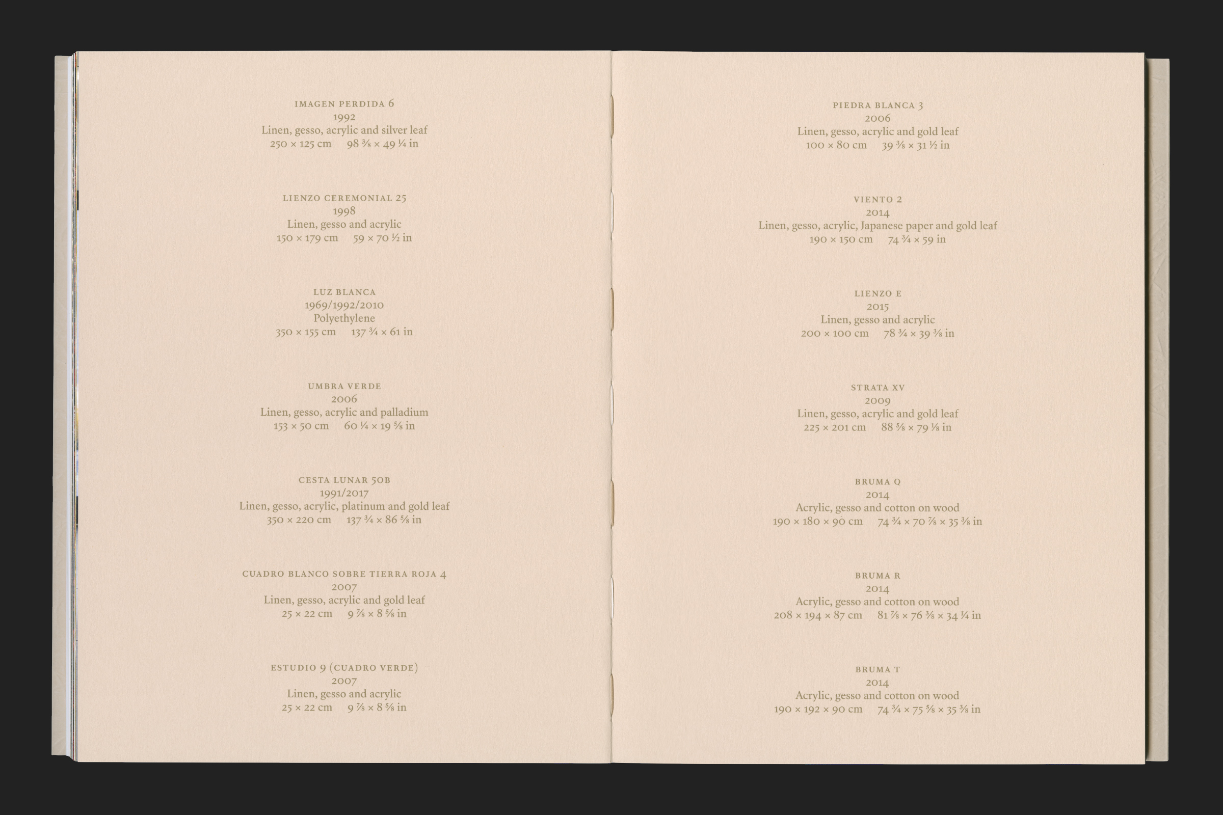
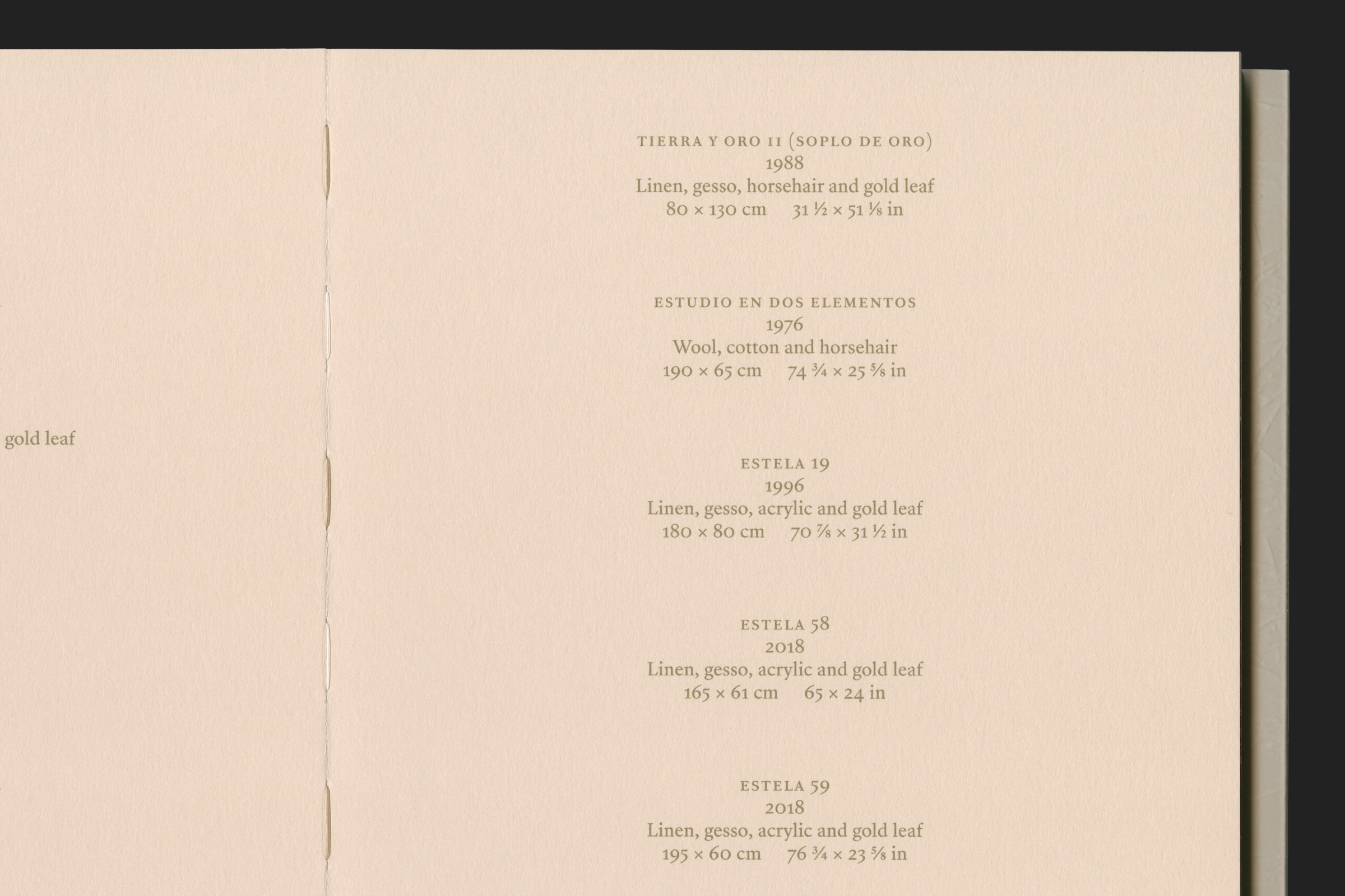
The same idea of playing with tradition and modernity is applied to the section dividers. These are made of heavier paper stock with large gold text. We used the SangBleu Republic by Swiss Typefaces to reflect our desire to give a contemporary feel to tradition: in this case the easy to read classical serif flourishes in bigger size, showing its peculiar details.
(MZ) Peculiarity and modernisation appear to be central in the identity work for ublication, a publisher of limited-run arts books you worked with for quite some time.
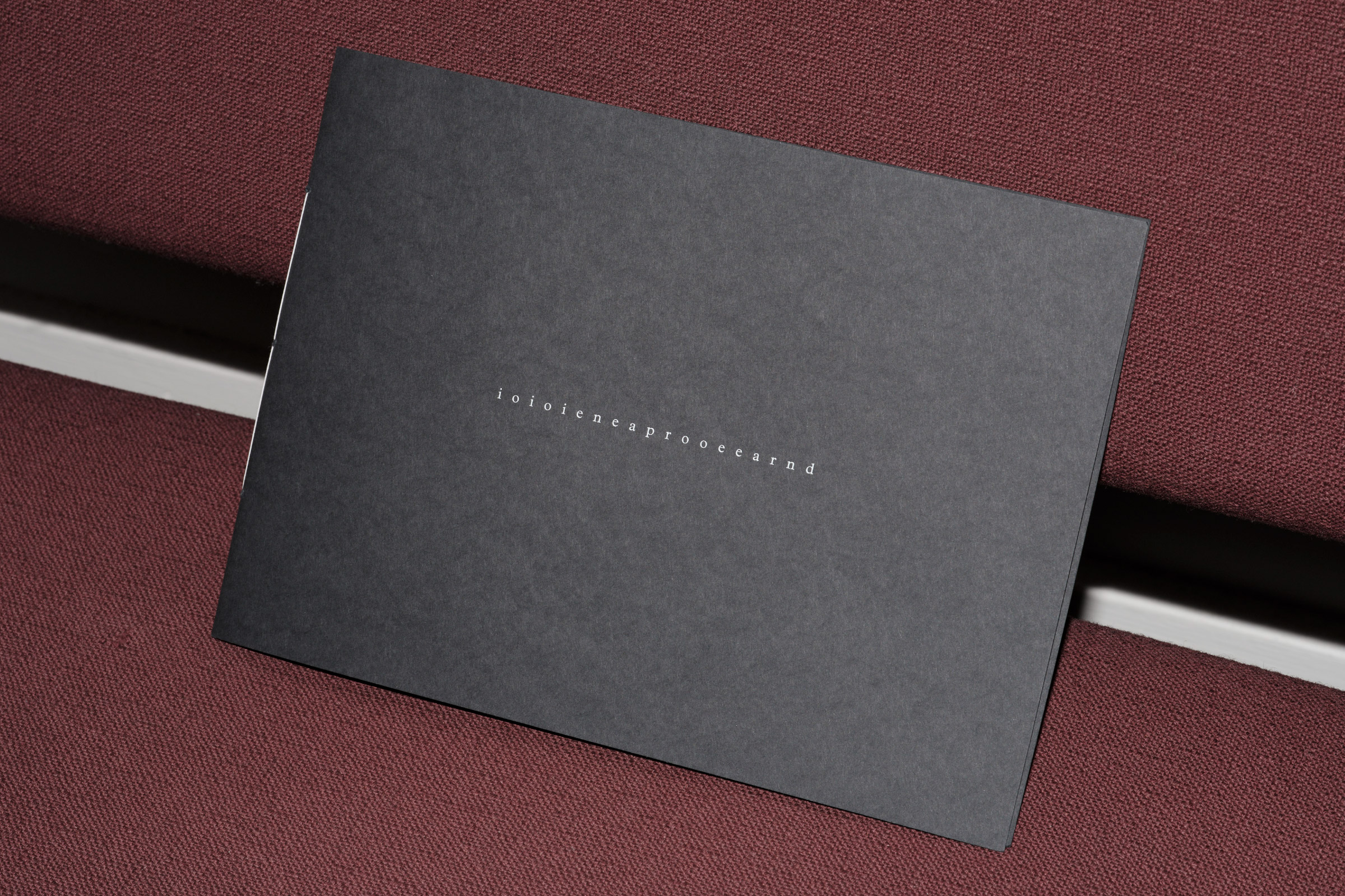
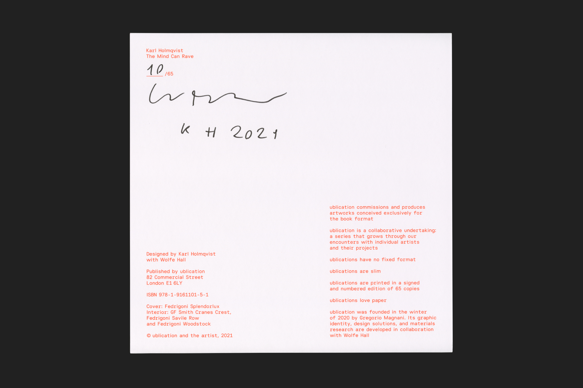
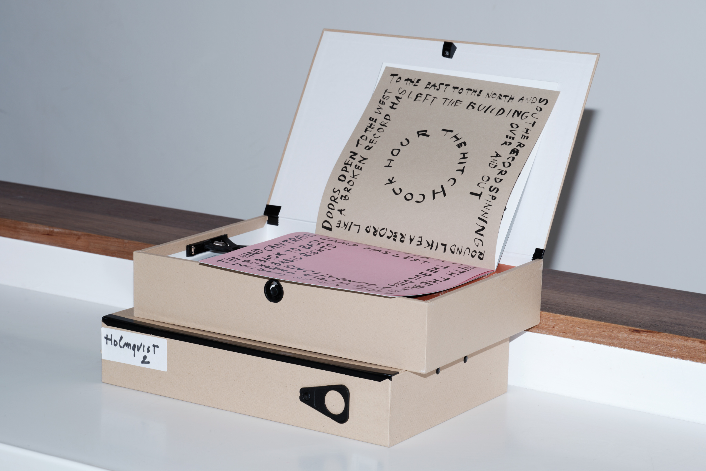
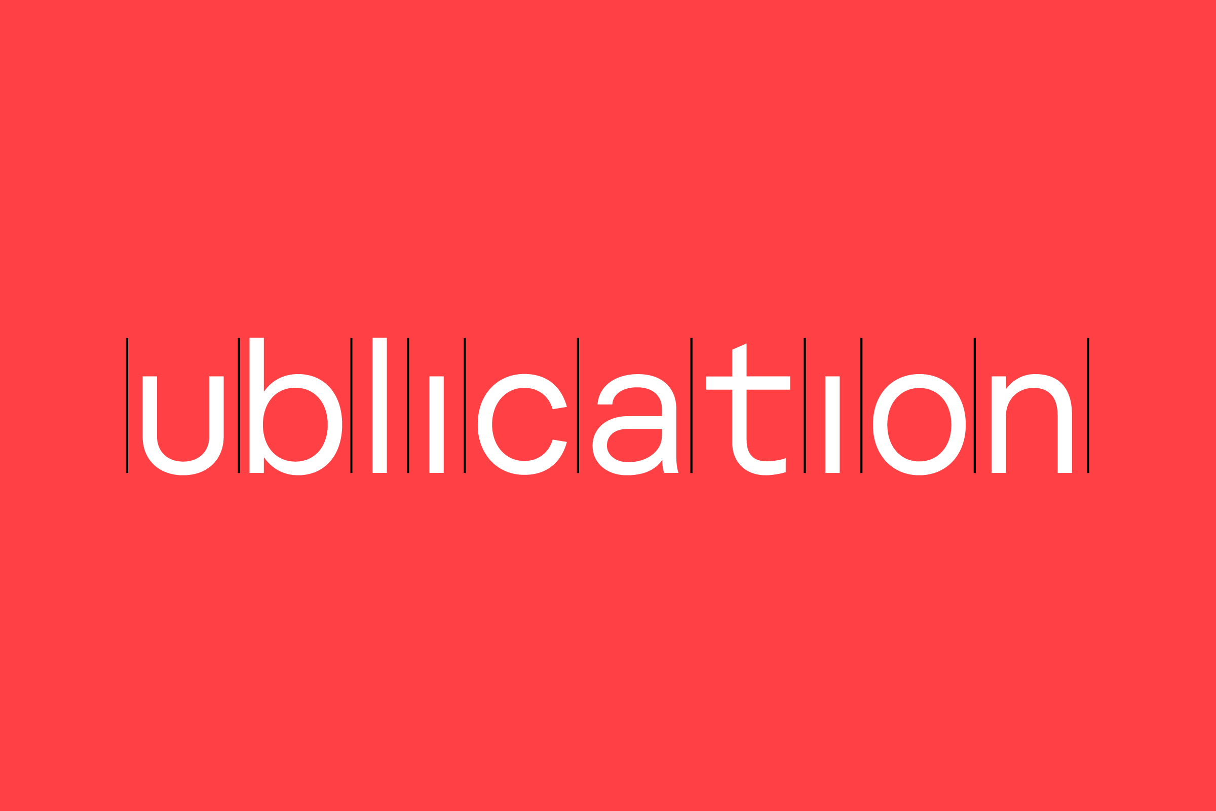
(JW and LH) ublication commissions artists to make small print-run artists’ books. With them the collaboration is total, and our intent is always to support the artists’ vision with our production expertise and design knowledge. Because ublication functions as an archive of sorts, we created a bespoke typeface that would reference the language of the “archive”, and give a recognisable voice to the platform, online and in print.
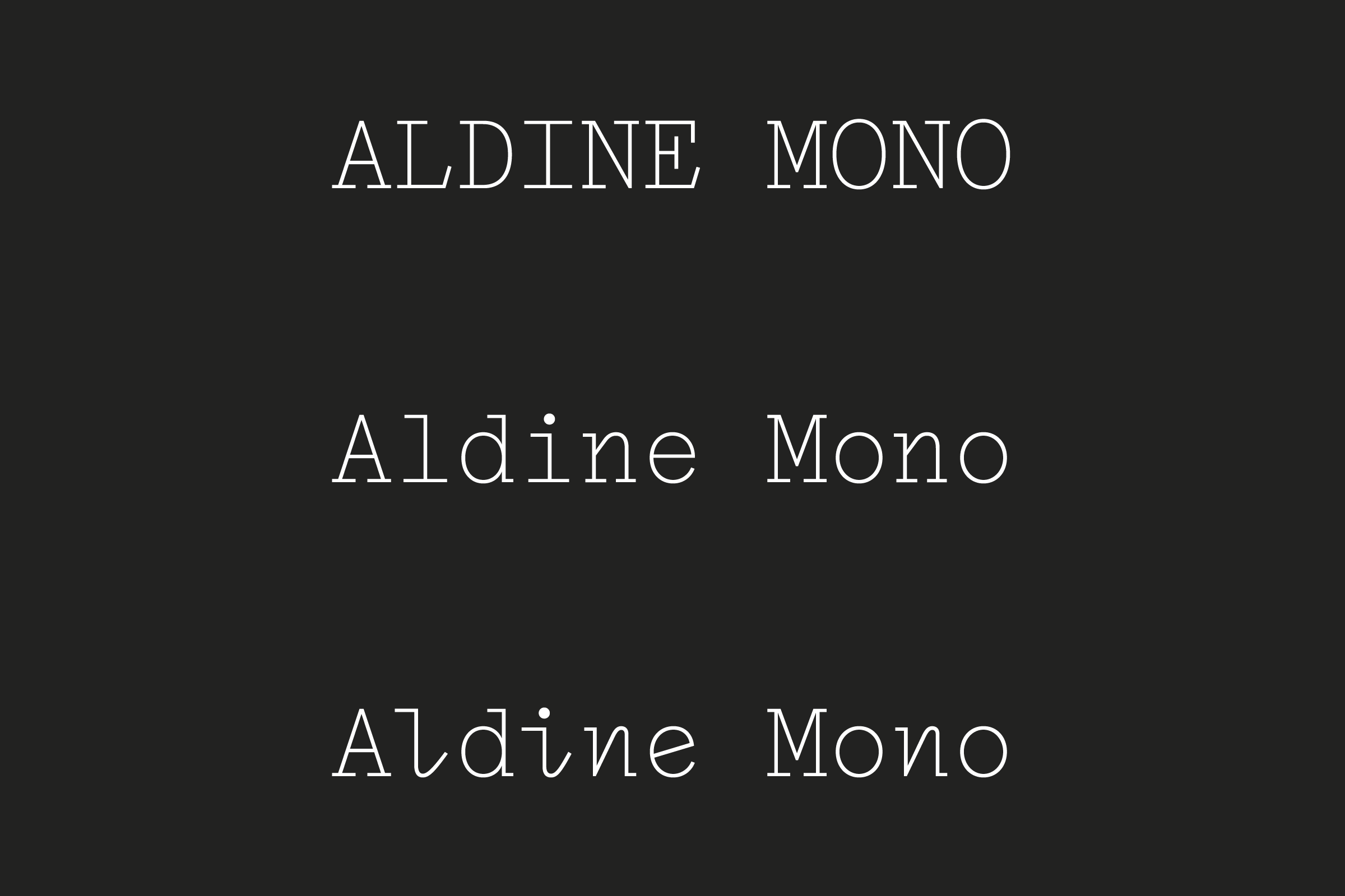
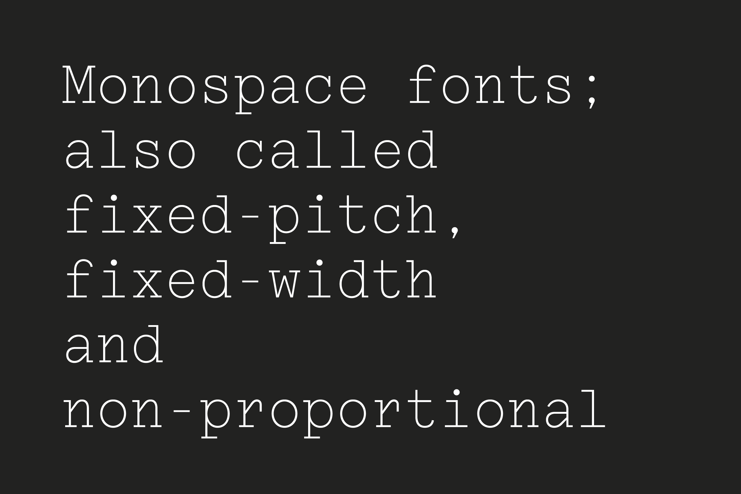
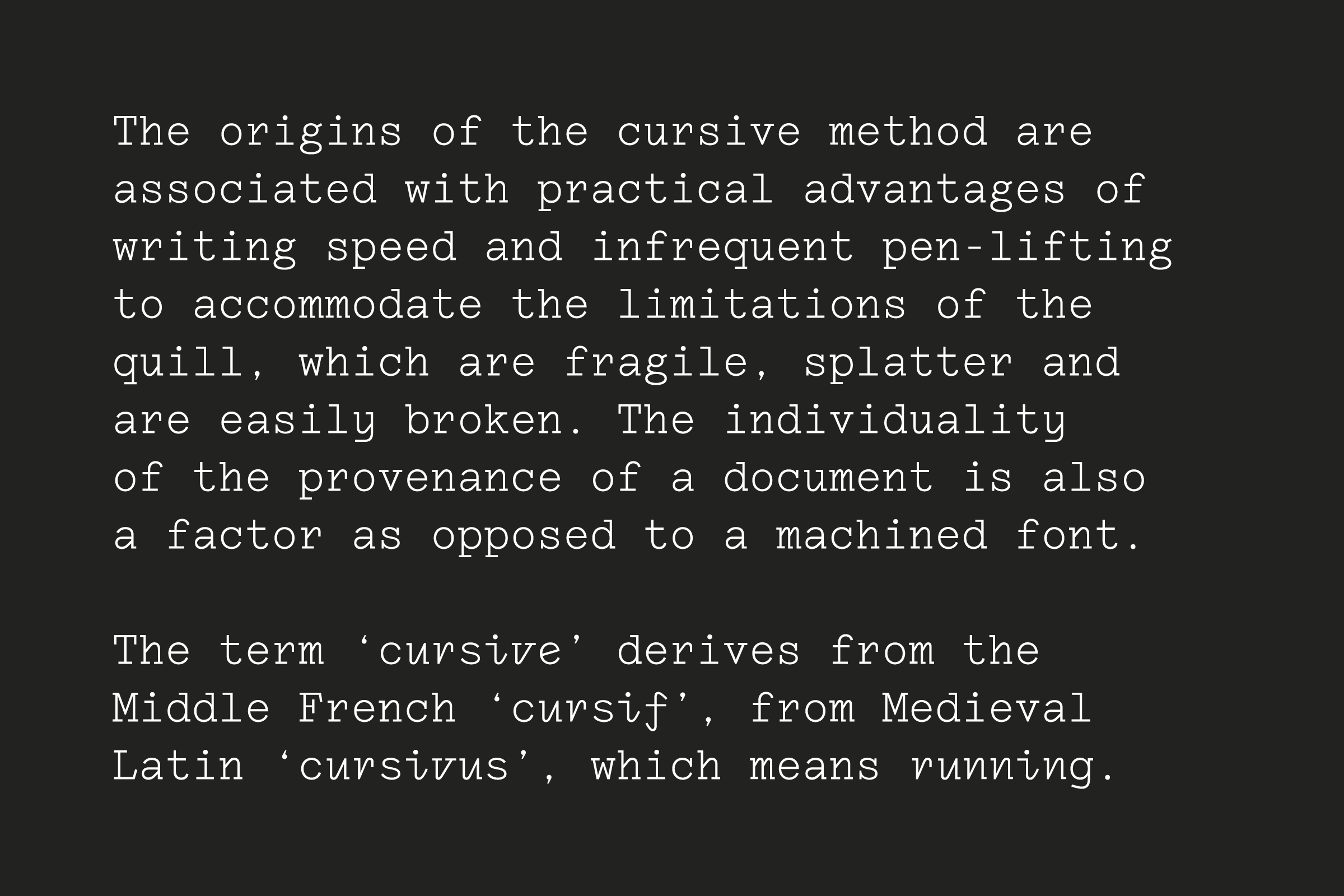
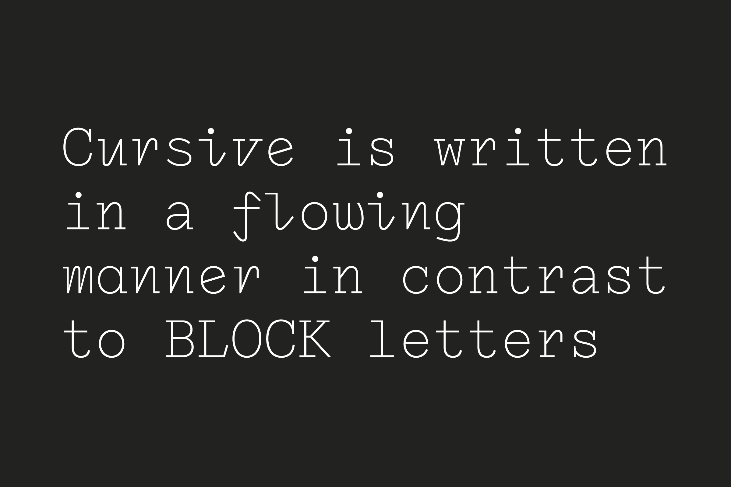
We developed a tri-space typeface, whereby the letters take up to 3 units in width, so that when typed the disrupted rhythm of spaces creates organic alignments. We knew that a monospace, with its fixed width, wouldn’t work across platforms, so we took the opportunity to expand the conversation on mono/fixed width typefaces and adapted it to contemporary needs.
Samuel Bradley and Kat Chan: Immortal Mushroom, Book design. Font In use: Noto Serif.
(MZ) The minute typographic research appears to be threading through Wolfe Hall’s work, with many book covers leading the communication with strong typography.
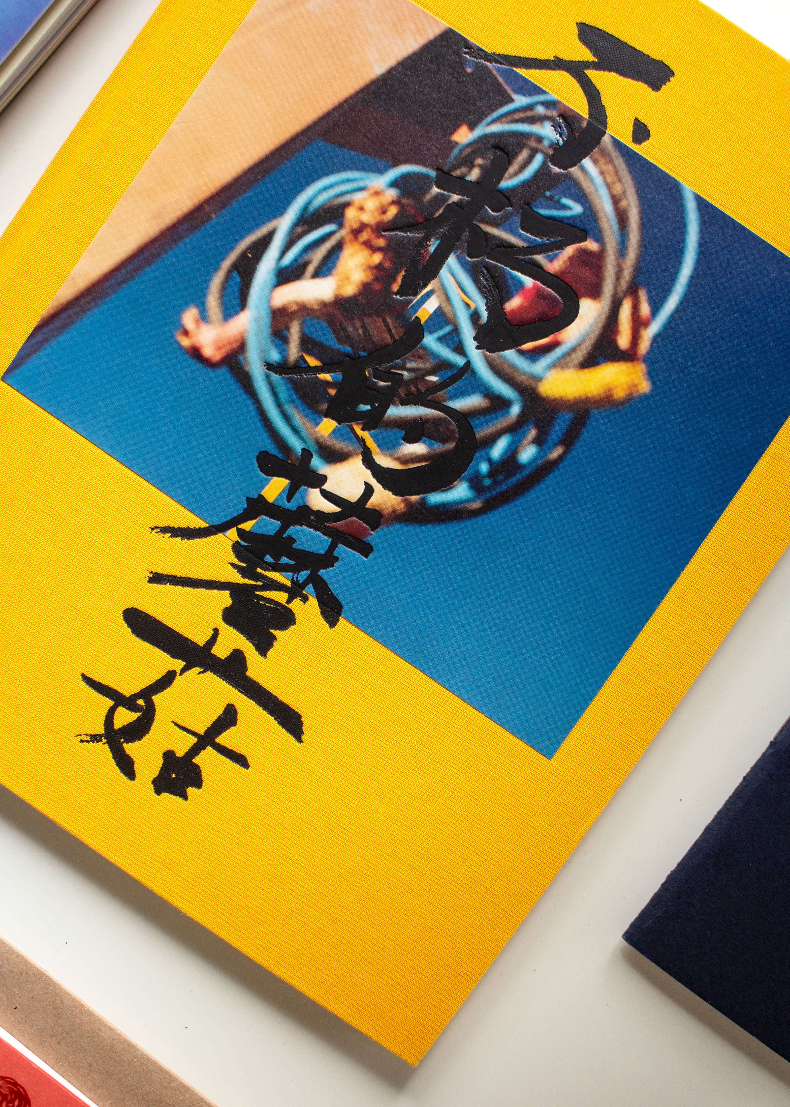
(JW and LH) This is perhaps a particular time or moment in design for us. Clients that in the past few years produced more image-led work are asking now for a strong type-driven approach. Or a combination of the two, like Samuel Bradley and Kat Chan’s debut book Immortal Mushroom. The matt black foiled calligraphic title overlaps the tip-in image and expands onto the book cloth. The production of this was a complex process of mediation and discovery also for the printer we worked with. But thanks to the positive relationship and collective effort we succeed in producing something unseen.

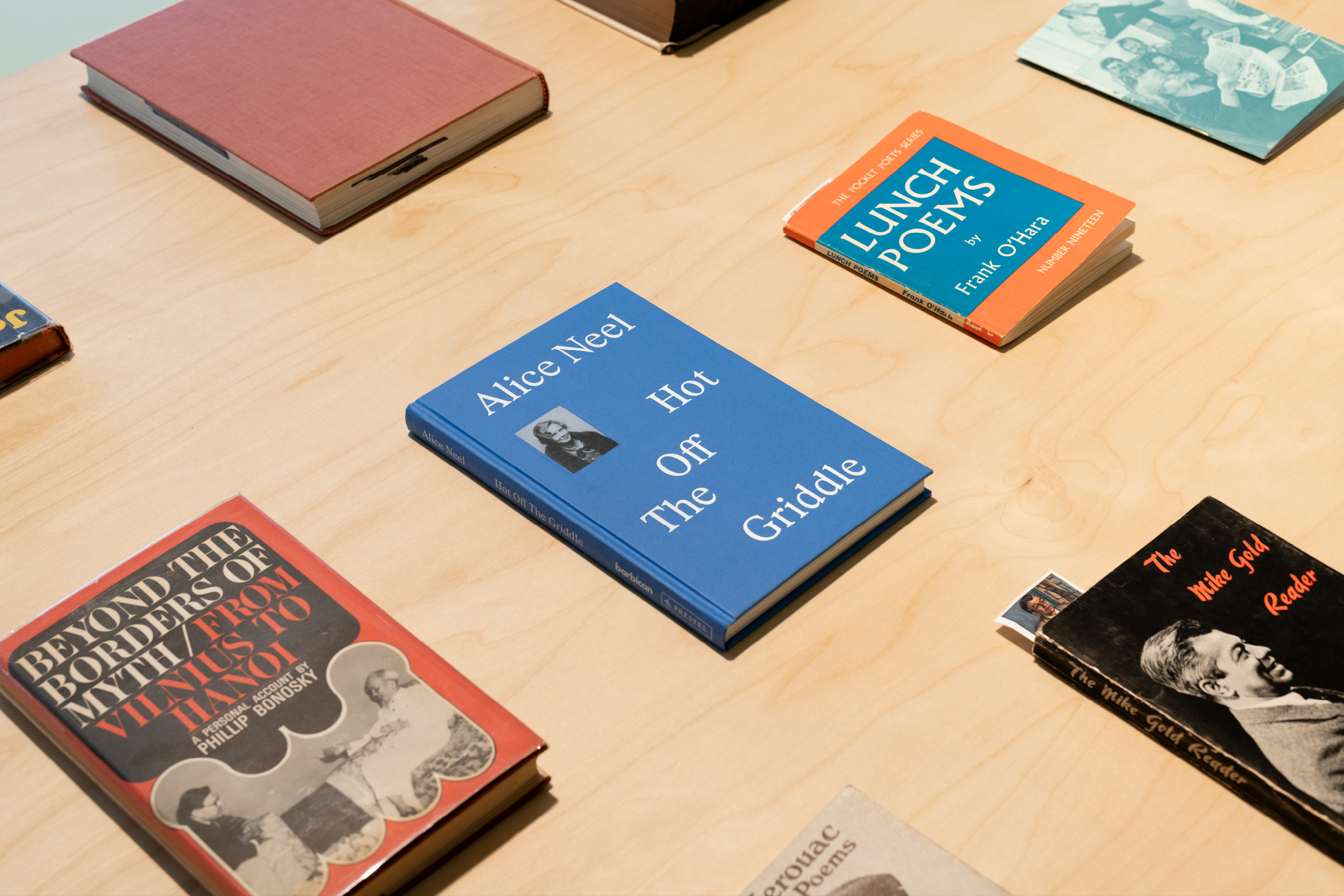
The same level of close collaboration happens with clients. The aim is to work side-by-side and very hands-on, to channel the artist’s vision and let the work speak for itself. Because of it, every project is for us necessarily singular. It’s interesting that other clients might start equating or somehow recognising an aesthetic that is close to theirs and there is a resonance happening. In truth, so far the titles of the books we worked on were all very powerful and demanded for space and presence. Alice Neil’s title, Hot Off The Griddle, naturally asked for a typographic cover – although there is this little picture of her catching your attention. We were fortunate that the Barbican team wanted to work very collaboratively on this.
(MZ) Would you be afraid of losing control when the client acquires this greater ability to steer decisions?
(JW and LH) The options and ideas we share come from our informed research, we respond with proposals based on our understanding of how the work should communicate. So every option or direction is test-proofed by us, but we enjoy the collaborators’ input and welcome their suggestions. This process was fundamental in the making of A Sentence in Soil, a book for Magali Reus designed for her show at the Nasher Sculpture Center in Dallas, Texas. It was made out of shared effort: we met regularly at hers or our studio to play with materials, language and layout in order to deconstruct the standard approach to the catalogue. The book is split into two Swiss-bound books of coloured and coated material. On one side the work interspersed her research and a mix of contextual research, construction and studio documentation. On the other the museum’s voice is presented through installation shots and textual information.
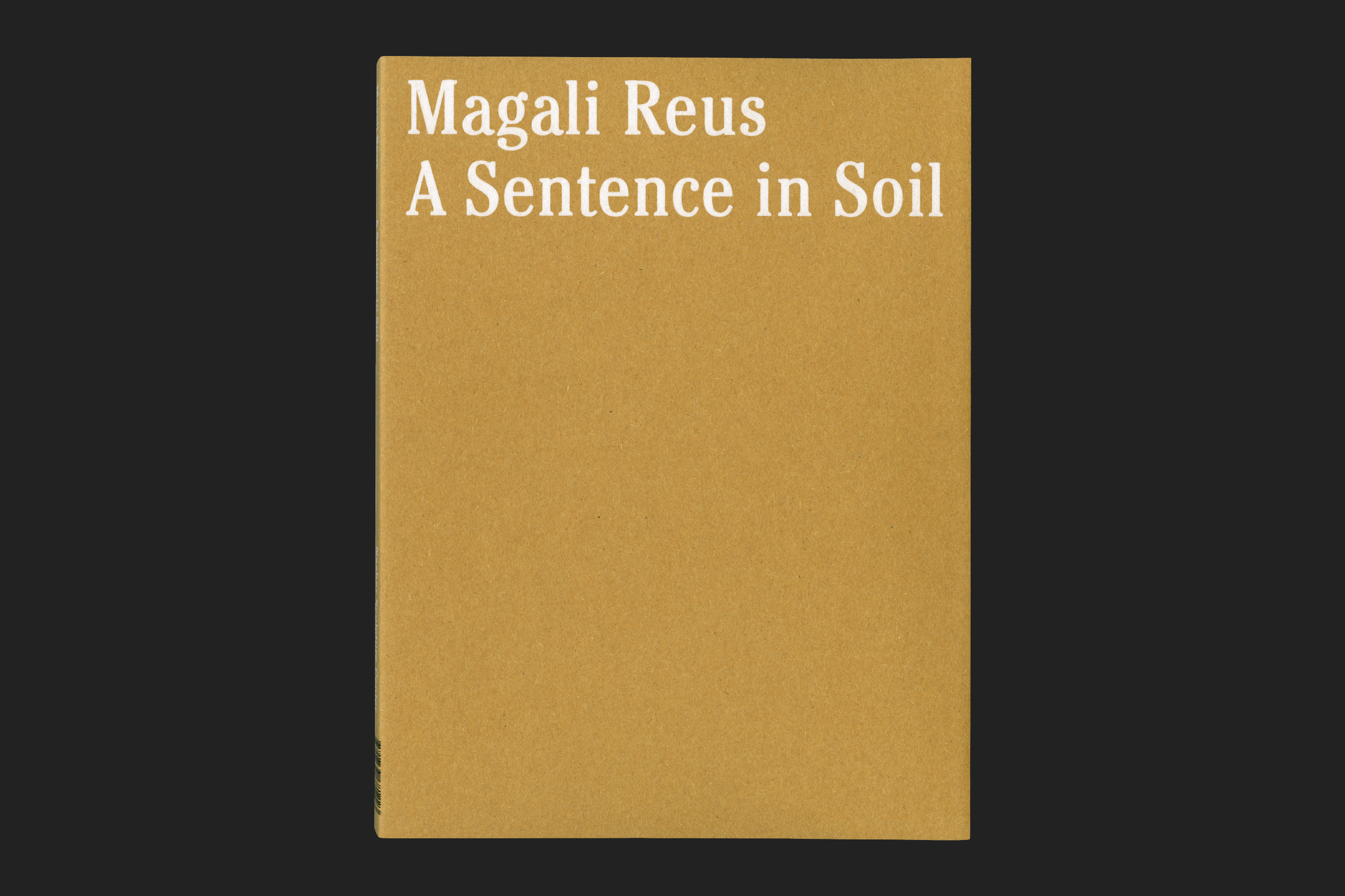
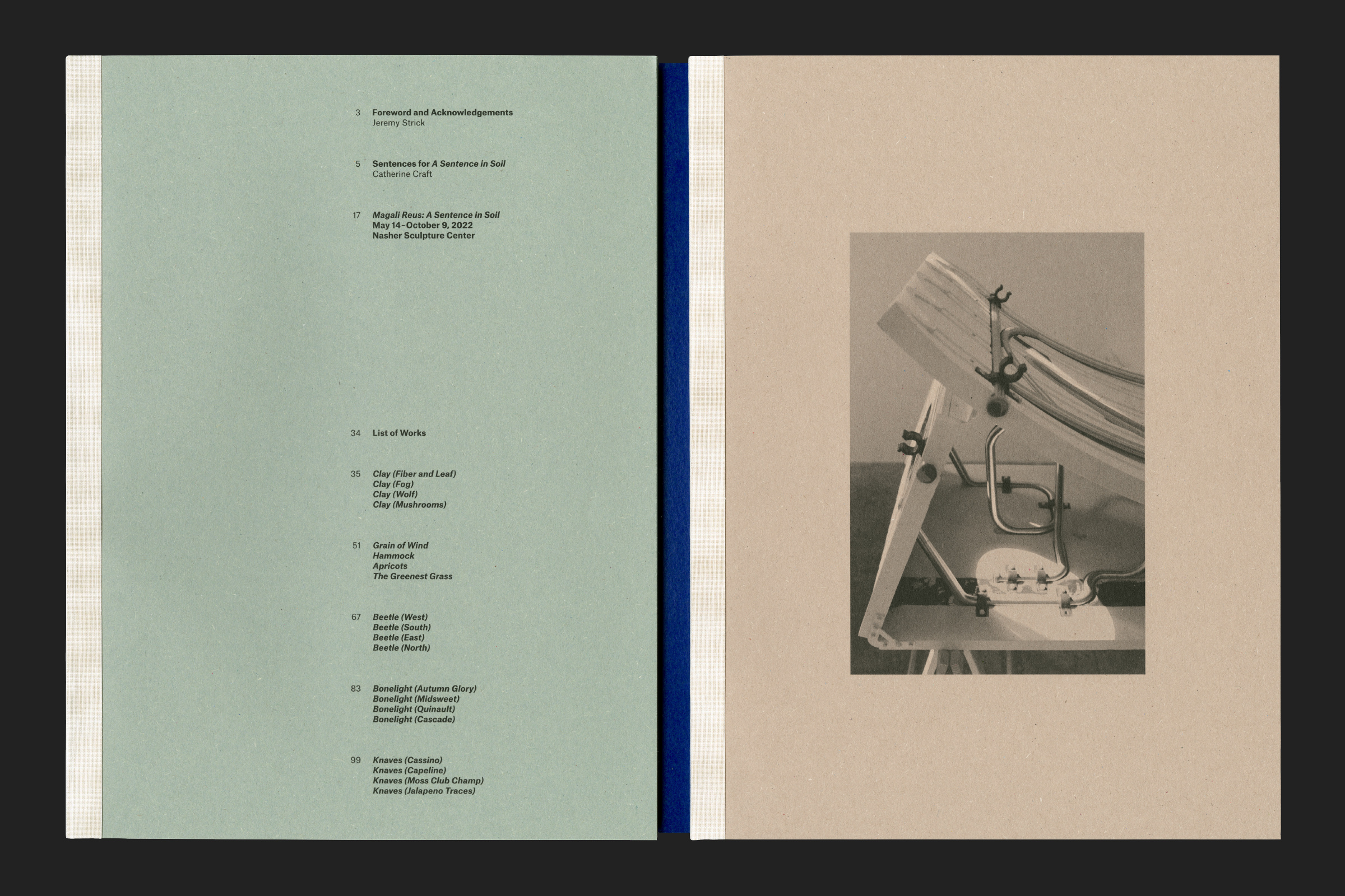
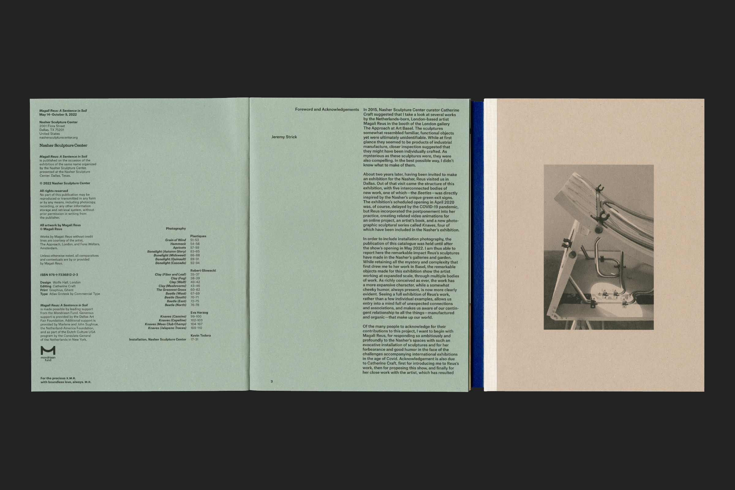
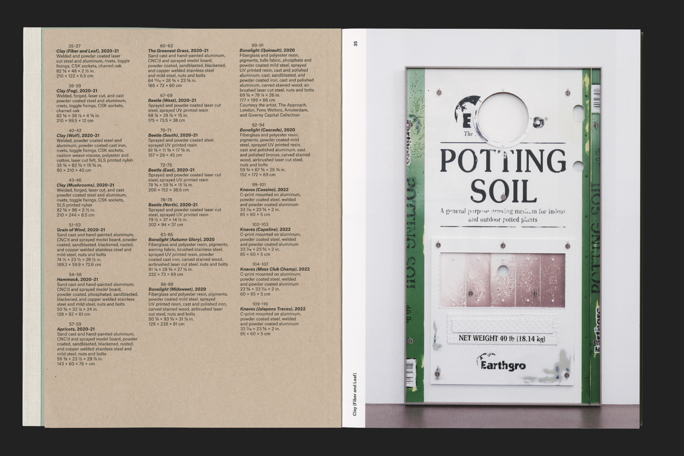
The typography is set in Atlas Grotesk, a contemporary revival of the Dutch Mercator by Commercial Type. Whilst being a neutral and clean sans, its industrial-like character and vertical proportions and contrasts bring it closer to American Gothics which felt more in-line with Magdali’s work.
(MZ) How did typography acquire such relevance in your practice?
(JW and LH) By chance it happened that we both self-trained. We attended different universities but we started looking at books for projects, and particularly fell for 50s–60s publications. Looking at the type-setting of the past forced us to consider why things are done in certain ways and to think how the freedom we have today can allow more precision and more expression. Also, the references we were gathering made us conscious about accessibility, and readability. This investigation and curiosity became studio practice. We learnt our approach to typography by doing, keeping in mind readability and good type-setting.
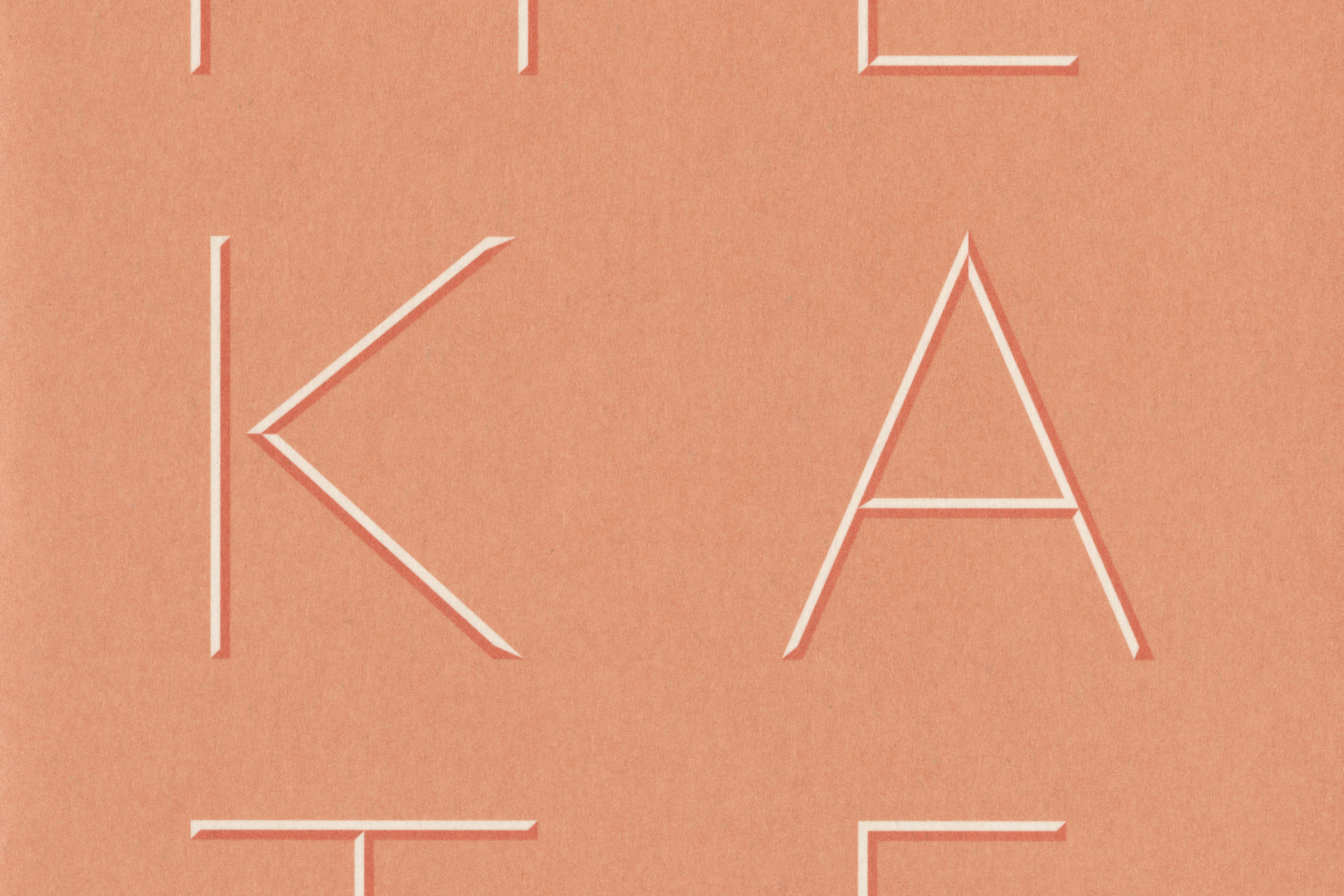
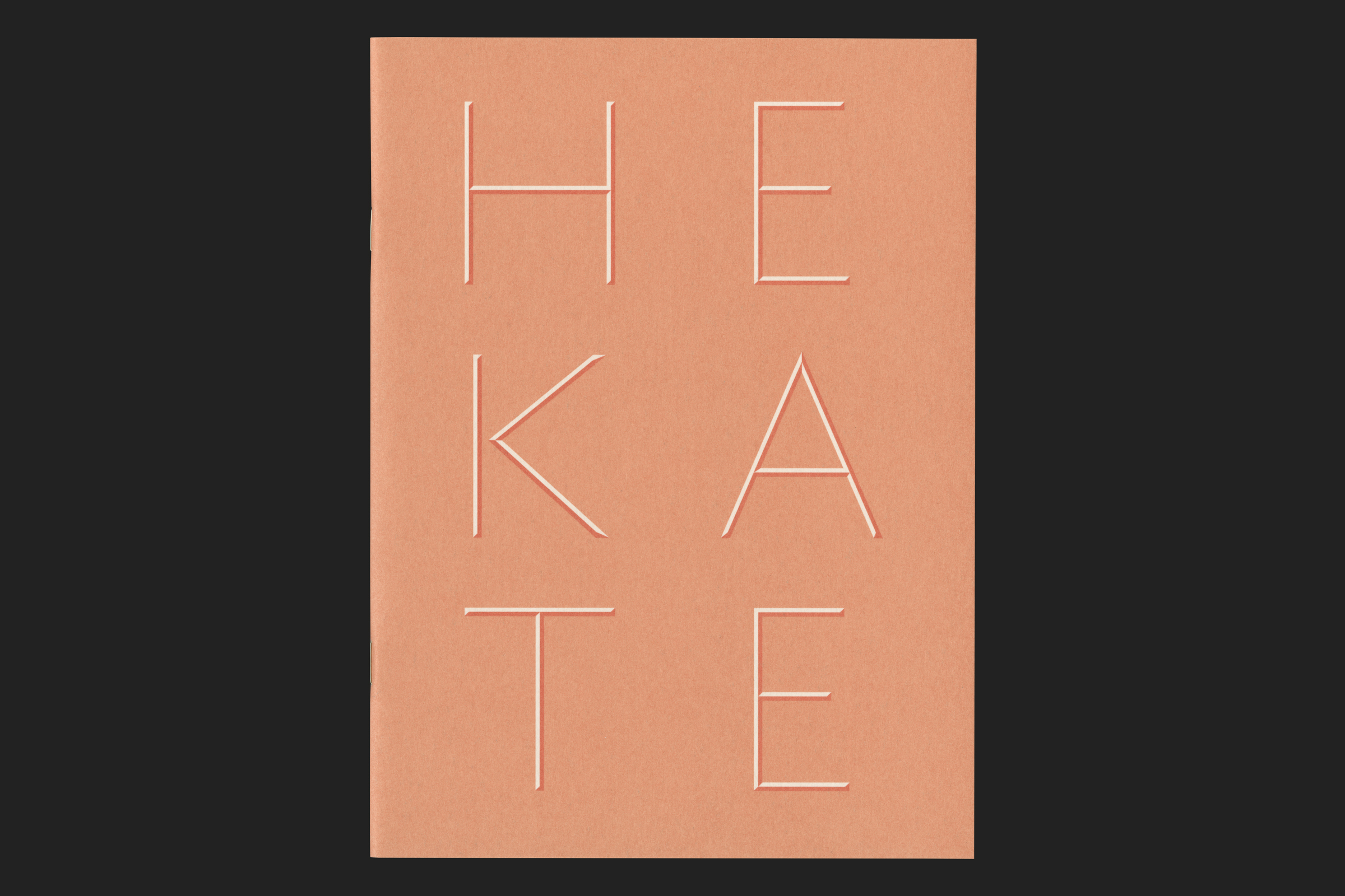
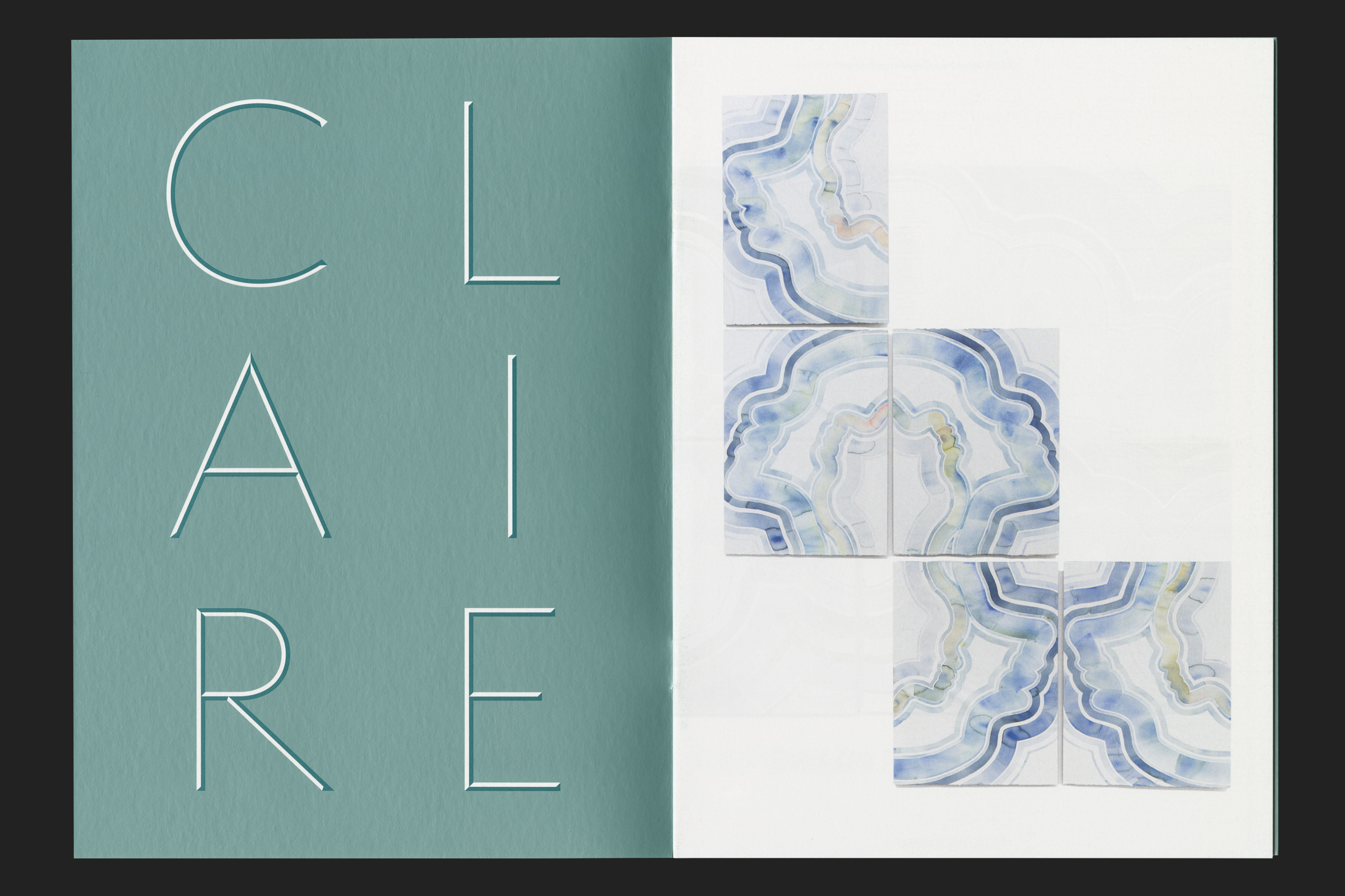
Some of the work we do is not necessarily for a project, and sometimes we dwell in the idea of the non-finito, in the design of lettering and not of a complete type. We like that many of our typefaces preserve a certain line of pastiche that comes from the more immediate learning by making – they feel somehow more human. A quick project, like the Claire Hooper: Hekate for Hollybush Gardens, was the perfect environment for this process. At the time we were playing with Humanist lettering, focussing mainly on the design of capitals, so we drew some letters for Hekate by setting simple parameters.

Alongside our exploration we are building a strong network with young and up-and-coming designers, and when we work on custom typography we always engage with type designers to engineer the type. Or we like to test new releases from people we follow, and try to promote the work of lesser represented designers. This feeds into the goal for the studio too; we want to work inclusively and collaboratively with clients, designers, craftsmen and producers, developing diverse projects through open and direct conversations.