Noticeable differences between thick and thin strokes characterize the type designs from Giambattista Bodoni and the Didot family. Their letters feature vertical contrast axes and often hairline thin serifs that cantilever out from the vertical strokes. Centuries of changes to typographic tastes paved the way for those design decisions, but Bodoni and the Didots each had predecessors whose work they built off of directly. One was the Parisian punchcutter and typefounder Pierre Simon Fournier le jeune (1712–1768). This review is about a revival of his typefaces called PS Fournier.
Outside of France, Fournier is probably less well-known than Bodoni and the Didots today. Internationally, Fournier is also less well known than his direct English contemporary: John Baskerville of Birmingham. Twentieth-century type makers revived Baskerville’s types much more often than Fournier’s. Nevertheless, Fournier briefly came back into vogue during the 1920s. Certain European foundries made fonts based on his display types and—during what can retrospectively be called Stanley Morison’s “revival program”—Monotype created two Fournier interpretations: Fournier roman and italic and Barbou roman. Of these, only Monotype’s Fournier roman and italic unfortunately ever made it into digital formats.
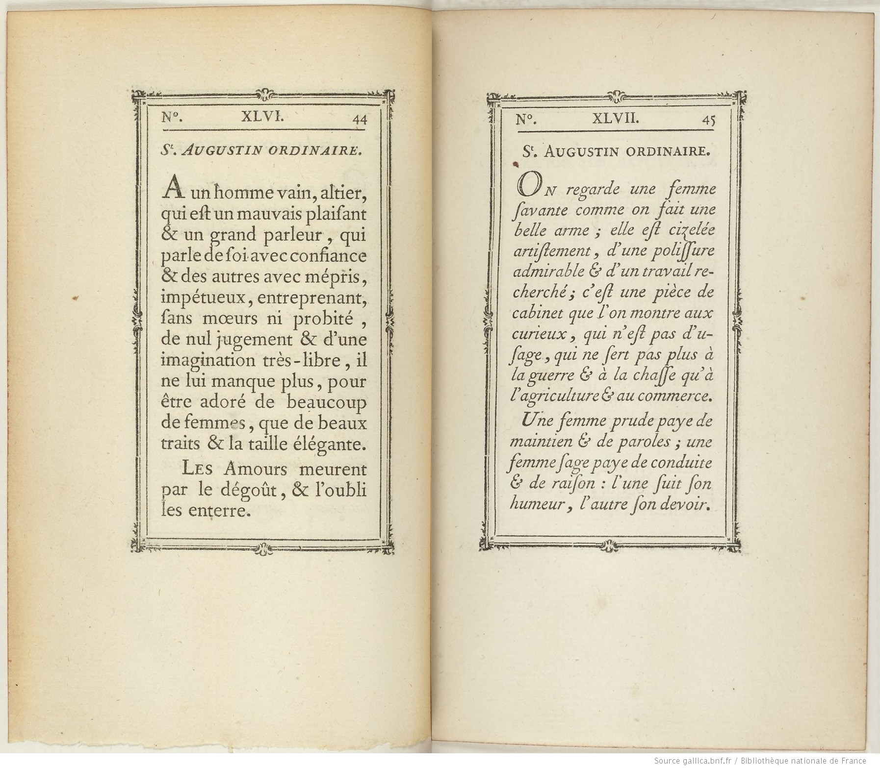
While Stéphane Elbaz did not base PS Fournier on any specific type size that Pierre Simon Fournier le jeune cut, earlier revivals followed specific Fournier sizes closely. For instance, Monotype’s Fournier is closest to the St. Augustin ordinaries type, which was about 14pt in size. You can see it in this spread from Fournier le jeune’s Manuel typographique, vol. 2 (1766). Source gallica.bnf.fr / Bibliothèque nationale de France
This left the field for a thorough digital Fournier revival open, and PS Fournier—published in 2016—is Stéphane Elbaz’s deep dive into Fournier ’s oeuvre. The fonts are part of Jean François Porchez’s Typofonderie, and Fontstand distributes three PS Fournier families, which are all part of the same overarching design. Elbaz developed each of those families for a specific size range. The base family, PS Fournier Std, is for regular “text-sized” settings. Meanwhile, PS Fournier Std Grand is for headlines and other large-sized applications, while PS Fournier Std Petit is for setting very small-sized type. Comparatively, the Petit fonts have heavier thin strokes and almost slab-like serifs. Grand features more contrast, and both its serifs and its thin strokes are much lighter. Since Grand is for larger sizes, Elbaz had room to add more detail to that optical size’s letterforms. These fineries are most visible in the PS Fournier Std Grand italics.
A un homme vain, altier, qui est un mauvais plaisant & un grand parleur, qui parle de soi avec mépris, impétueux, entreprenant, sans mœurs ni probité de nul jugement
Cromwel alloit ravager toute la Chrétienté : la famille Royale étoit perdue, & la sienne à jamais puissante, sans un petit grain de sable qui se mit dans son uretère
L’Exactitude & la justesse du raisonnement sont absolument nécessaires dans la profession d’Avocat. Un ancien Poëte a nommé les Avocats qui raisonnent mal
A quoi aboutissent tous le soins & toutes les veilles des Savans ? Le valet d’un Sous-Fermier aura, dans deux ans, plus de revenu qu’ils n’auront de fonds à la fin de leur vie
You might be asking yourself why Fournier has the words le jeune appended to his name. In French, that means “the younger,” for Fournier had an older brother who was also a typefounder. Jean-Pierre Fournier (1707–1783) is called Fournier l’aîné, or “the elder.” The Fournier brothers’ father managed a typefoundry whose roots stretched back into the sixteenth century. After he died, Fournier l’aîné purchased the business. Fournier l’aîné did not achieve the fame his younger brother would because his foundry had plenty of fonts printers of his day already wanted. That was a benefit Fournier le jeune did not have. He needed to create new fonts to establish himself in the typefounding business.
What Fournier le jeune did have was a unique combination of skills and ego. He wanted to prove himself, and he did so through his output. One thing making Fournier le jeune so interesting is the sheer amount of fonts he cut by hand in his lifetime. Morison reflected that “no man of his time accomplished so much as Fournier le jeune.” There is consistency to his types, too. As Typofonderie recounts in its promotional materials for PS Fournier, Fournier le jeune was “the first to clearly comprehend the concept of ‘type family,’ sorting a set of similarly styled alphabets by sizes, widths, and x-height.” Cutting roman and italic types in many sizes that could all match each other stylistically, he also produced decorative fonts, border-printing elements, and ornaments. Printers could produce entire books relying just on materials provided by Fournier le jeune.
Fournier’s italics are particularly noteworthy. They are designed with a regularized angle. That separates them from French Renaissance-era italics, which combined many angles, especially within the lowercase letters. The most recognizable difference Fournier employed can be seen on the in-strokes at the top-left of letters like the lowercase “b,” “d,” “h,” “i,” “l,” “m,” “n,” “p,” “r” and “u.” The in-strokes forms are very much like the triangular serifs on those letters in roman type. Fournier’s italics are almost sloped romans or “oblique” versions of the upright styles. Indeed, as individual letterforms, Fournier’s shapes are more legible than those made in the Renaissance by punchcutters like Francesco Griffo or Robert Granjon. Fournier did not invent this new kind of italics, but he embraced it so thoroughly that it has been associated with him ever since. He was inspired both by earlier French italics (beginning with the Romain du Roi designed in the 1690s) and by the lettering in seventeenth and eighteenth-century copperplate engraving, as well as by trends in French calligraphy that must have gone hand-in-hand with those developments.
Le fameux Pélisson s’amusoit à la Bastille à apprivoiser un araignée. On ne peut entièrement définir ce que le travail opère sur les esprits, le vuide unease qu’il remplit
Ce que l’on appelle proprement le Génie, est toûjours accompagne d’une sorte d’audace, & cette audace, regardée par le vulgaire comme un mouvement de la vanité
On s’imagine faussement qu’il n’y a que ceux qui occupent de grande laces, qui puissent prétendre à être utiles : chacun peut l être à sa manière.
Un sage Athénien répondit à un homme qui promettoit d’enseigner la méthode d’une mémoire artificielle : Apprends plûtôt à oublier ce qu’il ne faut pas dire.
It eventually became quite common in metal type for the same general design to be applied to a full range of type sizes. Then, after the advent of photo-typesetting in the twentieth century, typesetters began scaling a single master set of letterforms up or down to any size. For decades now, some type designers have tried to return type to its size-specific roots by making digital fonts with optical sizes, just as Elbaz does with PS Fournier. It is especially relevant for a Fournier revival to include optical sizes; Fournier himself worked so systematically. In some digital revivals of historic types, designers base each optical size on a specific font of metal type made by the original punchcutter. That is not the track Elbaz chose. Instead, PS Fournier’s three optical sizes each attempt to synthesize Fournier’s designs in a way that works for small, medium and large-sized type, respectively. PS Fournier’s optical sizes all feel like Fournier le jeune’s work—without being based on any three Fournier types specifically.
To show the printing world how well entire books made with his fonts, borders and ornaments could look, Fournier produced several elaborate type specimens. The first, from 1742, is his Modéles des caracteres de l’imprimerie. The Bibliothèque nationale de France has digitized a copy, which you can examine online yourself. That is also the case for Fournier’s Manuel typographique: you can read both the first volume from 1764 and its second from 1766 online, thanks to the French national library. Not only does Fournier’s “manual of typography” show his type designs off, but it also includes one of only two comprehensive explanations of the practice of punchcutting and typefounding written before the nineteenth century. Even without the book’s exquisite typography, Fournier’s writing alone makes it an important resource for design historians. Yet, we must stay with Fournier’s typography for a moment. His specimens are pinnacles of rococo typography. In style between the 1730s and the 1760s, the rococo style was ornamental to an extent of almost excessive decorativeness. It is characterized by theatricality and the repetition of curved elements and trompe-l’œil effects. Many of the borders Fournier placed around his specimen pages undulate dramatically, while others almost appear to be in motion.
Les humeurs du corps on un cours ordinaire qui meut & tourne imperceptiblement notre volonté. Elles roulent ensemble, & exercent successivement un empire secret sur nous
Quand les grands Hommes se laissent abattre par la longueur de leurs infortunes, ils font voir qu’ils ne les soûtenoient que par la force de leur ambition
Tours les sentiments ont chacun un ton de voix, des gestes & des mines qui leur sont propres. Ce rapport, bon ou mauvais, agréable ou desagréable, es ce qui fait que les personnes plaisent ou dépaisent.
Presque tout le monde prend plaisir à s’acquitter des petites obligations ; beaucoup de gens ont de la reconnoissance pour les médiocres ; mais il n’y a quasi personne qui n’ait de l’ingratitude par les grandes.
As I suggested above, not nearly as many twentieth-century typefoundries, typesetting-machine manufacturers, or photo-type firms revived Fournier’s work as they did Baskerville, Bodoni, or the Didots’ types. While Fournier’s legacy has been felt more greatly since the advent of digital type, it has been more common for type designers to draw on his example as one of many sources of inspiration than it has been to revive him directly. Two commonly-used examples are Charter—designed by Matthew Carter for Bitstream in 1987—and Adobe’s Source Serif, an OpenSource family designed by Frank Grießhammer. Another Fournier-inspired typeface on Fontstand is Joshua Darden’s Corundum Text. In terms of its overall color, Corundum Text is most like PS Fournier Std Petit. Fontstand users can choose from more Corundum Text styles. It has 17, compared to PS Fournier Std Petit’s six.
Communicability Palma de Mallorca +111 (51) 268-416 rannsóknarréttur
Majakowskiring 68 poliomyélitique College Station +122 (465) 524-803
montmorillonite Newcastle–Maitland saltvandsområde Albéric Magnard
Plaza Urbina 37 aproximadamente Neuenburg am Rhein 911/060-0984