Editor’s note: Thomas Huot-Marchand provided this text in French and English. I have presented the English version at the top of this post; the French version appears below it, and you can jump to it via this link. All text and photographs below come from Thomas; the hasty scans from catalogs and their captions are mine. The images in this post do not repeat, so after finishing the English version, scroll down to the French text for more. – Dan Reynolds
Since Boton’s death, several people have posted tributes to him on social media, including EsadType, which linked to more than four hours of video with Boton, recording during a master class with him and an exhibition of his work in Amiens from 2012. Fonts in Use has a landing page leading to all the examples of designers’ uses of Boton’s typefaces from its database.
“I entered the world of advertising through a window,” said Albert Boton. As an apprentice carpenter with his father in 1952, he visited Atelier Troy, a Parisian advertising agency, to replace said window. What he discovered in those premises was a revelation: the young man found his vocation.
Three years later, he joined the Deberny & Peignot foundry design studio and worked alongside Adrian Frutiger, Ladislas Mandel, and Lucette Girard. Here, he learned the art of typeface design in a highly stimulating and innovative environment. His job involved drawing on scraperboard the narrower series of Univers. Frutiger would later say of Boton that he quickly became one of his most talented employees. Boton subsequently started a prolific career, drawing a large number of typefaces in a variety of styles.
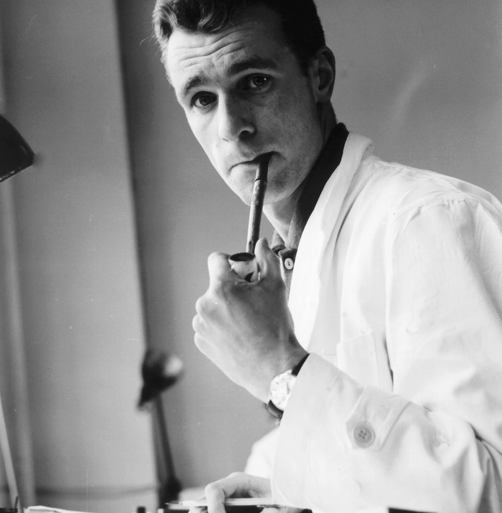
Portrait of Albert Boton at Deberny & Peignot, from 1956. Taken either by Ladislas Mandel or Adrian Frutiger.
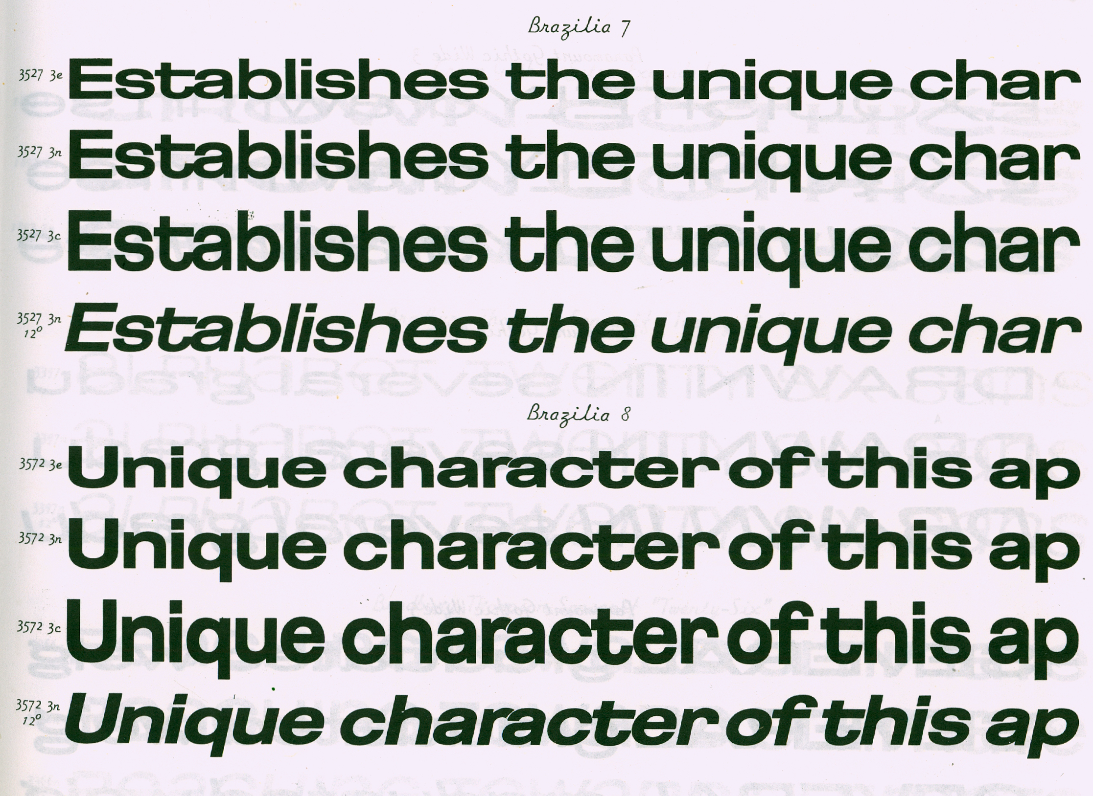
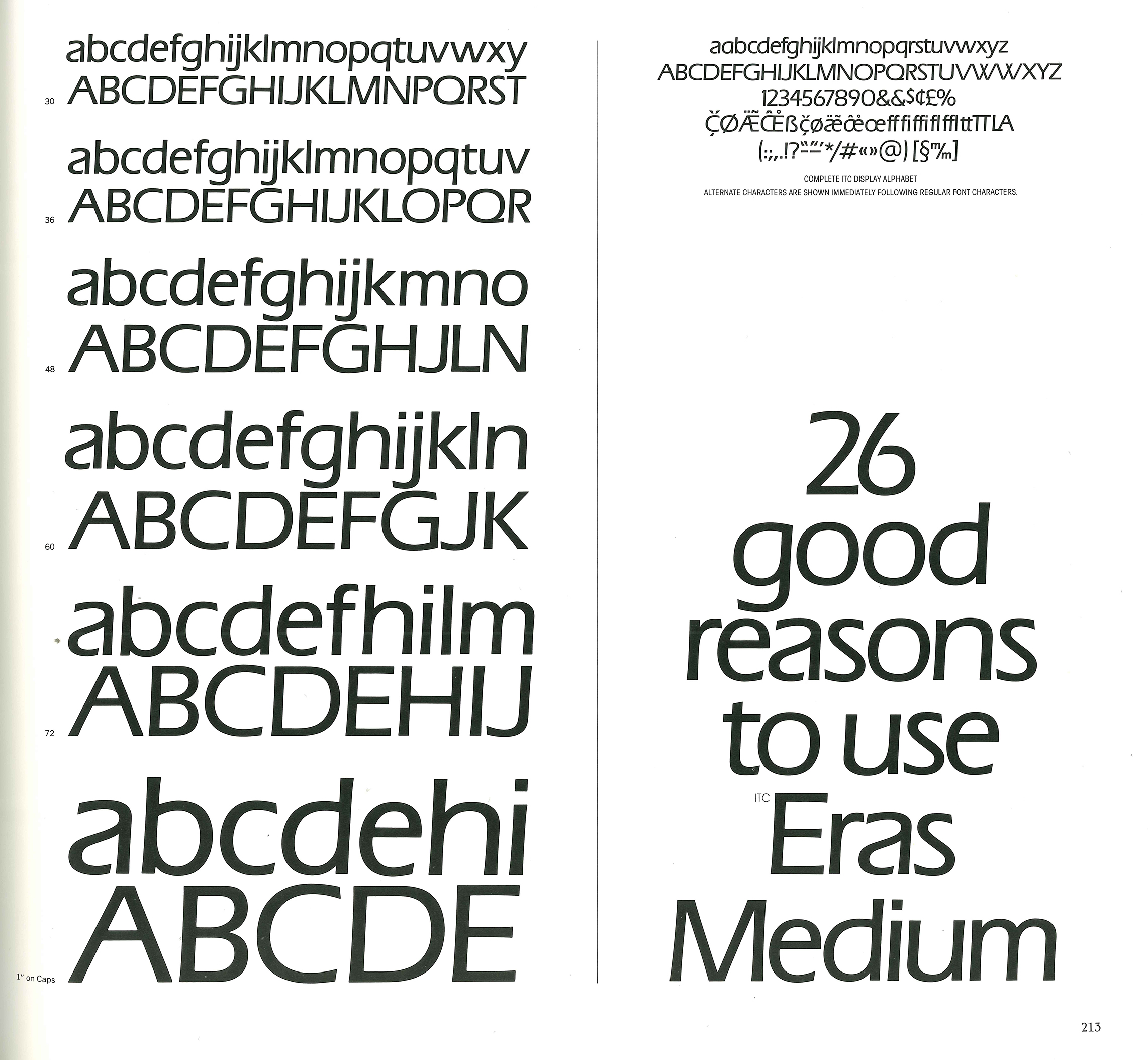
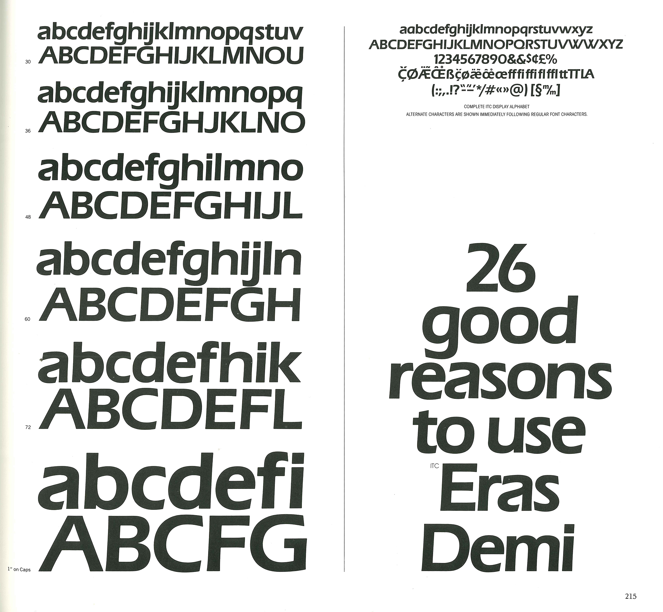
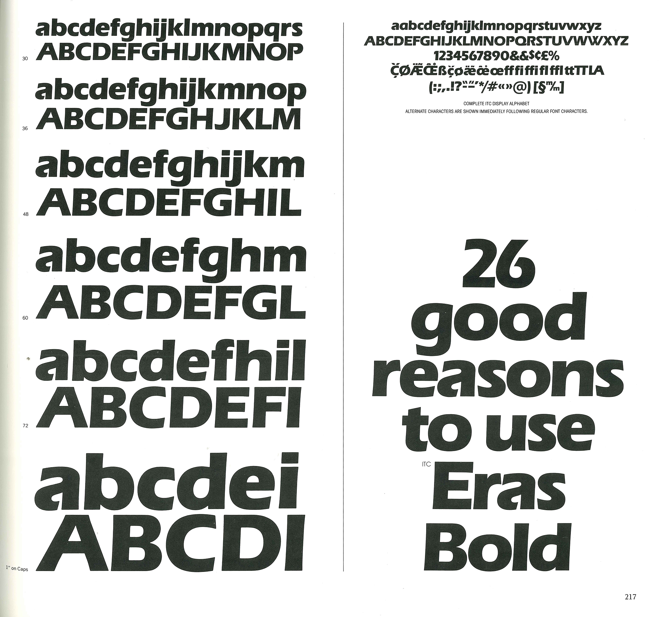
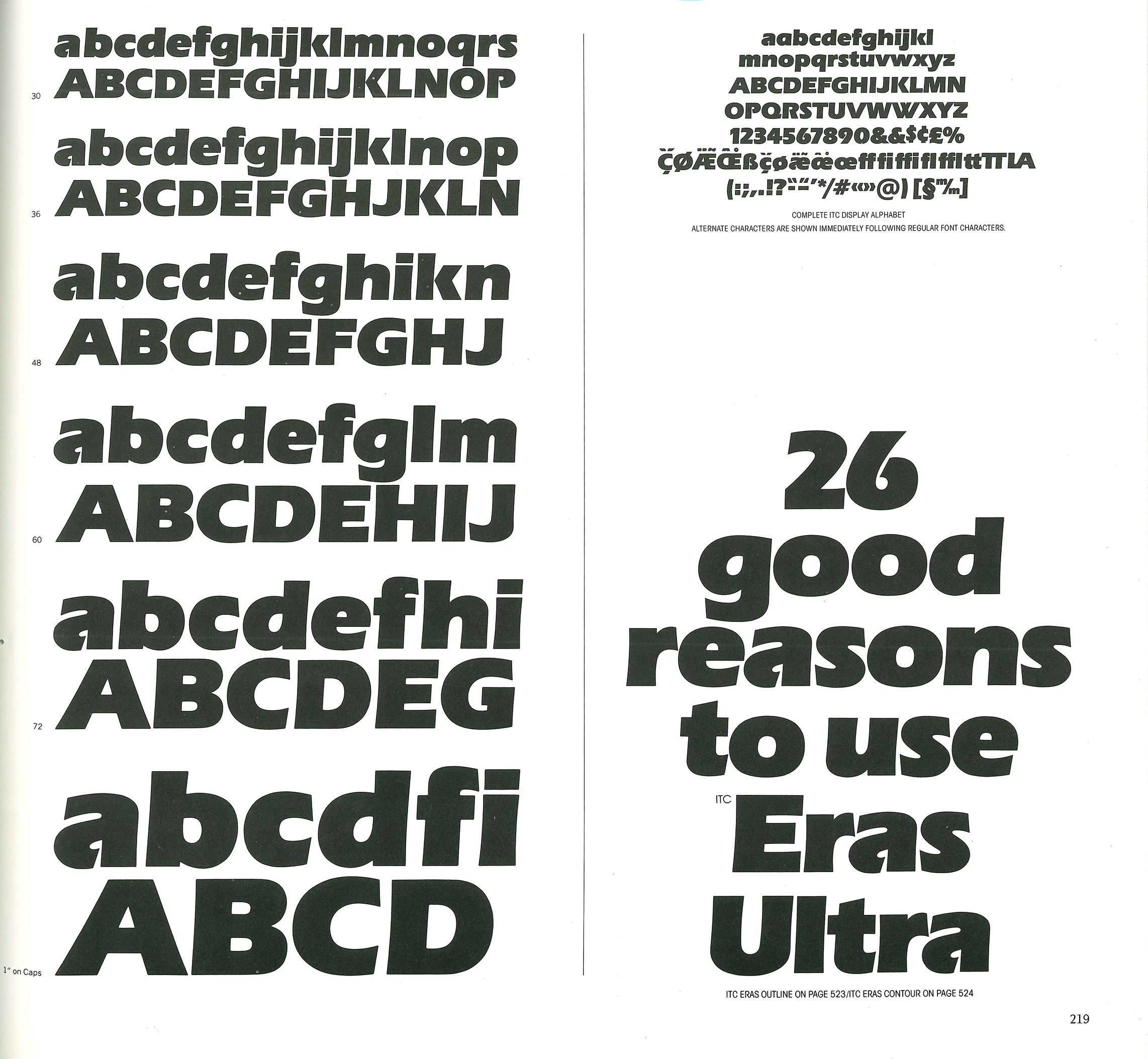
Whereas the work of Mandel and Mendoza, the first ANCT teachers, focused mainly on text typefaces (with a preference for small sizes), Boton’s work found its fullest form in typefaces for photolettering and advertising. Typefaces produced for phototypesetting soon contributed to the success of the Hollenstein studio: Boton’s Eras, for instance, was an international success from 1961 onwards.
He worked for the greatest Parisian advertising agencies: Hollenstein, Delpire, and Carré Noir, for which he designed a great number of logos and lettering pieces for Christian Dior, Cacharel, Renault, Schlumberger, etc. Those designs were often created in combination with custom typefaces: in that sense, Boton can be seen as a pioneer.
Boton taught calligraphy and type design at École nationale supérieure des arts décoratifs (1968–2004). He succeeded Ladislas Mandel at the Atelier National de Création Typographique (the original name for the ANRT) in 1988, where he taught during most of the 1990s under the direction of Peter Keller.
He has never stopped drawing letters: in the past ten years, Boton worked on adapting and digitizing his countless creations with his friend, the type designer Olivier Nineuil. Olivier Nineuil is preparing a major retrospective publication, to be released soon, to pay tribute to this giant of French typography.
Retail typefaces
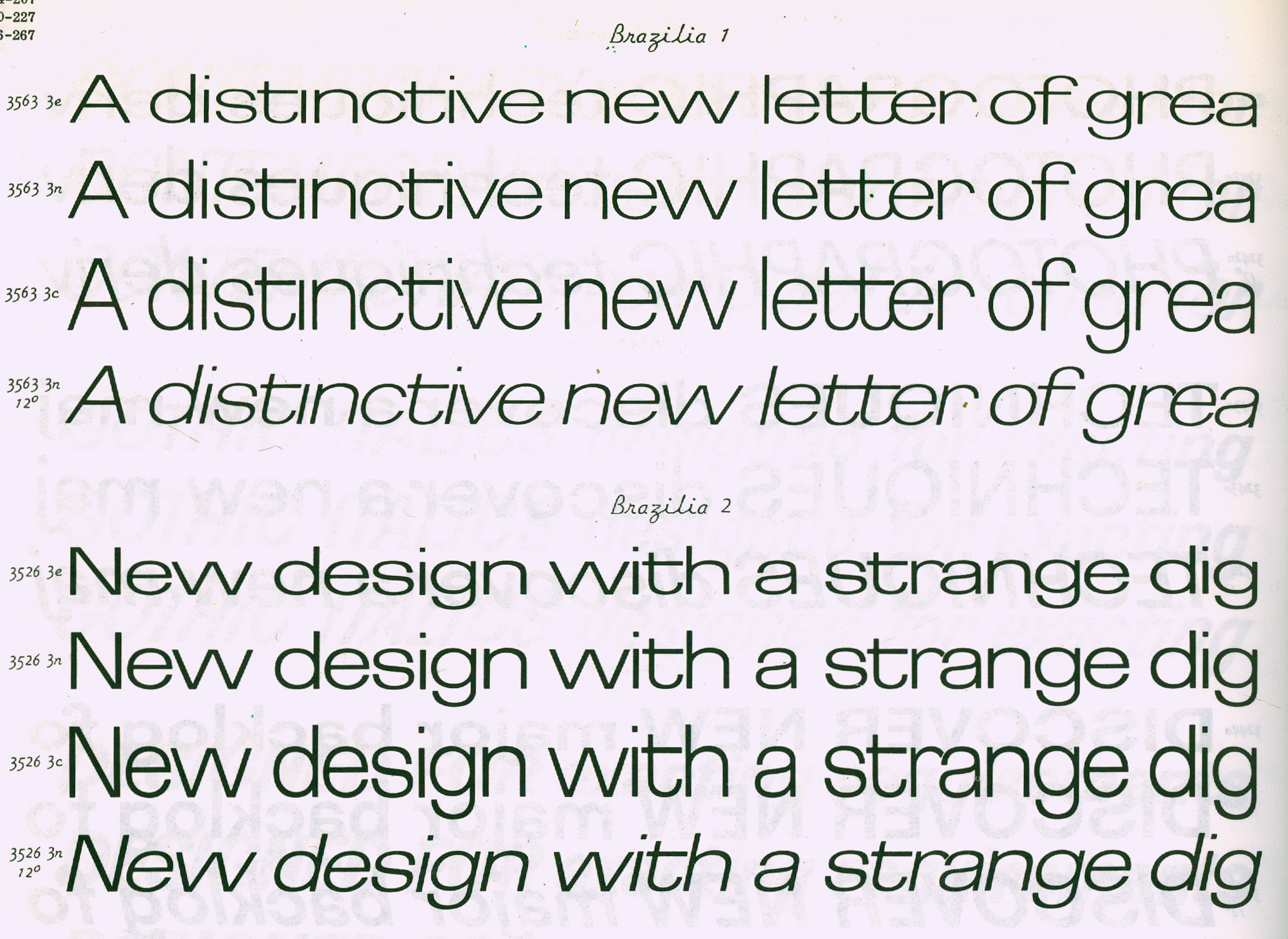
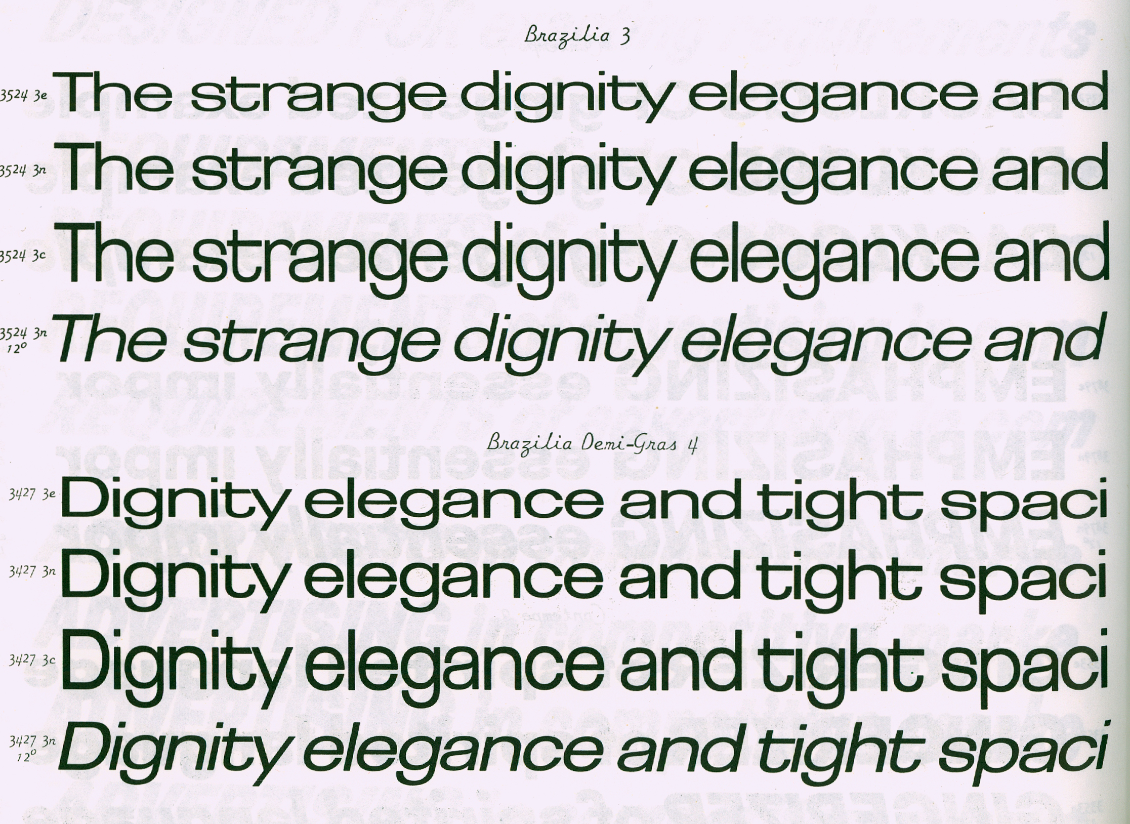
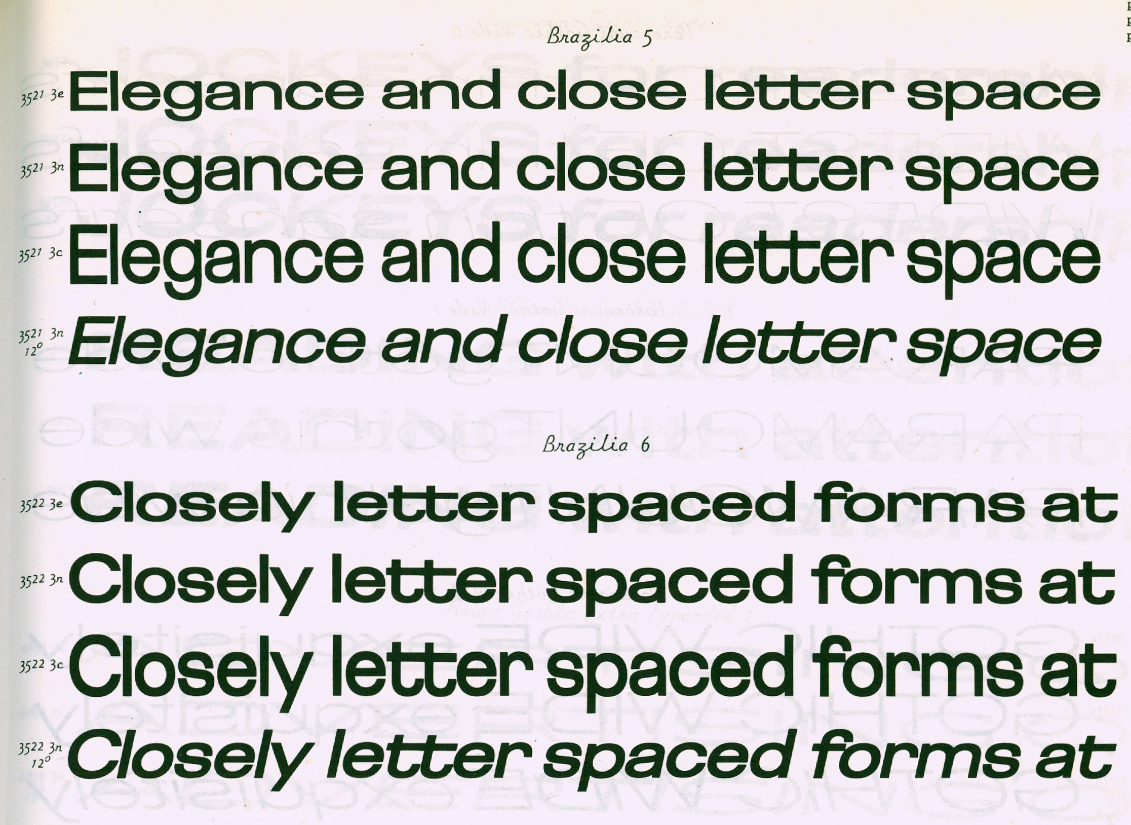
Fonderie Hollenstein: Sherwood (1958), Roc, Teen (1959), Brasilia (1960), Eras (1961), Adler, Broadway, Scherzo (1962), Rialto, Renault (1964), Black Boton, Roc noir, Zan (1970), Certina, Figgins, Navy Cut, Pharaon, Tanagra (1971), Botoni, Pampam (1974).
Mecanorma: Hillman (1972), Tzigane, Chinon (1973). Hudson (1975), Elan (1985), Boton, Navy Cut (1986).
ITC: Eras version 2 (1976), Elan (1986).
Typogabor: Boton (1976), York (1978)
Berthold: Boton (1986)
Agfatype-Monotype: Carrénoir, Scherzo (1995), Black Boton, Kit, Linex Sweet, Pharaon, Pompei (1997), Memo (1998), Linex Sans (2003)
FontFont: Aircraft, Studio, Elégie, Zan (2002), Cellini, Page, Linex Semi, Tibère (2003), District (2004).
Custom Typefaces
Studio Hollenstein: Paloma (1962), Primavera (1963)
Publicis: Chadking (1958), Renault (1964, 1971)
SNIP4: Rodier (1967)
Indépendant: Schneider Laden (1974)
Design Programmes-Roger Tallon: RER RATP (1977)
Carré Noir: Primagaz (1974), Intertel UTA (1989) Aérospatiale (1991), MAIF (1994), ESA (1995), Pyrénées (1996), Alfaro, Maître Pierre, Encyclopedia Universalis, Paris Rhin Rhône (1997), Le Guide Vert (1998), Sofitel (1999), Activ (2000)
CBA: Lipton (2003)
«Je suis entré dans la publicité par une fenêtre», dit Albert Boton. Apprenti menuisier auprès de son père, il se rend en 1952 dans l’Atelier Troy, une agence de publicité parisienne, pour remplacer ladite fenêtre. Ce qu’il découvre dans ces locaux est une révélation: le jeune homme a trouvé sa vocation.
Trois ans plus tard, il intègre le studio de création de la fonderie Deberny & Peignot, avec Adrian Frutiger, Ladislas Mandel et Lucette Girard. Il y apprend le dessin de caractères, dans un contexte d’innovation très stimulant. Frutiger dira de lui qu’il devient rapidement l’un de ses collaborateurs les plus doués. Il exécute alors, sur carte à gratter, les versions étroites de l’Univers. Boton démarre ensuite une carrière prolifique, dessinant un très grand nombre de caractères dans des registres très variés.
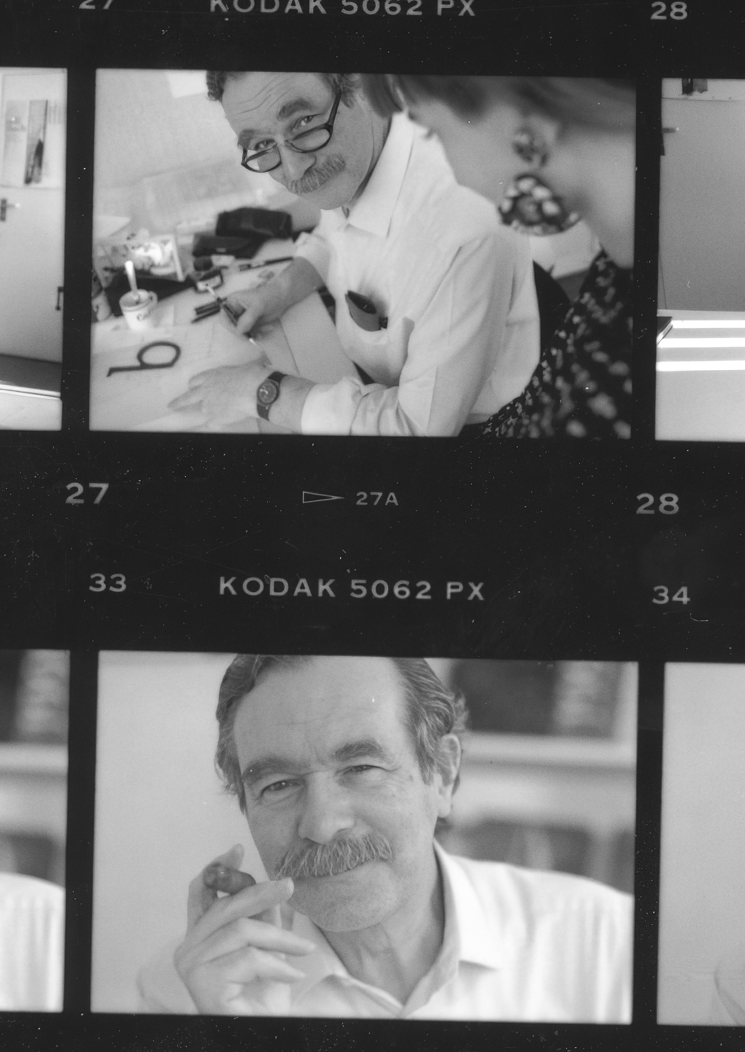
Contact sheet with two photos of Albert Boton, taken by Peter Keller at ANCT in 1991.
Si les productions des premiers enseignants de l’ANCT, Mandel et Mendoza, se concentrent sur les caractères de labeur (avec une prédilection pour les petits corps), Boton s’exprime pleinement dans le phototitrage et la publicité. Rapidement, ses caractères pour la photocomposition font les grandes heures de la fonderie Hollenstein: l’Eras, par exemple, est un succès international depuis 1961.
Il travaille dans les plus grandes agences de publicité parisiennes: Hollenstein, Delpire, puis Carré noir, avec lesquelles il va signer de nombreux logotypes et typogrammes (pour Christian Dior, Cacharel, Renault, Schlumberger.), créations qu’il accompagne régulièrement de caractères sur mesure: de ce point de vue, il est un précurseur.
Il enseigne la calligraphie et le dessin de lettres à l'École nationale supérieure des arts décoratifs (1968–2004). Il rejoint l’ANCT en 1988, succédant à Ladislas Mandel, et continue d’y enseigner durant la majeure partie des années 1990 lorsque celui-ci est dirigé par Peter Keller.
Albert Boton n’a jamais cessé de dessiner des caractères: pendant les 10 dernières années, il travaillait à l’adaptation et à la digitalisation de ses innombrable créations, avec son ami le type designer Olivier Nineuil. Olivier Nineuil prépare une grande publication rétrospective, à paraître prochainement, pour rendre hommage à ce géant de la typographie française.
Caractères
Fonderie Hollenstein: Sherwood (1958), Roc, Teen (1959), Brasilia (1960), Eras (1961), Adler, Broadway, Scherzo (1962), Rialto, Renault (1964), Black Boton, Roc noir, Zan (1970), Certina, Figgins, Navy Cut, Pharaon, Tanagra (1971), Botoni, Pampam (1974).
Mecanorma: Hillman (1972), Tzigane, Chinon (1973). Hudson (1975), Elan (1985), Boton, Navy Cut (1986).
ITC: Eras version 2 (1976), Elan (1986).
Typogabor: Boton (1976), York (1978)
Berthold: Boton (1986)
Agfatype-Monotype: Carrénoir, Scherzo (1995), Black Boton, Kit, Linex Sweet, Pharaon, Pompei (1997), Memo (1998), Linex Sans (2003)
FontFont: Aircraft, Studio, Elégie, Zan (2002), Cellini, Page, Linex Semi, Tibère (2003), District (2004).
Caractères sur-mesure
Studio Hollenstein: Paloma (1962), Primavera (1963)
Publicis: Chadking (1958), Renault (1964, 1971)
SNIP4: Rodier (1967)
Indépendant: Schneider Laden (1974)
Design Programmes-Roger Tallon: RER RATP (1977)
Carré Noir: Primagaz (1974), Intertel UTA (1989) Aérospatiale (1991), MAIF (1994), ESA (1995), Pyrénées (1996), Alfaro, Maître Pierre, Encyclopedia Universalis, Paris Rhin Rhône (1997), Le Guide Vert (1998), Sofitel (1999), Activ (2000)
CBA: Lipton (2003)
Source: Thomas Huot-Marchand, Roxane Jubert, Sébastien Morlighem: ANRT Archives 1985–2006, ENSAD Nancy-Les presses du réel, 2016.